July / August Thrift Finds

August ends tomorrow, so I think it’s pretty safe to say that I’m done thrifting for the month.  (But now that I think about it, I could conceivably hit up one last place Wednesday after work…tempting….)

Although I’m still feeling pretty satiated as regards my summer wardrobe, I have picked up a few new things since my last Thrift Finds in June, so I thought I’d share what I found.

Continue reading “July / August Thrift Finds”

Print Mixing 101

1 (2)

On Tuesday I talked about where to put your prints, arguing that the simplest way to a streamlined closet was to pick just one place for your patterns.

Where’s the fun in that, you say??

Well, if you’re a print lover (or you want to be), this post is for you.

Tips for Mixing Prints (from dipping a toe in to daring)

  • Mix subtle and bold. As mentioned Tuesday, a pinstripe, tiny polkadot, glen paid, very faded/light print, or even a seersucker stripe will read neutral when paired with a larger, bolder print.

A photo posted by LeahLW (@thriftshopchic) on

  • Use texture as a print.  Like the subtle prints mentioned above, lace, tweed, cable knit, etc. all walk the line between full-blown pattern and solid and will help ease you into the world of print mixing.

A photo posted by LeahLW (@thriftshopchic) on

A photo posted by LeahLW (@thriftshopchic) on

  • Break it up. Use a wide, solid belt or a color-block top with solid on the bottom and pattern up top to create visual interest without visual overload. My favorite way to do this is with fun shoes on the bottom, a solid pant, and a printed top:

A photo posted by LeahLW (@thriftshopchic) on


  • Stay in the same color family. If the main background colors of your prints are pretty close, it’ll read as a variation on a theme instead of competing narratives. Likewise, think about whether your prints are generally the same warmth/coolness* or saturation – layering neons over rich autumnal colors is just gonna make everyone queasy.
    (Check out these two Into Mind posts for an intro to color theory – e.g. what the heck is saturation? – and examples of harmonious color palettes for your wardrobe.)

Ps #printmixing ftw

A photo posted by LeahLW (@thriftshopchic) on


  • Mix two different genres. Floral + stripe.  Stripe + animal. Polkadot + tweed.  Monochrome check + bold cartoon colors.

A photo posted by LeahLW (@thriftshopchic) on


Speaking of monochrome…

  • Black & white + color. There’s enough of a contrast between black-and-white and colors that our eyes tend to read them as background + foreground (or vice versa).  For your colors, stick to bold and bright, more saturated hues if you don’t want to muddy things up (i.e. navy is probably not a great idea here, nor are super-soft pastels, unless you tone down the black in your monochrome to a correspondingly soft grey).
    I have very little black in my wardrobe so I have no outfit examples to show you, but the graphic at the top of the post is a good illustration of how well this works.


What are your tips for mixing prints?  Do you love to live on the leopard/zebra/tiger stripe wild side, or are you print-mixing shy?


*Apologies to artists everywhere.  Saying more blue/yellow/red instead of warmer/cooler is pretty confusing for us non-artists.


Friday Thrift Camaraderie

I met a gentleman at the thrift store recently who caught my attention when I accidentally thought he was asking me a question.  (I just assume strangers will speak to each other at thrift stores—it’s one of the nice things about the communal space thrifting creates).

Turns out he was just talking out loud to himself, but he took the opportunity to share his conversation with me.

“Is this too loud?”  (holds up a white shirt with orange/pink/green plaid striped over it, similar to below but with a lot more white/no blue:)

polo-ralph-lauren-orange-big-and-tall-long-sleeve-plaid-linen-shirt-product-1-19726315-0-384474396-normal
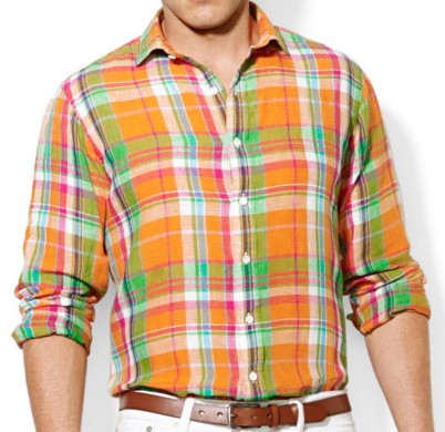
Source
 (edited for excessive male model brooding)

He continues: “I mean, I wear bright colors—this (points to a faded mauve madras shirt) is pretty tame for me.”

“I think it’s great,” I respond, “It’ll bring a pop of color without blinding anyone.”

“You think?  Good.  I hate being boring at work.”


This is thrifting camaraderie at its best: encouraging someone to live into their own style even when it’s a bit outside the norm.

Plus, who doesn’t love seeing masculine types wearing something besides a plain ol’ blue dress shirt?  (This is why the spouse has a purple/red/teal plaid shirt in his closet…)


What’s your latest/favorite thrifting camaraderie experience?  Do you talk to strangers (or solicit their advice) in thrift stores?  Or does it totally rub you the wrong way?


Happy Weekend, Thrifters!