I love color. And as a “Light Summer” in the world of personal color analysis (PCA), there are plenty of gorgeous colors to choose from: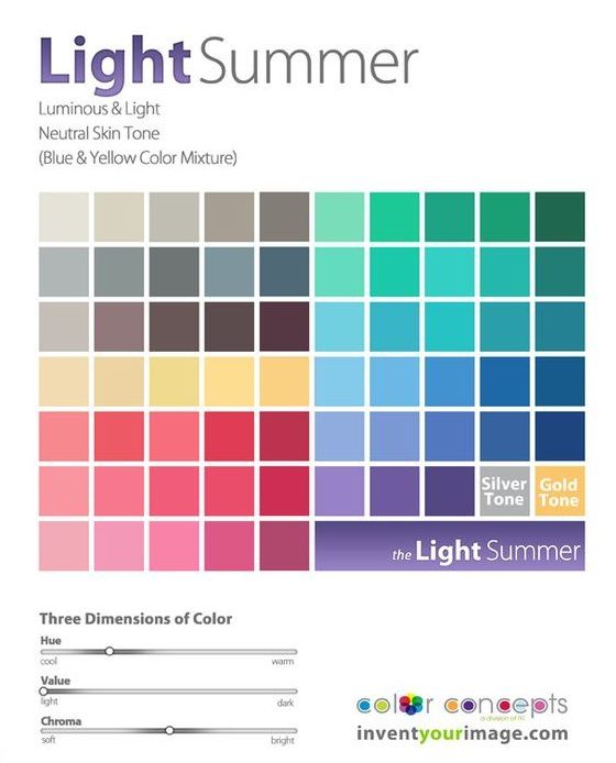
After a detour down the rabbit hole of Instagram-inspired neutrals and with my PCA color palette in hand, I was excited to start wearing color again. After all, I used to regularly dress in electric blue snakeprint blouses and dresses covered in purple tulips with red, green, and yellow accents. (Man I wish I had a picture of that dress to share with you.)
Someone further ahead on the PCA journey than I am cautioned me that neutrals would actually help ground the gorgeous colors in my new palette, and while I knew Kim’s advice was right on, as a color-lover, it felt so much more fun to hunt for my new colors than it did to look for neutrals.
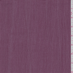
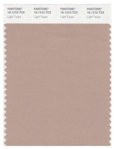
But as I’ve kept working on my Light Summer wardrobe, I’ve settled down on the color factor a bit and started to really appreciate my neutrals. Two particular favorites are a mauve I’ve seen referred to as “faded wine” (ha) and lovely shades of taupe. I also dig a real Light Summer gray – one that’s light and cool enough to elevate a whole outfit but not so cold it looks stark. Basically, the color of a koala.
This taupe looks weird on my monitor, but who would not be excited about that koala??
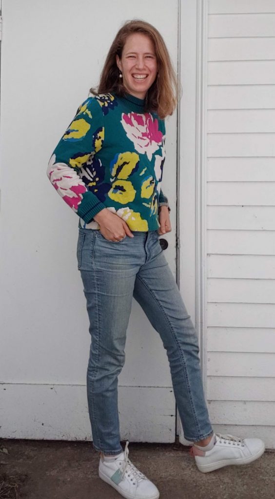
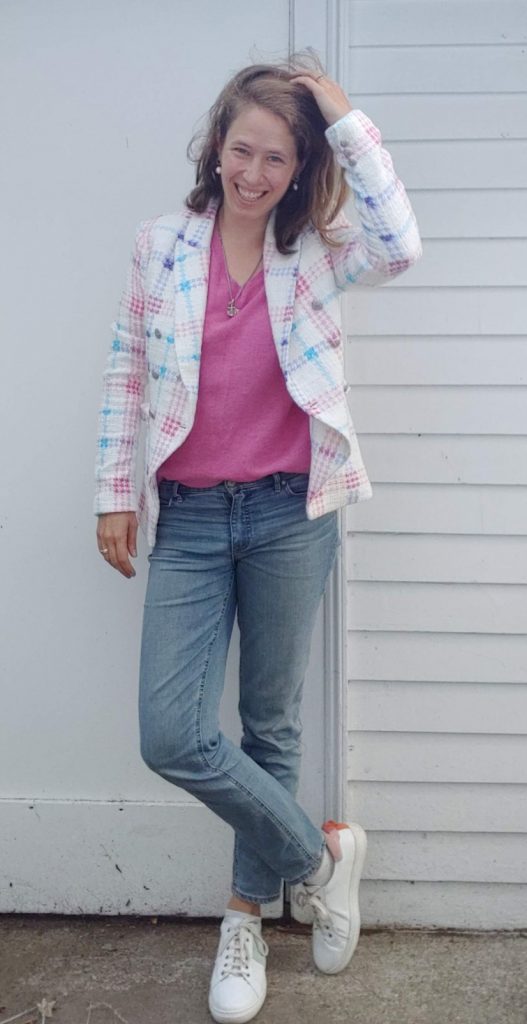
I’ve also realized that some outfits with a lot of color seem to work, where others read as cotton candy.
Too “old-fashioned gender binary baby shower”:
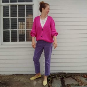
Eye-blinding – to me it works but in a magical unicorn one-off kind of way:
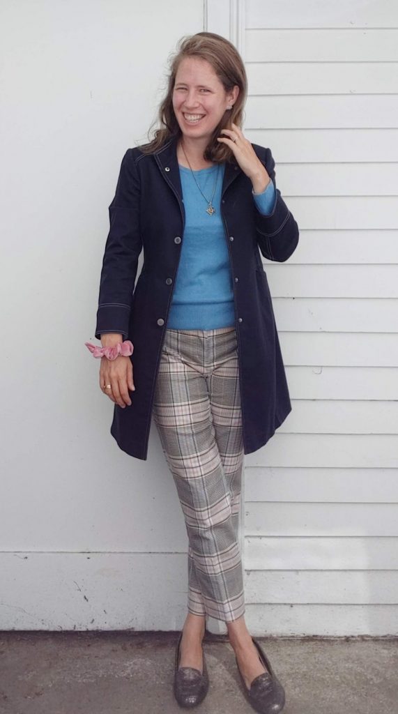
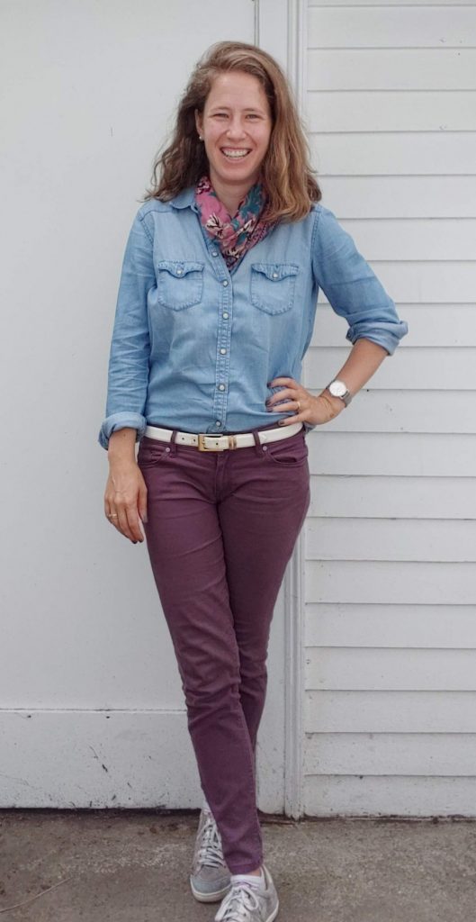
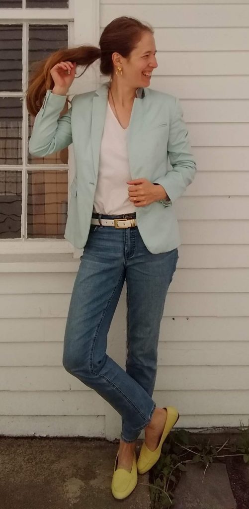
Outfits where color is mixed in with a big dash of “neutral” from my color palette (faded wine, chambray/denim, white, taupe) tend to be less of a gamble:
So basically I’ve discovered I shouldn’t buy colorful pants, ha. It’s true, though – I’ve tried for years to thrift just the right pink yellow, or purple pants, and even when I’ve hit the hue right on the head, they never really work in my wardrobe. For example, I have a pair of lemon yellow jeans in my drawer right now that I have yet to wear because they just seem to oversaturate every outfit. I’m going to tuck them into storage until spring and see if they improve with a change in the seasons.
Otherwise, the only colorful pants I have right now are green, and I deploy them judiciously. In addition to telling me that my pants forgot to go down all the way (thank you, Sister), my sister commented that the “watermelon” look on the right was overwhelming – fun, yes, but still overwhelming:
View this post on Instagram
So where I’ve landed for now is that my color generally resides in my top half – shirts, blazers, sweaters – and my bottom half stays neutral (with occasional pops of color in my shoes). This makes for a good mix of colors without me feeling like a clown.
How do you portion out color in your outfits? Or does more = better in your book?





I love color, too! I do understand the concern you have. I’m somewhere between a deep winter and a deep autumn, and the other day I wore a hunter green top with Nantucket red capris (I live in the tropics) thinking I had on a nice autumn-themed outfit. One of my colleagues said, “You look like you’re all ready for Christmas!” Which was not the look I was going for. Not only that, but in the spring I wore those same capris with a dark navy top and a friend at church said, “Why are you dressed for Halloween?”
I love both the outfits with the fuchsia sweater!
I like to thrift shop as well. And I buy things that fit me well (or easy fixes to make fit. I don’t look at color or buttons always, because I can change the buttons or dye things to the shade I want. Rit has color formulas on their website to make practically any color. I find myself doing that to get perfect matches. I like to wear natural fabrics, but the ‘dye more’ line works on synthetics. Once you start dyeing your clothes you need dedicated dye implements. I LOVE having my own colors, even if my colors aren’t in “style” (read-available for sale at the store.)
I think I’ve read that due to the subtlety of light summer, their best outfits are either monochromatic or neighbouring shades (like a light blue top with a slightly darker blue bottom). When we wear very different tops and bottoms – a technique called colour blocking, we don’t look as good because we are lightly and rather softly coloured (with an inner glow yes but not with sirens blazing like a spring or a winter).
I am a light summer too, and every time I go for overalls or an entire outfit in one shade with matching accessories, most people guess it would look boring but on me they gape with how gorgeous it turns out!
20ykq2