This post should really be called “The Style Magician…” because that is what my friend called the process when she talked about it to her spouse. But I don’t think magicians pay house calls, and “The Style Magician” sounded a lot more hokey than “The Style Doctor.”
A few weeks ago my friend Caitlin asked if I would come hang at her house and help her evaluate her style (and her closet). I couldn’t say YES! fast enough.
The Homework
The week before I gave her a few assignments to help her think through what she wanted and needed out of her wardrobe:
- Make a pie chart of how you spend your time and then have a heart-to-heart with your closet about which types of clothes you actually need. (AKA 6 cocktail dresses when you’re a student/stay at home mom ain’t cuttin’ it.)
-
Without overanalyzing it too much, write down your 5-10 favorite outfits. 5-10 pieces or ensembles you LOVE to wear, that put a smile on your face. (I say 5-10 because maybe you don’t have 10! But if you have more than 5, you could be looking at 2 work/school-weeks’ worth of wear.)
-
Now do the same for the 10 outfits you wear the MOST, whether you love them or not. This will help you figure out whether A) your pie chart was accurate and B) you are defaulting to the easy stuff rather than taking a few extra minutes to put on your favorites.
-
If you are a word person, think about what adjectives define your style. This one is kind of tricky though because it can be hard to figure out the line between how you wish you could dress all the time (aspirational dressing) vs. how you really will dress for your real life. It’s okay to be aspirational if you want to change your everyday look but temper that with a realistic evaluation of your lifestyle.
The Visit
We broke out the wine and dumped all Caitlin’s clothes on the bed, including a few bags of new stuff from Goodwill. We chatted about what she wanted to get out of her wardrobe in the coming year: a mom to a toddler, she’ll be a full-time student in the fall. She wants to look put-together for class but not overly dressy, and she wants to shed overly fussy or fancy clothes to make it easier to mom at the drop of a hat.
We started with some clear “no”s that she said she’d just been needing permission to toss. Total throwback to having my mom sit with me while I cleaned my room in jr. high…sometimes you just need someone there to help you DO. IT. Happy to oblige. :)
Then we started looking at her newly thrifted purchases and whether they “fit” with everything else. Caitlin has a clearly defined style – bold, saturated colors and lots of bright patterns with a bohemian flair. She knew what she liked at the thrift store, but she felt like she couldn’t put it all together – with all those colors and patterns, what “worked” and what didn’t?
The Outfits
We started pairing things and I explained what I saw:
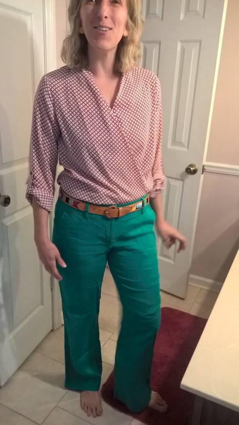
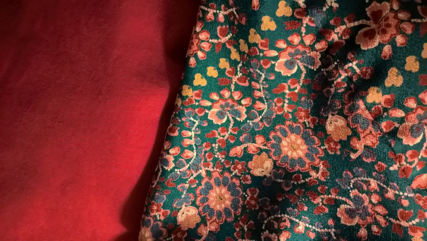
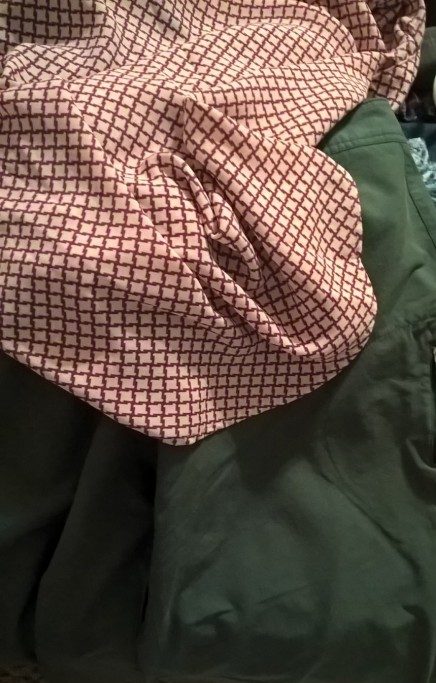
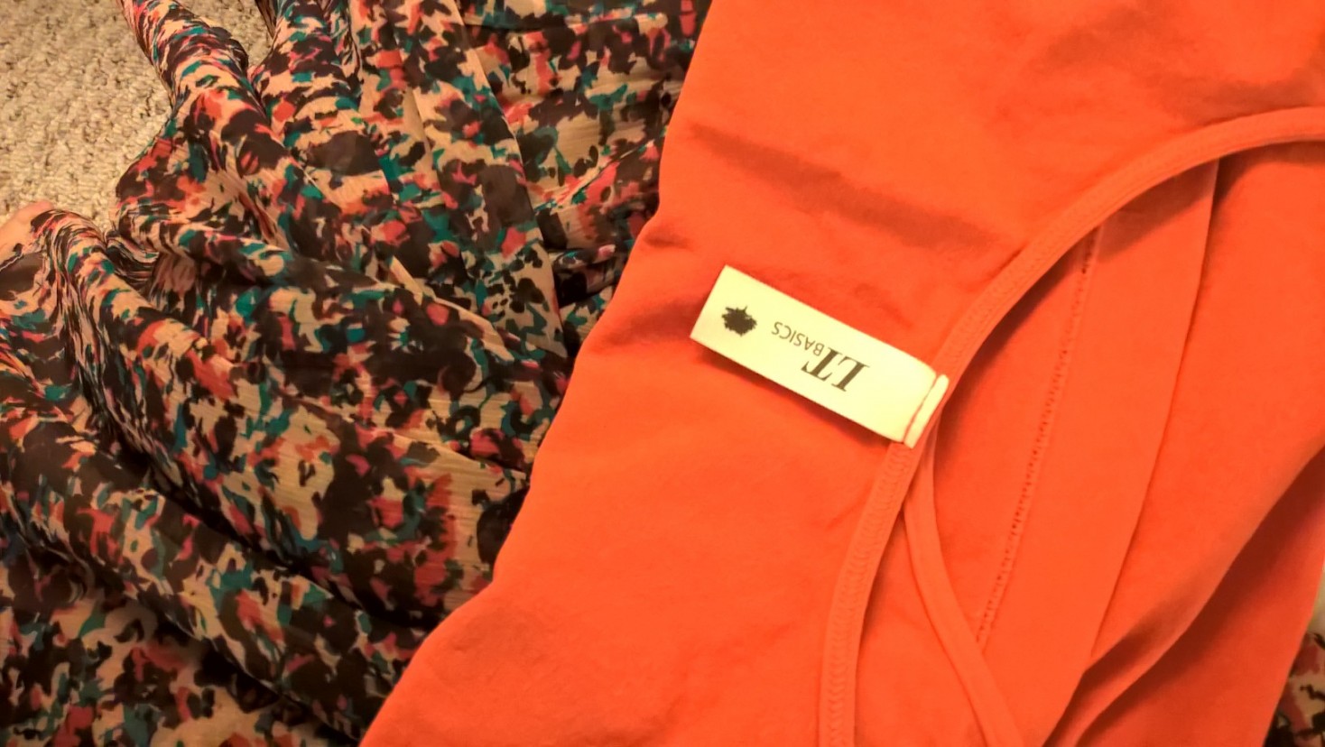
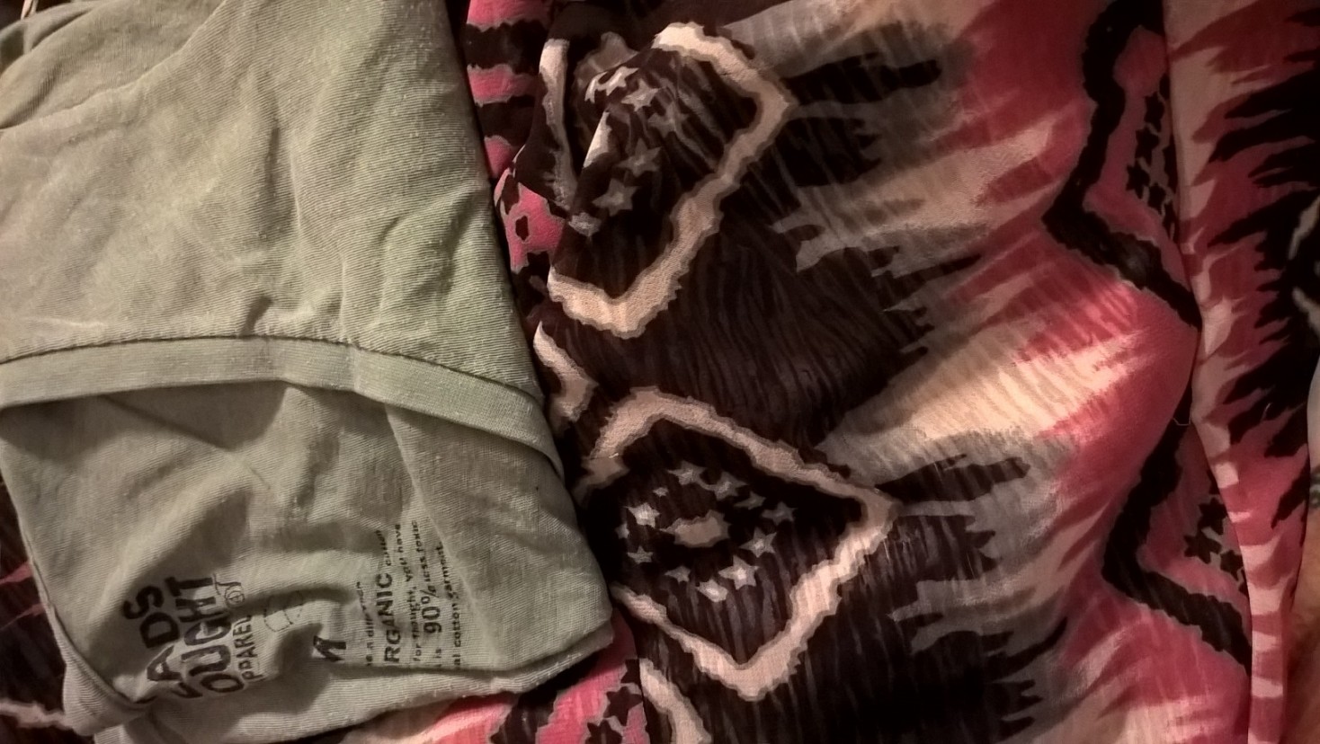
Isn’t that Banana Republic wrap top fab? Thrifted, natch. The mulberry in the pattern is approximately the same saturation (how “soaked” it is with color) and brightness (how bright/dark the color is)* as the turquoise of the pants – though it looks darker in the pic. Think of them like two colors you’d be likely to find in the “Bold” Crayola marker pack (remember that?). The belt has both colors so it’s a great tie-in, and melds a little of Caitlin’s funkiness into her chic ensemble.
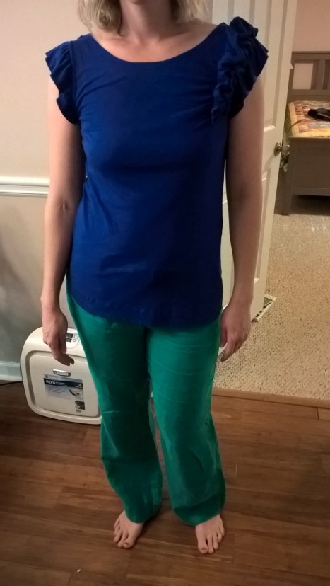
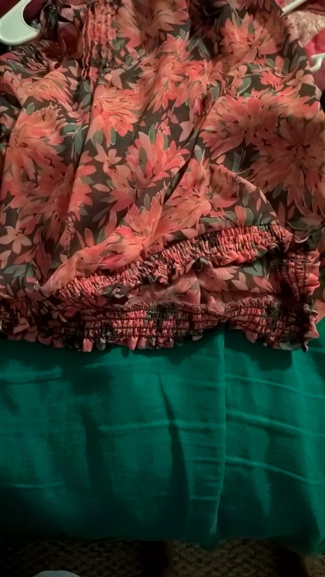
Ditto for this top with the same pants – they’re pretty close to the same saturation/brightness. The ruffles – which Caitlin LOVES – add interest to an otherwise low-texture ensemble. She can add a big blingy necklace, a pendant, or a scarf to punch this outfit up a notch – just don’t cover up those great ruffles!

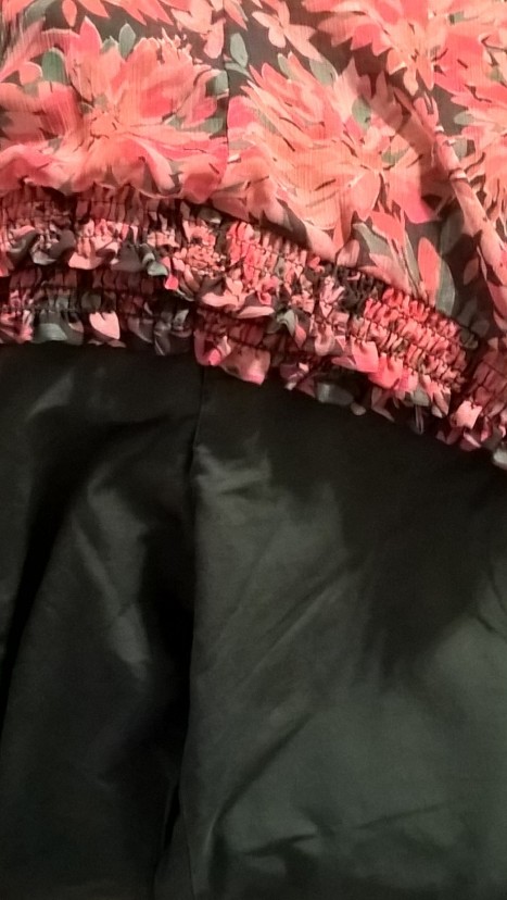
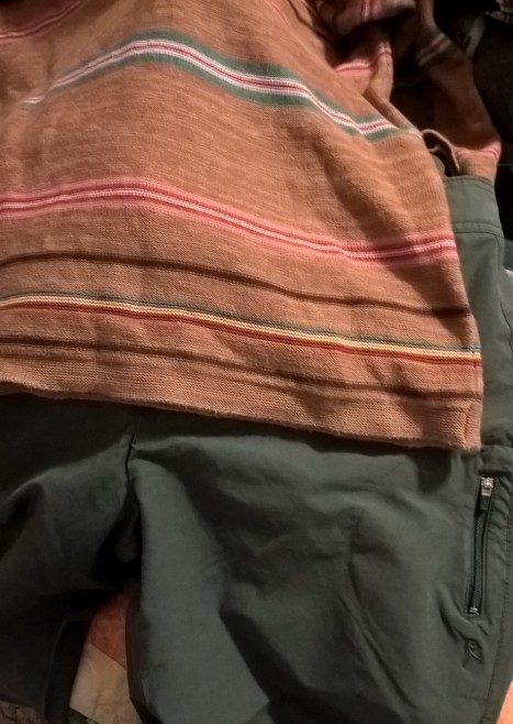
These pants, by the way, are thrifted and by the Loft, the Marisa cut. It’s hard to tell from this photo but the green-ish stripes in the top are about the same hue as the pants and the mulberry stripes are about the same color as the wrap top. The pants pick up those bright/saturated stripes; even if the turquoise-y colors aren’t perfect matches, the relatively small amount of turquoise in the top and its distance from the pants means you can fudge it.
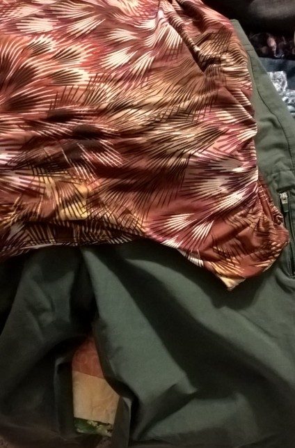
Another pair of awesome pants, this time a magenta (brighter than in the pic) similar to the mulberry in the wrap top and this warmer feather-like graphic print tank. The yellow in the vest picks up the yellow in the top (a color I didn’t even notice at first) and adds a little more coverage and warmth for air conditioned classrooms.
Since these pants stay in that “bold” category in terms of brightness and saturation, they can also match with the above three tops, with the patterned tops “fudging” a pretty close color match, or go with the blue ruffle top to color-block again.
After that I became a little less on it with the outfit pics (she has some great dresses I completely missed documenting!), but when Caitlin left to pick up her kiddo I snapped some more pairings to give her ideas for further combinations.
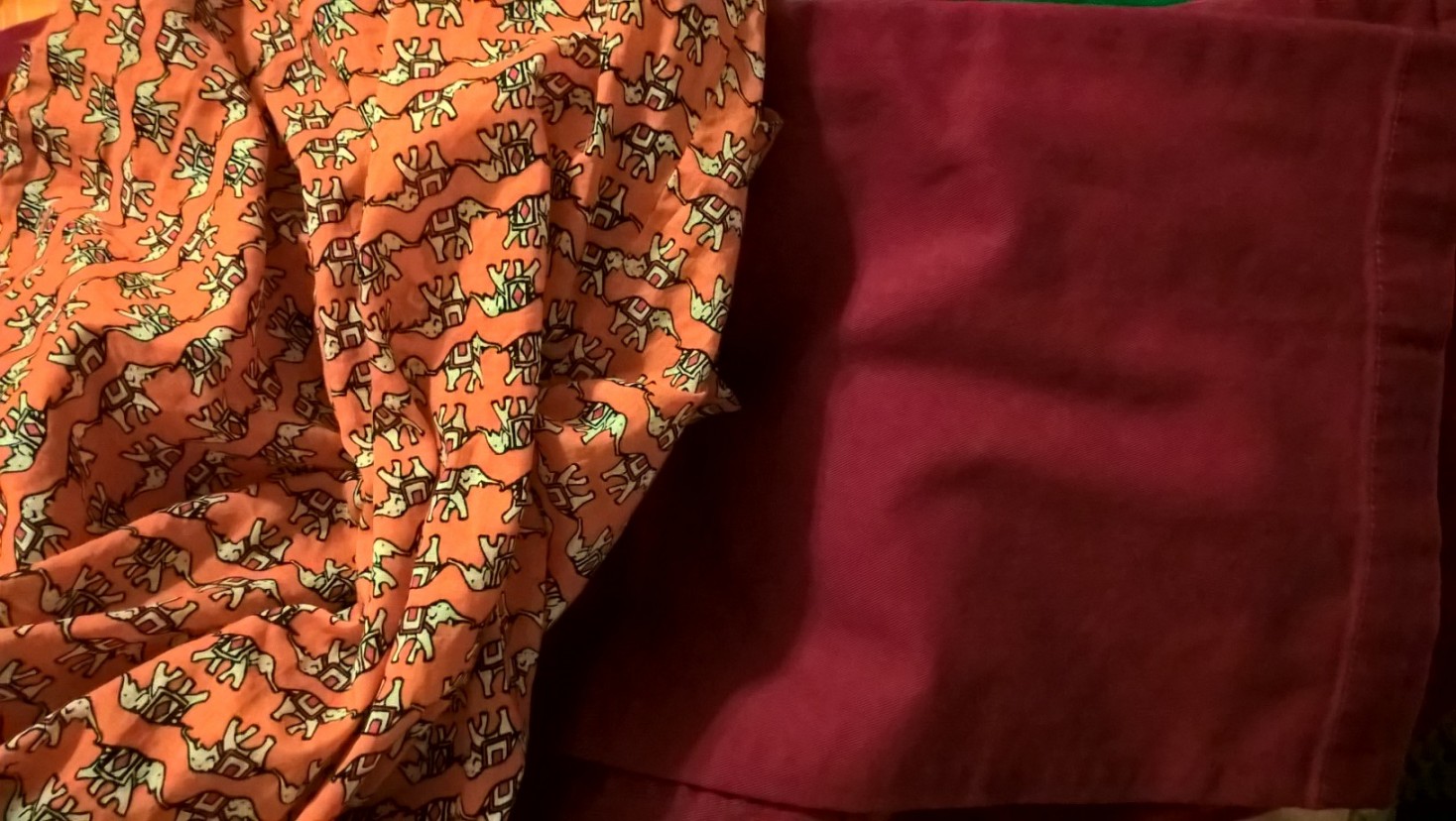
This fabulous elephant top in orange with mulberry details (sorry for poor color capturing) goes with both pants from above:

This tunic-like top goes great with the magenta pants, but the turquoise-y color here is more blue than that of the pants and it’s such a prominent color in the pattern that it clashes. (Ugh, sorry, horrible color on these two pics – I swear it’s the same magenta pants as above!)
The light teal – brighter in real life – in this top (one of my former favorites donated to my friend) can play with the turquoise pants…
…or the taupe in the background can go with some olive pants:
The olive pants would also work with the warmer tones of the feathery top; these colors would come from the “Autumn” marker pack if such a thing existed.
“Warmer” in this context just means they have more yellow than blue, whereas the turquoise and magenta pants above have more blue than yellow, also known as “cooler.” (Use whichever terminology makes more sense to you.)
Even though these olive pants are definitely not as bright as the turquoise pants (they’re more muted than “bright”), they still play well with mulberry and the striped top from above (and possibly the orange elephant top), because again, the pattern in these tops breaks up the intensity of the colors and “fudges” what they can go with:
Here’s another shirt that would work with both the olive pants and the turquoise ones because it has darker mulberry and brighter pinks in the pattern:
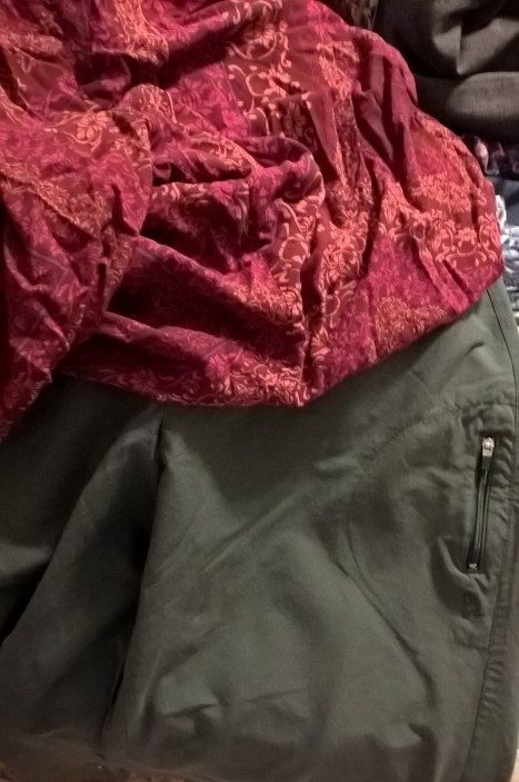
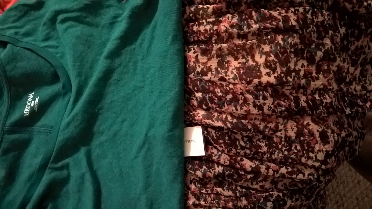
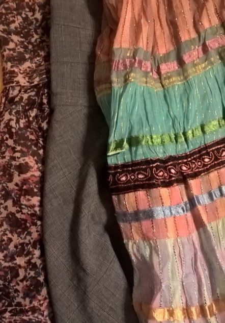
Now for some pattern down below! Following what we talked about in this post, Caitlin’s easiest bet is to pair print-i-ful skirts with solid tops. The turquoisey/blue (color is truer in second pic) in this French Connection skirt – new with tags! Great find, Caitlin – can go with this turquoise top or with something more blue:
..while the orangey-pink color can go with this orange tank Caitlin’s mom bought her or with the mulberry tank below. (And both of these tanks would make great layering pieces for several of the other tops above.)
Cute skirt, no? Alas, didn’t make the cut.
Here’s a gorgeous long skirt with a coral/taupey/dark brown pattern. Because of the small amounts of the taupe color, and its ambiguous olive/grey/brown character, it can “fudge” (there’s got to be a more technical term for this…) with 3 different olive shirts Caitlin already owns:
And the skirt’s reversible, with the same taupe/brown/white colors in a stripier pattern that will also go great with olive tops (below) or the mulberry tank and possibly even the turquoise Merona top or the blue ruffle top:
Last but not least we revisited a much more structured, tailored grey skirt Caitlin had nabbed at the Goodwill recently. She had another one like it in her closet but rarely wore it.
When I described it to her as “tailored” and “structured” with “clean lines,” a lightbulb went off and she understood why it felt so different from the rest of her wardrobe (a good reason to do the style vocabulary homework).
See the difference between this classic plaid fabric in a staid grey color and her colorful, more freeform skirts?
(She wore the one on the right to pick up her kid so I didn’t get many pictures of it!)
Caitlin did decide to keep this skirt (though not the similar skirt in her closet) as a go-to for any interview or formal presentation scenarios in her future. Doesn’t it look classy with the wrap top?
The Outcome
When we began, Caitlin didn’t know where to start to make outfits out of some great prints and bold colors. A few hours later, she had some new vocab and tools under her belt to help her see the connections between seemingly disparate clothes. The visual notes (in the form of the pics I took) will help cue her memory and train her eye for even more possibilities.
As follow up, I sent Caitlin the asterisked link below to help her learn more about color pairings and also a link on how to wash silk at home, since she had a one silk top she loved but wanted to skip the hassle and expense of going to the dry cleaners.
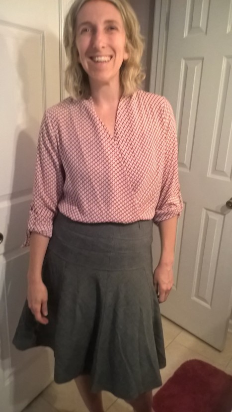
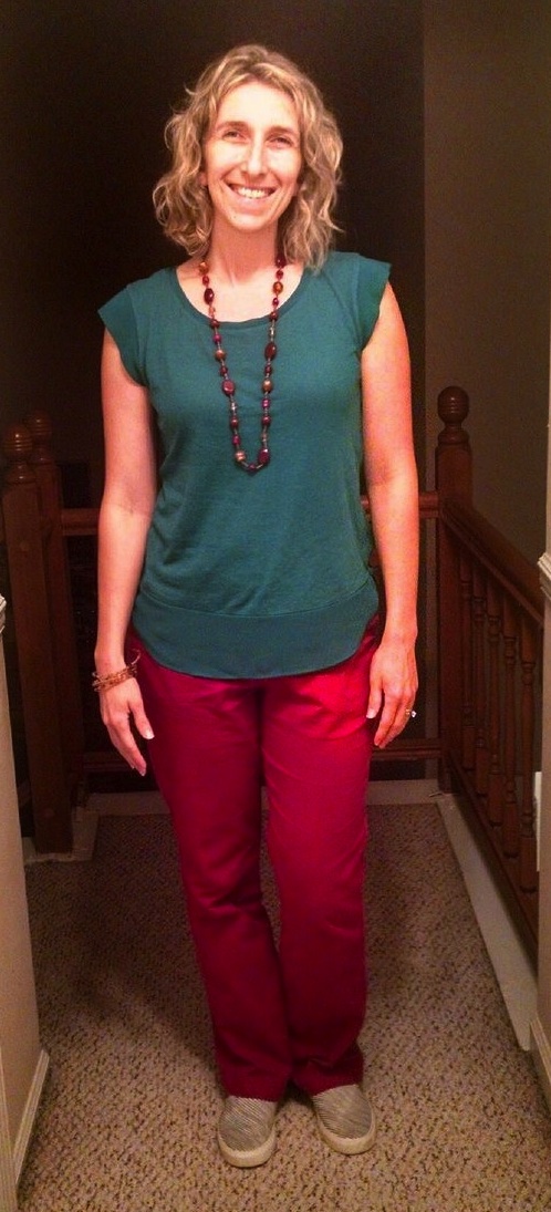
Below is a pic from a few days later rocking one of her newly discovered ensembles (magenta pants + turquoise Merona top teamed with French Connection skirt above) paired with a funky, gorgeous necklace and some sweet striped/floral Vans.
In Caitlin’s own words: “The last few days I have effortlessly picked out something to wear that I really like and that is appropriate for what I will be doing! I love this freedom!!”
Doesn’t she just glow? That’s the power of feeling confident in clothes you love, Thrifters.
A huge thank you to Caitlin for letting me into her closet and allowing me to write up our experience for the blog. It’s the first time I’ve tried something like this and I wanted to share how it went. Also thanks to her husband Brian for making us homemade kale and black bean enchiladas for dinner. That’s love.
*If you are a total newbie to color theory (aka saturation, brightness, and warmth/coolness – apologies artists), or how to tell which colors “go” together, head over to Into Mind’s excellent introduction to the subject.

Moim zdaniem warto przeczytać komentarze i dowiedzieć siÄ™ kto ma jakÄ… opiniÄ™ o produkcie. Zawsze tak wÅ‚aÅ›nie robiÄ™, aby sobie nieco wyrobić opinie i nie nabywać czegoÅ› bez zn›jmooÅaci.
Love it Leah. Would love that assistance
too. You have a good eye.
Thanks Penny! Glad you enjoyed :)