How Much Color Does a Colorful Wardrobe Need?

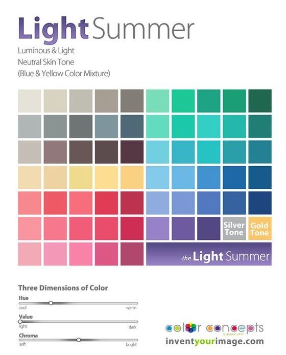
I love color. And as a “Light Summer” in the world of personal color analysis (PCA), there are plenty of gorgeous colors to choose from:
After a detour down the rabbit hole of Instagram-inspired neutrals and with my PCA color palette in hand, I was excited to start wearing color again. After all, I used to regularly dress in electric blue snakeprint blouses and dresses covered in purple tulips with red, green, and yellow accents. (Man I wish I had a picture of that dress to share with you.)

Someone further ahead on the PCA journey than I am cautioned me that neutrals would actually help ground the gorgeous colors in my new palette, and while I knew Kim’s advice was right on, as a color-lover, it felt so much more fun to hunt for my new colors than it did to look for neutrals.

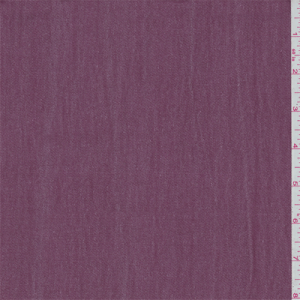
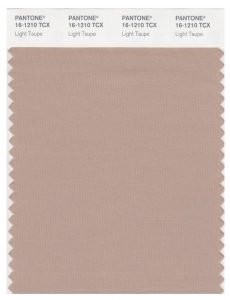
But as I’ve kept working on my Light Summer wardrobe, I’ve settled down on the color factor a bit and started to really appreciate my neutrals. Two particular favorites are a mauve I’ve seen referred to as “faded wine” (ha) and lovely shades of taupe. I also dig a real Light Summer gray – one that’s light and cool enough to elevate a whole outfit but not so cold it looks stark. Basically, the color of a koala.

This taupe looks weird on my monitor, but who would not be excited about that koala??

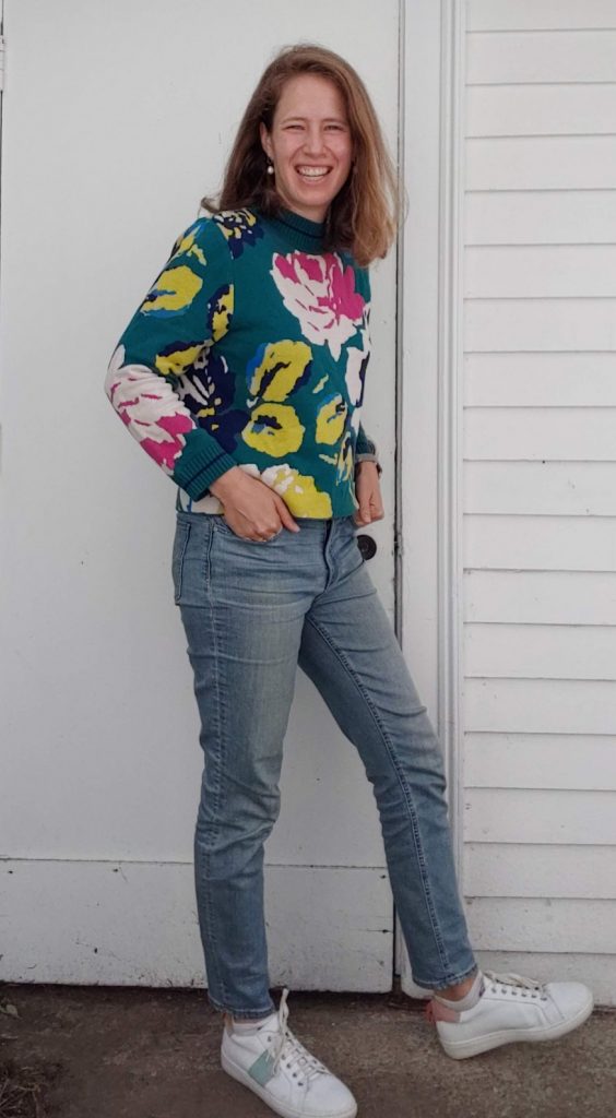
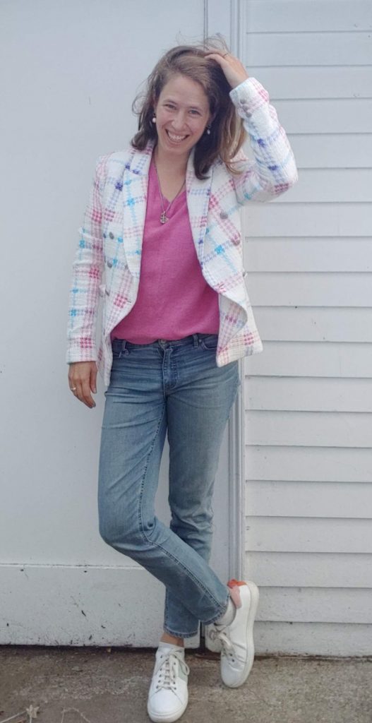
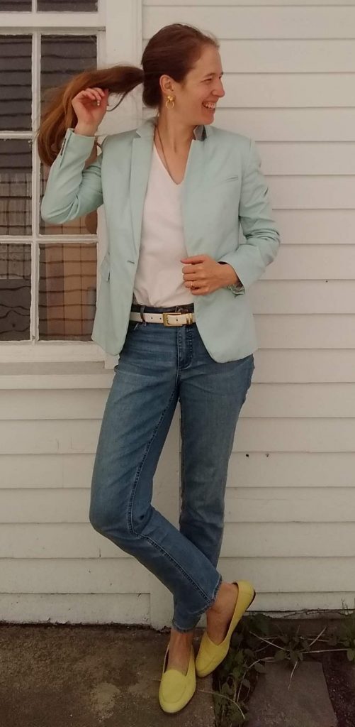
I’ve also realized that some outfits with a lot of color seem to work, where others read as cotton candy.

Too “old-fashioned gender binary baby shower”:

Eye-blinding – to me it works but in a magical unicorn one-off kind of way:


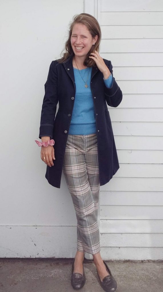
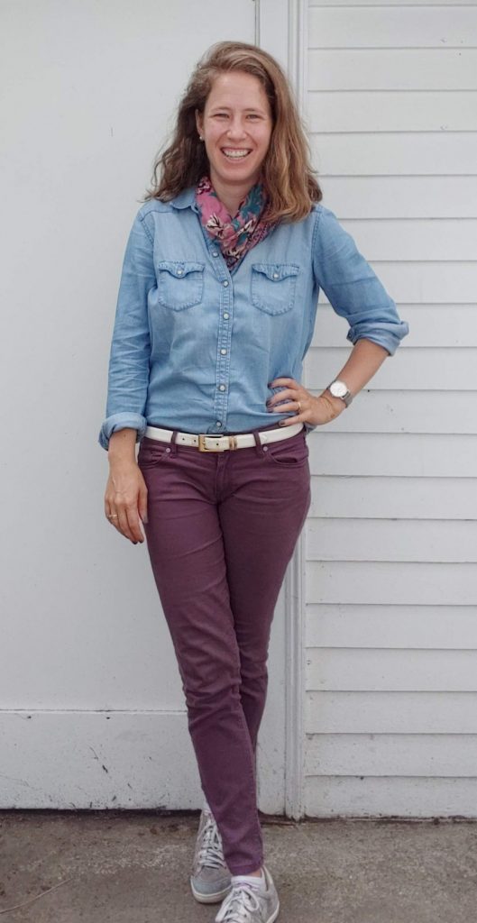
Outfits where color is mixed in with a big dash of “neutral” from my color palette (faded wine, chambray/denim, white, taupe) tend to be less of a gamble:


So basically I’ve discovered I shouldn’t buy colorful pants, ha. It’s true, though – I’ve tried for years to thrift just the right pink yellow, or purple pants, and even when I’ve hit the hue right on the head, they never really work in my wardrobe. For example, I have a pair of lemon yellow jeans in my drawer right now that I have yet to wear because they just seem to oversaturate every outfit. I’m going to tuck them into storage until spring and see if they improve with a change in the seasons.

Otherwise, the only colorful pants I have right now are green, and I deploy them judiciously. In addition to telling me that my pants forgot to go down all the way (thank you, Sister), my sister commented that the “watermelon” look on the right was overwhelming – fun, yes, but still overwhelming:


View this post on Instagram


A post shared by Leah (@thriftshopchic) on


So where I’ve landed for now is that my color generally resides in my top half – shirts, blazers, sweaters – and my bottom half stays neutral (with occasional pops of color in my shoes). This makes for a good mix of colors without me feeling like a clown.

How do you portion out color in your outfits? Or does more = better in your book?

Embracing Color and Saying No to Neutrals on Instagram (aka Swimming Upstream)

I mentioned a few months back that part of what I was looking forward to about my new Light Summer color palette was embracing color again:

This palette made me realize that I had let myself get seduced by the neutral-heavy palette of minimalist Instagram style mavens. Although there’s a lot to be said for playing with texture and silhouette within a very muted, narrow palette, I came to recognize it just didn’t feel like me. (One of my favorite shirts is bright blue snake print, for Pete’s sake!) When I posted a muted peach skirt on Instagram asking for color suggestions to dye it, someone suggested “rust!” with enthusiasm and I just wanted to run the other way.

It’s been a breath of fresh air leaning back into color with this new color palette and embracing PATTERN beyond just a neutral stripe or dot. (Can you tell how happy those floral pants make me?) I’m excited to share more with you as I finish building my spring/summer wardrobe – whenever spring finally arrives!!

If you scroll through my Instagram feed (on the righthand sidebar, or at www.instagram.com/thriftshopchic), you’ll see I’ve run straight into the arms of the Light Summer color wheel and have barely looked back. Although I wisely followed advice posted early into this journey and got myself some neutrals to pair with my newly found multi-hued treasures, those neutrals have been mostly white and denim/chambray. When I’ve tried to jive with the minimalist-inspired style Instagrammers, the pieces just haven’t worked out. (See the first two rejects in this post.) They feel too…muted for me now.

But I realized a few weeks back that my Instagram feed wasn’t reflecting my rediscovered enthusiasm for color. I was still following cool girls with a heavily edited, highly stylized neutral aesthetic – partially because neutrals tend to make great capsule wardrobes, and partly because the ethical brands I want to, at least in theory, support seem to be allergic to color. (What’s the deal, Eileen Fisher & friends? Give us some rainbows already!)

I will always love the sight of a chic, slimmed-down wardrobe (like this one who is starting to introduce some color to her closet or this one, who isn’t and that’s fine). It makes me unaccountably happy to gaze at a thoughtful, selective wardrobe where you can see all the pieces and dream of future outfit combos – I guess because it exudes contentment: “This is more than enough and I’m happy with it.” Wardrobe goals, as the kids say.

And people who love color? Well, on Instagram at least, they tend to be maximalist rather than minimalist. A few folks I’ve followed recently have a great time with color but do so through repeated trips to outlets and/or internet sales. Splurging on retail ain’t really my thing – and honestly, giant thrift hauls aren’t, either. How do people keep track of/wear so many pieces? To each their own level of wardrobe volume, I suppose!

But if I can skip over the shopping aspect of how folks arrive at their cute looks (hint: don’t watch Instastories!), I find myself a lot more inspired, and having a lot more fun, following color-filled accounts. They rarely convince me to go hunt for specific pieces – I just enjoy the aesthetic, and the inspiration to pair together colors or patterns I haven’t yet thought of on my own. Starting off Friday with a picture of someone’s flamingo-print blouse just makes me smile in a way that cognac + cream + black capsule wardrobes do not.

So without further ado, here are a couple of colorful IG accounts I’ve started to follow recently:

Frances Ayme – a J. Crew-loving mom of 3 who calls Bermuda home:

A post shared by Frances (@francesayme) on

A post shared by Frances (@francesayme) on

A post shared by Frances (@francesayme) on


Tarilyn – a 50-something Mainer with a passion for skirts and making life in New England look like vacation in Florida:

A post shared by Tarilyn (@talizat) on

A post shared by Tarilyn (@talizat) on

A post shared by Tarilyn (@talizat) on


Alice – a midlife mom with a flair for pattern:

A post shared by Alice (@happinessatmidlife) on

A post shared by Alice (@happinessatmidlife) on

A post shared by Alice (@happinessatmidlife) on

A bonus: these women reflect a greater diversity than the young, hip white women who dominate the IG neutral/ethical game. And it’s nice to see women who don’t blog or Instagram for a living wearing their real clothes!

Who are your favorite colorful Instagrammers (or bloggers)? Share the wealth!

Friday ReBlog: Checking in with Into Mind

Anuschka at Into Mind wrote a great post on thinking about your closet not just a collection of cute outfits but as a cohesive wardrobe, and using those lovely, stylized images of capsule wardrobes we talked about the other week to help evaluate your own closet.

She’s also got an example of said visual inspiration for summer.  It’s a great demonstration of how to do a unified closet with more color and polish than the neutrals/casual basics vibe we so often see in capsules, so if you love color or need a more work-appropriate look, check it out.  Bonus: the broad terms she uses (chic work top, fun work top, accent pants) help you think of your closet in terms of categories that work together instead of making you lust after specific pieces some blogger loved.

Last but not least, 5 Ways to Build a More Ethical Closet tackles ethical dressing from a broader perspective than the oft-touted “save up to buy Everlane even if you don’t love grey t-shirts.”  Anuschka outlines 5 different approaches to curating a more ethical closet that remind us not to “let perfect be the enemy of good.”  Approach #4 is “shop secondhand or vintage” – yay!


Happy Weekend, Thrifters!


When You Just Can’t Help Yourself; or, Can I Wear Colors That Don’t Suit Me?


I have a confession to make.

I LOVE chartreuse.

There’s something about that acidy, lemon-lime color that just draws me in—maybe it’s the way it pops next to navy and muted red, some of my other favorite wardrobe colors.  Or maybe it’s that it’s a little bit badass—not a color for those faint of heart!

Either way, I love it.

And it looks pretty horrible on me.

The lighting here doesn’t really do it justice, but you get the general idea that chartreuse wears me instead of the other way around.  It washes me out and is really too strong for my skin tone and coloring:

A photo posted by LeahLW (@thriftshopchic) on

But.

Part of me doesn’t really care.

This is a big no-no on style blogs; as with cuts and styles that flatter you, there’s a lot of blog and website space dedicated to finding “your” colors—the ones that complement your complexion and coloring instead of overwhelming you.

In theory, I get this concept—as Tamara at Glowing Color says, you want clothes that draw attention to you, not clothes that hog the limelight: “If the eye is drawn to your face first, you have a winner.”  This is partly why you won’t often see me in jewel tones or black—they overpower me. (And too much black is just…depressing.  Renouncing black is another fashion no-no but I claim it as my TRUTH.  Take that, NYC fashion elite.)

But.

Rules are made to be broken and fashion and style are supposed to make you feel good.  If that means wearing a color you LOVE despite its not being “right” for you, then I say go for it.  If you’re feeling timid about it, wear the hue in question away from your face—on the lower part of a top or on a skirt/pants, or wear it as a top but wear a scarf around your neck in a buffer color.

The bottom line, though, is that life is too short to wear clothing you don’t love.  So wear colors that make you SMILE.

Check out Peter Lappin’s take on this age-old predicament over at Male Pattern Boldness (yes, that is the most fabulous blog name ever; yes, you should RUN not walk over there if you love sewing, either as spectator or participant, particularly menswear).


What are your thoughts on the wear-it-or-leave-it color debate?  Scroll down to share!