How Much Color Does a Colorful Wardrobe Need?

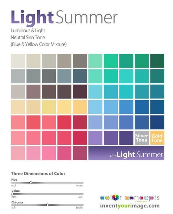
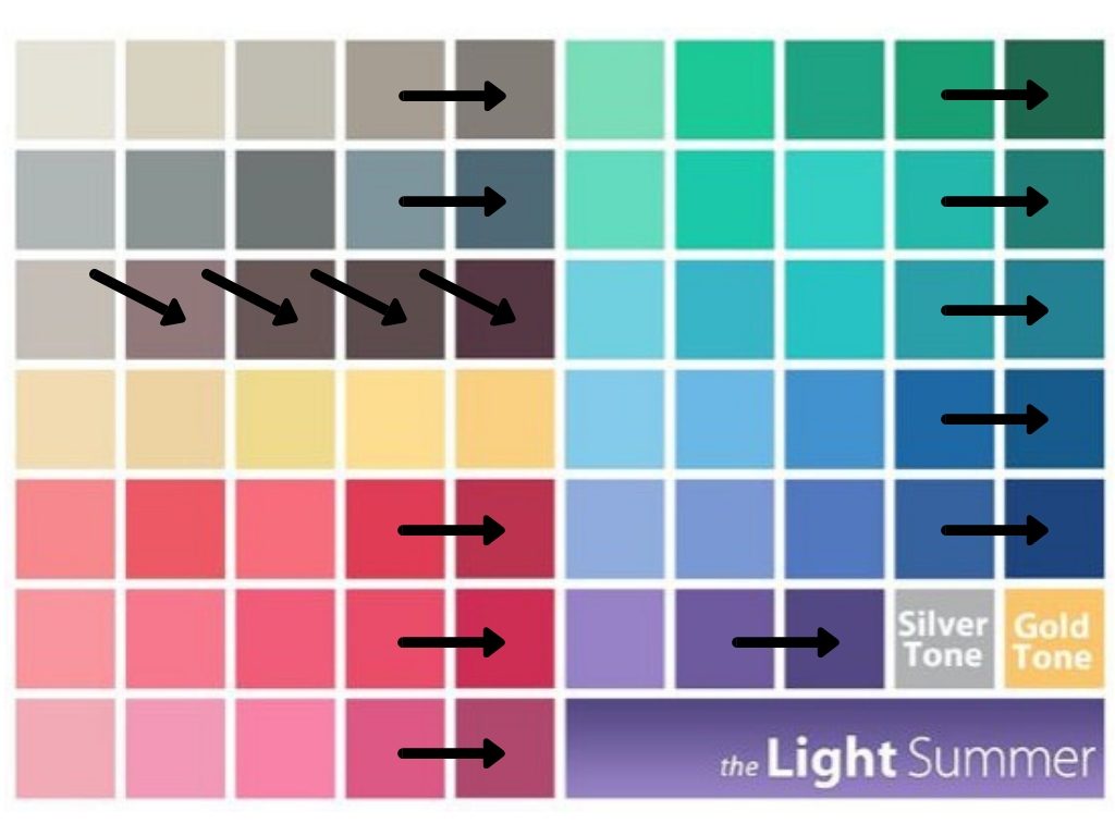
I love color. And as a “Light Summer” in the world of personal color analysis (PCA), there are plenty of gorgeous colors to choose from:

After a detour down the rabbit hole of Instagram-inspired neutrals and with my PCA color palette in hand, I was excited to start wearing color again. After all, I used to regularly dress in electric blue snakeprint blouses and dresses covered in purple tulips with red, green, and yellow accents. (Man I wish I had a picture of that dress to share with you.)

Someone further ahead on the PCA journey than I am cautioned me that neutrals would actually help ground the gorgeous colors in my new palette, and while I knew Kim’s advice was right on, as a color-lover, it felt so much more fun to hunt for my new colors than it did to look for neutrals.

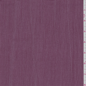
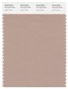
But as I’ve kept working on my Light Summer wardrobe, I’ve settled down on the color factor a bit and started to really appreciate my neutrals. Two particular favorites are a mauve I’ve seen referred to as “faded wine” (ha) and lovely shades of taupe. I also dig a real Light Summer gray – one that’s light and cool enough to elevate a whole outfit but not so cold it looks stark. Basically, the color of a koala.

This taupe looks weird on my monitor, but who would not be excited about that koala??

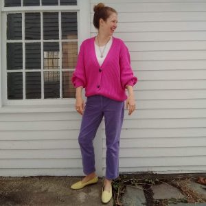
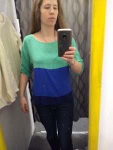
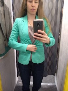
I’ve also realized that some outfits with a lot of color seem to work, where others read as cotton candy.

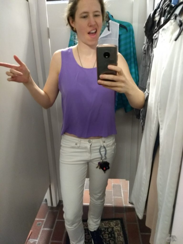
Too “old-fashioned gender binary baby shower”:

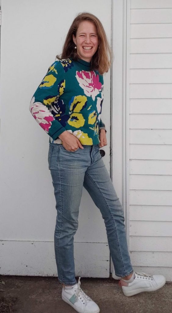
Eye-blinding – to me it works but in a magical unicorn one-off kind of way:


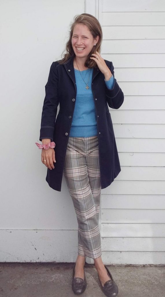
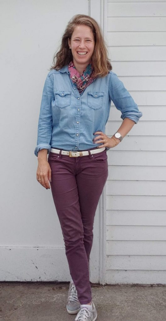
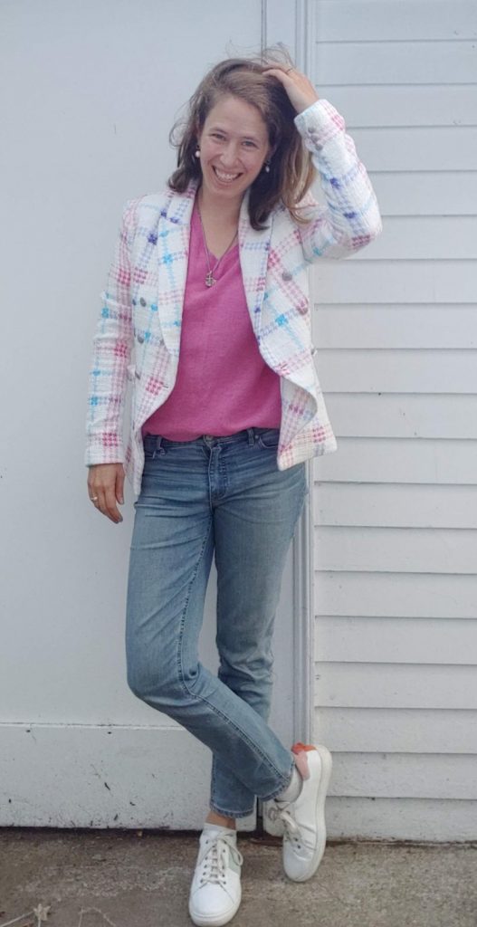
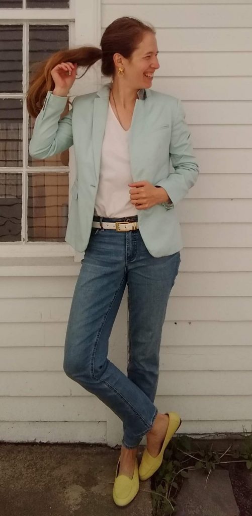
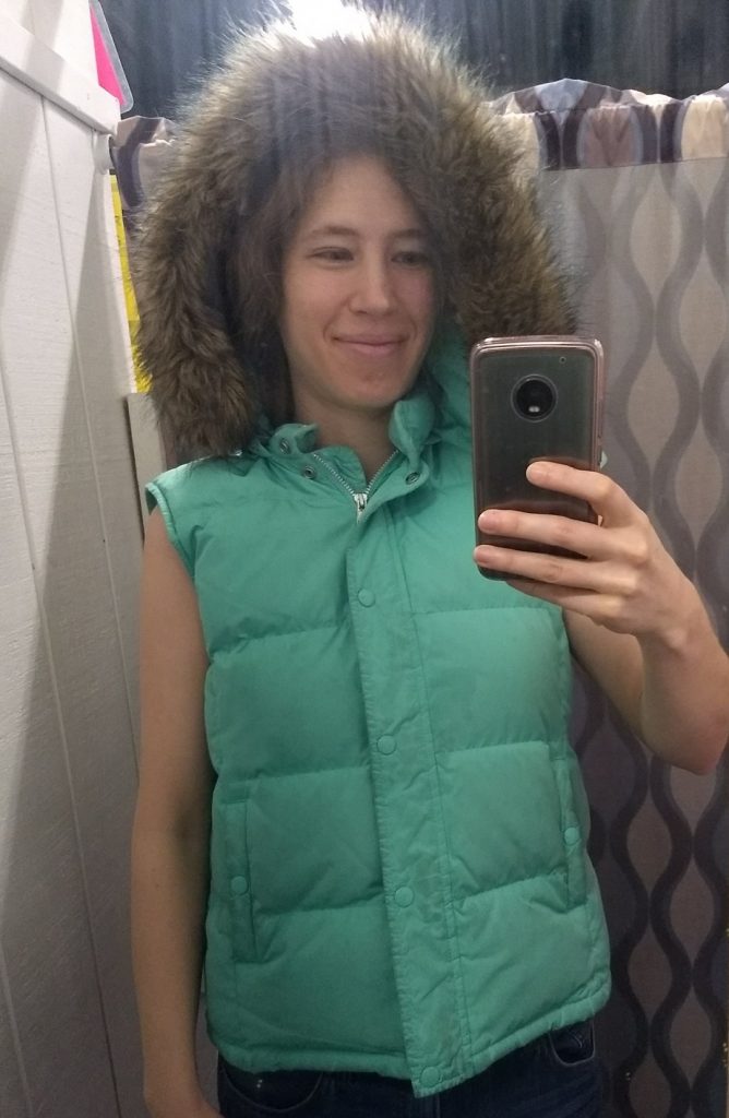
Outfits where color is mixed in with a big dash of “neutral” from my color palette (faded wine, chambray/denim, white, taupe) tend to be less of a gamble:


So basically I’ve discovered I shouldn’t buy colorful pants, ha. It’s true, though – I’ve tried for years to thrift just the right pink yellow, or purple pants, and even when I’ve hit the hue right on the head, they never really work in my wardrobe. For example, I have a pair of lemon yellow jeans in my drawer right now that I have yet to wear because they just seem to oversaturate every outfit. I’m going to tuck them into storage until spring and see if they improve with a change in the seasons.

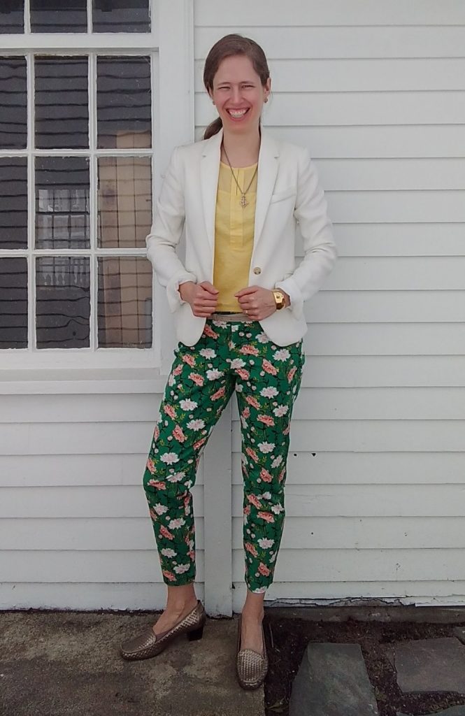
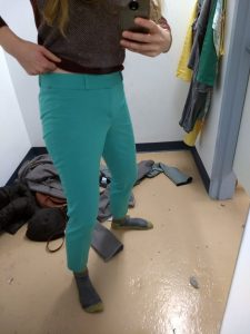
Otherwise, the only colorful pants I have right now are green, and I deploy them judiciously. In addition to telling me that my pants forgot to go down all the way (thank you, Sister), my sister commented that the “watermelon” look on the right was overwhelming – fun, yes, but still overwhelming:


View this post on Instagram


A post shared by Leah (@thriftshopchic) on


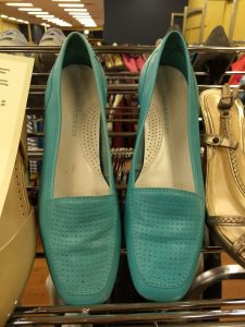
So where I’ve landed for now is that my color generally resides in my top half – shirts, blazers, sweaters – and my bottom half stays neutral (with occasional pops of color in my shoes). This makes for a good mix of colors without me feeling like a clown.

How do you portion out color in your outfits? Or does more = better in your book?

Wearing “Light Summer” Colors in the Fall

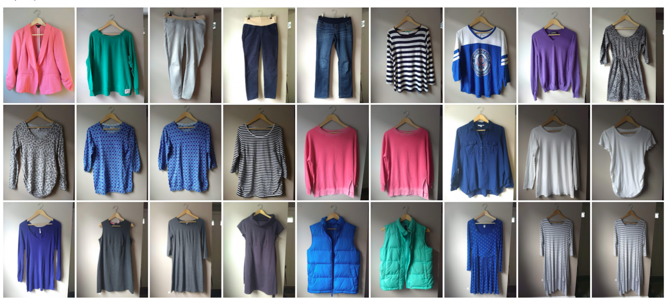
I have to admit I feel a great and growing affection for the colors in my “season” – Personal Color Analysis-speak for the range of colors that bring out the best in one’s skin tone. (See this post for a lot more on PCA.) I’m a Light Summer, and here are some of my palette’s glorious hues for my upcoming fall/winter maternity wardrobe:

Ahhhh! Happy sigh. I’m biased, of course, but I love the way Light Summer colors seem to glow from the inside like a sorbet, or popsicles, or sherbet…

…which of course, no one is excited to eat once cool fall weather arrives.

And therein lies the conundrum: none of these are “fall” colors. And because I’ve been very well trained by marketing trends and society’s idea of which colors belong to which season (thank you, Pumpkin Spice Lattes), it feels weird to look at these clothes – with nary a burgundy, aubergine, mustard, or pumpkin in sight – and think of them as my “fall” wardrobe.

Of course I could go ahead and wear whatever I damn well please, sporting rust and sienna and cognac with abandon; but as I said, I’ve grown to like my colors, feel at home at them – and perhaps most definitively, see how off-kilter my skin tone looks by comparison in colors that are too warm and dark (i.e. all the fall colors).

So I think I’ll stick with my palette – but use the fall (that is, next fall, since I’m already set for clothes this season) to explore the darker and more muted neutral ends of my color palette. Colors like these:

If you don’t particularly like or wear autumn colors, how do you deal with the transition to fall style?

Living into Light Summer – Four Months In

Hey all,

It’s been four months since I got my colors “done“; time for an update!

I’m settling into this new season; I see when my face “pops” with a good color; I can now see plainly that a few old pieces I initially thought were Light Summer are not; and it’s becoming a lot easier for me to pick out some of the Light Summer colors at a glance (I then confirm with my handy dandy color palette).

Greens and purples are probably the easiest – they jump out at me:


Can you tell I’m having fun with this?

Blues don’t jump very much but there’s some flexibility there. I’m getting better at yellows and pinks (which are really mostly corals); and I’ve even found a few good browns – though I haven’t thrifted them:


Too big.


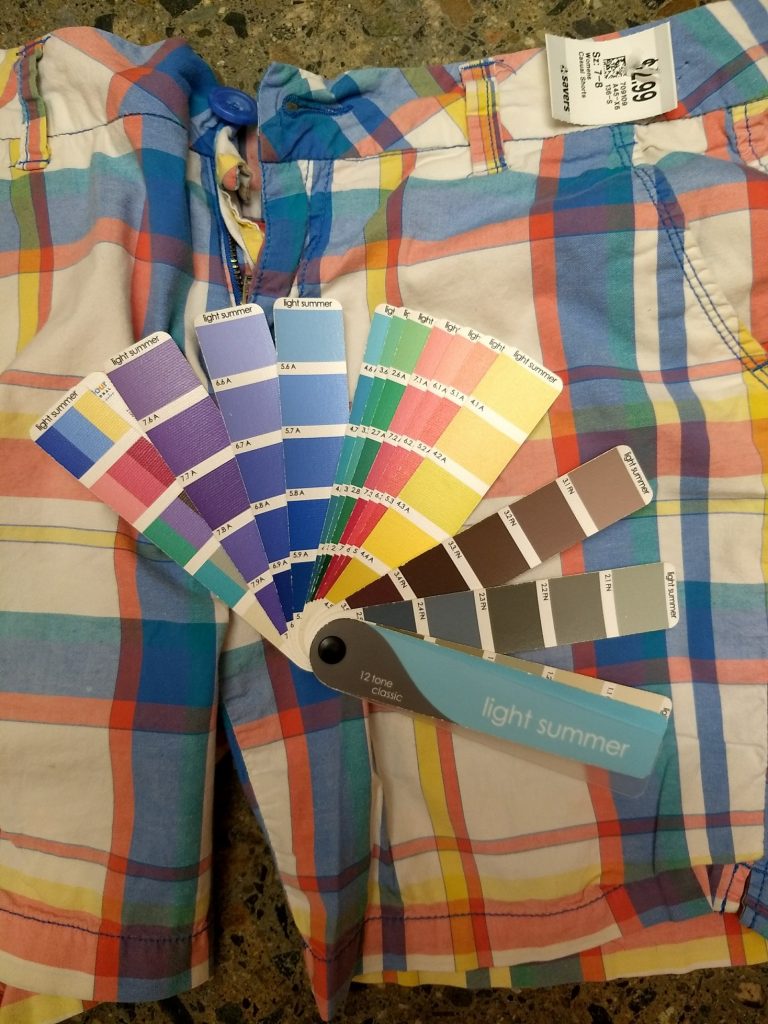
I see when my color palette (the actual samples of colors I take with me when I thrift) pops against colors in my season when I didn’t used to:


Pop! As always, take photos of the palette with a large grain of salt due to lighting etc.

I thrifted these Bermuda shorts even though they’re more where my style 8 was years ago. I couldn’t help myself – they were so perfectly Light Summer. That’s actually been a challenge – it’s still novel and exciting for me to find something that’s a perfect palette match that I sometimes buy things I normally wouldn’t because IT IS MY PALETTE. Working on that.


Amazingly, I’ve even had success finding my colors online, which can be a tricky proposition since lighting and monitor settings affect things. Knowing it’s hard to match colors in some ways makes me more restrained – I’m less likely to buy something unless I’ve seen it in person.

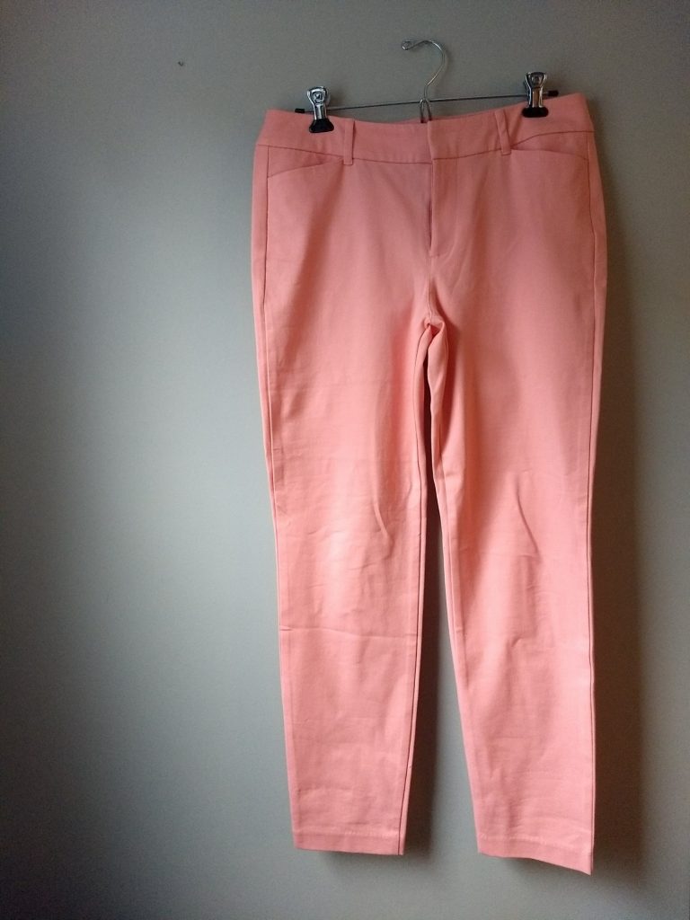
Otherwise, I piece together a variety of photos from the seller and the original retail site (these are usually pretty accurate) and make an educated guess, which is how I ended up with these pants – SUCH a good match for Light Summer:


Glorious. The Pixie pant from Old Navy via Poshmark.

These also were a perfect match, which is great since I’ve been looking for pink pants to set off my warmer weather tops:


Also Pixies from Old Navy via Poshmark.


As far as denim goes, I’ve been happy to stick with my darker Paige jeans because we so easily read jeans as a neutral; plus pants are far from the face, where it’s most obvious if you’re wearing something outside your palette. And I had found some “Best Girlfriend” jeans that were right in my color palette; but they are baggy, weekend, laze-around-the-house jeans that don’t give the cleaner silhouette I like for more polished outfits.

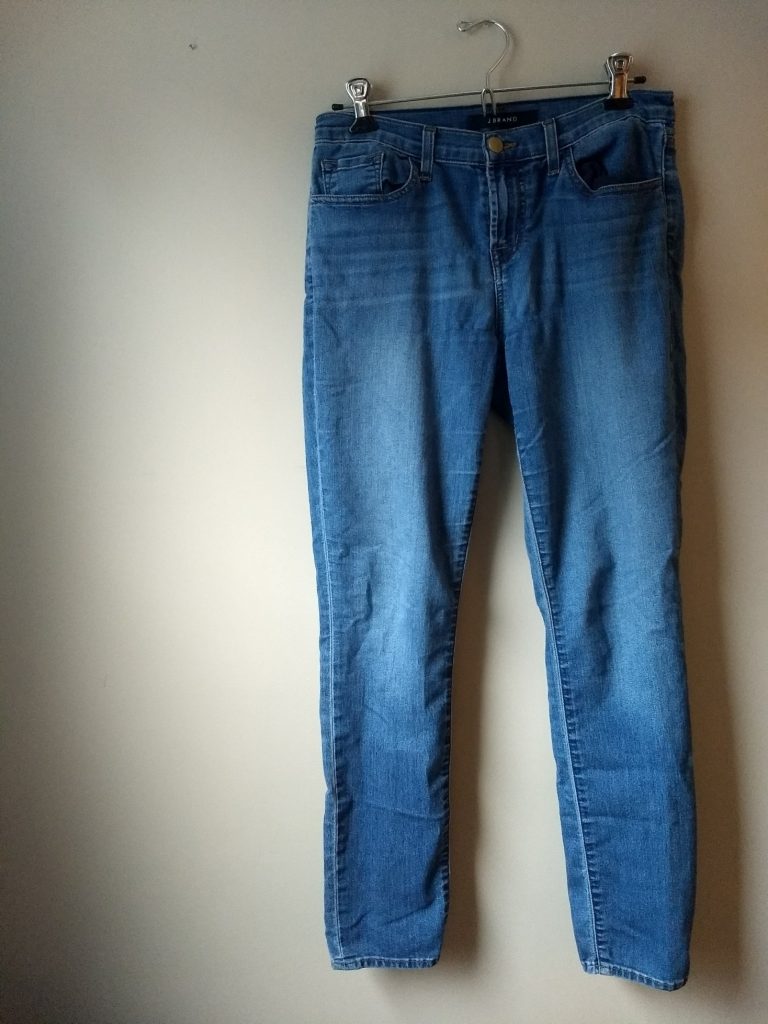
Lo and behold, the thrifting gods sent me the first pair of J Brand jeans that didn’t feel like sausage casing around my legs; they have some stretch (I know that’s antithetical to denim purists and I don’t care). They are a lovely light blue wash that is squarely Light Summer denim territory:

They’re a tiny bit cropped but since I plan to wear them now through fall, that should work just fine.


I think I mentioned before that this palette made me realize that I had let myself get seduced by the neutral-heavy palette of minimalist Instagram style mavens. Although there’s a lot to be said for playing with texture and silhouette within a very muted, narrow palette, I came to recognize it just didn’t feel like me. (One of my favorite shirts is bright blue snake print, for Pete’s sake!) When I posted a muted peach skirt on Instagram asking for color suggestions to dye it, someone suggested “rust!” with enthusiasm and I just wanted to run the other way.

It’s been a breath of fresh air leaning back into color with this new color palette and embracing PATTERN beyond just a neutral stripe or dot. (Can you tell how happy those floral pants make me?) I’m excited to share more with you as I finish building my spring/summer wardrobe – whenever spring finally arrives!!

Light Summer Colors: What’s Hard (and Easy) to Find

One of the joys of a PCA (personal color analysis) is knowing exactly what “your” colors are – the ones that complement and enhance your skin tone. The burden is that sometimes *your* particular colors aren’t on trend; if your purple is softer/darker/lighter than Pantone’s Ultraviolet, you may have to wait another fashion cycle (or three) before you can buy purple clothes retail.

Enter the thrift store, where the colors of seasons past all live together in glorious harmony, and where you are much more likely to find “your” version of blue, purple, yellow, etc.

But. I’ve noticed that even with a veritable rainbow of colors at my fingertips, it’s still harder to find some Light Summer (my palette) colors than others. I suspect this is due in part to what particular kinds of colors have been popular over the last several years; it’s mostly due, though, to different seasons wearing different colors more easily.

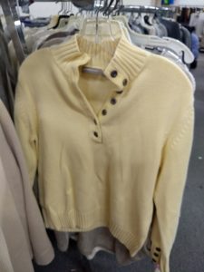
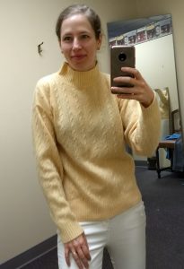
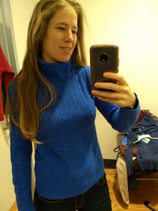
I’m no expert here (dive into the delightful rabbit hole of Christine Scaman’s 12 Blueprints for that), but as I’ve dug into the subject of personal color analysis a bit, I’ve picked up that, say, Light Summers can rock a wide variety of blues (even fudging some that aren’t our best), but that orange will likely never be our friend. A special warm/cool blend of coral, yes, but that can be hard to find, since coral tends to err on the side of warm. Likewise, the very muted, cool yellows in Light Summer’s palette are tricky to find – fashion has favored mustards or warmer, lemony yellows for years, so that my yellows are more likely to be found in grandpa cardigans or strangely cropped pullovers or cableknits from an unfortunate slice of the 90s:

IMG_20180216_112248660 IMG_20180216_112221830 IMG_20171226_130756606

Likewise, ALL the pinks that hit that elusive warm/cool spot beloved of Light Summers seem to be cable knits or cardigans, neither of which are my favorite. Why, fashion designers, why?

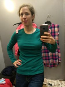
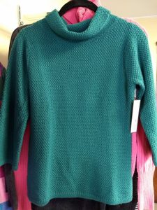
On the other hand, greys are pretty easy to fudge, and teals and blues call to me from the racks like beacons of cool, soft, lightness:

IMG_20180101_174619762 IMG_20180101_164425578 IMG_20180101_171303058 (1) IMG_20171228_115855943_BURST001 (1)  IMG_20180101_160335200_BURST000_COVER_TOP IMG_20180117_152837974 IMG_20180117_162847618 IMG_20180118_143127451 IMG_20180216_111413030 IMG_20180212_135950800_BURST001 IMG_20180212_135437827

These are some of my “easiest” colors to wear, and end up therefore being the “easiest” to spot – even if they don’t all come home with me.

If you’ve been analyzed – or if you know your best colors – which are the easiest to find? Which are harder? What’s your take on the magic of finding “your” colors?

PCA Light Summer, One Month In

Judging by the comments, you all are up for more posts as I transition into a Light Summer season. (That’s SciArt/12 Blueprints parlance – if none of that makes sense, start here. Read more about SciArt here).

I had my Personal Color Analysis (PCA) appointment one month ago (details in that first linked post above). Since then I’ve been practicing swatching my colors at the thrift store and I’ve started swapping out some of my warmer, darker, and/or brighter clothes for Light Summer’s cool, soft, and light hues.

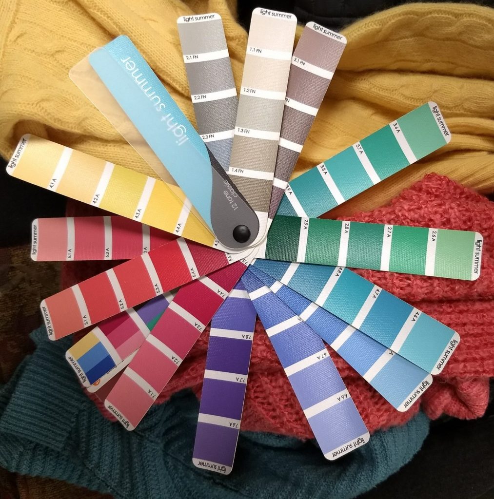
As a reminder, here’s a decent-ish picture of my season’s colors as depicted in my swatch book:
IMG_20171226_130119584
The swatches aren’t used to find exact matches; rather the swatchbook helps you see whether a particular color harmonizes with your season. If the color and the swatchbook light each other up, if they both seem more vibrant put next to each other, you’ve got a match. If the color in question looks too dark, dull, or muted next to the swatchbook, or if it overwhelms the swatchbook with brightness or clashes in terms of hue (warm vs. cool), you’re looking at different seasons.

As you can probably imagine, it takes time to develop swatching skills. I need to train my brain to filter for the right hue (warm vs. cool), value (light vs. dark), and saturation/chroma (greyed out vs. pure color), which is more difficult in the thrift racks where you’re never looking at a color in isolation. I need to ignore colors I’ve previously gravitated toward and say “no” to colors that seem so close but are just a shade too dull/bright/intense etc. I’ve already thrifted things that, as I keep refining my (rather rough) swatching skills, no longer seem like real Light Summer colors.

Case in point: this pink sweater photographs brighter than it is in real life, but it still feels a tad too bright for my face:

IMG_20180110_091617366 (1)

Why does this matter? If I love a color, shouldn’t I just wear it?

Yes! But while some of my “new” colors are old favorites, others are reallllly new to my wardrobe (pretty much all the pinks, yellows, and purples), and if I’m going to grow to love new colors, I want to grow to love the ones that really light my face up. I don’t particularly want to hold on to a bright pink sweater that isn’t doing it for my complexion.

My original reason for getting a PCA was to avoid buying stuff I don’t wear because the colors feel off. So I’ve also been flexing my willpower by saying no to stuff that I otherwise like but that’s not in my colors. I have plenty of clothes I love regardless of their color; I don’t need to buy anything else not in my season even if it’s a great find. (Whoops; should have said no to this oatmeal-y gray sweater, the cut and neckline of which I love but that is too warm for Light Summer.)

So let’s start off with a bunch of misses that might give you a sense of how it feels to develop your eye/willpower.


The Seasonal Misses

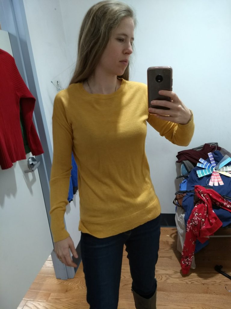
A Light Summer yellow? Nope. The right mutedness but too warm. Too bad, because I loved the fit!
IMG_20180101_171708562_BURST000_COVER_TOP

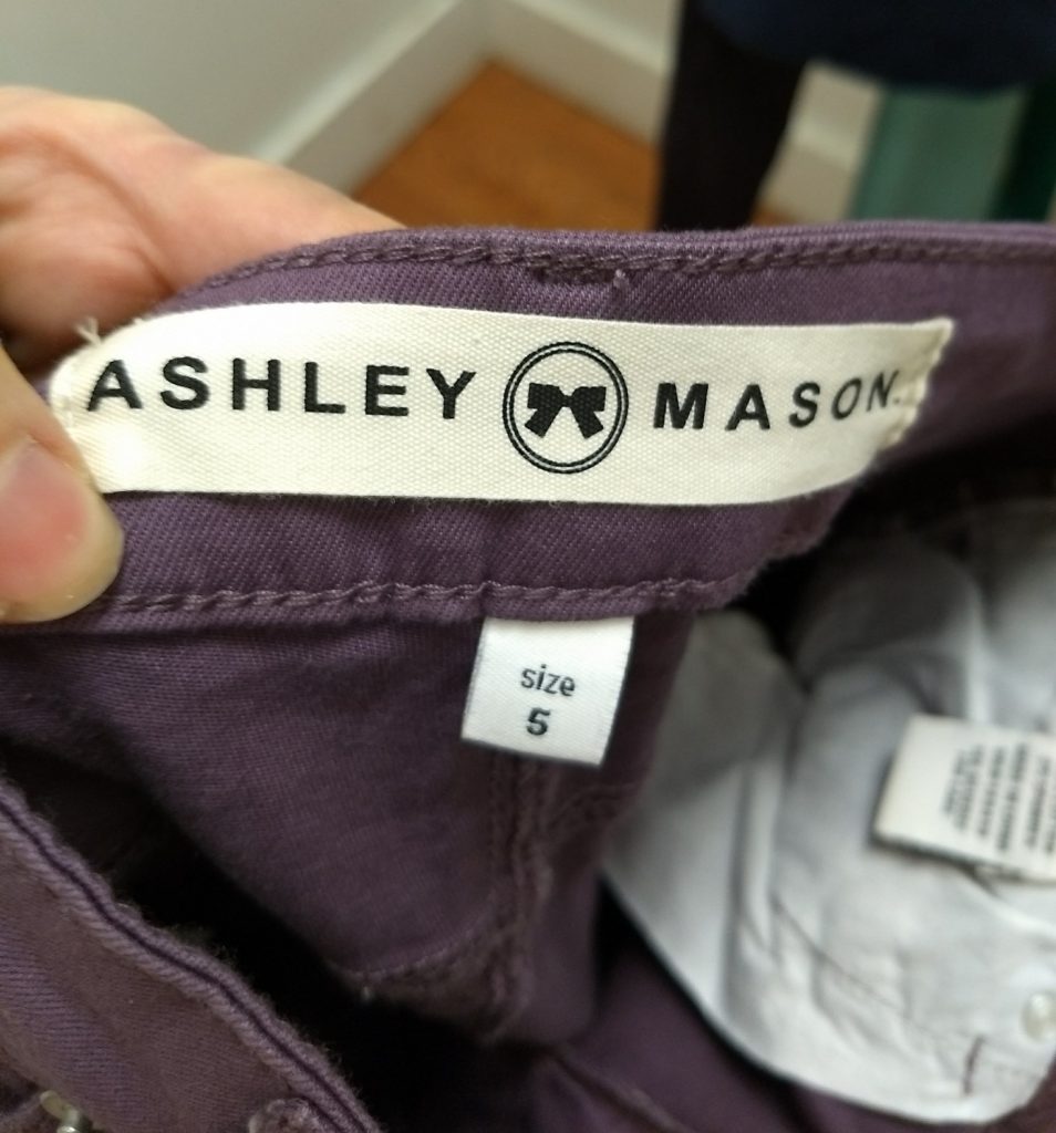
These pants were too grayed out (and too small! odd sizes indicate Juniors sizing, which is not forgiving to grown up hips/thighs), but they planted the seed for purple pants…so much personality!
IMG_20180113_135004813

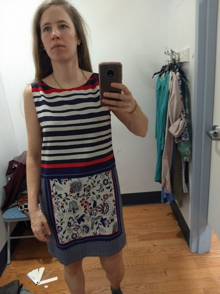
This Ann Taylor dress is totally in my former color wheelhouse, and some of the individual colors work; but per Hope, my analyst, in a mixed-season pattern you’re looking for 80% of the colors being in your season and this one had too much dark navy. It looked too stark:
IMG_20180101_155854488

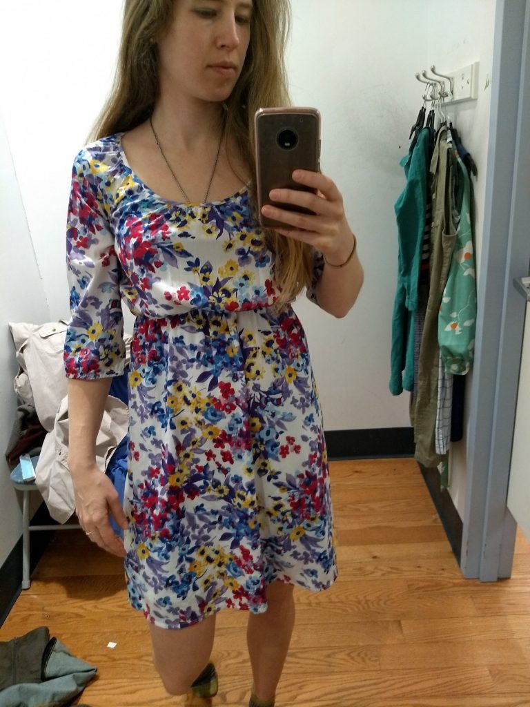
This floral caught my eye because the yellow, blues, the pink, and the richer purple looked like they might work; swatching revealed the colors to be a little too cool and muted. I’m no expert but I’d guess True Summer:
IMG_20180101_160636572

Speaking of which, I’ve really enjoyed the mental game of trying to guess the seasons of random clothes I meet. (Slightly distracting if the clothes are on somebody you’re supposed to be talking to!)

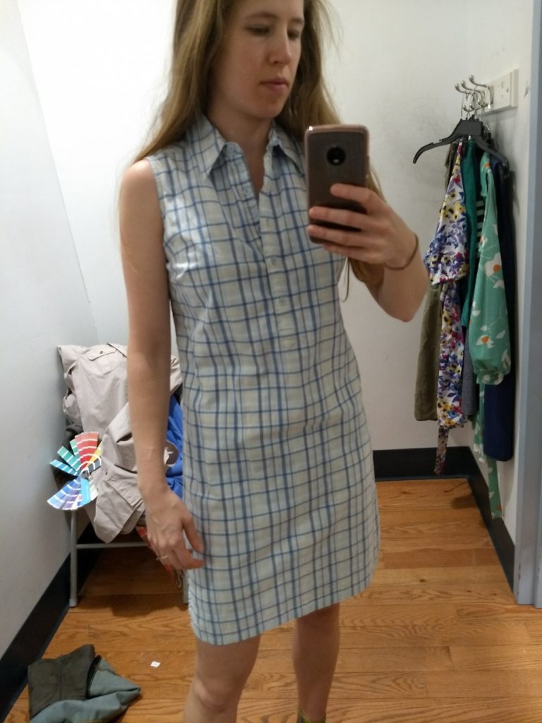
This plaid sleeveless shirt dress is totally my style, but the pastels were sooooo grayed out (not saturated enough) that it looked faded and old on me:
IMG_20180101_160847507
(Maybe this is Dark Winter?? Now I’m just getting reckless!)

This cherry blossom fitted sweatshirt by H&M (I think) was super cute, but the red was too red – Light Summer “reds” are all pretty pink – plus I didn’t love it as much as I thought I would for a floral print:
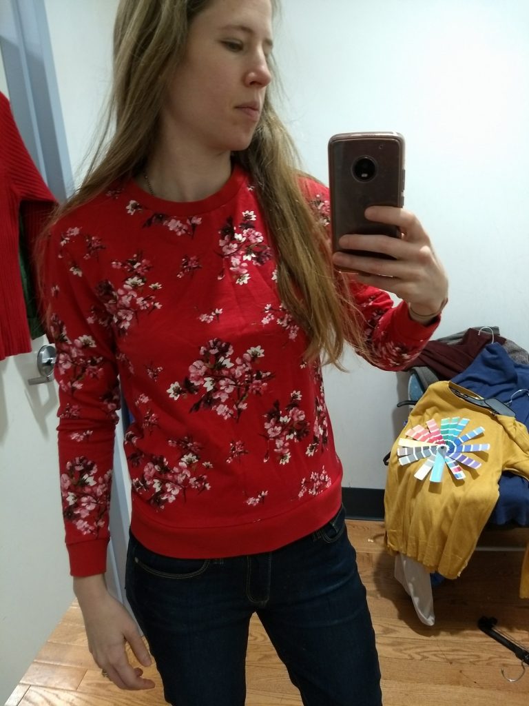
IMG_20180101_171507832

I was hopeful for this dress – I could deal with the pink and it was fun and summery – but I’d venture that’s some Bright Winter coloring going on, aka too bright for me:
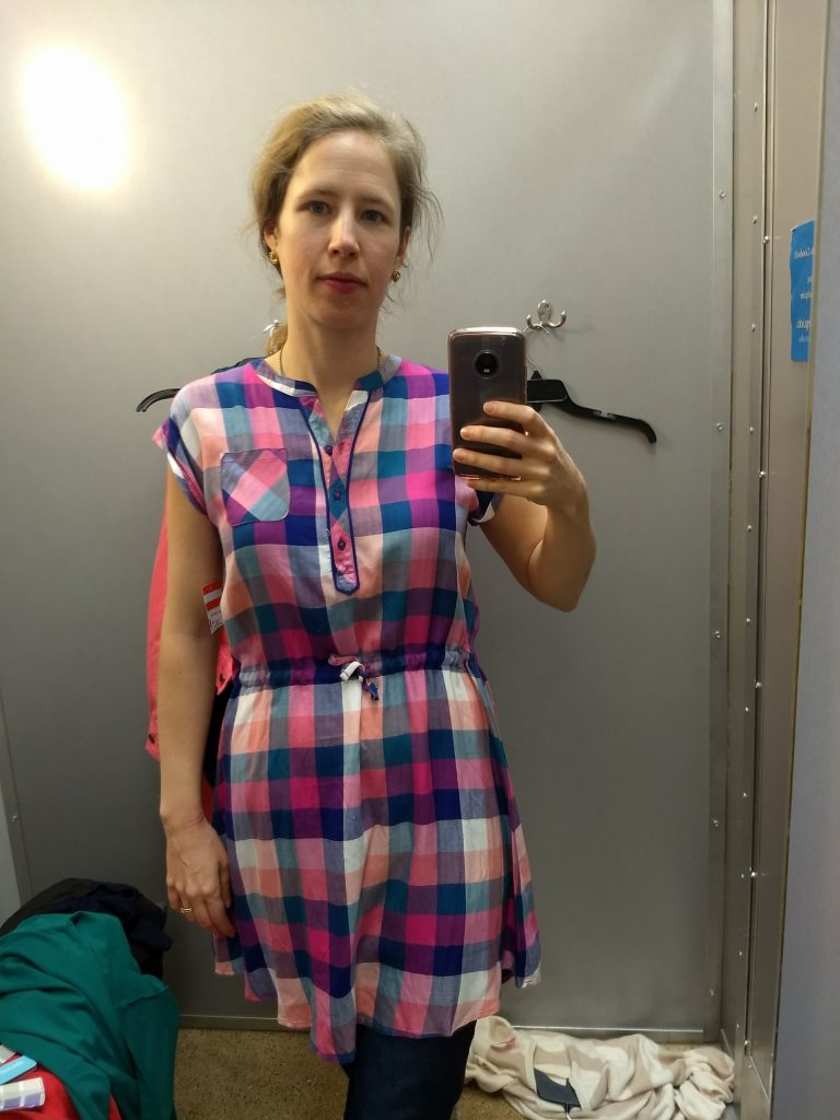
IMG_20171228_120016714

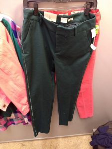
Two gloriously piped trousers to which I said “no,” for they were not my colors:
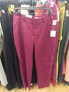
IMG_20171228_115137659 IMG_20171228_120336090


Now for some clothes that matched, season-wise, but that I didn’t thrift for other reasons.


Light Summer finds that didn’t work

This sweater is pretty close, maybe a bit too muted, but we all know how I feel about straight up cable knit sweaters…
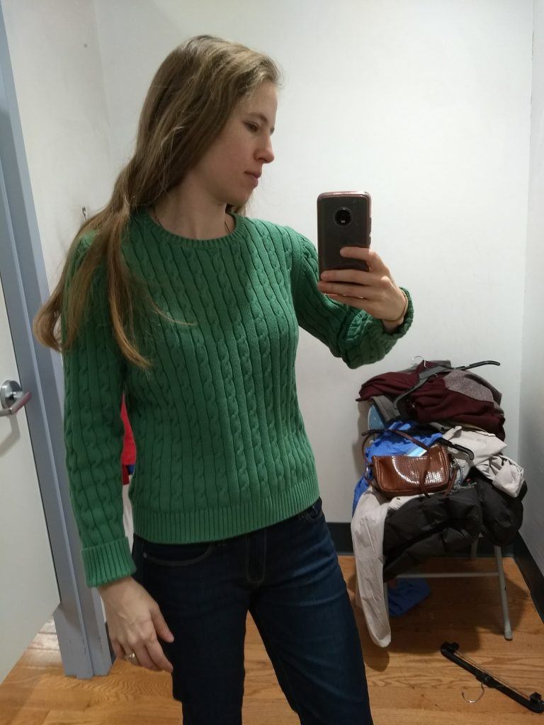
IMG_20180101_170741227

Plus it felt worn, and not in a pleasantly broken-in way.

Cable knit sweaters, unfortunately, seem to be designers’ favorite vehicle for Light Summer sweaters.

I featured this one previously as a good Light Summer yellow but too big…and cable knit. I kind of wish I had thrifted it anyway because it turns out Light Summer yellows are hard to find and it would have been a good reference point. Plus it looks halfway decent as an oversized top with fitted pants:

IMG_20171226_130756606

You know what else is hard to find? Light Summer pinks. Most are too bright, too purply, too muted, or for the corals, too yellow. I didn’t feel like I’d found a real ringer until I saw this post by Edmonton thrifter Adina of Blue Collar Red Lipstick. I’m completely lusting over this Zara blazer/coat thing she thrifted:

A post shared by Adina J (@bcrladinaj) on

Colors being different in photographs, this could look quite different in real life – but the fact that she captioned it with a watermelon emoji makes me think it can’t be too far off. That shade of pink with a hint of translucence looks delicious.

Here is a great Light Summer teal, but either Eddie Bauer was making crop sweaters long before it was cool or somebody shrunk this:
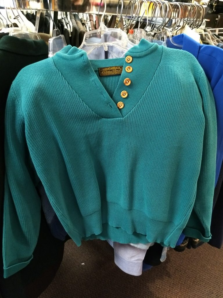
IMG_20171226_123916045

I was psyched to find a pattern that was decently Light Summer in these Old Navy pants; but they were too small despite being my regular size. I’ll just have to keep an eye out for them in the right size in the world of online thrift:
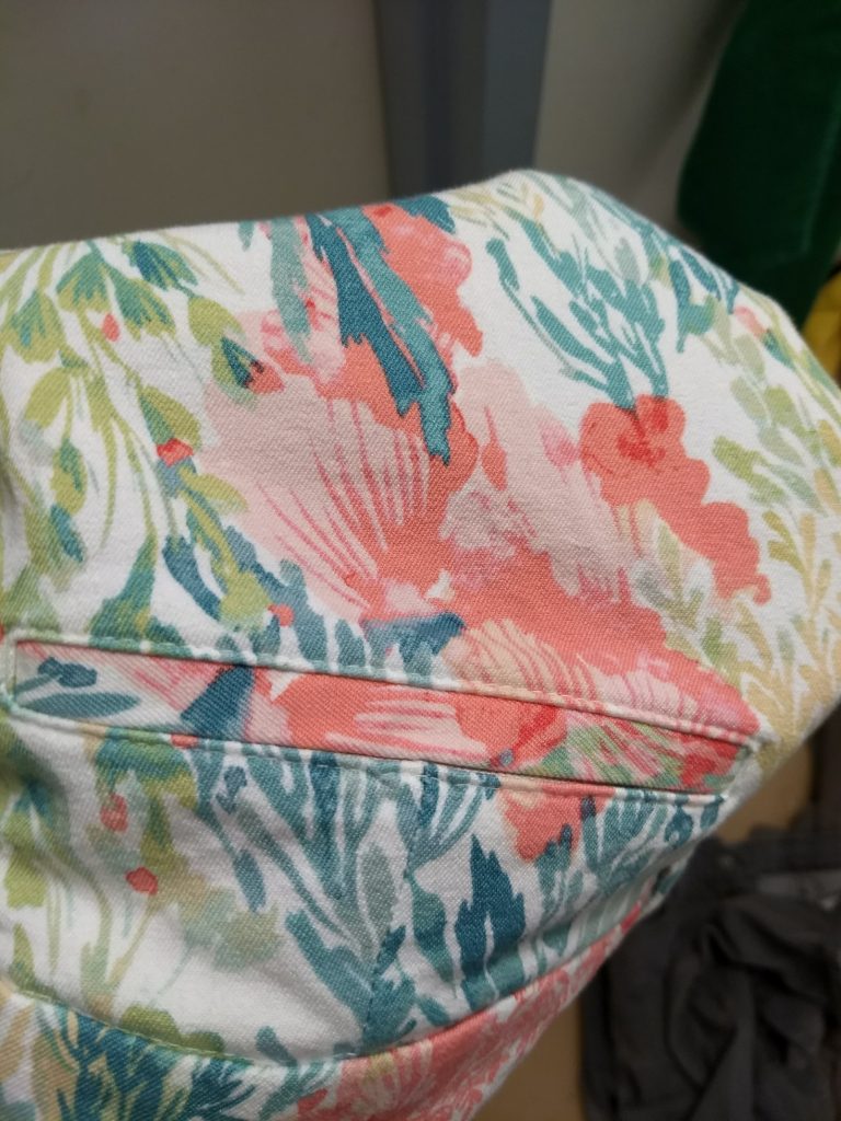
IMG_20180101_174750096

Which, by the way, is going to be a good tool going forward. If I find something in my season on the thrift rack but it’s the wrong size, I can search for it online without worrying about whether the color on my monitor matches up with the actual color of the fabric. This could be dangerous….!

For example, here are a couple things I’d like to find online:

Great leopard print in cool, light, not-too-dark colors; a size too big:
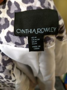
IMG_20180113_142432508
(Does anyone know whether Cynthia Rowley holds up well? The version in the thrift store was starting to look faded, but one in my size on Poshmark looks quite crisp.)

It’s a little too moto for my taste, but I like the tailored details on this jacket by Zenergy by Chico’s. It is the perfect “koala grey” for Light Summer – nice and clear/fresh in color, but also too big:
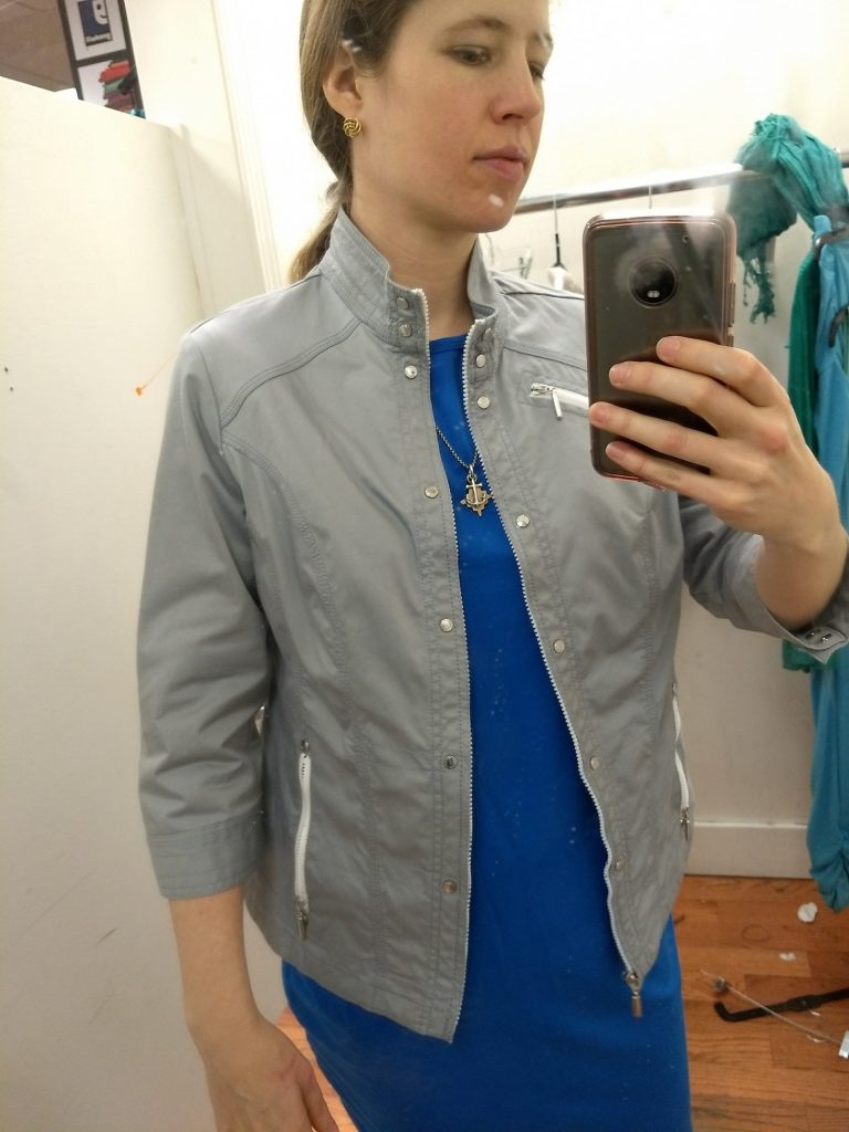
IMG_20180113_125652138

(That dress was also a great Light Summer, but a size or two too big; baggy in the arms and hips.)

Here’s another good fresh, light grey that was too small for me:
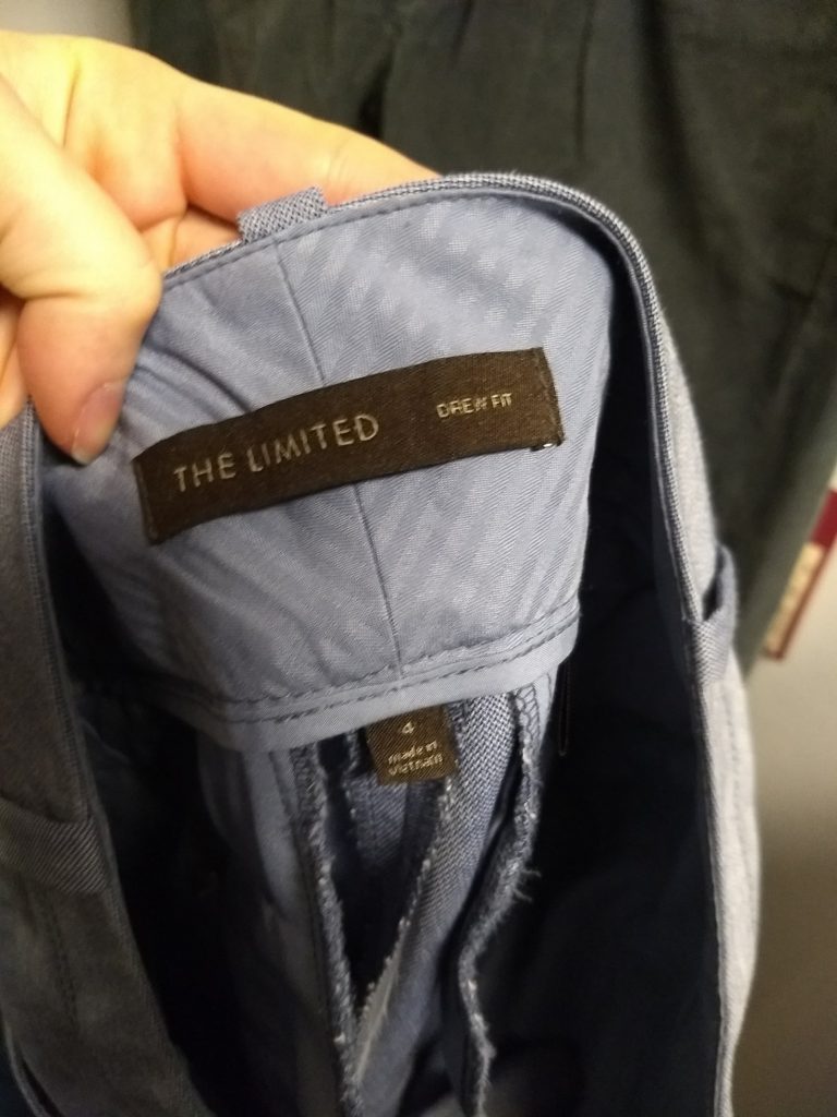
IMG_20180114_171356219

I love slightly worn in, soft cotton twill, but that fabric seems to lend itself to more muted colors (see purple pants below), while the fresh colors I’m looking for have a little shine, like these pants.  A pair of silk-blend Ann Taylor trousers in a cool champagne had the same effect, but they were also too small. (I imagine the shimmer of silk is going to be my friend here.)


Light Summer finds that worked

Part of Hope’s analysis services include a season-specific guide for makeup/clothing/hair, and all the nature-based images she used to talk about Light Summer’s coloring have a bit of luminescence to them. I’m carrying similar images (e.g. the “watermelon pink” I just thought of) in my head to help me flag my colors while thrifting. While Hope’s guide is a proprietary product that comes with the analysis, the 12 Blueprints Light Summer Pinterest board has some good examples – particularly that pink men’s shirt.

I find women’s clothing with that inner glow Hope spoke of to look a little…fancy? Cocktail party-esque? But with the clean, tailored lines of menswear’s, it looks simply divine. So my current goal is to find menswear-inspired pieces with some crispness that will balance out the luminescence. (You know me; I’m 45% Ines de la Fressange / Gentlewoman Chic.)

I’ve been looking for a blazer in Light Summer’s glowing teal to hit just that spot, and found one (that wouldn’t photograph well) but that was also oversized and from the 80s. The tailored pants I shared previously also find the sweet spot of reigning in the overly feminine (to my eyes) glowiness:

IMG_20180101_174619762

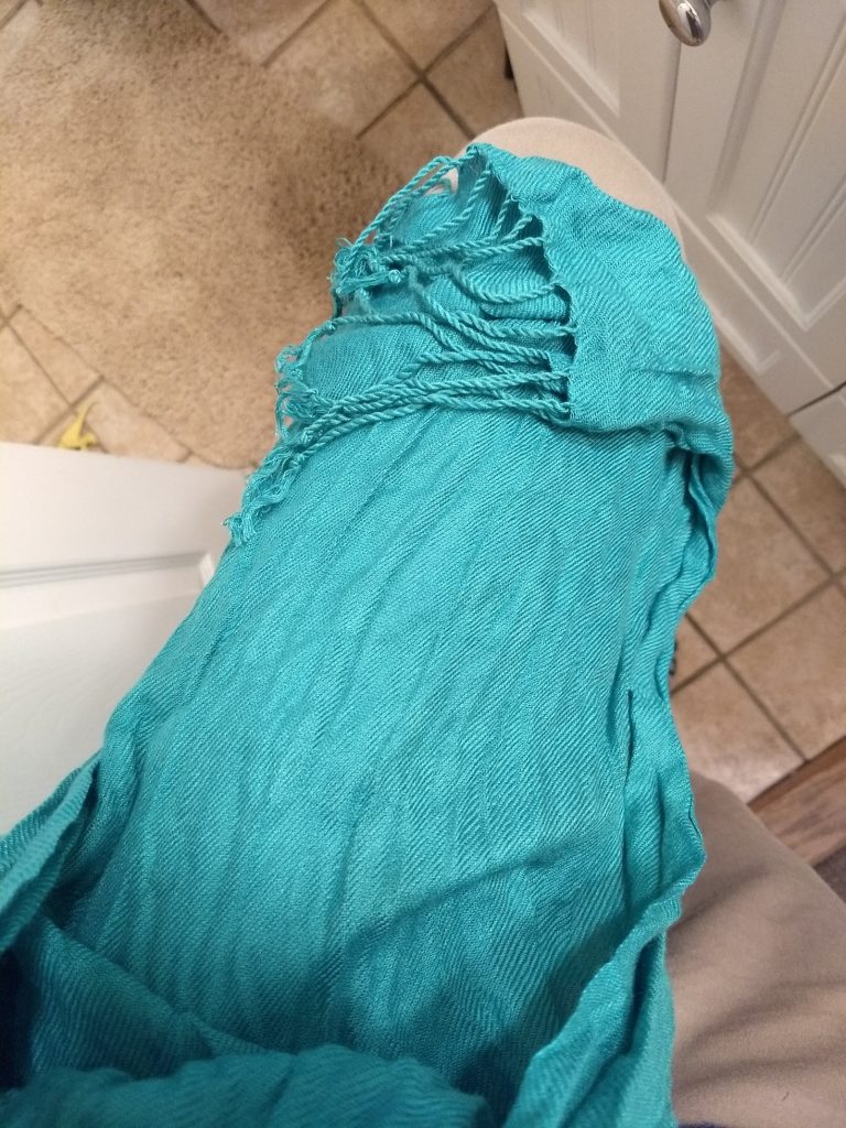
Apparently I have the easiest time finding teals/turquoises; here’s a scarf in a similar color that is 100% nailing Light Summer. It’s got a little shine to it, but I can deal with the glow because it’s not also covered in sequins or drapes or bows:
IMG_20180117_152837974
Bonus points if you can spot the dinosaur on the bathroom floor.

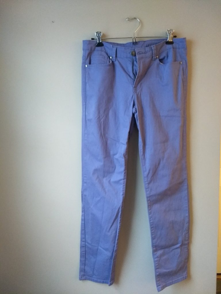
Here’s my second try with purple pants, by Clavin Klein. I think they are in the right purple family but probably a bit too grayed out. I don’t care, though, because will be far enough from my face to fudge it and they fit like a dream:
IMG_20180117_153208450

And then, in a fit of sensibility inspired by Kim’s comment, I got myself some neutral bottoms. While purple, green, and yellow pants get me super excited, and I’m even more excited for colored blazers, there are only going to be so many times I’ll want to wear yellow pants with a watermelon blazer and a blue shirt.

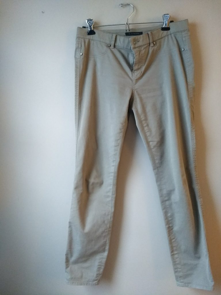
Here are some Elie Tahari pants in a stoney taupe that fit like a dream (my only qualm is all the pockets are fake):
IMG_20180117_153452391

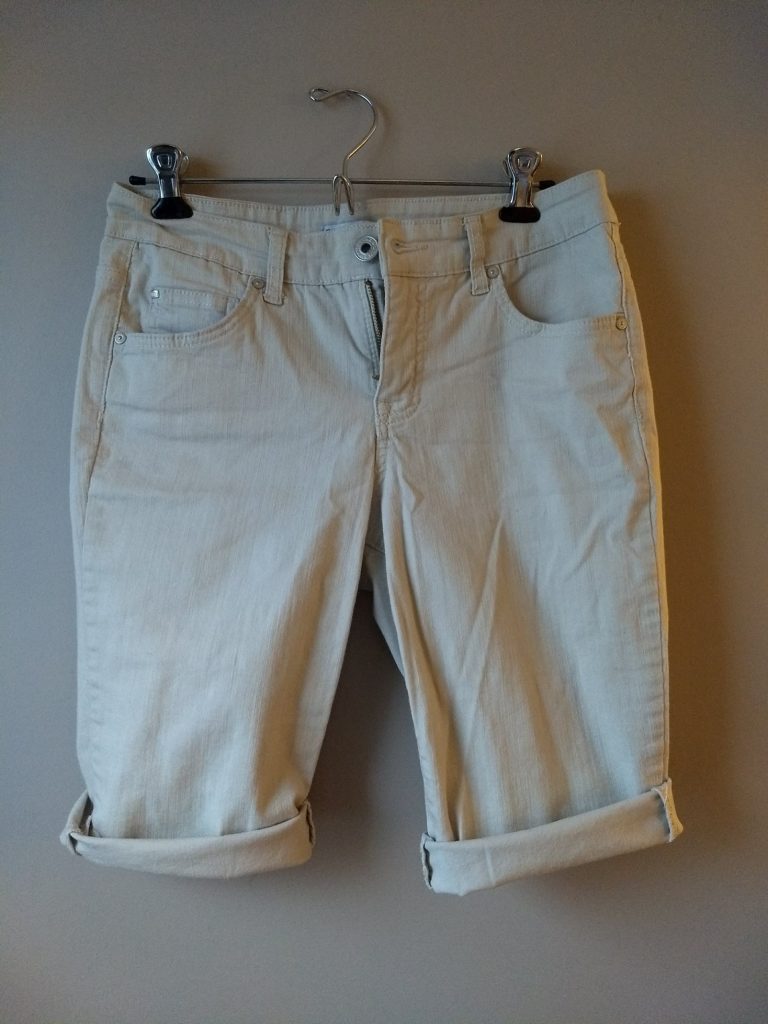
A pair of bleached driftwood (making up color names as I go…) Bandolino capris in the ugliest length possible – just covering the knees…why?! – that I have chopped off and will probably chop more to make into non-Bermuda-length shorts:
IMG_20180117_153313268

Returning to color, here’s a blue that works really well for Light Summer; it’s a little more cornflower than this picture shows. Check out that sassy bias cut and split hem!
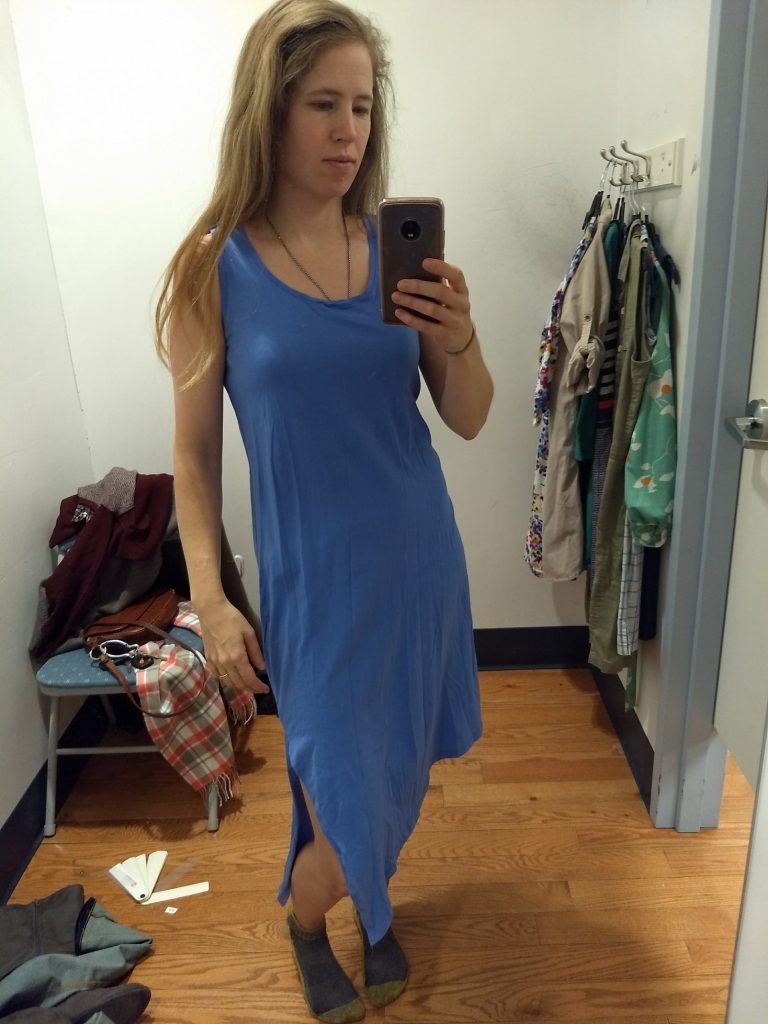
IMG_20180101_160335200_BURST000_COVER_TOP
Once the wrinkles are steamed out, this will feel utterly sexy yet super comfortable. It will be interesting to figure out where I’ll wear it…it’s a bit nightdress-adjacent but I’d love to wear it out of the house, too.

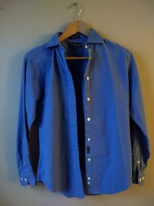
Although I like women’s take on menswear, I haven’t done too many button-downs (I prefer popover tunics) because it’s so hard to find a good fit. But here’s an F by Façonnable button down that fits great; like my new (to me) Land’s End flannel, I plan to wear it under sweaters:

IMG_20180117_162847618

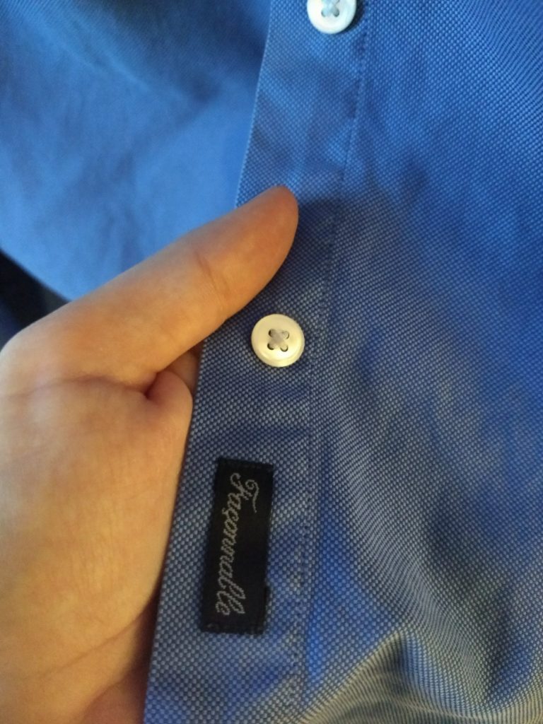
It has two different shades of blue in the fabric, both of which are plausibly Light Summer, but which combined give an almost 3D intensity that might skate into Spring:
IMG_20180117_162926139

We’ll see how that wears.

A brief report from the makeup front: I’m waiting on a cooler foundation before I start trying to find a good lipstick match. (In the makeup portion of my PCA, Hope said my current warm-ish foundation works fine because it blends into the skin. But using it more in certain areas to cover breakouts leaves me looking a bit orange.)  I go for natural beauty products that don’t use toxic ingredients, which narrows down the options considerably and often means it’s more difficult to test in person. But I’m hopeful that a cooler foundation will make it easier to spot Light Summer clothes that make my complexion pop.


That’s all for now, folks! Let me know what you think of my finds and whether you’d like more in this vein.

PS The Winter 10×10 starts tomorrow! Go here for details and let me know if you plan to play along.