My Current Color Palette

Pretty much everybody who writes about building capsule or edited wardrobes recommends that you start by choosing a color palette.

Some of my favorite posts on this topic, also included in the recently updated “Resources” page: Anuschka ReesUse Less; oodles of examples you just might want to steal on The Vivienne Files 

Choosing a limited number of colors to focus on goes a long way to narrowing down your clothes to a manageable amount that plays well together (aka a capsule wardrobe), and helps you hone your shopping when you want to fill a wardrobe hole or augment what you already have. Color theory goes a long way towards ensuring the colors you choose actually work together; the first two posts linked above will help you get your head around the basic principles.

Seasonal color analysis (aka finding “your” colors) also hinges on color theory, and if you choose to get analyzed (and the analyst is skilled enough to get it right!), you’ll automatically end up with a color palette that goes well with your natural coloring. Here’s mine from my personal color analysis:

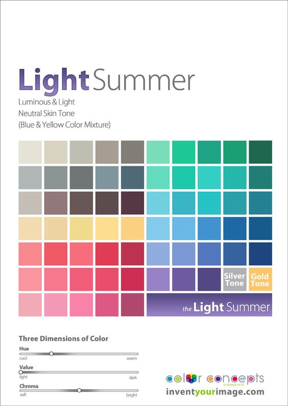
See that “three dimensions of color” chart at the bottom? That’s color theory at work – all these colors share about the same level of hue (warm to cool – or in artist speak, yellow to blue), value (light to dark), and chroma (soft to bright – more or less muted). And that’s why they all look good together.

But that’s still a lot of colors to choose from. And while they technically go together, you might not personally love every combo these colors can make. Maybe you hate green or love neutrals or don’t want to look like an Easter egg.

I mean… (and yes, that pink is more bright winter than light summer…the perils of thrifting online where colors in photos can be deceiving)

So a lot of color palette advice suggests narrowing it down to a few core colors, a few neutrals, and maybe an accent or two. Like this:

Ta-da!

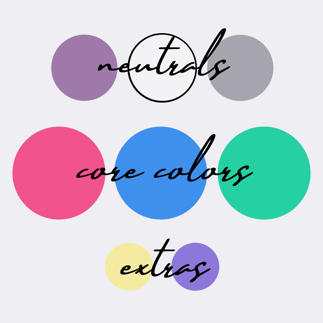
This is a general approximation of the colors I’m currently using in my wardrobe – I eyeballed them from the color-picker on my graphics maker. (And of course monitor colors vary – so if these don’t look precisely Light Summer to you, that’s why!)

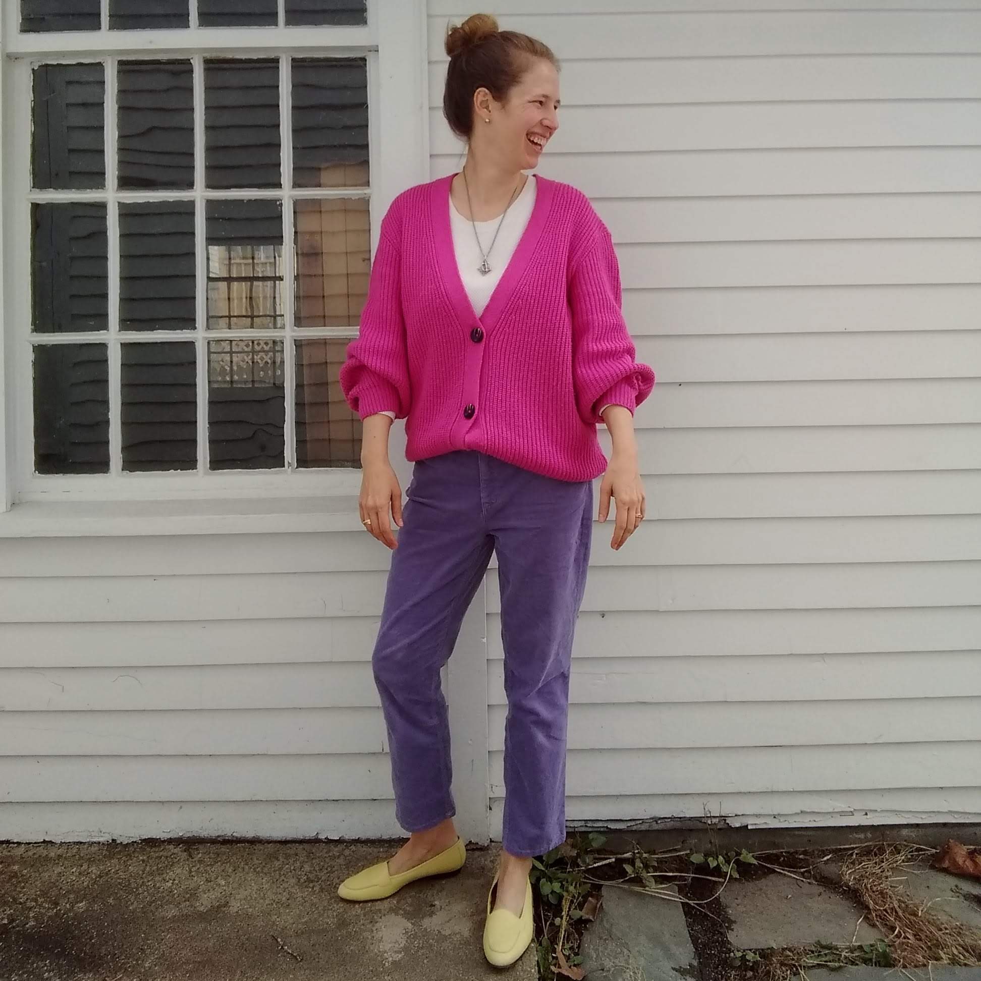
Most of the clothes in my wardrobe are pink, blue, or green – with a good dose of neutral-friendly white, gray, and a purply-grey sometimes called faded wine (?? I didn’t make it up…). There are just a few items, like the shoes or pants above, that are purple or yellow, which end up giving a little visual interest to my basic color palette:


Personal color analysis did most of the work here for me, but narrowing down my color palette even further has kept me from trying to thrift pants or shirts in every color of my Light Summer palette. And committing to some neutrals, as a wise commenter suggested early in this process, has helped me avoid looking like an Easter egg – except when I want to :)

Do you have a color palette for your wardrobe? Does it help you thrift better/maintain a more coherent closet? Or do you go for whatever color strikes your fancy?


Print Mixing 101

1 (2)

On Tuesday I talked about where to put your prints, arguing that the simplest way to a streamlined closet was to pick just one place for your patterns.

Where’s the fun in that, you say??

Well, if you’re a print lover (or you want to be), this post is for you.

Tips for Mixing Prints (from dipping a toe in to daring)

  • Mix subtle and bold. As mentioned Tuesday, a pinstripe, tiny polkadot, glen paid, very faded/light print, or even a seersucker stripe will read neutral when paired with a larger, bolder print.

A photo posted by LeahLW (@thriftshopchic) on

  • Use texture as a print.  Like the subtle prints mentioned above, lace, tweed, cable knit, etc. all walk the line between full-blown pattern and solid and will help ease you into the world of print mixing.

A photo posted by LeahLW (@thriftshopchic) on

A photo posted by LeahLW (@thriftshopchic) on

  • Break it up. Use a wide, solid belt or a color-block top with solid on the bottom and pattern up top to create visual interest without visual overload. My favorite way to do this is with fun shoes on the bottom, a solid pant, and a printed top:

A photo posted by LeahLW (@thriftshopchic) on


  • Stay in the same color family. If the main background colors of your prints are pretty close, it’ll read as a variation on a theme instead of competing narratives. Likewise, think about whether your prints are generally the same warmth/coolness* or saturation – layering neons over rich autumnal colors is just gonna make everyone queasy.
    (Check out these two Into Mind posts for an intro to color theory – e.g. what the heck is saturation? – and examples of harmonious color palettes for your wardrobe.)

Ps #printmixing ftw

A photo posted by LeahLW (@thriftshopchic) on


  • Mix two different genres. Floral + stripe.  Stripe + animal. Polkadot + tweed.  Monochrome check + bold cartoon colors.

A photo posted by LeahLW (@thriftshopchic) on


Speaking of monochrome…

  • Black & white + color. There’s enough of a contrast between black-and-white and colors that our eyes tend to read them as background + foreground (or vice versa).  For your colors, stick to bold and bright, more saturated hues if you don’t want to muddy things up (i.e. navy is probably not a great idea here, nor are super-soft pastels, unless you tone down the black in your monochrome to a correspondingly soft grey).
    I have very little black in my wardrobe so I have no outfit examples to show you, but the graphic at the top of the post is a good illustration of how well this works.


What are your tips for mixing prints?  Do you love to live on the leopard/zebra/tiger stripe wild side, or are you print-mixing shy?


*Apologies to artists everywhere.  Saying more blue/yellow/red instead of warmer/cooler is pretty confusing for us non-artists.