
On Tuesday I talked about where to put your prints, arguing that the simplest way to a streamlined closet was to pick just one place for your patterns.
Where’s the fun in that, you say??
Well, if you’re a print lover (or you want to be), this post is for you.
Tips for Mixing Prints (from dipping a toe in to daring)
- Mix subtle and bold. As mentioned Tuesday, a pinstripe, tiny polkadot, glen paid, very faded/light print, or even a seersucker stripe will read neutral when paired with a larger, bolder print.
- Use texture as a print. Like the subtle prints mentioned above, lace, tweed, cable knit, etc. all walk the line between full-blown pattern and solid and will help ease you into the world of print mixing.
- Break it up. Use a wide, solid belt or a color-block top with solid on the bottom and pattern up top to create visual interest without visual overload. My favorite way to do this is with fun shoes on the bottom, a solid pant, and a printed top:
- Stay in the same color family. If the main background colors of your prints are pretty close, it’ll read as a variation on a theme instead of competing narratives. Likewise, think about whether your prints are generally the same warmth/coolness* or saturation – layering neons over rich autumnal colors is just gonna make everyone queasy.
(Check out these two Into Mind posts for an intro to color theory – e.g. what the heck is saturation? – and examples of harmonious color palettes for your wardrobe.)
A photo posted by LeahLW (@thriftshopchic) on
- Mix two different genres. Floral + stripe. Stripe + animal. Polkadot + tweed. Monochrome check + bold cartoon colors.
Speaking of monochrome…
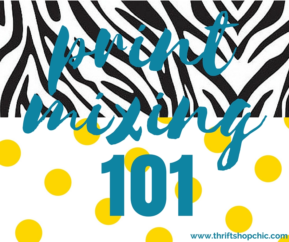
- Black & white + color. There’s enough of a contrast between black-and-white and colors that our eyes tend to read them as background + foreground (or vice versa). For your colors, stick to bold and bright, more saturated hues if you don’t want to muddy things up (i.e. navy is probably not a great idea here, nor are super-soft pastels, unless you tone down the black in your monochrome to a correspondingly soft grey).
I have very little black in my wardrobe so I have no outfit examples to show you, but the graphic at the top of the post is a good illustration of how well this works.
What are your tips for mixing prints? Do you love to live on the leopard/zebra/tiger stripe wild side, or are you print-mixing shy?
*Apologies to artists everywhere. Saying more blue/yellow/red instead of warmer/cooler is pretty confusing for us non-artists.
