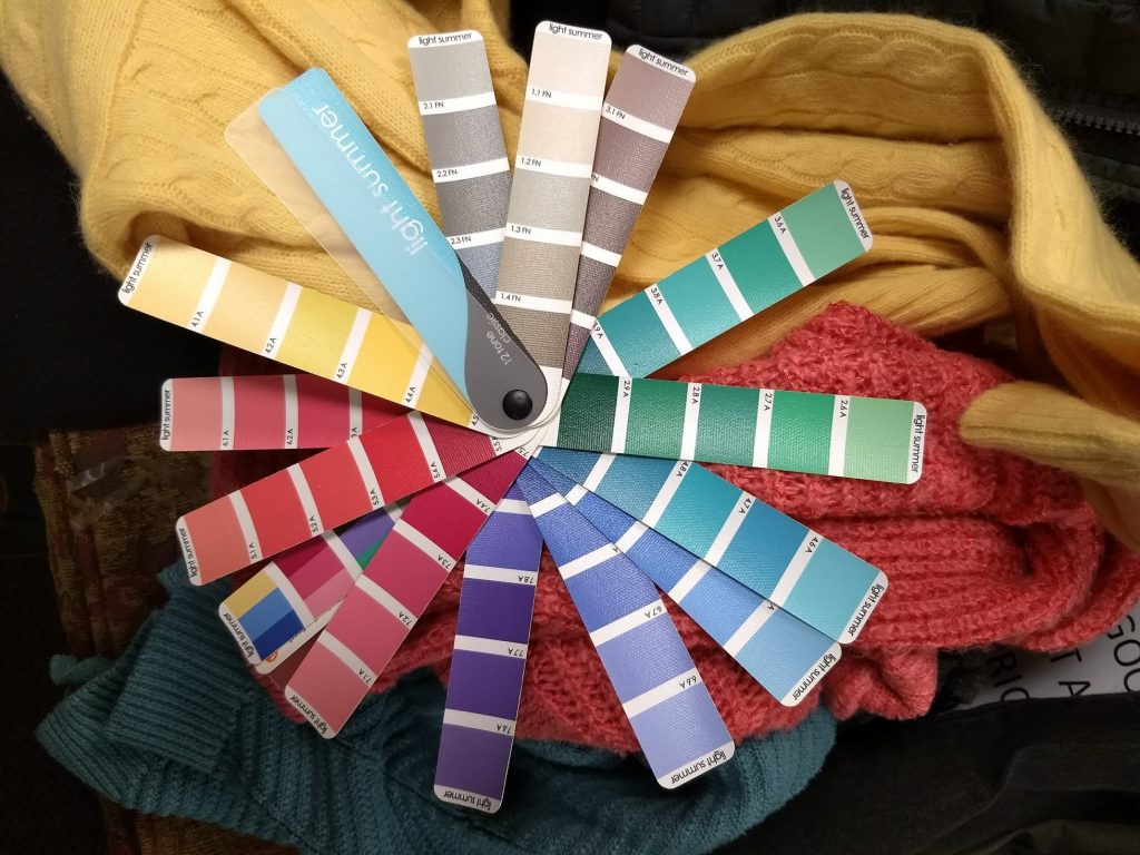
I was tired of buying clothes in colors that didn’t feel great on me, so I got my colors done – i.e., had a personal color analysis to figure out what colors really light me up. You can read about the analysis here,
V. Shopping My Closet
I got home after my personal color analysis appointment and wanted to swatch all my clothes right away – but instead I hung out with my preschooler. :) I haven’t yet finished going through everything, and I’m not great yet at swatching – it takes practice to evaluate all those value/hue/saturation factors at a glance! – but it’s safe to say that I do NOT have a lot of Light Summer colors in my closet.
Yet in Light Summer’s palette recognized the only purple I have ever thought looked good on me; the brushed, muted metallics I’m drawn to in jewelry and shoes; and the blued green of a favorite dress (long since donated due to pilling). Yay for some sort of color intuition!
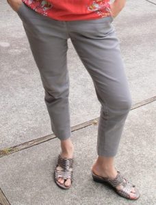
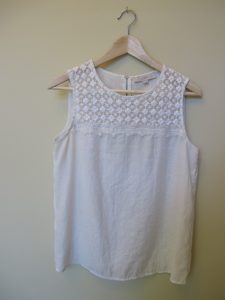
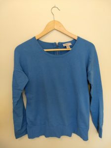
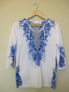
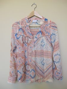
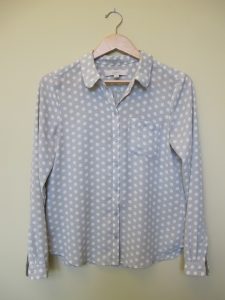
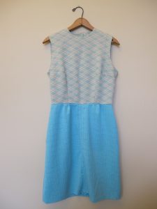
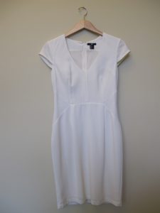
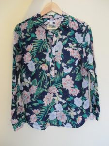
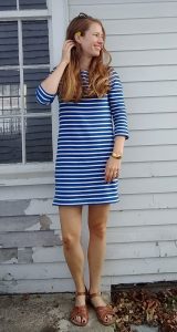
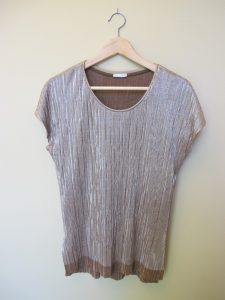
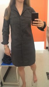
Here are the best bets I’ve found for Light Summer clothes already in my closet – apart from the blue sweater which Hope helped me swatch, I’m not 100% sure they all work since I’m still learning to match colors:
and these shirts, donated for being too small across the shoulders/chest, and these shoes, which I wore holes in – rest in peace!
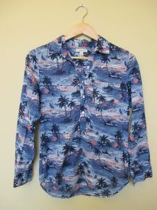
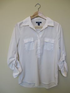
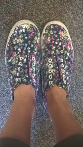
and this blazer, which I LOVED but donated because I thought the grey was too cool….smh:
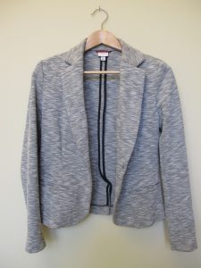
You’ll notice that almost all my “Light Summer” pieces are warm weather clothes, while pretty much everything in my cold weather wardrobe is from some other season (mostly fall, I think). Katie of Dressed on a Dime posted yesterday about how her wardrobe had strayed from colors she loves that look good on her due to a combination of dressing in “seasonal” colors and neutral-heavey Instagram inspiration…and I am guilty on both counts. Should be fun putting some real color back in my winter wardrobe!
VI. Thrifting for Light Summer
 Top to bottom: yep; maybe; nope (True Summer, I think)
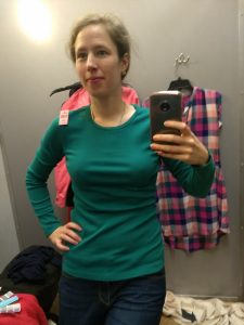
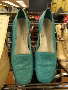
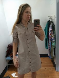
Given said holes in my wardrobe and, of course, my love of thrifting, I spent a couple days over the holidays training my eye to spot Light Summer colors. Here are a few I found that I didn’t take home (again, remember that lighting, photo settings, and monitor settings will distort each of these to some extent):
An otherwise perfect green J. Crew shirt that was too tight – boo!; not my size, wanh wannnnh; too big with some moth holes:
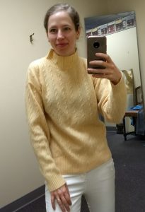
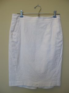
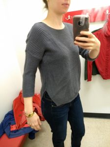
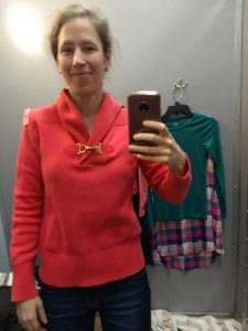
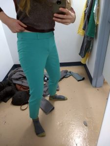
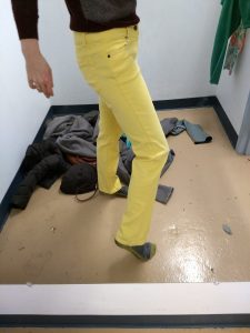
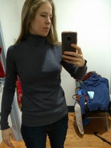
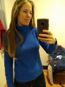
And here are some I took home:
Those yellow pants – I die! And those turquoise pants (warm weather, I admit), fit like a DREAM. So chic – they even have little notches in the pant hem. I’ll post better pictures when it’s actually warm out.
Let’s see that grey turtleneck up closer – though this picture is over-exposed, in it you can see that this is chock full of summer-y colors:
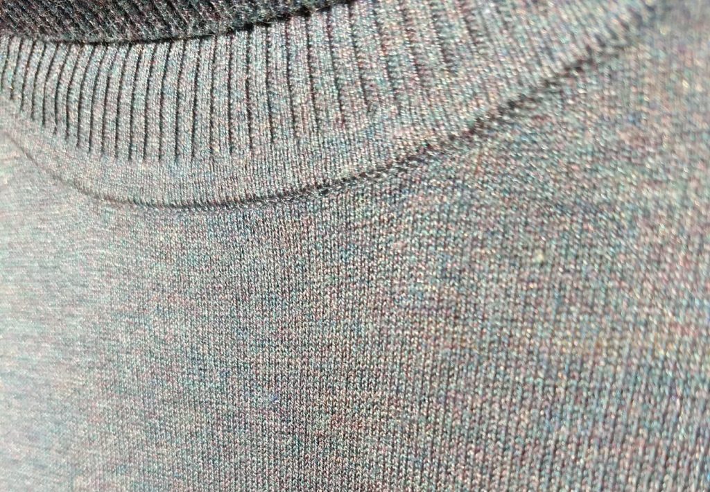
And in my own home-made draping attempt, here are two of the sweaters up against my face and a neutral-ish grey background:
That pink is still a little too hot pink in the pictures…but you get the idea. And yes, I hate cableknits; it’ll serve as a placeholder ’til I find something non-cable-y in an equally glorious blue.
VII. Conclusions
I’ve worn color in good doses most of my life; it’s only recently (and largely thanks to Instagram and style bloggers) that I’ve loaded up on neutrals. I’m a little hesitant to wear, say, purple pants with a yellow top; but I am curious to see whether wearing more color brings a little more zip to my days, since many folks who have found “their” colors report a shift in how they feel and how they see themselves.
I’m not going to chuck everything that doesn’t fit my newly discovered season; I have some favorites I suspect I’ll keep no matter what. But I do feel a new permission to let go of things I wasn’t loving that aren’t in my color wheelhouse; and an excitement to go find yellows and greens, berry hues, and maybe even some purples (!) that work since those colors are so absent from my wardrobe.
And I ended up with a few colors I don’t really care for: stoney grays that feel “blah” to me, periwinkle, and a drab-ish yellow. I’ll put them on the backburner until I’ve built up garments in some of the colors in the palette that I’m more drawn to, then see how I like them when they’re playing with colors they resonate with.
Overall, I’m glad I did it; I feel like the uncertainty I had about what works is gone. I am still a bit nervous to build a wardrobe out of colors I have neglected for so long; but mostly I’m excited, because it means I get to spend a lot of time doing something I love: thrifting.
Thanks for reading along. Let me know if you’ve ever had your colors “done” or wondered what it would be like, or whether you’re a color genius who already knows what looks great on you!

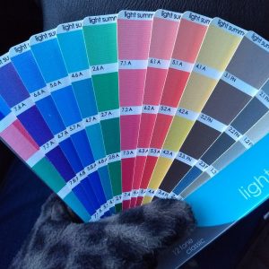
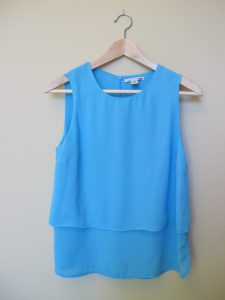
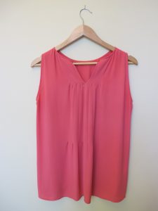



So nice to see that you have quite a few light summers in your closet. I bet it was fun “shopping” in there. Yeah, those yellow are super!
It has been fun! I went back over a few of them and am not sure they’re really Light Summers…but they’ll do while I take the time to find better matches. Those yellow pants make me smile!!
I’m a True Summer in the SciArt realm. I’ve never forgotten what my analyst told me about building up my wardrobe. Maybe it will help you too.
“Remember that you don’t want “Baskin Robbins” in your closet! The fewer “accent” colors you have in the beginning the better off you will be.
Go and ‘grow’ your accent and core neutral colors “deep” (the same color in many different items)
When a color is ‘in between’ two colors on your chart you can safely assume that it will be a good color on you. The way that I look at this is that it is in the same ‘family’ and would be more like mono-chromatic dressing. Or dressing head to toe in one color which is very chic when done so with texture and shading like this.”
So basically choose my favorite neutral and get several items in that color. Then pick 1-3 of my favorite TSu colors and get several items in each of those colors. This way you don’t end up with the Baskin Robbins wardrobe. It’s been great advice for me.
Kim, this was SUCH a helpful comment. Having focused on neutrals the last several months, I was excited to dive back into color and went out looking for every flavor in the ice cream shop, to keep the analogy going. Thankfully, after just 2 thrift trips I read your comment and on the next one I was able to thrift some neutrals to pair with my accents, because while I’m excited to really wear yellow pants with a purple top, there are many more outfit combinations possible when you start adding neutrals to the mix. Thank you!
You’re so welcome! Glad it helped.
Thanks for the time and effort you put into these in-depth posts. It was fascinating to tag along on your color analysis and and subsequent reevaluation of your wardrobe. It’s encouraged me to do the same when the opportunity presents itself. (I’m a little jealous of any followers here who share your colors and can extrapolate a little!) You do glow in your new colors–congratulations! Looking forward to seeing how this impacts your future thrifting strategy and purchases.
Thanks, Ursula! It was a lot of fun and I’m glad you enjoyed following along :) I’m still figuring things out so expect more posts on these lines…
Welcome to New England! I hope you are enjoying Boston even if the Patriots lost the Super Bowl! As a person who shops her colors, I believe that the color wheel is important for colors near the face, such as pants, skirts, and shoes, matter less. I shop neutrals for pants, skirts, and some more formal dresses and coats, but collect sweaters, blazers, blouses, scarves, and jewelry in “my colors.” I am a Bright Winter, and I just cannot wear brights on the bottom very much–too silly looking for my job and life. Enjoy! Love your posts!
Thanks for the welcome! I am enjoying Boston and am a baseball person much more than football, so we’re good :)
That’s a good point about the lower half – I imagine wearing something totally out of “season” would clash, but neutrals that are in your season or adjacent make sense. I think it’s…True Spring? that can take ALL the color and then some, but the rest of the seasons need to mix in those neutrals to look balanced. (I’d imagine some of the less saturated seasons like Soft Summer/Soft Autumn could also pull off a lot of their colors in one outfit because they’re so close to neutral?)
I’ve realized I’ll probably need to do with color what I did with prints (http://thriftshopchic.com/where-to-put-your-prints/) – choose a category or two of clothing where color goes (e.g. tops, or blazers) and use neutrals for the rest. I admit, though, I’ve been planning a warmer-weather watermelon outfit with a green blazer on top and pink pants on the bottom with a white shirt…and hoping that white will make it all work :)
Glad you enjoy and thanks for the great suggestion!
It’s such a fun journey. You look like beautiful magic in your LS colors. It’s so much fun to recognize how amazing we can look. From a Soft Summer draped by Christine at 12 Blueprints years ago.
Robin, it must have been so exciting to have Christine drape you – how fun to work with someone who’s just a font of PCA knowledge! And thanks for your kind words. I’m still working on seeing the difference my palette makes – sometimes it seems SO subtle! – and you’ve reminded me the main point is fun :)
So fun to read about your color journey! You look fabulous in your Light Summer colors! I had my PCA done a couple of years ago by Terry Wildfong, a Sci/Art 12 Blueprints analyst. It’s been a fantastic journey…..I had been draped in the 80s as a Spring because of my blonde hair/blue eyes I lived in that color world for many years and slowly fell away. When I’d go to a make up counter, the salesperson would put me in peachy neutrals. I always had a red blush to my face which embarrassed me. I stopped wearing makeup because it didn’t show up and didn’t do anything for me. I got interested in color analysis again and went to Terry to be draped. It turns out I’m a True Winter! The coolest of the cool palettes, no wonder everything was off! I understand now why I gravitated to purple, red and cobalt blue, but never bought because I didn’t think they were right. It’s fun to shop and wear make up again.
I guess what I’m saying in this long winded post is, PCA changed the way I feel in my clothes and how I about myself. It makes shopping much easier and I’ve found that once your clothes are mostly all in your color space, all the colors harmonize and work together. I have a pair of raspberry jeans that I wear like neutral, they just work. Keep exploring and have fun creating!
Thanks Paula! Ditto to what I said to Robin – must have been a great experience to get draped by one of the originals!
It’s cool (pun intended?) to read about when people already are drawn to their season before getting draped – I love so many different kinds of color palettes that I just had no clue apart from knowing I wasn’t a Winter. :)
I enjoyed reading how you feel about living into the PCA experience and am excited to get there myself. And I LOVE that you have raspberry jeans as a neutral!!! Awesome.
would like to have my colors done
You can look on the 12 Blueprints site to see if there’s an analyst near you – and then either save up or ask for contributions to your PCA cost for your birthday/holiday gifts! It’s pricey, but the price covers the cost of the drapes (not cheap) as well as the extensive training the analyst undergoes. Good luck!