Hey all,
It’s been four months since I got my colors “done“; time for an update!
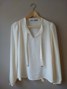
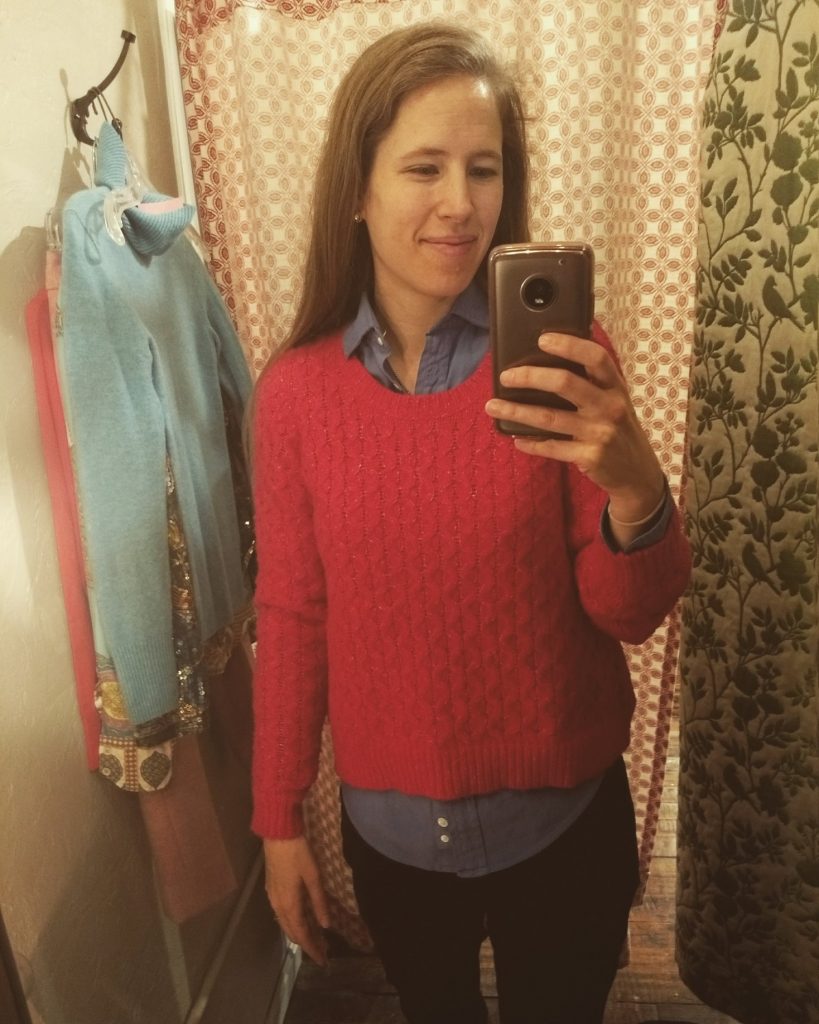
I’m settling into this new season; I see when my face “pops” with a good color; I can now see plainly that a few old pieces I initially thought were Light Summer are not; and it’s becoming a lot easier for me to pick out some of the Light Summer colors at a glance (I then confirm with my handy dandy color palette).
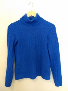
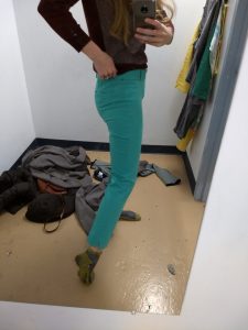
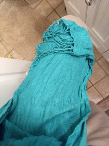
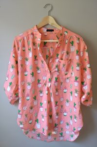
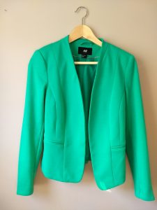
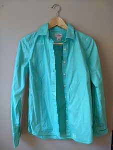
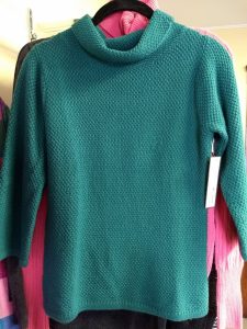
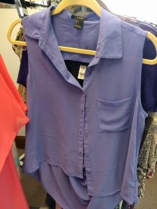
Greens and purples are probably the easiest – they jump out at me:
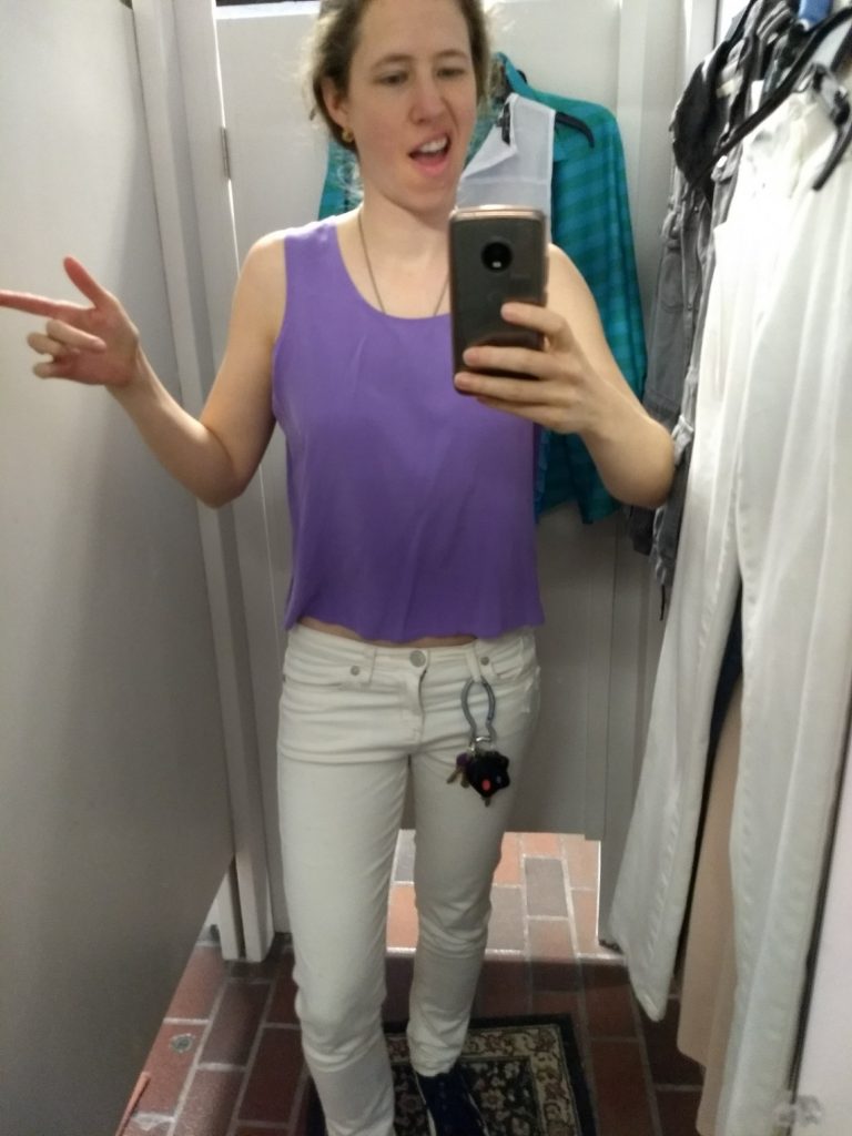
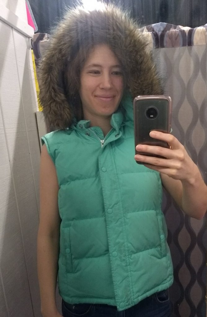
Can you tell I’m having fun with this?
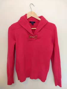
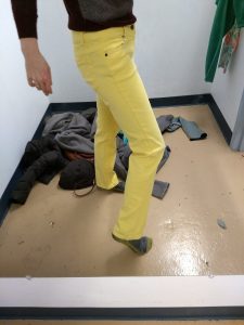
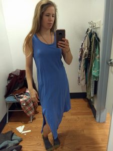
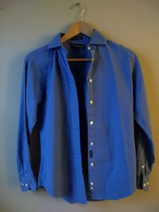
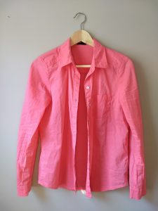
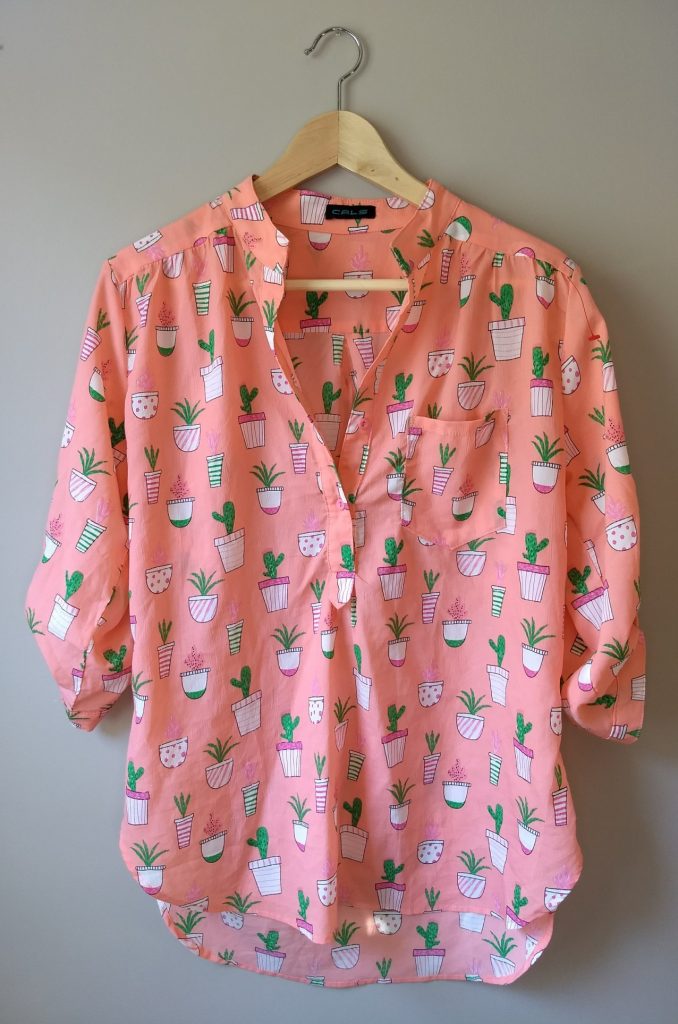
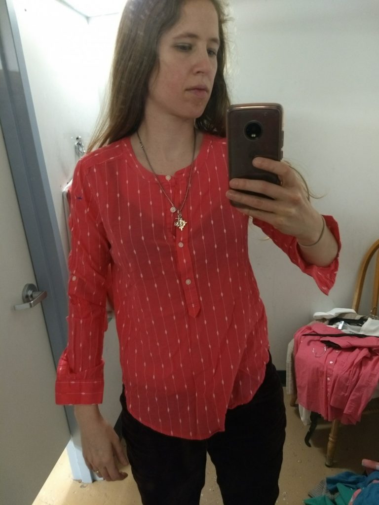
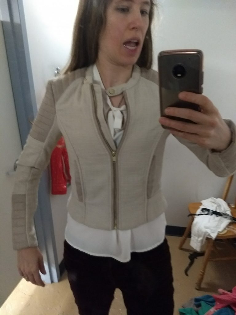
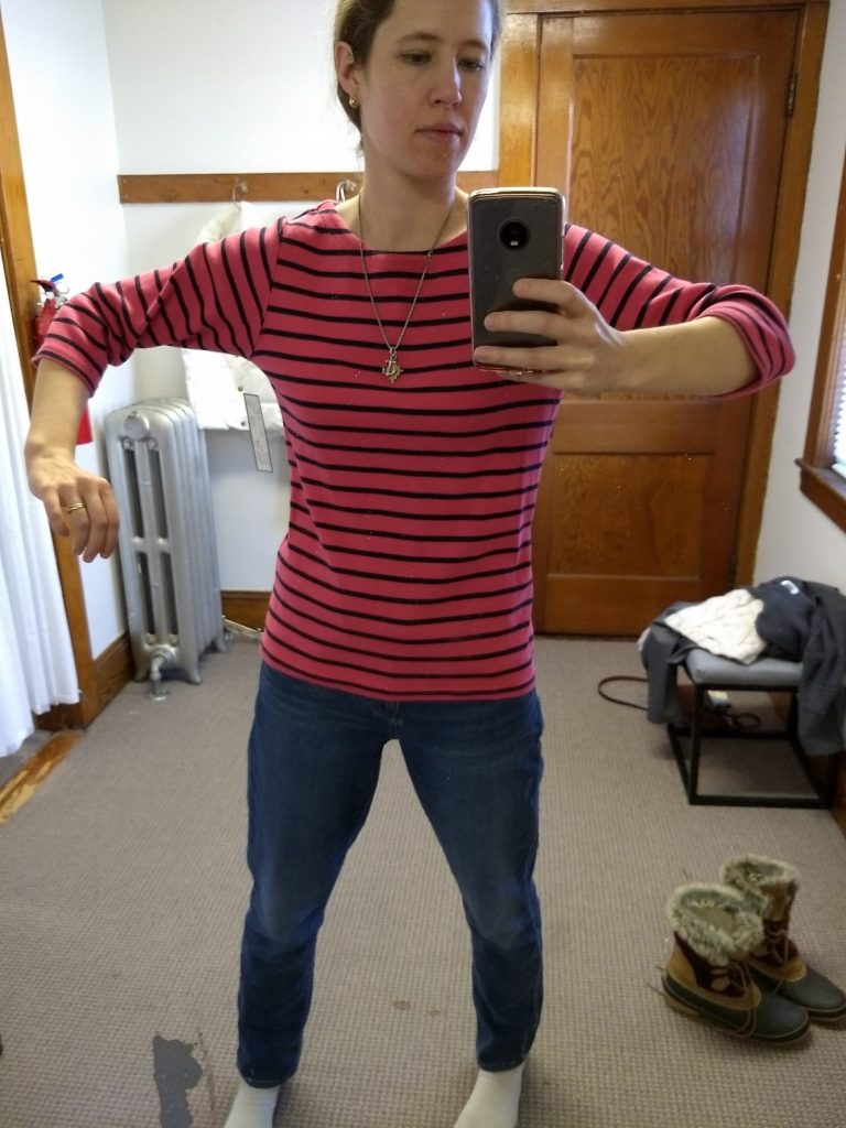
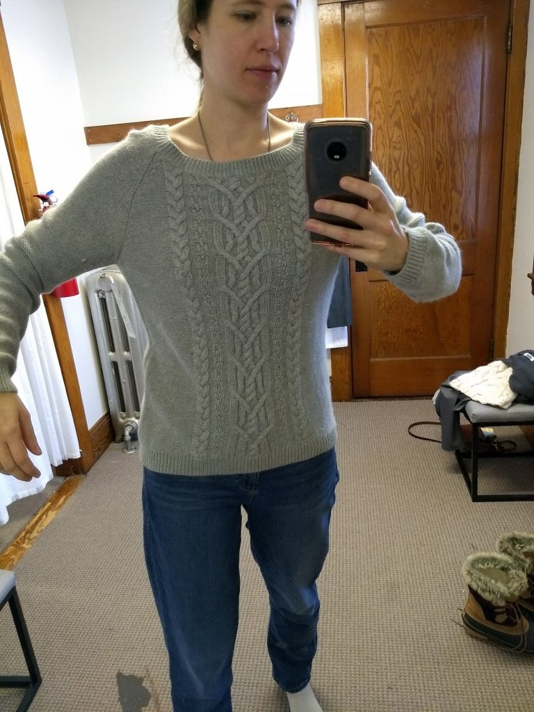
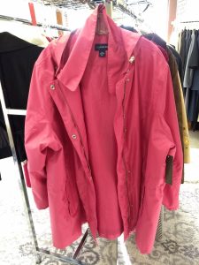
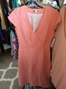
Blues don’t jump very much but there’s some flexibility there. I’m getting better at yellows and pinks (which are really mostly corals); and I’ve even found a few good browns – though I haven’t thrifted them:
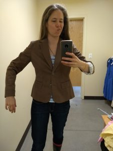
Too big.
I see when my color palette (the actual samples of colors I take with me when I thrift) pops against colors in my season when I didn’t used to:
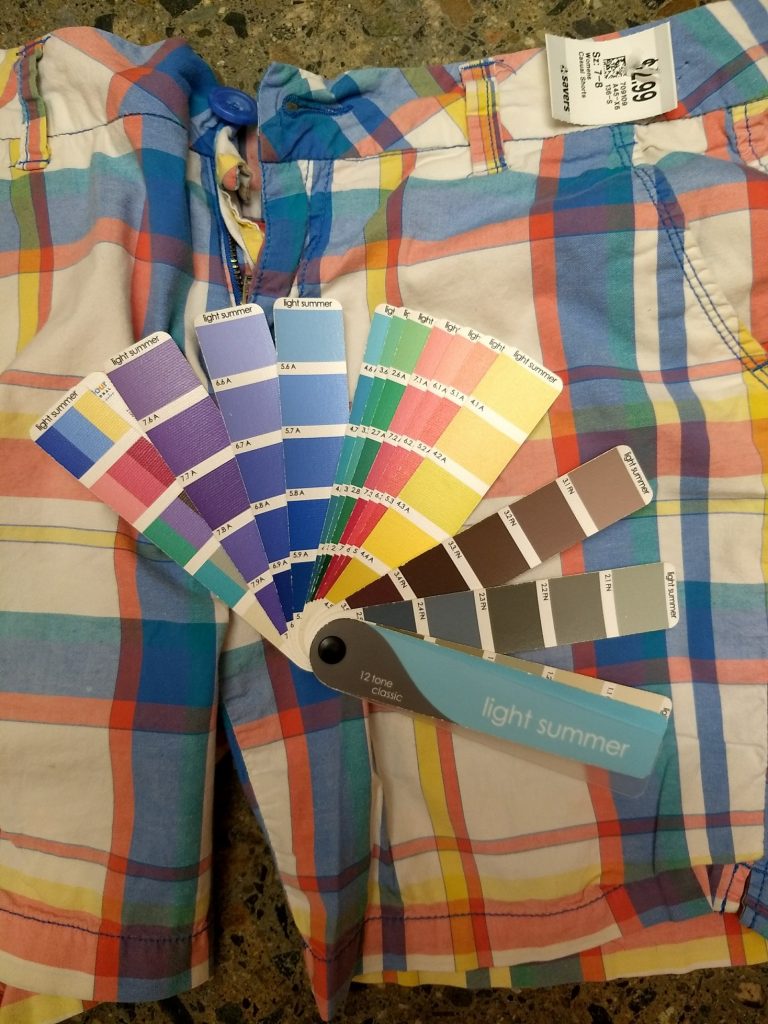
Pop! As always, take photos of the palette with a large grain of salt due to lighting etc.
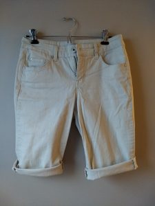
I thrifted these Bermuda shorts even though they’re more where my style 8 was years ago. I couldn’t help myself – they were so perfectly Light Summer. That’s actually been a challenge – it’s still novel and exciting for me to find something that’s a perfect palette match that I sometimes buy things I normally wouldn’t because IT IS MY PALETTE. Working on that.
Amazingly, I’ve even had success finding my colors online, which can be a tricky proposition since lighting and monitor settings affect things. Knowing it’s hard to match colors in some ways makes me more restrained – I’m less likely to buy something unless I’ve seen it in person.
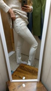
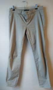
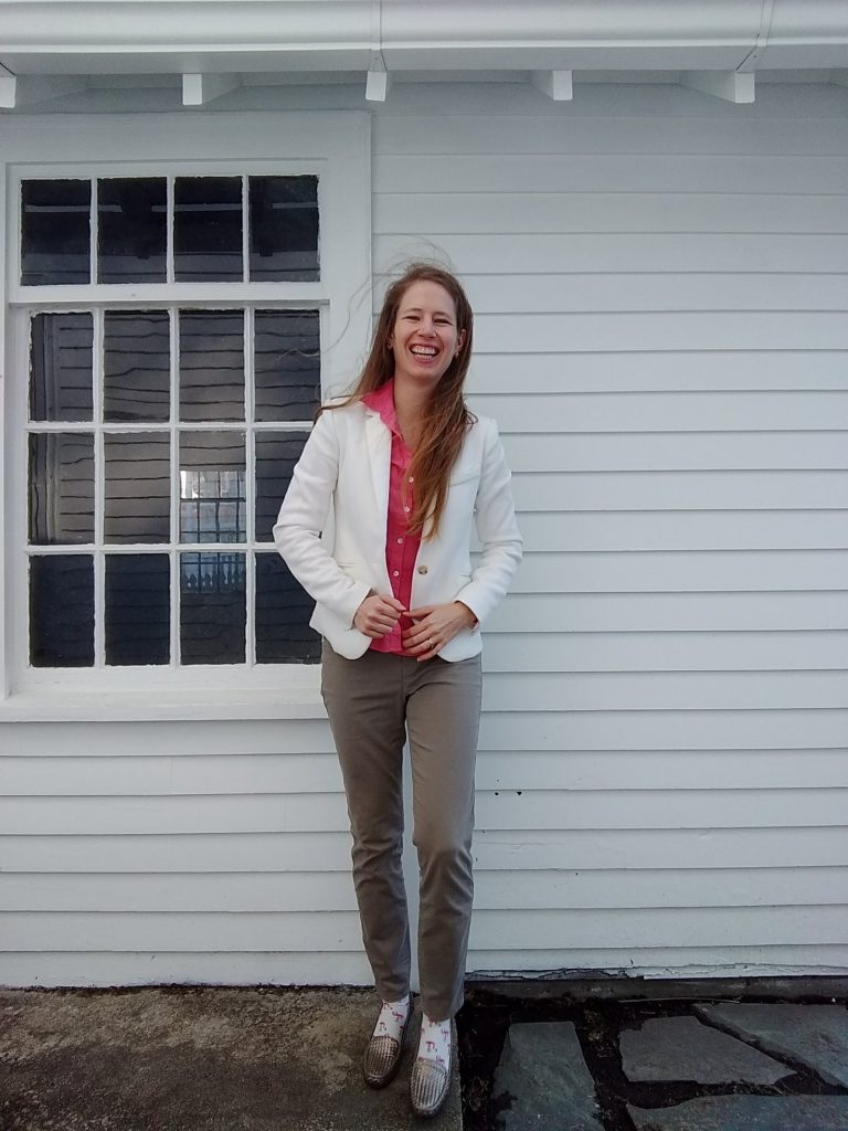
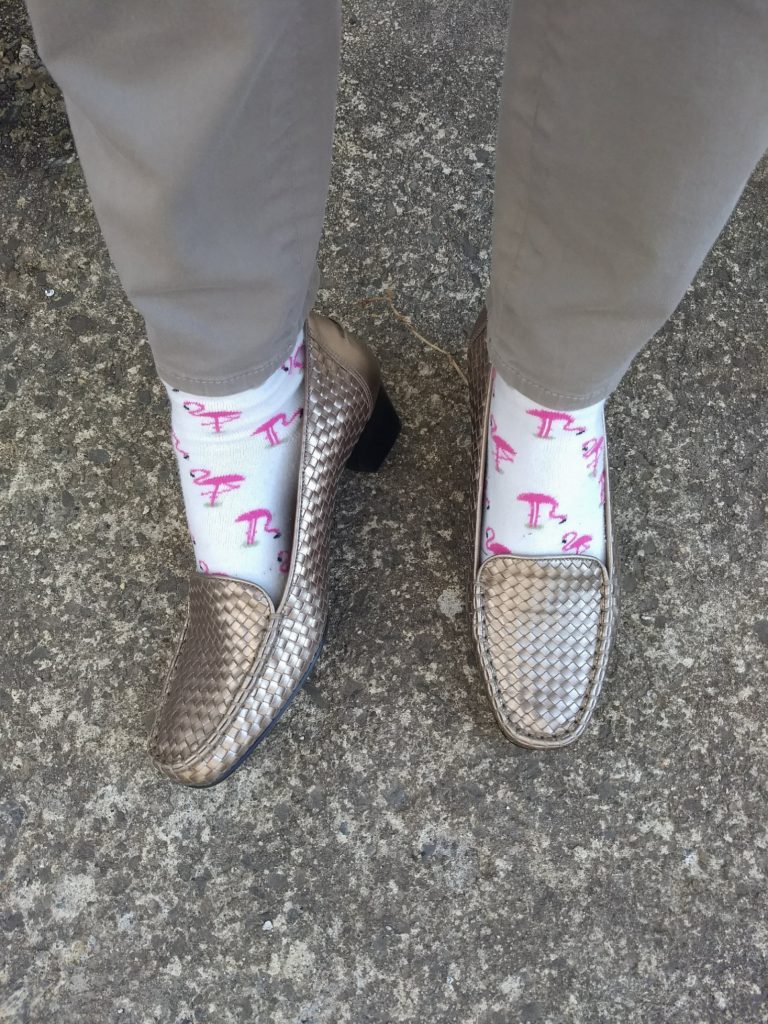
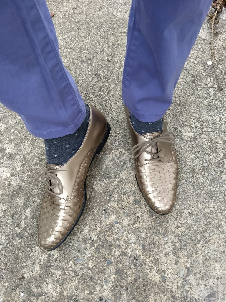
Otherwise, I piece together a variety of photos from the seller and the original retail site (these are usually pretty accurate) and make an educated guess, which is how I ended up with these pants – SUCH a good match for Light Summer:
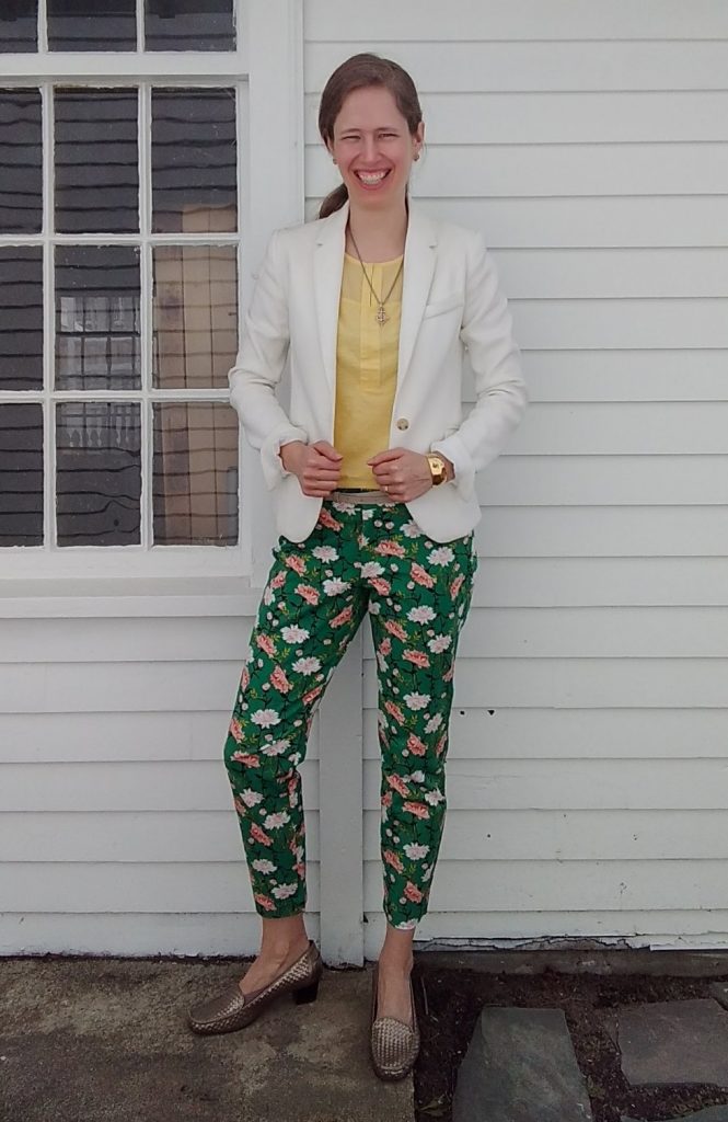
Glorious. The Pixie pant from Old Navy via Poshmark.
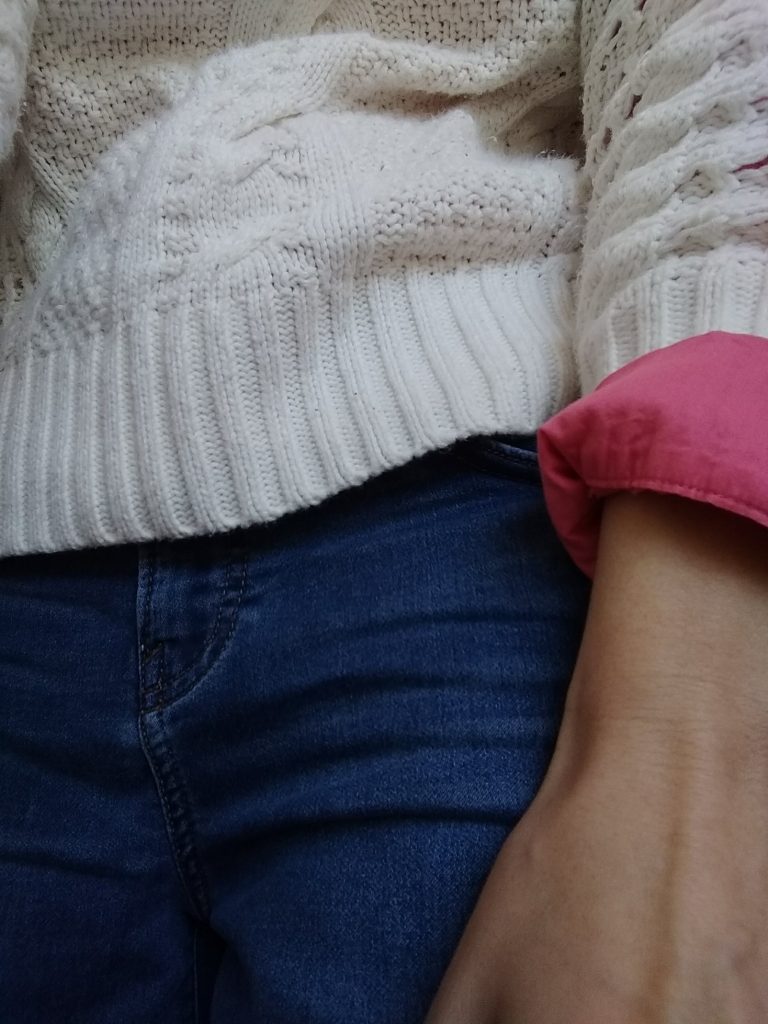
These also were a perfect match, which is great since I’ve been looking for pink pants to set off my warmer weather tops:
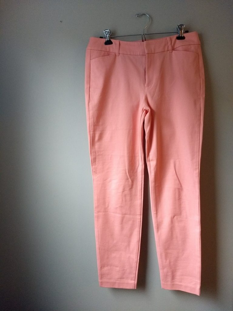
Also Pixies from Old Navy via Poshmark.
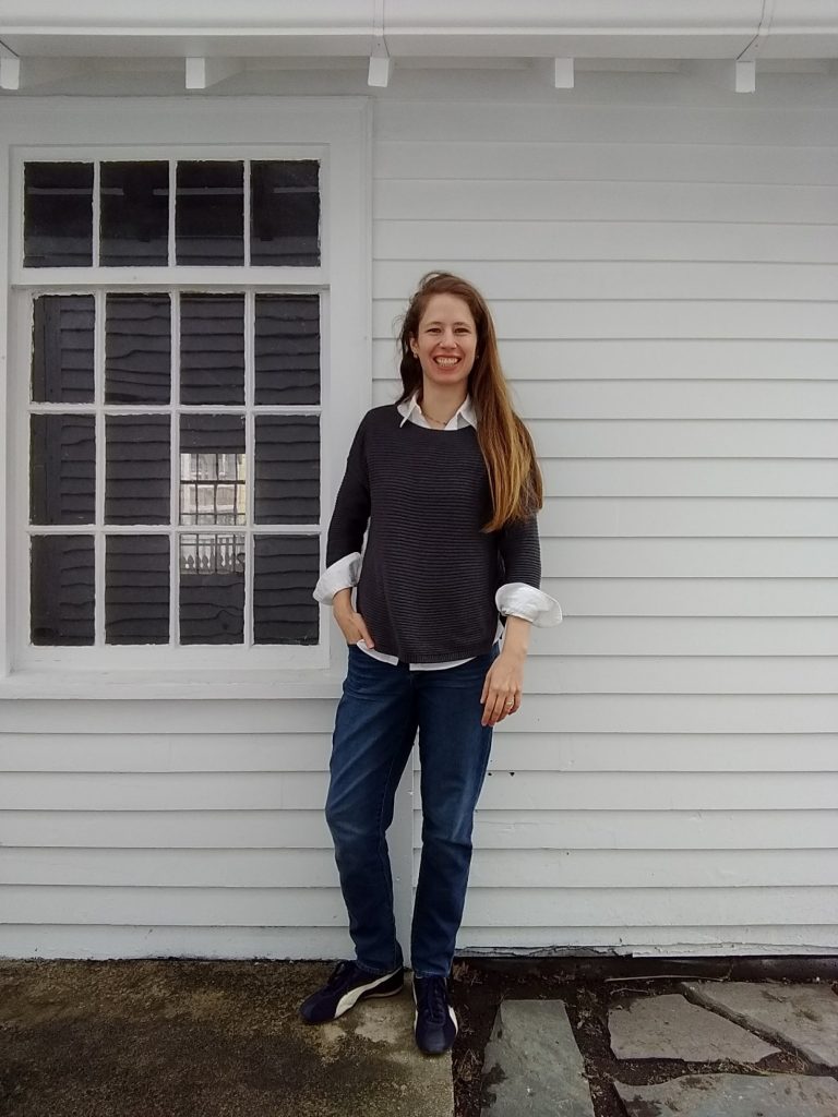
As far as denim goes, I’ve been happy to stick with my darker Paige jeans because we so easily read jeans as a neutral; plus pants are far from the face, where it’s most obvious if you’re wearing something outside your palette. And I had found some “Best Girlfriend” jeans that were right in my color palette; but they are baggy, weekend, laze-around-the-house jeans that don’t give the cleaner silhouette I like for more polished outfits.
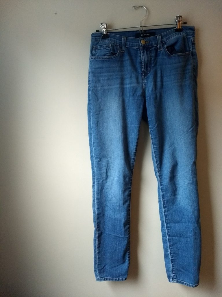
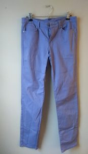
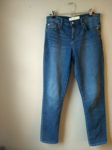
Lo and behold, the thrifting gods sent me the first pair of J Brand jeans that didn’t feel like sausage casing around my legs; they have some stretch (I know that’s antithetical to denim purists and I don’t care). They are a lovely light blue wash that is squarely Light Summer denim territory:
They’re a tiny bit cropped but since I plan to wear them now through fall, that should work just fine.
I think I mentioned before that this palette made me realize that I had let myself get seduced by the neutral-heavy palette of minimalist Instagram style mavens. Although there’s a lot to be said for playing with texture and silhouette within a very muted, narrow palette, I came to recognize it just didn’t feel like me. (One of my favorite shirts is bright blue snake print, for Pete’s sake!) When I posted a muted peach skirt on Instagram asking for color suggestions to dye it, someone suggested “rust!” with enthusiasm and I just wanted to run the other way.
It’s been a breath of fresh air leaning back into color with this new color palette and embracing PATTERN beyond just a neutral stripe or dot. (Can you tell how happy those floral pants make me?) I’m excited to share more with you as I finish building my spring/summer wardrobe – whenever spring finally arrives!!
