What I Wore: Preacher Casual

I’ve mentioned before that my new office is on the more casual side – jeans, capris, unfussy tees and polos – especially compared to where I previously worked. As the pastor, I’m aiming to appear polished but not make anyone feel under dressed in comparison (not that there’s too much danger of that since I run by the church in my sweaty workout clothes all the time…), so over the last few weeks I’ve played with translating my rather dressy wardrobe staples into my new style environment.

I’ve kept in rotation my collection of blouses to bring more casual ensembles up a notch, and added my trusty blazers to dresses in need of a little warmth or formality. But I’ve stashed my pencil skirts and wedges in favor of pants and sneakers/sandals; kept my sheath dresses mostly under wraps in favor of my more casual dresses; and left my trousers in the drawer in favor of chinos and jeans. I even wore shorts to the office once, gasp!

I don’t plan on donating my dressier dresses and skirts, since I love them and since they’ll come in handy for Sunday mornings and formal occasions. I’ll share some of those Sunday AM outfits in another post, but here’s a few examples of where I’ve landed for weekdays filled with office work, pastoral/hospital visits, and practicing communion choreography.

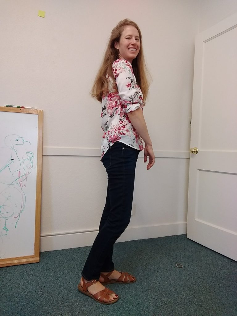
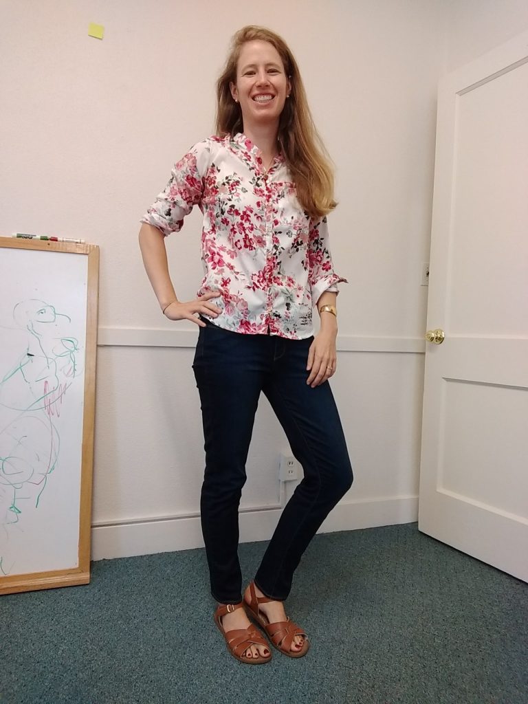
First up, a variation on what I wore my entire first week: jeans + blouse. Please note the authentic office decor including a not-yet-mounted-but-already-drawn-on-by-office-children white board:

IMG_20170912_131502087

Blouse: no label, thrifted
Jeans: Paige, thrifted
Sandals: Saltwaters, retail

The best thing about this blouse – besides the delightful colors in the floral pattern and the collarless neckline – is the hem. It draws the eye pleasingly upward instead of chopping me in half horizontally:

IMG_20170912_131538337

And the toes! Can’t forget to showcase the nail polish matching the shirt:
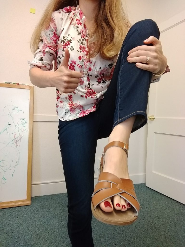
IMG_20170912_131625984
This is a level of coordination I rarely achieve.

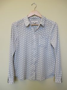
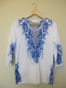
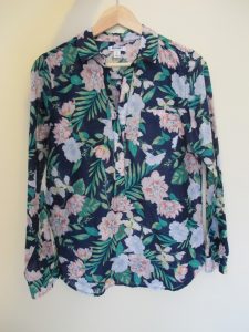
Basically all last week I wore these jeans plus a similar top. E.g. these:
IMG_5600 IMG_5562 IMG_5568 IMG_6364
Banana Republic Heritage, Loft, Chico’s, Old Navy.

Here is another work outfit, on the even more casual side, which I posted last week:
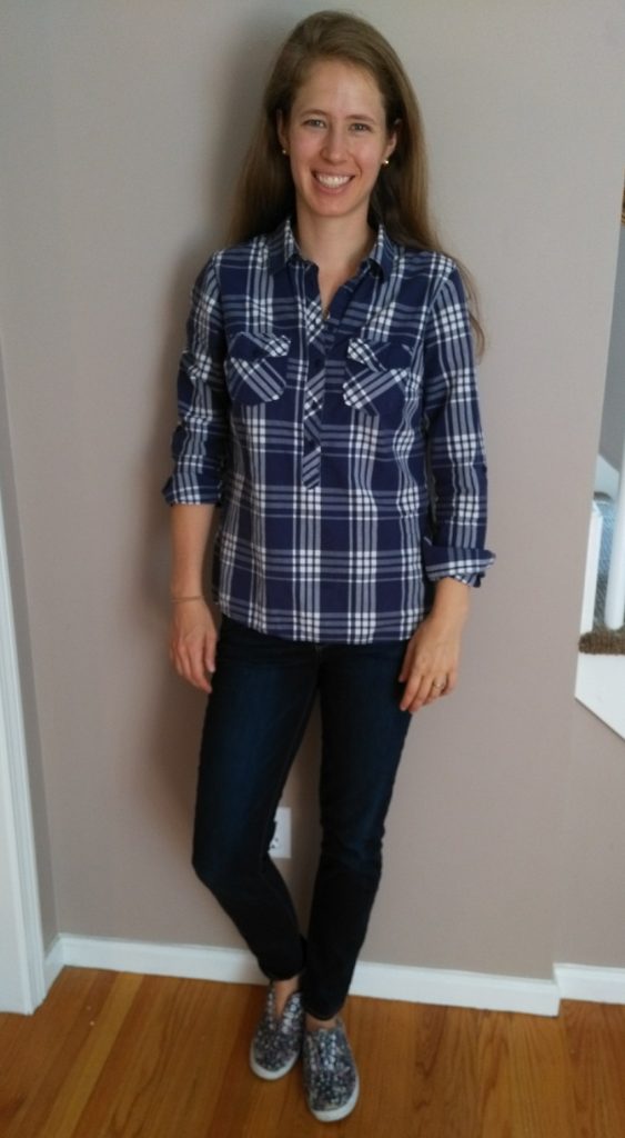
IMG_20170830_152554
Shirt: Kenar, thrifted
Jeans: Paige, thrifted
Shoes: City Sneaks, thrifted

Each day I chose sneakers or sandals depending on the morning’s briskness. I added this blazer one especially cool morning:
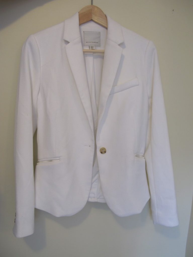
IMG_6371
Mercer & Madison, a new thrift find already coming in handy.

This week I was feeling the need for something fresh, so I broke the outfit mold – and found a place to take decent outfit pictures! (Now I just need to work on focus and exposure, ha.)

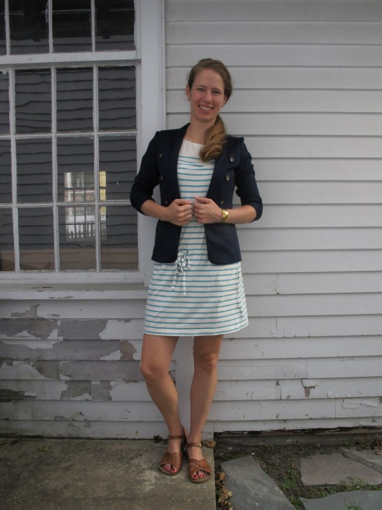
Behold, my shabby chic garage siding, and a dress/blazer combo:
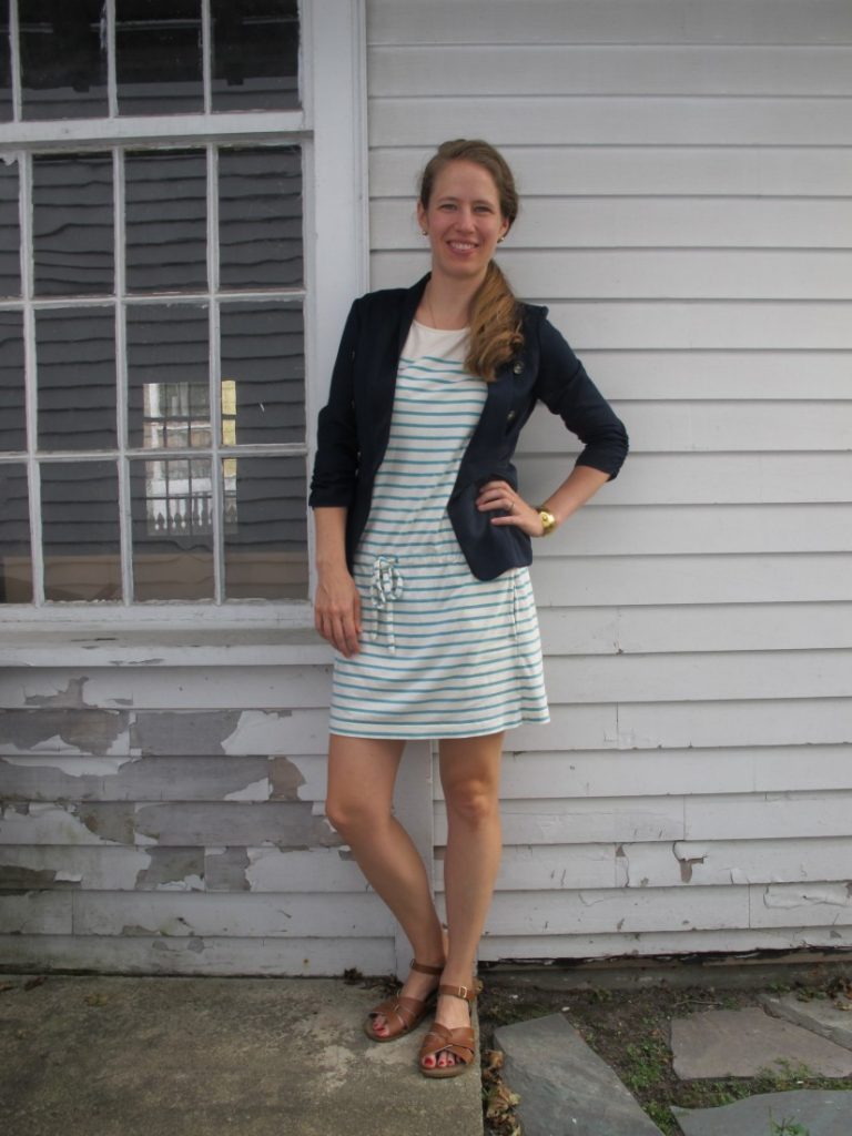
IMG_6404
Dress: J. Crew, thrifted
Blazer: Charlotte Russe, thrifted

Cuff bracelet: Monet, thrifted
Sandals: Saltwaters, retail

IMG_6409

^^I wore this for staff meeting and some office work.

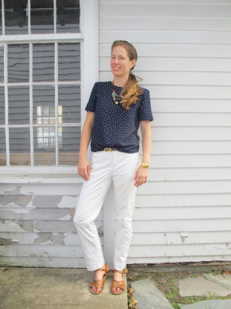
The day before I sported this outfit for office work & pastoral visits:

IMG_6413

Top: Jacqueline Ferrar, thrifted
Pants: Banana Republic, thrifted
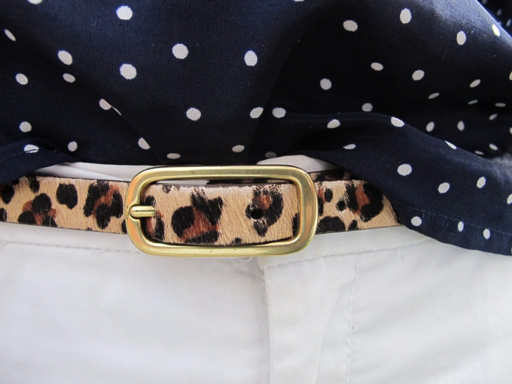
Belt: J. Crew, thrifted
Cuff bracelet: Monet, thrifted
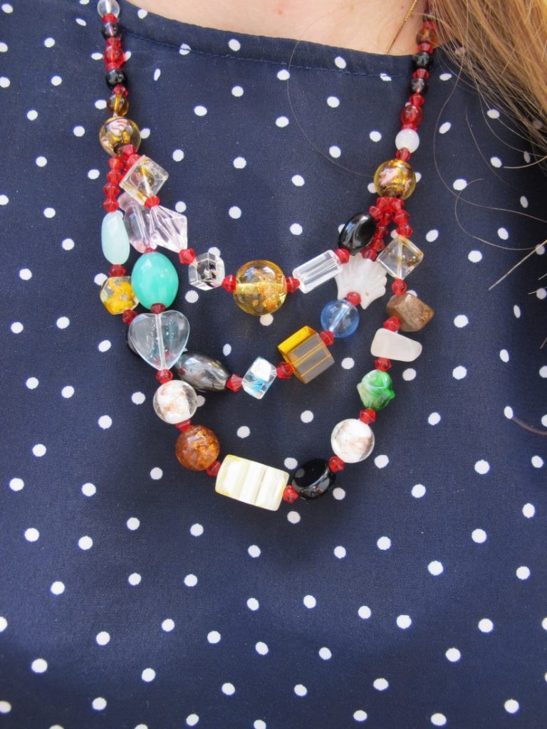
Necklace: street vendor, Washington D.C.
Sandals: Saltwaters, retail

IMG_6418

IMG_6420

Love that pop of leopard and gold showcased by a little t-shirt tuck.


Where do you fall on the formal/casual divide? How do you dress something up or down as the occasion/setting requires?

 

What I Wore: Classic Nautical

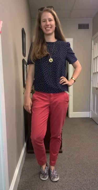
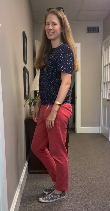
This is 100% classic Leah. A muted nautical palette, print-mixing, gold accents, and a “gentlewoman chic” silhouette:
WP_20170626_13_48_33_Pro

Everything thrifted but the necklace & sunglasses:
Top: vintage Jacqueline Ferrar (yes those are shoulder pads!)
Pants: Bandolino
Shoes: City Sneaks
Belt: J. Crew
Cuff bracelet: Monet
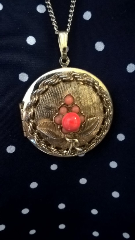
Necklace: vintage from my grandma
Sunglasses: Ray-Ban via Costco

WP_20170626_13_48_44_Pro WP_20170626_13_51_26_Pro

Styling: It’s funny, I don’t think I’ve ever showcased this outfit on the blog or on Instagram, but I do wear it often – so often that I don’t even have to think about the pairing. The boxy fit of this blouse plus the longer, tailored sleeves dress up the chinos nicely.  I’ve also done this look with dressy sandals and champagne flats, but it’s summer casual at my office, so I just went all out with the floral sneaks.

Thoughts: This outfit isn’t groundbreaking, but it is “me.” The color palette and tailored top + casual pants just feel like no-brainers and I feel relaxed and chic at the same time.
Do you all have an outfit you wear so often it doesn’t feel remarkable to you at all – yet it has enough oomph to keep you coming back? Scroll down to comment!

Print Mixing 101

1 (2)

On Tuesday I talked about where to put your prints, arguing that the simplest way to a streamlined closet was to pick just one place for your patterns.

Where’s the fun in that, you say??

Well, if you’re a print lover (or you want to be), this post is for you.

Tips for Mixing Prints (from dipping a toe in to daring)

  • Mix subtle and bold. As mentioned Tuesday, a pinstripe, tiny polkadot, glen paid, very faded/light print, or even a seersucker stripe will read neutral when paired with a larger, bolder print.

A photo posted by LeahLW (@thriftshopchic) on

  • Use texture as a print.  Like the subtle prints mentioned above, lace, tweed, cable knit, etc. all walk the line between full-blown pattern and solid and will help ease you into the world of print mixing.

A photo posted by LeahLW (@thriftshopchic) on

A photo posted by LeahLW (@thriftshopchic) on

  • Break it up. Use a wide, solid belt or a color-block top with solid on the bottom and pattern up top to create visual interest without visual overload. My favorite way to do this is with fun shoes on the bottom, a solid pant, and a printed top:

A photo posted by LeahLW (@thriftshopchic) on


  • Stay in the same color family. If the main background colors of your prints are pretty close, it’ll read as a variation on a theme instead of competing narratives. Likewise, think about whether your prints are generally the same warmth/coolness* or saturation – layering neons over rich autumnal colors is just gonna make everyone queasy.
    (Check out these two Into Mind posts for an intro to color theory – e.g. what the heck is saturation? – and examples of harmonious color palettes for your wardrobe.)

Ps #printmixing ftw

A photo posted by LeahLW (@thriftshopchic) on


  • Mix two different genres. Floral + stripe.  Stripe + animal. Polkadot + tweed.  Monochrome check + bold cartoon colors.

A photo posted by LeahLW (@thriftshopchic) on


Speaking of monochrome…

  • Black & white + color. There’s enough of a contrast between black-and-white and colors that our eyes tend to read them as background + foreground (or vice versa).  For your colors, stick to bold and bright, more saturated hues if you don’t want to muddy things up (i.e. navy is probably not a great idea here, nor are super-soft pastels, unless you tone down the black in your monochrome to a correspondingly soft grey).
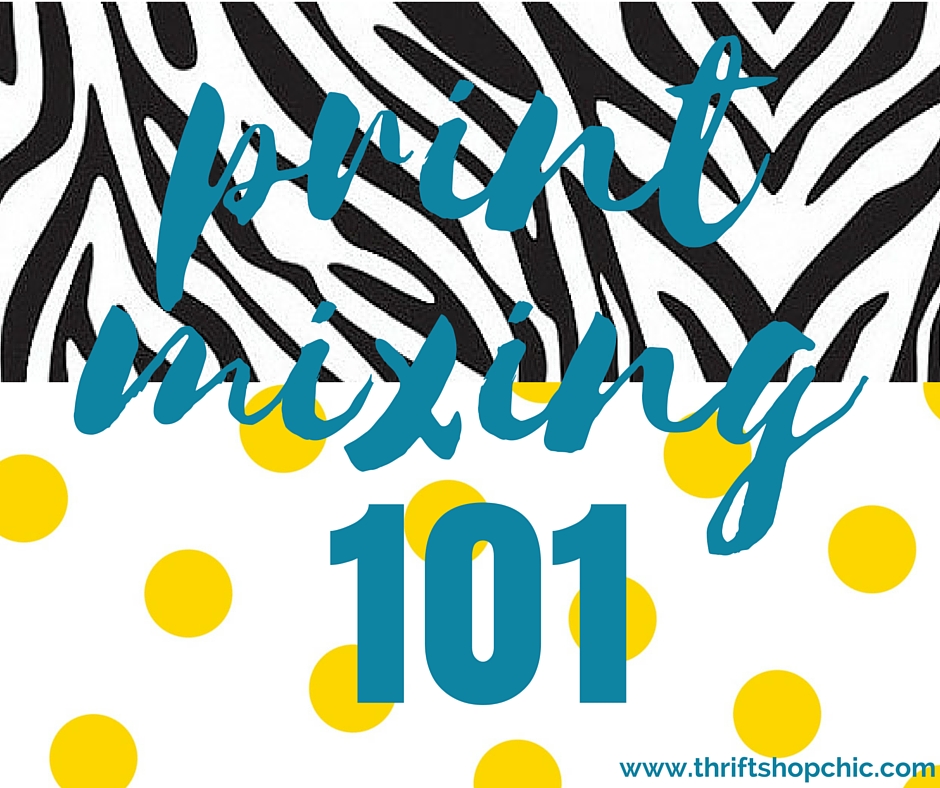
    I have very little black in my wardrobe so I have no outfit examples to show you, but the graphic at the top of the post is a good illustration of how well this works.


What are your tips for mixing prints?  Do you love to live on the leopard/zebra/tiger stripe wild side, or are you print-mixing shy?


*Apologies to artists everywhere.  Saying more blue/yellow/red instead of warmer/cooler is pretty confusing for us non-artists.