What I Wore: Town Festival & Preaching with a Pattern

Hi all! A few what-I-wores from the past few weeks, wherein I bust out a new thrift find and accessorize an old one (and where I achieve somewhat better focus for my outfit shots). These outfits spanned the hot, then cool, then hot again end-of-summer weather we’ve been having in New England; if you’re having the same kind of weather, hopefully you’ll find them useful!

First up, my outfit for the town fair, which involved 5+ hours of walking around booths and staffing our own, getting to know people, nabbing books at the library sale, and eating Thai food and cupcakes the girls soccer team made. I needed something casual but easy to spot as I wandered the crowds being introduced and introducing myself hither and yon. Luckily a thrift find the day before at the Davis Square Goodwill hit the spot:

IMG_6427
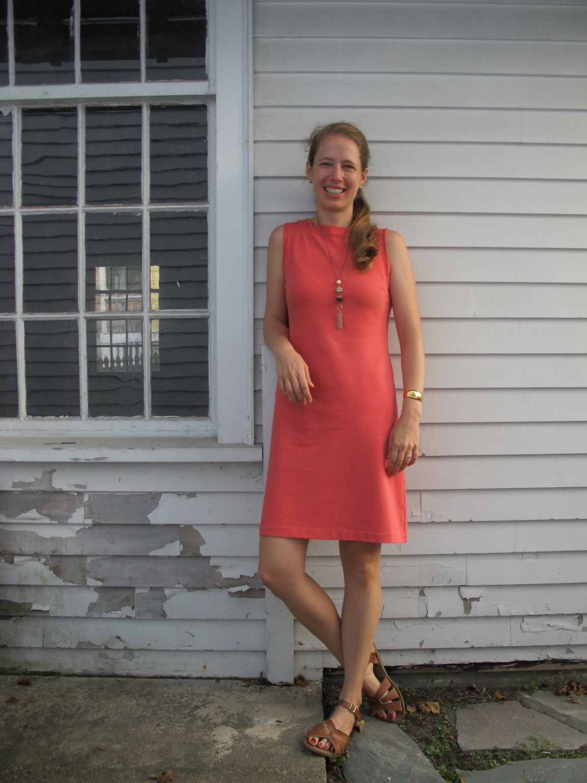
Dress: Talbots, thrifted
Necklace: DIY from thrifted parts
Bracelet: Monet, thrifted
Shoes: Saltwaters, retail

I pulled an ERII and decided to dress myself in one color for visibility; after that it was a matter of adding simple accessories for a touch of detail (necklace) and for functionality (bag):

IMG_6425
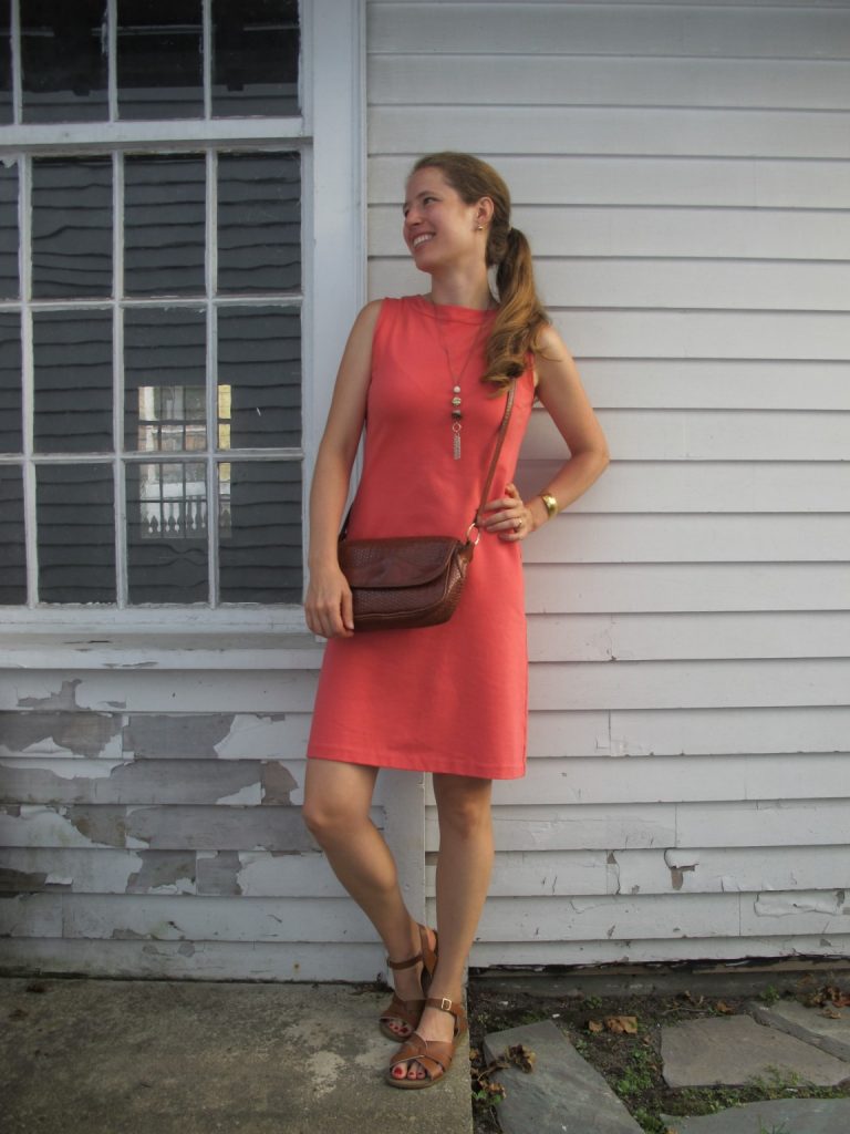
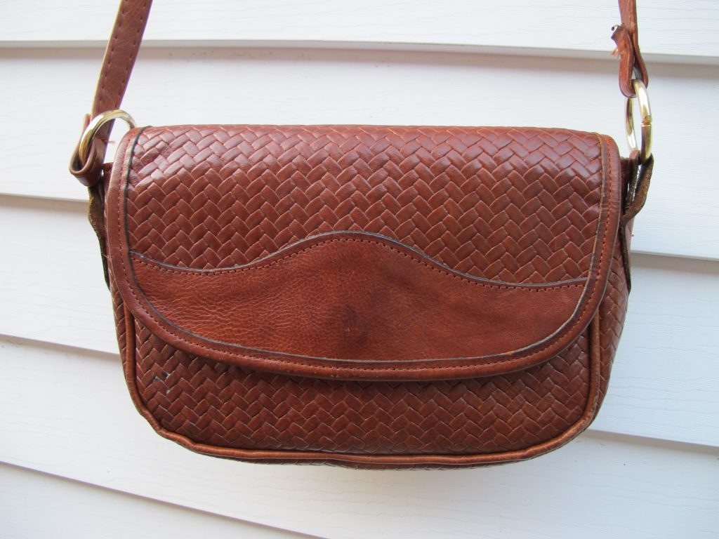
Bag: Marco Avané, thrifted

I love the warmth and cheeriness of the coral/salmon color and its polo shirt-adjacent feeling, which fits my town’s casual vibe so well.  It’s like the Massachusetts version of this dress, which was too stiff and scratchy and formal but whose color I loved:

A photo posted by LeahLW (@thriftshopchic) on


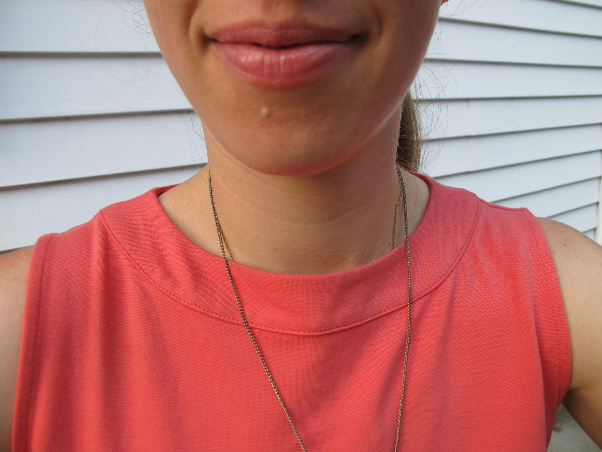
Here’s a look at the collar, which was wide and casual but whose neat finishing polished things up a bit:

IMG_6434

A closeup on the bag for those who haven’t seen it yet:

IMG_6435IMG_6436

…and on the necklace, although this shot showcases that I need to spend a little time with the sweater stone on my new purchase to tame the micro-pills.  This shot is also rather pink in color whereas the above shots come out more on the orange side; the true hue lies somewhere in the middle:

IMG_6433

One sizing note for Talbots, for what it’s worth: this dress was marked a full size smaller than what I normally wear. I’m not sure if that’s due to vanity sizing at Talbots or just that their items tend to be a little roomier in fit, but it’s a great reminder that you should trust your own eye on whether something might fit rather than the size label.

PS I wore this same outfit this past Sunday for preaching in a late-September heat wave and it worked perfectly to keep me cool yet looking collected.


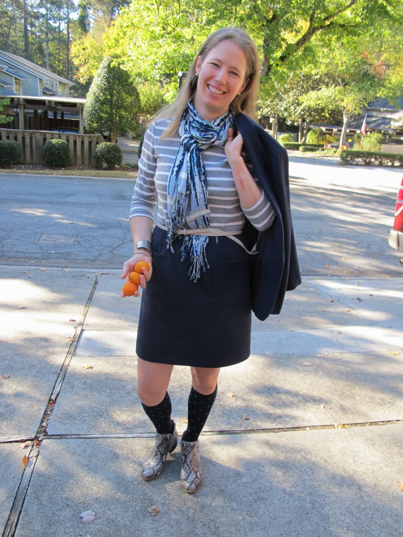
Up next: Sunday preaching. It was dumb to wear both long sleeves and leggings underneath my robes on a hot September day, but this ensemble was just right after worship was over and the robes came off:

IMG_6438
Dress: Land’s End, thrifted
Leggings: F21, thrifted
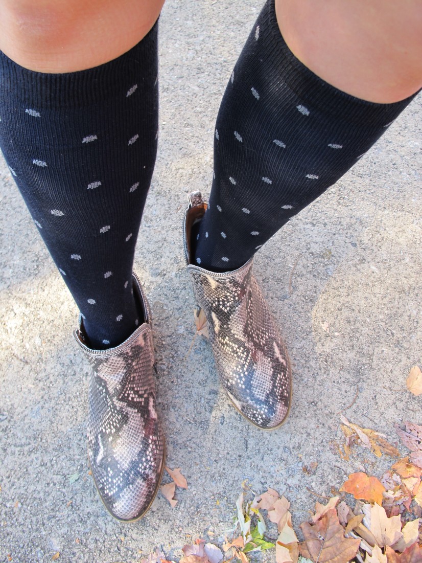
Wedges: Bandolino, thrifted
Scarf: no label, thrifted
Cuff: Monet, thrifted
Squinty eyes: sun reflecting off house window

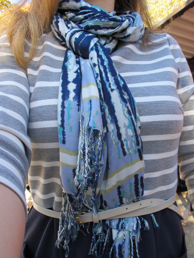
Let’s get a closeup on that scarf, which I found on the same trip as the Talbots dress:

IMG_6444

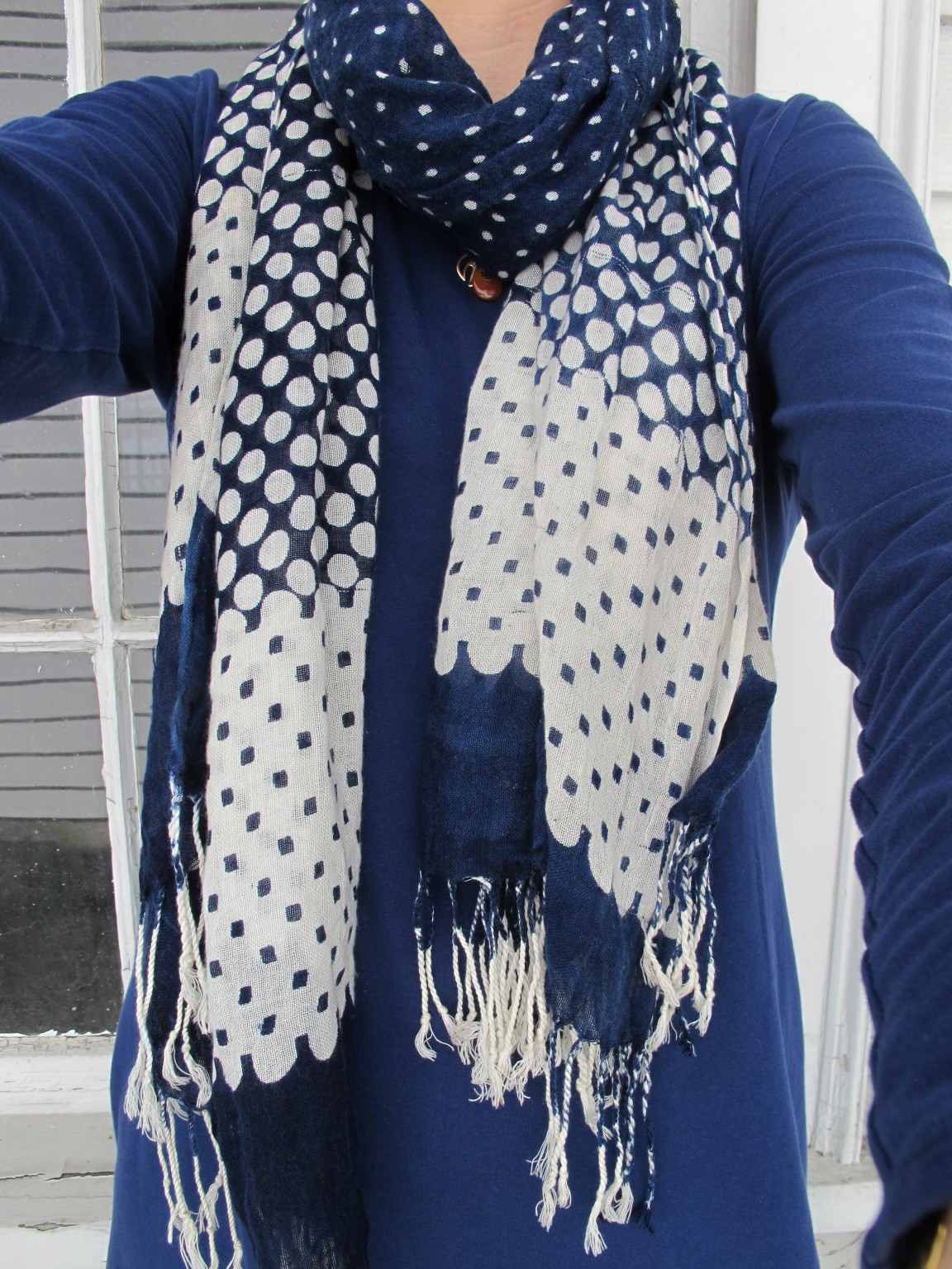
With scarves, I don’t really know what I’m looking for until I see it; this was a clear “YES” right on the rack. It has a few pulled threads and even what looks like a burn hole smack in the middle, but the pattern disguises all of that (as does rolling it the right way). My love of blue, polka dots, and print-mixing also outweighed its imperfections; who could resist two different dot patterns AND the awesome scallop effect at the bottom?

Have you ever bought something with imperfections you knew would be hidden by placement or pattern? What do you think of my finds? Do you agree with my (no longer so) revolutionary stance that it’s okay to wear white after Labor Day, particularly if it’s HOT?

Friday ReBlog: When You’re Uncertain How to Style Something Outside Your Comfort Zone

Hey, it’s Veterans Day (aka Armistice Day)!  If you’d like to honor a veteran in your life, consider donating to Justice for Vets to support life-saving and life-changing veterans treatment courts. 

This week’s Friday ReBlog is really just an excuse to talk about an outfit I wore this week.  But it’s my blog so I’ll just go ahead and claim it.

Caroline at Un-Fancy wrote recently about how to style something new to you that’s a little bit outside your style comfort zone.  Essentially, she said: pair it with other slam-dunks in your closet to help the new piece feel less out there and to help you feel more confident.

In somewhat related news, I stared at one of my favorite cardigans this week as it hung, lonely and unworn for much of the last year, in my closet.  Inspired by The Spirited Thrifter’s minimalist closet game, I was weeding out my closet and it was hard to justify keeping something the colors and pattern of which I love but which never gets worn.  (Traditional cardis are hard for me to style without looking like a twinset – which is just not me.)

Then I looked up to where I keep my blazers – a space increasingly filled with statement pieces – and realized I could style my patterned cardigan like a statement blazer to make it fresh.  So I paired it with a pattern like I had done with my plaid blazer earlier in the week and the print-mixing instantly took it from staid (and a little twee?) to visually engaging:

A photo posted by LeahLW (@thriftshopchic) on


So that’s my semi-related revelation for how to mix something that doesn’t really seem to be your style anymore back into your wardrobe.  What’s something y’all have been keeping in your closet that doesn’t really fit your current look but that could be restyled to play along?


PS My newest accessory:

wp_20161110_17_18_33_pro

Explanation here.


Have a great weekend, Thrifters!


What I Wore: Skinned Knee Chic

When your spouse is sick and you are singlehandedly making the church run with a toddler and you are preaching and you are LATE, you only get three outfit photos and you are HAPPY with them:

img_4533
Do you like how I turned a last-minute snack for my kid into an autumnal-colored accessory?


And when you have recently face planted while running and skinned your knee (and your elbow and your wrist) pretty significantly and your household has run out of band aids so you can’t wear pants or leggings (plus you ruined your favorite pair of leggings in said face plant) but it’s too crisp to go completely bare legged, you put on knee socks and pretend you meant to wear this all along (skinned knee not pictured out of consideration for the faint of heart):

img_4532

The print mixing, it is out of control:

img_4531

Color block/striped dress: Gap, thrifted
Blazer: Haberdashery by Personal, thrifted
Belt: J. Crew, thrifted
Scarf: my mama’s Kohl’s shopping spree
Socks: Target
Ankle boots: Lucky Brand, gift from my sister


Seriously though I did buy these socks for just such a look, hoping to encourage myself to wear skirts through fall and thinking that, with the ankle boots, it would read sort of like a tall boot (of which I have yet to be convinced I need to buy a pair although I would be happly to thrift some). Don’t worry, these socks came in a two-pack with plain navy so I don’t have to be in a 5-billion-patterns mood to wear them.

What do y’all think of the knee sock/ankle boot look? Or the tuck-your-scarf-into-your-belt look? (Very handy for showing off your belt and keeping the fringe out of reach of handsy toddlers/your coffee mug.) Or the print party? Scroll down to comment!


Print Mixing 101

1 (2)

On Tuesday I talked about where to put your prints, arguing that the simplest way to a streamlined closet was to pick just one place for your patterns.

Where’s the fun in that, you say??

Well, if you’re a print lover (or you want to be), this post is for you.

Tips for Mixing Prints (from dipping a toe in to daring)

  • Mix subtle and bold. As mentioned Tuesday, a pinstripe, tiny polkadot, glen paid, very faded/light print, or even a seersucker stripe will read neutral when paired with a larger, bolder print.

A photo posted by LeahLW (@thriftshopchic) on

  • Use texture as a print.  Like the subtle prints mentioned above, lace, tweed, cable knit, etc. all walk the line between full-blown pattern and solid and will help ease you into the world of print mixing.

A photo posted by LeahLW (@thriftshopchic) on

A photo posted by LeahLW (@thriftshopchic) on

  • Break it up. Use a wide, solid belt or a color-block top with solid on the bottom and pattern up top to create visual interest without visual overload. My favorite way to do this is with fun shoes on the bottom, a solid pant, and a printed top:

A photo posted by LeahLW (@thriftshopchic) on


  • Stay in the same color family. If the main background colors of your prints are pretty close, it’ll read as a variation on a theme instead of competing narratives. Likewise, think about whether your prints are generally the same warmth/coolness* or saturation – layering neons over rich autumnal colors is just gonna make everyone queasy.
    (Check out these two Into Mind posts for an intro to color theory – e.g. what the heck is saturation? – and examples of harmonious color palettes for your wardrobe.)

Ps #printmixing ftw

A photo posted by LeahLW (@thriftshopchic) on


  • Mix two different genres. Floral + stripe.  Stripe + animal. Polkadot + tweed.  Monochrome check + bold cartoon colors.

A photo posted by LeahLW (@thriftshopchic) on


Speaking of monochrome…

  • Black & white + color. There’s enough of a contrast between black-and-white and colors that our eyes tend to read them as background + foreground (or vice versa).  For your colors, stick to bold and bright, more saturated hues if you don’t want to muddy things up (i.e. navy is probably not a great idea here, nor are super-soft pastels, unless you tone down the black in your monochrome to a correspondingly soft grey).
    I have very little black in my wardrobe so I have no outfit examples to show you, but the graphic at the top of the post is a good illustration of how well this works.


What are your tips for mixing prints?  Do you love to live on the leopard/zebra/tiger stripe wild side, or are you print-mixing shy?


*Apologies to artists everywhere.  Saying more blue/yellow/red instead of warmer/cooler is pretty confusing for us non-artists.