This was written during the last week or two of my pregnancy but not edited/published before the babe got here – so just ignore the weird tenses that imply that I haven’t yet had the baby. I have! He’s wonderful! Hooray!
Despite the fact that my body is now closer to wearing pre-pregnant clothes than maternity wear, I’m covered in milk all the time, so I’m trying to spare my pre-pregnancy things from milk stains. Which means that pretty much all of the first paragraph of the original post still applies.
I will admit to having spent this last month or so of pregnancy daydreaming about the time when I will be able to wear more than just the same five maternity-friendly outfits on repeat. (As mentioned here, I don’t think it’s so much because I dislike having so few options at any one time – I am a serial re-wearer of favorite outfits, after all – but I am itching to get out some of the old favorites that are currently unwearable.)
The good thing about this enforced style break and daydreaming, though, is that it’s given me the opportunity to think about my style and how it is ready to evolve.
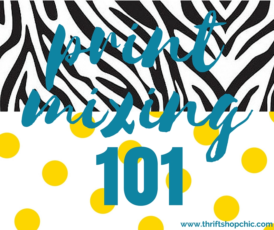
First up? Dresses with less structure and more flow, color, and print.
Story time: Last week I went thrifting at Global Thrift, a large independent store where I can easily spend a few hours roaming the racks (thank you, maternity leave). I was looking for a nursing-friendly frock in the dress racks when I saw a champagne-colored, sheath dress in a size I will likely be able to wear once things settle down post-partum. Sheaths had been a major part of my style in the not-too-recent past and I was tempted to thrift it even without trying it on.
But I checked the impulse to buy what’s worked in the past and asked myself whether I had really been excited, in the months leading up to maternity wear, about trotting out my existing sheath dresses. The answer, aided by a quick scroll through my Instagram outfit-of-the-day posts to refresh my memory, was no – even though sheaths look great on me, I’ve been more excited about dresses with more flow and more pattern, or shirt dresses. So I ultimately put the champagne number back.
Dresses that have rung my bell more than sheaths in the past 6 months:

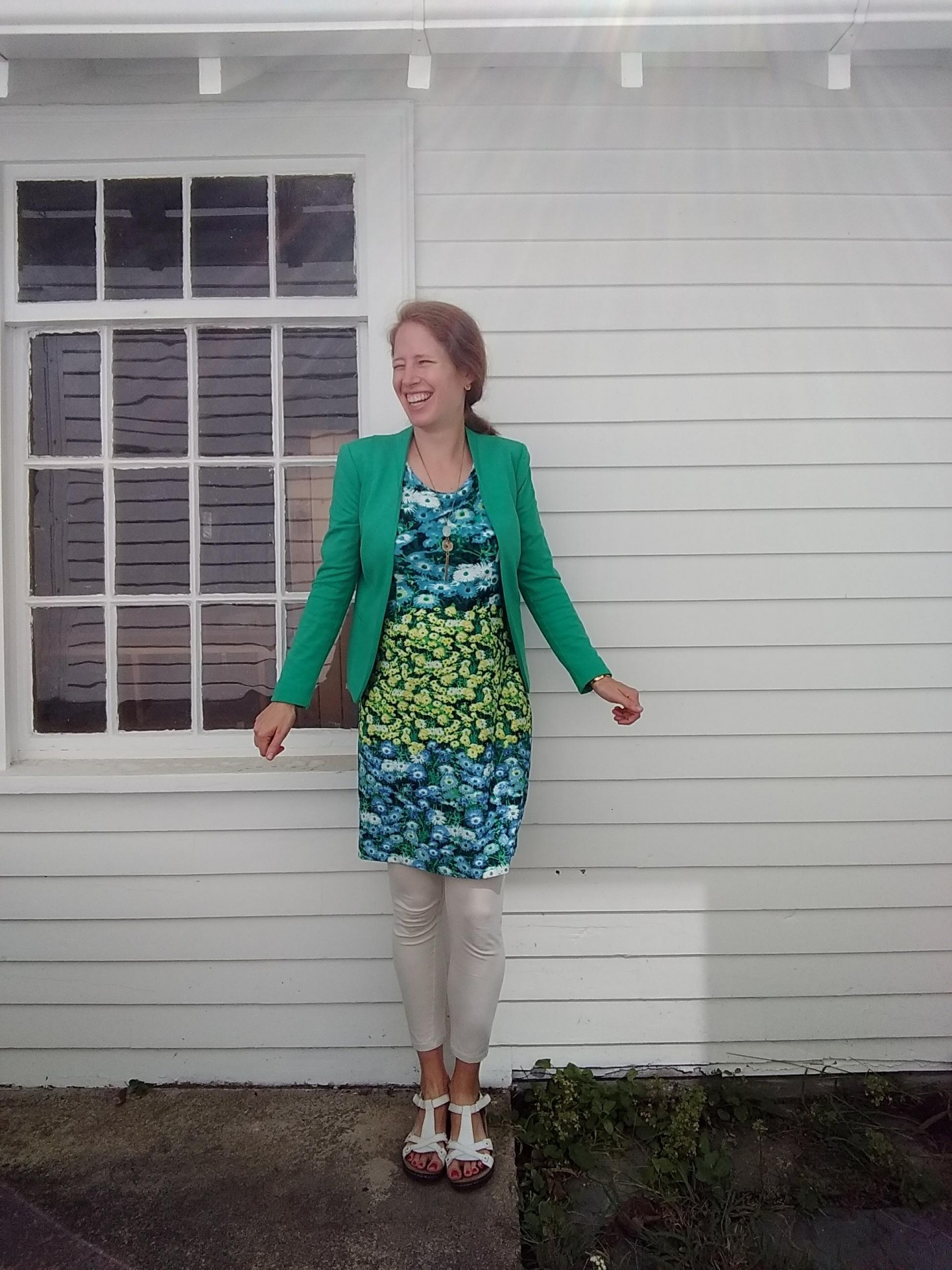
What turned me on to this new groove? Seeing Anna from The Anna Edit rock this flowing floral number by Ganni:
View this post on Instagram
Probably because it was such a bold new style choice for her, it has stuck in my mind as an example of how to freshen things up and bring movement and print into the dress section of my closet.
Next: trading pencil skirts for pants
Don’t worry, I still have my three favorite pencil skirts hanging in the guest closet. But I don’t think I have worn them even once since moving to New England. At my administrative job in Atlanta they read “polished and professional,” but they feel a bit overdone here in the L.L. Bean wonderland that is the greater Boston metro area. Plus it often feels either too hot (all of summer) or too cold (most of fall/winter) for fitted skirts, and I’m not a fan of layering skirts over leggings to compensate for the cold (too many things trying to cut me off in the middle!).
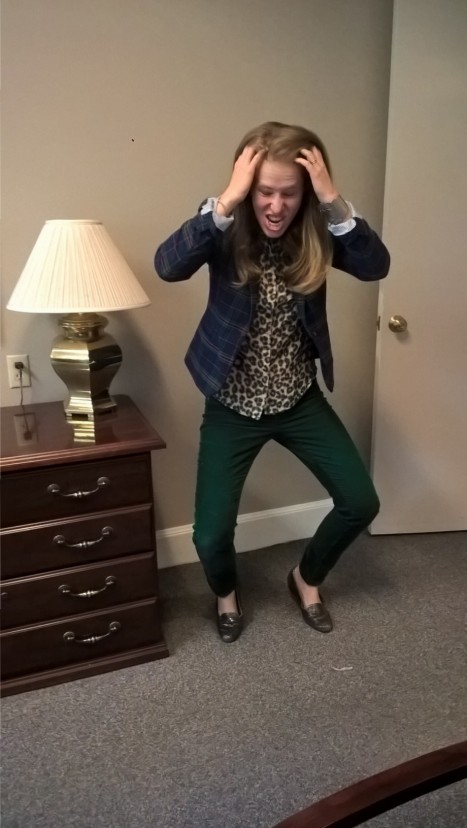
So I’ve noticed a natural shift toward pants – jeans, occasionally, but more often corduroys (winter) or lightweight, bright/patterned pants. I’m thinking about how to bring some more print or textured depth into my pants + blazer game so I don’t just look like a giant color block:
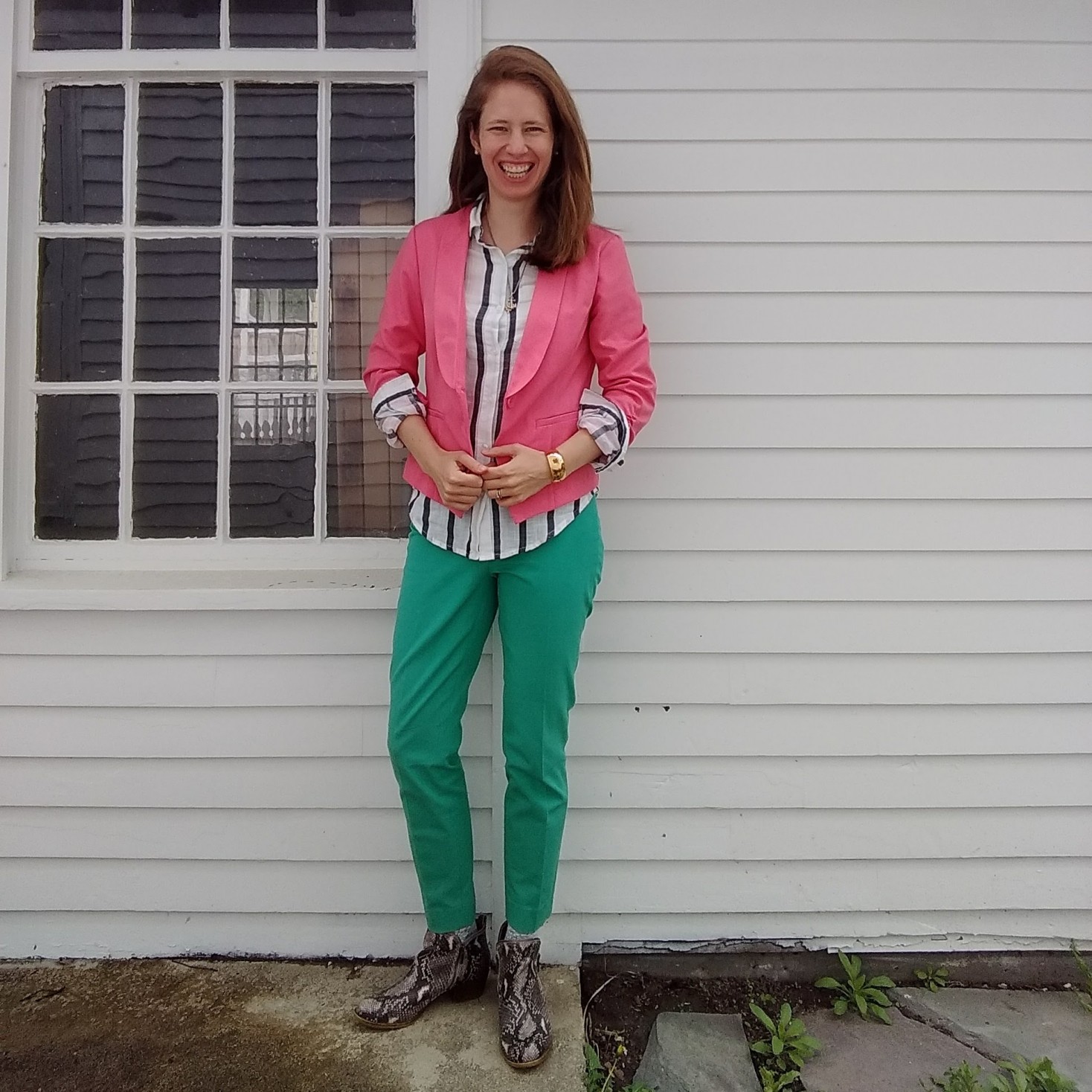
I call this look (styled by my preschooler) “Watermelon Referee”
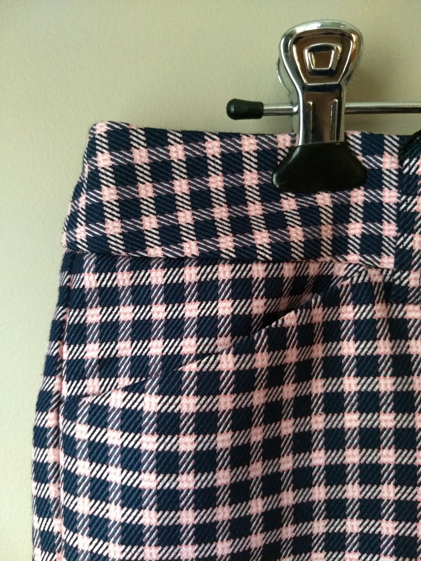
I’ve already stuck my toe back into patterned pants with these plaid trousers from Express (via Poshmark):
and into patterned blazer territory with this oversized find:
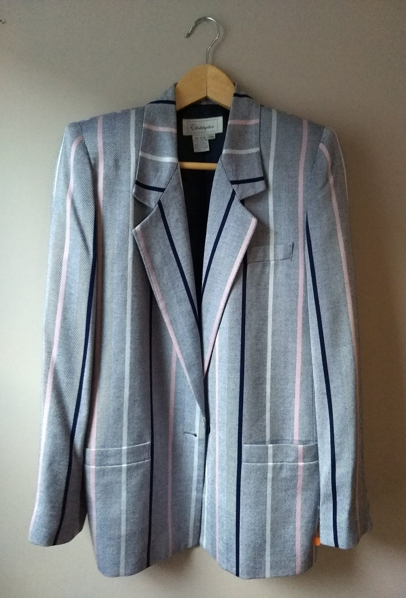
I like how I imagine being able to style the blazer (with solid colored slim fit pants and a white shirt, or a navy or grey turtleneck), but now need to think about how I want to parse out having pattern up top and also in my pants. (Side note: both my mom and my spouse love this blazer. I’m not sure what that means since they have wildly different tastes…)
My current inspiration for doing more with print/pattern? Frances Ayme’s excellent pattern-and-print mixing:
View this post on Instagram
and Kelly of Alterations Needed, who wears very little besides black, grey, and white but who uses print and texture so well:
View this post on Instagram
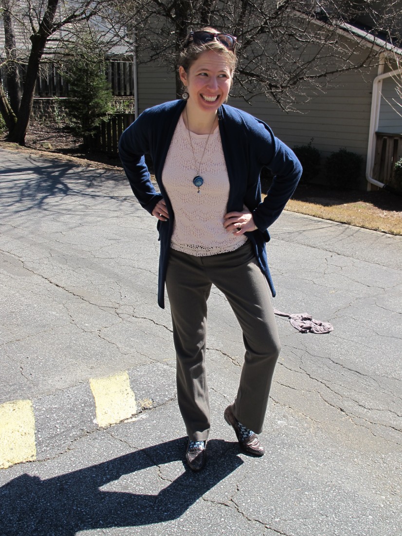
And, turns out, my own print-mixing self from a few years ago! (Many more print mixes in that post):
I did a pretty good job there, and want to return to that sense of fun details and personality in my wardrobe (often helped along by socks).
I’m pretty happy with my shoe game at the moment, but having worn nothing except my running shoes (for walking) or my snakeprint ankle boots (for everything else) during the last trimester, I’m realizing I don’t love my tall grey boots and could probably use a cold weather shoe or boot to take their place: snow-friendly but appropriate for indoor events. The way the snake print of my ankle boots lends “oomph” to an otherwise simple outfit has clued me in to look for something similarly interest-adding at the thrift store. I have no idea yet what that will specifically look like…
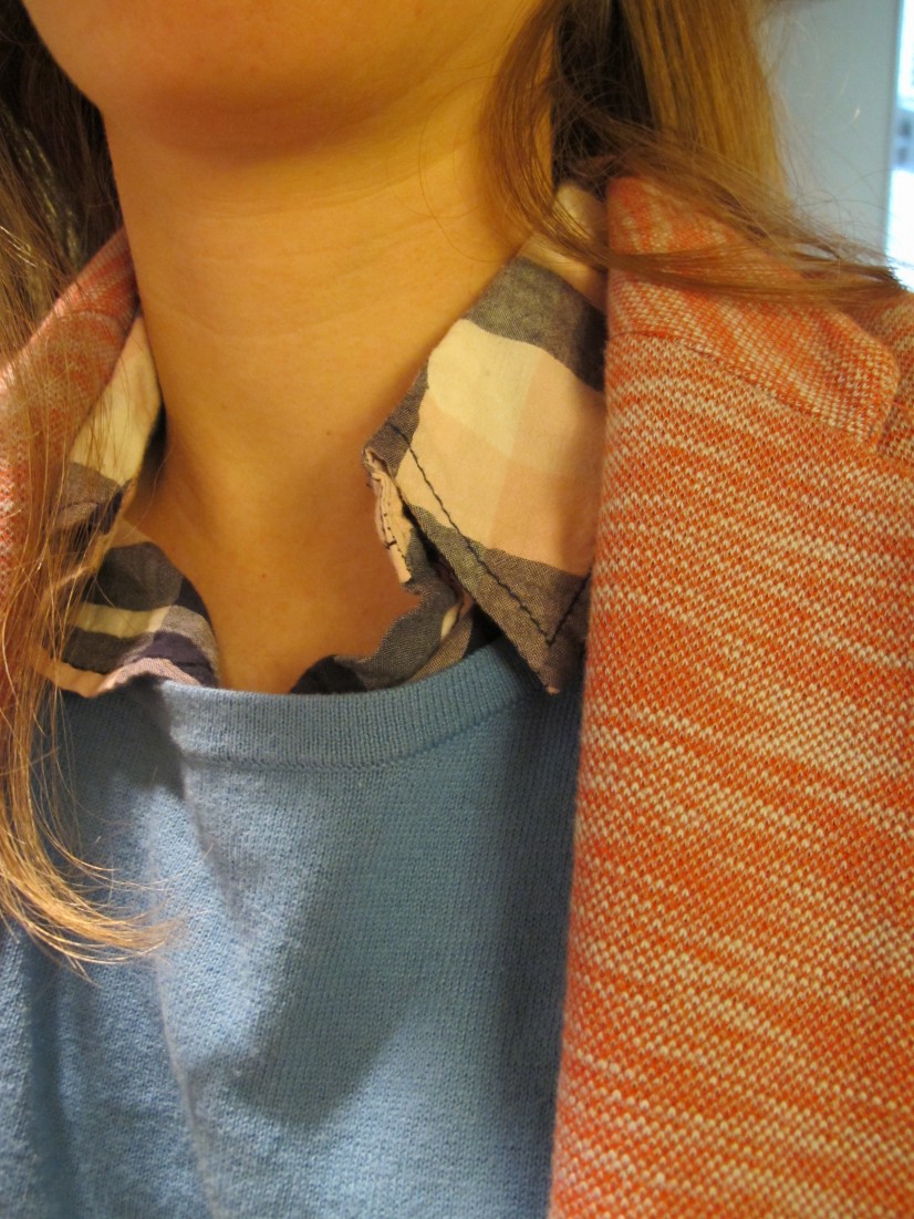
I’m getting interested in patterned scarves for a similar reason: though I’ve rarely felt instinctively comfortable with how to wear them, I keep seeing them add that extra something to complete a look and I want to experiment with that in my own outfits.
Here’s one place I did it successfully:
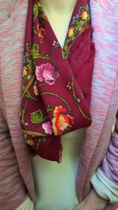
I’ve since given away that scarf because it didn’t fit my Light Summer color palette – and it’s one of the very few things I regret donating!
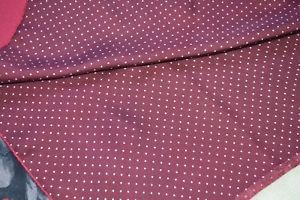
Here’s my original inspiration for patterned scarfery – Ellen Page’s character in Inception:
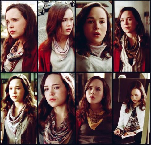
I usually see older women rocking patterned scarves but the styling here made me realize it could work on younger women, too, and that it could be an everyday look, almost a signature piece. Now I just have to convince myself that I’ll be able to find this exact shade of berry-almost-maroon on a polkadotted scarf that costs a fraction of the $100 listing for this Paul Smith silk scarf I’m lusting after:
Wish me luck, ha!
I’ll report back later with how all of this eventually plays out when I can wear more than 10% of my wardrobe again. Until then, I’m slipping back into pj pants, nursing pads, and a sweatshirt. Ciao!