Personal Color Analysis, Part 2

I was tired of buying clothes in colors that didn’t feel great on me, so I got my colors done – i.e., had a personal color analysis to figure out what colors really light me up. You can read about the analysis here

V. Shopping My Closet

I got home after my personal color analysis appointment and wanted to swatch all my clothes right away – but instead I hung out with my preschooler. :) I haven’t yet finished going through everything, and I’m not great yet at swatching – it takes practice to evaluate all those value/hue/saturation factors at a glance! – but it’s safe to say that I do NOT have a lot of Light Summer colors in my closet.

IMG_20171216_162906_547
Not a lot of these.

Yet in Light Summer’s palette recognized the only purple I have ever thought looked good on me; the brushed, muted metallics I’m drawn to in jewelry and shoes; and the blued green of a favorite dress (long since donated due to pilling). Yay for some sort of color intuition!

Here are the best bets I’ve found for Light Summer clothes already in my closet – apart from the blue sweater which Hope helped me swatch, I’m not 100% sure they all work since I’m still learning to match colors:

IMG_5666 IMG_5671 IMG_3784 IMG_5668 IMG_20180106_095700216 IMG_5568 IMG_5572 IMG_5562 IMG_5593 IMG_5596 IMG_6364 IMG_20171004_180532576 IMG_5678 WP_20170517_12_54_25_Pro IMG_5584 IMG_20171124_150421752

and these shirts, donated for being too small across the shoulders/chest, and these shoes, which I wore holes in – rest in peace!
IMG_5569 IMG_5566 WP_20170512_16_23_30_Pro

and this blazer, which I LOVED but donated because I thought the grey was too cool….smh:
IMG_5579

You’ll notice that almost all my “Light Summer” pieces are warm weather clothes, while pretty much everything in my cold weather wardrobe is from some other season (mostly fall, I think). Katie of Dressed on a Dime posted yesterday about how her wardrobe had strayed from colors she loves that look good on her due to a combination of dressing in “seasonal” colors and neutral-heavey Instagram inspiration…and I am guilty on both counts. Should be fun putting some real color back in my winter wardrobe!


VI. Thrifting for Light Summer 

IMG_20171226_130119584Top to bottom: yep; maybe; nope (True Summer, I think)

Given said holes in my wardrobe and, of course, my love of thrifting, I spent a couple days over the holidays training my eye to spot Light Summer colors. Here are a few I found that I didn’t take home (again, remember that lighting, photo settings, and monitor settings will distort each of these to some extent):

An otherwise perfect green J. Crew shirt that was too tight – boo!; not my size, wanh wannnnh; too big with some moth holes:
IMG_20171228_115855943_BURST001 IMG_20180101_164425578 IMG_20171226_130756606


And here are some I took home:

IMG_20171228_115654037 IMG_20180101_174619762 IMG_20180101_174959225 IMG_20180101_171053399 IMG_20180101_171303058 IMG_20180101_160146765

Those yellow pants – I die! And those turquoise pants (warm weather, I admit), fit like a DREAM. So chic – they even have little notches in the pant hem. I’ll post better pictures when it’s actually warm out.

Let’s see that grey turtleneck up closer – though this picture is over-exposed, in it you can see that this is chock full of summer-y colors:

IMG_20180106_095312519

And in my own home-made draping attempt, here are two of the sweaters up against my face and a neutral-ish grey background:

IMG_20180110_091617366 (1) IMG_20180110_091549448 (1)

That pink is still a little too hot pink in the pictures…but you get the idea. And yes, I hate cableknits; it’ll serve as a placeholder ’til I find something non-cable-y in an equally glorious blue.


VII. Conclusions

I’ve worn color in good doses most of my life; it’s only recently (and largely thanks to Instagram and style bloggers) that I’ve loaded up on neutrals. I’m a little hesitant to wear, say, purple pants with a yellow top; but I am curious to see whether wearing more color brings a little more zip to my days, since many folks who have found “their” colors report a shift in how they feel and how they see themselves.

I’m not going to chuck everything that doesn’t fit my newly discovered season; I have some favorites I suspect I’ll keep no matter what. But I do feel a new permission to let go of things I wasn’t loving that aren’t in my color wheelhouse; and an excitement to go find yellows and greens, berry hues, and maybe even some purples (!) that work since those colors are so absent from my wardrobe.

And I ended up with a few colors I don’t really care for: stoney grays that feel “blah” to me, periwinkle, and a drab-ish yellow.  I’ll put them on the backburner until I’ve built up garments in some of the colors in the palette that I’m more drawn to, then see how I like them when they’re playing with colors they resonate with.

Overall, I’m glad I did it; I feel like the uncertainty I had about what works is gone. I am still a bit nervous to build a wardrobe out of colors I have neglected for so long; but mostly I’m excited, because it means I get to spend a lot of time doing something I love: thrifting.

Thanks for reading along. Let me know if you’ve ever had your colors “done” or wondered what it would be like, or whether you’re a color genius who already knows what looks great on you!

I Got My Colors Done: Personal Color Analysis, Part 1

Happy New Year, y’all! I’ve been busy with the holidays, travel, shoveling out from a cyclone bomb (whatever that means!), and reworking my thrifting game after getting my “colors” done – aka having a personal color analysis. This whole saga is on the long side, so I’ve broken it up into 2 posts with section headings to keep everything digestible. Enjoy!


I. Personal Color Analysis

Personal color analysis (PCA) has often been used as a fashion weapon to declare that people (usually women) with certain skin tones, hair or eye colors should or should not wear particular hues. So let’s just get this out of the way: you can wear whatever colors you damn well please.

If you’ve been reading here awhile, you know I’m not interested in following fashion rules just because someone decided that this or that cut, color, or style was flattering on a certain body type, skin color, etc. So often the word “flattering” is just toxic code for body-shaming, and I am not into that.

What I am into is knowing how lines, colors, and styles work so that I can play with them and decide how I want to use them to create a look I like – a look that feels like me.

For awhile now I’ve been wanting to use PCA as a source of knowledge that helps me pick out clothes I love and will wear. Too often I’ve thrifted something I really liked, only to leave it hanging in the closet because the color, actually worn on my body, made me feel blah, weighed down, too serious, or made me look like I hadn’t gotten enough sleep.

You know the feeling?

To figure out where I was going wrong, I started researching personal color analysis. PCA operates on the premise that everyone has certain hues that complement their complexion – and others that clash. It’s not about your mother telling you never to wear yellow (or always to wear blue), but rather finding out which yellows and blues go best with your unique skin, allowing you to make informed decisions about the colors you wear.

In my research I quickly learned that PCA has evolved a lot since the days of Color Me Beautiful. You might remember Color Me Beautiful as the four seasons style model where every blond was a “Spring” or a “Summer” and every person of color was an autumn. (Please. Like everyone with skin less pale than Cruella Deville’s has identical skin tone.)

1432048170-cruella-de-vil-101-dalmatians
Nah.

II. 12 Blueprints

Some PCA systems are still based on the “what color are your skin + hair + eyes?” equation that often slots people into categories that don’t feel like “them.” 12 Blueprints, the PCA system I liked best, has 12 seasons instead of the classic four, and instead of being based on a surface-level equation, it involves meticulous comparison of different colors against your skin to see what value (light to dark), hue (warm to cool), and saturation (grayed out to pure color) light you up. It’s analyzing your skin’s undertone, which is different from, and harder to see than, the more obvious overtone that presents at face value (ahem, pun intended).

Because of my artist sister, I was already familiar with value/hue/saturation, so the color calibration behind this system made total sense to me. If you want to paint snow, you’re not just going to paint it white, you’re going to use lots of different whites with lots of different other colors mixed into them. Why wouldn’t human skin be just as complex, and just as responsive to variations in value/hue/saturation? (My sister would kill me if I didn’t point out that artists don’t say warm/cool; they say “more yellow” or “more blue.” But I digress.)

The other thing that made sense to me about 12 Blueprints’ approach? It insists that you can’t figure out your season from photographs or by description of features, but only in person. Is that frustrating for those of us who just want to look up some online tests and get an answer? Yes. Is it convenient for a PCA system that relies on in-person consultation by a paid analyst? Yep. But it also makes perfect sense. I look completely different in different photographs based on the lighting, time of day, etc., not to mention that cameras capture colors differently, and computer monitors display the exact same image differently based on their hardware and settings.

Plus, I had a hard time finding conclusive results based on online tests that all seemed utterly subjective. 12 Blueprints uses drapes specifically calibrated to help you (and the analyst) figure out if your undertone is cooler/warmer, darker/lighter, etc. So while it does rely on human eyes to make the final call, there’s a systematic series of comparisons to help arrive at that decision.

Some people, by the way, are much better at figuring out the colors that go with their complexions than I am – if you are naturally drawn to certain colors that make you come alive, that make your skin sing – good on you! I’m not so great at it and was done with guessing and wondering. I was also done with spending money (even thrift money) on clothes that just feel “off.”


III. Colors by Hope

So I started looking for an analyst, and lo and behold, I found Hope Turner just a few miles away from me. Two things I loved about Hope’s take on PCA: one, if a color you love to wear isn’t part of your “season,” who cares? Wear what makes you happy. Not only do I agree with that, but it let me know she didn’t take this whole thing too seriously. I felt like she wasn’t married to the system for its own sake but uses it because it gets the best results.

And two, Hope acknowledges that PCA as an industry has largely ignored people of color. Part of the reason she decided to learn 12 Blueprints’ method is that it treats people of any and all skin colors as unique individuals who come with their own glorious coloring, making it impossible to lazily slot everyone with brown skin into “autumn” or maaaaaybe “winter.”

A generous gift made it possible for me to book an appointment with Hope, and it was a blast. After chatting about the R2D2 jello mold hanging in her kitchen (a good omen) and making tea, Hope walked me through the basic scales we’d be talking about – the aforementioned value, hue, and saturation. She also walked me through the 12 seasons or tones – Bright Winter, Soft Summer, True Autumn, etc. Then we got to draping.

Draping consists of the analyst flipping back and forth between two large fabric swatches meant to help us decide whether I was more this or that on a particular scale. It’s done in front of a value/hue/saturation neutral grey to eliminate interference from other colors. Hope described what she was looking for – does the person in the mirror look more approachable in this color? More at peace? More outgoing?  Does the drape overwhelm them, cause them to look ill or dull? Does it bring out redness or yellowness in the skin, or does it seem to balance the skin out? Etc.

Seb+PCA1 Scott+True+Winter1
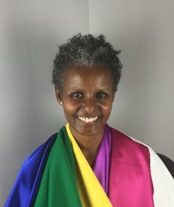
A couple of Hope’s clients with the drapes that work for them – credit.


IV. I get draped!

The process was pretty demanding, attention-wise – during a three-hour appointment, we spent the majority of the time draping. That’s a lot of looking at your face and trying to notice very subtle differences! Luckily Hope started off by saying that while she wanted my input and wanted me to see for myself the colors that worked (or didn’t), it was her responsibility to guide the session and to see and interpret subtle nuances she has been trained to analyze. (Each 12 Blueprints analyst does 20 case studies in training and Hope has had many more clients beyond that.)

So I tried to relax and enjoy. Inside, though, I was nervous – was I going to end up with a season whose colors I hated? What if I disagreed with Hope?

Because my skin often looked yellow to me, I figured I was some sort of Spring, one of the “warm” (aka yellow-er) seasons. But I had read enough on the 12 Blueprints website to know that I could very well be wrong. And I had also read enough to know that when someone is surprised by their season, it can take awhile to live into it – to really feel like these colors are “you.” (If you never feel at home in your assigned colors, you were probably mis-analyzed, which luckily doesn’t seem to happen much with the 12 season calibrated drapes approach.)  I could, of course, keep wearing whatever I wanted – but the reason I was doing this was to find out which colors really enhanced my complexion, and I didn’t really want those colors to be colors I disliked – say, icy greys or baby pinks.

Here was the most interesting part of the process – Spring colors looked okay on me (better than pure black/white or the deep tones of winter), but they also made my face look yellow. This didn’t strike me as necessarily bad – I was used to seeing my skin look yellow compared to my husband’s and my kid’s, and even yellow in the mirror – which I read as sort of “healthy tan.”

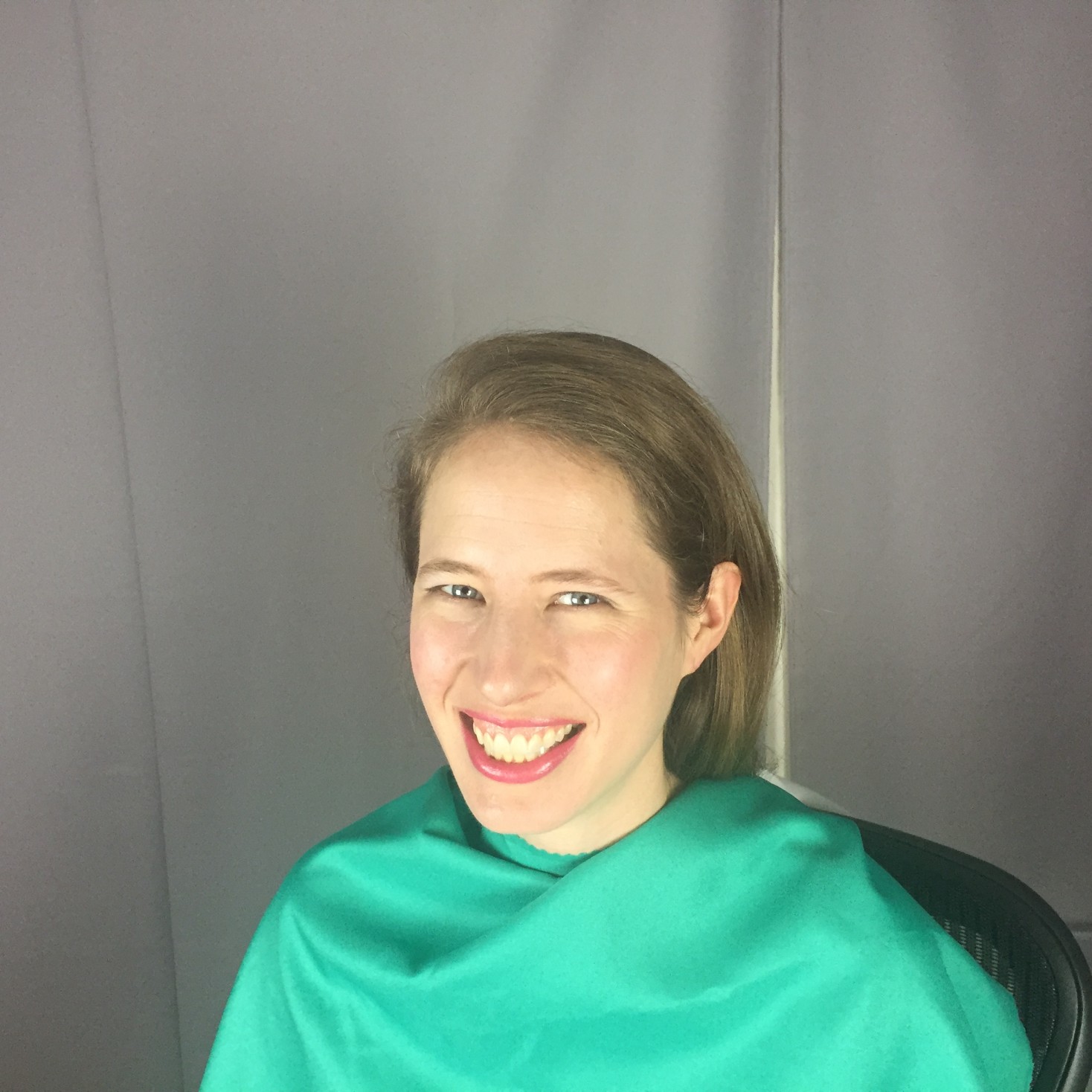
Turns out, though, that only people whose skin doesn’t fall into the Spring categories look yellow in those colors. When the Summer drapes came around – particularly the Light Summer drapes – the yellow disappeared, the red splotchiness in my skin cleared out, and I was left looking like my skin made sense:

IMG_4685
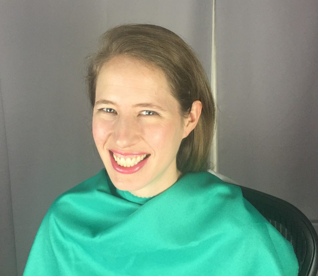
I know I just got done telling you that photographs shouldn’t be relied upon for color analysis, but I hope you get a sense of how evenly harmonious my skin looks against this Light Summer drape. It was certainly obvious in person!

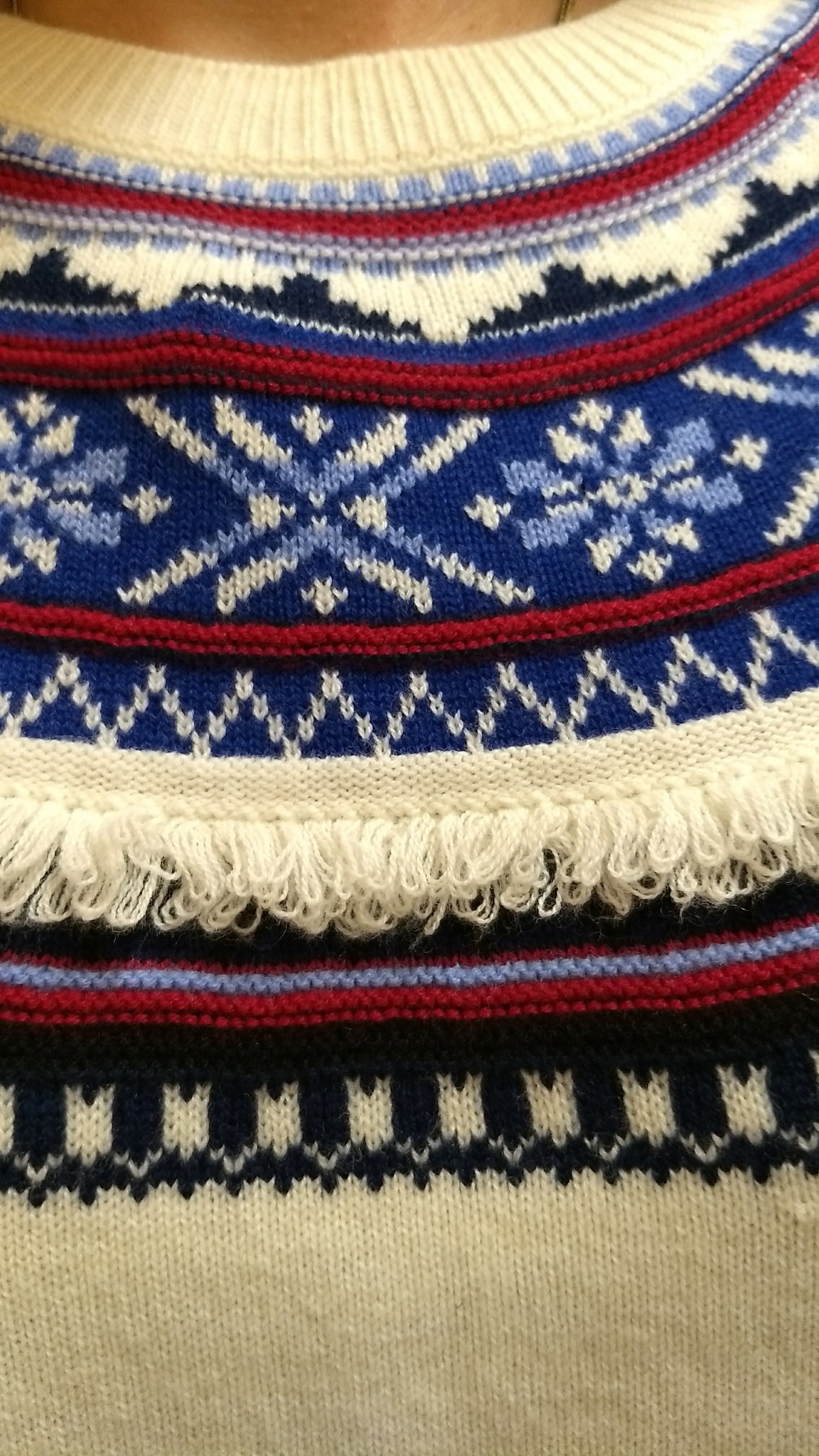
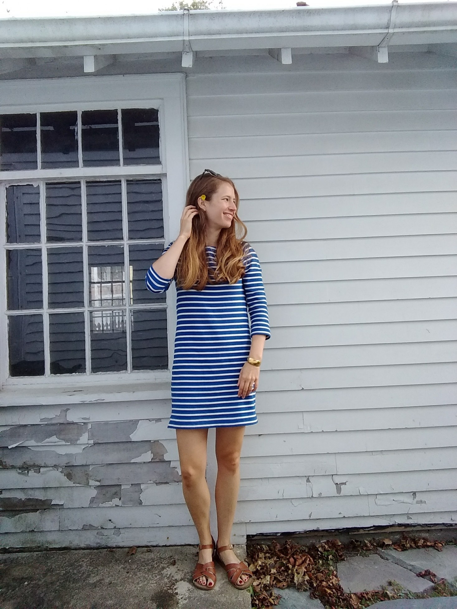
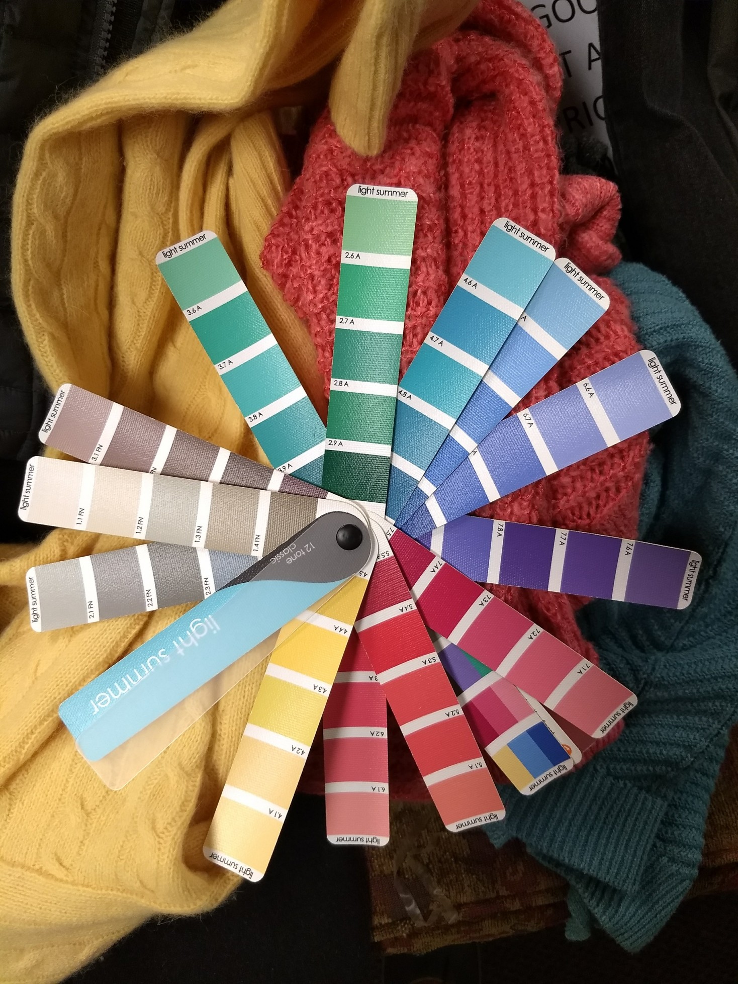
After we eliminated the drapes of all the other seasons (particularly Light Spring and True Summer, which are Light Summer’s next-door neighbors), everything just sort of settled in and glowed with the Light Summer colors:

IMG_20171216_162906_547
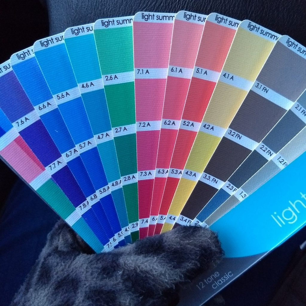
Decent-ish pic of the colors, taken on my cell phone in fading light. So, you know, don’t take it as a perfect representation.

Hope walked me through what kind of makeup works for Light Summers, and we had a fun makeup application session. (For those who don’t really wear or like makeup, that part is optional – though you might find you like the makeup that actually goes with your face!) I tried a less-orange foundation, though Hope commented that what I usually wear should work because it blends right into the overtone of my skin, which, again, is different from the undertone.  My shimmery, warm, light bronze eyeliner got swapped for slate grey and my coral lipstick switched out for more of a berry color – again, exchanging warmer colors for cooler ones. I was afraid “cooler” colors would look greyed out or pale on me, but then remembered that only people who aren’t Summers look greyed out in the somewhat muted Summer colors.

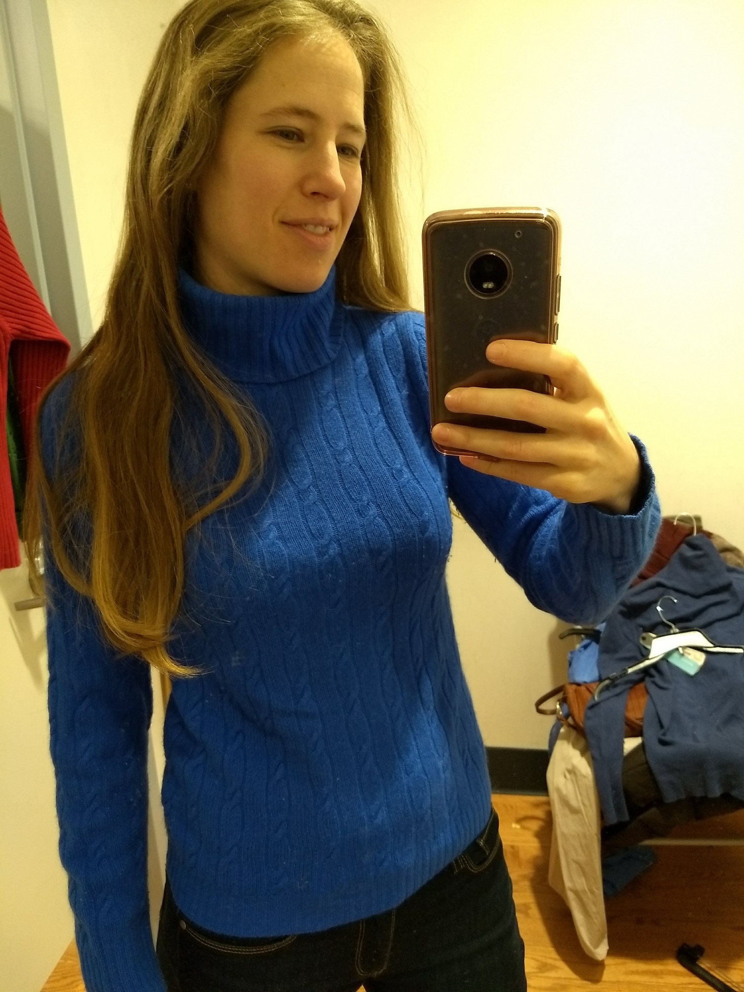
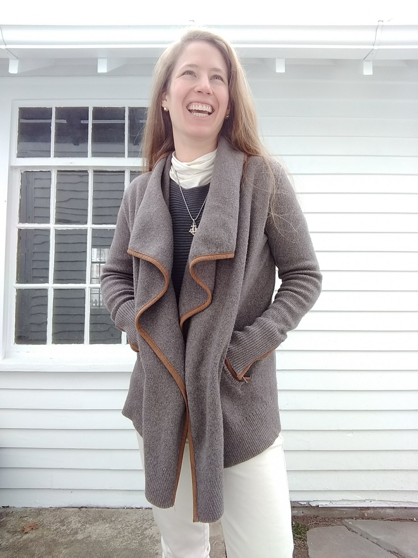
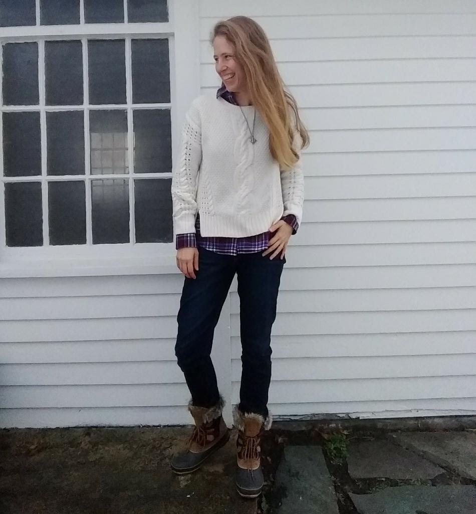
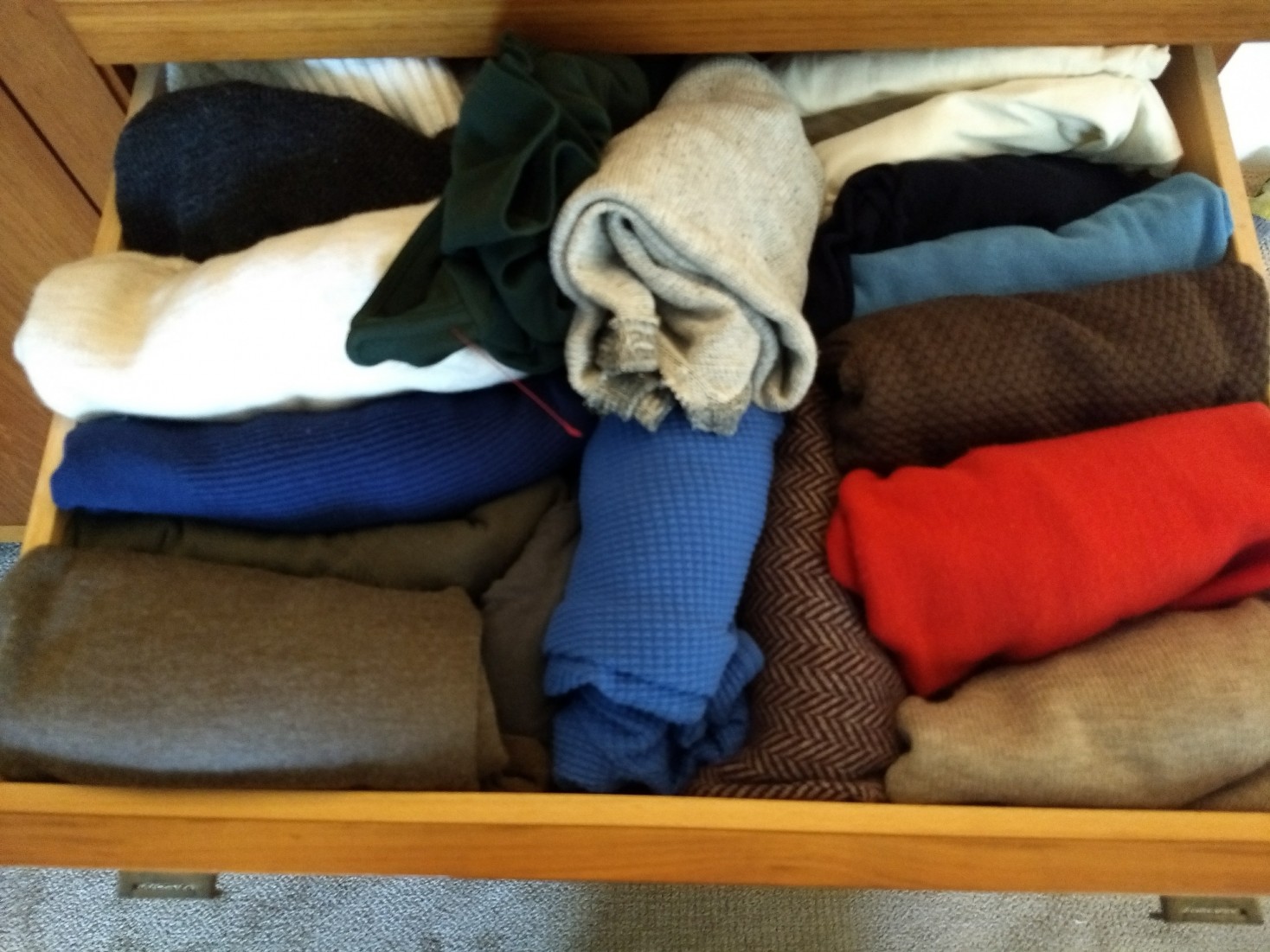
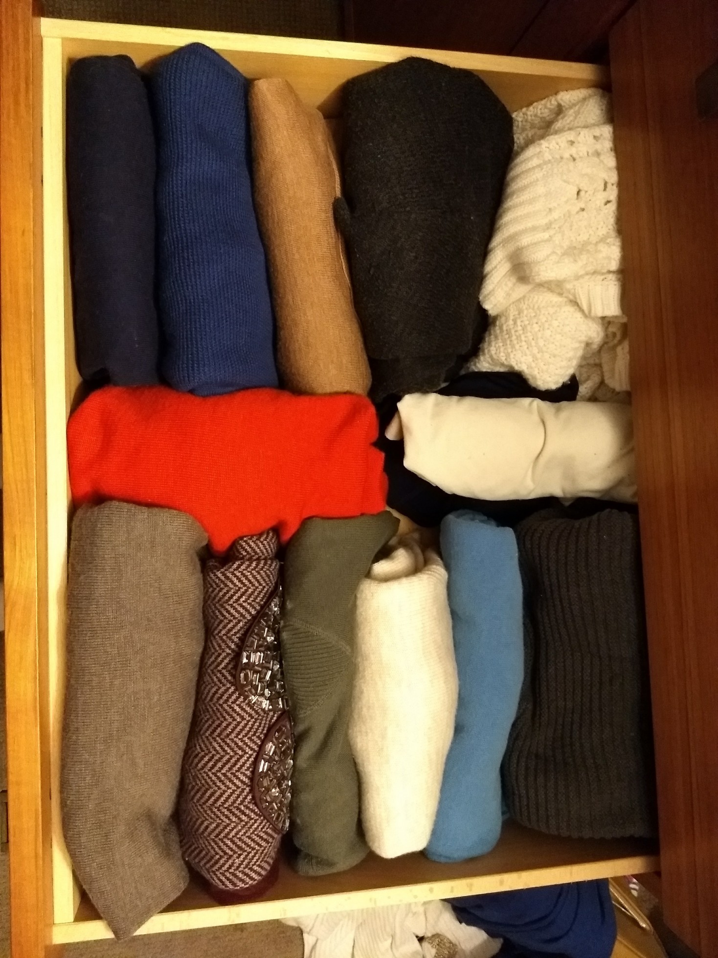
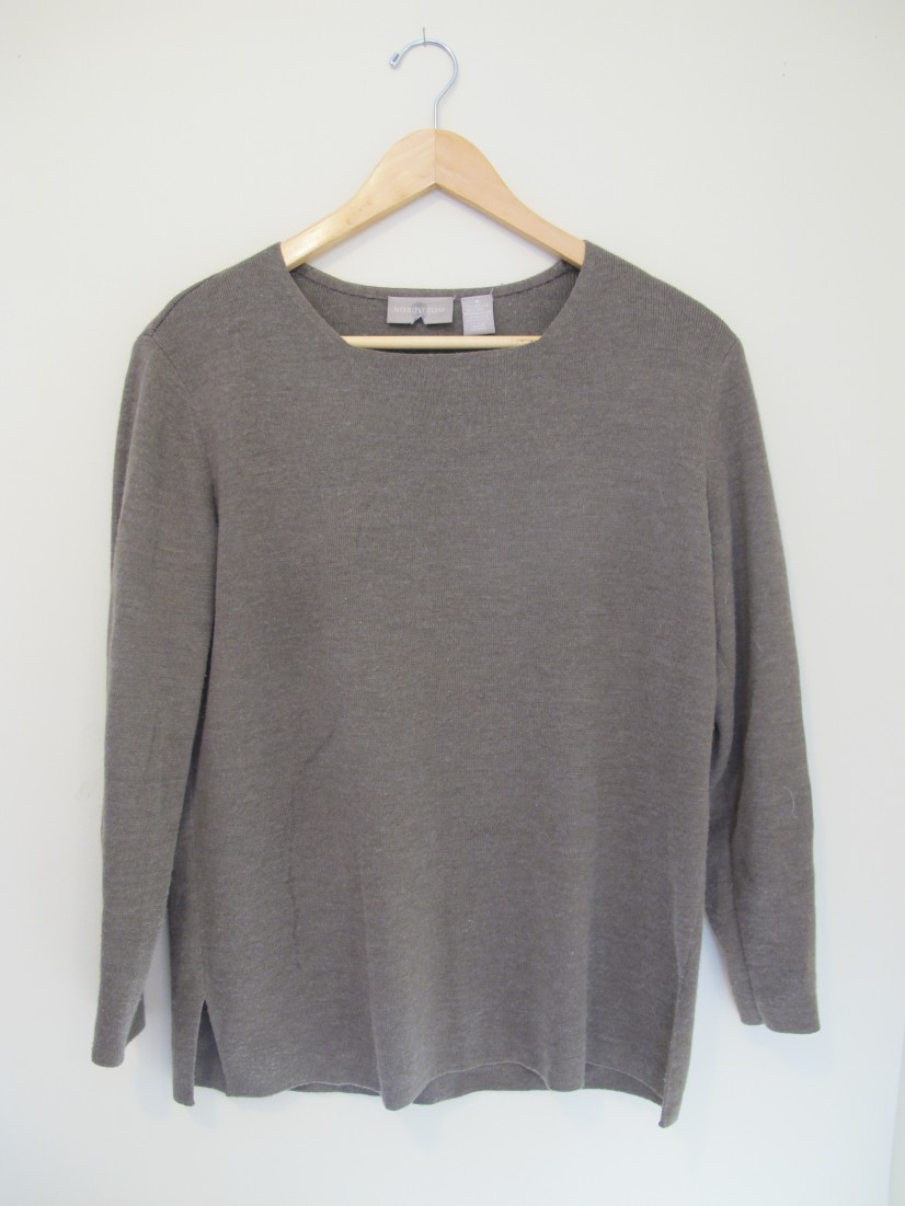
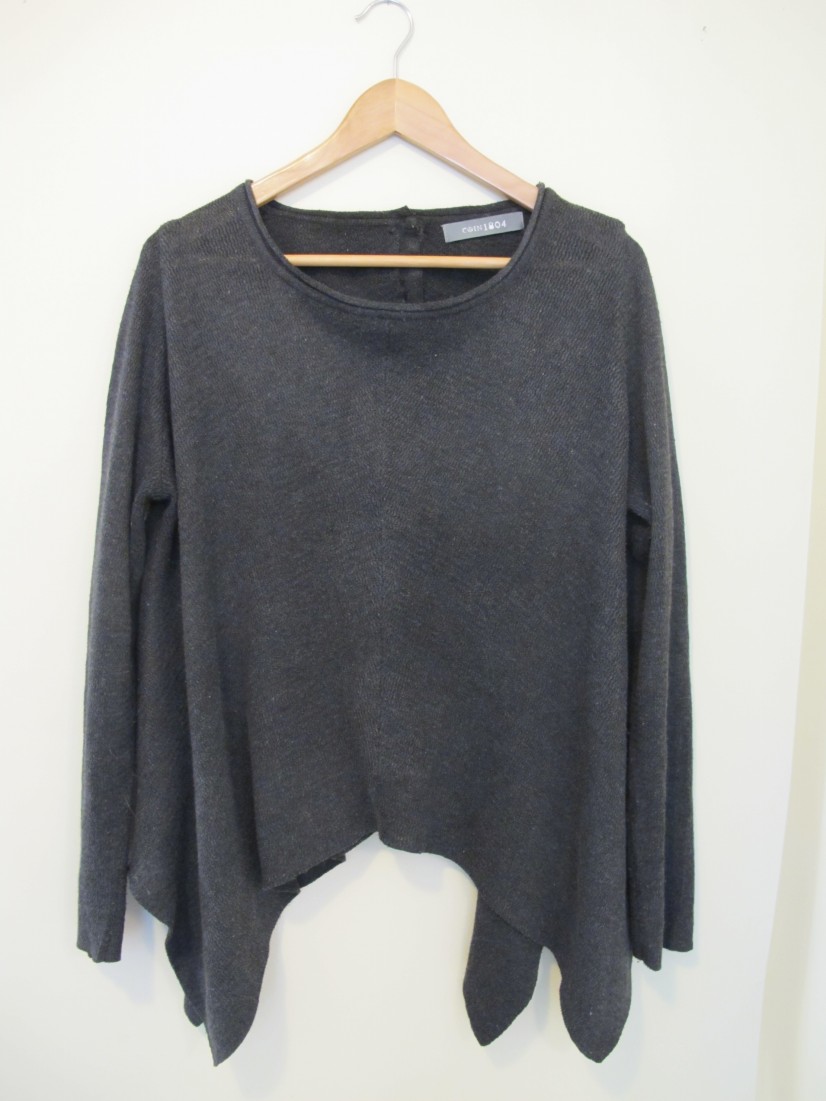
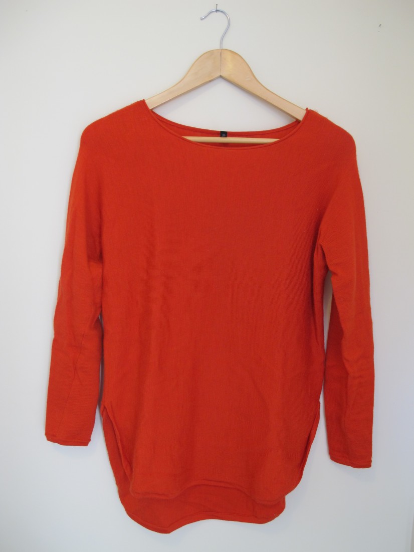
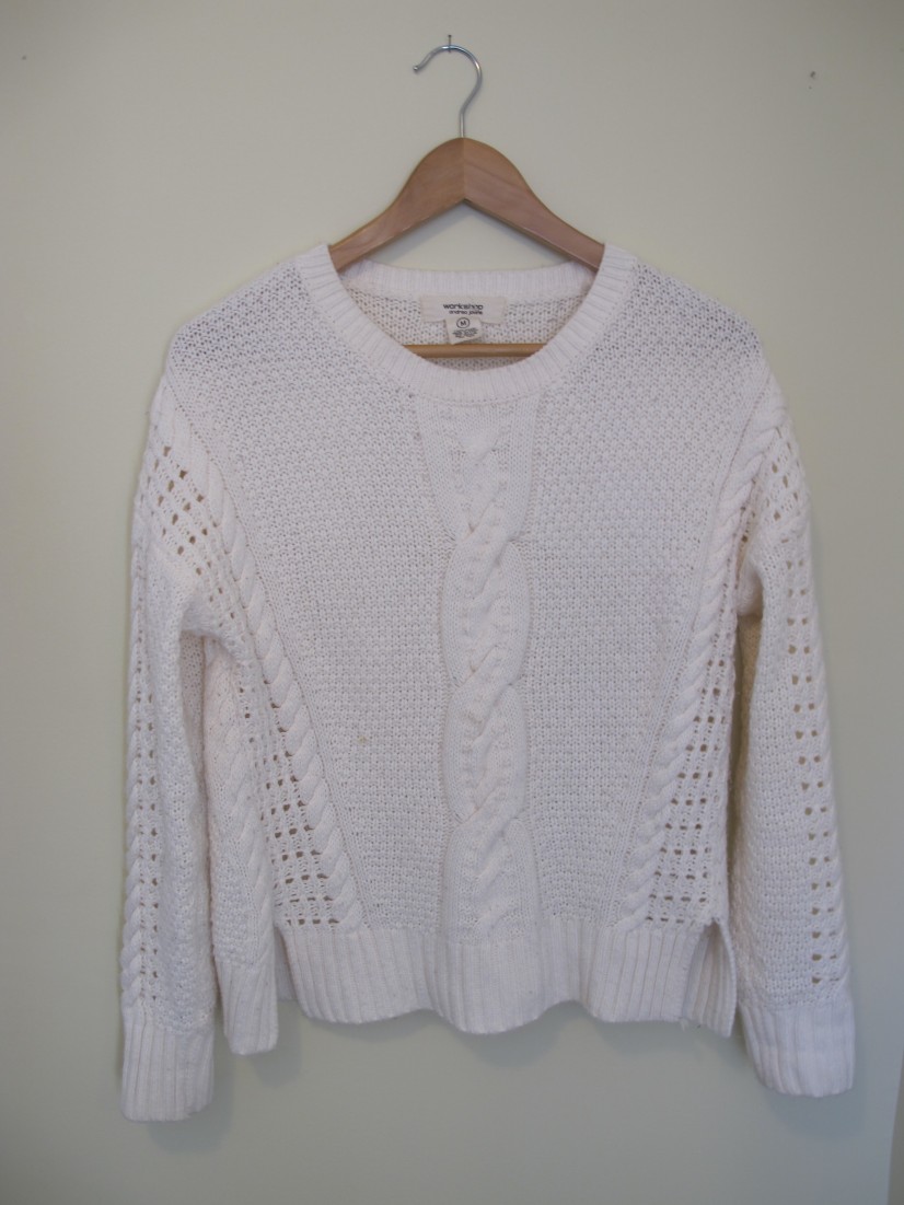
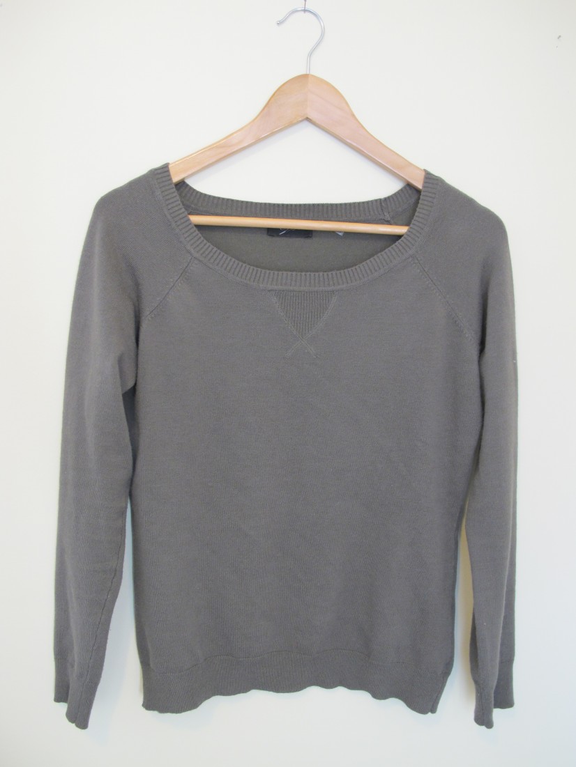
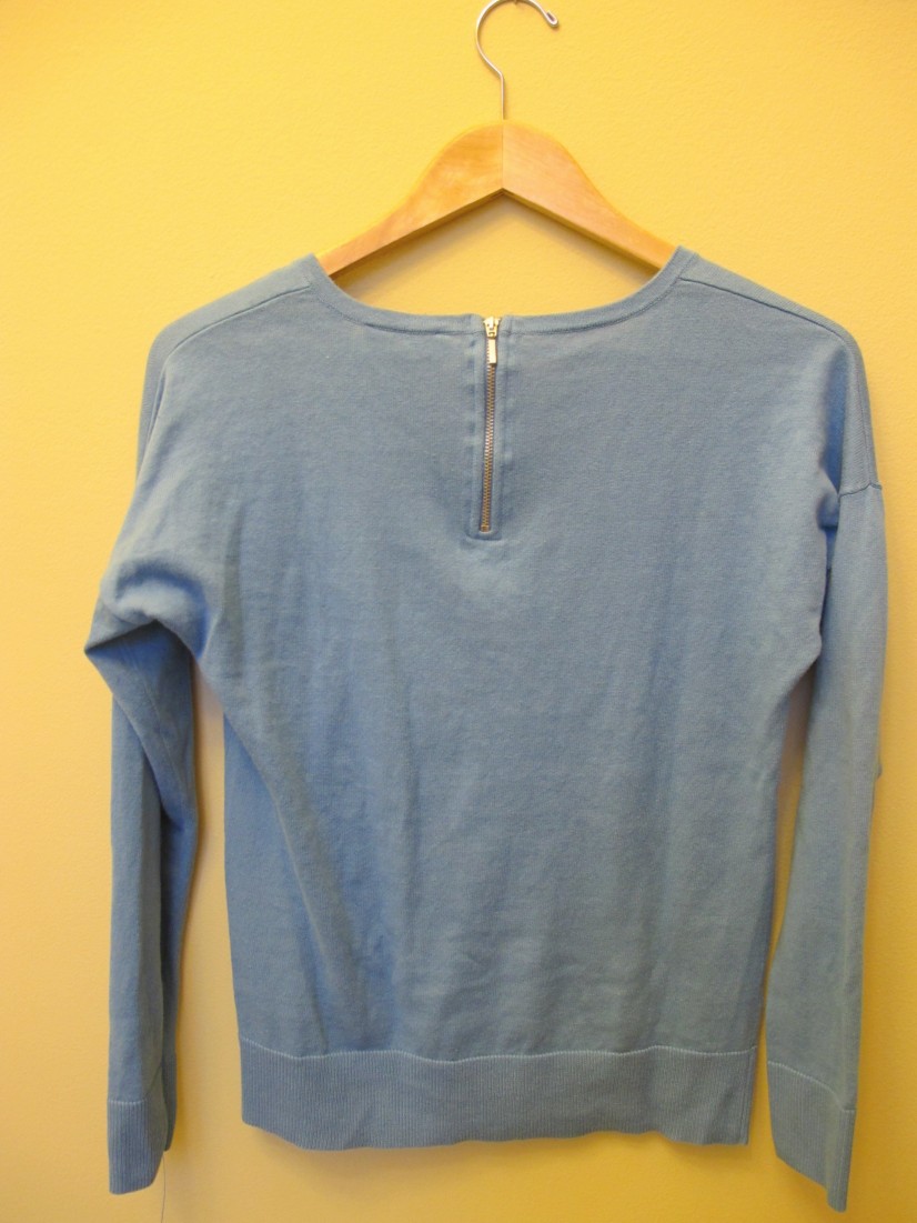
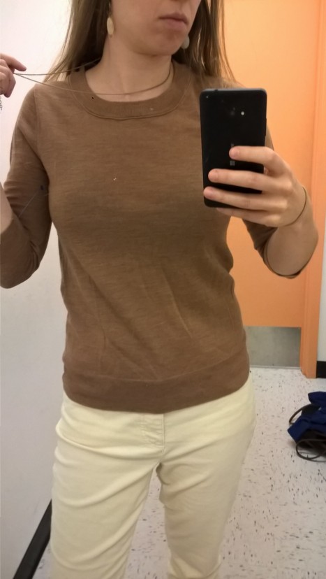
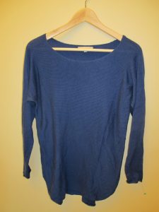
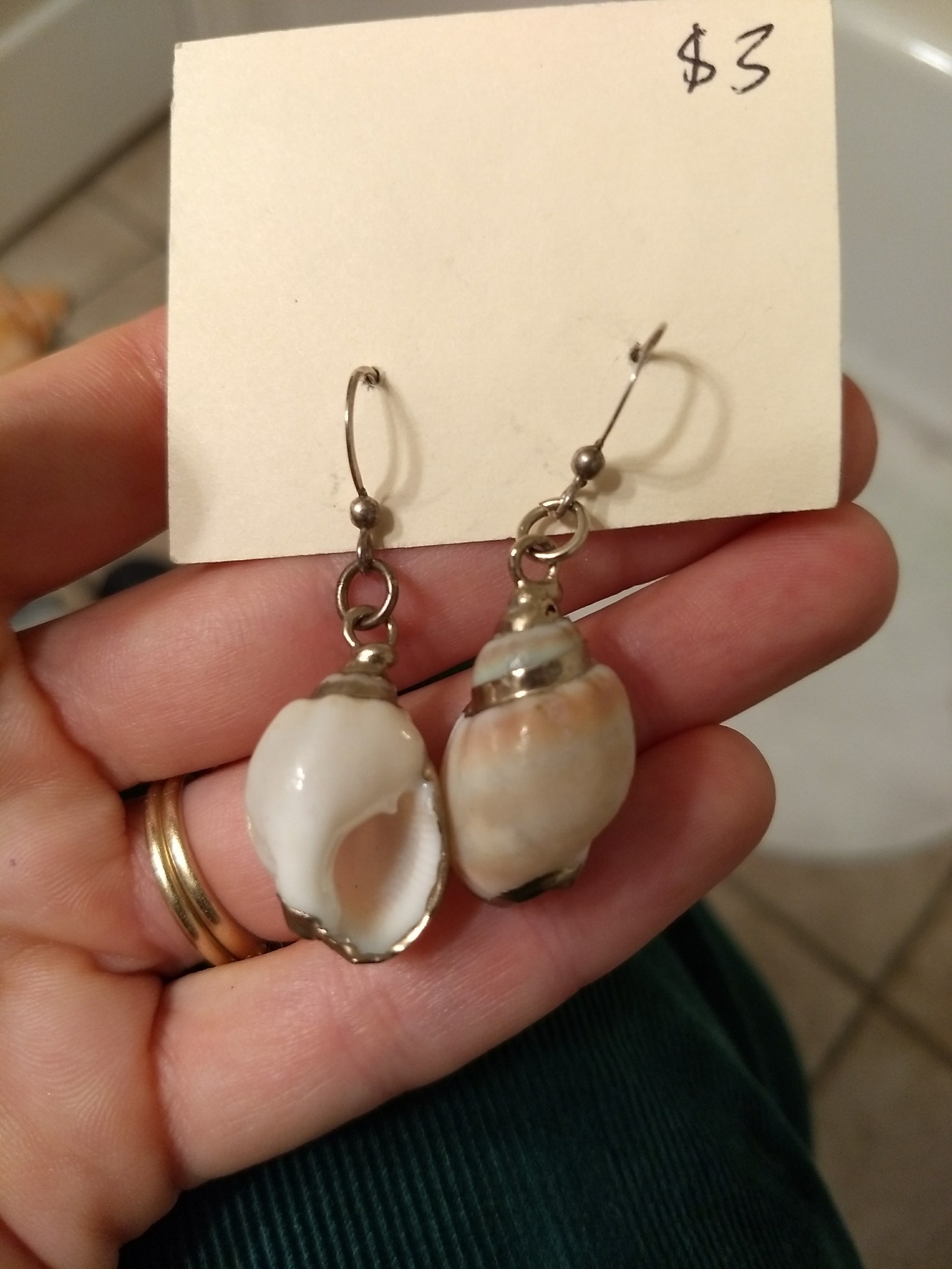
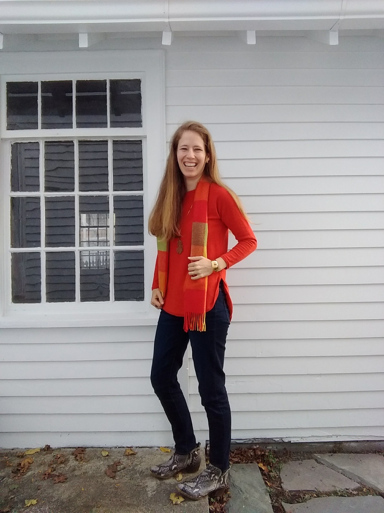
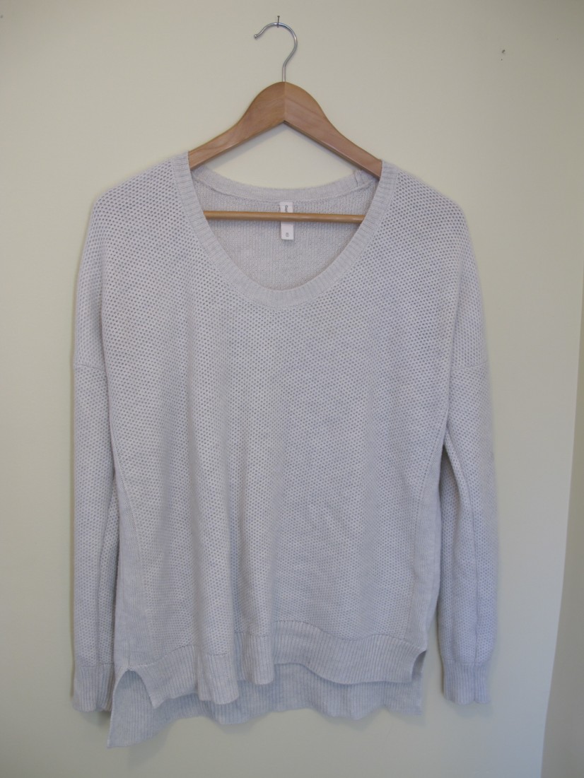
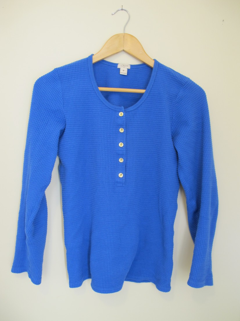
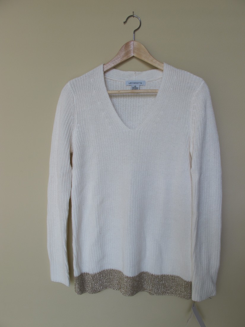
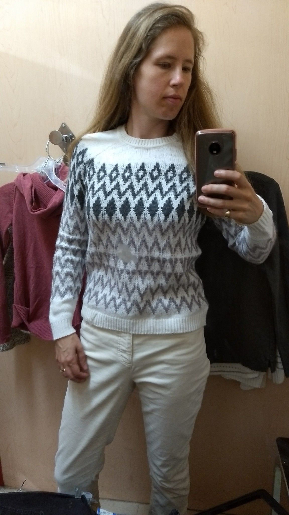
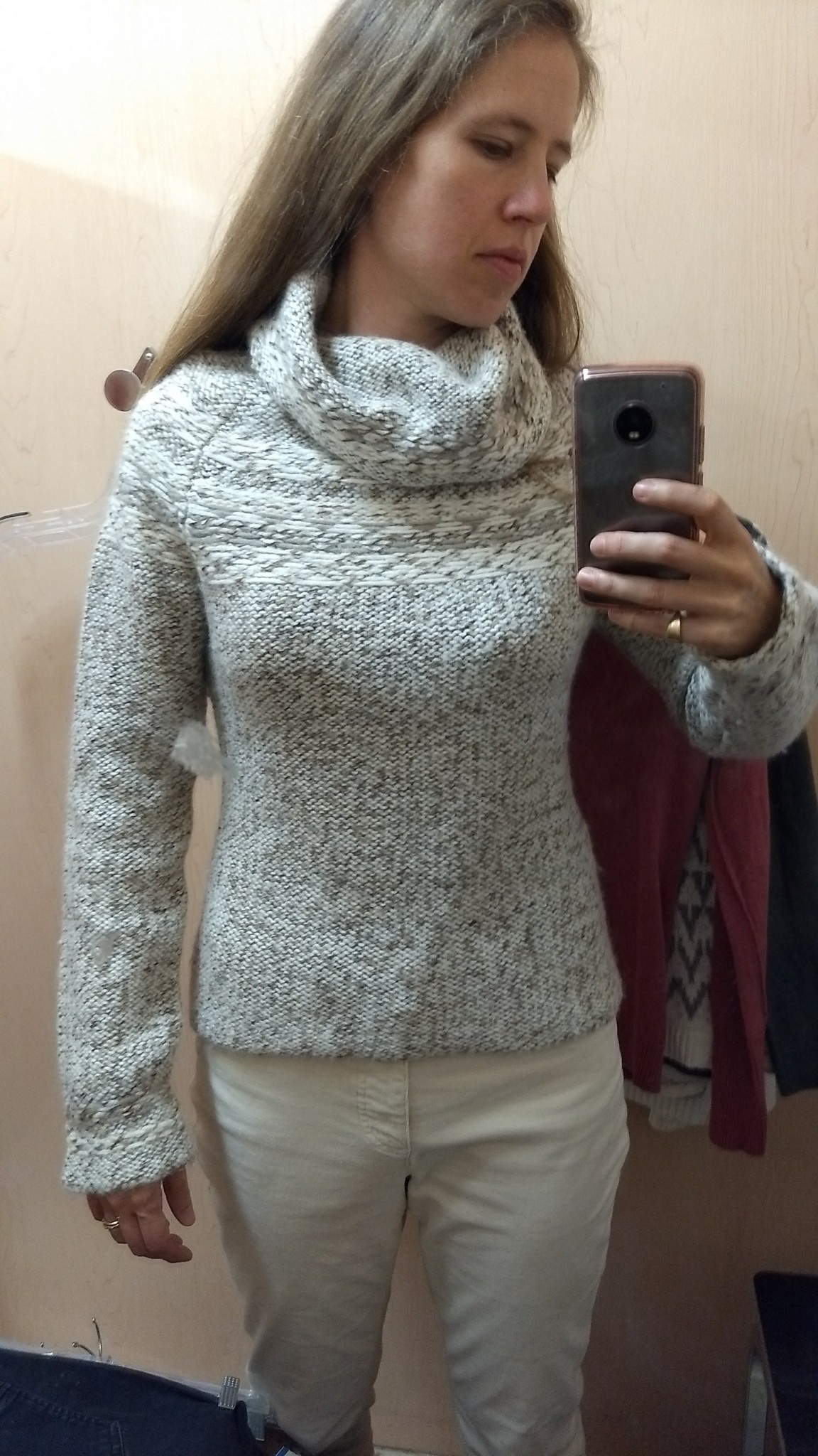
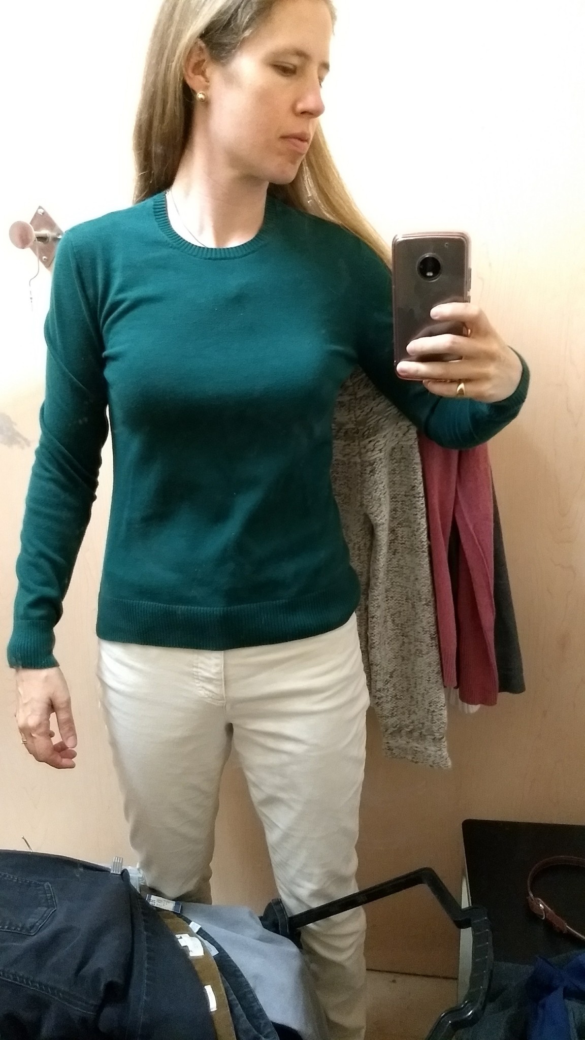
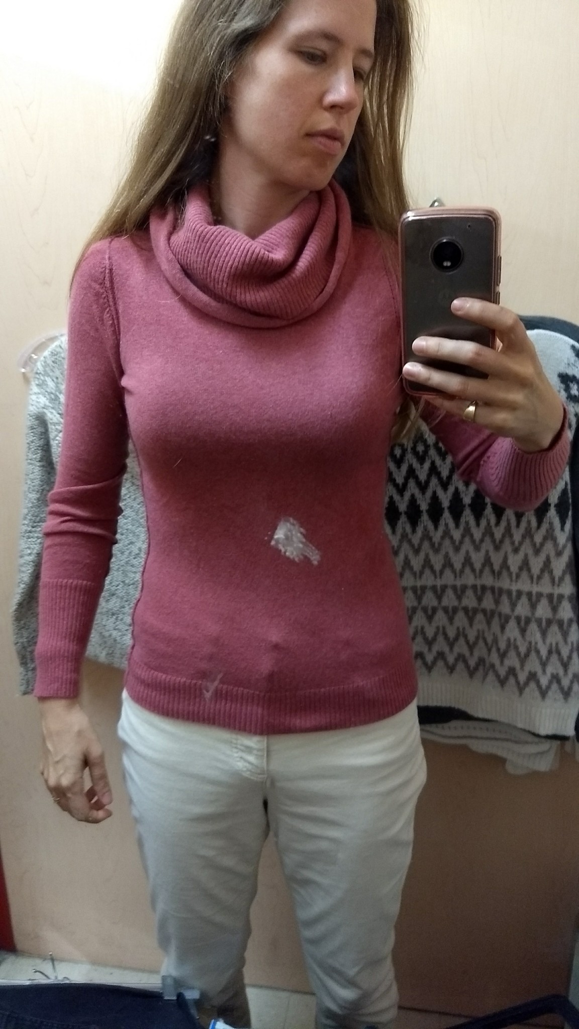
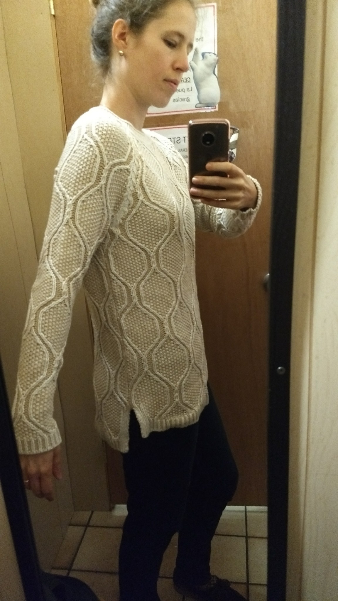
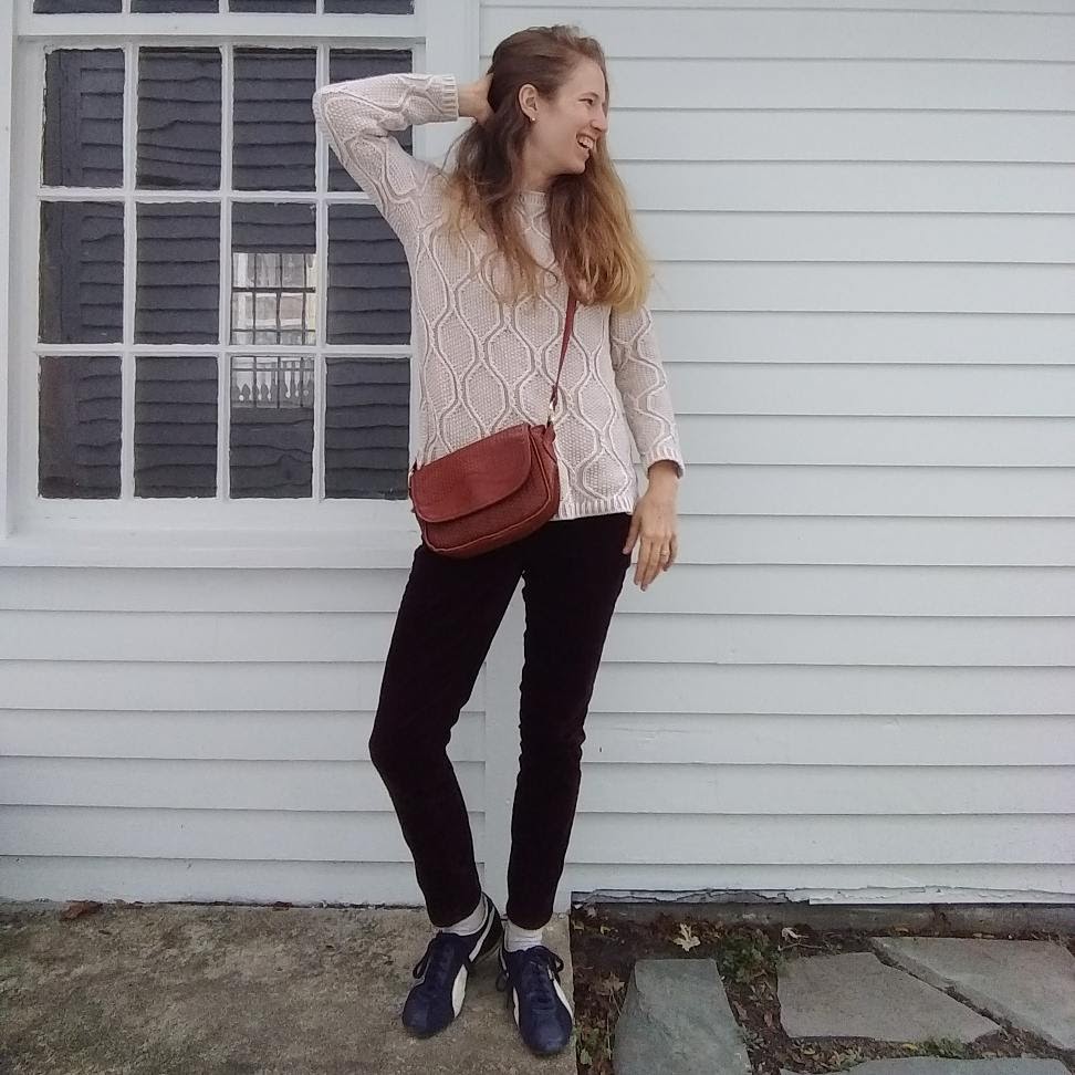
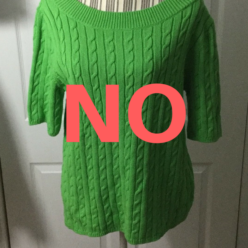
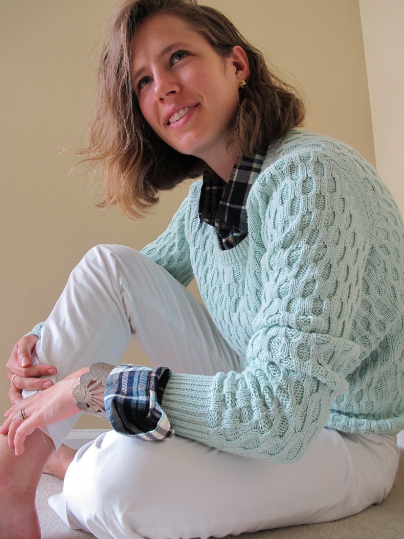
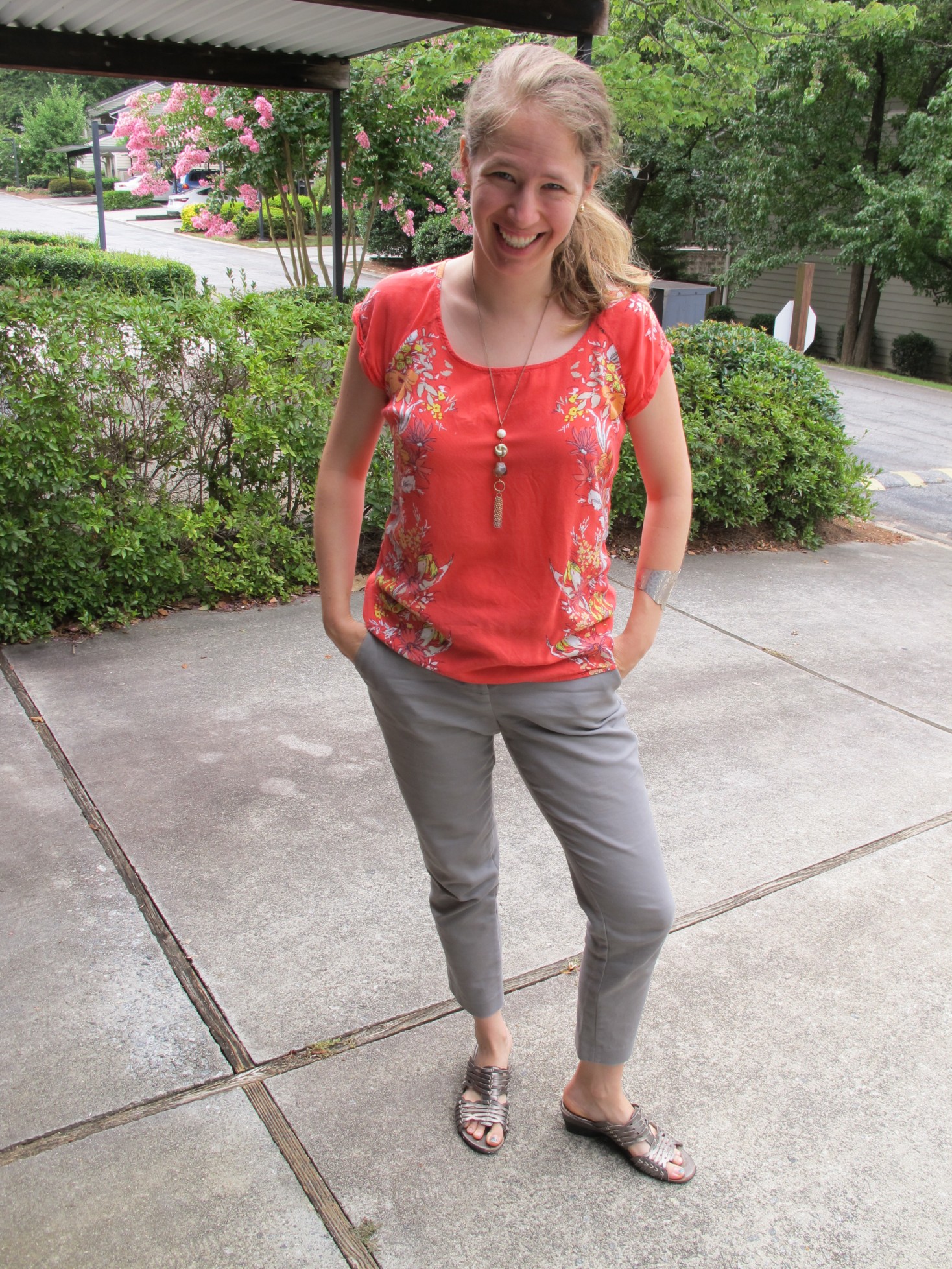
We took some pictures of me draped in my new colors (see Hope’s Instagram for more), and then Hope gave me my swatch book: 65 colors that harmonize with Light Summer undertones and that can be used to find clothing and makeup that harmonizes, too.  She taught me how to drop the swatchbook onto the sweaters I had brought with me to see whether the colors on the swatchbook and the garment light each other up, or just look like awkward neighbors or mere background.  Spoiler alert: only my scarf and one of the five sweaters I brought along really sang next to my Light Summer colors.

Overall Hope was warm, friendly, professional, able to put me at ease through what could have been a daunting process – and we had FUN! It’s almost magic to watch as you move closer and closer to colors that make your face come alive, and it felt great to finally know not only which clothing colors did that but also why lipstick has never looked right on me and what to do about it. On the drive home I couldn’t stop smiling in the mirror – everything popped!


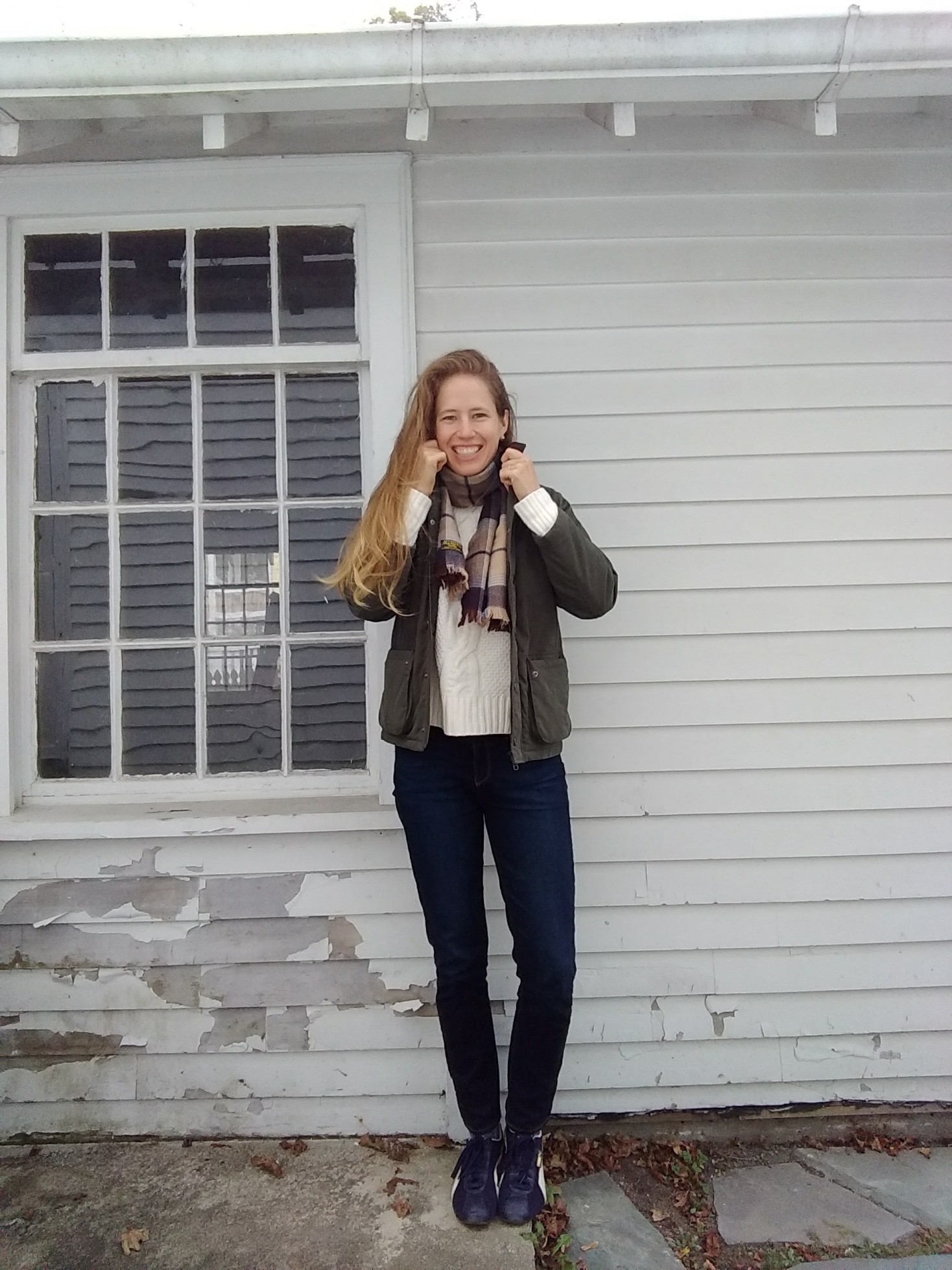
You can read about how I’ve been easing into my new colors and what thrifting is like with a whole new set of criteria here.
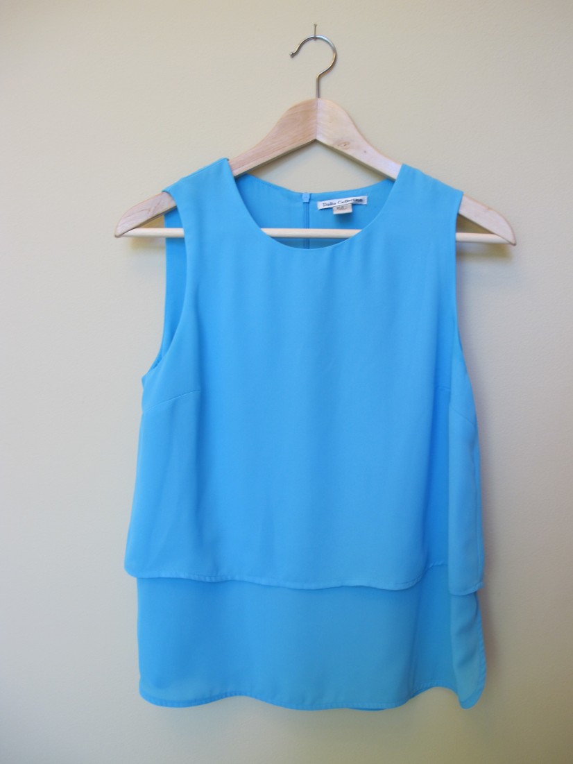
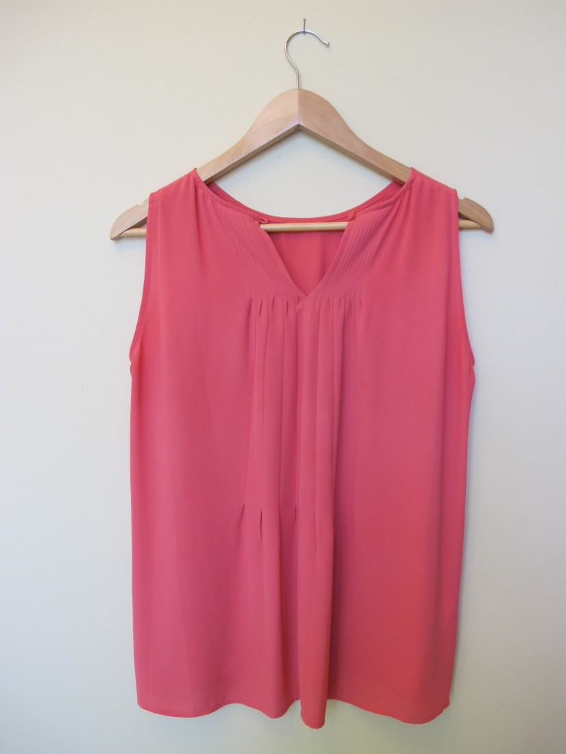
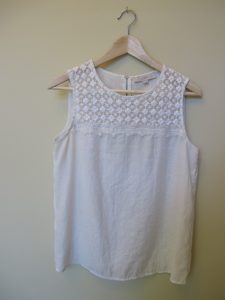
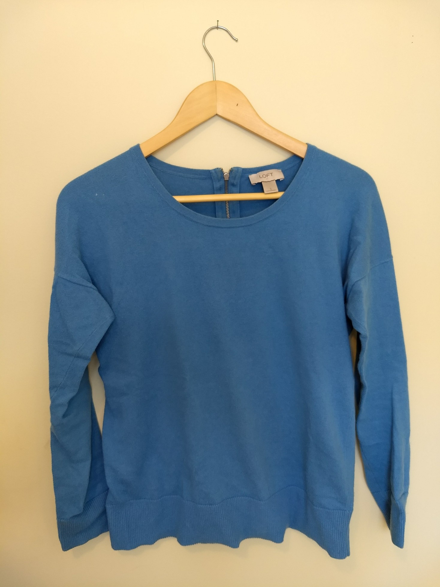
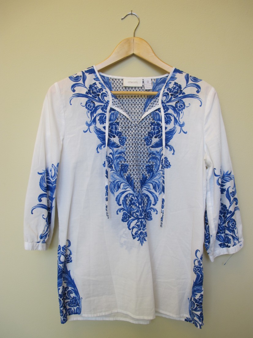
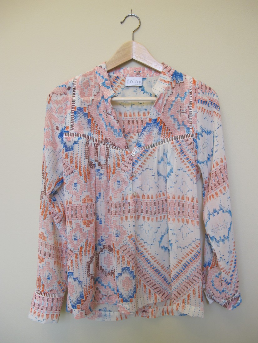
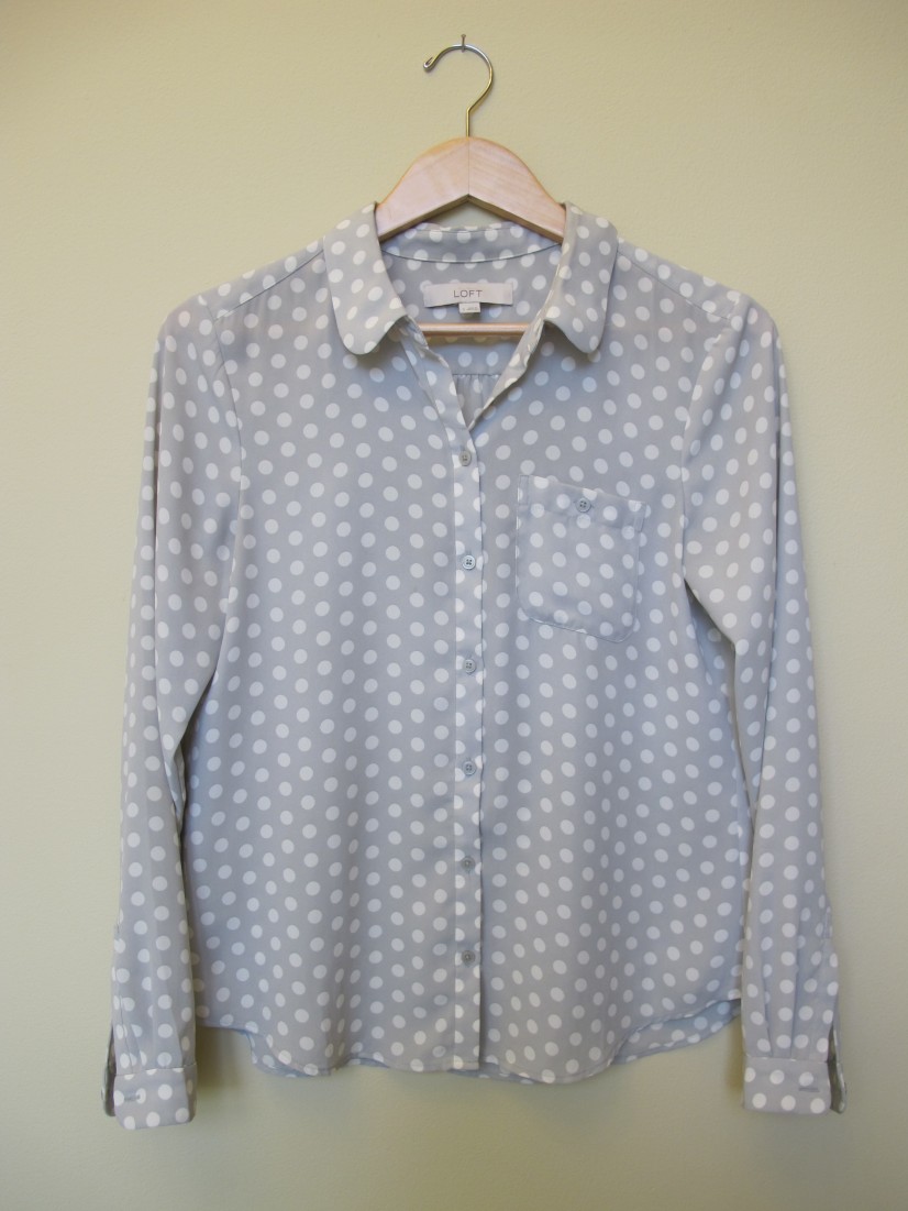
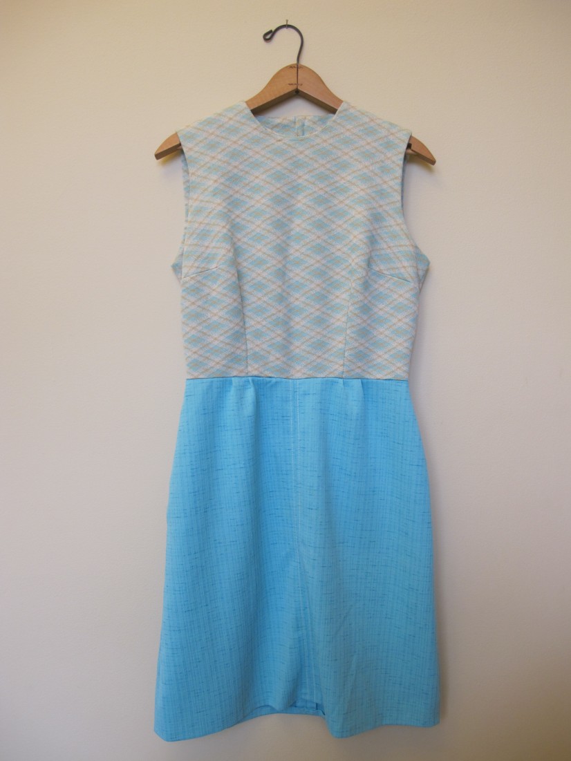
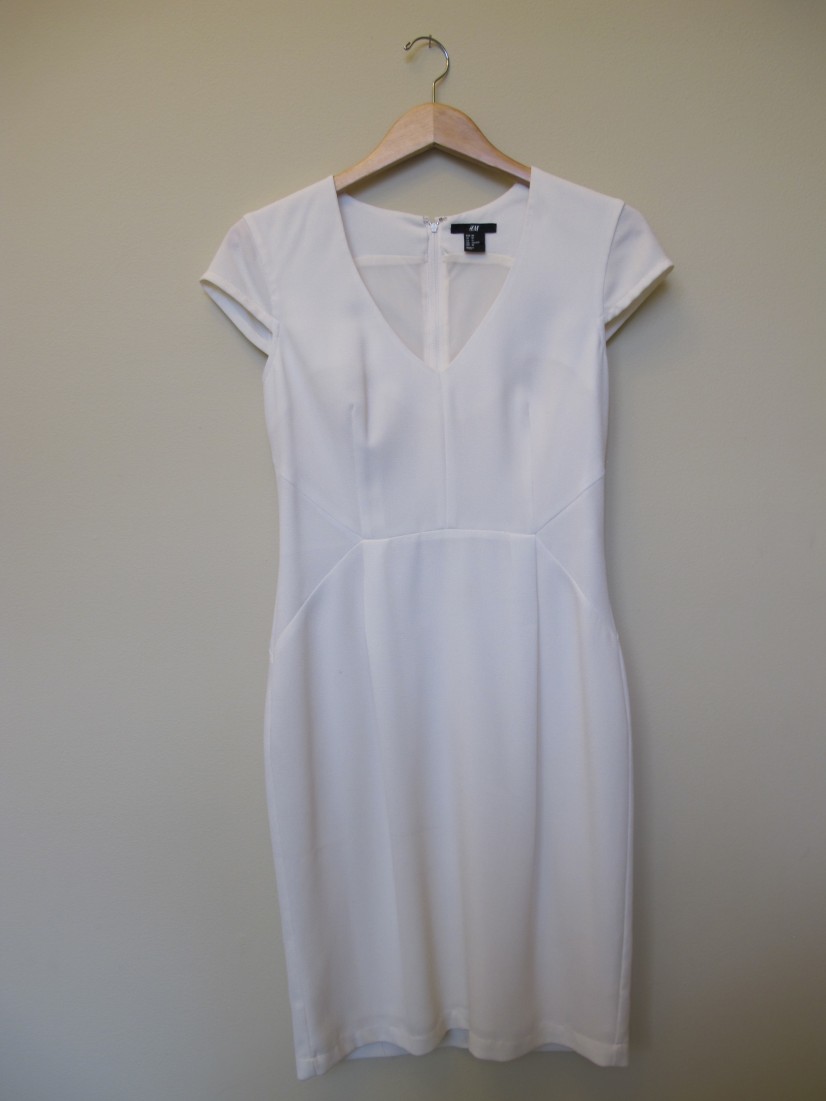
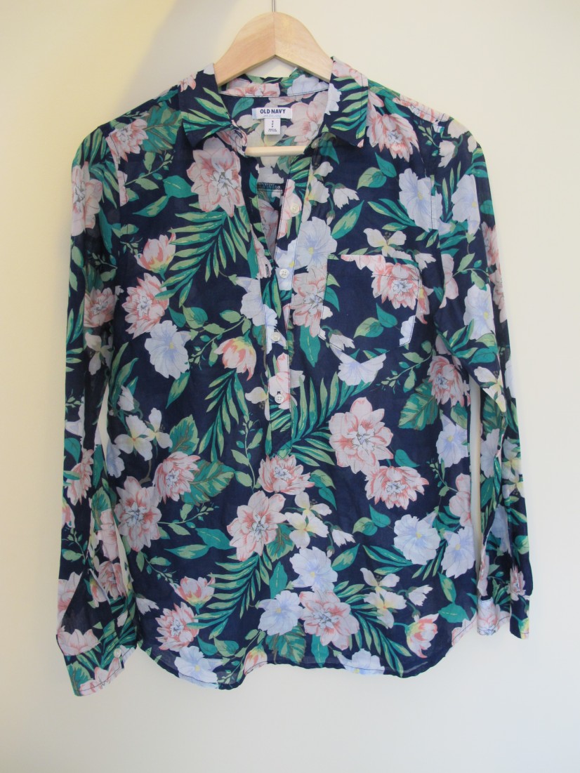
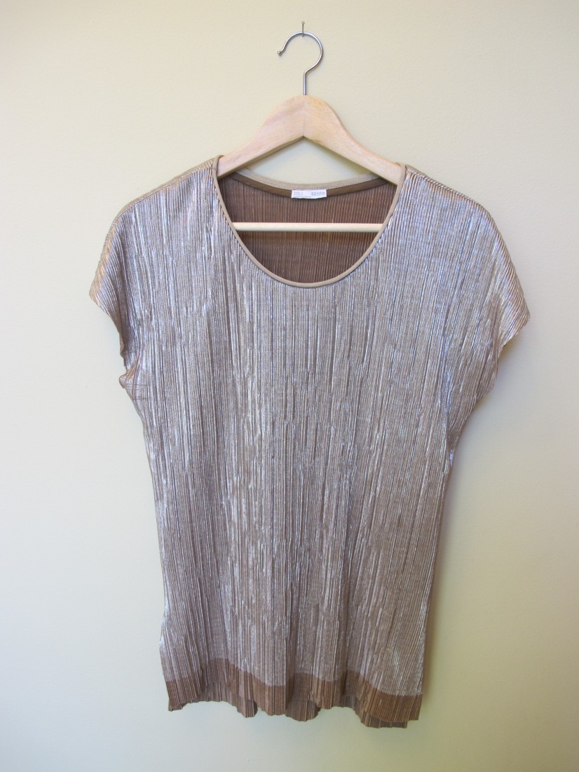
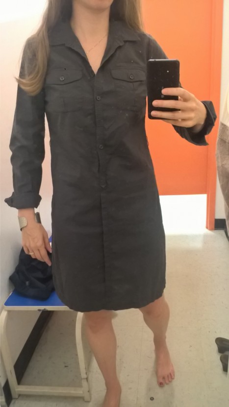
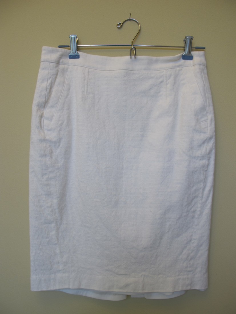
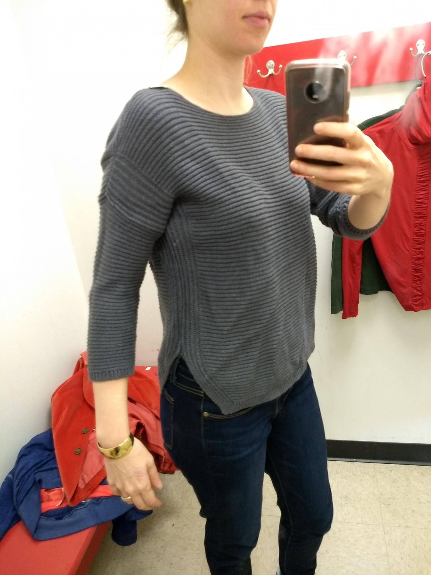
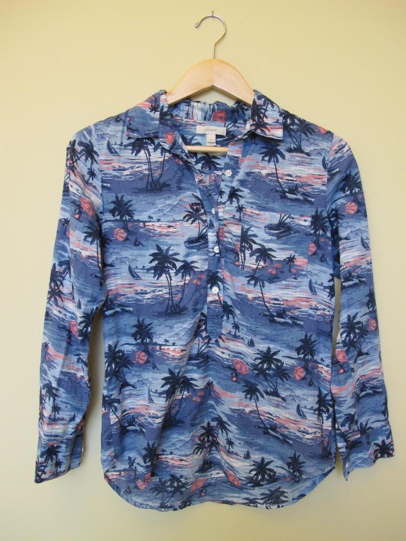
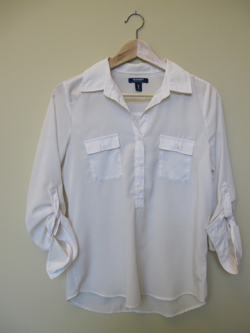
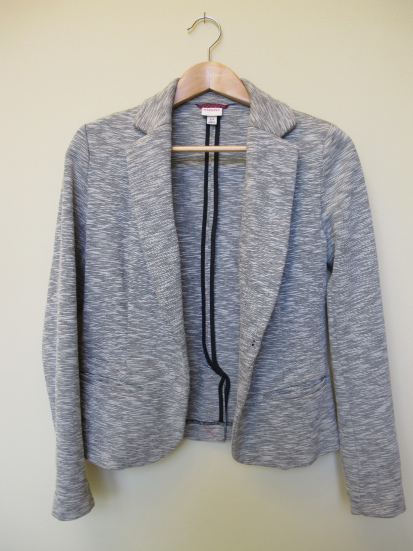
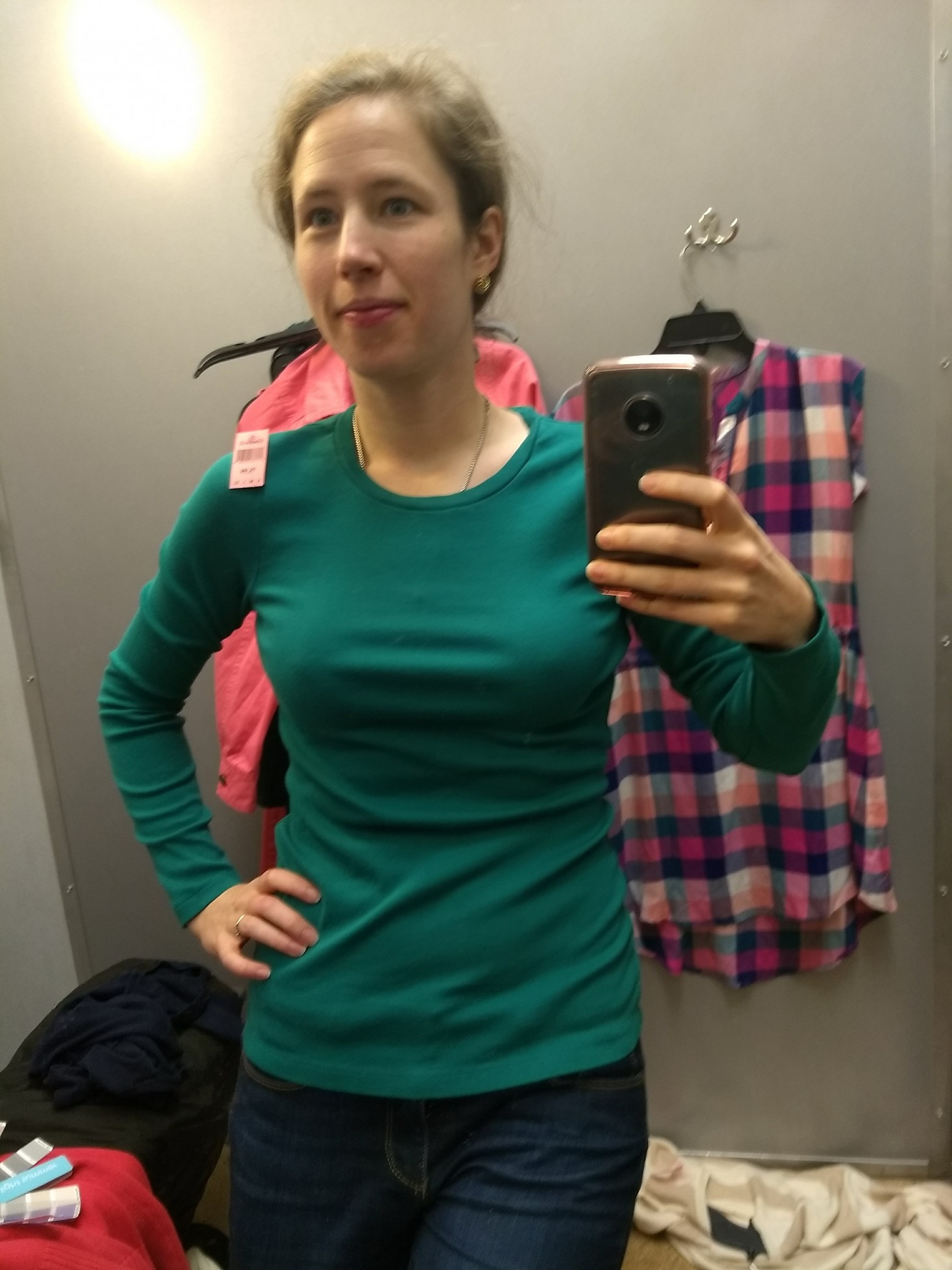
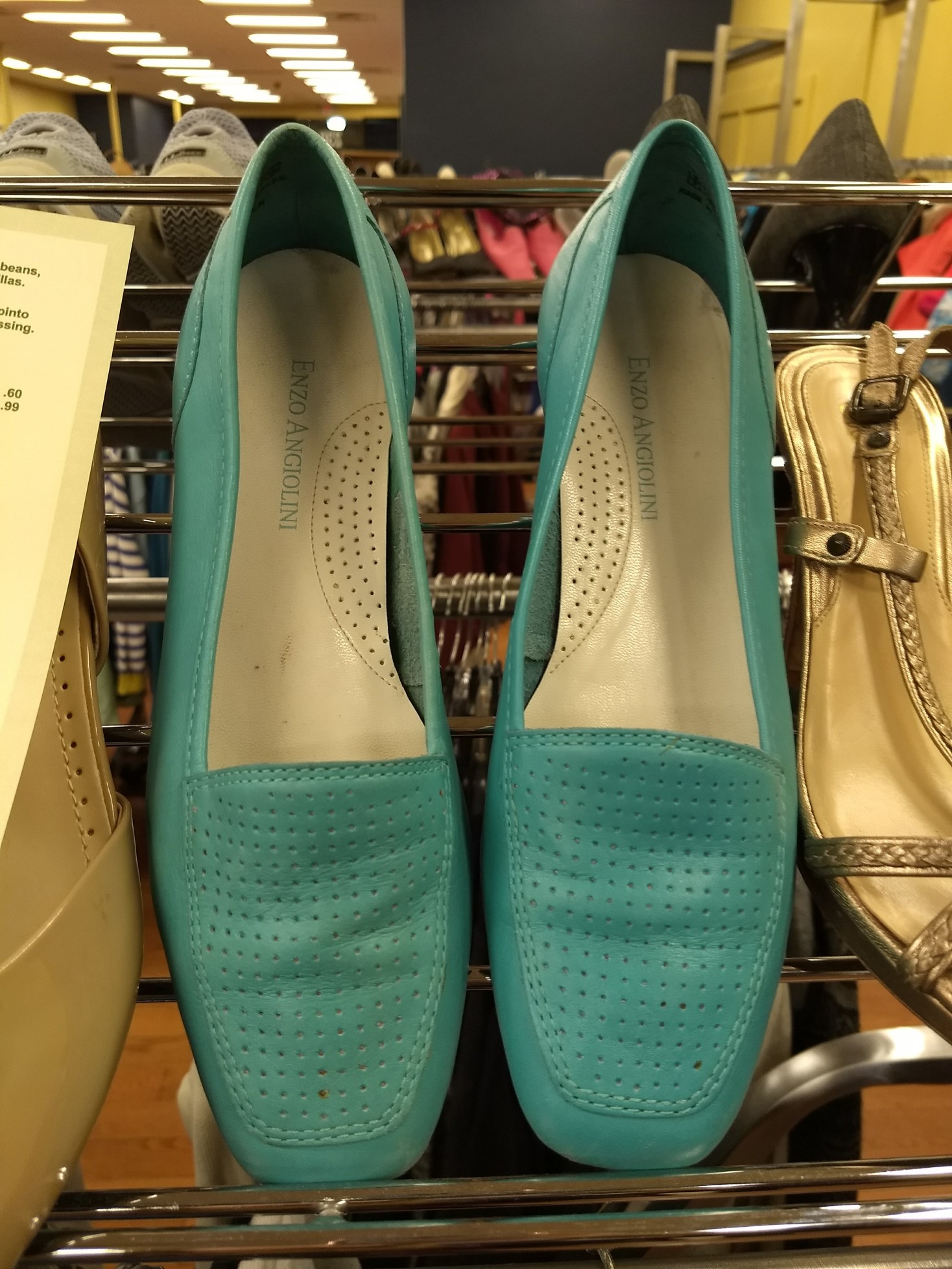
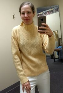
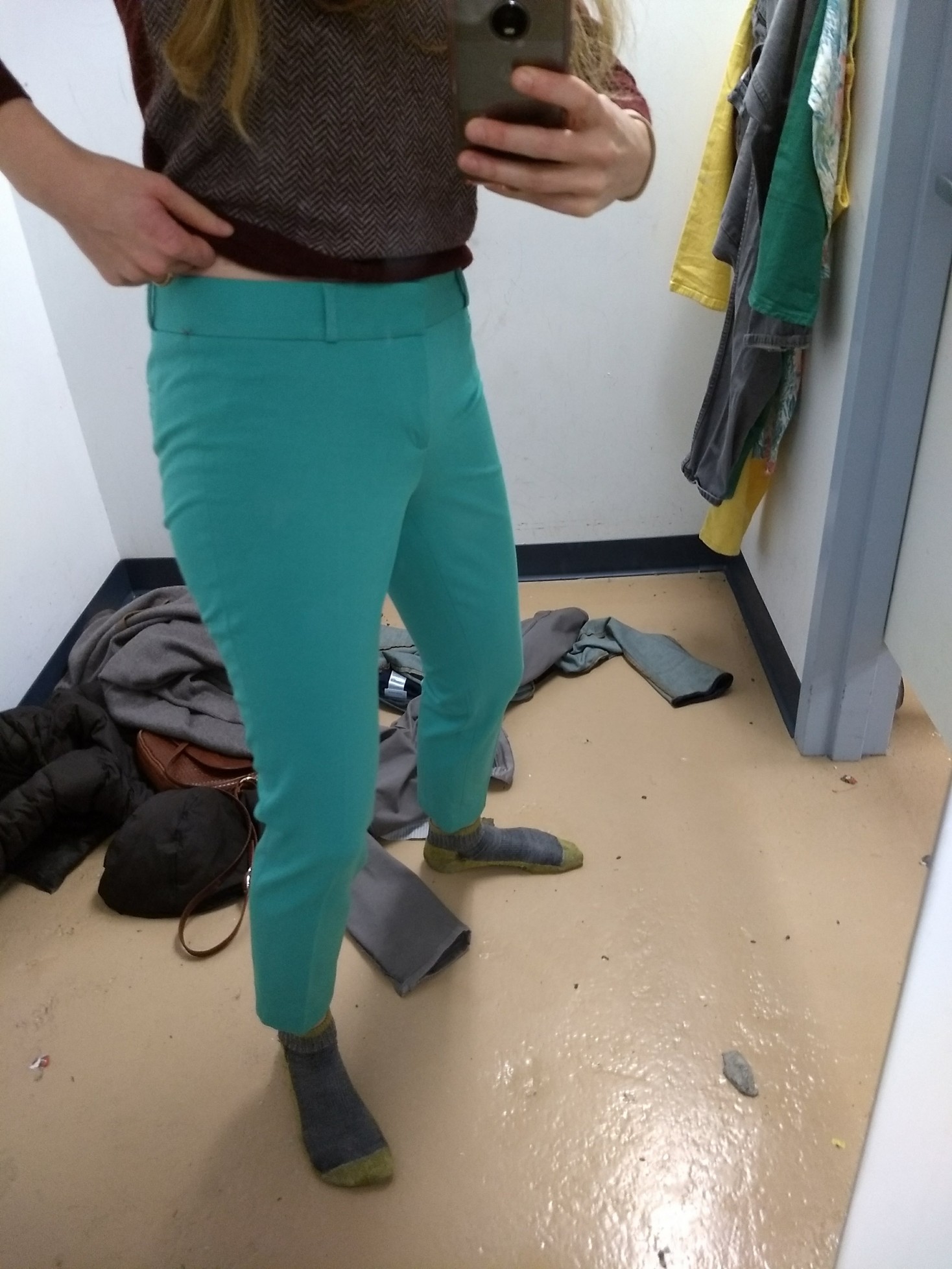
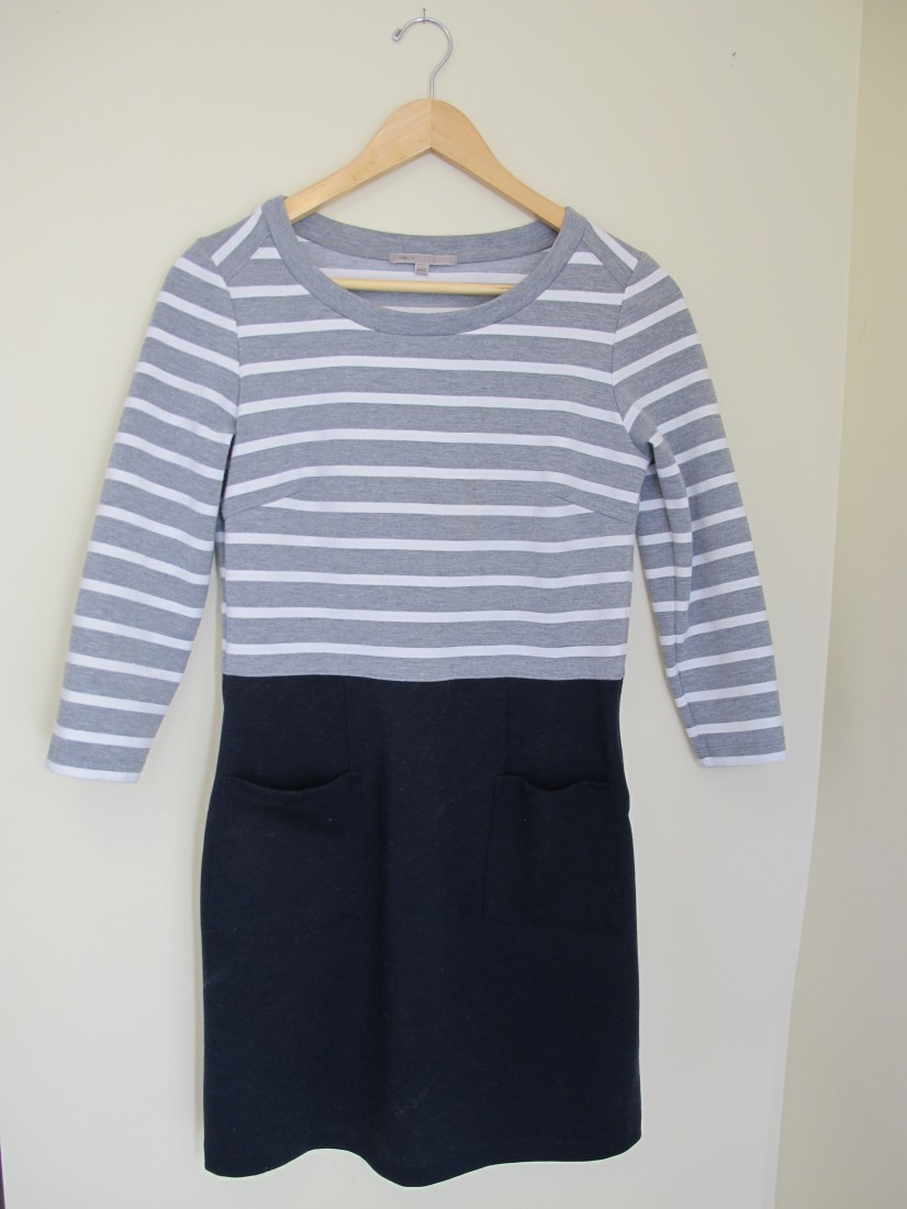
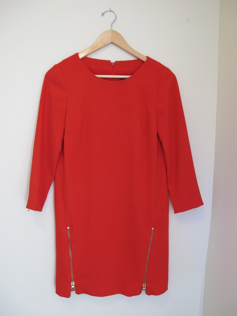
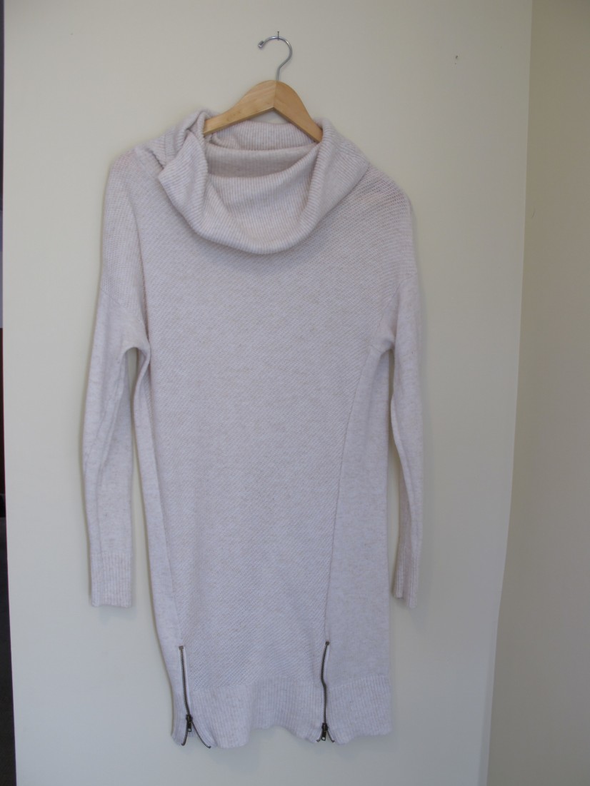
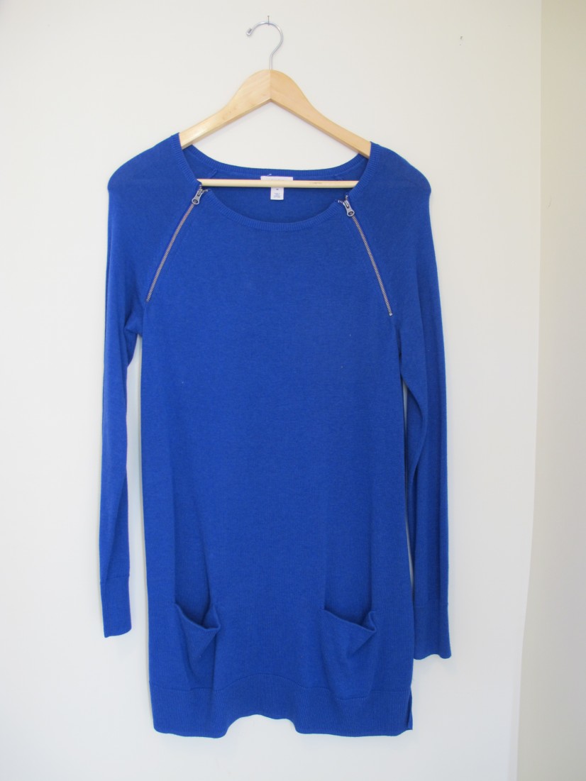
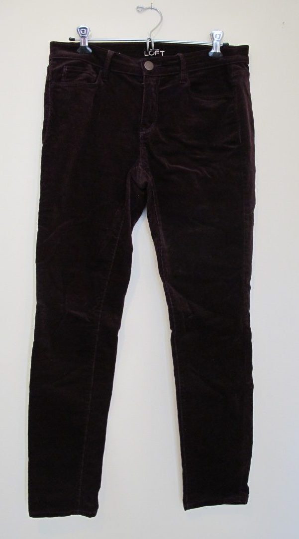
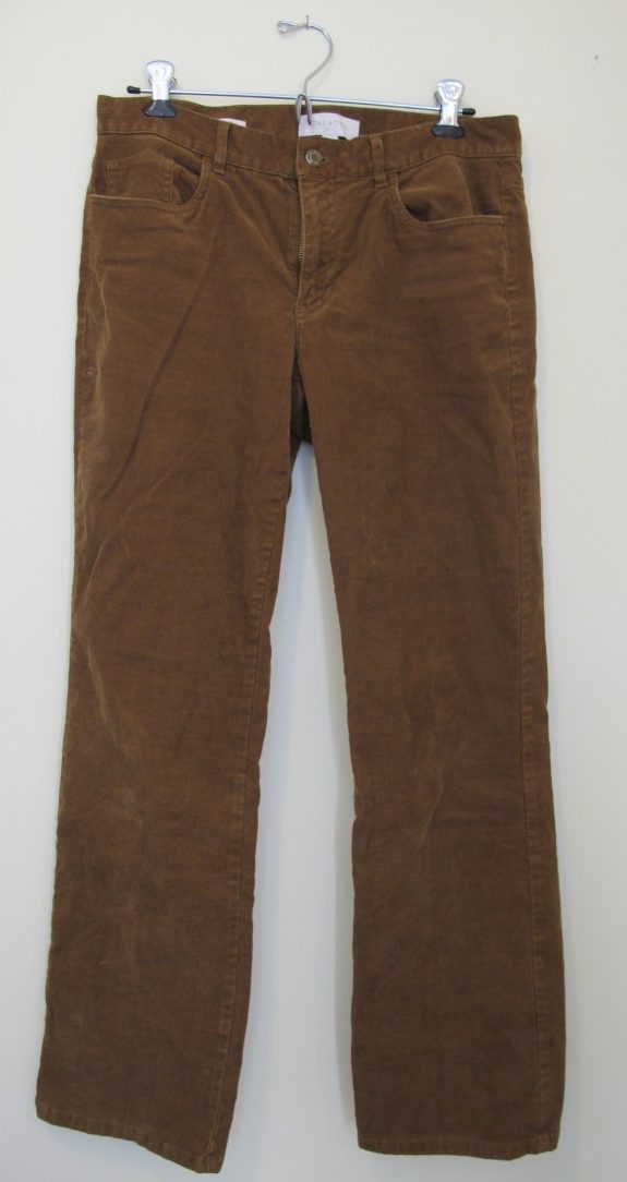
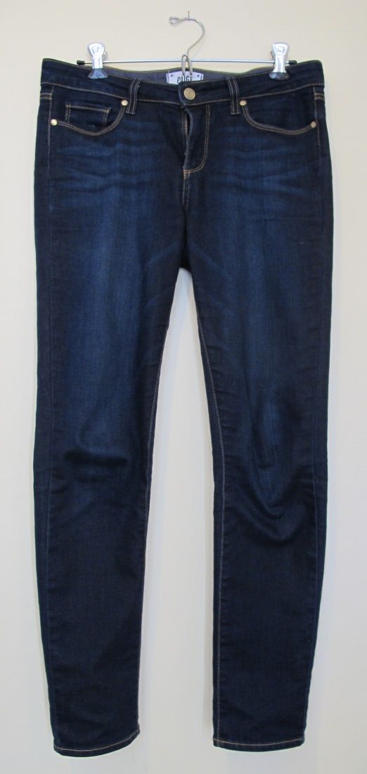
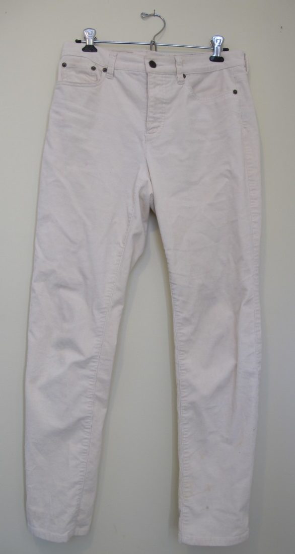
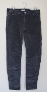
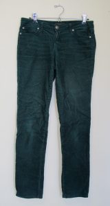
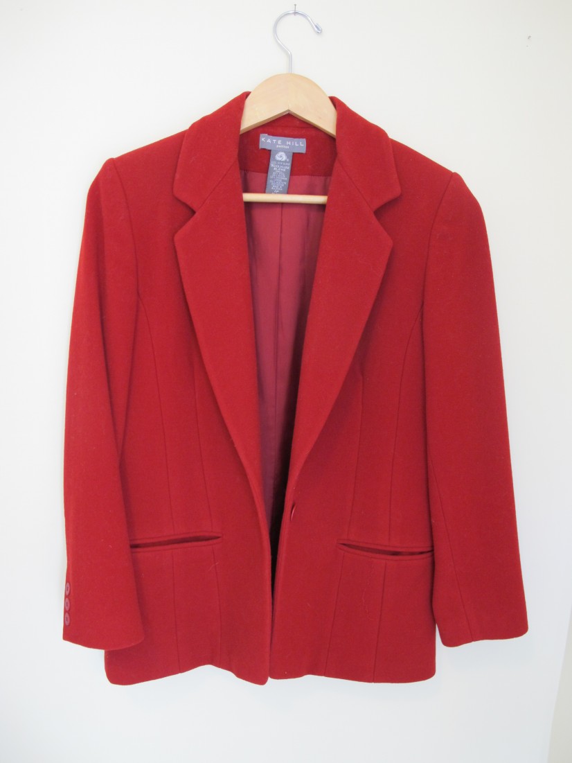
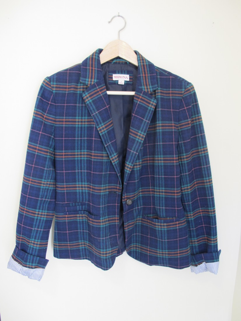
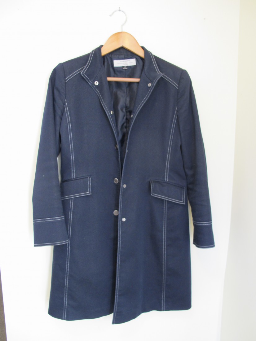
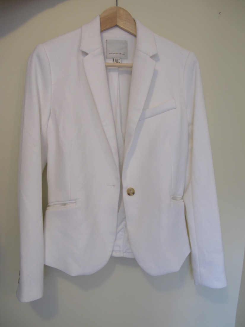
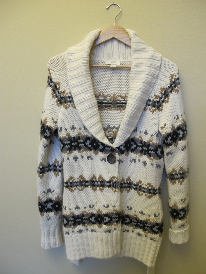
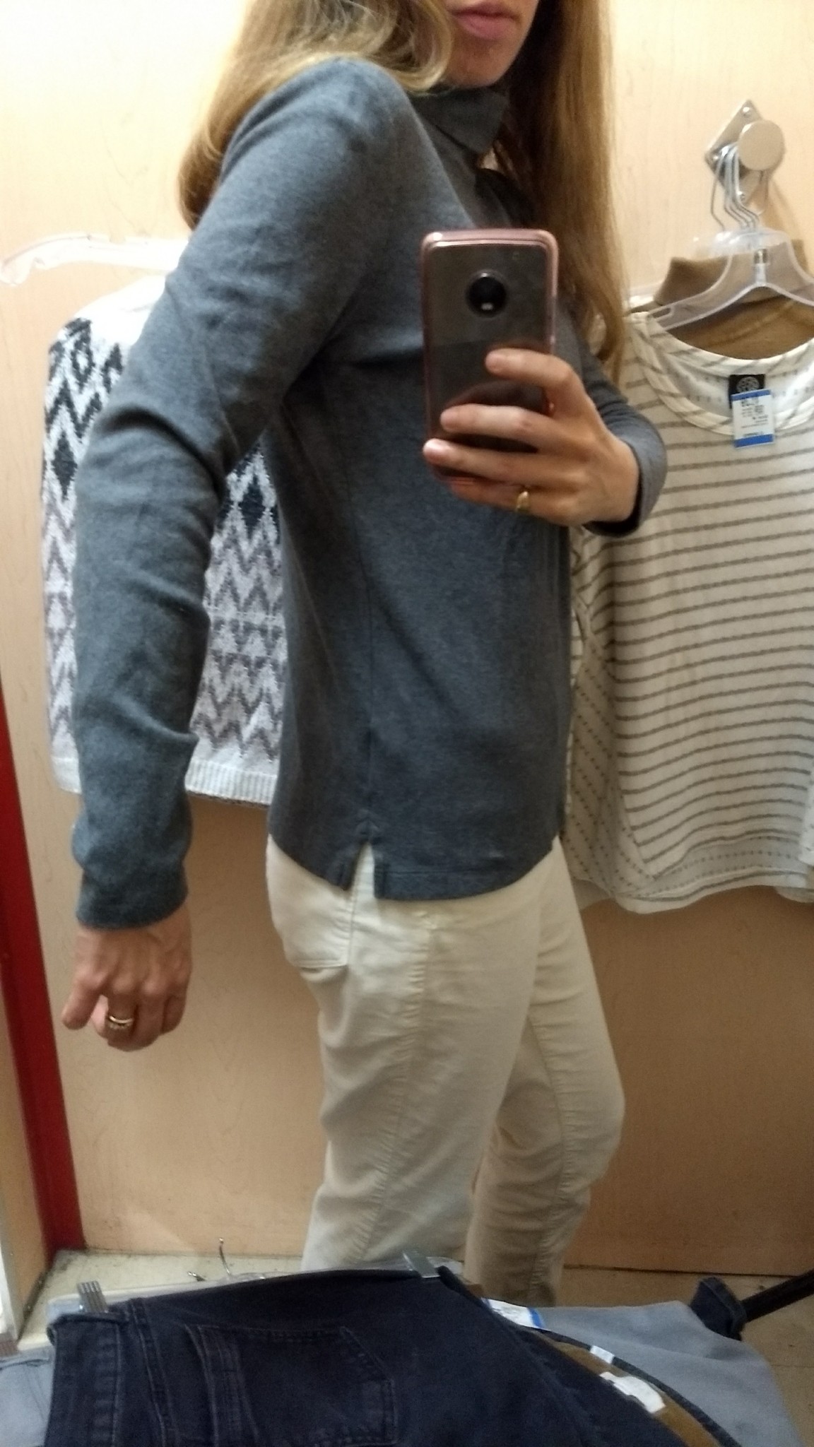
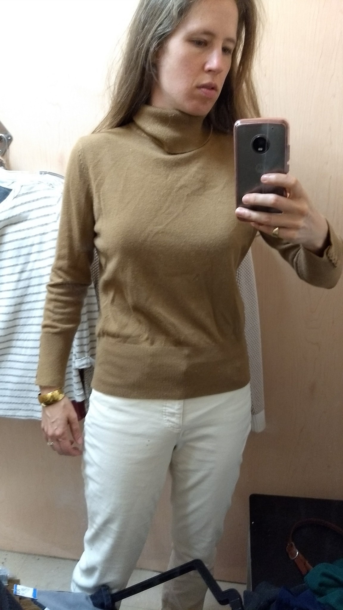
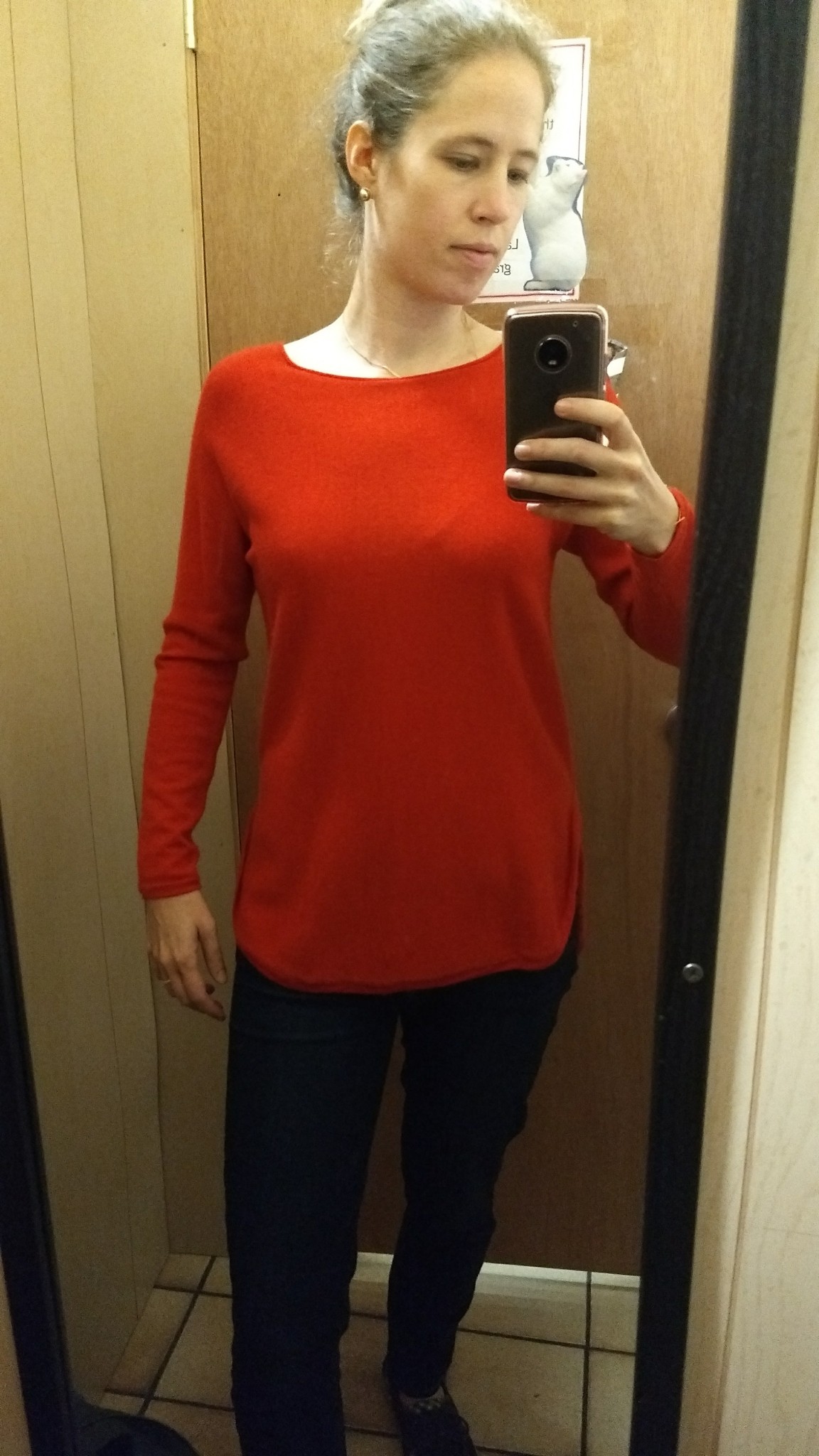
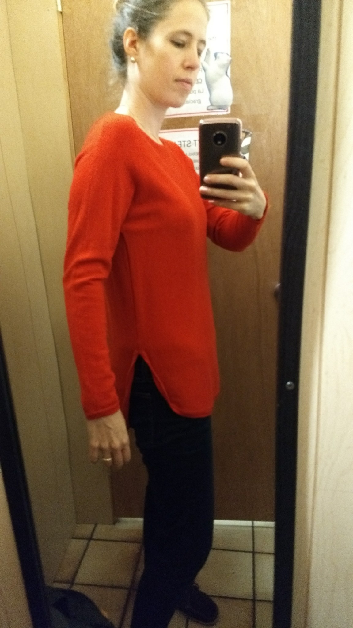
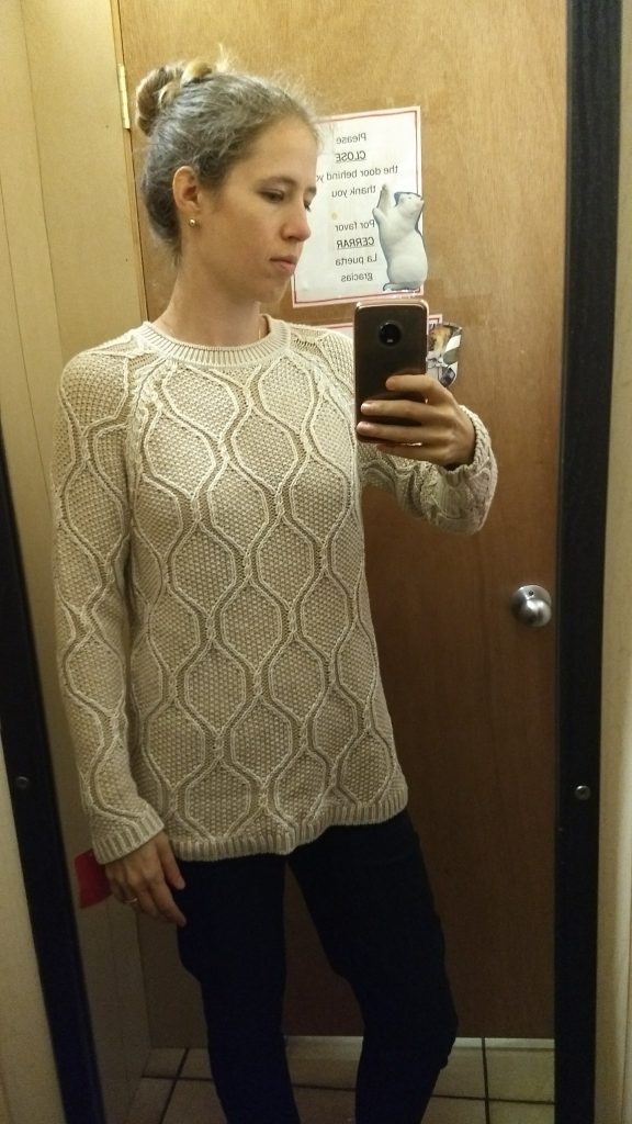
Recent Online Thrift Scores + Online Thrifting Tips

Remember how I swore online thrifting was not for me, but in the same post admitted I had just ordered a pair of pants off of Poshmark? Well, they arrived, along with two other online finds – and unlike the first two times I tried online thrifting (here and here), these fit perfectly and I’m happy with my purchases.

What changed?

I got smarter. Here are my three finds along with some tips for acing online thrifting.

1. Real life references. You’re much closer to guaranteed success if you’re looking for a version of something you’ve already tried on, whether it’s something you spotted at the thrift store or something in your own closet that you’re looking to replace or get in another color.

Last time I went to Sister Thrift, I happened to try on a pair of cream-colored Rock and Republic jeans and fell in love. They were soft like butter on my skin, just the right off-white color for fall and winter, and had enough heft to keep my legs warm in the cold, cold weather. And they were a great skinny fit that would offer another option to my roomier cream corduroys.

The only problem? They were too tight. I could button them just fine, but they squeezed in all the wrong places – I’m not a fan of spray-on legs or pulling in the crotch:

IMG_20171101_163524334
A near miss. (Or a near hit, as Victor Borge would say.)

See that teeny, tiny bit of distressing on the pocket? That was another reason I liked these pants – the distress gave them some textural interest and made me feel like a micro-badass. (“Micro” is how you describe distressing so innocuous that no one at work will notice.)

Since I knew what size was just a smidge too small, and since they fit great length- and waist-wise, I went a-hunting online for the next size up. I figured that the stretch in the fabric would make up for any extra room in the waist. Lo and behold,on my first visit to Poshmark I found a pair in my desired size, and after sitting on it for several days (I was a bit gunshy after my previous failures), I bought ’em:

IMG_20171206_114815990
Hello, lovelies.

One thing I like about Poshmark is the option to make an offer. If something has been up for more than a few days, chances are the seller will be open to negotiating on price a bit. In response to your offer, they can either counteroffer or ignore it; if ignored, the offer expires in 24 hours so you’re not on the hook 6 weeks later for something you no longer want. Thanks to my painfully polite Midwestern upbringing, I’m not much of a bargainer, but the face-saving outs built into this system let you avoid all the awkwardness of telling somebody you’ll pay them less than they’re asking. And if they want to be firm on price, they just won’t offer the “make me an offer” option.

Amateur tip: Make an offer that’s the asking price minus shipping. If the seller accepts, you essentially get free shipping while not gouging their profit too much. After all, this person is making available to you something you either haven’t been able to find in your local thrift store or don’t want to take the time to look for. Throw them a bone.

That being said, online prices mean you’re paying 5 times or more what you’d pay in a thrift store, and there are no returns, so…


2. Only buy what you know you’ll wear, both in terms of fit and style. This means I stay away from certain categories of clothing unless I’ve tried on the exact same item IRL but need a different color or better condition. (Blazers, I’m looking at you – I’ve almost pulled the trigger on a couple of beauties but it’s just too hard to know how a new-to-me blazer will fit in the chest, shoulders, etc.)  I’d also skip pants unless (like above) it’s a brand and fit I know works for me. Just too much room for error in waist size and rise.

Something more forgiving, though, like an open cardigan, is a far less risky proposition. I learned a season or two ago that I am not a cardigan lightweight; no matter how fetching the pattern, I can’t stand layers getting scrunched up under thin, tight-sleeved cardis, plus I can never find a way to button them (or not?) that doesn’t look twee. So I opted for a giant abominable snowman of an oversized cardigan – the kind that fits well in the shoulders but goes down to the hips and is substantial enough to really keep you toasty – and have never looked back. Happily, their roominess also means you can fudge a little when guesstimating re: the fit of an online find.

I currently have one such cardigan in my closet…

img_4229
Such great colors.

…but went looking for a second, both for variety and for wash days. Because sometimes it’s so dang cold that you are wearing a ginormous cardigan even while you sleep (hello New Hampshire nights).

I knew I wanted one with some good drapery (ha) to keep the silhouette interesting, and maybe some leather trim detail, for color contrast and, again, visual interest. I spent more time scrolling through Poshmark than I would like to admit, and came up with a lusciously thick, taupey-grey knit with caramel leather trim by Abercrombie & Fitch:

IMG_20171214_100937817

The colors are similar to the ones in my other cardigan, which meant it would go with everything that played well with my existing cardigan; and the waterfall instead of shawl collar plus the solid-color-with-trim  instead of a knit pattern would keep it from looking too samey.

And we know how I feel about zipper details:

IMG_20171214_101020944_BURST000_COVER_TOP
Who knew you could be so chic, so subtle, so high quality, A&F? You appear to no longer be the debaucherous, obnoxiously overbranded retailer of the malls of my youth.

This cardigan was available in multiple sizes from different sellers, so I got on A&F’s website to check their sizing. I also read every description sellers had posted, and several remarked on how thick and luxurious the knit felt. That’s what I wanted – not some flimsy coverup, but a workhorse that would keep me WARM. My research made me pretty sure I’d love it, and I do.

Amateur tip: for the love of all that is holy, use filters. You get much better results if you use a site’s filters instead of just searching for key words. Not to mention – you know how eBay, ThredUp, and for Pete’s sake even Google’s shopping search results eventually come to an end? Without enough filters, Poshmark’s algorithms will just keep. bringing. you. listings until your eyeballs are ready to pop out of your head. It’s a nefarious plot to fry your brain into spending inordinate amounts of time (and money) on their site, and the only way around it is to tick every box you can find in an attempt to narrow down your search. Sometimes this means doing a search multiple times using different variables, but trust me, your brain will thank you.


3. Shop for specific holes in your closet. The world of online secondhand shopping has exploded in the last few years; there are literally tens of thousands of items for you to peruse on any given site (Poshmark, ThredUp, ReStitch, eBay, Schoola, etc.). It’s also easy to find quality, even designer brands that may be harder to find in a brick-and-mortar thrift store, which means that if you don’t maintain focus, you can end up spending a lot more than you planned on “incredible” deals. (That’s in quotation marks because it’s only incredible if it will really pull its weight in your wardrobe.)

The story of one such wardrobe hole: on the first chilly weekend of fall, I saw a family of three at our holiday fair all sporting plaid flannel shirts.  “It’s the uniform here,” they enthused – “a necessity!” I knew plaid flannel would be right at home in my casual work setting and that I would get a lot of use out of a heavier button down, both over and under other layers.

And I knew which brands to shop for quality. This family was, of course, all wearing L.L. Bean, because – New England. But I found a gorgeous colorway by Lands’ End on Poshmark, and figured that as a native Midwesterner I could sport the Wisconsin-based version of L.L. Bean with integrity:

IMG_20171214_101735697
So. Dang. Snuggly.

Look at those COLORS! Delicious.  I may have worn it two days in a row:

IMG_20171212_165304_482
Duck boots + cable knit sweater + plaid flannel; the New Englander transformation is complete.


Last but not least:

4. Learn to sit with your finds before you buy. It’s easy to feel anxious based on how many people have “liked” or are “watching” a particular posting and then get a bad case of trigger finger. But that’s how you end up with pieces you regret.  When you find something you’re tempted to buy right away, use the “like” feature or simply bookmark the page and come back to it after a few days.  If it’s still there and you’re still excited about it, you’ll know it’s not just FOMO clouding your judgment. If it’s not there, fear not; most things you’ll find on these sites are mainstream enough that they’ll resurface at some point, maybe even in a better size or a color you like more.


What tips and lessons learned do you have to share about online thrifting?  What items would you never buy without first trying on?

Sweater Edit

Y’all. I had a little sweater/wardrobe freak out a few weeks ago. After my winter wardrobe post went up, I did some impulse thrifting and ended up with a sweater drawer that looked like this:

IMG_20171117_105945883

Holy exploding sweaters, Batman! You can’t even see all the knitwear stuffed in there.

So I had a little think about what I really wanted in my sweater collection – textures and colors I love and that have some variation, plus comfort and a great fit – and I pared it down to this:
IMG_20171205_161446590

Two of the above (upper middle) are sleeveless undershirts for layering. Sweater-wise, a few pieces got moved to my “loungewear” shelf or tucked away for next fall; but many more were donated.

Like this one and its blue-grey sibling, both post-wardrobe post additions:

IMG_20171130_111826568

I so wish these vintage Jaeger wool cowl necks would have made the cut (pun intended), but something about the cut makes them ride up after about 2 minutes of wearing. Nope.

I also said goodbye to this Ivanka Trump number for feeling too artificial (no, seriously) and laying oddly on my torso:

IMG_6475

The original price tag was $98 but I just can’t see it – the feel is not nearly luxurious enough; my hand slides off in a weird way.

Here are the two I added in. A deliciously warm grey sweater with partially dropped sleeves and a split hem – unexpected deliciousness from Old Navy:

IMG_20171126_164352_049

With a little closeup on the texture – this thing is SO. INCREDIBLY. SOFT:

IMG_20171126_175146642

This herringbone/bling/Peter Pan collared J. Crew number is just an excuse to wear something ridiculously festive:

IMG_20171128_205316_023

And I LOVE IT. Not classic enough to keep forever, but for $6 it’s worth all the fun I’ll have with it in the next few months/years.

And finally, this wool blend from Nordstrom’s that’s a beautiful taupe and has a slightly oversized cut (with split hems!):

IMG_6513

Please ignore the snail-trail line on the torso – I had just steamed it and didn’t let some of the condensation dry.

So now my sweater lineup looks like this:

IMG_6489 IMG_6500 IMG_6473 IMG_6471  IMG_3668 IMG_6513img_4240 wp_20161102_16_55_01_pro img_4497 wp_20161205_14_35_29_pro-1 IMG_20171128_205316_023 IMG_20171124_150421752

A little more trimmed down (12 instead of 14), a little more variety in color, and every piece something I love to wear.

Speaking of sweaters, they are easy to accidentally shrink in the dryer. If you have something in need of unshrinking, try using this tutorial from the good people at Tips Bulletin (no compensation for sharing this; they just suggested it might be useful to my readers and I agree!).
How’s your sweater game lately?

DIY Pendant Necklace Update

A while back, I lost my original DIY pendant necklace:

IMG_3713

Sad face. I’ve lazily waited a few weeks for it to turn up, feeling no urgency since I hadn’t been wearing it much anyway. But as I started to lean more into solid tops just begging for a little pendant pick-me-up, I realized how much I had relied on this puppy. Absence makes the heart grow fonder and all that.

So I set about reconstructing it. I unfortunately had no more creamy, taupe-y pentagonal dodecahedrons (geometry term of the day!), and it turned out to be easier to leave the chain links on the metal spiral bead they were attached to, so it ended up looking quite different – but you can see where I got the inspiration:

IMG_20171126_175706250

While I had my supplies out, I also made a pendant out of some gold-tipped shell earrings I thrifted the week before.

From this…IMG_20171115_205629605

…to this:

IMG_20171122_091433_660Crystals + blush pink – is that not the most millenial piece of jewelry you’ve ever seen?


I also made another one similar to the first, but in bigger proportions:

IMG_20171126_175146642

I’ve worn each one once or twice so far; expect to see these popping up on my Instagram while I figure out which pieces go with what outfits and which I really love. (It’s a case of the “more becomes less” phenomenon also seen in my wardrobe – i.e., make a bunch of pendants and see which ones stick!)

If you’d like more detailed instructions on how to make your own pendant from thrifted parts, I documented the making of that original pendant here.  Fingers crossed I eventually find the original squirreled away in some unfolded pile of laundry!

Thrifting Dupes for Online Finds

Sometimes I am bad and go surfing on the secondhand interwebs for things I wish I had in my closet. It never ends well (see here and here). Lately, I’ve had a bit of restraint, and have been rewarded with in-person dupes for my internet finds.

It started with this French Connection sweater, which was, alas, too small for me:

IMG_20171013_151327178

I loved that caramel-and-cream combo and the textured pattern, so I went looking online for that same sweater, with no luck. So instead of keeping an eye out online, I kept an eye out on my thrifting rounds for something similar:

IMG_6501

Cream & caramel colors? Check. Textured pattern? Check. This L.L. Bean sweater does the job, and for a lot less than the price of an online find.

Ta-da:

IMG_20171028_115315_355


In my French Connection searches online, I came across this fabulous tomato red number:

m_59108bea13302a7a4600660f
Source

I loved the color and the split/hi-lo hem. The price was right ($11 – although I still had to pay $6.49 for shipping). But there was no way to tell if it would fit. I put it out of my mind by thinking about how disappointing it would be to have it show up and be too small.

But then, lo and behold, for less than the selling price of the French Connection sweater online, my very first Eileen Fisher find hit the nail on the head:

IMG_6500

It’s 100% merino wool and a great fall color:

IMG_20171028_172920496

The lesson I’m supposed to learn from this is that when I’m tempted to snap up some online find, I’d do better to wait and let the thrift gods send me something just as good (or better!).

Buuuuuuut… after letting them sit for a few weeks, I just bought some cream-colored skinny jeans off the internet. I tried on a smaller size in the thrift store – that was my inspiration – so I am reasonably confident they’ll fit. Who knows, though – I’m 0 for 2 in terms of online thrift finds success. Let’s just hope this one breaks the streak!


What thrifting habit do you *know* you should give up, but you have a hard time leaving alone?


PS To all my American readers, Happy Thanksgiving! (And a VERY belated Thanksgiving to my Canadian readers as well.) May you thrift super-chic outfits with stretchy waistbands to accommodate all the delicious food you’ll eat this week!

My Winter Wardrobe

First, a note about my posting schedule. Work is ramping up (hello Advent, you’re right around the corner!) which means lately I haven’t had as much time as I would like to write and publish posts.  For the foreseeable future, you can keep expecting at least one post a week, but my usual Tuesday/Thursday schedule will now become the ideal rather than the norm.  Thanks for your flexibility and for continuing to keep this blog a fun and creative place for community and conversation!


And now, this year’s late fall/winter wardrobe, for your viewing pleasure. Since I broke up with capsule wardrobes, this is not a comprehensive list of every single piece I will wear this winter, but rather the pieces I imagine will get the most wear; they form the core of my wardrobe.

Tops

IMG_6489 IMG_6470 IMG_6500 IMG_6475 IMG_6473 IMG_6507 IMG_6471 IMG_3677 IMG_3668 img_4240 IMG_6501 wp_20161102_16_55_01_pro img_4497 wp_20161205_14_35_29_pro-1
Coin 1804; Gap Body; Eileen Fisher; Ivanka Trump; Workshop by Andrea Jovine; J. Crew; Cyn; Liz Claiborne; Gap; Loft; L.L. Bean; J. Crew; Joan Vass; Gap Designed & Crafted

I’ve really upped the number of tops this year for two reasons: I have about twice as much winter to contend with, plus my M.O. for expanding a section of my wardrobe tends to be “buy several different varieties I think I’ll like and then see what actually gets worn.”  Instead of “less is more” (which is where I hope to end up), this is basically the “more becomes less” approach.

Re: colors – is anyone surprised that my sweater palette is basically blue and cream, with pops of caramel, grey, and red? That’s my whole summer wardrobe right there.


And the dresses keep the theme going….

Dresses

IMG_6490 IMG_6491 IMG_6492 IMG_6493 IMG_6494
Gap; J. Crew; Merona; Caslon; Merona

I’ll wear these with cream, blue, and grey tights of varying weights.


The pants, however, have a liiiittle more variation in hue happening…

Pants

IMG_6480 IMG_6479 IMG_6478 IMG_6476 IMG_6505 IMG_6506
Loft; Talbots; Paige; Lauren by Ralph Lauren; Banana Republic; Jessica Simpson

I’m enjoying pairing more neutral tops with more colorful bottoms – if you can call purple so dark it photographs as black (those first pants) “color”!  And yes, apart from the jeans, I’m sticking with the all-corduroy streak again this year. They just feel…cozier.  I’m probably deceiving myself that corduroy imparts extra warmth; after all, the fuzziness is on the outside, not on the inside where it would do some good.  I don’t care; just let me hold onto my comforting delusion!


Back to the trusty ol’ red/cream/blue color palette for my layering pieces.

Layers:

IMG_6495 IMG_6496 IMG_6498 IMG_6499 IMG_6371 img_4229
Kate Hill; Merona; Tahari by Arthur S. Levine; The Savile Row Co.; Mercer & Madison; Loft


Last but not least…

Outerwear:

IMG_6469  IMG_2747 IMG_20171013_154535594
United Colours of Benetton; J. Crew; Larry Levine
That’s a lot for now; I’ll share scarves/hats and footwear in another post.

In the meantime, check out my winter wardrobe this time last year; a lot has changed!

Thrift Finds: October 2017

First up, I want to share with you all Nadia at Happy Malista’s recap from her 10×10 challenge; she shared her outfits as well as outfits from a few other bloggers whose challenges she enjoyed, including yours truly! It’s sometimes hard finding a style blogger whose style is close enough to your own to resonate but different enough to inspire you; Nadia’s 10×10 hits that sweet spot for me. She’s convinced me I need to replace the blazer I used to own that was kind of a spring take on moss green…

And now, on to my thrift finds from last month!  Starting with the NOs:

A great soft dark grey turtleneck with split hem, made of supima cotton, that was too baggy – sigh:

IMG_20171013_152719743

A Talbots sweater that made me feel like I live in a ski chalet – look at that great fringe!

IMG_20171013_153206604

A wonky fit in the torso, though:

IMG_20171013_153200362 (1)

I’m on the hunt for a caramel-colored turtleneck but this one was giant in the armpits:

IMG_20171013_152917179

It hid its ginormous pits well, though:

IMG_20171013_152912016

This dark cognac trench was a dream – 100% wool, and just had so much character:

IMG_20171013_160744484_BURST001

It was a little TOO oversized on me, and the color a bit intense – see how it’s the first thing your eye is drawn to in the picture, instead of my face? Sign of a tone mismatch.  Anyway, this would have fit my fantasy life (city dweller with a 20 minute walk across the Loop to get to my office) but not my real life (quick jog down the block to my office, then where do I stash this monster?), so I left it there.  Tear.

It’s hard to tell, but this riding jacket by Ralph Lauren was too big on me. The cut is very equestrian; can’t you see it paired with jodhpurs?

IMG_20171013_154652648

But here’s where it shines – velvet collar and some purple woven in with that moss green. It’s like heather in a blazer!

IMG_20171013_160343816

Various pants I tried out because I thought I needed grey jeans (probably not true):

IMG_20171013_154055468 IMG_20171013_153914420 IMG_20171013_153732837

Several sweaters that didn’t make the cut, such as:

Loft – loved the diamond pattern but it was scratchy-atchy-atchy, as one of my kid’s storybooks says:

IMG_20171013_152605229

Same with this Gap sweater – scratchy, and that neck plus those sleeves totally remind of the year 2000:

IMG_20171013_152216235

Too much blue in this green sweater by Land’s End – but it fit perfectly! (Their tops are usually too wide in the torso for me):

IMG_20171013_152111795

Italian wool from Banana Republic, too tight (that smudge is the mirror, not a sweater defect):

IMG_20171013_152418998

And a J. Crew dress that underwhelmed, I think mostly because it was short enough to need leggings, but lightweight enough to show any lumps and folds from underlayers:

IMG_20171026_163853216

That bottom half is navy, despite its greenish tinge in this photo.


And now, for the winners!

You’re familiar by now with my new cable knit sweater by Workshop by Andrea Jovine:

IMG_20171013_153359855

Here’s my new goose down coat by Larry Levine; it retails for up to $200 but thrifted for $20. I may not be psychologically ready for the cold, but I will be sartorially ready for it!

IMG_20171013_154535594

It’s just this side of dark charcoal, so hopefully it will not wash me out quite as much as pure black. Honestly, though, if I’m warm and I paid 10% of MSRP, I don’t care. Functional wins out over everything else in this case.

Here’s my first Eileen Fisher find! A bright, orangey red that is sort of intensely bright – what a great fall color:

IMG_20171026_164029416

Check out that split hem!

IMG_20171026_164024202

To wit, here it is styled:

IMG_20171031_090119432 IMG_20171028_172920496

And this tan/cream patterned sweater by L.L. Bean:

IMG_20171026_163718207
There’s a cat balancing on my phone!

…with a fun hi-lo split hem:

IMG_20171026_163725289

Here it is styled:

IMG_20171101_200831_843

And last but not least, this merino wool plaid scarf in colors that complement my wardrobe in stellar fashion:

IMG_20171016_173945_518IMG_20171024_165459875


Overall, a pretty good month.  Onward to November!

Did anything in my finds catch your eye?  What did you thrift this past month?

Freezer Waffles & Christmas Lights: Happy Halloween!

Can you guess who we are?

IMG_20171031_090901409 IMG_20171031_090656346

If you need a hint (or a laugh), watch this.

PS the only thing thrifted is my United Colours of Benetton field jacket, but everything else we already had in the house. (Thank you, church members, for stocking our freezer with Eggo waffles!)

Happy Halloween, y’all!

Finding the Perfect Cable Knit Sweater

I hate cable knit sweaters.

I can’t really deal with how preppy they look, how plain and boring it feels to see the same. twisty. pattern. repeated over and over.

NO

If they are your jam, I apologize now.

The closest thing I’ve ever owned to a cable knit sweater was this mint deal from a few winters back…and it was a flop. But how catalogue-worthy is this shot?!  Haha.

IMG_1795


Then one day a few weeks back, I spotted this baby on Instagram:

And suddenly my attention was captured.

What made this different from the samey-same feeling of traditional cable knit sweaters and cardigans? First of all, the cable knit was BIG and BOLD which considerably reduced the twee factor.  Second, there was other texture going on – a sort of chic waffle that is one of my favorites – and it made the cable knit a feature, not the whole story.  Then that split hem (another favorite) updated it out of the traditional prep aesthetic. And the flecked knit job (yet another fave) brought even more texture and visual appeal.

Refinery, the Instagram account that featured the sweater, is a consignment shop in Oregon City, Oregon. I have no idea whether they ship, but I was so taken by it that I inquired whether it was still for purchase (nope). I then spent a bunch of time searching on ThredUp, Poshmark, etc. for the sweater, which is by Urban Day.  No luck.

Then I figured I would just keep a thrift eye out for something similar, and saved the image on Instagram for easy visual reference while thrifting. (Did you know this is a thing? There’s a little bookmark or ribbon-like icon below a post that lets you save it to your “collections.” Learned that handy little tip from The Anna Edit in this video, where she uses the save and “collection” features to keep style notes that help her flesh out her seasonal capsule wardrobes.)

Lo and behold, the thrift gods smiled upon me, and I spotted this baby by Workshop by Andrea Jovine not long after:

IMG_6472
Don’t worry, I don’t actually store my sweaters on hangers – that stretches them out!

Giant cable knit? Check. Other texture of a waffle-y variety? Check.  Split hem? Check.  Flecked yarn? Nope, but you can’t have everything.

This sweater has quickly become a favorite – I feel like its relaxed chic vibe, particularly its loose semi-cropped silhouette, instantly catapulted me into realms of style blogger cool I rarely reach. And it is so soft. 

Something you can’t see in the pictures?  It’s got some not-so-nice pilling happening. More than I can reasonably tackle in one sitting.  This means the yarn is made of short fibers, which are cheaper (and poorer quality).  So as much as I love this sweater for what it is, I’ll be keeping an eye out for a higher quality upgrade.

So cozy:

IMG_20171014_104252838

Sweater chic:

IMG_20171016_173106085 (1)


What are your feelings on cable knit?  And what’s an item or style of clothing you had to find juuuust the right version of before it even remotely appealed?