How Much Color Does a Colorful Wardrobe Need?

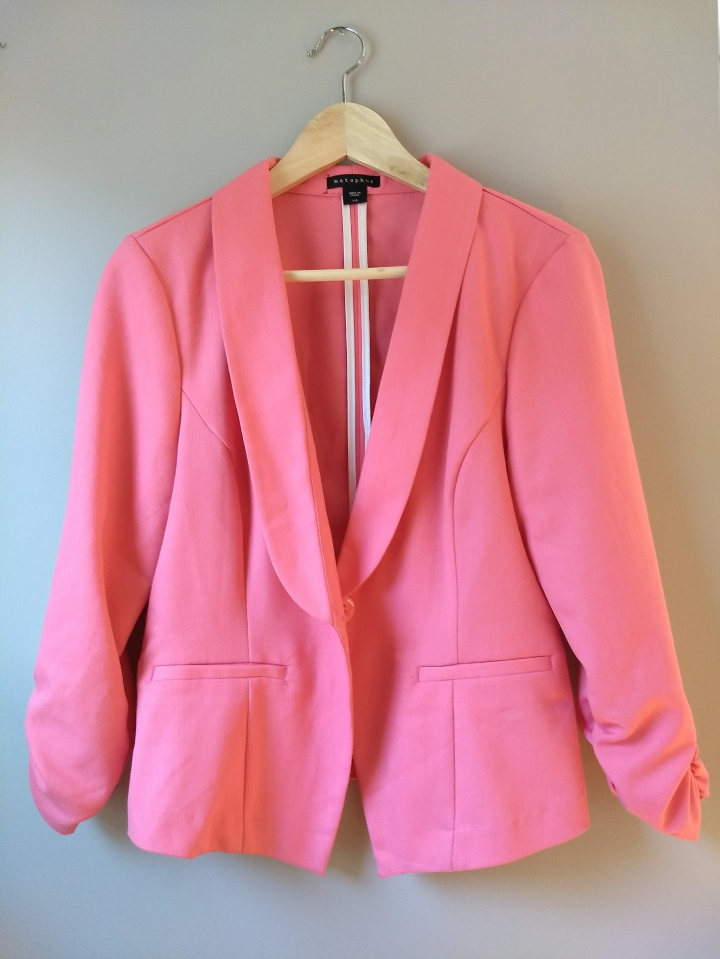
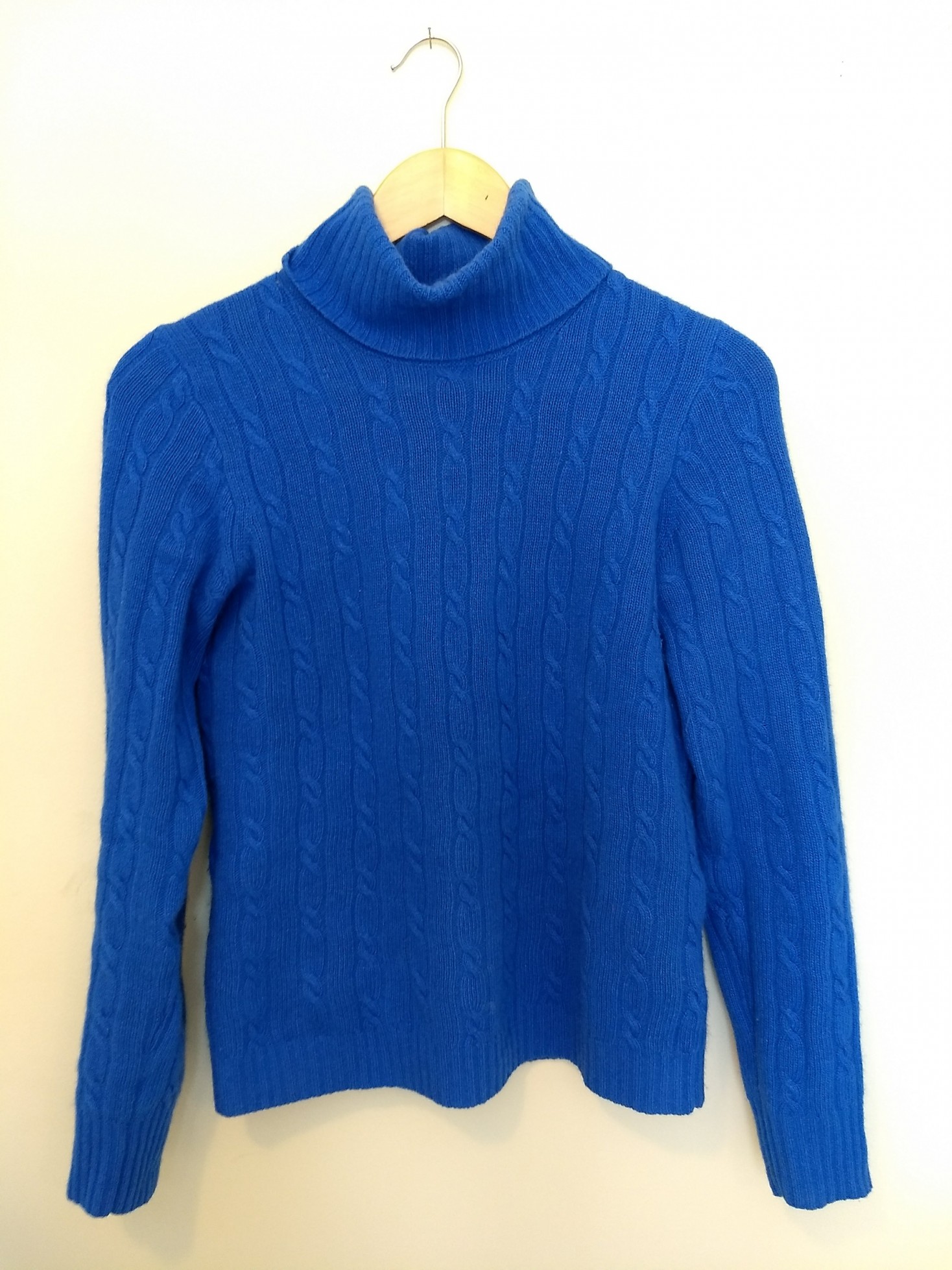
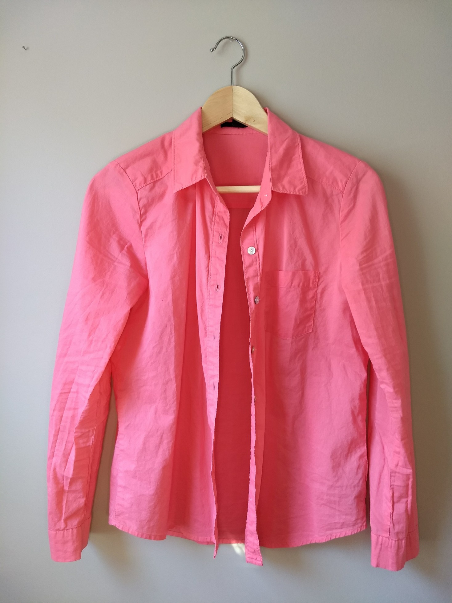
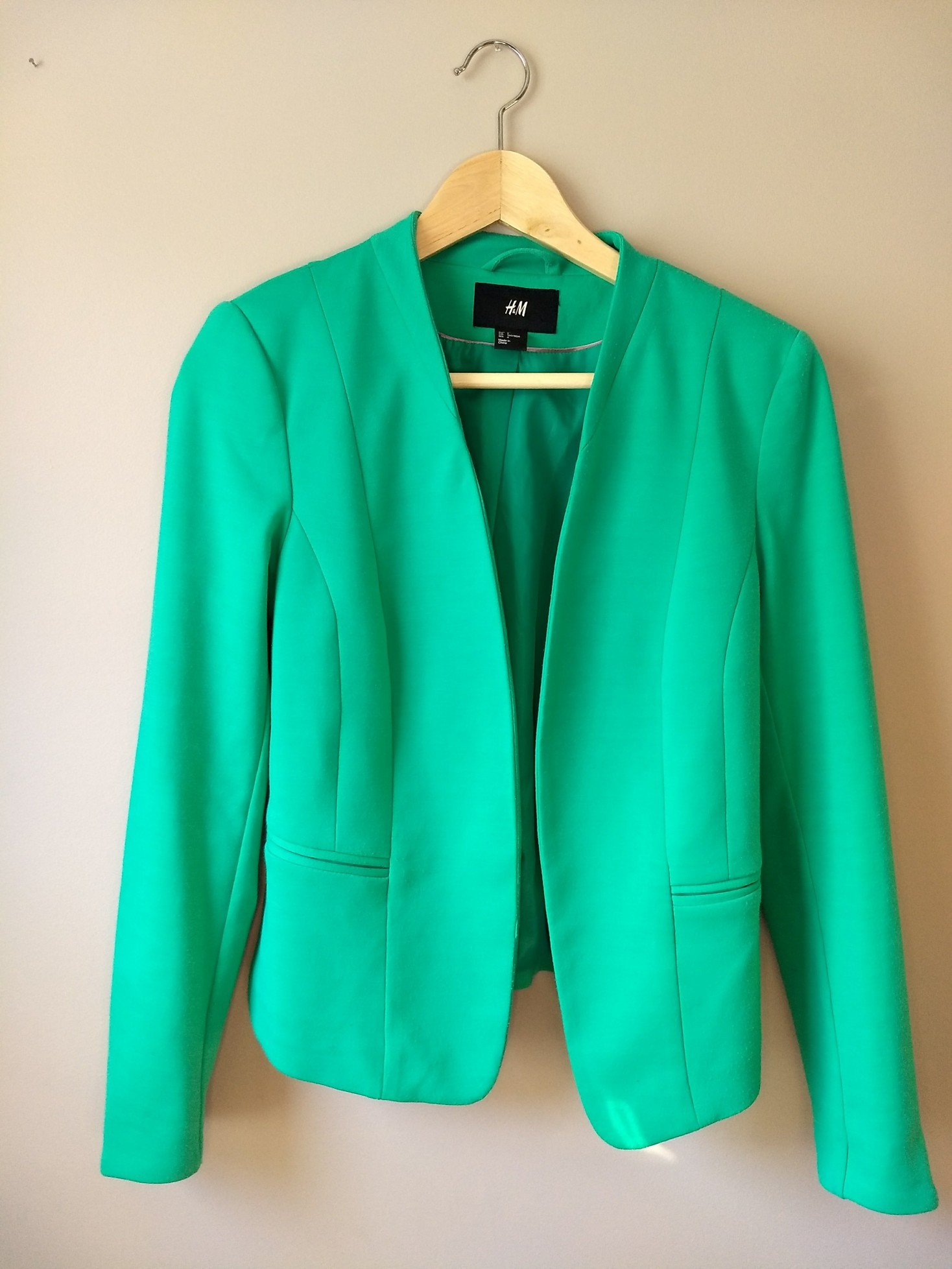
I love color. And as a “Light Summer” in the world of personal color analysis (PCA), there are plenty of gorgeous colors to choose from:

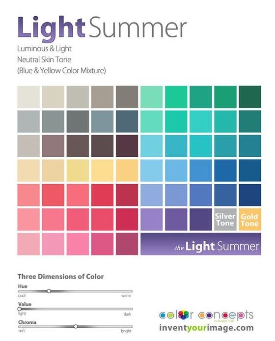
After a detour down the rabbit hole of Instagram-inspired neutrals and with my PCA color palette in hand, I was excited to start wearing color again. After all, I used to regularly dress in electric blue snakeprint blouses and dresses covered in purple tulips with red, green, and yellow accents. (Man I wish I had a picture of that dress to share with you.)

Someone further ahead on the PCA journey than I am cautioned me that neutrals would actually help ground the gorgeous colors in my new palette, and while I knew Kim’s advice was right on, as a color-lover, it felt so much more fun to hunt for my new colors than it did to look for neutrals.

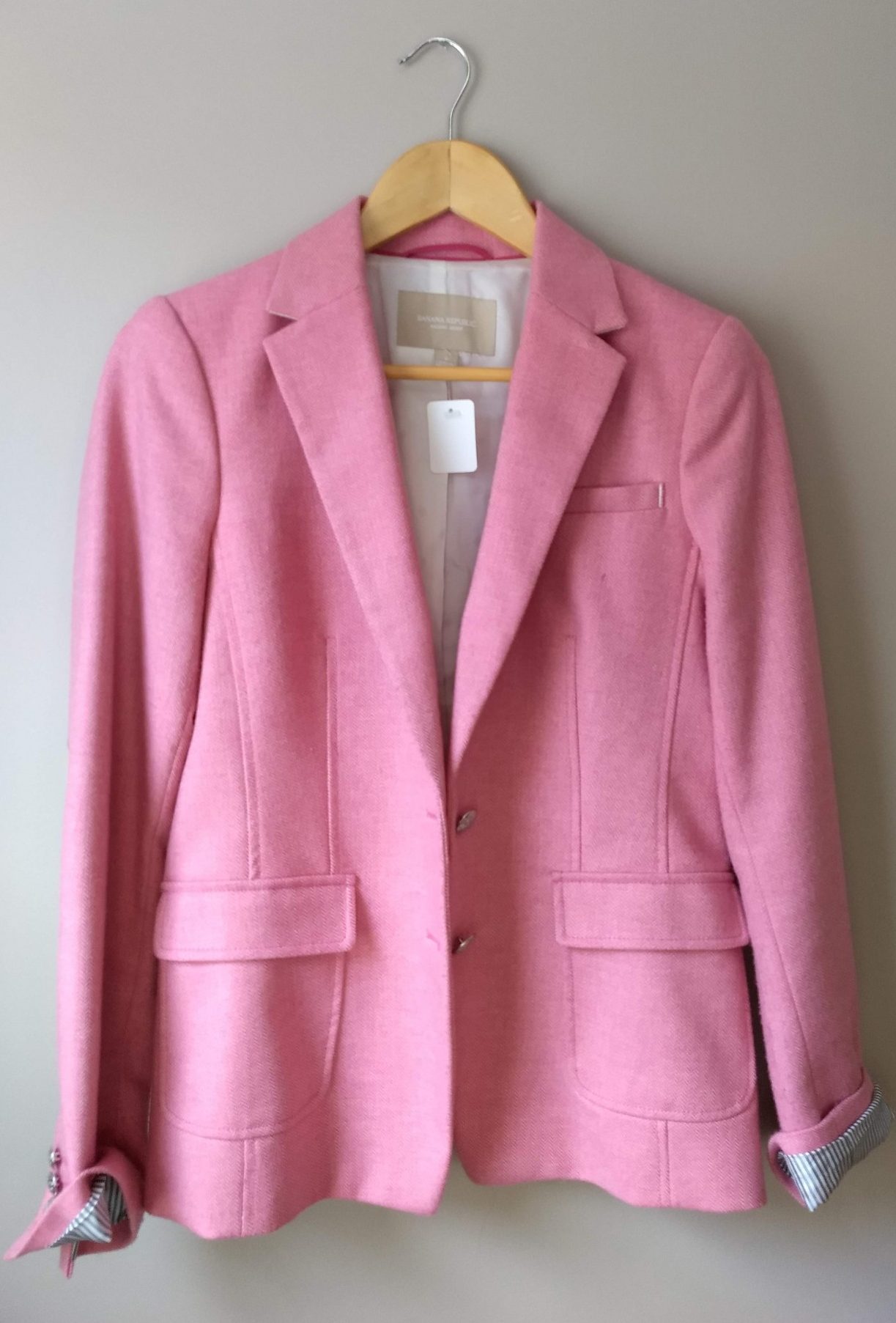
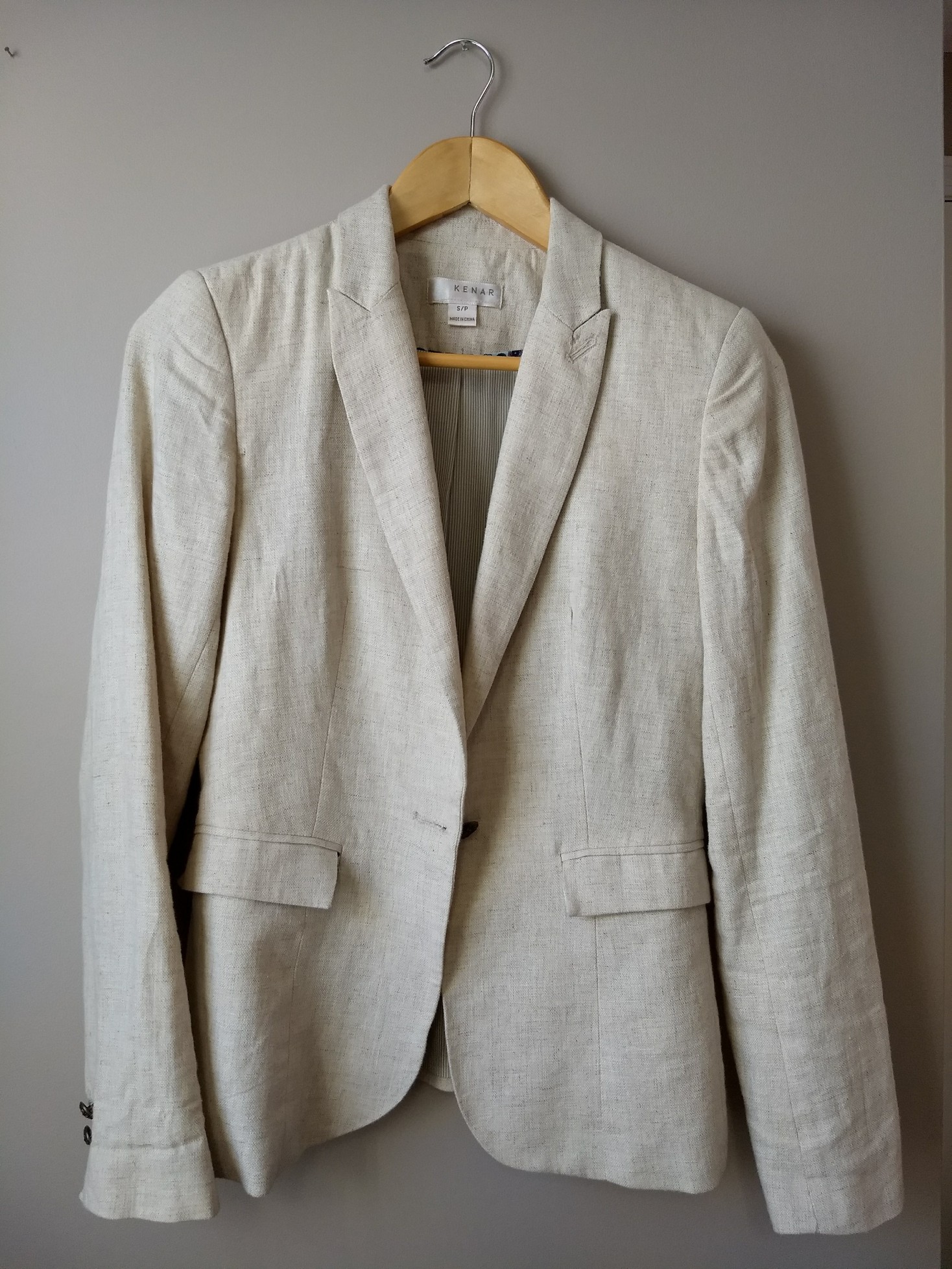
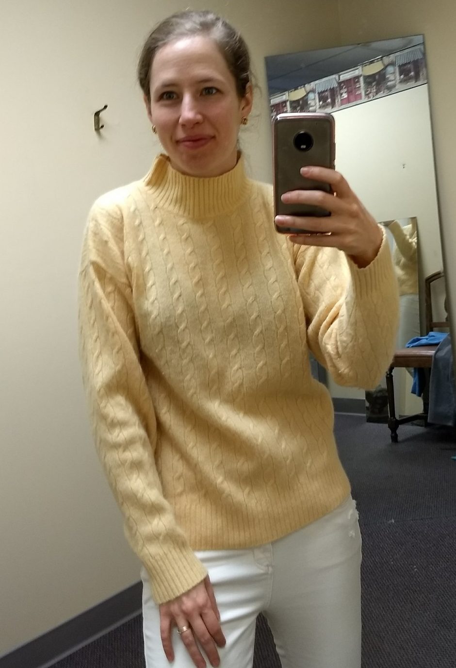
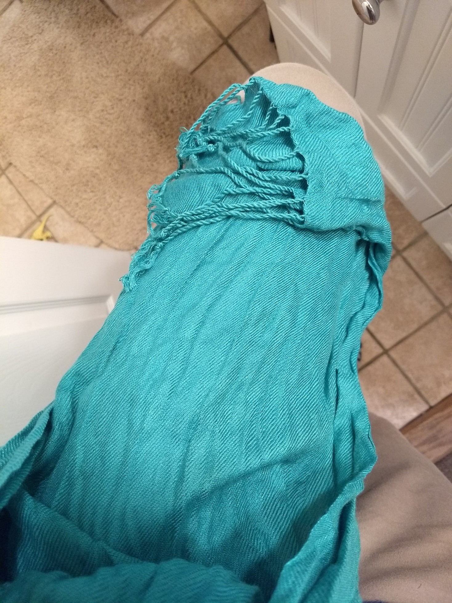
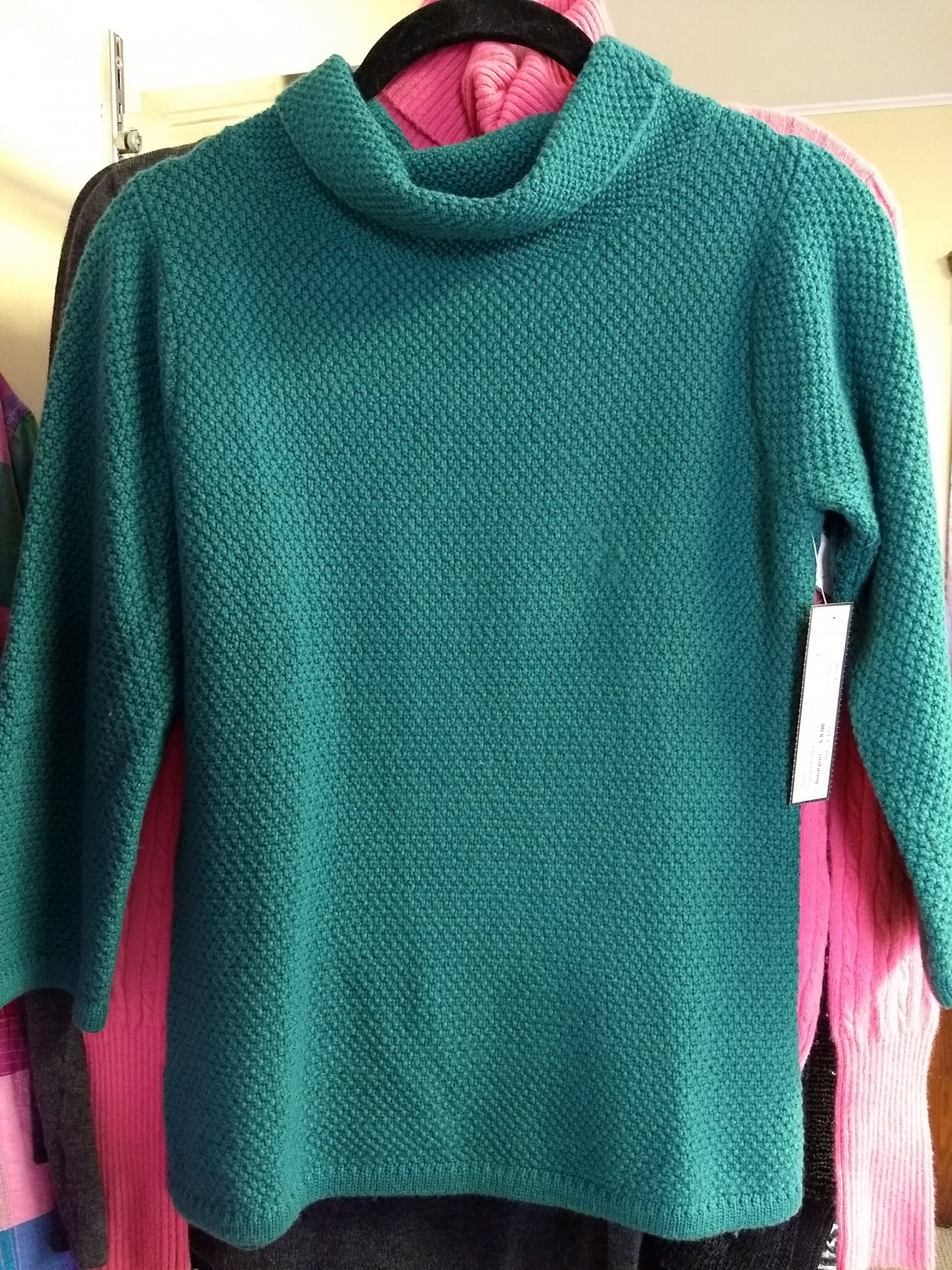
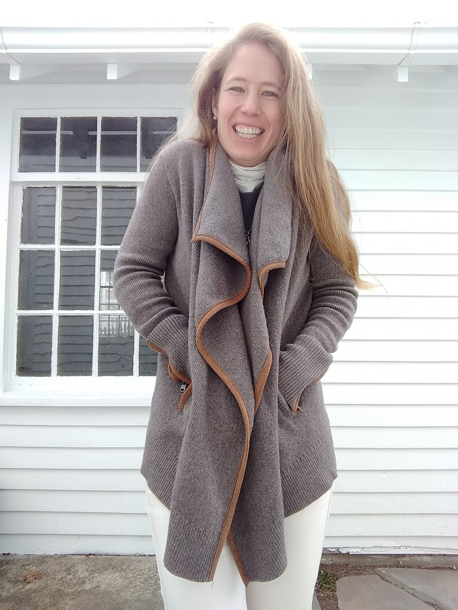
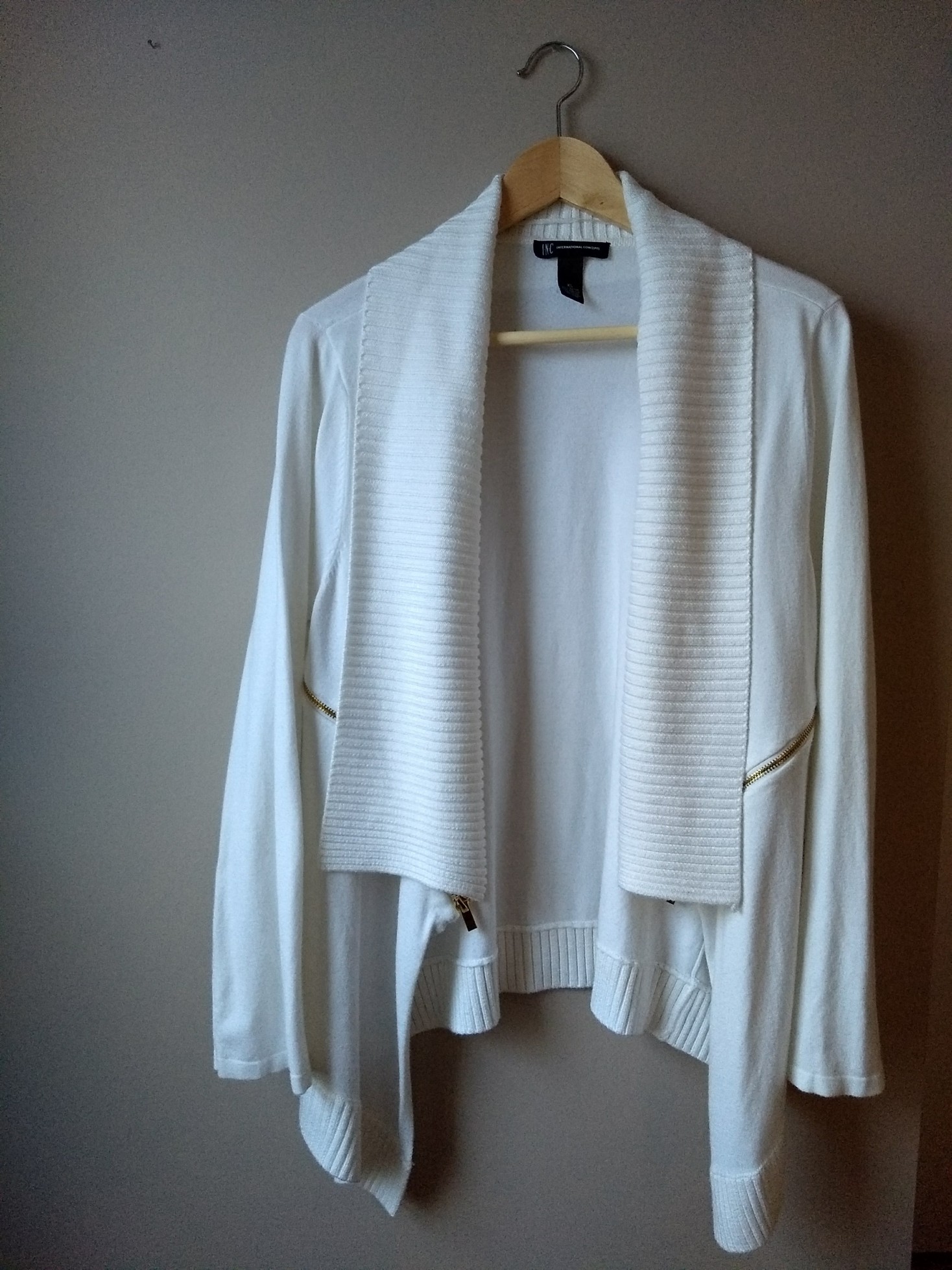
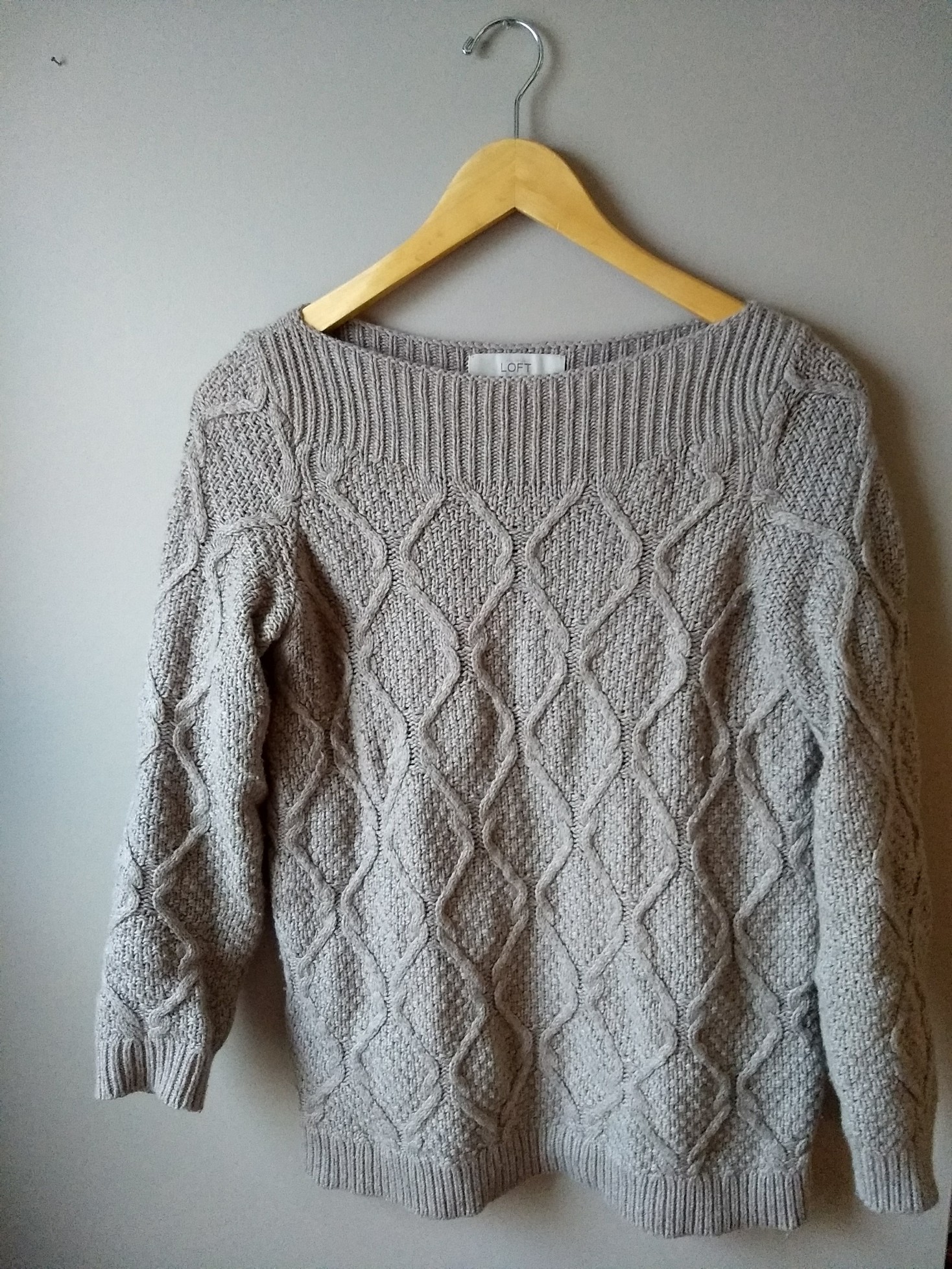
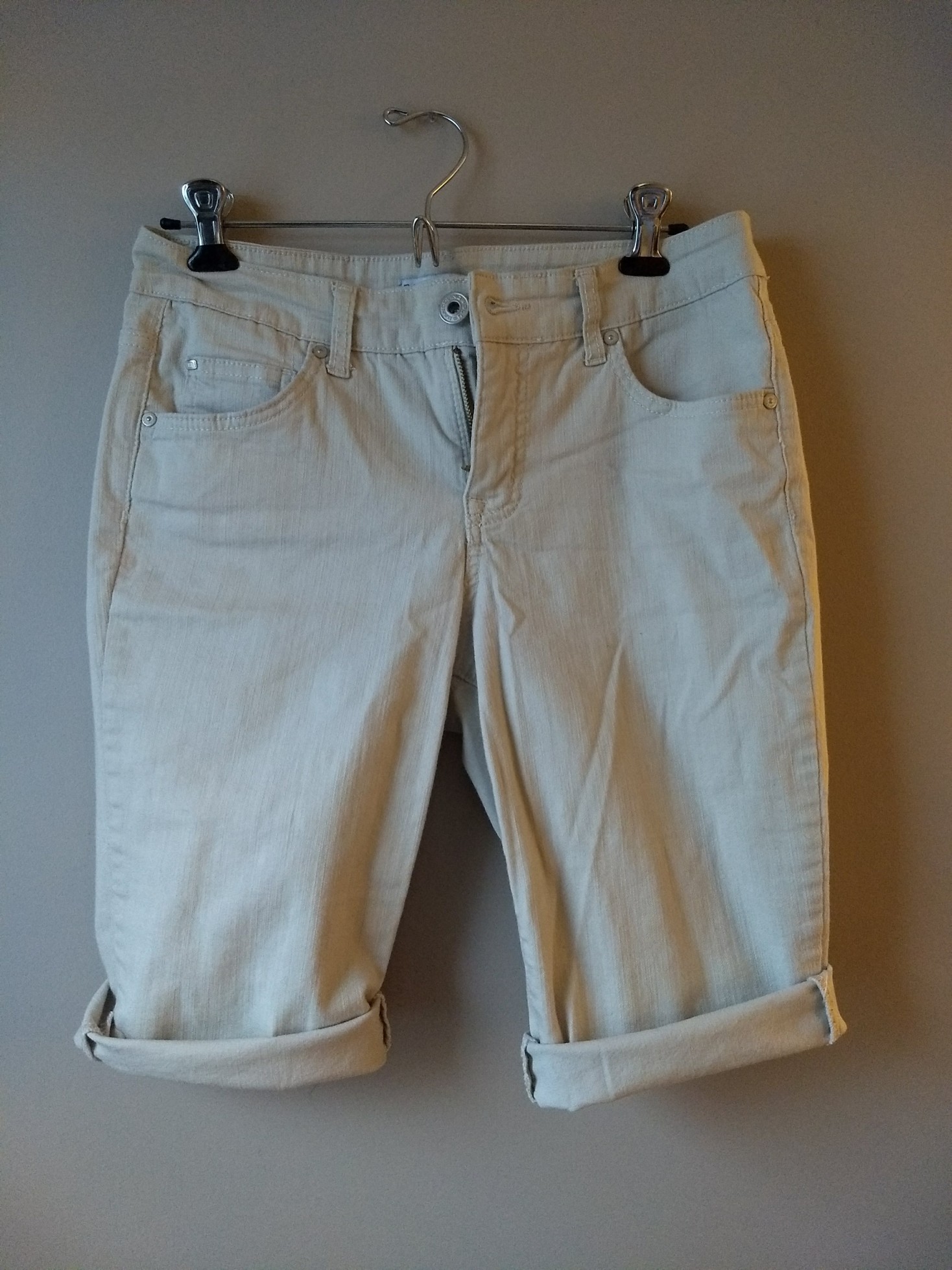
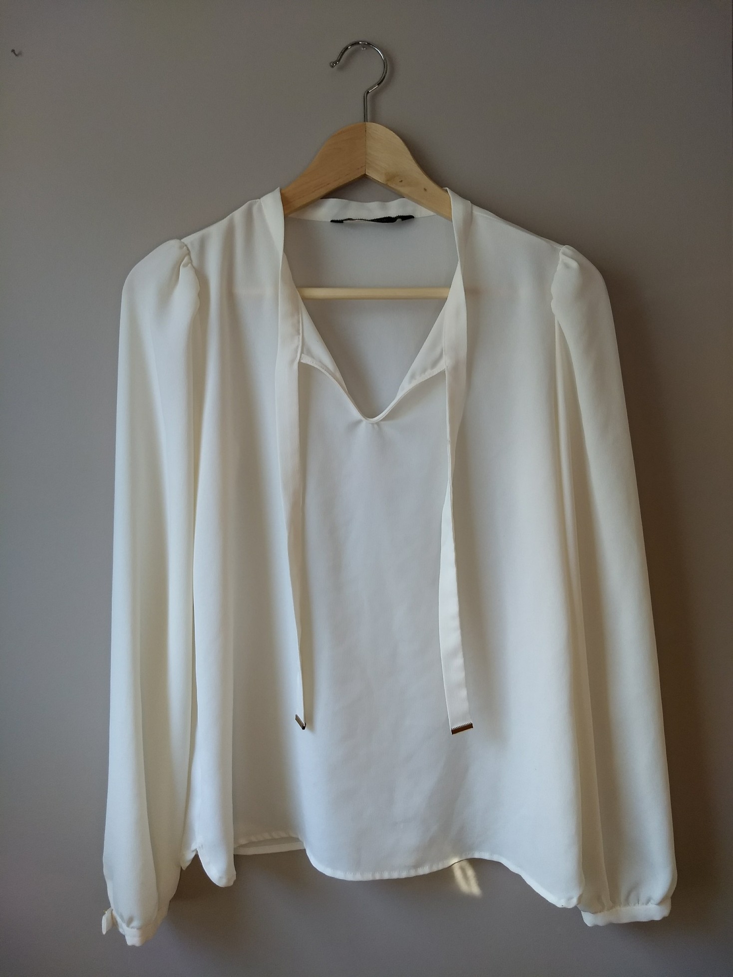
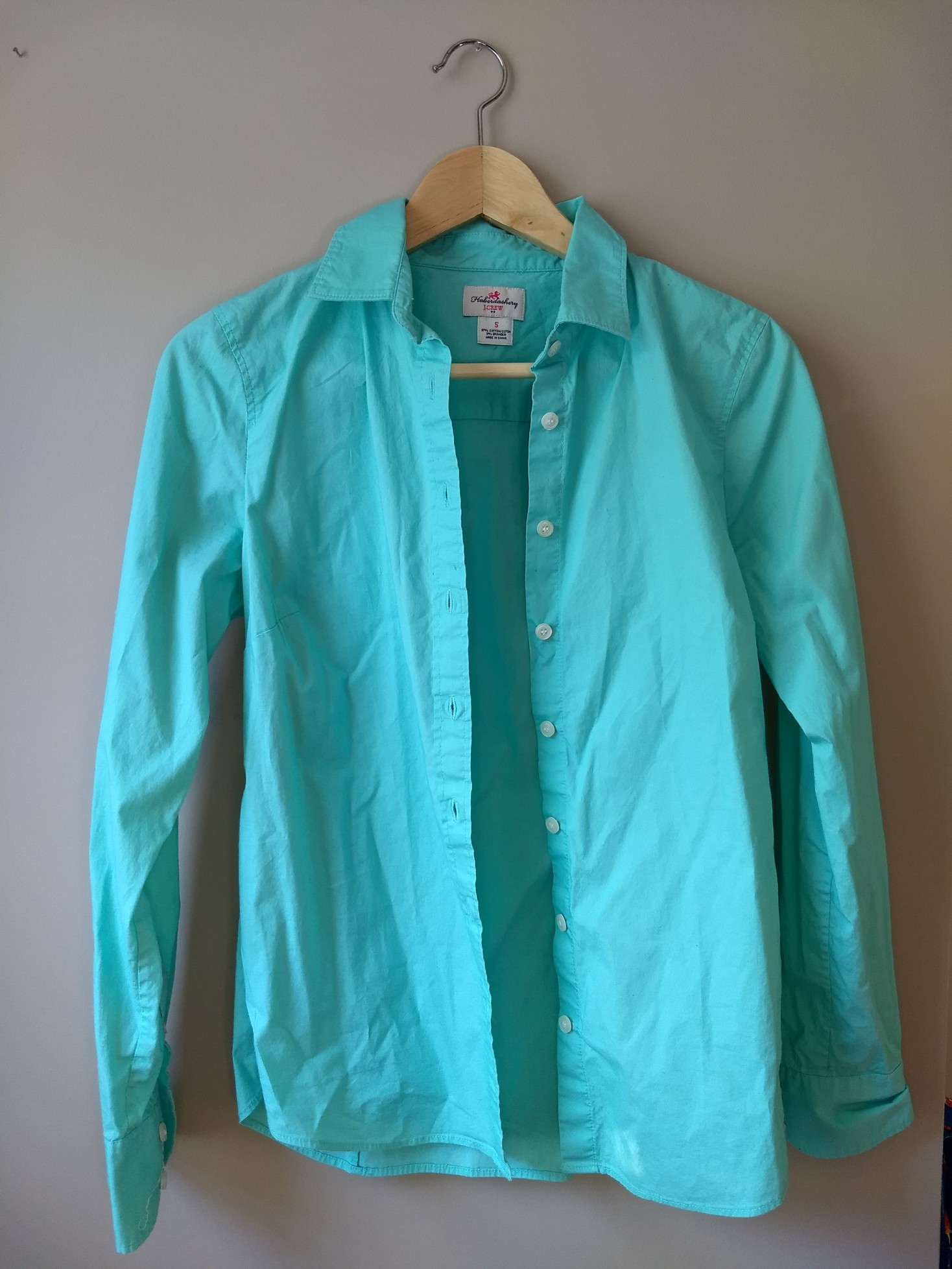
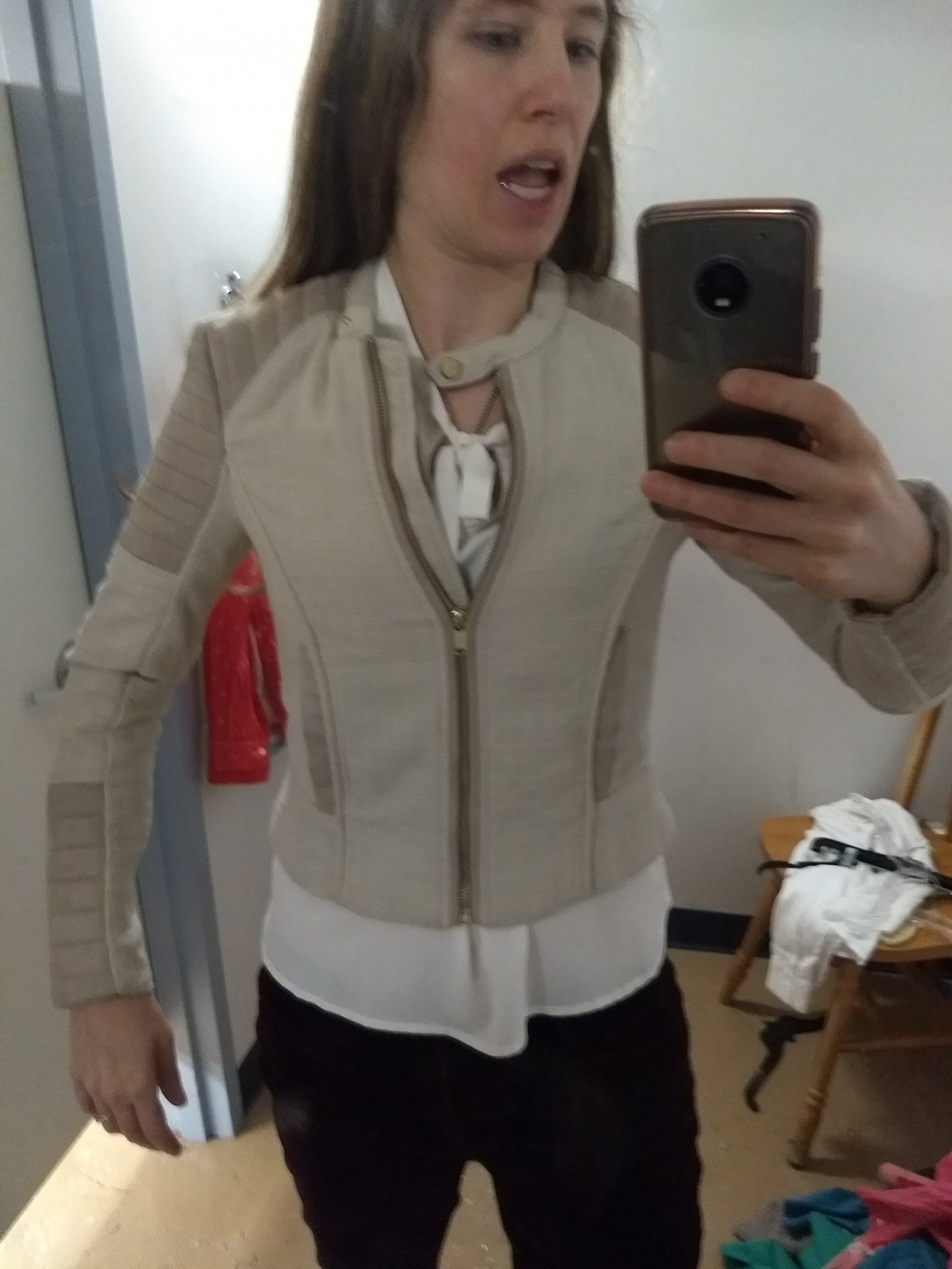
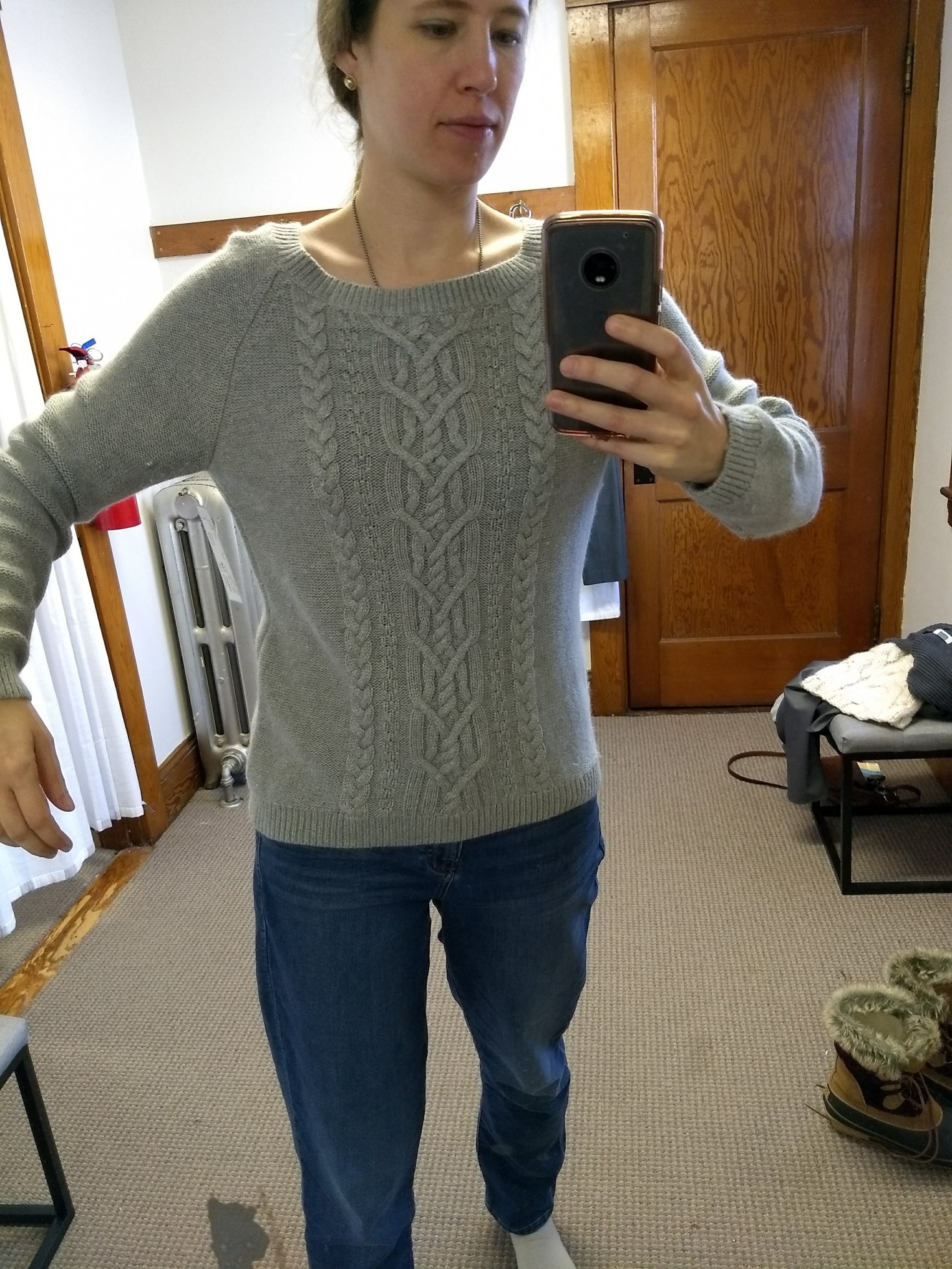
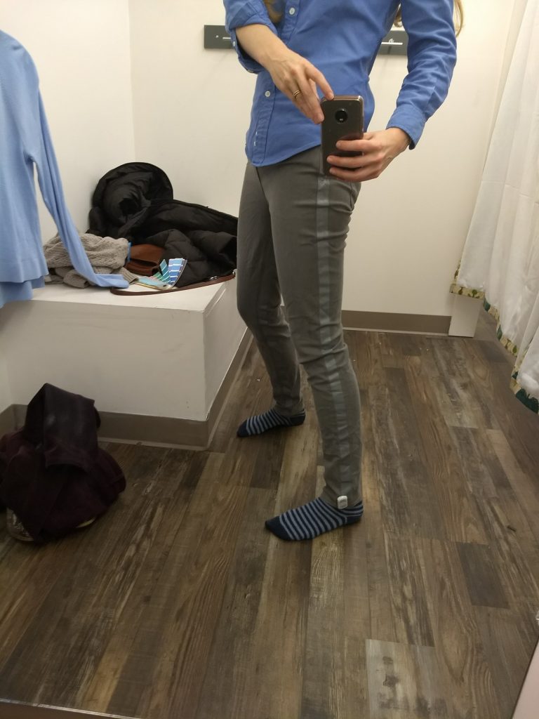
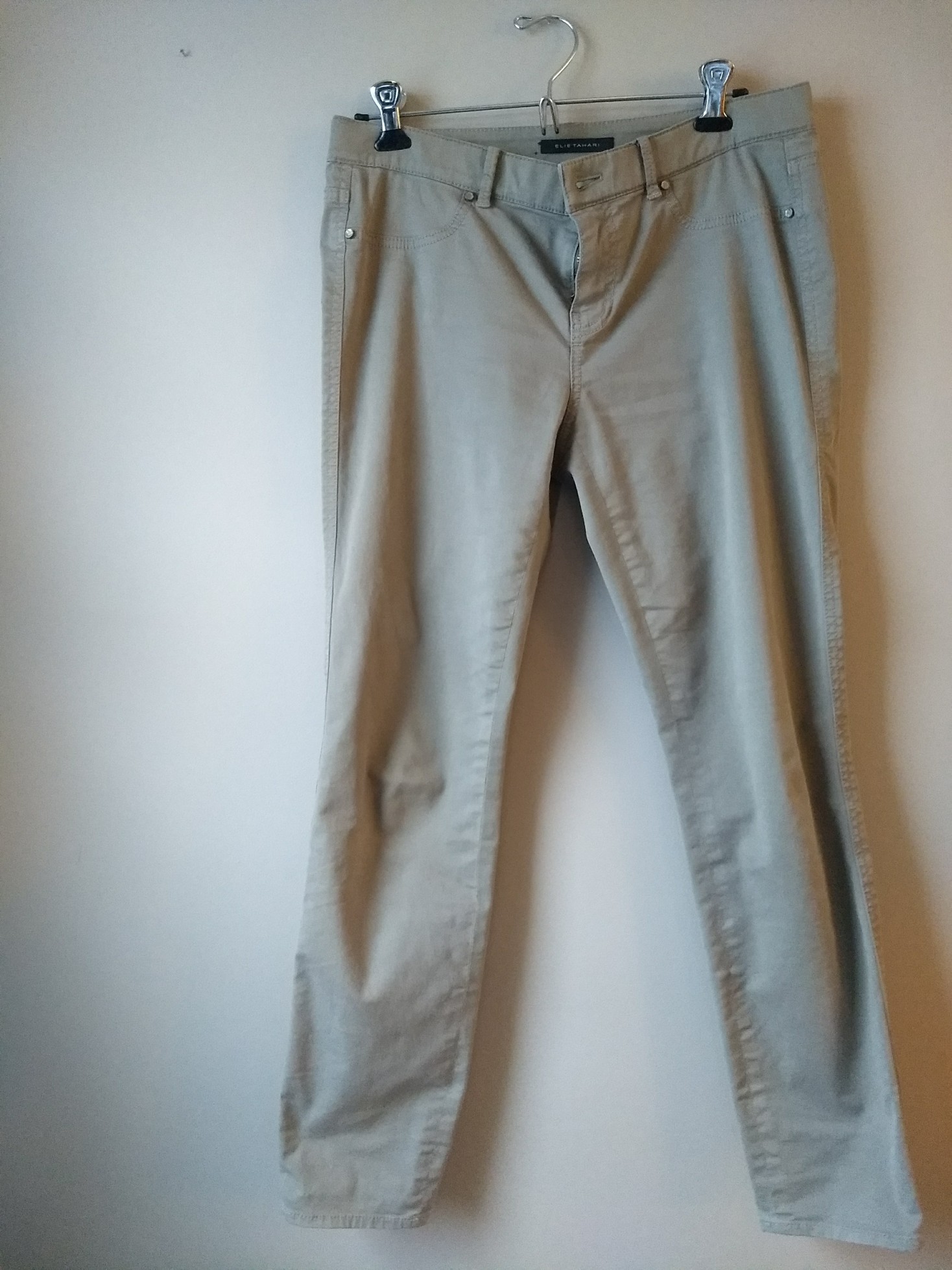
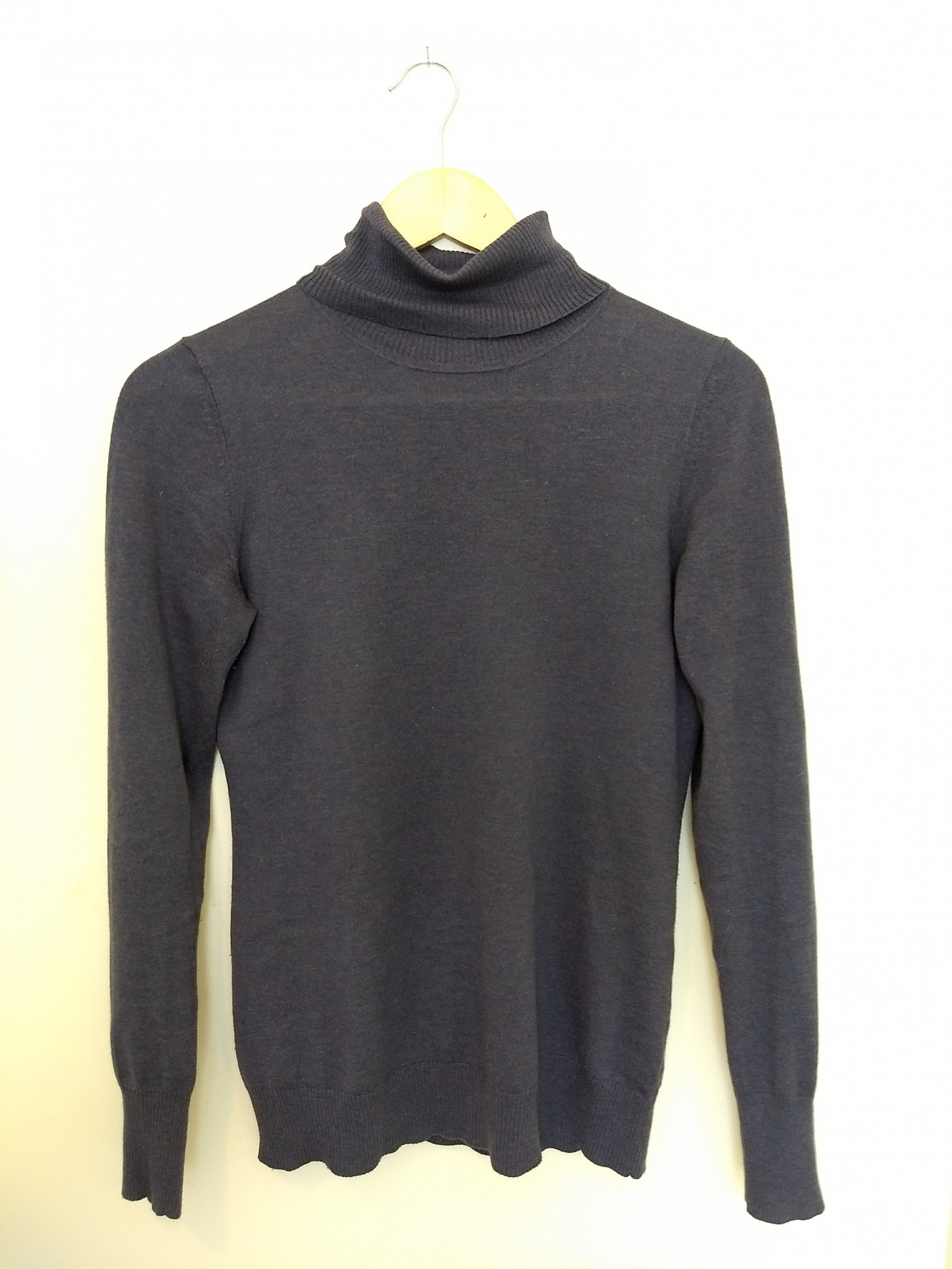
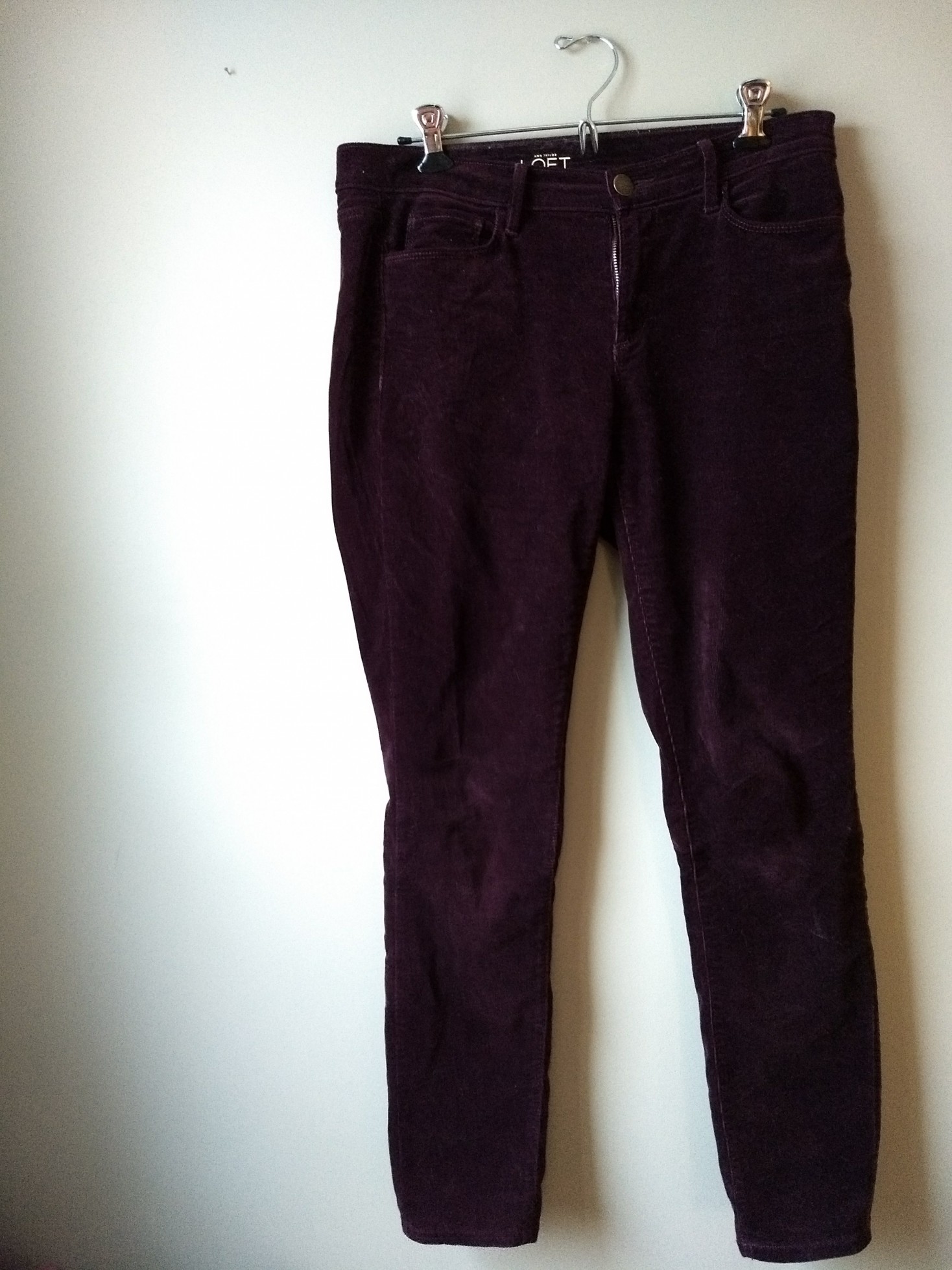
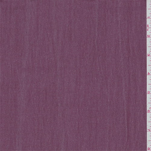
But as I’ve kept working on my Light Summer wardrobe, I’ve settled down on the color factor a bit and started to really appreciate my neutrals. Two particular favorites are a mauve I’ve seen referred to as “faded wine” (ha) and lovely shades of taupe. I also dig a real Light Summer gray – one that’s light and cool enough to elevate a whole outfit but not so cold it looks stark. Basically, the color of a koala.

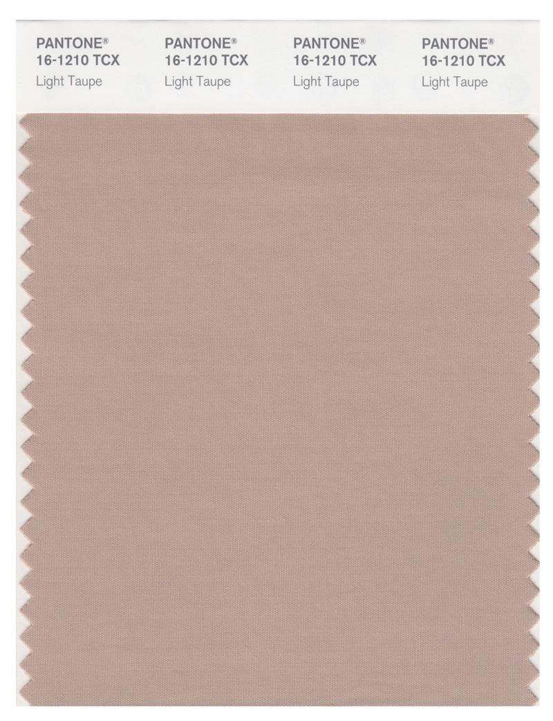
This taupe looks weird on my monitor, but who would not be excited about that koala??

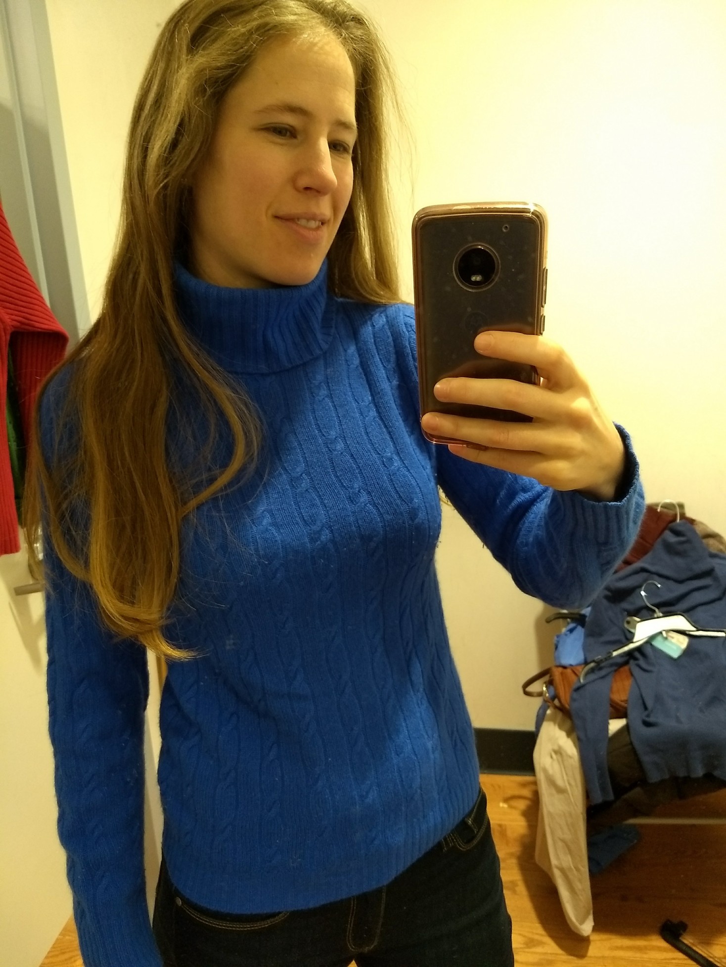
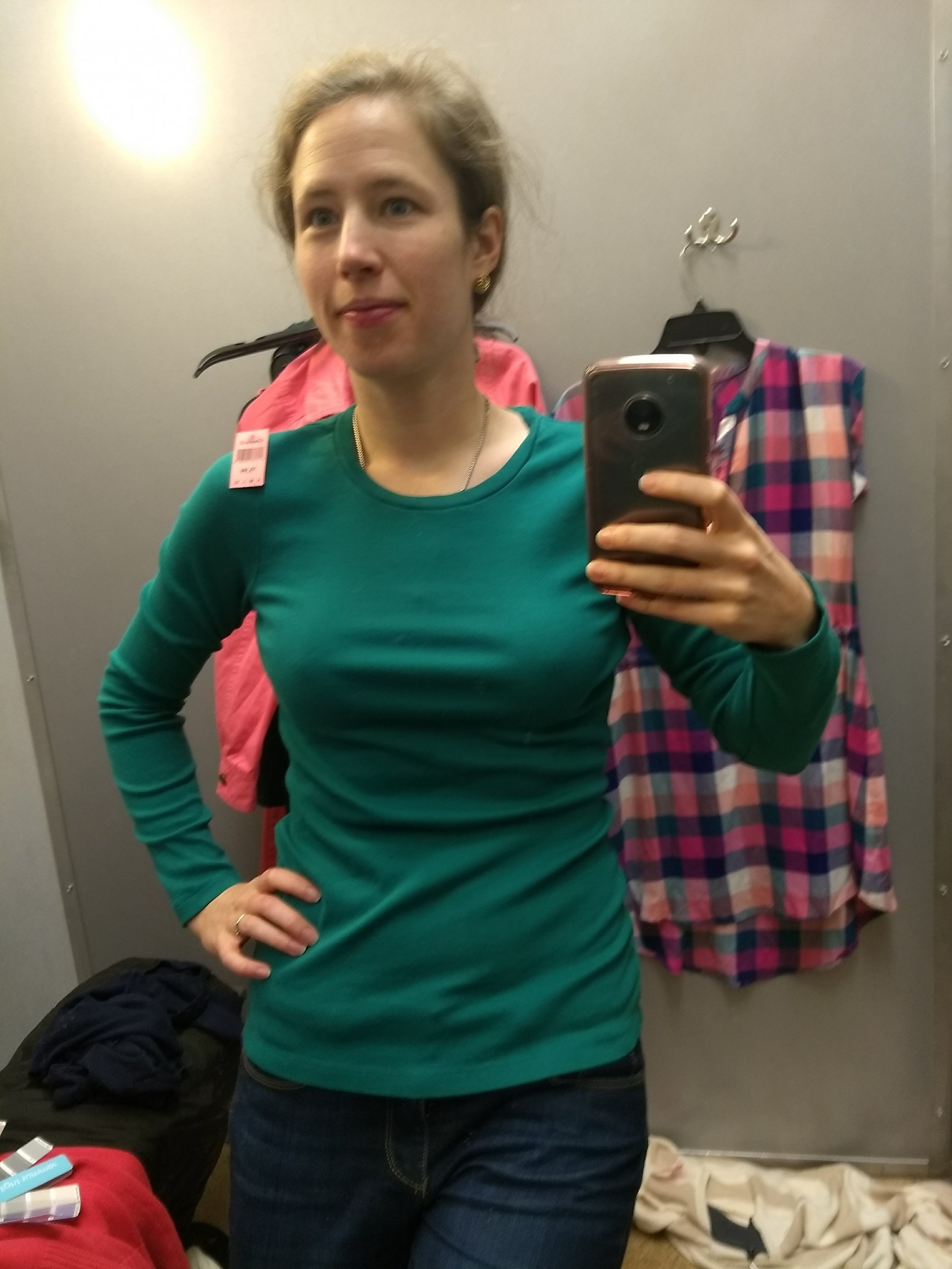
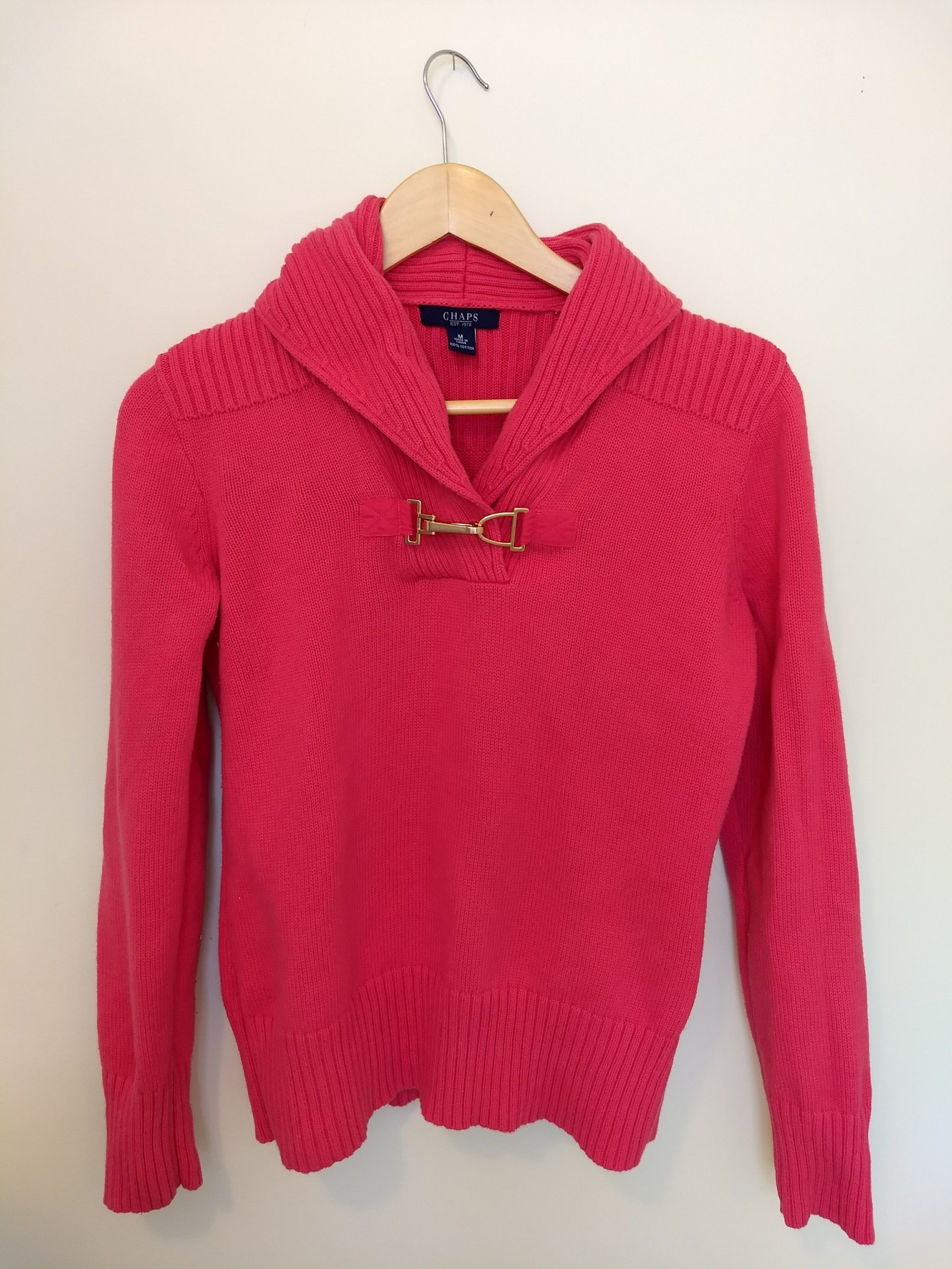
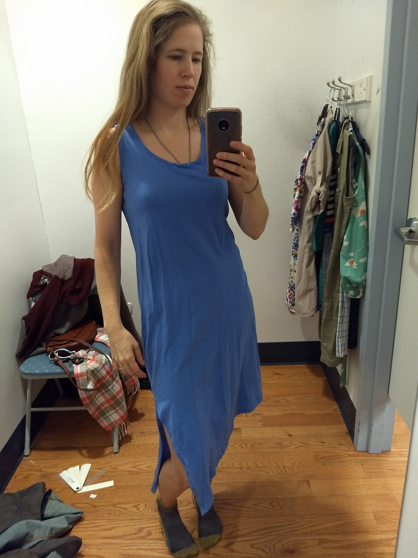
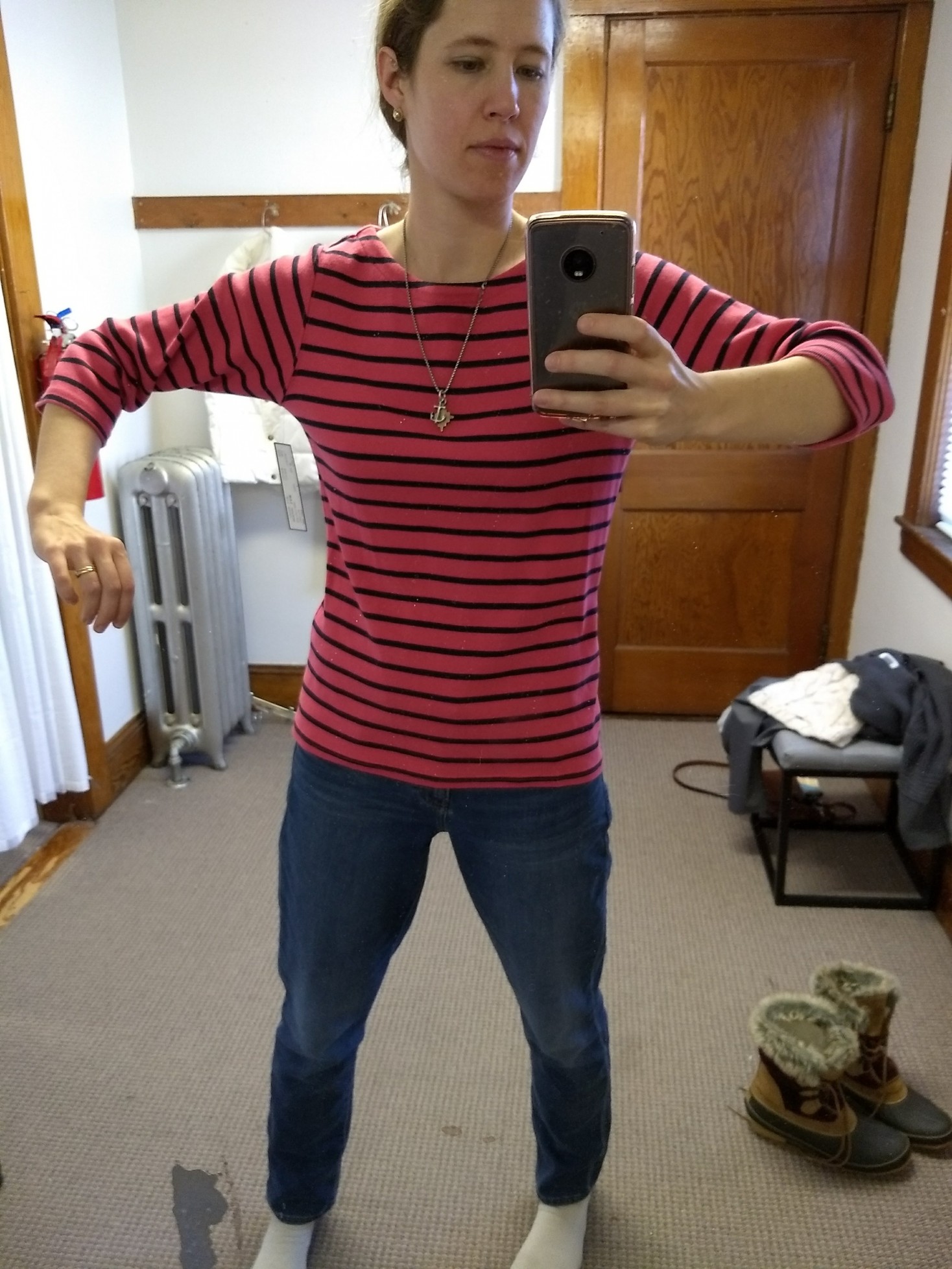
I’ve also realized that some outfits with a lot of color seem to work, where others read as cotton candy.

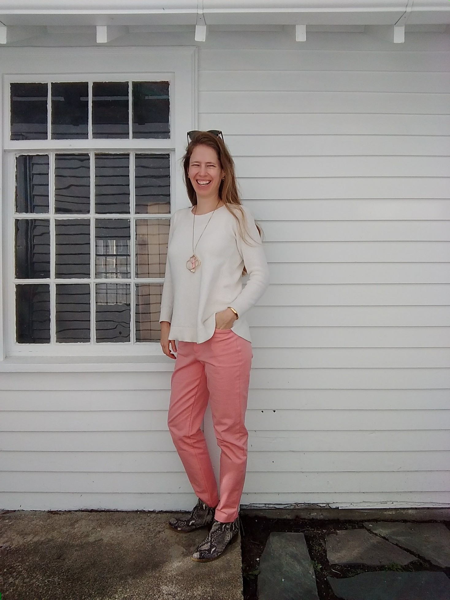
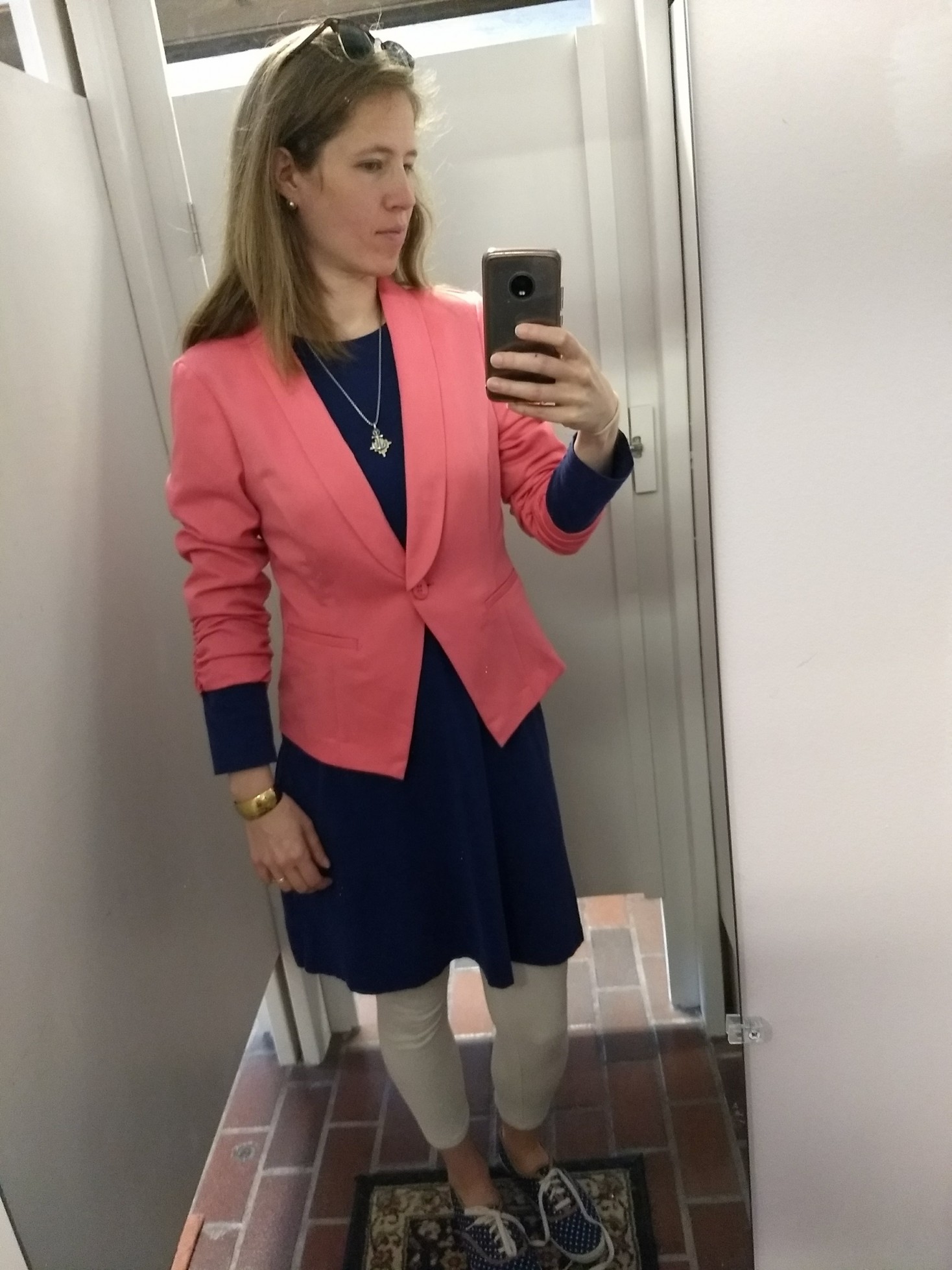
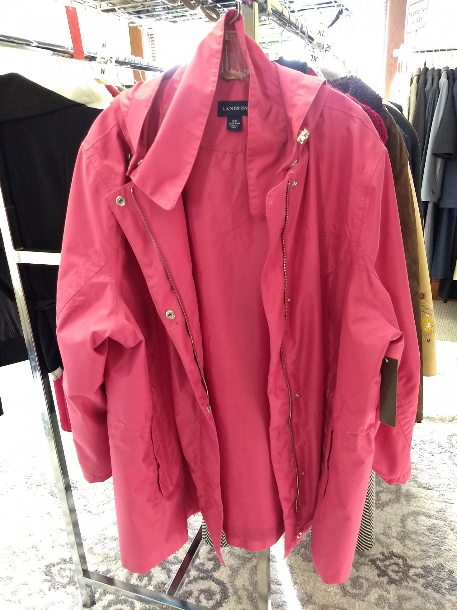
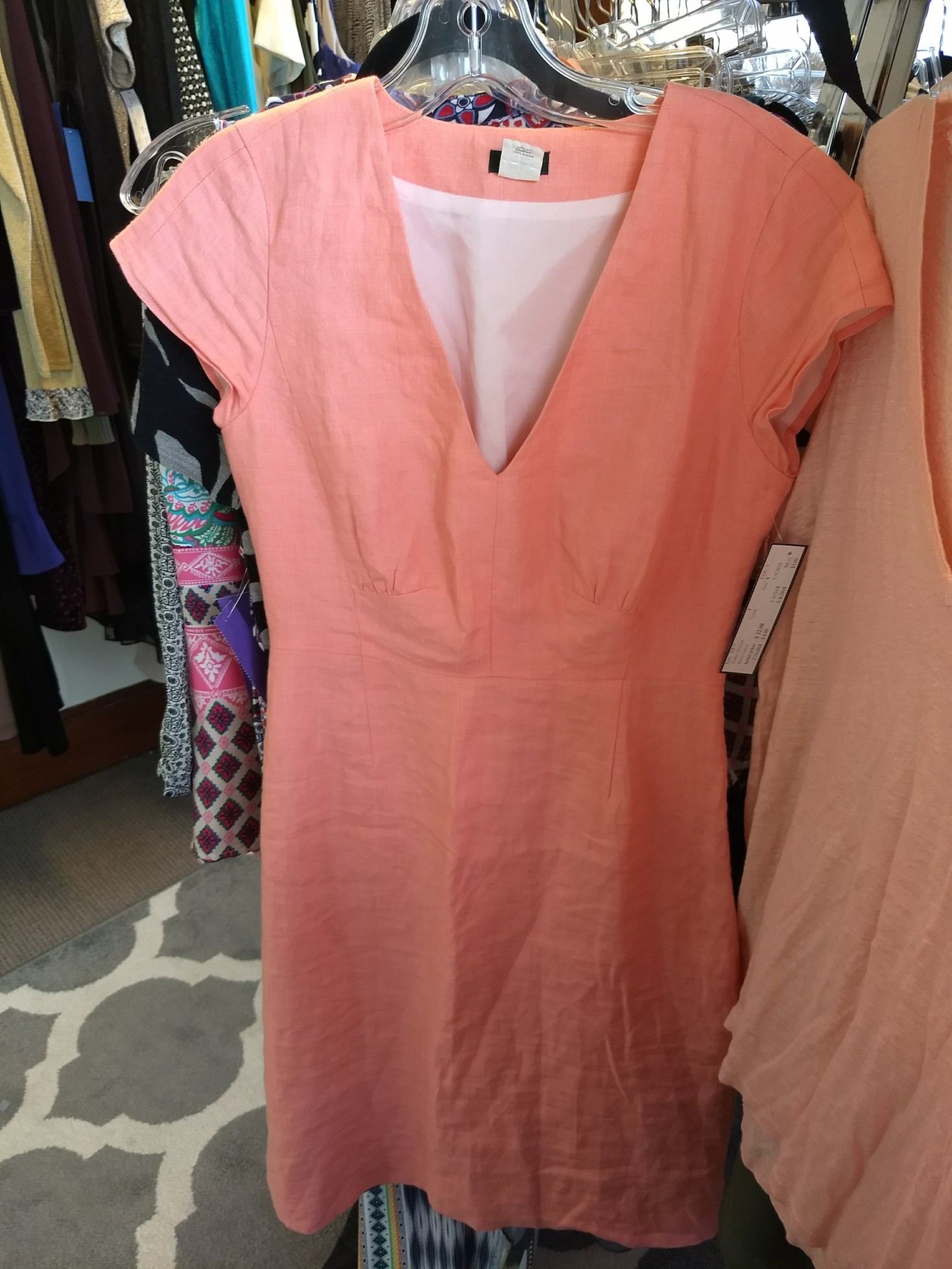
Too “old-fashioned gender binary baby shower”:

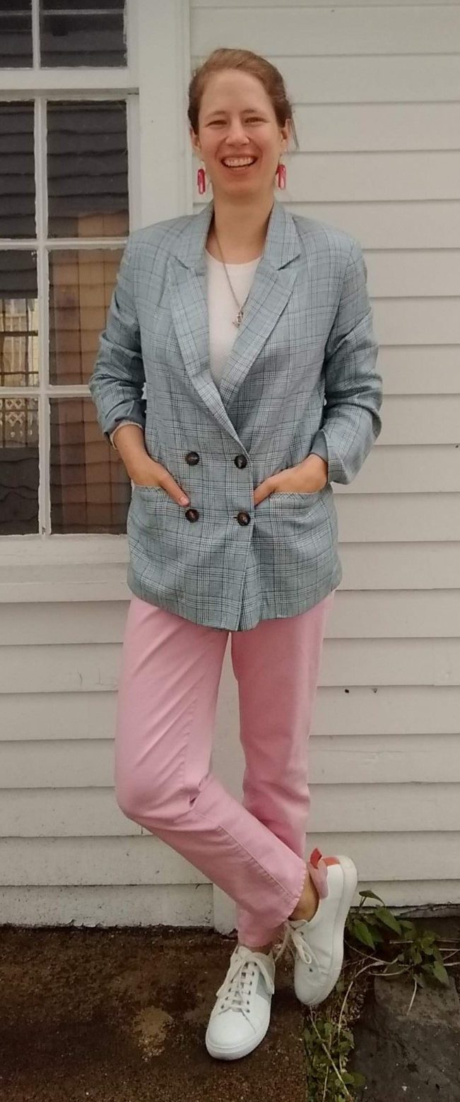
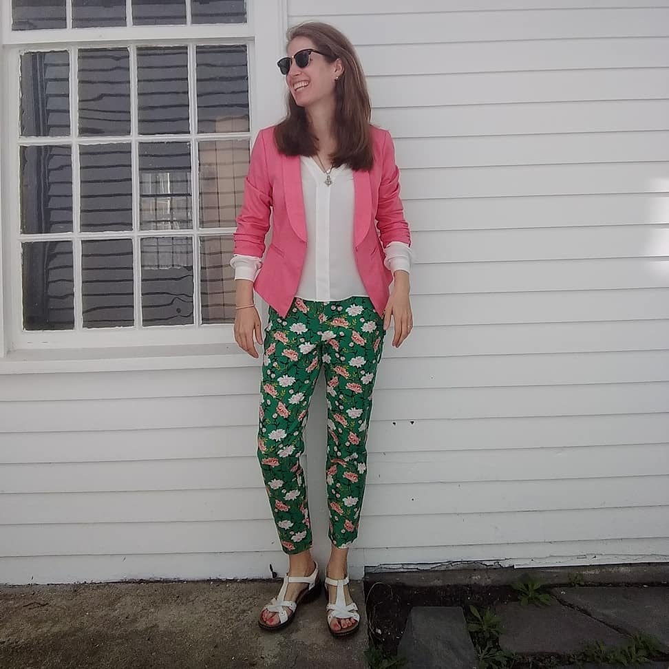
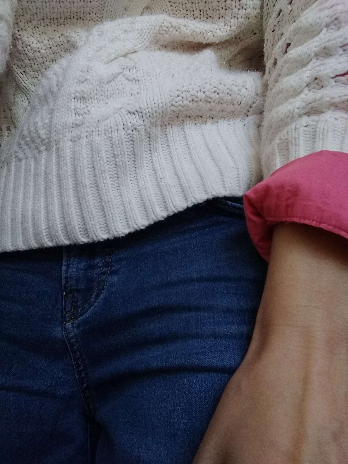
Eye-blinding – to me it works but in a magical unicorn one-off kind of way:


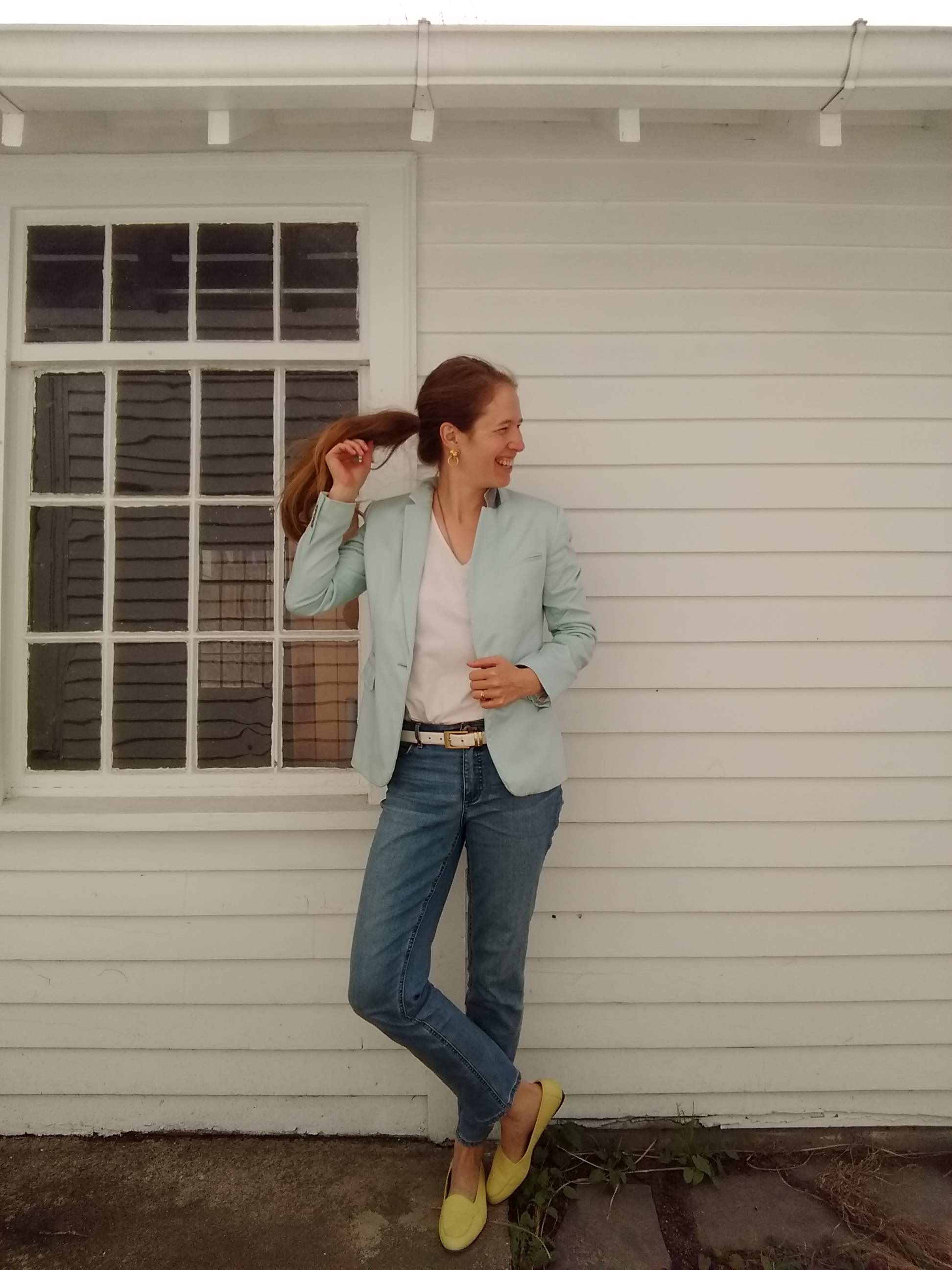
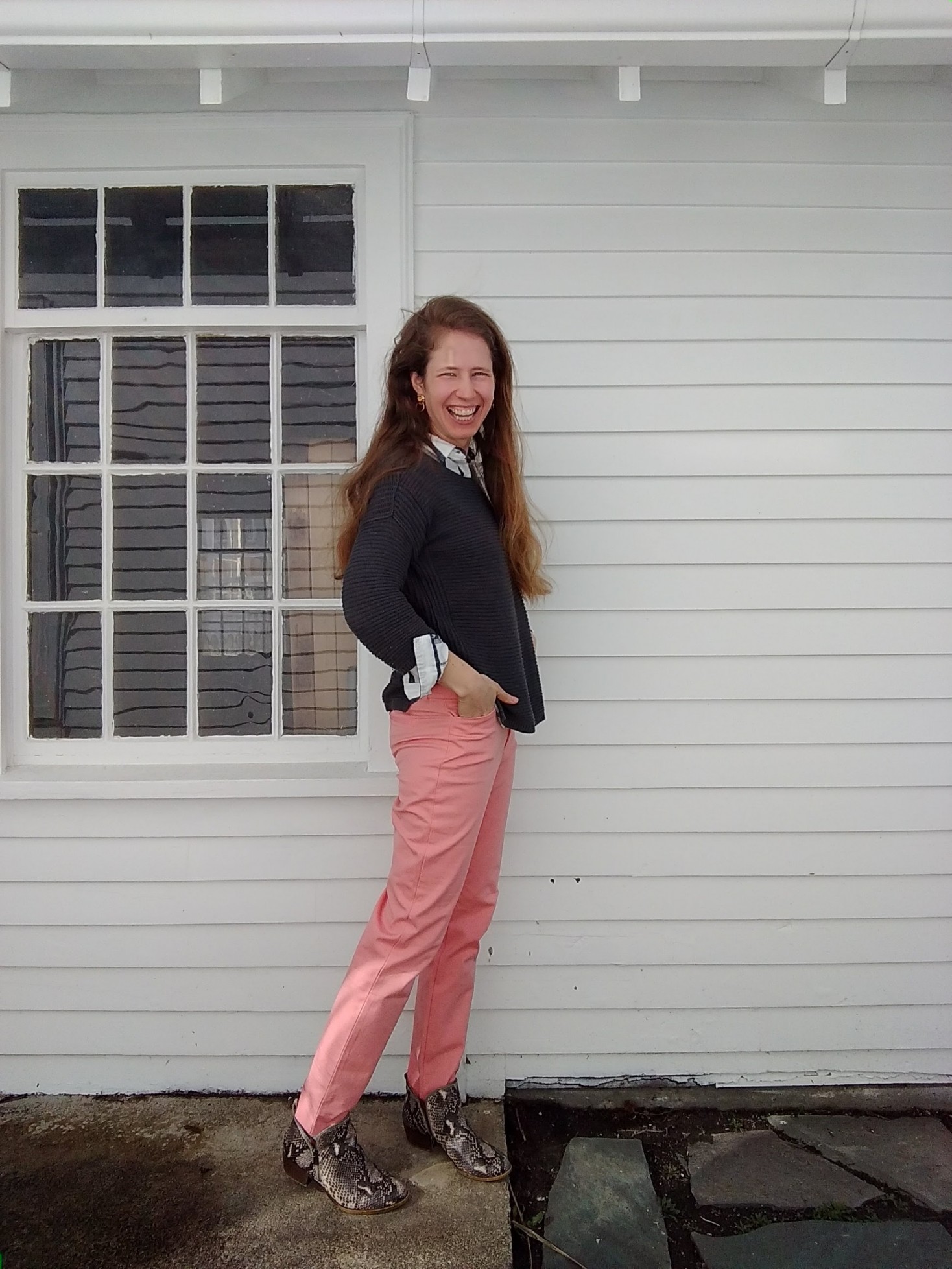
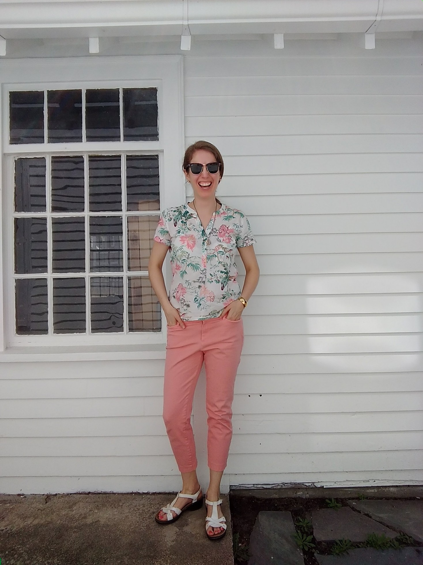
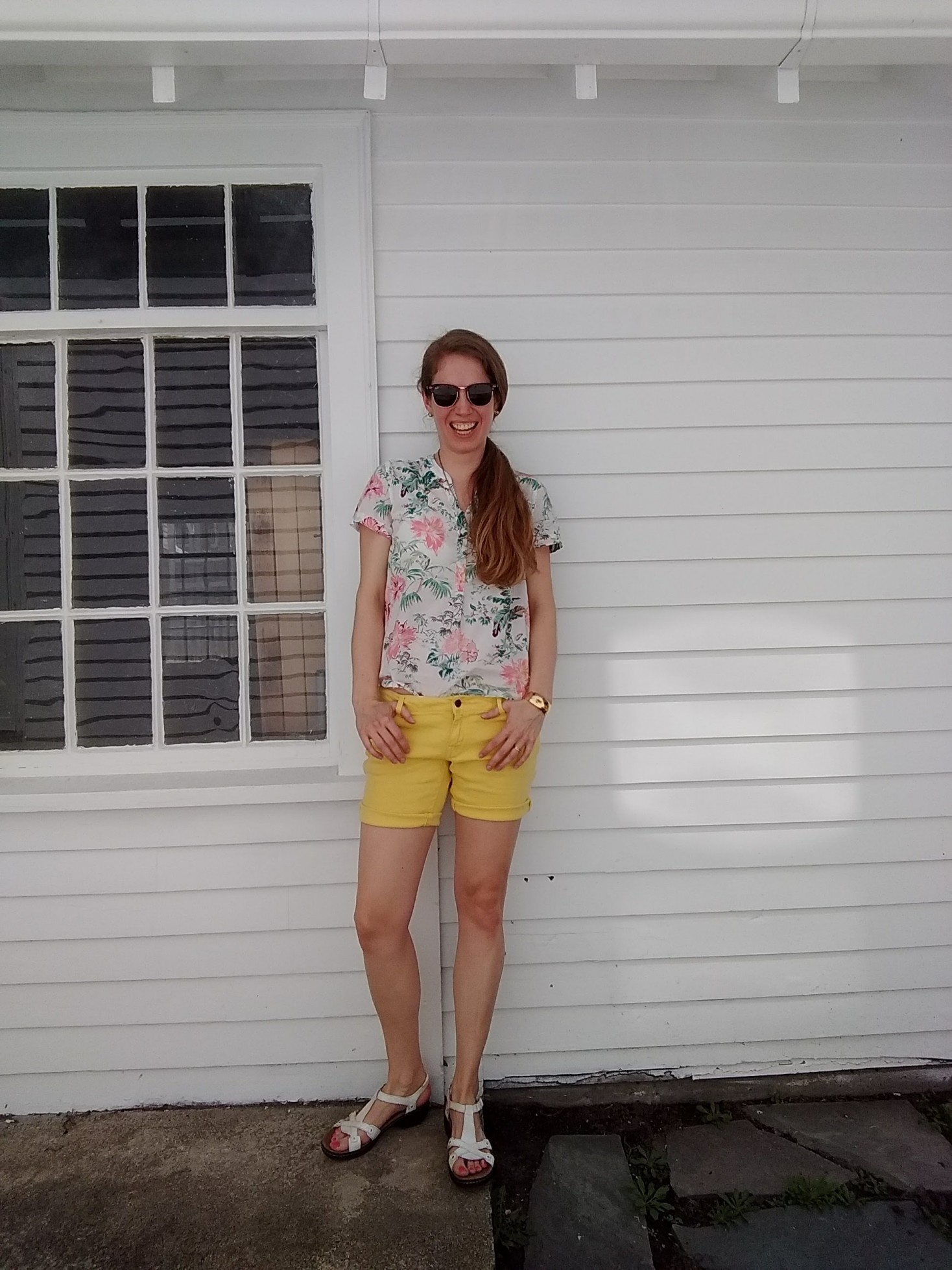
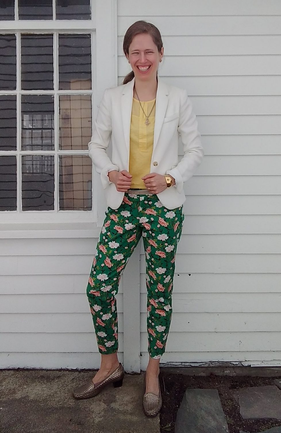
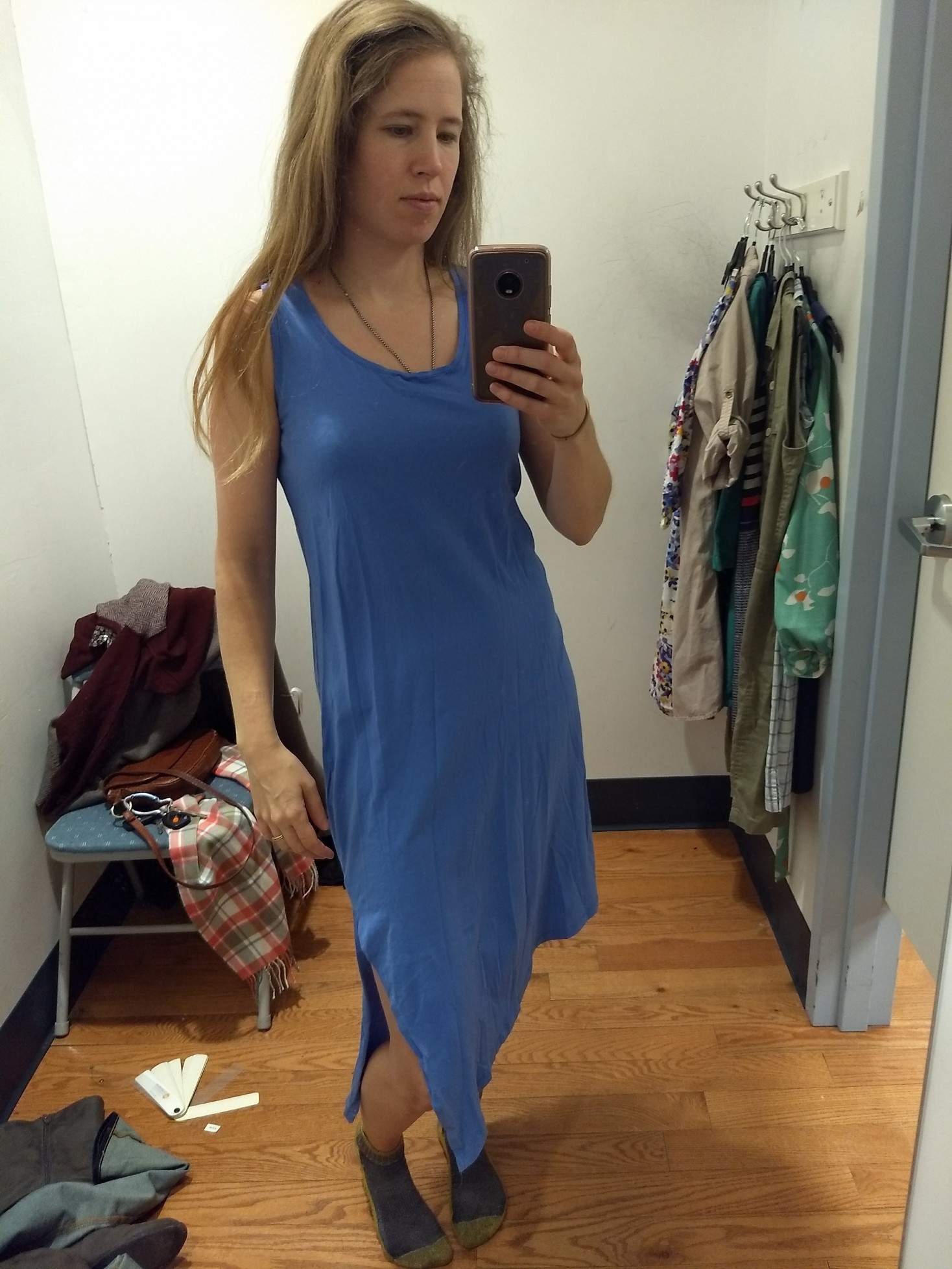
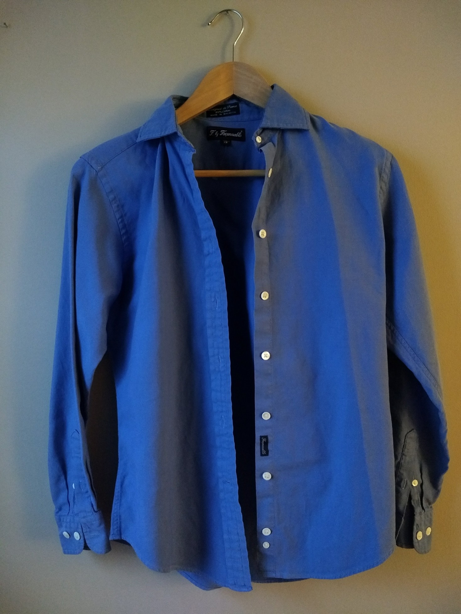
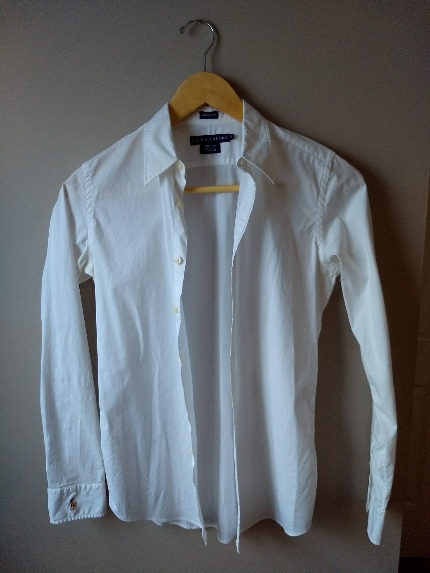
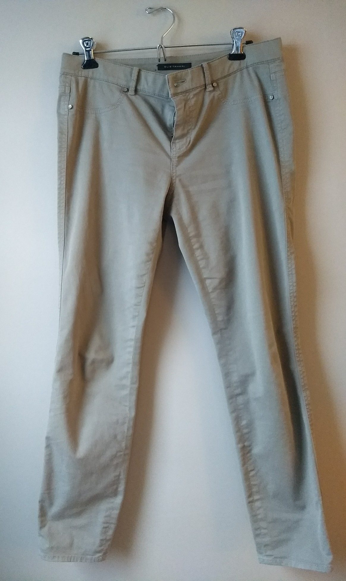
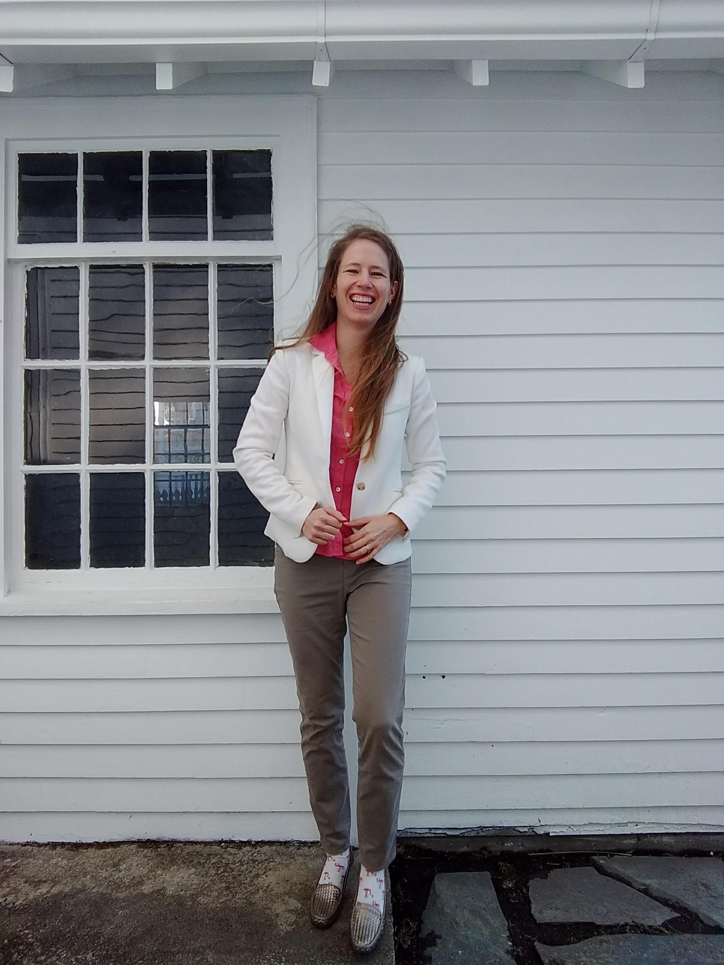
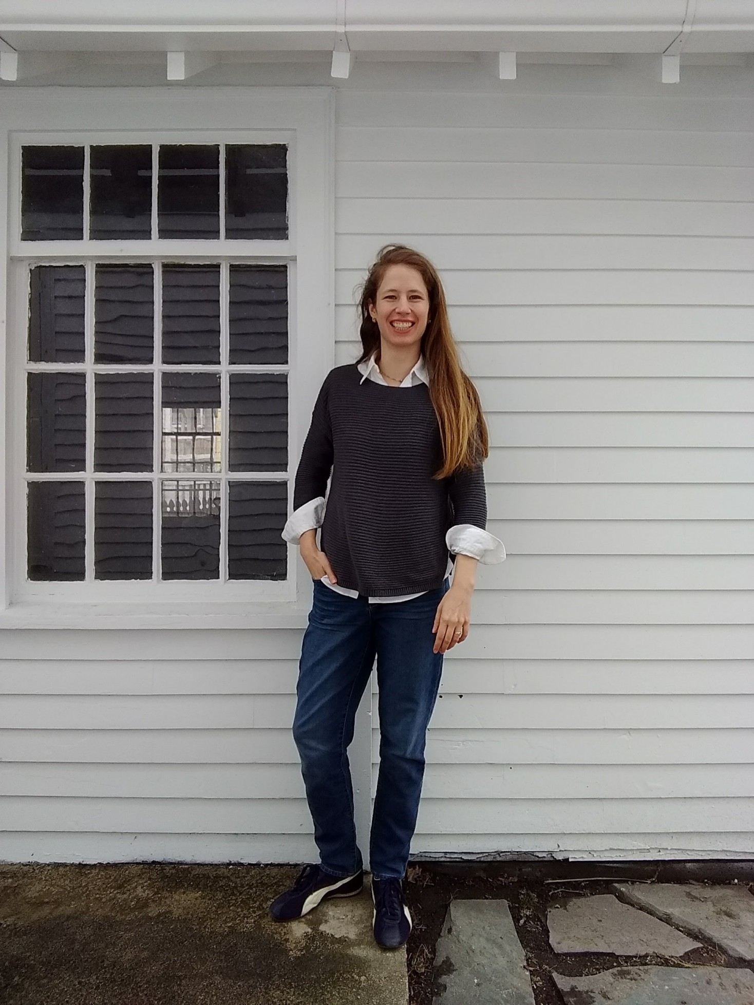
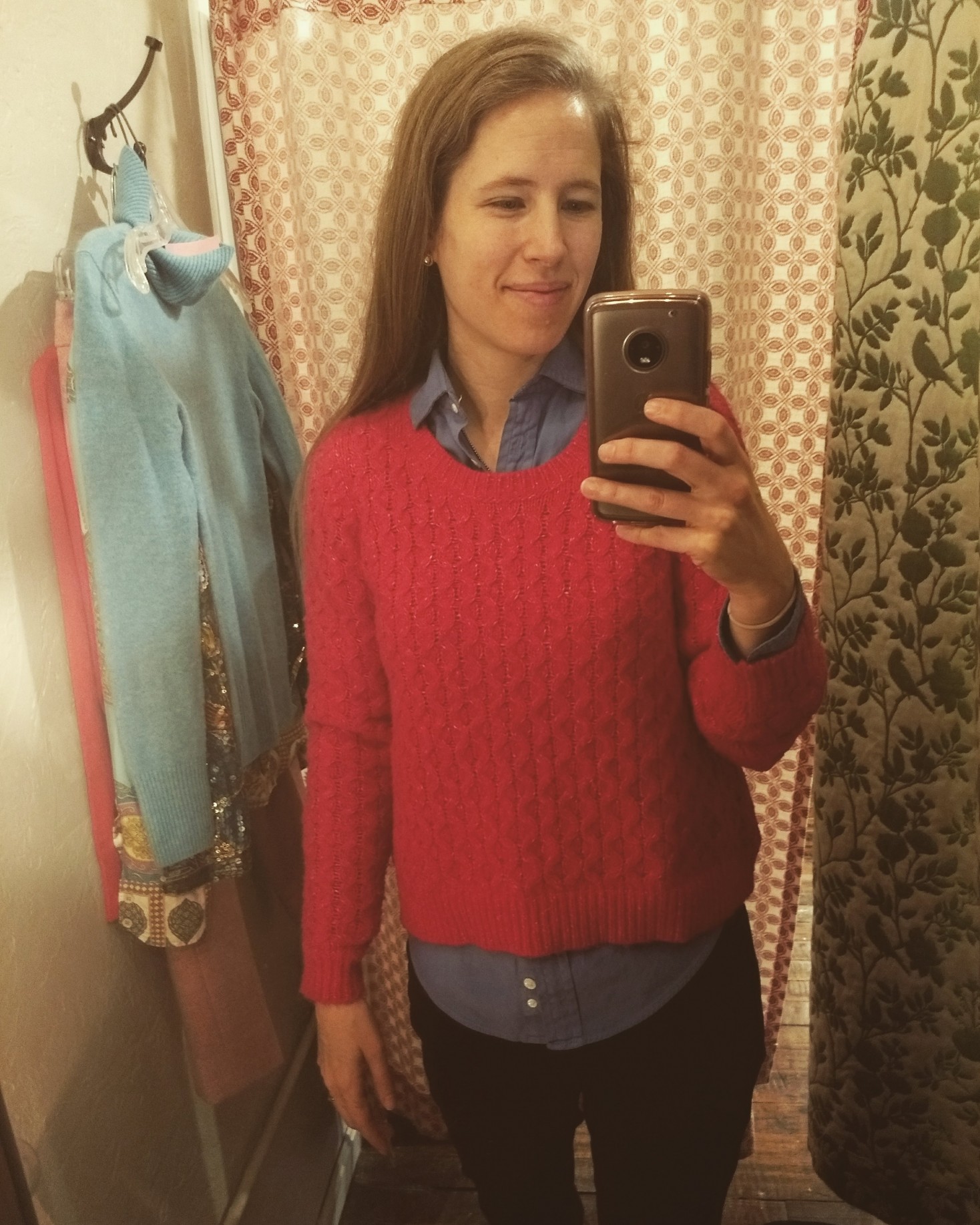
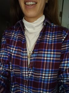
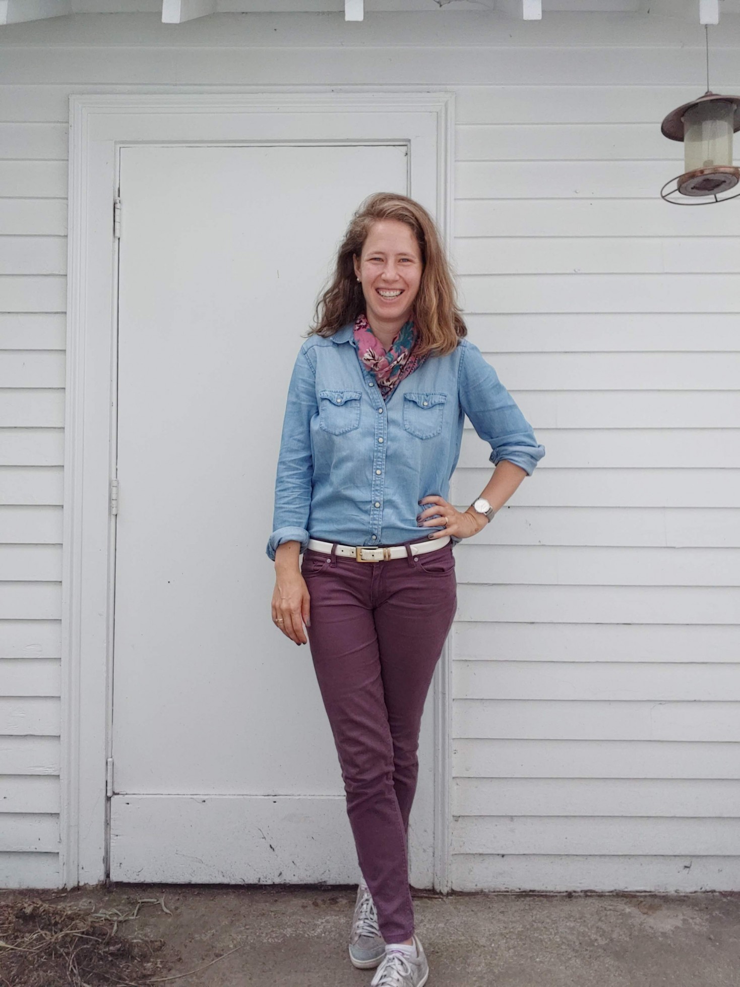
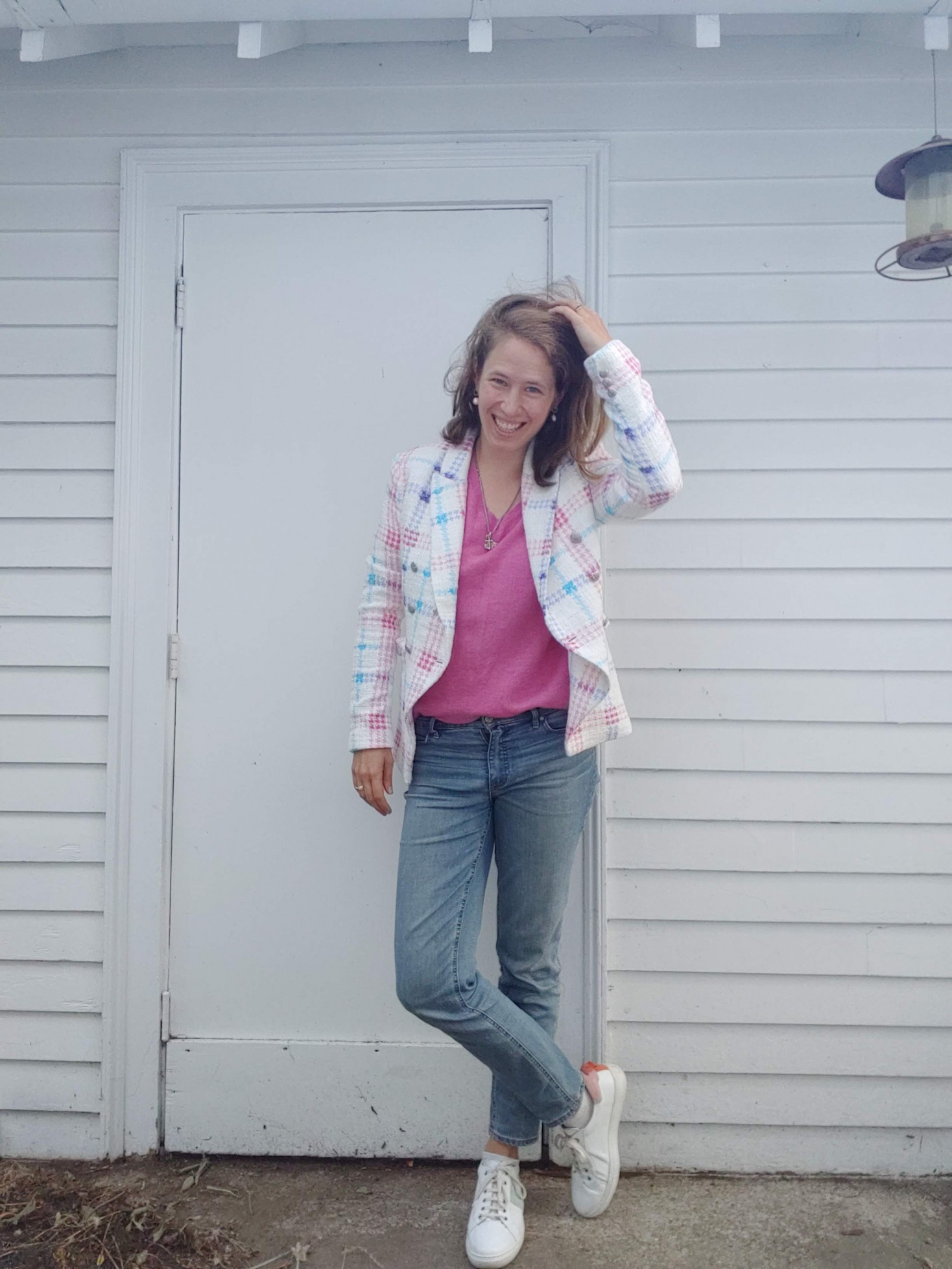
Outfits where color is mixed in with a big dash of “neutral” from my color palette (faded wine, chambray/denim, white, taupe) tend to be less of a gamble:


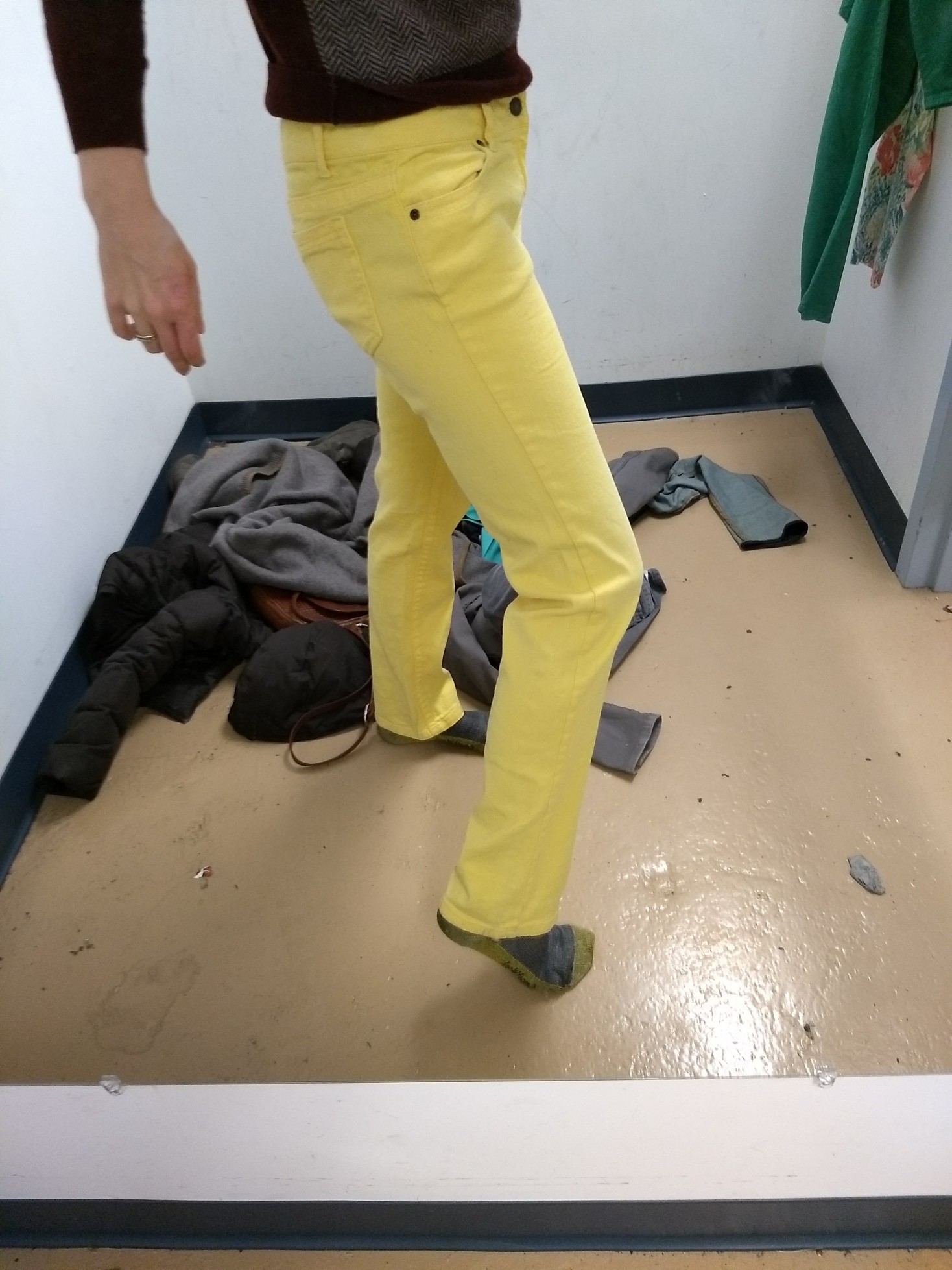
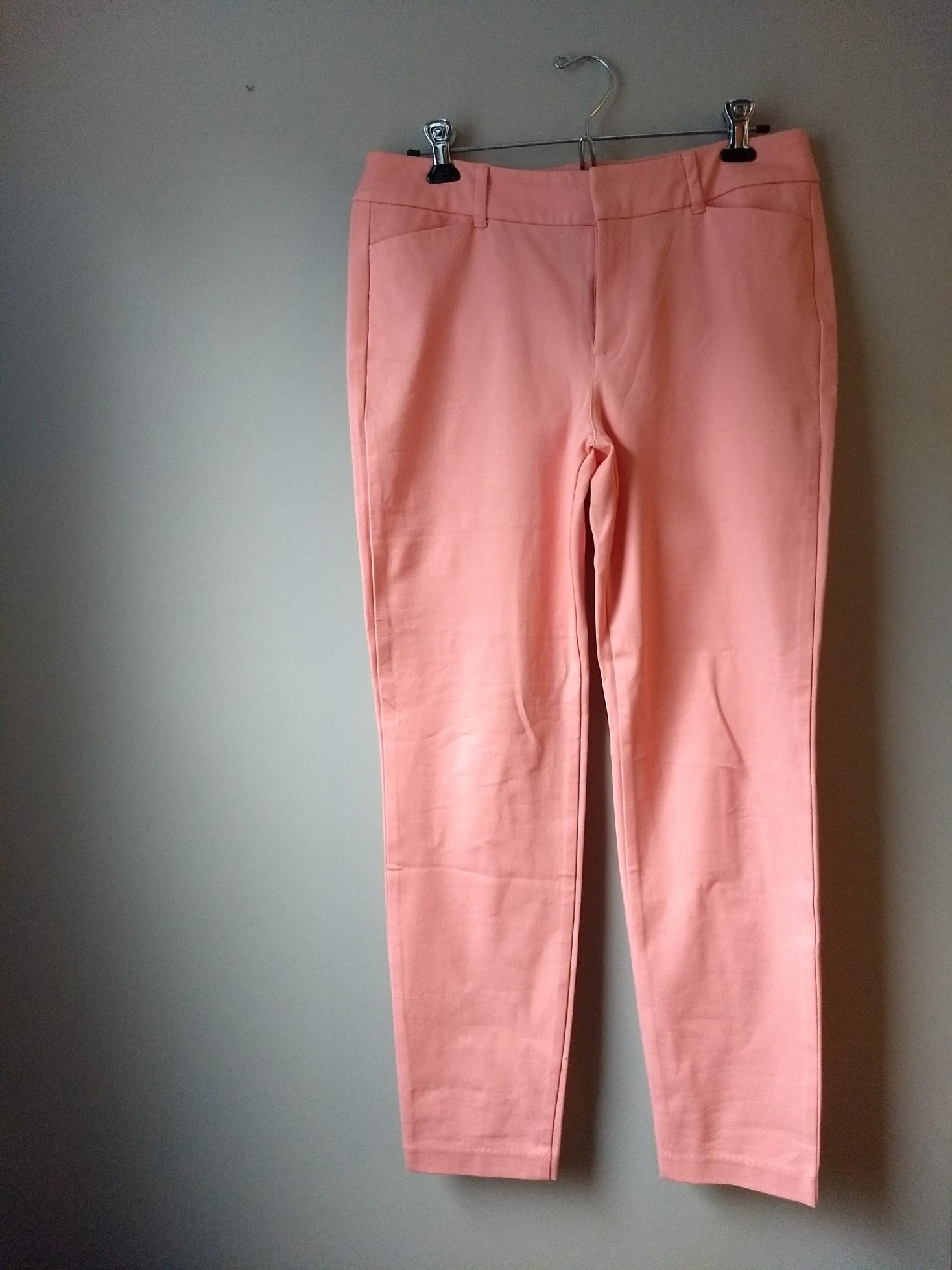
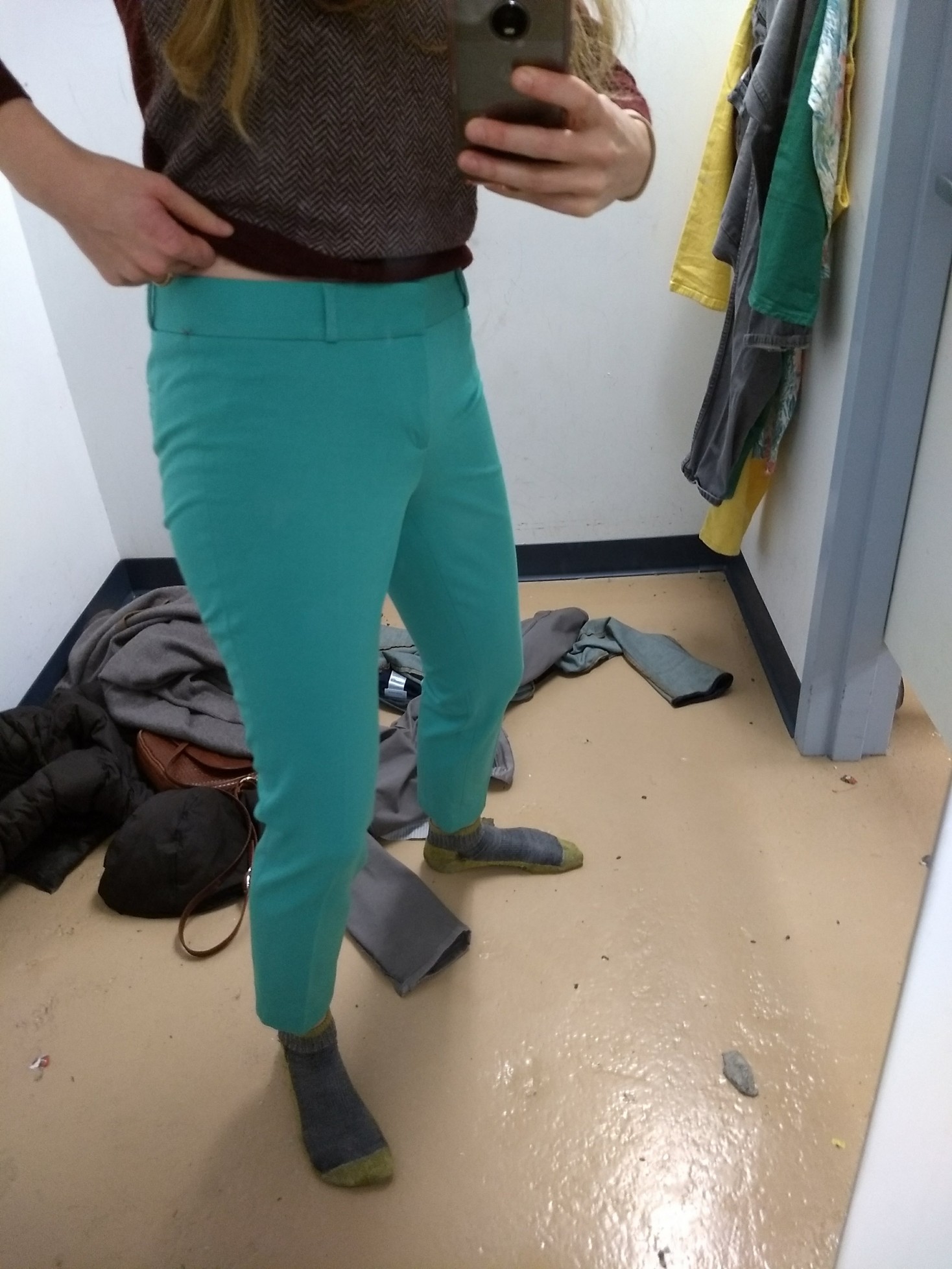
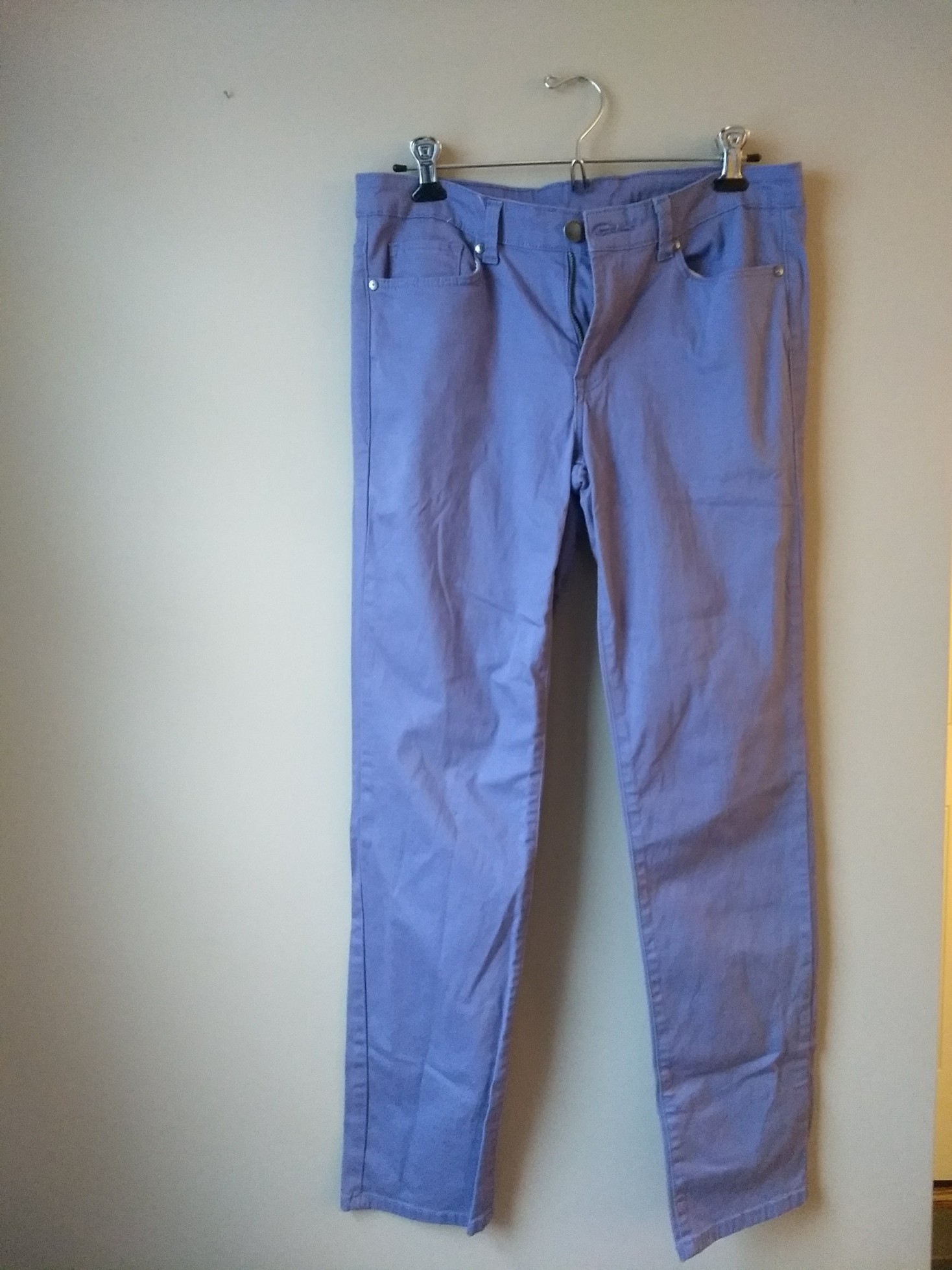
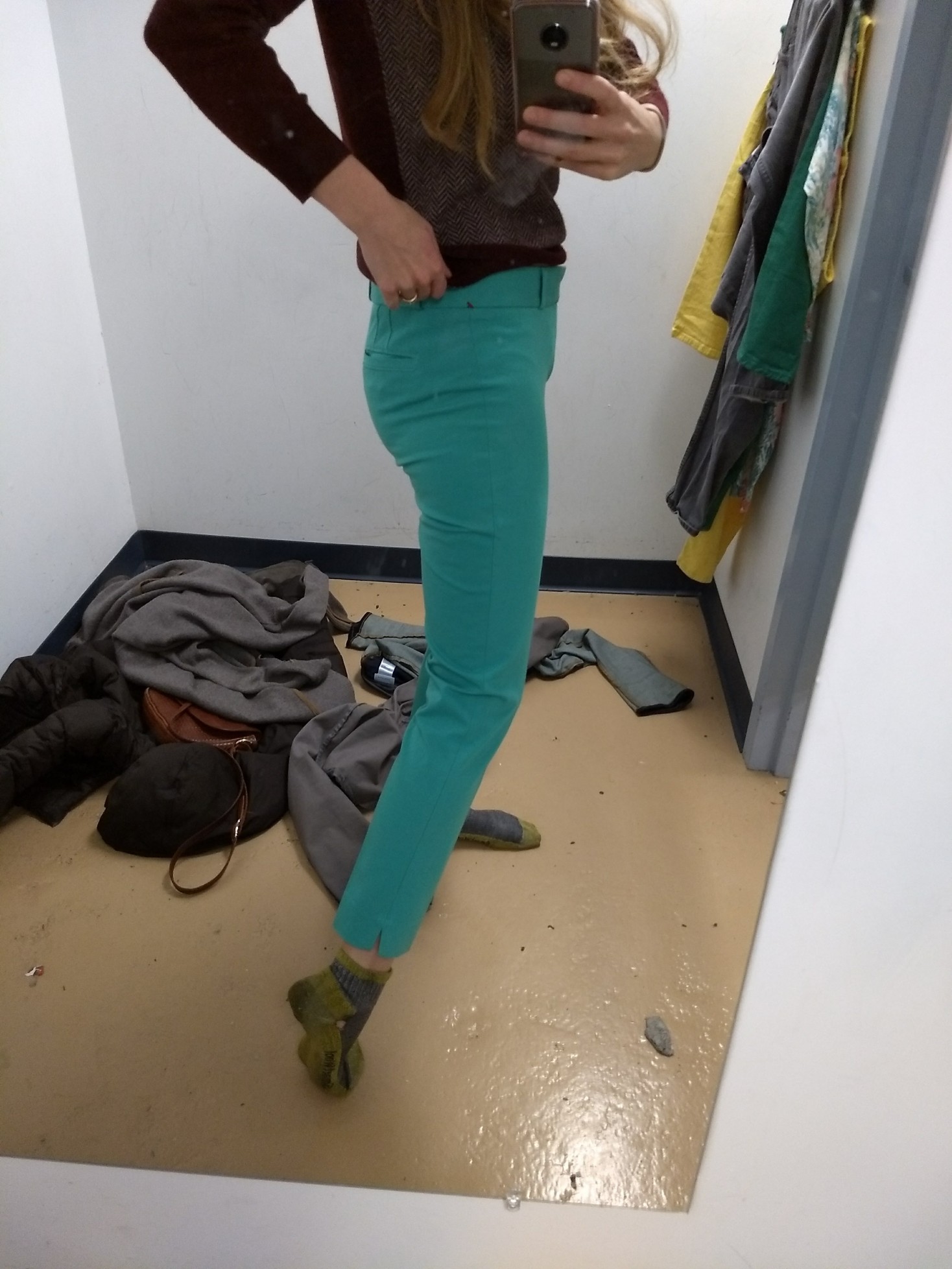
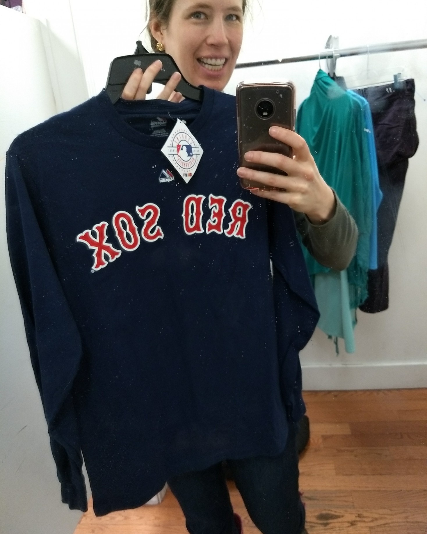
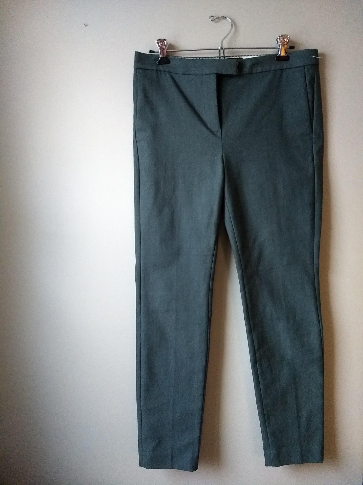
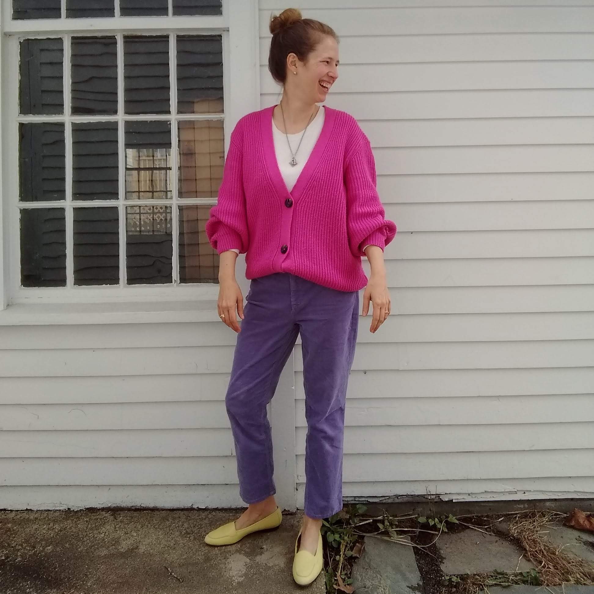
So basically I’ve discovered I shouldn’t buy colorful pants, ha. It’s true, though – I’ve tried for years to thrift just the right pink yellow, or purple pants, and even when I’ve hit the hue right on the head, they never really work in my wardrobe. For example, I have a pair of lemon yellow jeans in my drawer right now that I have yet to wear because they just seem to oversaturate every outfit. I’m going to tuck them into storage until spring and see if they improve with a change in the seasons.

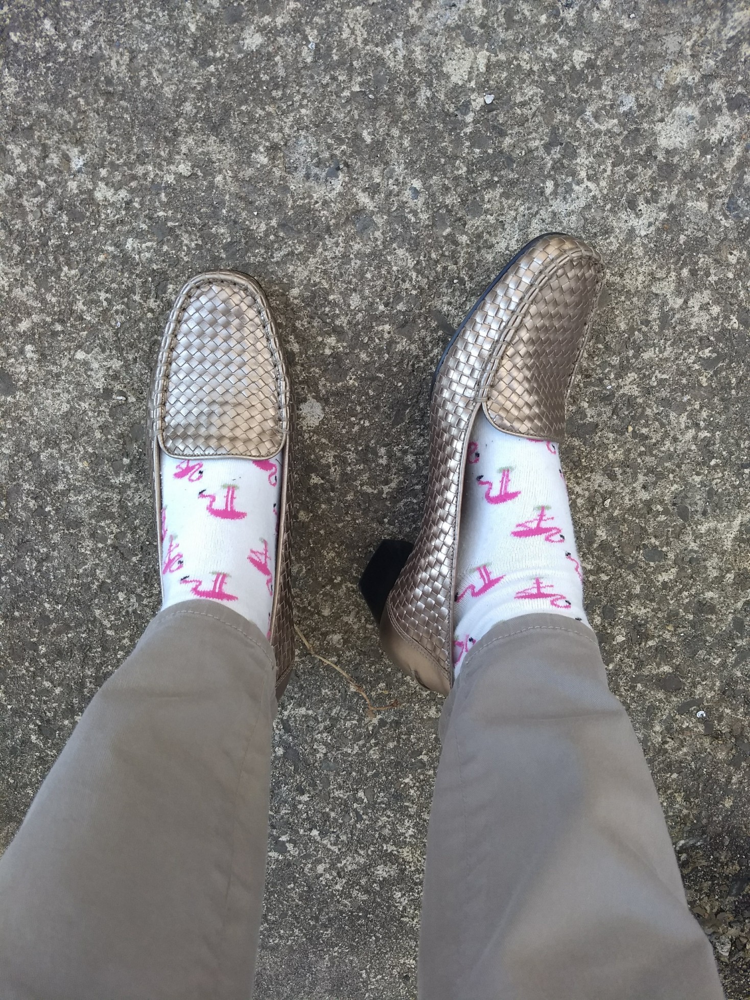
Otherwise, the only colorful pants I have right now are green, and I deploy them judiciously. In addition to telling me that my pants forgot to go down all the way (thank you, Sister), my sister commented that the “watermelon” look on the right was overwhelming – fun, yes, but still overwhelming:


View this post on Instagram


A post shared by Leah (@thriftshopchic) on


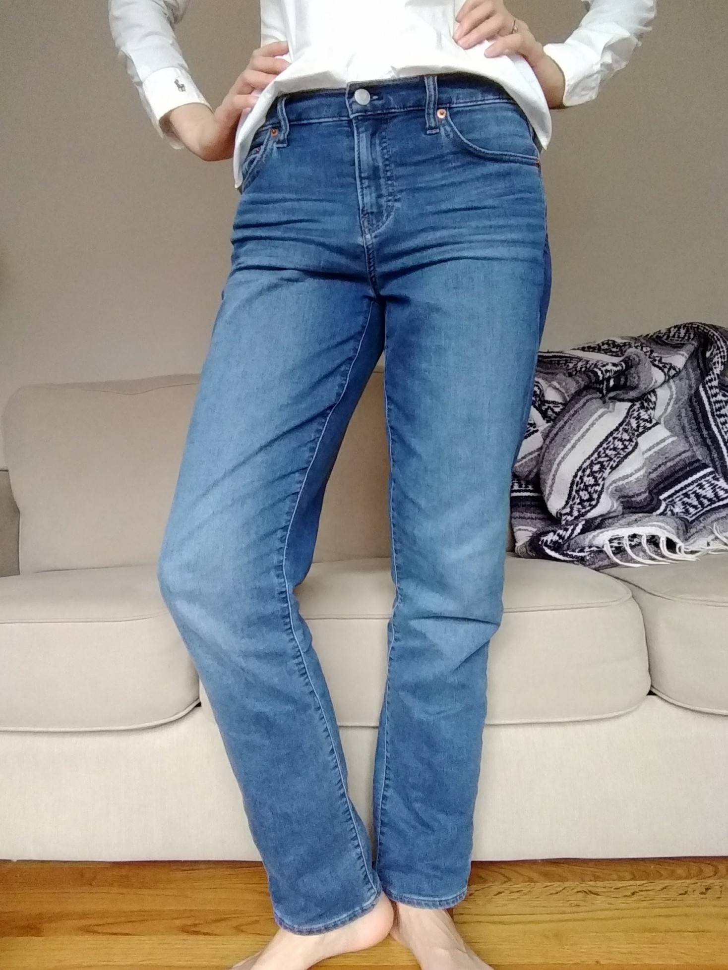
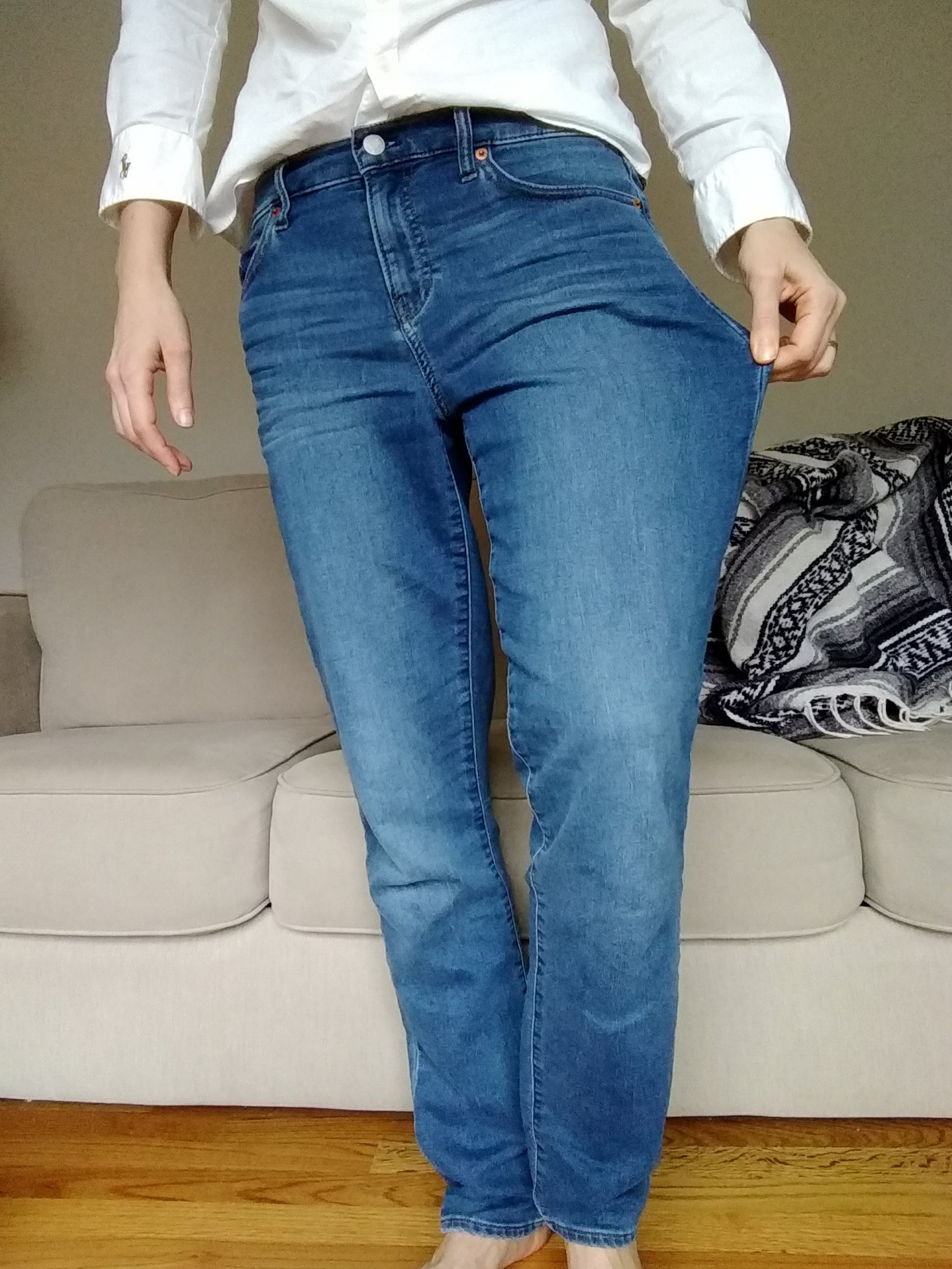
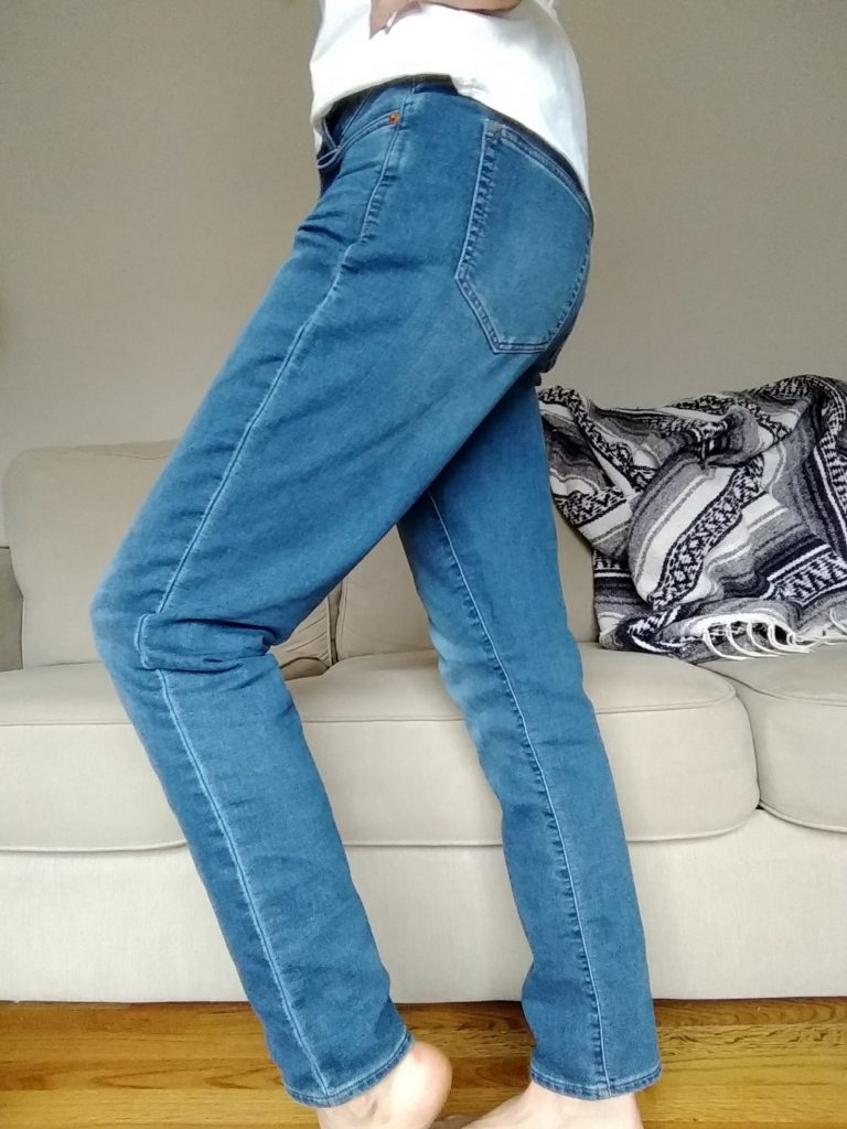
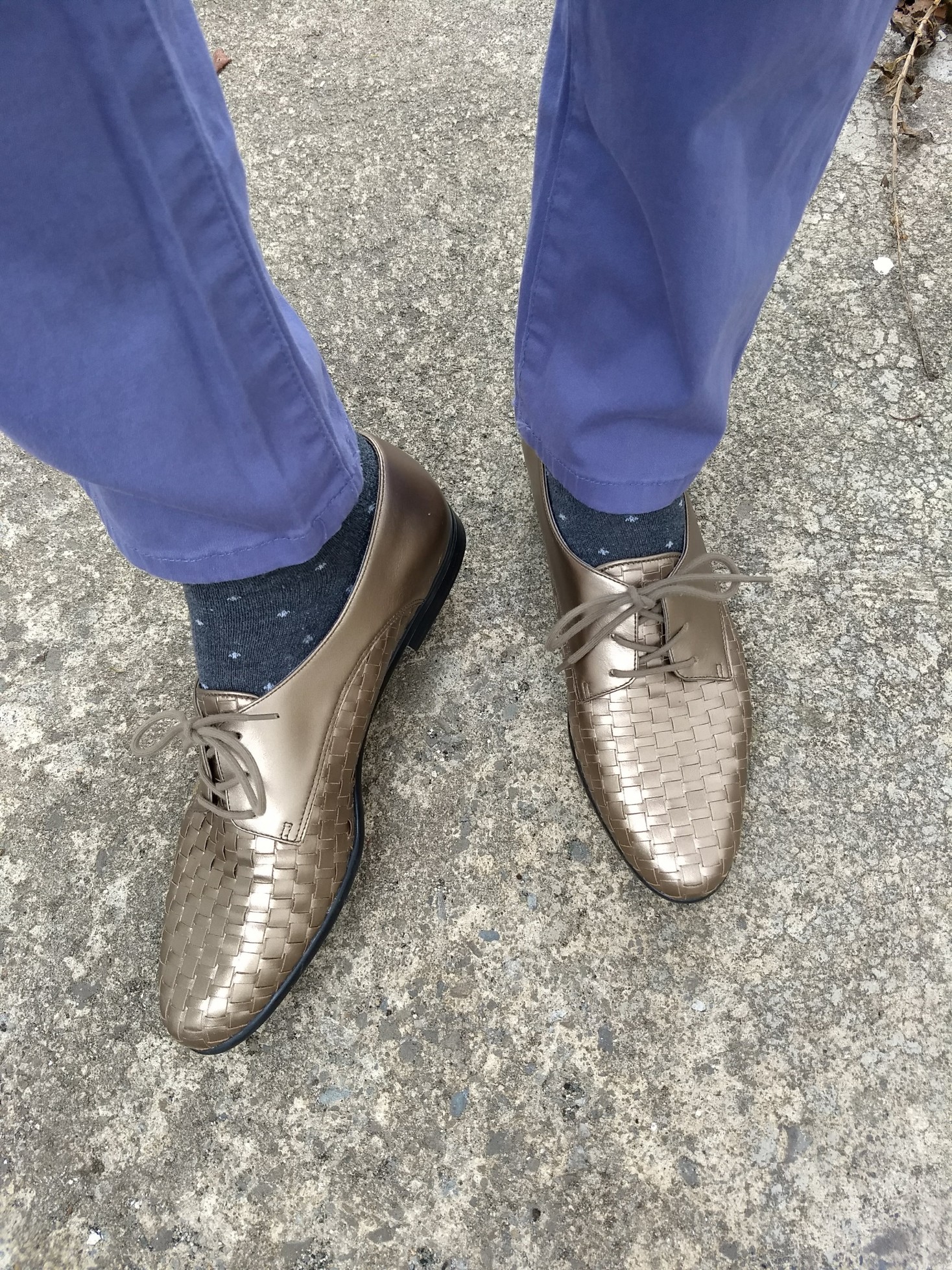
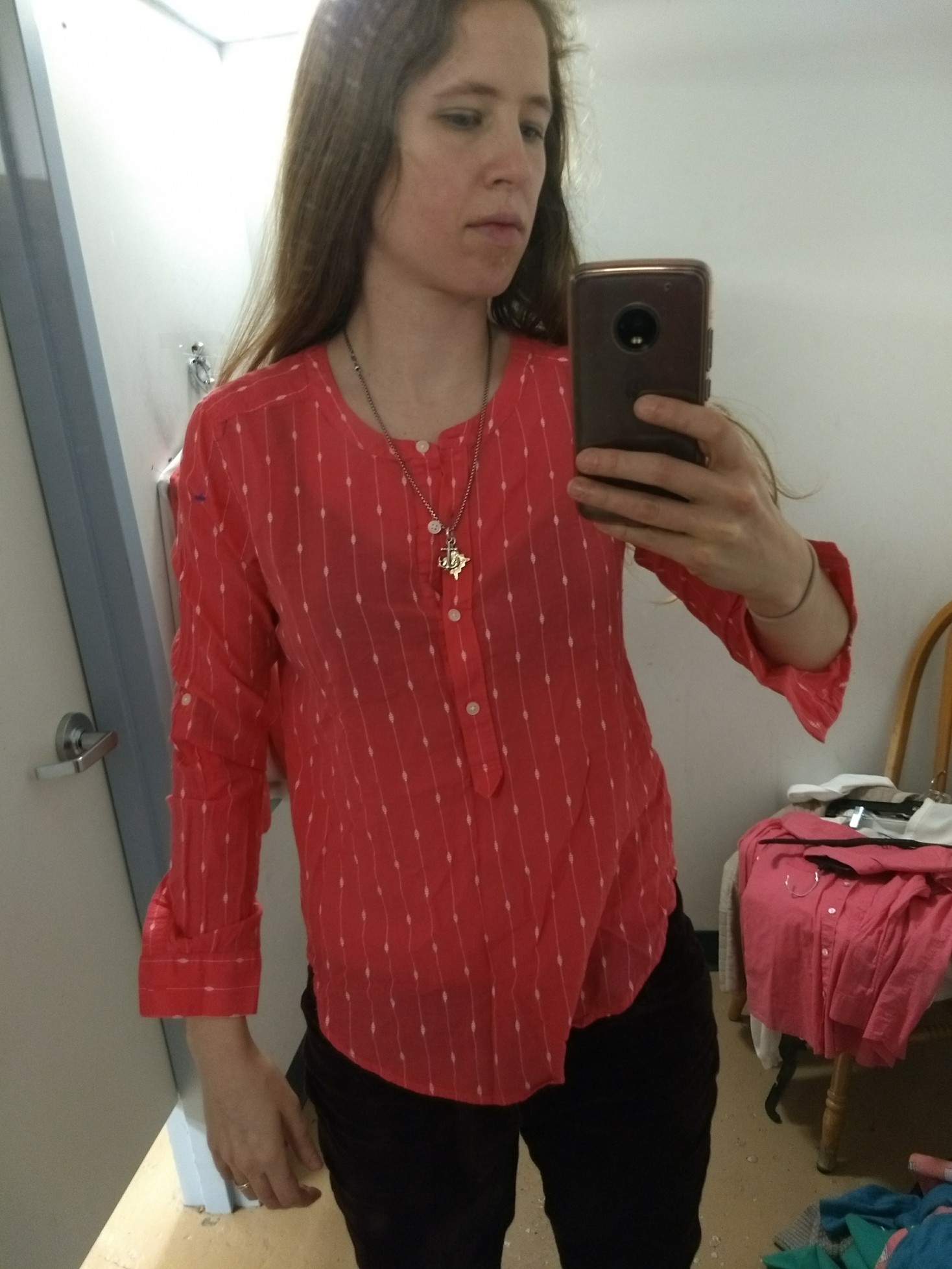
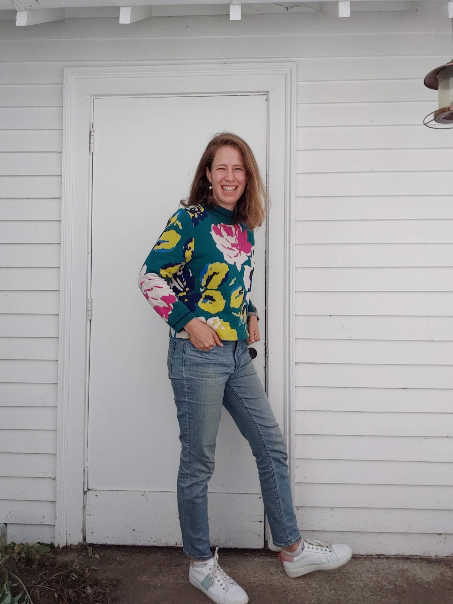
So where I’ve landed for now is that my color generally resides in my top half – shirts, blazers, sweaters – and my bottom half stays neutral (with occasional pops of color in my shoes). This makes for a good mix of colors without me feeling like a clown.

How do you portion out color in your outfits? Or does more = better in your book?

My Current Color Palette

Pretty much everybody who writes about building capsule or edited wardrobes recommends that you start by choosing a color palette.

Some of my favorite posts on this topic, also included in the recently updated “Resources” page: Anuschka ReesUse Less; oodles of examples you just might want to steal on The Vivienne Files 

Choosing a limited number of colors to focus on goes a long way to narrowing down your clothes to a manageable amount that plays well together (aka a capsule wardrobe), and helps you hone your shopping when you want to fill a wardrobe hole or augment what you already have. Color theory goes a long way towards ensuring the colors you choose actually work together; the first two posts linked above will help you get your head around the basic principles.

Seasonal color analysis (aka finding “your” colors) also hinges on color theory, and if you choose to get analyzed (and the analyst is skilled enough to get it right!), you’ll automatically end up with a color palette that goes well with your natural coloring. Here’s mine from my personal color analysis:

See that “three dimensions of color” chart at the bottom? That’s color theory at work – all these colors share about the same level of hue (warm to cool – or in artist speak, yellow to blue), value (light to dark), and chroma (soft to bright – more or less muted). And that’s why they all look good together.

But that’s still a lot of colors to choose from. And while they technically go together, you might not personally love every combo these colors can make. Maybe you hate green or love neutrals or don’t want to look like an Easter egg.

I mean… (and yes, that pink is more bright winter than light summer…the perils of thrifting online where colors in photos can be deceiving)

So a lot of color palette advice suggests narrowing it down to a few core colors, a few neutrals, and maybe an accent or two. Like this:

Ta-da!

This is a general approximation of the colors I’m currently using in my wardrobe – I eyeballed them from the color-picker on my graphics maker. (And of course monitor colors vary – so if these don’t look precisely Light Summer to you, that’s why!)

Most of the clothes in my wardrobe are pink, blue, or green – with a good dose of neutral-friendly white, gray, and a purply-grey sometimes called faded wine (?? I didn’t make it up…). There are just a few items, like the shoes or pants above, that are purple or yellow, which end up giving a little visual interest to my basic color palette:


Personal color analysis did most of the work here for me, but narrowing down my color palette even further has kept me from trying to thrift pants or shirts in every color of my Light Summer palette. And committing to some neutrals, as a wise commenter suggested early in this process, has helped me avoid looking like an Easter egg – except when I want to :)

Do you have a color palette for your wardrobe? Does it help you thrift better/maintain a more coherent closet? Or do you go for whatever color strikes your fancy?


Lessons from Clothes I’ve Outgrown

These days the word “outgrown” makes me think of how fast my preschooler is blowing through toddler sizes. But as an adult I’m still outgrowing clothes, too – just in a different sense.

You know when you buy something that is good enough to convince you in the dressing room, but after a few wears, an annoying flaw becomes apparent? For a long time I would suffer through pants that had to be hitched up or blazers that cut off my range of motion because I liked how they looked or I worried about how I could possibly make outfits without white pants/neutral blazer/etc. etc.

But as I pare down my wardrobe to fewer and higher quality pieces and still find I have plenty to wear, I’ve become less and less willing to tolerate bothersome clothes.

In the last few years, I’ve outgrown clothes that are poor quality; tight; sheer; too short or too low cut; scratchy or itchy; pill easily; or fit everywhere but one crucial spot. And as I’ve become more honest with myself about what irritates me – no you will not enjoy wearing a see-through blouse no matter how cute it is! – I’ve been better able to head off bad purchases in the thrift store instead of bringing them home with me. Win.

Here’s a recent “outgrown” that illustrates the power of quality and fit. Banana Republic makes a great blazer, and I recently had the good fortune to thrift two of them, both of which fit perfectly. They’re beautifully tailored, with just enough give to allow for reaching, stretching, etc.:


Then I tried on this Kenar linen blazer, which is a great Light Summer neutral and which I wanted to use in an upcoming outfit post:

I hadn’t worn it in awhile, but going straight from the BR blazers to this one, I realized how tight the shoulders were and how much the sleeves compressed my arms when I bent at the elbow. Super uncomfortable – I couldn’t believe it was still hanging in my closet!

Sometimes you need the contrast of something perfect to help you realize just how far off the mark “good enough” really is.

So it was goodbye to the Kenar blazer (*tear,* thank you for all the neutral blazer looks you helped me dream about), and then I relaxed right back into the stellar tailoring of the BR blazers.

What have you outgrown lately? And what helped you go from making something less-than-ideal work to not settling for anything less than perfect?

PS For loads of looks featuring these two new-to-me blazers, visit my Instagram page.

Tweaking Outfits toward Perfection

Not that one ever achieves outfit perfection….or that one should even hold outfit perfection as an objective. Or that one should talk about oneself in the third person.

But I noticed that in a few of my recent favorite outfits, minor adjustments moved my look from “okay” to “spot on. So today I’m sharing a couple of tweaks to help an outfit go from good to great.

First up: my pinkish Pixie pants by Old Navy, via Poshmark.

I found my size in Tall on Poshmark, and, thinking they would offer more length than the ankle length of the classic Pixie pant, bought them. Just as I had hoped, they turned out to be a perfect match for Light Summer, and they were definitely long enough.

Turns out, though, that “Tall” – Old Navy’s designation for women 5’10” and up (I’m not quite that tall) – isn’t just long, it’s bigger in other areas to accommodate the larger frame of tall women:


Definitely giving off a roomy vibe.

I knew I didn’t want that much extra fabric clinging on me in the warm months, which is when I wanted to wear these puppies, so I went hunting for the classic-sized (aka ankle length Pixie pant in the same color, and voilà – I made one tweak in style and they fit just right:


Definitely ankle-length, though. 

(Online thrifting tip: if you want to find the exact color of something you’ve already seen in person, look at one of the tiny tags underneath the big tag and it might tell you the specific color of the item; if not, it will usually note the season and year – e.g. “SPR 17” – which you can then use to cross-check online listings. If the color/season isn’t mentioned in the listing, just message the seller and ask them to check that tiny tag and report back. That’s how I confirmed this second pair was indeed “Life’s a Peach,” a color variously described and photographed as pink, coral, salmon, etc.)

I’m not sure yet what I’ll do with the Talls – sell them on Poshmark (something I’ve yet to try) in order to make back some of the money I’ve spent there? Save them for next winter? (Leggings for those extra cold days would definitely fit under there.) What would you do?


The tropical shirt (H&M) in that last photo leads me to my next tweak: pants into cutoffs.

These yellow bootcut jeans from Forever 21 were fun as is, but I was having a hard time finding a way to wear them in the cold months. And because the denim was so floppy (read: not super high quality), they didn’t have much shape down below:

So I chopped ’em, rolled the cuffs, and wore them with that same tropical shirt when the temperature hit 80:

Another quick tweak was to wash the sandals in this pic with a damp cloth. Thus dingy-colored Clarks with nothing else wrong with them became gloriously white (and wearable) once again. I wonder if the person who gave them away was truly tired of them or thought they’d passed the point of no return without realizing a quick clean would have done the trick.

To check whether the dirt on a thrift shoe find is washable (in the store), dab a tiny amount of water from your water bottle onto a spare hankie or tissue and gently rub (don’t do this on suede). I did this in the middle of Savers and was rewarded with the knowledge that these shoes weren’t stained, merely dirty:


Ta-da!

Last but not least, a “tweak” that really comes down to styling.

I found this Metaphor blazer at Restoration Project in a pitch-perfect Light Summer pink and in my sweet spot for blazers – long and lean lapels with a pre-scrunched sleeve for added insouciance:


Yes, I know I just said I didn’t need any more blazers, but I was silently still keeping an eye out for a pink blazer unicorn.

The only problem? It was a size (or two?) too large, at least on the tag. Over a long-sleeved shirt, it felt a bit big in the arms a bit big in the armpits:

…but with armpits reined in, it actually looked pretty good on:

and I was so happy to find a blazer in one of “my” pinks (I had plans; see unicorn comment above) that I bought it anyway. Better a slightly oversized look than a too-tight look, yes?

Here is the execution of the first of my many plans involving this blazer, in which the simple tweak of giving the sleeves an extra couple SCRUNCHES made everything look more fitted/on purpose:


My spouse said this outfit made his head explode. I figure that means it’s just right.


Conclusion: just a few small adjustments here and there can make a big difference. What are your favorite thrift tweak success stories?


Living into Light Summer – Four Months In

Hey all,

It’s been four months since I got my colors “done“; time for an update!

I’m settling into this new season; I see when my face “pops” with a good color; I can now see plainly that a few old pieces I initially thought were Light Summer are not; and it’s becoming a lot easier for me to pick out some of the Light Summer colors at a glance (I then confirm with my handy dandy color palette).

Greens and purples are probably the easiest – they jump out at me:


Can you tell I’m having fun with this?

Blues don’t jump very much but there’s some flexibility there. I’m getting better at yellows and pinks (which are really mostly corals); and I’ve even found a few good browns – though I haven’t thrifted them:


Too big.


I see when my color palette (the actual samples of colors I take with me when I thrift) pops against colors in my season when I didn’t used to:


Pop! As always, take photos of the palette with a large grain of salt due to lighting etc.

I thrifted these Bermuda shorts even though they’re more where my style 8 was years ago. I couldn’t help myself – they were so perfectly Light Summer. That’s actually been a challenge – it’s still novel and exciting for me to find something that’s a perfect palette match that I sometimes buy things I normally wouldn’t because IT IS MY PALETTE. Working on that.


Amazingly, I’ve even had success finding my colors online, which can be a tricky proposition since lighting and monitor settings affect things. Knowing it’s hard to match colors in some ways makes me more restrained – I’m less likely to buy something unless I’ve seen it in person.

Otherwise, I piece together a variety of photos from the seller and the original retail site (these are usually pretty accurate) and make an educated guess, which is how I ended up with these pants – SUCH a good match for Light Summer:


Glorious. The Pixie pant from Old Navy via Poshmark.

These also were a perfect match, which is great since I’ve been looking for pink pants to set off my warmer weather tops:


Also Pixies from Old Navy via Poshmark.


As far as denim goes, I’ve been happy to stick with my darker Paige jeans because we so easily read jeans as a neutral; plus pants are far from the face, where it’s most obvious if you’re wearing something outside your palette. And I had found some “Best Girlfriend” jeans that were right in my color palette; but they are baggy, weekend, laze-around-the-house jeans that don’t give the cleaner silhouette I like for more polished outfits.

Lo and behold, the thrifting gods sent me the first pair of J Brand jeans that didn’t feel like sausage casing around my legs; they have some stretch (I know that’s antithetical to denim purists and I don’t care). They are a lovely light blue wash that is squarely Light Summer denim territory:

They’re a tiny bit cropped but since I plan to wear them now through fall, that should work just fine.


I think I mentioned before that this palette made me realize that I had let myself get seduced by the neutral-heavy palette of minimalist Instagram style mavens. Although there’s a lot to be said for playing with texture and silhouette within a very muted, narrow palette, I came to recognize it just didn’t feel like me. (One of my favorite shirts is bright blue snake print, for Pete’s sake!) When I posted a muted peach skirt on Instagram asking for color suggestions to dye it, someone suggested “rust!” with enthusiasm and I just wanted to run the other way.

It’s been a breath of fresh air leaning back into color with this new color palette and embracing PATTERN beyond just a neutral stripe or dot. (Can you tell how happy those floral pants make me?) I’m excited to share more with you as I finish building my spring/summer wardrobe – whenever spring finally arrives!!

Light Summer Colors: What’s Hard (and Easy) to Find

One of the joys of a PCA (personal color analysis) is knowing exactly what “your” colors are – the ones that complement and enhance your skin tone. The burden is that sometimes *your* particular colors aren’t on trend; if your purple is softer/darker/lighter than Pantone’s Ultraviolet, you may have to wait another fashion cycle (or three) before you can buy purple clothes retail.

Enter the thrift store, where the colors of seasons past all live together in glorious harmony, and where you are much more likely to find “your” version of blue, purple, yellow, etc.

But. I’ve noticed that even with a veritable rainbow of colors at my fingertips, it’s still harder to find some Light Summer (my palette) colors than others. I suspect this is due in part to what particular kinds of colors have been popular over the last several years; it’s mostly due, though, to different seasons wearing different colors more easily.

I’m no expert here (dive into the delightful rabbit hole of Christine Scaman’s 12 Blueprints for that), but as I’ve dug into the subject of personal color analysis a bit, I’ve picked up that, say, Light Summers can rock a wide variety of blues (even fudging some that aren’t our best), but that orange will likely never be our friend. A special warm/cool blend of coral, yes, but that can be hard to find, since coral tends to err on the side of warm. Likewise, the very muted, cool yellows in Light Summer’s palette are tricky to find – fashion has favored mustards or warmer, lemony yellows for years, so that my yellows are more likely to be found in grandpa cardigans or strangely cropped pullovers or cableknits from an unfortunate slice of the 90s:

IMG_20180216_112248660 IMG_20180216_112221830 IMG_20171226_130756606

Likewise, ALL the pinks that hit that elusive warm/cool spot beloved of Light Summers seem to be cable knits or cardigans, neither of which are my favorite. Why, fashion designers, why?

On the other hand, greys are pretty easy to fudge, and teals and blues call to me from the racks like beacons of cool, soft, lightness:

IMG_20180101_174619762 IMG_20180101_164425578 IMG_20180101_171303058 (1) IMG_20171228_115855943_BURST001 (1)  IMG_20180101_160335200_BURST000_COVER_TOP IMG_20180117_152837974 IMG_20180117_162847618 IMG_20180118_143127451 IMG_20180216_111413030 IMG_20180212_135950800_BURST001 IMG_20180212_135437827

These are some of my “easiest” colors to wear, and end up therefore being the “easiest” to spot – even if they don’t all come home with me.

If you’ve been analyzed – or if you know your best colors – which are the easiest to find? Which are harder? What’s your take on the magic of finding “your” colors?

In Which I Try Girlfriend (or Mom?) Jeans

When I was at Restoration Project last month looking for some neutral pants for my Light Summer wardrobe, these pants looked like just the light, lovely color of blue that would light up my new (to me) wardrobe:

IMG_20180215_150801666

They’re by Gap and they’re labeled “Best Girlfriend Jeans.” Huh?

(This article will help you make as much sense as possible of all the jeans named after relationships in your life. Which is not much, because as the photos included show, what one brand calls a Girlfriend jean is someone else’s Boyfriend jean, etc. I still have no idea what makes jeans borrowed from your best girlfriend better than jeans borrowed from just your regular girlfriend. Le sigh.)

As far as I can tell, what Gap means by Best Girlfriend is jeans with a midrise waist and tapered but not skinny legs, that are rather roomy in the hip/thigh:

IMG_20180215_150855227

IMG_20180215_150743501

So….Mom Jeans. But cooler. (I think.)

(I should note that depending on the style, I wear two different sizes in Gap jeans and this is the larger one, so the fit might not be designed to be quiiiiite this loose. Yet they were such a dreamy color, and incredibly comfortable – very soft, good stretch – that I decided to branch out, style-wise.)

Mind you, this is only the second pair of jeans I own, the first being skinny jeans (the Paige Skyline – thank you thrift gods), so I feel like quite the cool kid in my slouchy denim. I’ve worn them a couple of ways so far: around the house when I want to look dressed but still want to feel pajama-level comfort, over leggings for some added warmth…

IMG_20180214_121819414
Distributing ashes outside for 2 hours in Boston in February is cold!

…and on snowy days when I’d rather stay at home and want to bring that comfy feel into the office:

IMG_20180130_161016_964
The transition to New England style is complete.

I actually really dig them with the white button down shirt I wore to get a good picture of them for you – I guess it’s a case of good lighting + colors in the same season really lighting each other up:

IMG_20180215_150801666

The only negative is that I have to keep yanking them up as they work their way down my derriere – we’re not risking crack territory here, but of course it makes things look slumpier. I’m excited when sweater season is over to pull out a belt and wear them hitched up and styled with button downs and tucked in blouses for a relaxed look that maintains its lines.

Do you sport any Girlfriend/Boyfriend/Mom/Dad/Grandpa/whatever the newest person-related style is? Why or why not, and how do you style them?


November, December & January Thrift Finds

The end of the year was busy enough at work that I didn’t showcase my thrift finds from December…or November! So I’m covering them here along with January. This will probably feel like overload but most of it was actually thrifted in January – that’s what happens when you switch color palettes! Rest assured, I’ve given away as much as I’ve thrifted, with more donations sure to come.

Let’s bring some order to this giant mountain of finds.

First up, online thrift scores, covered in more detail here:

IMG_20171214_100957891 IMG_20171214_102005847 (1) IMG_20171101_163503392 (1)
Abercrombie & Fitch waterfall cardigan; Lands’ End plaid flannel; Rock & Republic skinny jeans


Next, my first attempts at thrifting within my Light Summer color palette (read more here and here):

IMG_20180106_095553902 IMG_20180106_095436580
Chaps; J. Crew

Ironically, I think both of these are a little too bright for Light Summer. I don’t looooove either of them (fit on the pink one is a bit loose at the waist, while the blue one is a bit too boxy and, well, cable knit) but I’d keep the pink one if the color were a better fit. I’m tempted to bleach it to see if I can get the color to fade a smidge; anyone tried this at home and care to share your tips?

My next round of Light Summer thrifting yielded better color matches (although those yellow pants may need a bit of fading, too – and I’m still not sure how to style the purple ones), but I went all Baskin Robbins on it and ended up with a bunch of colors that are overwhelming to wear together:

IMG_20180117_153208450 IMG_20180101_174622305 IMG_20180101_174959225 (1) IMG_20180117_152837974 IMG_20180106_095256686
Calvin Klein; Banana Republic; Forever 21; no label; Banana Republic

And a few dresses I’m really excited about that won’t make their debut until spring/summer:

IMG_20180101_160146765 (1) IMG_20180101_160335200_BURST000_COVER_TOP (1)
Gap, S. Wear

Plus some Red Sox, because that will always be my color palette:

IMG_20180115_105720_174 (1)


Luckily for me, reader Kim made a great comment right as I was resurfacing from this rainbow deep dive suggesting I focus on neutrals with some pops of color. So my next thrift run yielded this:

IMG_20180117_153602348 IMG_20180118_161734956 IMG_20180118_161448355 IMG_20180118_161333447 IMG_20180117_162847618 IMG_20180117_153452391 IMG_20180117_153313268 IMG_20180118_161533469
Gap; INC; Loft; Ralph Lauren; F by Façonnable; Elie Tahari; Bandolino; J. Crew


And finally, a touch more color, because I can’t help myself:

IMG_20180125_110023411 IMG_20180125_111110048 IMG_20180125_110226233 IMG_20180125_110304110 IMG_20180125_105931700
CALS; Forever 21; H&M; Zara; J. Crew

Pretty sure the light teal button down is a touch too bright, but it fits like a dream; and pretty sure the tie-front Zara blouse isn’t a perfect white for me. As I’m learning, though, you can fudge a bit on some aspects of your palette if the rest of your outfit is spot on. We’ll see how these work; the tie-front blouse is probably the first of many since I am very much feeling the tie/bow front blouse again after a few years of hiatus.

How cute is that cactus shirt?! And we know I love a popover blouse. Here’s a closeup of the print:

IMG_20180125_110023411


Here’s what a couple of successfully Light Summer outfits have looked like lately, thanks to these finds:

IMG_20180205_144341577_BURST000_COVER_TOP

Colors lighter in real life on this one:
IMG_20180128_153316770 IMG_20180125_110907630


Looking at these reminds me I forgot the SHOES I scored online this month – both Trotters, my go-to brand for granny chic shoes that run narrow enough to fit my skinny feet, and both a champagne-y gold in line with the brushed metallics that complement Light Summer coloring:

IMG_20180205_144457614

Love the low-ish heels and the woven texture (very similar to these).

And here it is again in oxfords (!!):

IMG_20180129_095628304

This is definitely in the gentlewoman-chic category. They’re a bit tight with socks on so they’ll probably stay indoors until spring; we’ll see if I live up to them or not!


And now, the misses!

Too orange:

IMG_20180124_181220457

Great color (despite bad lighting that makes it look super saturated) – but lumpy right around the waist:

IMG_20180124_164957_527

Too small- yeep!

IMG_20180124_181618220

Too big:

IMG_20180118_150804459

Also too big – and a bit too fussy:IMG_20180118_150858959

Great colors, wrong sizes:

IMG_20180118_143127451 IMG_20180118_145843752 IMG_20180118_144646737 IMG_20180118_145939896
Boden; Forever 21; Lands’ End; J. Crew

These Vince pants fit ah-MA-zingly but the weird painted stripe on the side made them look like badly done DIY. I think they were going for a tuxedo pant effect, which I totally would have gone for if it had been fabric:

IMG_20180124_173005270


That’s all for now – I found some good stuff today, though, so check back next month for more thrift finds!

Winter 10×10: My Picks

It’s time for the 2018 Winter 10×10!

For those unfamiliar, the 10×10 style remix is a wardrobe challenge that uses limitations to spark creativity. Originating with Lee Vosburgh of StyleBee and now cohosted by Caroline of Un-Fancy, a 10×10 remix takes 10 pieces of clothing and makes them into 10 outfits over 10 days. What you count as an item is up to you (I’m not counting shoes, workout gear, outerwear), and so is the outcome – maybe you want to be satisfied with what you have instead of fighting the urge to shop, maybe you want to find new ways of wearing what you already have, maybe you don’t want to have to stand in front of your closet agonizing over what to wear.

This time around, my goal is to incorporate some of my newly thrifted Light Summer pieces into some of my existing wardrobe. As I ease into this new color concept, I want to get a feel for how “right” it looks when I’m wearing my season. I hope this positive reinforcement will help me stay motivated to keep thrifting my season’s colors. (Check out this post and this one for more info on my new season.)

I’m also going to try out a layering combo that’s new-ish to me: button down shirt under a sweater. It’s often cold enough here to warrant two layers, and why not make them both visible and add interest to my outfit?  I’ve struggled in the past with layering a button down under a sweater, but I’m ready to give it a try again because I have found 1) slimmer fitting button downs and and 2) heavier sweaters.

Let’s take a look at the contenders.

First up, newly acquired Light Summer pieces (mostly neutral):

IMG_20180117_162847618 IMG_20180117_153452391 IMG_20180118_161333447 IMG_20180118_161448355 IMG_20180118_161734956 IMG_20180106_095256686
F by Faconnable; Elie Tahari; Ralph Lauren; Loft; INC; Banana Republic

Mixed in with pieces already in my wardrobe (including one Light Summer sweater):

IMG_6478 IMG_20180118_161858182 IMG_20180106_095700216  IMG_20171214_101735697
Paige; Loft; Loft; Lands’ End

Should be fun! Let me know if you’re doing the 10×10 too. You can follow along with me here (I’ll post recaps every 3 outfits or so), or on Instagram (daily). You can see what everybody else is doing for the challenge by searching IG for the hashtags #Winter10x10 and #10x10friends.