Random Bits of Style Goodness – Mary Berry and Norma Kamali

A couple of bits of style goodness for your Tuesday morning.

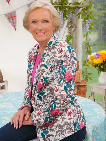
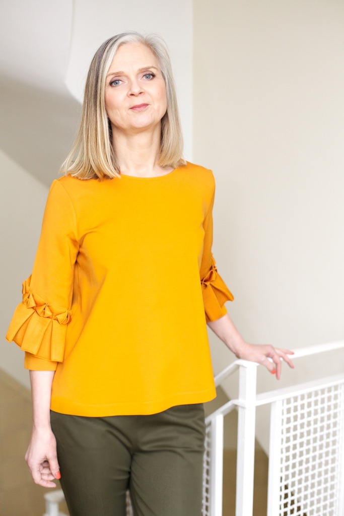
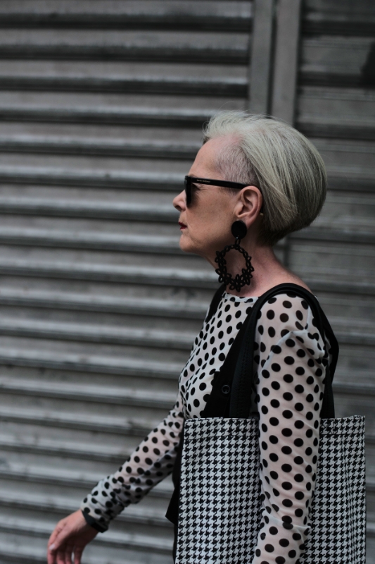
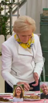
I’ve been watching two seasons of The Great British Bakeoff (aka The Great British Baking Show on Netflix). I cried at the end of one of them. Just the right mix of interesting (I know nothing about baking), dramatic (the natural drama of “Will this sponge cake set in time?” instead of manufactured interpersonal drama), charming (love the hosts), and stylish – Mary Berry is my new blazer inspiration:


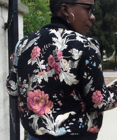
She even does moto jackets & bombers:

 
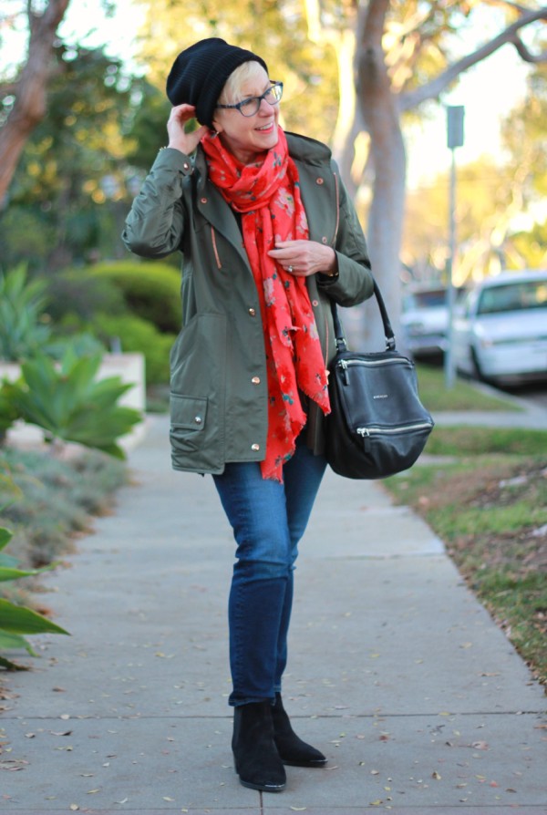
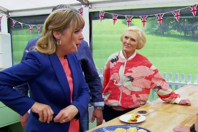
Scarf game = 100.         PS that’s host Mel Giedroyc stuffing pastries into her pocket. Charming, yes?


What a badass. She’s 80 and wearing stuff 20-year-old models sport – much of which sold out as soon as she wore it on TV. Here’s a fun read on her style icon status.

And from Norma Kamali (a 70-year-old designer and fashion maven in her own right), in an interview by Garance Doré, speaking about style in the 60s:

“If somebody liked what they put together, it would not be strange for them to wear it for 48 hours…people wouldn’t just change their clothes everyday; if you liked what was happening, maybe you’d add another scarf.”


Source.

Thank you, Norma, for validating my habit of wearing an outfit that works two days in a row – either with a change of shoes or without.

Enjoy your day!

In Which I Try Girlfriend (or Mom?) Jeans

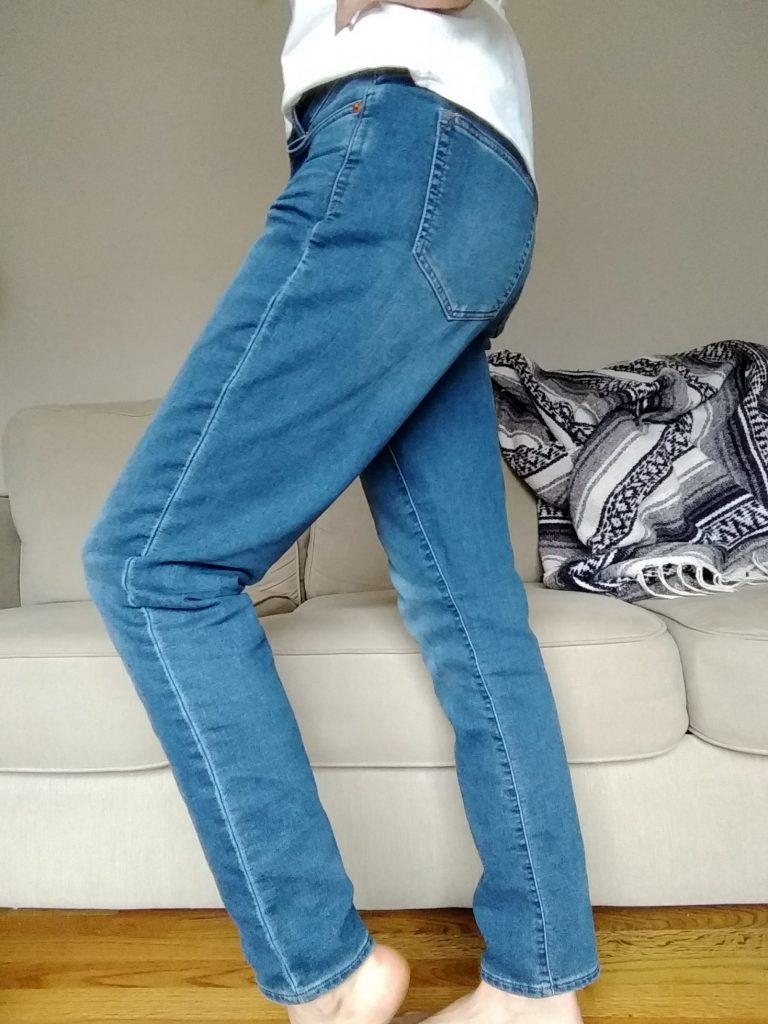
When I was at Restoration Project last month looking for some neutral pants for my Light Summer wardrobe, these pants looked like just the light, lovely color of blue that would light up my new (to me) wardrobe:

IMG_20180215_150801666

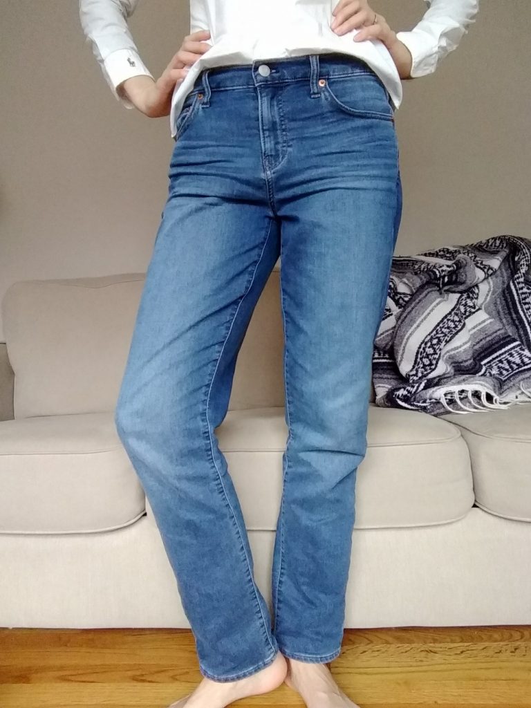
They’re by Gap and they’re labeled “Best Girlfriend Jeans.” Huh?

(This article will help you make as much sense as possible of all the jeans named after relationships in your life. Which is not much, because as the photos included show, what one brand calls a Girlfriend jean is someone else’s Boyfriend jean, etc. I still have no idea what makes jeans borrowed from your best girlfriend better than jeans borrowed from just your regular girlfriend. Le sigh.)

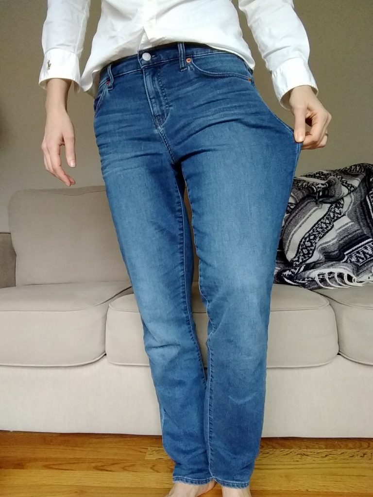
As far as I can tell, what Gap means by Best Girlfriend is jeans with a midrise waist and tapered but not skinny legs, that are rather roomy in the hip/thigh:

IMG_20180215_150855227

IMG_20180215_150743501

So….Mom Jeans. But cooler. (I think.)

(I should note that depending on the style, I wear two different sizes in Gap jeans and this is the larger one, so the fit might not be designed to be quiiiiite this loose. Yet they were such a dreamy color, and incredibly comfortable – very soft, good stretch – that I decided to branch out, style-wise.)

Mind you, this is only the second pair of jeans I own, the first being skinny jeans (the Paige Skyline – thank you thrift gods), so I feel like quite the cool kid in my slouchy denim. I’ve worn them a couple of ways so far: around the house when I want to look dressed but still want to feel pajama-level comfort, over leggings for some added warmth…

IMG_20180214_121819414
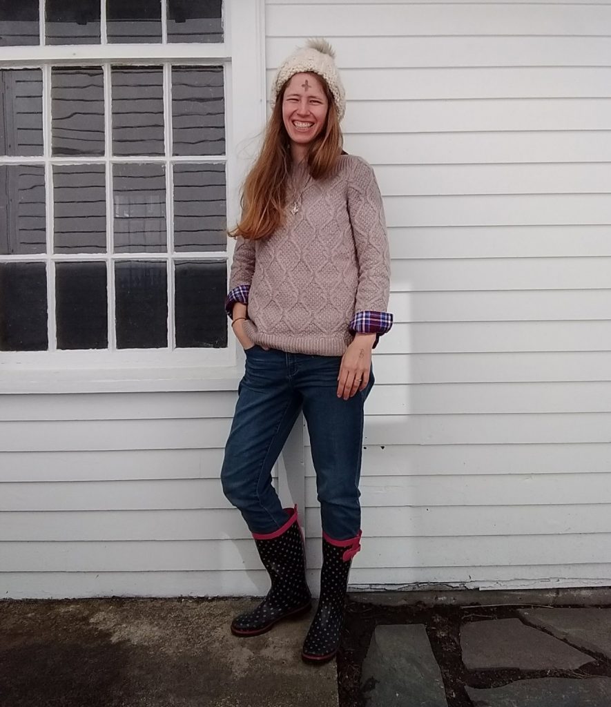
Distributing ashes outside for 2 hours in Boston in February is cold!

…and on snowy days when I’d rather stay at home and want to bring that comfy feel into the office:

IMG_20180130_161016_964
The transition to New England style is complete.

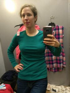
I actually really dig them with the white button down shirt I wore to get a good picture of them for you – I guess it’s a case of good lighting + colors in the same season really lighting each other up:

IMG_20180215_150801666

The only negative is that I have to keep yanking them up as they work their way down my derriere – we’re not risking crack territory here, but of course it makes things look slumpier. I’m excited when sweater season is over to pull out a belt and wear them hitched up and styled with button downs and tucked in blouses for a relaxed look that maintains its lines.

Do you sport any Girlfriend/Boyfriend/Mom/Dad/Grandpa/whatever the newest person-related style is? Why or why not, and how do you style them?


Personal Color Analysis, Part 2

I was tired of buying clothes in colors that didn’t feel great on me, so I got my colors done – i.e., had a personal color analysis to figure out what colors really light me up. You can read about the analysis here

V. Shopping My Closet

I got home after my personal color analysis appointment and wanted to swatch all my clothes right away – but instead I hung out with my preschooler. :) I haven’t yet finished going through everything, and I’m not great yet at swatching – it takes practice to evaluate all those value/hue/saturation factors at a glance! – but it’s safe to say that I do NOT have a lot of Light Summer colors in my closet.

IMG_20171216_162906_547
Not a lot of these.

Yet in Light Summer’s palette recognized the only purple I have ever thought looked good on me; the brushed, muted metallics I’m drawn to in jewelry and shoes; and the blued green of a favorite dress (long since donated due to pilling). Yay for some sort of color intuition!

Here are the best bets I’ve found for Light Summer clothes already in my closet – apart from the blue sweater which Hope helped me swatch, I’m not 100% sure they all work since I’m still learning to match colors:

IMG_5666 IMG_5671 IMG_3784 IMG_5668 IMG_20180106_095700216 IMG_5568 IMG_5572 IMG_5562 IMG_5593 IMG_5596 IMG_6364 IMG_20171004_180532576 IMG_5678 WP_20170517_12_54_25_Pro IMG_5584 IMG_20171124_150421752

and these shirts, donated for being too small across the shoulders/chest, and these shoes, which I wore holes in – rest in peace!
IMG_5569 IMG_5566 WP_20170512_16_23_30_Pro

and this blazer, which I LOVED but donated because I thought the grey was too cool….smh:
IMG_5579

You’ll notice that almost all my “Light Summer” pieces are warm weather clothes, while pretty much everything in my cold weather wardrobe is from some other season (mostly fall, I think). Katie of Dressed on a Dime posted yesterday about how her wardrobe had strayed from colors she loves that look good on her due to a combination of dressing in “seasonal” colors and neutral-heavey Instagram inspiration…and I am guilty on both counts. Should be fun putting some real color back in my winter wardrobe!


VI. Thrifting for Light Summer 

IMG_20171226_130119584Top to bottom: yep; maybe; nope (True Summer, I think)

Given said holes in my wardrobe and, of course, my love of thrifting, I spent a couple days over the holidays training my eye to spot Light Summer colors. Here are a few I found that I didn’t take home (again, remember that lighting, photo settings, and monitor settings will distort each of these to some extent):

An otherwise perfect green J. Crew shirt that was too tight – boo!; not my size, wanh wannnnh; too big with some moth holes:
IMG_20171228_115855943_BURST001 IMG_20180101_164425578 IMG_20171226_130756606


And here are some I took home:

IMG_20171228_115654037 IMG_20180101_174619762 IMG_20180101_174959225 IMG_20180101_171053399 IMG_20180101_171303058 IMG_20180101_160146765

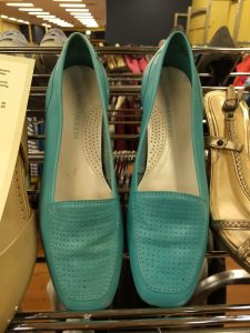
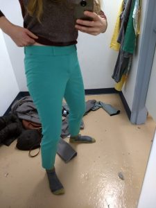
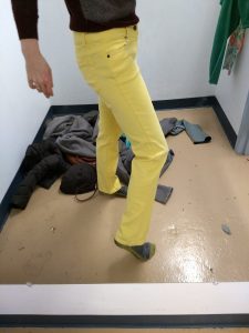
Those yellow pants – I die! And those turquoise pants (warm weather, I admit), fit like a DREAM. So chic – they even have little notches in the pant hem. I’ll post better pictures when it’s actually warm out.

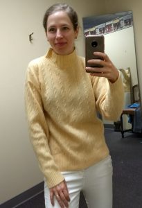
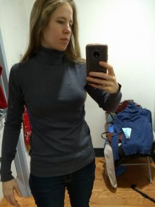
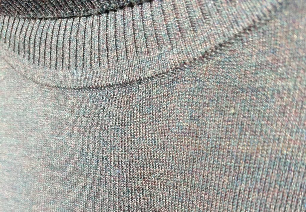
Let’s see that grey turtleneck up closer – though this picture is over-exposed, in it you can see that this is chock full of summer-y colors:

IMG_20180106_095312519

And in my own home-made draping attempt, here are two of the sweaters up against my face and a neutral-ish grey background:

IMG_20180110_091617366 (1) IMG_20180110_091549448 (1)

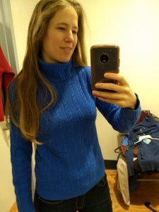
That pink is still a little too hot pink in the pictures…but you get the idea. And yes, I hate cableknits; it’ll serve as a placeholder ’til I find something non-cable-y in an equally glorious blue.


VII. Conclusions

I’ve worn color in good doses most of my life; it’s only recently (and largely thanks to Instagram and style bloggers) that I’ve loaded up on neutrals. I’m a little hesitant to wear, say, purple pants with a yellow top; but I am curious to see whether wearing more color brings a little more zip to my days, since many folks who have found “their” colors report a shift in how they feel and how they see themselves.

I’m not going to chuck everything that doesn’t fit my newly discovered season; I have some favorites I suspect I’ll keep no matter what. But I do feel a new permission to let go of things I wasn’t loving that aren’t in my color wheelhouse; and an excitement to go find yellows and greens, berry hues, and maybe even some purples (!) that work since those colors are so absent from my wardrobe.

And I ended up with a few colors I don’t really care for: stoney grays that feel “blah” to me, periwinkle, and a drab-ish yellow.  I’ll put them on the backburner until I’ve built up garments in some of the colors in the palette that I’m more drawn to, then see how I like them when they’re playing with colors they resonate with.

Overall, I’m glad I did it; I feel like the uncertainty I had about what works is gone. I am still a bit nervous to build a wardrobe out of colors I have neglected for so long; but mostly I’m excited, because it means I get to spend a lot of time doing something I love: thrifting.

Thanks for reading along. Let me know if you’ve ever had your colors “done” or wondered what it would be like, or whether you’re a color genius who already knows what looks great on you!

I Got My Colors Done: Personal Color Analysis, Part 1

Happy New Year, y’all! I’ve been busy with the holidays, travel, shoveling out from a cyclone bomb (whatever that means!), and reworking my thrifting game after getting my “colors” done – aka having a personal color analysis. This whole saga is on the long side, so I’ve broken it up into 2 posts with section headings to keep everything digestible. Enjoy!


I. Personal Color Analysis

Personal color analysis (PCA) has often been used as a fashion weapon to declare that people (usually women) with certain skin tones, hair or eye colors should or should not wear particular hues. So let’s just get this out of the way: you can wear whatever colors you damn well please.

If you’ve been reading here awhile, you know I’m not interested in following fashion rules just because someone decided that this or that cut, color, or style was flattering on a certain body type, skin color, etc. So often the word “flattering” is just toxic code for body-shaming, and I am not into that.

What I am into is knowing how lines, colors, and styles work so that I can play with them and decide how I want to use them to create a look I like – a look that feels like me.

For awhile now I’ve been wanting to use PCA as a source of knowledge that helps me pick out clothes I love and will wear. Too often I’ve thrifted something I really liked, only to leave it hanging in the closet because the color, actually worn on my body, made me feel blah, weighed down, too serious, or made me look like I hadn’t gotten enough sleep.

You know the feeling?

To figure out where I was going wrong, I started researching personal color analysis. PCA operates on the premise that everyone has certain hues that complement their complexion – and others that clash. It’s not about your mother telling you never to wear yellow (or always to wear blue), but rather finding out which yellows and blues go best with your unique skin, allowing you to make informed decisions about the colors you wear.

In my research I quickly learned that PCA has evolved a lot since the days of Color Me Beautiful. You might remember Color Me Beautiful as the four seasons style model where every blond was a “Spring” or a “Summer” and every person of color was an autumn. (Please. Like everyone with skin less pale than Cruella Deville’s has identical skin tone.)

1432048170-cruella-de-vil-101-dalmatians
Nah.

II. 12 Blueprints

Some PCA systems are still based on the “what color are your skin + hair + eyes?” equation that often slots people into categories that don’t feel like “them.” 12 Blueprints, the PCA system I liked best, has 12 seasons instead of the classic four, and instead of being based on a surface-level equation, it involves meticulous comparison of different colors against your skin to see what value (light to dark), hue (warm to cool), and saturation (grayed out to pure color) light you up. It’s analyzing your skin’s undertone, which is different from, and harder to see than, the more obvious overtone that presents at face value (ahem, pun intended).

Because of my artist sister, I was already familiar with value/hue/saturation, so the color calibration behind this system made total sense to me. If you want to paint snow, you’re not just going to paint it white, you’re going to use lots of different whites with lots of different other colors mixed into them. Why wouldn’t human skin be just as complex, and just as responsive to variations in value/hue/saturation? (My sister would kill me if I didn’t point out that artists don’t say warm/cool; they say “more yellow” or “more blue.” But I digress.)

The other thing that made sense to me about 12 Blueprints’ approach? It insists that you can’t figure out your season from photographs or by description of features, but only in person. Is that frustrating for those of us who just want to look up some online tests and get an answer? Yes. Is it convenient for a PCA system that relies on in-person consultation by a paid analyst? Yep. But it also makes perfect sense. I look completely different in different photographs based on the lighting, time of day, etc., not to mention that cameras capture colors differently, and computer monitors display the exact same image differently based on their hardware and settings.

Plus, I had a hard time finding conclusive results based on online tests that all seemed utterly subjective. 12 Blueprints uses drapes specifically calibrated to help you (and the analyst) figure out if your undertone is cooler/warmer, darker/lighter, etc. So while it does rely on human eyes to make the final call, there’s a systematic series of comparisons to help arrive at that decision.

Some people, by the way, are much better at figuring out the colors that go with their complexions than I am – if you are naturally drawn to certain colors that make you come alive, that make your skin sing – good on you! I’m not so great at it and was done with guessing and wondering. I was also done with spending money (even thrift money) on clothes that just feel “off.”


III. Colors by Hope

So I started looking for an analyst, and lo and behold, I found Hope Turner just a few miles away from me. Two things I loved about Hope’s take on PCA: one, if a color you love to wear isn’t part of your “season,” who cares? Wear what makes you happy. Not only do I agree with that, but it let me know she didn’t take this whole thing too seriously. I felt like she wasn’t married to the system for its own sake but uses it because it gets the best results.

And two, Hope acknowledges that PCA as an industry has largely ignored people of color. Part of the reason she decided to learn 12 Blueprints’ method is that it treats people of any and all skin colors as unique individuals who come with their own glorious coloring, making it impossible to lazily slot everyone with brown skin into “autumn” or maaaaaybe “winter.”

A generous gift made it possible for me to book an appointment with Hope, and it was a blast. After chatting about the R2D2 jello mold hanging in her kitchen (a good omen) and making tea, Hope walked me through the basic scales we’d be talking about – the aforementioned value, hue, and saturation. She also walked me through the 12 seasons or tones – Bright Winter, Soft Summer, True Autumn, etc. Then we got to draping.

Draping consists of the analyst flipping back and forth between two large fabric swatches meant to help us decide whether I was more this or that on a particular scale. It’s done in front of a value/hue/saturation neutral grey to eliminate interference from other colors. Hope described what she was looking for – does the person in the mirror look more approachable in this color? More at peace? More outgoing?  Does the drape overwhelm them, cause them to look ill or dull? Does it bring out redness or yellowness in the skin, or does it seem to balance the skin out? Etc.

Seb+PCA1 Scott+True+Winter1
A couple of Hope’s clients with the drapes that work for them – credit.


IV. I get draped!

The process was pretty demanding, attention-wise – during a three-hour appointment, we spent the majority of the time draping. That’s a lot of looking at your face and trying to notice very subtle differences! Luckily Hope started off by saying that while she wanted my input and wanted me to see for myself the colors that worked (or didn’t), it was her responsibility to guide the session and to see and interpret subtle nuances she has been trained to analyze. (Each 12 Blueprints analyst does 20 case studies in training and Hope has had many more clients beyond that.)

So I tried to relax and enjoy. Inside, though, I was nervous – was I going to end up with a season whose colors I hated? What if I disagreed with Hope?

Because my skin often looked yellow to me, I figured I was some sort of Spring, one of the “warm” (aka yellow-er) seasons. But I had read enough on the 12 Blueprints website to know that I could very well be wrong. And I had also read enough to know that when someone is surprised by their season, it can take awhile to live into it – to really feel like these colors are “you.” (If you never feel at home in your assigned colors, you were probably mis-analyzed, which luckily doesn’t seem to happen much with the 12 season calibrated drapes approach.)  I could, of course, keep wearing whatever I wanted – but the reason I was doing this was to find out which colors really enhanced my complexion, and I didn’t really want those colors to be colors I disliked – say, icy greys or baby pinks.

Here was the most interesting part of the process – Spring colors looked okay on me (better than pure black/white or the deep tones of winter), but they also made my face look yellow. This didn’t strike me as necessarily bad – I was used to seeing my skin look yellow compared to my husband’s and my kid’s, and even yellow in the mirror – which I read as sort of “healthy tan.”

Turns out, though, that only people whose skin doesn’t fall into the Spring categories look yellow in those colors. When the Summer drapes came around – particularly the Light Summer drapes – the yellow disappeared, the red splotchiness in my skin cleared out, and I was left looking like my skin made sense:

IMG_4685I know I just got done telling you that photographs shouldn’t be relied upon for color analysis, but I hope you get a sense of how evenly harmonious my skin looks against this Light Summer drape. It was certainly obvious in person!

After we eliminated the drapes of all the other seasons (particularly Light Spring and True Summer, which are Light Summer’s next-door neighbors), everything just sort of settled in and glowed with the Light Summer colors:

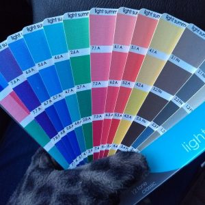
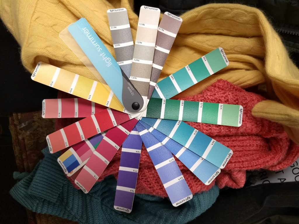
IMG_20171216_162906_547Decent-ish pic of the colors, taken on my cell phone in fading light. So, you know, don’t take it as a perfect representation.

Hope walked me through what kind of makeup works for Light Summers, and we had a fun makeup application session. (For those who don’t really wear or like makeup, that part is optional – though you might find you like the makeup that actually goes with your face!) I tried a less-orange foundation, though Hope commented that what I usually wear should work because it blends right into the overtone of my skin, which, again, is different from the undertone.  My shimmery, warm, light bronze eyeliner got swapped for slate grey and my coral lipstick switched out for more of a berry color – again, exchanging warmer colors for cooler ones. I was afraid “cooler” colors would look greyed out or pale on me, but then remembered that only people who aren’t Summers look greyed out in the somewhat muted Summer colors.

We took some pictures of me draped in my new colors (see Hope’s Instagram for more), and then Hope gave me my swatch book: 65 colors that harmonize with Light Summer undertones and that can be used to find clothing and makeup that harmonizes, too.  She taught me how to drop the swatchbook onto the sweaters I had brought with me to see whether the colors on the swatchbook and the garment light each other up, or just look like awkward neighbors or mere background.  Spoiler alert: only my scarf and one of the five sweaters I brought along really sang next to my Light Summer colors.

Overall Hope was warm, friendly, professional, able to put me at ease through what could have been a daunting process – and we had FUN! It’s almost magic to watch as you move closer and closer to colors that make your face come alive, and it felt great to finally know not only which clothing colors did that but also why lipstick has never looked right on me and what to do about it. On the drive home I couldn’t stop smiling in the mirror – everything popped!


You can read about how I’ve been easing into my new colors and what thrifting is like with a whole new set of criteria here.
Finding the Perfect Cable Knit Sweater

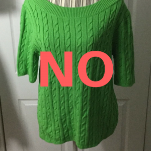
I hate cable knit sweaters.

I can’t really deal with how preppy they look, how plain and boring it feels to see the same. twisty. pattern. repeated over and over.

NO

If they are your jam, I apologize now.

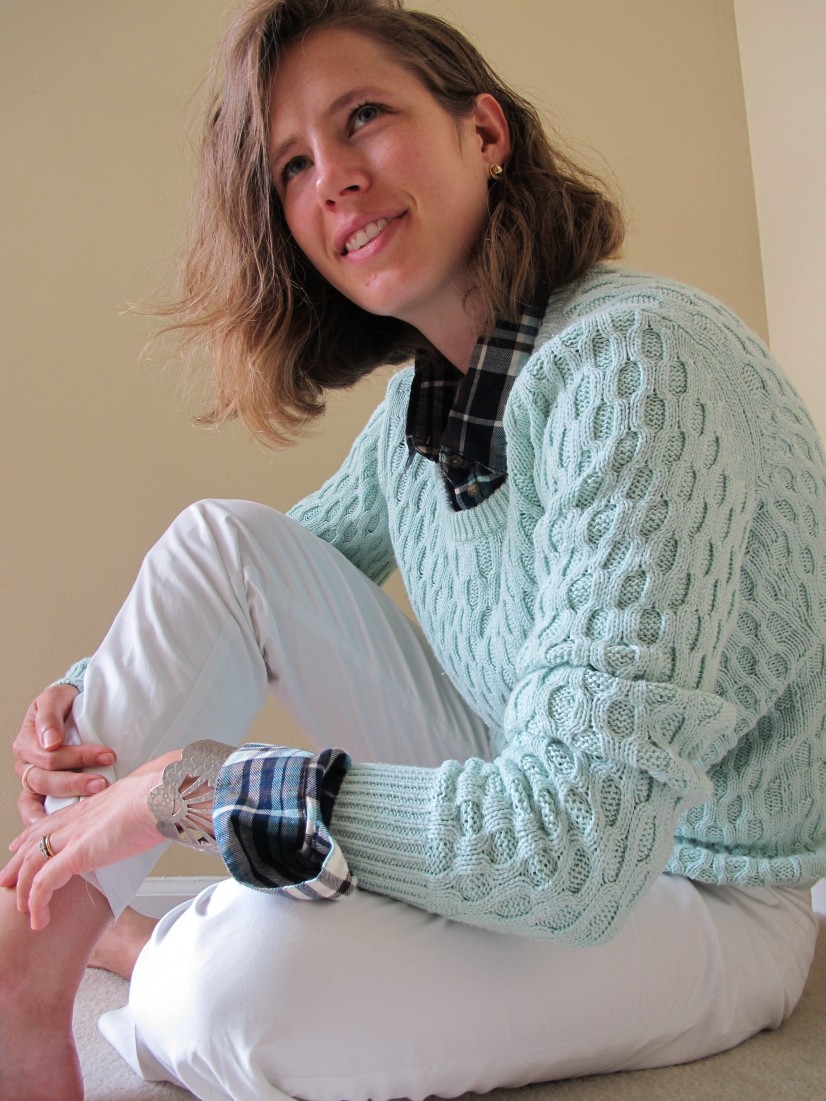
The closest thing I’ve ever owned to a cable knit sweater was this mint deal from a few winters back…and it was a flop. But how catalogue-worthy is this shot?!  Haha.

IMG_1795


Then one day a few weeks back, I spotted this baby on Instagram:

And suddenly my attention was captured.

What made this different from the samey-same feeling of traditional cable knit sweaters and cardigans? First of all, the cable knit was BIG and BOLD which considerably reduced the twee factor.  Second, there was other texture going on – a sort of chic waffle that is one of my favorites – and it made the cable knit a feature, not the whole story.  Then that split hem (another favorite) updated it out of the traditional prep aesthetic. And the flecked knit job (yet another fave) brought even more texture and visual appeal.

Refinery, the Instagram account that featured the sweater, is a consignment shop in Oregon City, Oregon. I have no idea whether they ship, but I was so taken by it that I inquired whether it was still for purchase (nope). I then spent a bunch of time searching on ThredUp, Poshmark, etc. for the sweater, which is by Urban Day.  No luck.

Then I figured I would just keep a thrift eye out for something similar, and saved the image on Instagram for easy visual reference while thrifting. (Did you know this is a thing? There’s a little bookmark or ribbon-like icon below a post that lets you save it to your “collections.” Learned that handy little tip from The Anna Edit in this video, where she uses the save and “collection” features to keep style notes that help her flesh out her seasonal capsule wardrobes.)

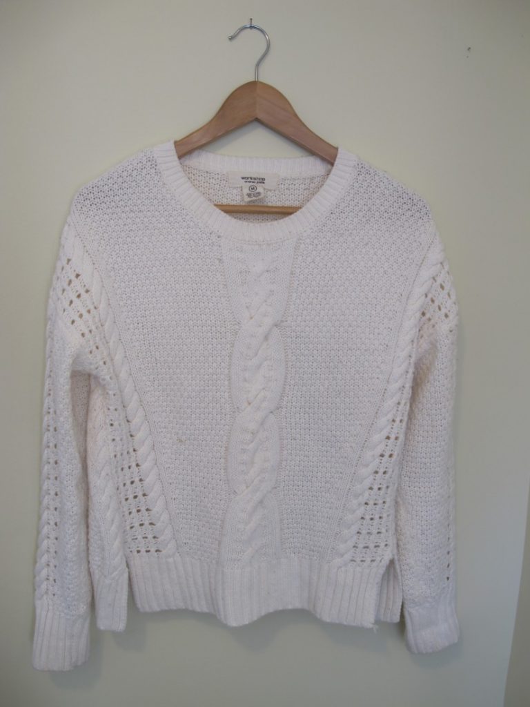
Lo and behold, the thrift gods smiled upon me, and I spotted this baby by Workshop by Andrea Jovine not long after:

IMG_6472
Don’t worry, I don’t actually store my sweaters on hangers – that stretches them out!

Giant cable knit? Check. Other texture of a waffle-y variety? Check.  Split hem? Check.  Flecked yarn? Nope, but you can’t have everything.

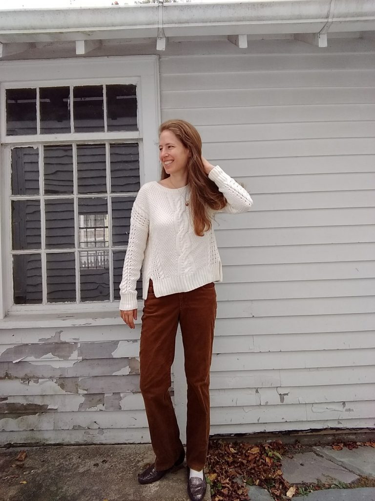
This sweater has quickly become a favorite – I feel like its relaxed chic vibe, particularly its loose semi-cropped silhouette, instantly catapulted me into realms of style blogger cool I rarely reach. And it is so soft. 

Something you can’t see in the pictures?  It’s got some not-so-nice pilling happening. More than I can reasonably tackle in one sitting.  This means the yarn is made of short fibers, which are cheaper (and poorer quality).  So as much as I love this sweater for what it is, I’ll be keeping an eye out for a higher quality upgrade.

So cozy:

IMG_20171014_104252838

Sweater chic:

IMG_20171016_173106085 (1)


What are your feelings on cable knit?  And what’s an item or style of clothing you had to find juuuust the right version of before it even remotely appealed?


Updated Post: Updating My Basic Jewelry

And now, with pictures! Sorry for the technical snafu yesterday and thanks to those who pointed it out.

I am a wear-the-same-basic-jewelry-every-day kinda gal. Sometimes I throw in a statement necklace or swap in a more casual bracelet, but most days you’ll catch me wearing a metallic cuff bracelet, my wedding/engagement rings, and gold stud earrings.  Today I’ll tell you about updating my bracelet after it sustained damage, and adding a ring (whoa!).

Up until recently, this vintage cuff was my bracelet:

IMG_1851

It was my grandma’s and I loved wearing it. It reminded me of her and had a style you just don’t see anymore. Paired with relatively simple outfits, it really popped.

But costume jewelry from the 60s isn’t made of Teflon. After several years of wearing it almost every day, it cracked.

I still wore it for awhile, since the crack wasn’t super noticeable. But it kept catching on things, and I realized that if I ever wanted to get it fixed I should probably stop wearing it to prevent further damage. So onto my dresser top it went, where I could still see it every day and smile at the memory of my grandma:IMG_1852

In the meantime, I had a serious case of NAB. (Go Fug Yourself readers will recognize this acronym as “Needs a Bracelet.”) I knew I wanted a cuff; they don’t flop around like bangles or cut off you circulation like elastic bracelets and they’re not infernally hard to put on like regular ol’ clasp bracelets are. Unsurprisingly, the last bracelet I had worn to death was a cuff as well; they just feel elegant and “me.”

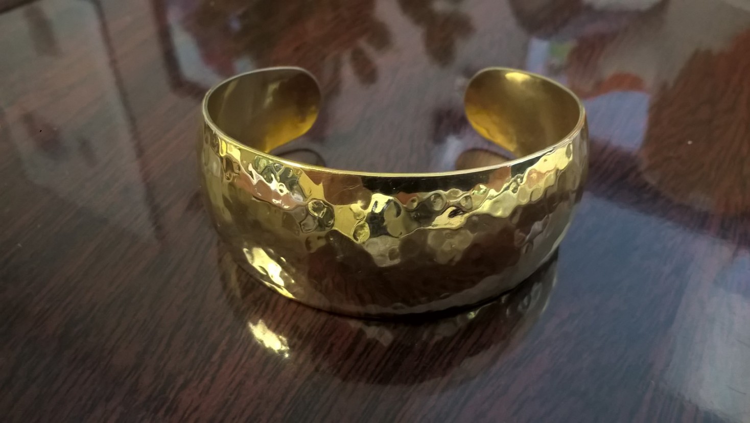
So I started searching the jewelry counter at the Goodwill. I found a few bangles in good color schemes (off white and gold) and a silver cuff I really liked, but no gold cuffs. After several weeks of keeping my eyes peeled, I stopped into the Thriftique and lo and behold, this baby was waiting for me:

WP_20170607_12_47_12_Pro

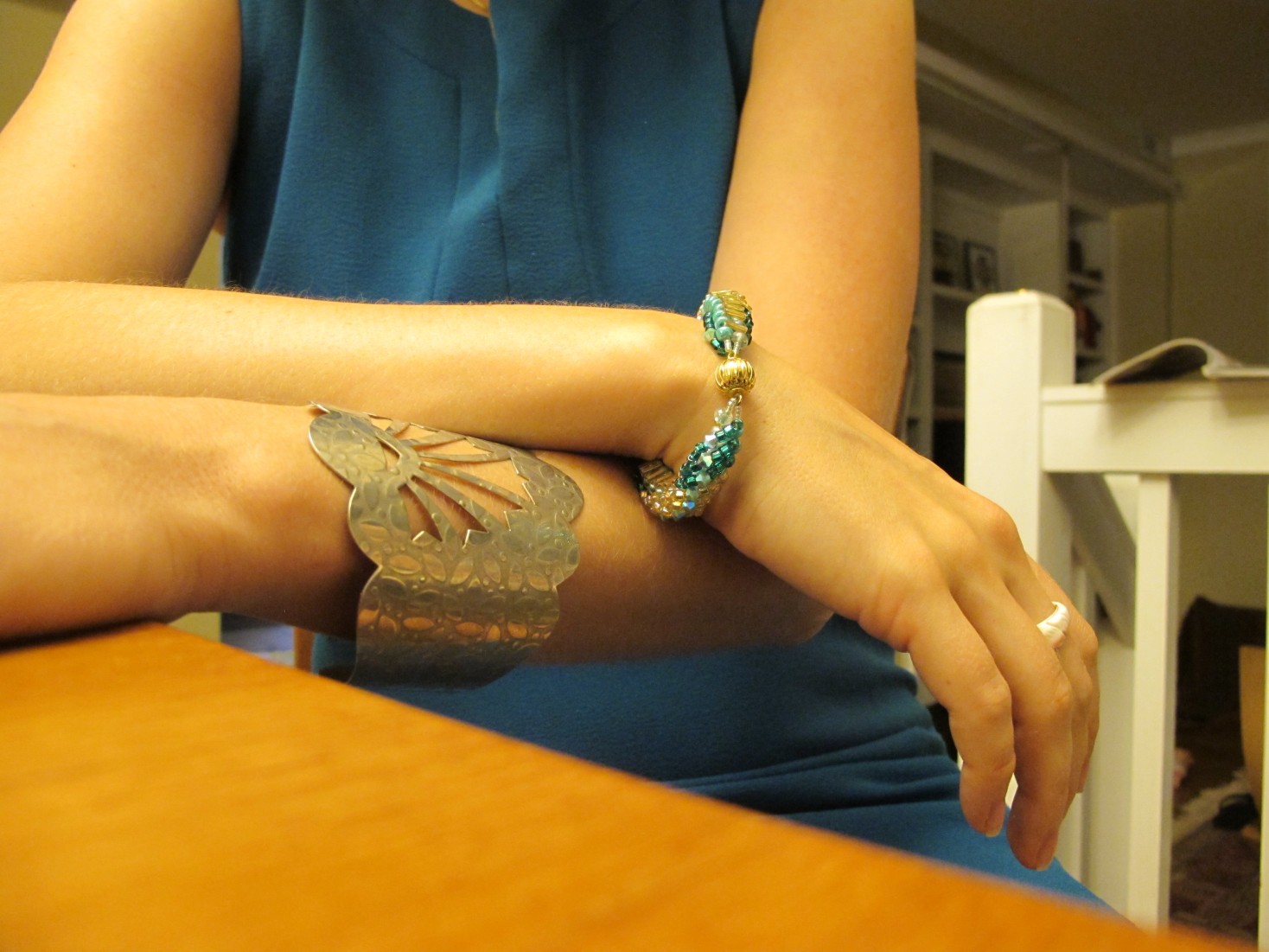
At first I was worried it would feel a little too bold – it was a much yellower gold than my previous bracelet, more in your face. But it was much narrower than my last cuff, and I loved the beaten texture. I reminded myself that Grandma’s cuff took some time to move from giving me an “I AM WEARING COSTUME JEWELRY” feeling to being my signature statement piece, and then I gave it some time.

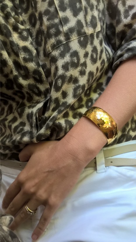
Now it feels like a natural part of my wardrobe and fits with seemingly everything (and doesn’t get caught on sleeves like my last one did).WP_20170614_09_34_20_Pro (1)

The stamp on it says Monet, which is a J.C. Penney brand; quality-wise it’s not going to be around forever, but when it “dies” (as my spouse likes to say) I can thrift a new one that will have its own character, or go back to wearing my grandma’s repaired cuff.


I have a whole collection of rings, mostly my mom’s vintage stuff and a few sentimental pieces from junior high/high school when I was an avid ring wearer. But I rarely pull them out, mostly because my bracelet is hogging the attention in the hand/wrist department and I don’t want to compete. I was looking through them for some reason a few weeks ago, though, and was struck by how the color and bold style of this one matched my recently acquired cuff replacement:

WP_20170614_09_14_05_Pro


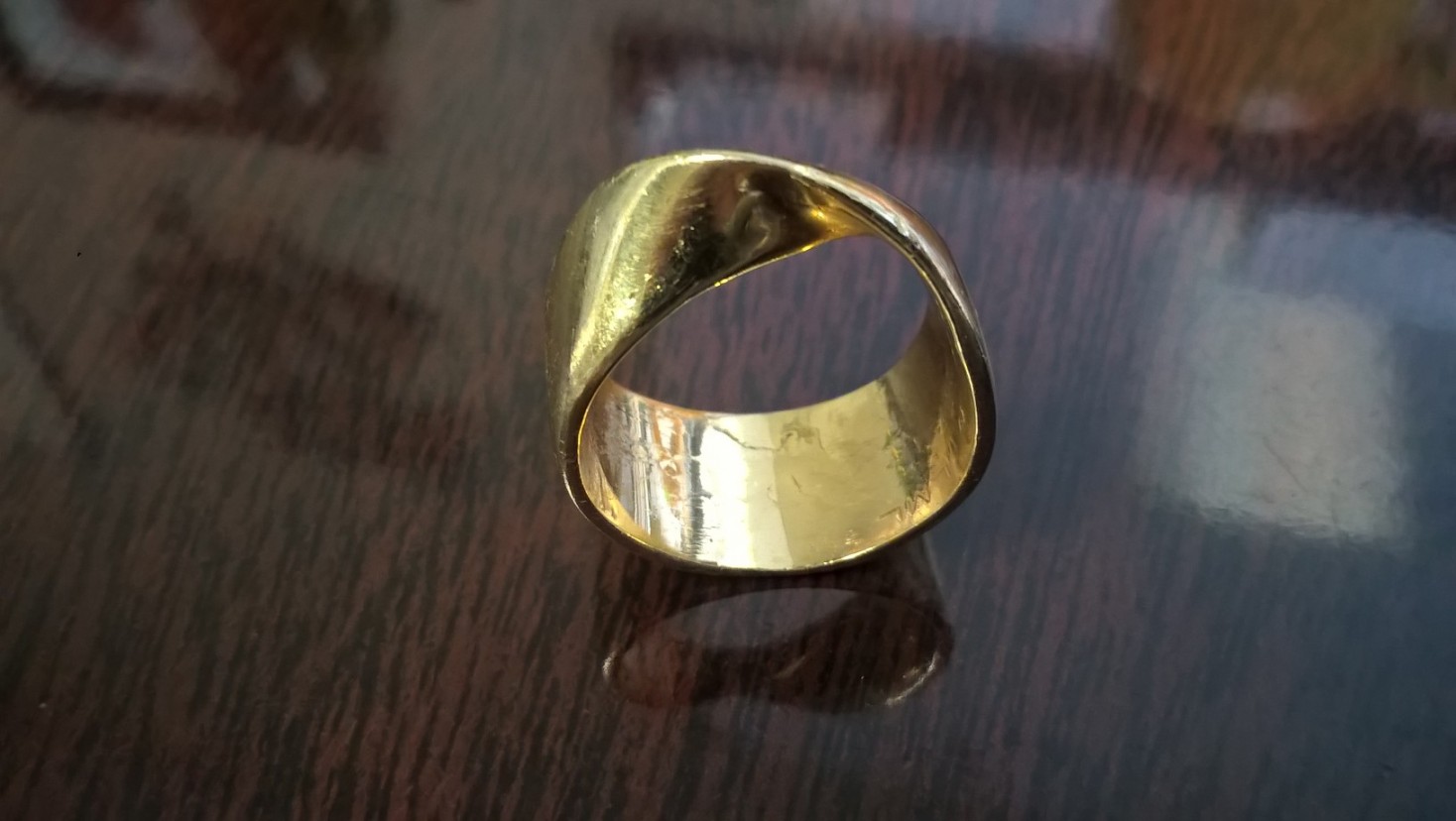
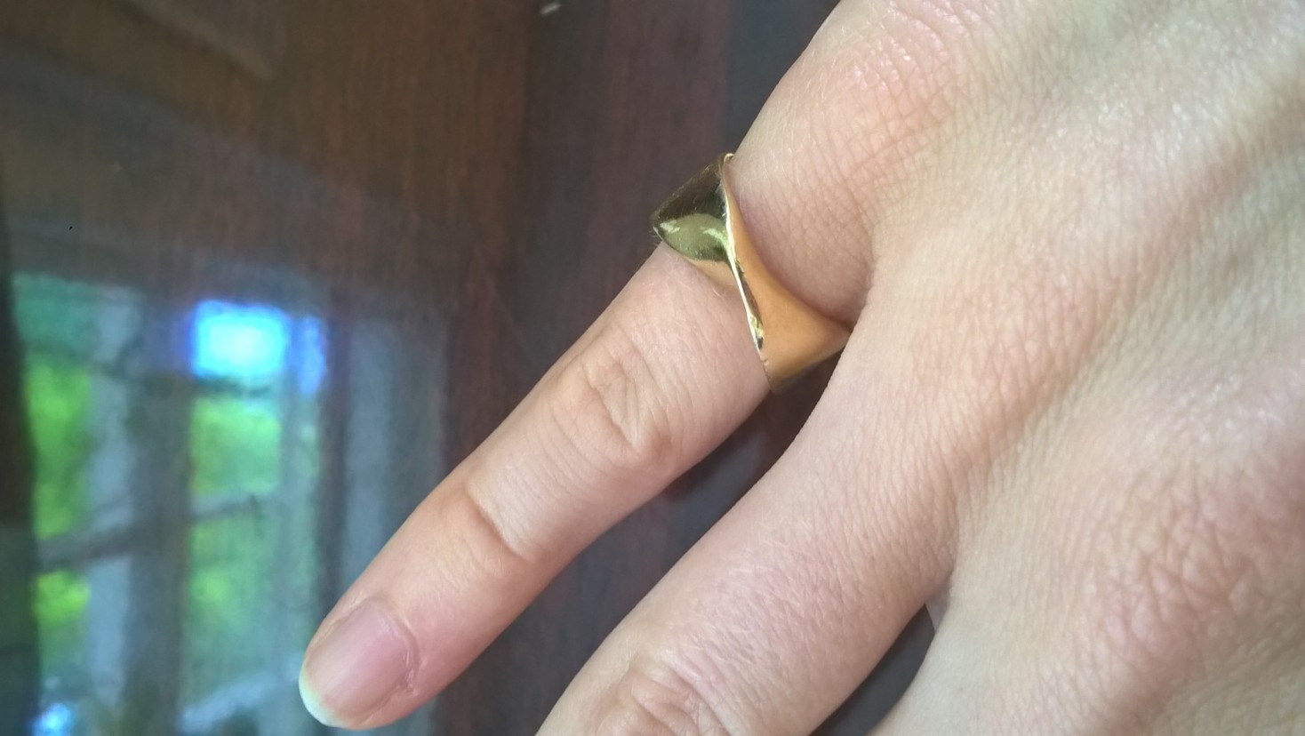
It was my mom’s original wedding ring (she has since moved on to something with diamonds). It’s a Möbius strip, which I think makes for great symbolism. I absolutely LOVE how simple and yet unexpected the design is; in my head this is a top-tier style-blogger level of finger jewelry, though quite a bit chunkier than what’s popular in that set.

When she got married her fingers must have been TINY; it doesn’t fit on my ring finger, so I wear it on my pinky which I think gives it more panache anyway:

WP_20170614_09_14_19_Pro

It’s a tiny bit loose; I have to be careful when I get my hands wet. I’ll probably take it to a jeweler to size it down.  Any recommendations?


So there you go; secondhand jewelry all the way. I hope you enjoyed the update and would love to know what treasures you sport every day!


Dressing Up a Breton Stripe Tee, Two Ways

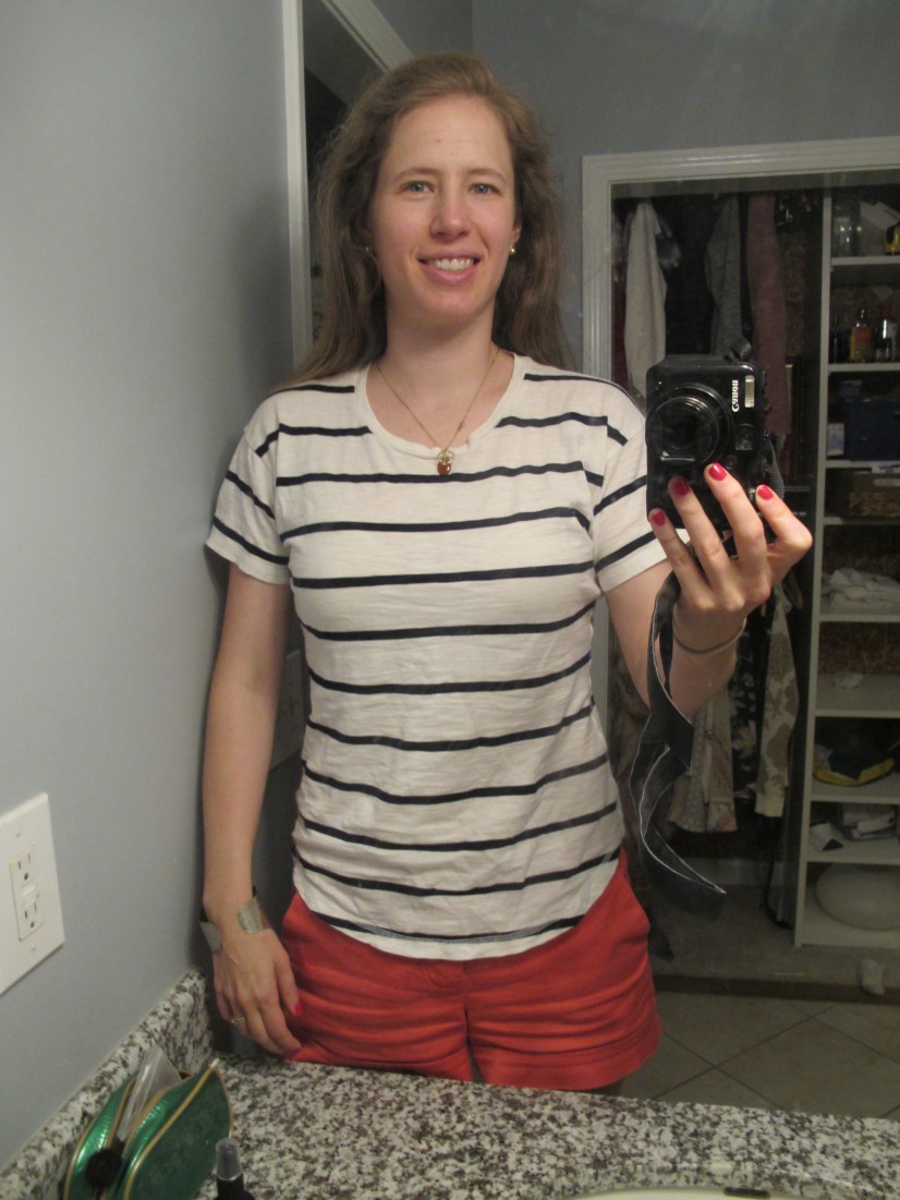
My last few Thursday nights have been marked by a distinct lack of sleep. But Mama’s gotta work; wearing this Madewell Breton stripe tee (which is super comfortable – it basically feels like pajamas) is as close as I could get to staying in bed.  How to dress up such a casual-vibe top without completely scrapping the comfort factor?

IMG_5662
Decidedly casual.

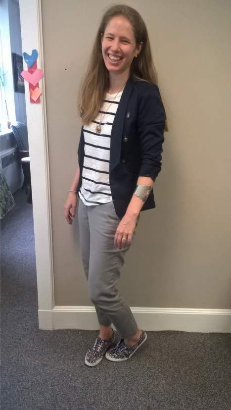
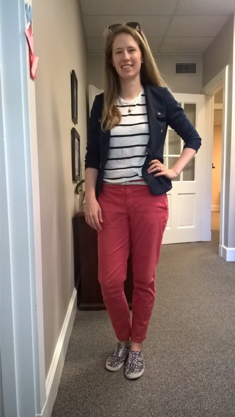
I wore the outfits below on two consecutive Fridays to play with the styling a bit:

WP_20170512_16_22_44_Pro WP_20170519_16_41_22_Pro
Both: shirt, Madewell; blazer, Charlotte Russe; sneakers, City Sneaks. First: pants, Vince Camuto. Second: pants, Bandolino.

And how’s here I added some spit and polish:

The blazer was key to smartening up both of these looks; its touch of stretch kept it from feeling too confining or stiff.

How I dressed it up in the first photo: the “cigarette” pants are in a slim cut and a neutral hue. The necklace (closeup photo below) lends a little gravitas – it’s a focal point with some character.  And my cuff bracelet makes the whole thing look “finished.”

How I dressed it up in the second: the tucked shirt and skinny belt give a pulled-together look. While the sunglasses-as-headband look definitely reads “beach” in parts of the country, they are my first well-made, non-scavenged pair and they made me feel more dressy. (More on these in a later post.)

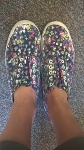
Admittedly the floral sneakers round this down to the casual end of “business casual.” If I really wanted to dress up, I would’ve combined all the polished elements listed above into one outfit (grey pants, tucked/belted tee, statement necklace, cuff bracelet) and skipped straight to my bronze wedges:
WP_20170420_15_09_06_Pro

But the combos above passed muster for Casual Friday in my office and prevented me from feeling like a slob even though I *did* feel like going back to sleep.

Here’s a closeup on the necklace, a vintage number that belonged to my Grandma:
WP_20170519_18_48_14_Pro

Do you have any tricks for dressing up t-shirts?  Or for masquerading pj-level comfy outfits as workwear? Scroll down to share!


Thrift Style for Older Women – Part 3

In Part 1 we pregamed; in Part 2 we went thrifting. Today Part 3 is all about inspiration to get those style juices flowing. These women are the experts I mentioned back in Part 1 – some in thrifting, some in retail, but all in style. (May I note for all you spring chickens out there: I regularly read several of these and the style inspiration therein is in no way limited by age – so click through and read what speaks to you!) Scroll down to share your favorites, that we all may benefit.

Thrift blogs
These first three are all Canadians who know (and link to) each other.  Please help me expand and diversify my list of thrift blogs by older women!

Ephemera


Bag and a Beret

Suzanne Carillo
challenge your style try something new spring florals for women over 40 suzanne carillo

Fellow Atlantan Rhoda has a regular feature on her Southern Hospitality blog about stylish finds for those over 50 which often features thrifted pieces:
fashion-over-50001

On Instagram, Darlene Fadem of Las Vegas:

A post shared by Darlene Fadem (@darlenefadem) on


Handmade:
A Colourful Canvas


Non-thrift Style blogs
Note: there’s a lot of emphasis on blogs like Ari Seth Cohen’s Advanced StyleSaramaijewels (Instagram), or Judith Boyd’s Style Crone where the looks are fabulously larger than life. I dig those looks both for their sheer boldness and the styles themselves, but if you’re reading my blog chances are you’re not going to wear opera gloves or turbans in your daily looks. (Correct me if I’m wrong!) So in this list I tried to aim for women who had more relatable, down-to-earth style.

Senior Style Bible (blogger Dorrie Jacobson is an 80-year-old retired Playboy bunny and her style is ON FIRE – although lately she posts more regularly on Instagram)
DorrieJacobson_SeniorStyleBIble_SeniorStyle_2 copy

So What to Twenty!
baroque-021

Une Femme d’un Certain Age
beanie-1-600x894

Fashion on the 4th Floor
A Fairytale Ending with the Fab 40s

Privilege

The SequinistAbout Me Collage

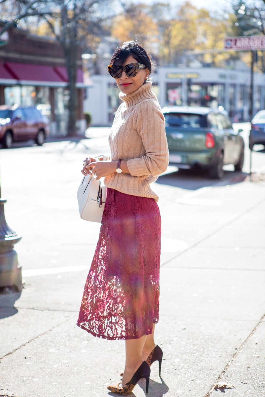
Petite Style Studio
work style, office style, petite fashion, fall fashion, 9to5, office outfit, business casual, feminine work style, dressy, lace skirt, midi skirt, jcrew, h&m, petite style, petite style studio, affordable style, easy style, fashion over 40

That’s Not My Age

Accidental Icon

High Heels in the Wilderness
 black zippered jacket from Lulu Lemon, pink Hot Chillys base layer turtleneck from Bushtakah, black joggers from Aritzia, black boots from Stuart Weitzman, fuchsia tweed coat from Max Mara


Last but not least, an edit – I’m adding on a blog that isn’t focused on the author’s personal style, but IS geared toward this audience and teaches you how to pair colors and silhouettes to create a wardrobe of stylish things that work together (which is, after all, my own wardrobe goal!):

The Vivienne Files

Thanks Jill B. for catching this oversight!

What are your favorite style/thrift blogs written by/for older women?  Scroll down to comment!

Thrift Style for Older Women – Part 1

In my survey at the end of last year several of you asked me to tackle capsule or casual wardrobe ideas for older women, aka “senior thrift style.” (FYI That last phrase is from one of y’all, not me. People have ALL kinds of feelings about terminology for “women of a certain age,” including hating that very phrase and/or the word “seniors.” I will do my best to avoid the minefield by sticking to “older women.”  Be sure to let me know if you hate that too…😁)

I’ll end this series by pointing you to blogs created by and for stylish older women. As someone in my early 30s I am far from an expert in this area, but I do know thrifting, and I think a lot of what I see in thrift stores (as well as a lot of style advice) translates well to a variety of ages.  So I’ll tackle this topic as a three-part conversation that I hope you all will join in on.

Part one: let’s talk pregame. If you want to thrift successfully, you have to do a little prep work.

  • Assess your lifestyle – and your style-style. I read several style blogs written by older women, many of whom have gone through some kind of life transition that affects their style. Think rising up the ranks at work, shifting to part time or more casual work, retirement, caring for grandkids or an aging partner, or traveling more. Or maybe as you’ve aged you’ve just decided to quit wearing uncomfortable shoes and clothes for the sake of someone else’s definition of fashion.
    As with any life transition, it sometimes takes a while for reality to catch up with our style image of ourselves. Take a minute and think about what kind of clothes you wear the most during any given week. See if your closet reflects that breakdown. Then, out of the kinds of clothes you are actually wearing, which pieces are you most drawn to, and why? Here are some more prompts for figuring out your style.

If you already have a good handle on your style, skip straight to the next step:

  • Figure out where the holes are. My biggest tip for thrifting, whether your’e a newbie or a pro, is to go in armed with a list of what you’re looking for so you don’t get overwhelmed (newbie) or distracted (pro). If you know what you’re missing – say, you have one great blazer but could use one in a different color; you want a more comfortable pair of shoes – your process will be more focused and you’ll have a better chance of success.
    A lot more thrifting pregame strategy here.
  • Invest in a great bra and some underwear you love. Although I’ve bought new underwear at a thrift store, secondhand is generally not the place to buy lingerie. You need underthings in great condition to make the most of your closet – there’s nothing sadder than a fabulous top that looks funky because your bra is bunching the skin on your back or letting things sag. You don’t even have to splurge; just find a fit guide online or go to a lingerie or department store for a fitting and use that information to get something good in your price range. As we grow older our breasts change, so it’s worth it to do this periodically to keep your gals looking great and your clothes looking great on top of them. (If you don’t wear a bra, then just skip all that advice.)
    Buy some no-show undies if you have bottoms that show panty lines and make all your other undies things you love to wear. Again, no need to break the bank unless you want to. I dig cotton so I just get Hanes or Fruit of the Loom in colors/patterns I love. Your mileage may vary. (And if you can afford to buy ethically made underthings, all the better!)

Next week we’ll talk about strategies once you get in the store.  In the meantime, scroll down to share any particular questions or issues you want me to tackle during this conversation.
 

What I Wear Every Weekend

Surprise! A weekend-related post for the weekend.

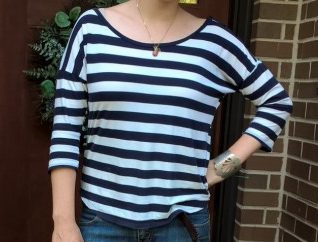
Though I can be fickle with my weekday wardrobe – thrift something one week, donate it the next – I am a creature of habit on the weekends. In spring, here is the shirt I reach for without a second thought every Saturday (and often after work or church):wp_20160924_17_00_19_pro

It’s by Gap and made of incredibly soft, worn-in cotton.  It has my favorite width of stripes: not too thin or thick and evenly spaced so the shirt doesn’t appear too white or too navy. The drop shoulders make it look a little more modern although I wouldn’t care if they were normal shoulders. The wide neckline feels laidback as does the loose, but not sloppy, cut.

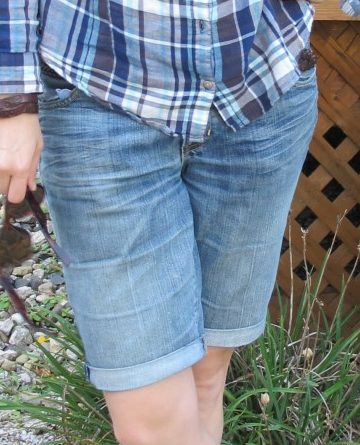
Most often than not I pair it with these cut-offs. They’re Gap jeans I thrifted 10 years ago right after I stopped buying retail. They were already cut to this Bermuda-esque length, which is just right for breezy days when shorts would feel too chilly.  And although they’ve stretched out a leeetle too far for their own good, I can’t give them up. They are perfectly worn in and just feel right. (I even wore them in one of my engagement photos lo these many years ago!)  I can roll up the edges for a neater look or let them go frayed when I’m feeling a little more free spirited.
img_4281
Both pics from this post.

That’s it!  If you see me wearing something else on a Saturday, it’s either unseasonably cold (and I’m in jeans) or someone forgot to do laundry.

Do you have a weekend “uniform”?  If so, scroll down to share.