Light Summer Colors: What’s Hard (and Easy) to Find

One of the joys of a PCA (personal color analysis) is knowing exactly what “your” colors are – the ones that complement and enhance your skin tone. The burden is that sometimes *your* particular colors aren’t on trend; if your purple is softer/darker/lighter than Pantone’s Ultraviolet, you may have to wait another fashion cycle (or three) before you can buy purple clothes retail.

Enter the thrift store, where the colors of seasons past all live together in glorious harmony, and where you are much more likely to find “your” version of blue, purple, yellow, etc.

But. I’ve noticed that even with a veritable rainbow of colors at my fingertips, it’s still harder to find some Light Summer (my palette) colors than others. I suspect this is due in part to what particular kinds of colors have been popular over the last several years; it’s mostly due, though, to different seasons wearing different colors more easily.

I’m no expert here (dive into the delightful rabbit hole of Christine Scaman’s 12 Blueprints for that), but as I’ve dug into the subject of personal color analysis a bit, I’ve picked up that, say, Light Summers can rock a wide variety of blues (even fudging some that aren’t our best), but that orange will likely never be our friend. A special warm/cool blend of coral, yes, but that can be hard to find, since coral tends to err on the side of warm. Likewise, the very muted, cool yellows in Light Summer’s palette are tricky to find – fashion has favored mustards or warmer, lemony yellows for years, so that my yellows are more likely to be found in grandpa cardigans or strangely cropped pullovers or cableknits from an unfortunate slice of the 90s:

IMG_20180216_112248660 IMG_20180216_112221830 IMG_20171226_130756606

Likewise, ALL the pinks that hit that elusive warm/cool spot beloved of Light Summers seem to be cable knits or cardigans, neither of which are my favorite. Why, fashion designers, why?

On the other hand, greys are pretty easy to fudge, and teals and blues call to me from the racks like beacons of cool, soft, lightness:

IMG_20180101_174619762 IMG_20180101_164425578 IMG_20180101_171303058 (1) IMG_20171228_115855943_BURST001 (1)  IMG_20180101_160335200_BURST000_COVER_TOP IMG_20180117_152837974 IMG_20180117_162847618 IMG_20180118_143127451 IMG_20180216_111413030 IMG_20180212_135950800_BURST001 IMG_20180212_135437827

These are some of my “easiest” colors to wear, and end up therefore being the “easiest” to spot – even if they don’t all come home with me.

If you’ve been analyzed – or if you know your best colors – which are the easiest to find? Which are harder? What’s your take on the magic of finding “your” colors?

In Which I Try Girlfriend (or Mom?) Jeans

When I was at Restoration Project last month looking for some neutral pants for my Light Summer wardrobe, these pants looked like just the light, lovely color of blue that would light up my new (to me) wardrobe:

IMG_20180215_150801666

They’re by Gap and they’re labeled “Best Girlfriend Jeans.” Huh?

(This article will help you make as much sense as possible of all the jeans named after relationships in your life. Which is not much, because as the photos included show, what one brand calls a Girlfriend jean is someone else’s Boyfriend jean, etc. I still have no idea what makes jeans borrowed from your best girlfriend better than jeans borrowed from just your regular girlfriend. Le sigh.)

As far as I can tell, what Gap means by Best Girlfriend is jeans with a midrise waist and tapered but not skinny legs, that are rather roomy in the hip/thigh:

IMG_20180215_150855227

IMG_20180215_150743501

So….Mom Jeans. But cooler. (I think.)

(I should note that depending on the style, I wear two different sizes in Gap jeans and this is the larger one, so the fit might not be designed to be quiiiiite this loose. Yet they were such a dreamy color, and incredibly comfortable – very soft, good stretch – that I decided to branch out, style-wise.)

Mind you, this is only the second pair of jeans I own, the first being skinny jeans (the Paige Skyline – thank you thrift gods), so I feel like quite the cool kid in my slouchy denim. I’ve worn them a couple of ways so far: around the house when I want to look dressed but still want to feel pajama-level comfort, over leggings for some added warmth…

IMG_20180214_121819414
Distributing ashes outside for 2 hours in Boston in February is cold!

…and on snowy days when I’d rather stay at home and want to bring that comfy feel into the office:

IMG_20180130_161016_964
The transition to New England style is complete.

I actually really dig them with the white button down shirt I wore to get a good picture of them for you – I guess it’s a case of good lighting + colors in the same season really lighting each other up:

IMG_20180215_150801666

The only negative is that I have to keep yanking them up as they work their way down my derriere – we’re not risking crack territory here, but of course it makes things look slumpier. I’m excited when sweater season is over to pull out a belt and wear them hitched up and styled with button downs and tucked in blouses for a relaxed look that maintains its lines.

Do you sport any Girlfriend/Boyfriend/Mom/Dad/Grandpa/whatever the newest person-related style is? Why or why not, and how do you style them?


Getting Stains out of Thrift Store Finds

Many an article on thrifting advice will advise you to skip the stained, torn, snagged, or otherwise damaged thrift find. In some ways, this makes sense – you shouldn’t let thrift prices (“But it’s so cheap!”) lure you into buying something that is poor quality or damaged beyond repair.

But stains, tears, and snags are often fixable. Can you sew by hand? Great, you can fix that hole in the armpit or along the side seam. Got a crochet hook (or a bobby pin or a tapestry needle)? Great, you can fix the snag in that sweater. Have a box of powdered oxygen bleach? Buh-bye, stains.

Which is what I’m going to show you today.

I present to you this lovely Y-neck tunic by Atmosphere:

IMG_20180210_162551295

It’s made out of the kind of high quality polyester that’s a decent dupe for silk; it drapes well; and it’s a good polished but not uncomfortable blouse for Sunday mornings (aka work).

It came with some sort of coffee-like stain on the hem, front and back:

Untitled design (2)

(It’s a little hard to see; one day I’ll learn to take close ups of stains before I fix them.) I figured someone had spilled on it, washed it, and then donated it when the stain didn’t come out of that first wash.

The Goodwill cashier very thoughtfully pointed out the stain to me and asked if I was sure I wanted to buy it; when I said yes, she replied, “Well, we do have a 7 day return policy if it doesn’t come out.”

O ye of little faith!

Actually, I didn’t know if it would come out, but I figured $6 + the possibility of a return were good odds.

I dumped a little powdered oxygen bleach (I have this brand – not an affiliate link) in a bucket I keep for soaking stained stuff (great for baby/toddler stains!) and added some lukewarm water to dissolve it. Then I stuck the offending hems into the water, draped the rest of the shirt over the side of the bucket, stuck it on top of the washing machine where my kid couldn’t tip it over, and let it sit overnight.

The next morning I checked to see if the stains had disappeared – they had! – and then stuck the shirt in a regular load of wash, taking it out to hang dry as soon as the cycle stopped.

Et voilà:

IMG_20180212_113133017

No more coffee stains!

Lest you think this was a fluke, there were also the white shorts that I thrifted knowing they had period stains on them (yes, yes, you may throw up in your mouth a little if that skeeves you out). I applied a paste made of the above-mentioned oxygen bleach + water and let sit overnight, then scrubbed out with an old toothbrush and water. I did that a few times as the stain got fainter; I also let it soak just like I did this blouse and I think that worked better than the paste. Just soak/wash/air dry/repeat until the stain has faded away completely. Hanging to dry in the sun also helps.

Here they are, clean as new:

IMG_7559

I can’t say this will work on any/all stained thrift finds; I’m sure some items get donated because their previous owner has already tried EVERYTHING, to no avail. But if $6 of your money is worth the possibility of ending up with an unstained, new-to-you piece you love, give it a try. Especially if there’s a return policy. :)
What minor mishaps have you successfully fixed – and what kinds of defects are you willing to thrift?

November, December & January Thrift Finds

The end of the year was busy enough at work that I didn’t showcase my thrift finds from December…or November! So I’m covering them here along with January. This will probably feel like overload but most of it was actually thrifted in January – that’s what happens when you switch color palettes! Rest assured, I’ve given away as much as I’ve thrifted, with more donations sure to come.

Let’s bring some order to this giant mountain of finds.

First up, online thrift scores, covered in more detail here:

IMG_20171214_100957891 IMG_20171214_102005847 (1) IMG_20171101_163503392 (1)
Abercrombie & Fitch waterfall cardigan; Lands’ End plaid flannel; Rock & Republic skinny jeans


Next, my first attempts at thrifting within my Light Summer color palette (read more here and here):

IMG_20180106_095553902 IMG_20180106_095436580
Chaps; J. Crew

Ironically, I think both of these are a little too bright for Light Summer. I don’t looooove either of them (fit on the pink one is a bit loose at the waist, while the blue one is a bit too boxy and, well, cable knit) but I’d keep the pink one if the color were a better fit. I’m tempted to bleach it to see if I can get the color to fade a smidge; anyone tried this at home and care to share your tips?

My next round of Light Summer thrifting yielded better color matches (although those yellow pants may need a bit of fading, too – and I’m still not sure how to style the purple ones), but I went all Baskin Robbins on it and ended up with a bunch of colors that are overwhelming to wear together:

IMG_20180117_153208450 IMG_20180101_174622305 IMG_20180101_174959225 (1) IMG_20180117_152837974 IMG_20180106_095256686
Calvin Klein; Banana Republic; Forever 21; no label; Banana Republic

And a few dresses I’m really excited about that won’t make their debut until spring/summer:

IMG_20180101_160146765 (1) IMG_20180101_160335200_BURST000_COVER_TOP (1)
Gap, S. Wear

Plus some Red Sox, because that will always be my color palette:

IMG_20180115_105720_174 (1)


Luckily for me, reader Kim made a great comment right as I was resurfacing from this rainbow deep dive suggesting I focus on neutrals with some pops of color. So my next thrift run yielded this:

IMG_20180117_153602348 IMG_20180118_161734956 IMG_20180118_161448355 IMG_20180118_161333447 IMG_20180117_162847618 IMG_20180117_153452391 IMG_20180117_153313268 IMG_20180118_161533469
Gap; INC; Loft; Ralph Lauren; F by Façonnable; Elie Tahari; Bandolino; J. Crew


And finally, a touch more color, because I can’t help myself:

IMG_20180125_110023411 IMG_20180125_111110048 IMG_20180125_110226233 IMG_20180125_110304110 IMG_20180125_105931700
CALS; Forever 21; H&M; Zara; J. Crew

Pretty sure the light teal button down is a touch too bright, but it fits like a dream; and pretty sure the tie-front Zara blouse isn’t a perfect white for me. As I’m learning, though, you can fudge a bit on some aspects of your palette if the rest of your outfit is spot on. We’ll see how these work; the tie-front blouse is probably the first of many since I am very much feeling the tie/bow front blouse again after a few years of hiatus.

How cute is that cactus shirt?! And we know I love a popover blouse. Here’s a closeup of the print:

IMG_20180125_110023411


Here’s what a couple of successfully Light Summer outfits have looked like lately, thanks to these finds:

IMG_20180205_144341577_BURST000_COVER_TOP

Colors lighter in real life on this one:
IMG_20180128_153316770 IMG_20180125_110907630


Looking at these reminds me I forgot the SHOES I scored online this month – both Trotters, my go-to brand for granny chic shoes that run narrow enough to fit my skinny feet, and both a champagne-y gold in line with the brushed metallics that complement Light Summer coloring:

IMG_20180205_144457614

Love the low-ish heels and the woven texture (very similar to these).

And here it is again in oxfords (!!):

IMG_20180129_095628304

This is definitely in the gentlewoman-chic category. They’re a bit tight with socks on so they’ll probably stay indoors until spring; we’ll see if I live up to them or not!


And now, the misses!

Too orange:

IMG_20180124_181220457

Great color (despite bad lighting that makes it look super saturated) – but lumpy right around the waist:

IMG_20180124_164957_527

Too small- yeep!

IMG_20180124_181618220

Too big:

IMG_20180118_150804459

Also too big – and a bit too fussy:IMG_20180118_150858959

Great colors, wrong sizes:

IMG_20180118_143127451 IMG_20180118_145843752 IMG_20180118_144646737 IMG_20180118_145939896
Boden; Forever 21; Lands’ End; J. Crew

These Vince pants fit ah-MA-zingly but the weird painted stripe on the side made them look like badly done DIY. I think they were going for a tuxedo pant effect, which I totally would have gone for if it had been fabric:

IMG_20180124_173005270


That’s all for now – I found some good stuff today, though, so check back next month for more thrift finds!

Winter 10×10 Wrap Up

Here are my last three outfits of the Winter 10×10 (which I did wear in sequence, but did not post on in sequence. It’s been a week).

Day 8
Buttondown shirt by F by Façonnable
Cardigan by INC
Pants by Elie Tahari
Boots by Lucky Brand – everything thrifted but the boots

IMG_20180126_104536_479

So I like how classic (button down + khaki-ish pants) blends with funky here (waterfall-ish cardigan with zipper details + snakeskin ankle boots). And the slightly longer length and the curved hem of the button down avoid the “chopped in half” look. Not something I would’ve thought to try without this challenge; also not something I loved so much I’ll do it all the time. I give it 7/10 for unexpected success.


Day 9
Button down by F by Façonnable
Hi-lo cableknit sweater by Workshop by Andrea Jovine
Paige denim
Puma sneakers – all thrifted

IMG_20180126_131442233

The only thing in this outfit that was in my original 10×10 was the button down. Oh well! I’m back in my comfort zone here with some great shirt tails peeking out, lovely summer-y colors on top, and some texture thrown in for interest. Wearing my snakeskin ankle boots would have added just that much more pattern to break up the long block of navy on my lower half; 9/10 for this slightly more casual, monochrome look.


Day 10
Left: Button down by Ralph Lauren
Blazer by H&M
Ryder pants by J. Crew
Boots by Lucky Brand

Right: Button down by Ralph Lauren
Sweater by Old Navy
“Mom” jeans by Gap
Puma sneakers – everything thrifted but the boots

IMG_20180128_161047_993

This was Sunday morning – church, aka work – and Sunday afternoon, respectively. Again, the only thing in either of these outfits that was in my original 10×10 picks is the button down shirt. At least it was in both!

First, Sunday AM (on the left): I LOVE these Ryder pants – they are sort of canvas-y in texture yet much more polished than chinos or more casual pants; they fit like a dream. The boots add some fun and work superbly with the length/taper of the pants; but the rest of the outfit is boring, with a harsh contrast between the white/navy and my face. It just washed me out. I did look quite professional for a post-church meeting, though. (And let’s take a moment to appreciate my beach-vibes hair, which happened on the blustery walk home.) 5/10 ’cause I like the bottom half but not the top.

Sunday PM (on the right): once again with sweater-over-button down – now that I’ve figured out the formula I apparently can’t stop wearing it. The mom jeans + looser sweater together reads a bit too baggy for my taste, but I have to admit it was a super comfortable outfit, which is just what Sunday afternoon calls for. The warm-ish gray and light blue of the pants also does my face a lot of favors – much less harsh than the outfit on the right. 8/10 and would up that to 10 if I could do the colors of those jeans in a slimmer cut.


Conclusions & Musings

IMG_20180119_125944_231 IMG_20180120_152159141 IMG_20180121_145908140 IMG_20180122_145205117 IMG_20180123_110158_306 IMG_20180124_095309_642IMG_20180125_112924_070 IMG_20180126_104536_479 IMG_20180126_131442233 IMG_20180128_161047_993

I’ve successfully figured out how to layer a sweater over a button down – the keys being a thick enough sweater to stay put and not show shirt folds; a slim-fitting button down; and shirt tails long enough to poke out from underneath the hem of the sweater. As mentioned above I am wearing on semi-repeat; enjoy :)

I happily threw the challenge out the window 2/3 of the way through when I felt like I had gotten all the “interesting” outfits I could out of what I had chosen, and instead spent 3 of the last 4 days wearing new-to-me things I was excited to style (and which I learned from – e.g. nope to the white shirt + navy blazer combo!). Note to self: maybe don’t thrift stuff right before the challenge and then not include it in your 10×10. :)  As Carol commented, “If you have something new to you, of course you want to wear it right away!!!”

What I enjoy from these 10x10s is that the constraints help me find interesting or unexpected ways to wear things I already have. I didn’t feel that way this time, at least in part because I picked some pretty similar pieces to start with.  In previous 10x10s (spring; summer; fall) I gave my choices more thought and ended up with more engaging possibilities.  So if I want that feeling back next time, I’m going to have to plan a little more than “what do I feel like wearing the next 10 days?”

What do you think of the outfits I came up with – both inside and outside the lines?


Treating the Thrift Store Like Rent the Runway

One of the best parts about shopping at the thrift store is finding things you’d love to try out – new styles or colors you want to play with but that may not be permanent closet additions.

Like this houndstooth wool J. Crew sweater with bedazzled Peter Pan collar:

A post shared by Leah (@thriftshopchic) on

Fun to wear! Festive! A great fall color. But not really a hue I love or a level of flash I want to regularly sport. For $6, though, I was able to wear it through autumn and the holidays and not feel bad about donating it back to Goodwill after Christmas.

Paying thrift prices means you can essentially Rent the Runway for your regular wardrobe. (For those not familiar, Rent the Runway lets you rent designer clothes for a black tie or special event, then return them, all for a fraction of the retail price. They take care of cleaning the clothes for the next person.)

As someone who believes in an edited wardrobe, I advocate against willy-nilly thrifting things you won’t really wear just because the price is cheap. But if I know something will make me smile every time I put it on, even if I only wear it a half dozen times (or for one special event) – and if I know I’ll be happy to donate it afterwards – it’s worth the thrift.


If you don’t have trouble saying goodbye to a piece after a handful of wears, this approach will let you have fun with your wardrobe and keep you from holding on to any self-imposed wardrobe rules too tightly. If you tend towards a capsule wardrobe ethos, “renting” or “borrowing” select items from the thrift store can also spice up an otherwise static collection of clothes.

It’s a closet catch and release without the environmental impact of fast fashion shopping – or the impact of dry cleaning that Rent the Runway stuff!

What’s your approach to short-term adds to your closet? Is it a fun way to add variety, or does it encourage you to buy stuff you don’t need and won’t wear?

Winter 10×10: Part 2, aka Mission Aborted

Click here to read about the 10×10.

Let’s start with Day 5:
Lands’ End plaid shirt
INC waterfall(ish) cardigan
Loft corduroy pants (deep purple although it’s hard to see)
Rain boots, no label – all thrifted

IMG_20180123_110158_306

This is not a look I had planned but it solved the problem from my previous cardigan outfits – looking chopped in the middle. What fixes the issue here is the longer length of the plaid, the pattern that breaks up what would otherwise be blocks of color, and the way the purple (again, hard to see) of the pants and the dark berry of the plaid make my base layers look like one long column. Thanks to Danielle for getting me thinking in this direction!

I love the contrast of the plaid and white, and the long line of the base layers. The style is a little mixed – casual, homey plaid and more sporty, technical cardigan with those gold zippers – so I give it an 8/10. (On a non-rainy day I’d swap out the rain boots so their giant clunkiness doesn’t figure into my rating here.)


Day 6
Blue button down by F by Façonnable
Sweater by Loft
Corduroy pants by Loft
Snake print ankle boots by Lucky Brand

All thrifted but the boots (gift from The Sister)

IMG_20180124_095309_642

I have to say, this look is a 10/10 for me – great textures, neutrals with a pop of color – and a great finish with those snake skin boots.


Day 7

Apparently I didn’t plan my mix very well this time – a white button down + white cardi doesn’t work so well; neither does a sweater under a sweater. So I have now paired nearly every top with every finishing layer that makes sense. It feels boring to me to just swap out pants with looks that are the same on top. Plus I just thrifted some more Light Summer-ish tops and was itching to get them in rotation.

So here’s Day 7 – all things not included in my 10×10 line up!
Pink button down by Forever 21
Cable knit sweater by Workshop by Andrea Jovine
Mom jeans by Gap
Sneakers by Puma – everything thrifted

IMG_20180125_112924_070

I wish the shirt tails of the pink shirt poked out below to give that same burst of color in my other buttondown/sweater combos (which, full disclosure, really only happen if I’ve rucked up the sweater hem because that Loft sweater is so long!). I thought the shorter length of this sweater would take care of it but this button down is shorter in the torso than the others I’ve recently thrifted.

In this closeup, though, everything looks divine:

IMG_20180125_110907630

Let’s talk Mom Jeans. Gap has labeled these “Best Girlfriend Jeans,” whatever that’s supposed to mean – I think they’re supposed to be a slightly more tapered version of Boyfriend Jeans? which are a looser, straighter fit, like you borrowed them from your male significant other (that’s making a lot of assumptions about you, your orientation, your relationship status, and how you like to wear your jeans – but then, that’s marketing). They are looser in real life than they appear in this shot and oh so comfy. They’re my laze-around-the-house jeans, almost pajama territory. That being said, I don’t particularly like how sloppy they look if I haven’t just hiked them up; I think with a belt I could reign in their slouch factor. I’ll post more thoroughly on them in the future.

5/10 for this outfit. It’s comfy and I love the colors together, but the torso feels too short without the shirt tails and I’m not sure the pink is quite right for my face.

Speaking of which, I have had a really hard time picking out Light Summer pinks – finding something that’s the right saturation and not too warm has proven tricky. This pink, for example, looks like it belongs with the other pinks in my swatchbook – but it doesn’t seem to be doing my complexion any favors. That could, of course, be down to this sweater being not quite the right white or my foundation still being a bit too orange…sigh. This whole find-your-seasonal-colors thing is more complicated than I had anticipated.


Day 8 may well see a return to my original lineup – e.g. the blue button down with the white cardi – but Days 9 and 10 may be a free for all, especially because I recently found some stellar J. Crew Ryder trousers that will be A+ for church. Tune in next week for a full recap!

Winter 10×10 Part 1

Click here to read about the 10×10 challenge and see my picks for this go-around.

We’re almost halfway through the Winter 10×10; today I’m recapping looks 1-4. Let’s get started!

Day 1

Ralph Lauren button down
Loft sweater
Paige jeans
Puma sneakers – all thrifted

IMG_20180119_125944_231

As mentioned previously, I have struggled with layering button down shirts under sweaters. One of my goals for this 10×10 was to give that combo another try, with better-fitting shirts and a thicker sweater to help everything lay flat. So I gave it a shot right out of the gate – and behold! I succeeded. I really enjoyed the crispness of the white collar against the soft, snuggly sweater; the simple color palette; and the way the sneakers just barely kept it from veering into preppy suburban mom territory.

I also love that the Polo logo on the Ralph Lauren shirt is on the cuff; I can keep the very obvious branding out of sight simply by cuffing the sleeves, which I often do anyway. And when I want to wear it sans sweater, there will be no logo marring its lovely lines:

IMG_20180119_125944_233

I also think this white shirt fits Light Summer’s “cloud white” nicely.

Rating: 10/10.


Day 2

Blue sweater by Loft
White cardigan by INC
Paige denim
Puma sneakers – all thrifted

IMG_20180120_152159141

I was excited to find this waterfall-esque cardigan with gold zipper details at Restoration Project in Belmont, but it’s proved harder than I thought to style.  The (Light Summer) lightness of the upper half of my body doesn’t look like it belongs with the lower half, and the shawl collar ends at a spot that kind of cuts me off in the middle.

I do, however, love those gold zippers and am committed to giving this another try:

IMG_20180120_152246033

Rating: 5/10


Day 3

Banana Republic turtleneck
Cardigan by INC
Pants by Elie Tahari – all thrifted
Socks by Target (retail)
Shoes by Clarks (retail)

IMG_20180121_145908140

I wore this to church which is why my shoes are fancier and I made the effort to match my socks to my turtleneck. Also why the pants aren’t jeans – although they’re basically the stretchy chino version of jeans. Suuuuuper comfy (but no pockets – boo).

This turtleneck is super soft and has a great cut; but again, the cardigan cuts me off in the middle. This time it doesn’t seem quite as harsh – maybe because these are all neutrals?

Speaking of which, now that I’m trying out more color, the all-neutral look I used to wear a lot doesn’t seem nearly as interesting. These are all Light Summer colors (or my approximation of them as I’m learning my color palette), but it falls a little flat. I think the lesson here is that I need some color.

Rating: 6/10. It’s polished, but not exciting.


Day 4

Plaid shirt by Lands’ End
Sweater by Loft
Paige denim
Rain boots – all thrifted

IMG_20180122_145205117

I’m disappointed that the collar doesn’t show more above the sweater, although I like the pops of color on the cuffs. I think this sweater works better with the white shirt – the intensity of the plaid colors seems too much for the calm of the neutral sweater. I thought about wearing the purple corduroys with this (and may yet do it) – but that may not solve the bright/muted problem.

PS You can’t tell, but there’s pink in the shirt that matches the pink in the boots.

Rating: 6/10. The colors clash and it’s just not as good as the white shirt.


Let me know what you think of the outfits – and come back Friday for looks #5-7!

Winter 10×10: My Picks

It’s time for the 2018 Winter 10×10!

For those unfamiliar, the 10×10 style remix is a wardrobe challenge that uses limitations to spark creativity. Originating with Lee Vosburgh of StyleBee and now cohosted by Caroline of Un-Fancy, a 10×10 remix takes 10 pieces of clothing and makes them into 10 outfits over 10 days. What you count as an item is up to you (I’m not counting shoes, workout gear, outerwear), and so is the outcome – maybe you want to be satisfied with what you have instead of fighting the urge to shop, maybe you want to find new ways of wearing what you already have, maybe you don’t want to have to stand in front of your closet agonizing over what to wear.

This time around, my goal is to incorporate some of my newly thrifted Light Summer pieces into some of my existing wardrobe. As I ease into this new color concept, I want to get a feel for how “right” it looks when I’m wearing my season. I hope this positive reinforcement will help me stay motivated to keep thrifting my season’s colors. (Check out this post and this one for more info on my new season.)

I’m also going to try out a layering combo that’s new-ish to me: button down shirt under a sweater. It’s often cold enough here to warrant two layers, and why not make them both visible and add interest to my outfit?  I’ve struggled in the past with layering a button down under a sweater, but I’m ready to give it a try again because I have found 1) slimmer fitting button downs and and 2) heavier sweaters.

Let’s take a look at the contenders.

First up, newly acquired Light Summer pieces (mostly neutral):

IMG_20180117_162847618 IMG_20180117_153452391 IMG_20180118_161333447 IMG_20180118_161448355 IMG_20180118_161734956 IMG_20180106_095256686
F by Faconnable; Elie Tahari; Ralph Lauren; Loft; INC; Banana Republic

Mixed in with pieces already in my wardrobe (including one Light Summer sweater):

IMG_6478 IMG_20180118_161858182 IMG_20180106_095700216  IMG_20171214_101735697
Paige; Loft; Loft; Lands’ End

Should be fun! Let me know if you’re doing the 10×10 too. You can follow along with me here (I’ll post recaps every 3 outfits or so), or on Instagram (daily). You can see what everybody else is doing for the challenge by searching IG for the hashtags #Winter10x10 and #10x10friends.


PCA Light Summer, One Month In

Judging by the comments, you all are up for more posts as I transition into a Light Summer season. (That’s SciArt/12 Blueprints parlance – if none of that makes sense, start here. Read more about SciArt here).

I had my Personal Color Analysis (PCA) appointment one month ago (details in that first linked post above). Since then I’ve been practicing swatching my colors at the thrift store and I’ve started swapping out some of my warmer, darker, and/or brighter clothes for Light Summer’s cool, soft, and light hues.

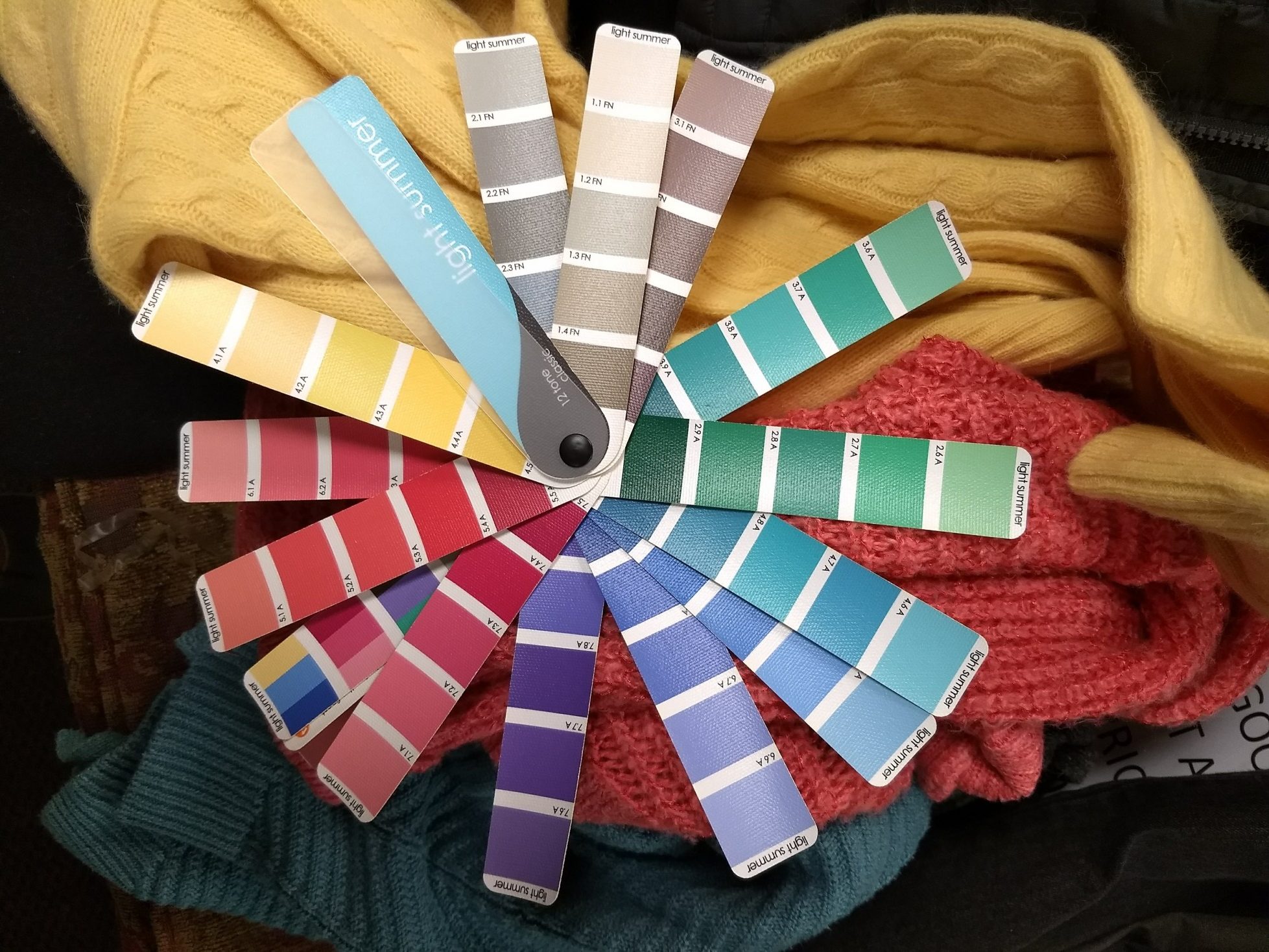
As a reminder, here’s a decent-ish picture of my season’s colors as depicted in my swatch book:
IMG_20171226_130119584
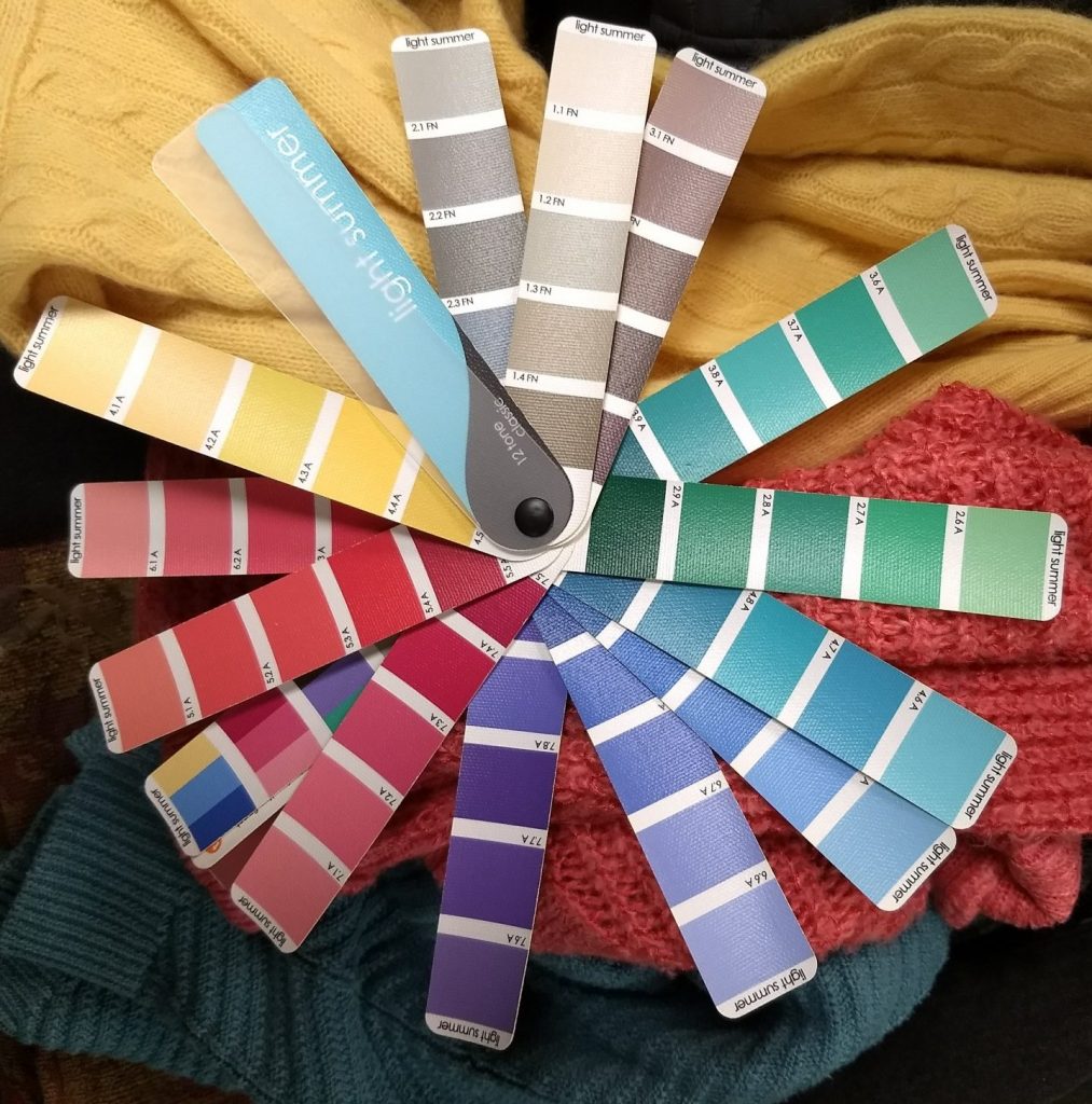
The swatches aren’t used to find exact matches; rather the swatchbook helps you see whether a particular color harmonizes with your season. If the color and the swatchbook light each other up, if they both seem more vibrant put next to each other, you’ve got a match. If the color in question looks too dark, dull, or muted next to the swatchbook, or if it overwhelms the swatchbook with brightness or clashes in terms of hue (warm vs. cool), you’re looking at different seasons.

As you can probably imagine, it takes time to develop swatching skills. I need to train my brain to filter for the right hue (warm vs. cool), value (light vs. dark), and saturation/chroma (greyed out vs. pure color), which is more difficult in the thrift racks where you’re never looking at a color in isolation. I need to ignore colors I’ve previously gravitated toward and say “no” to colors that seem so close but are just a shade too dull/bright/intense etc. I’ve already thrifted things that, as I keep refining my (rather rough) swatching skills, no longer seem like real Light Summer colors.

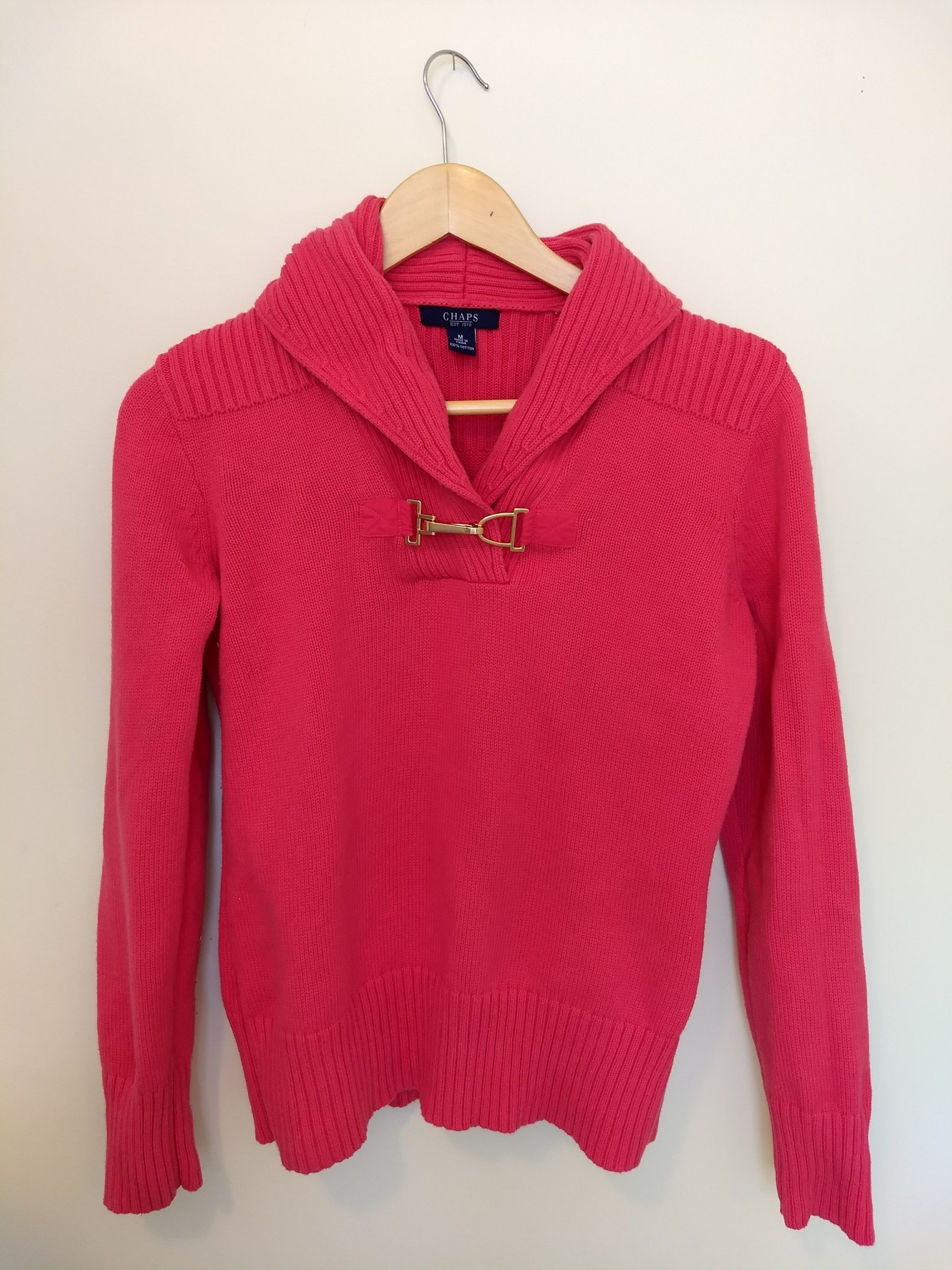
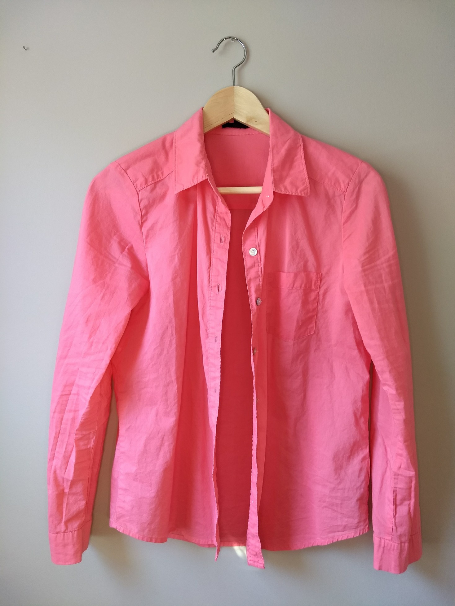
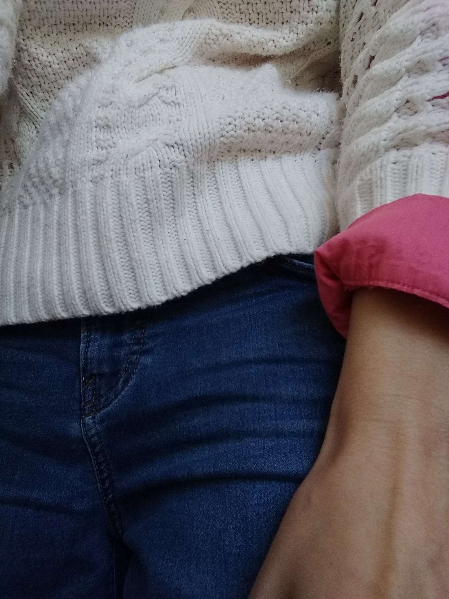
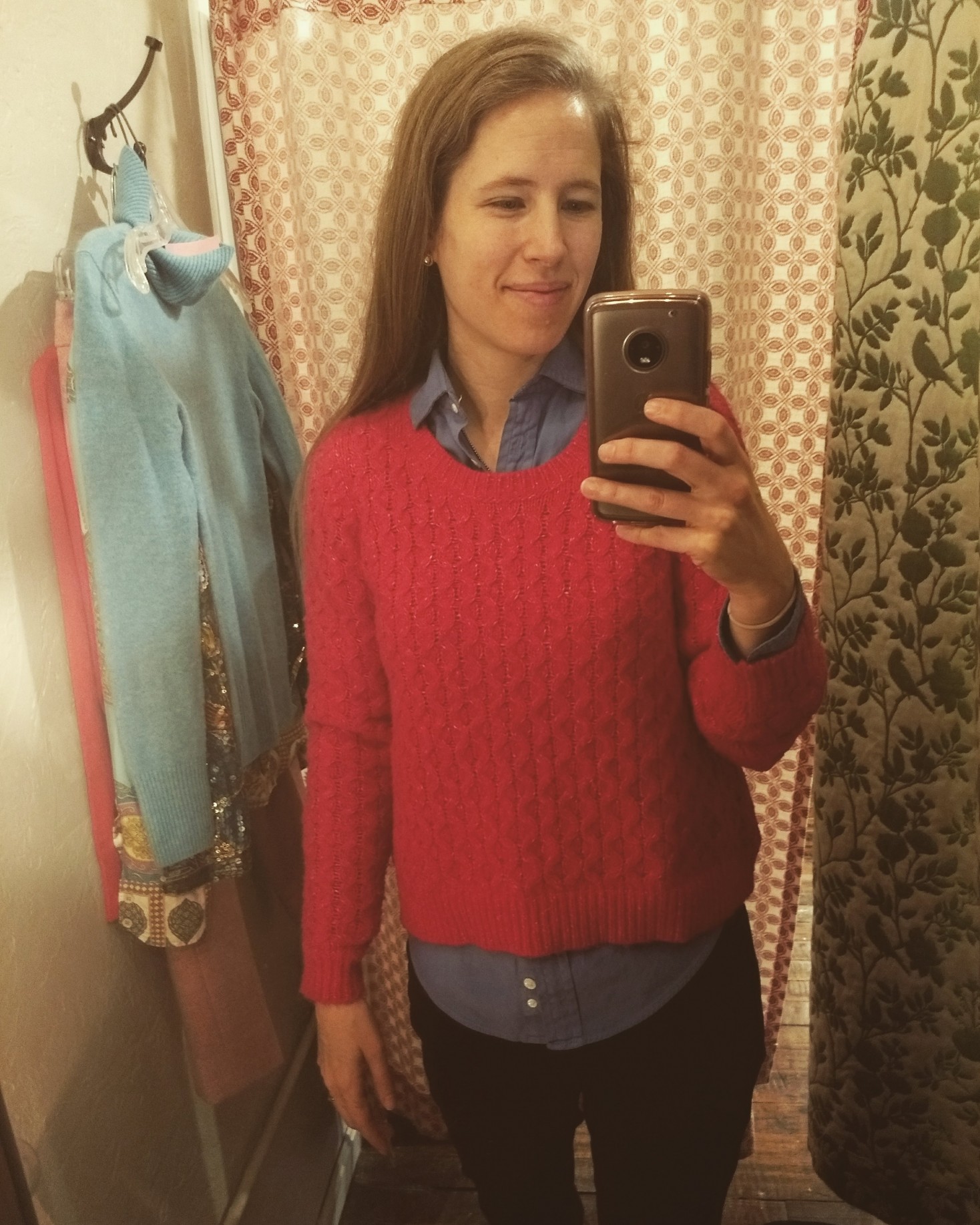
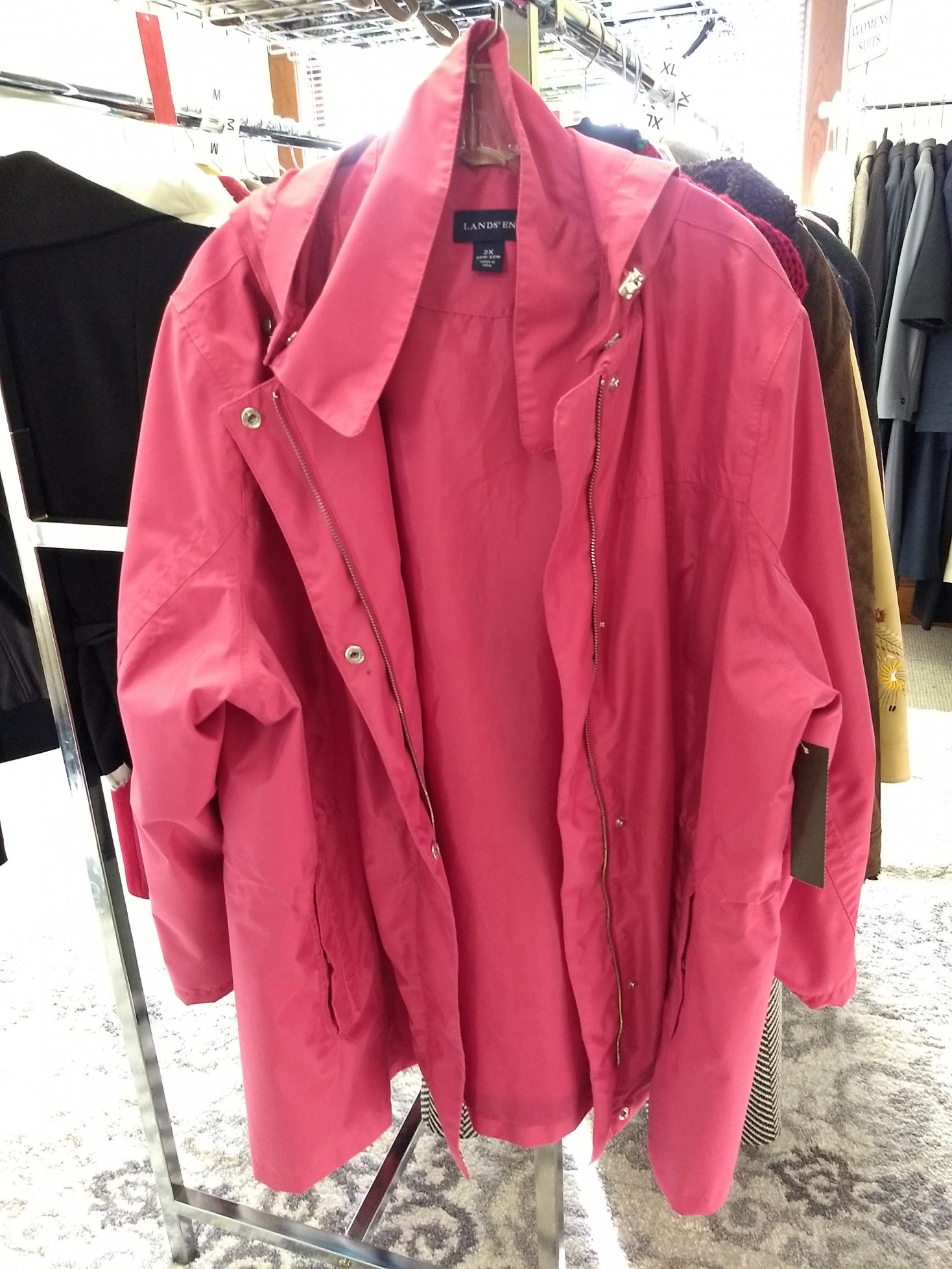
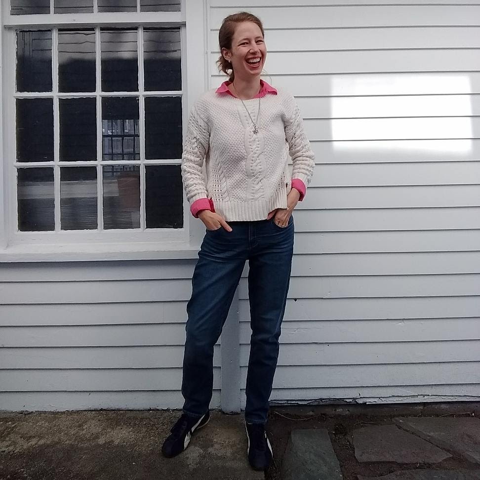
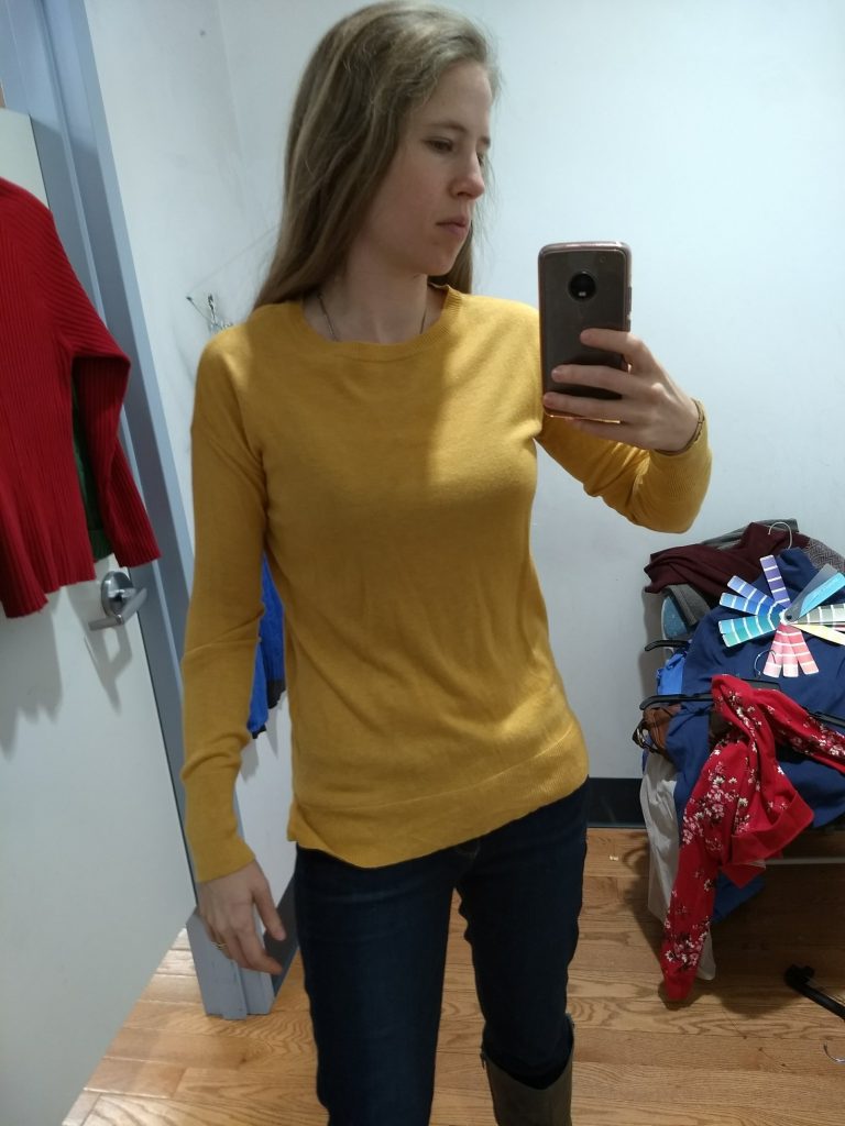
Case in point: this pink sweater photographs brighter than it is in real life, but it still feels a tad too bright for my face:

IMG_20180110_091617366 (1)

Why does this matter? If I love a color, shouldn’t I just wear it?

Yes! But while some of my “new” colors are old favorites, others are reallllly new to my wardrobe (pretty much all the pinks, yellows, and purples), and if I’m going to grow to love new colors, I want to grow to love the ones that really light my face up. I don’t particularly want to hold on to a bright pink sweater that isn’t doing it for my complexion.

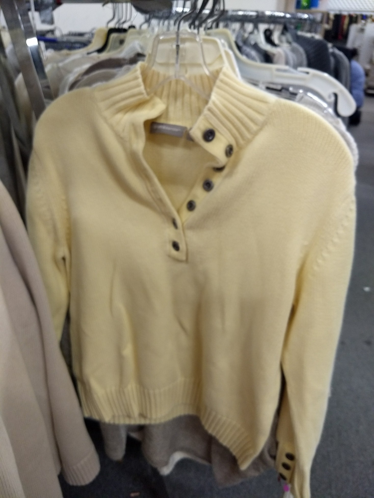
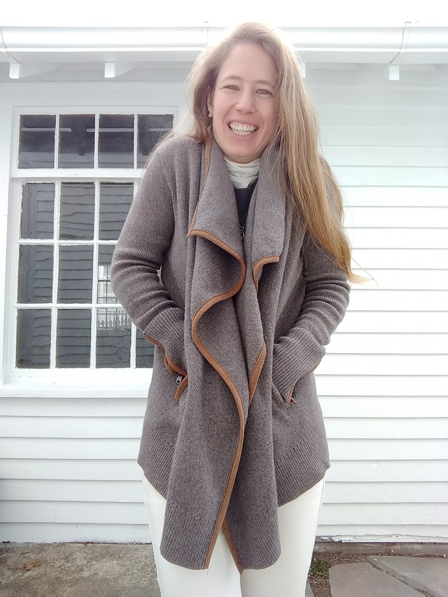
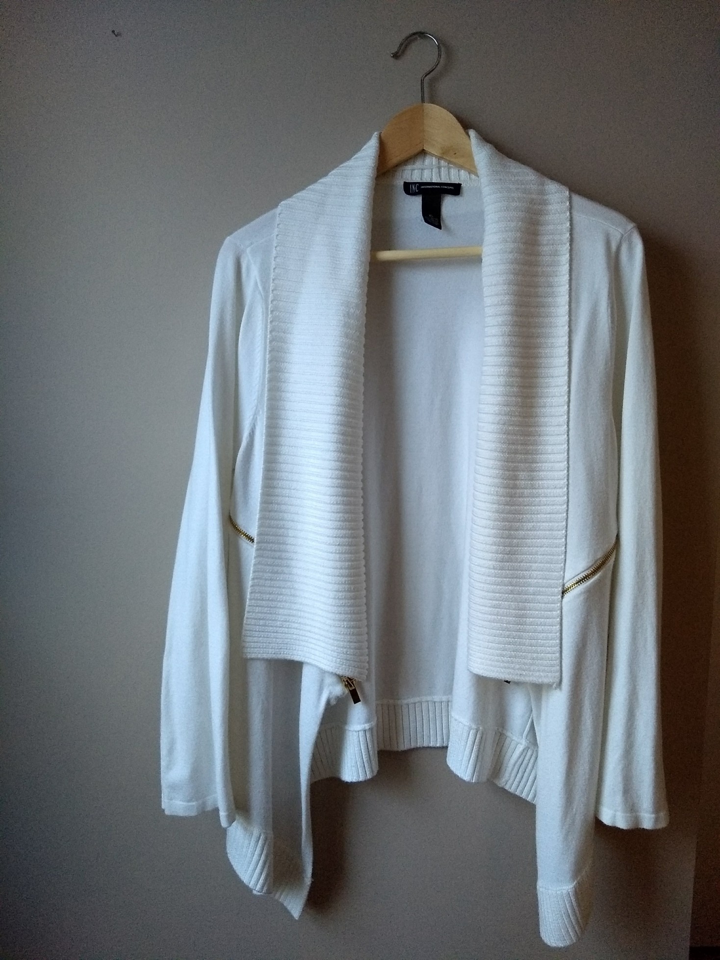
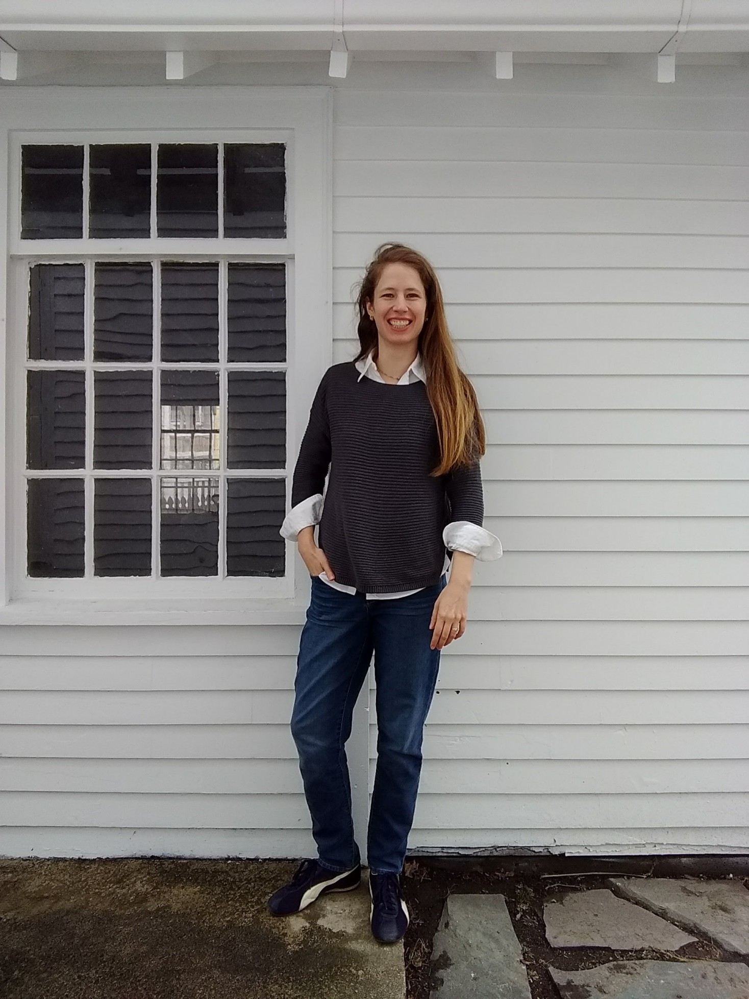
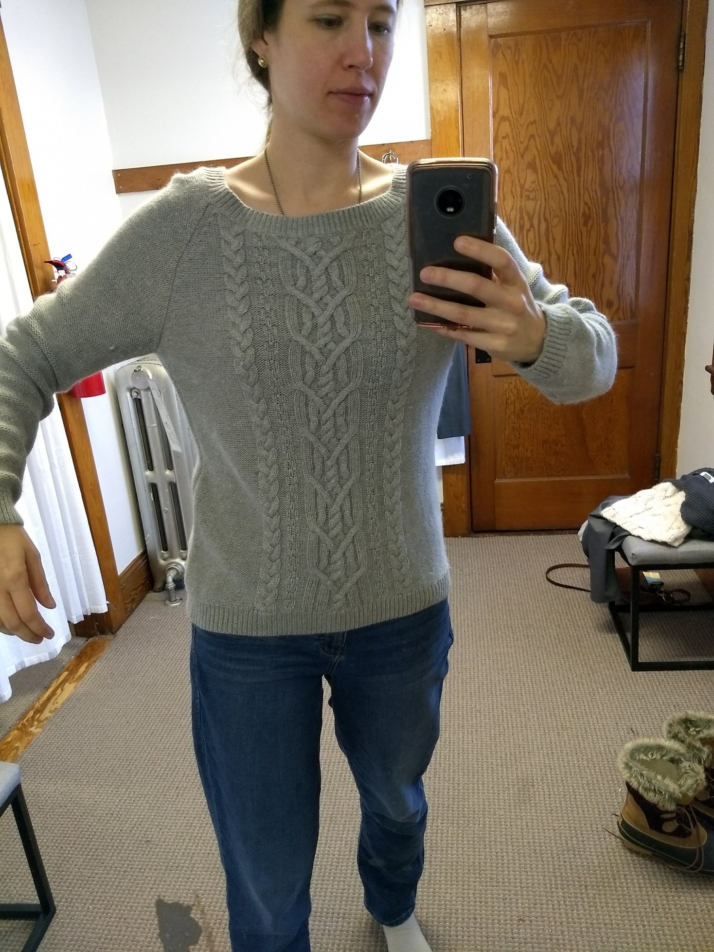
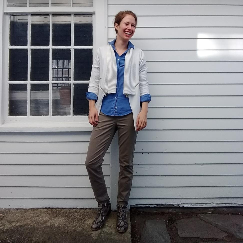
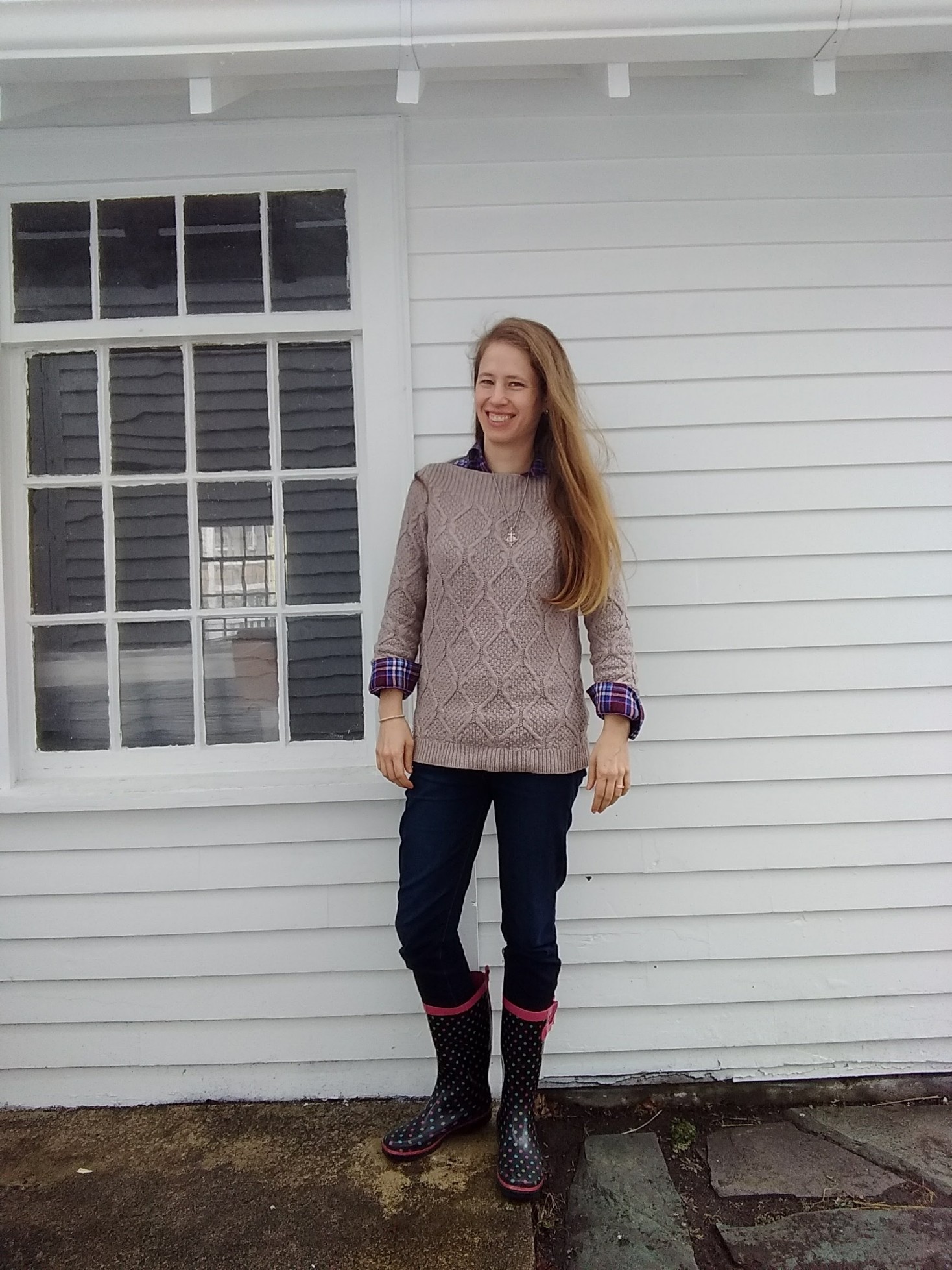
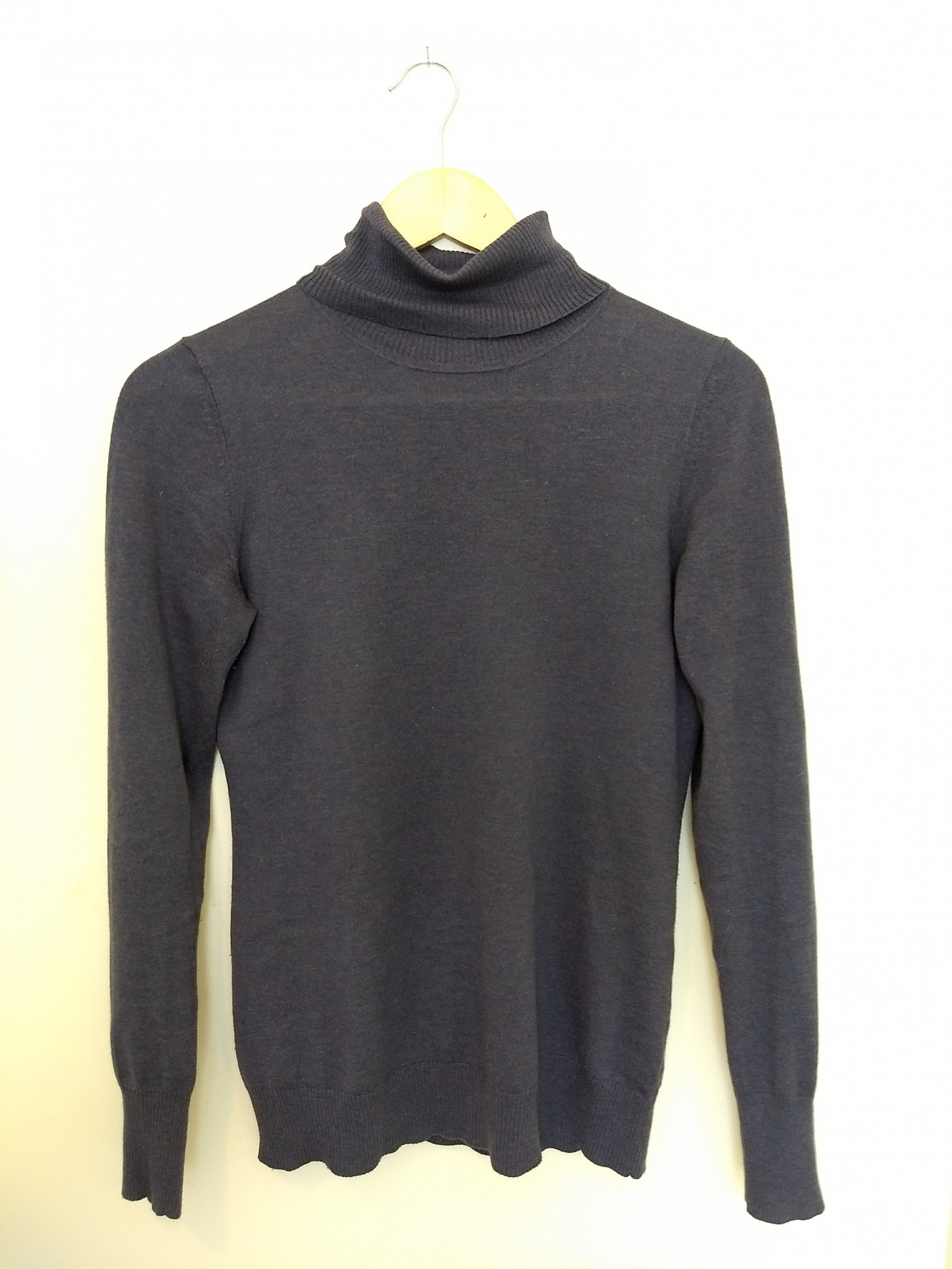
My original reason for getting a PCA was to avoid buying stuff I don’t wear because the colors feel off. So I’ve also been flexing my willpower by saying no to stuff that I otherwise like but that’s not in my colors. I have plenty of clothes I love regardless of their color; I don’t need to buy anything else not in my season even if it’s a great find. (Whoops; should have said no to this oatmeal-y gray sweater, the cut and neckline of which I love but that is too warm for Light Summer.)

So let’s start off with a bunch of misses that might give you a sense of how it feels to develop your eye/willpower.


The Seasonal Misses

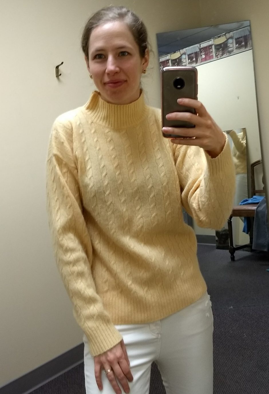
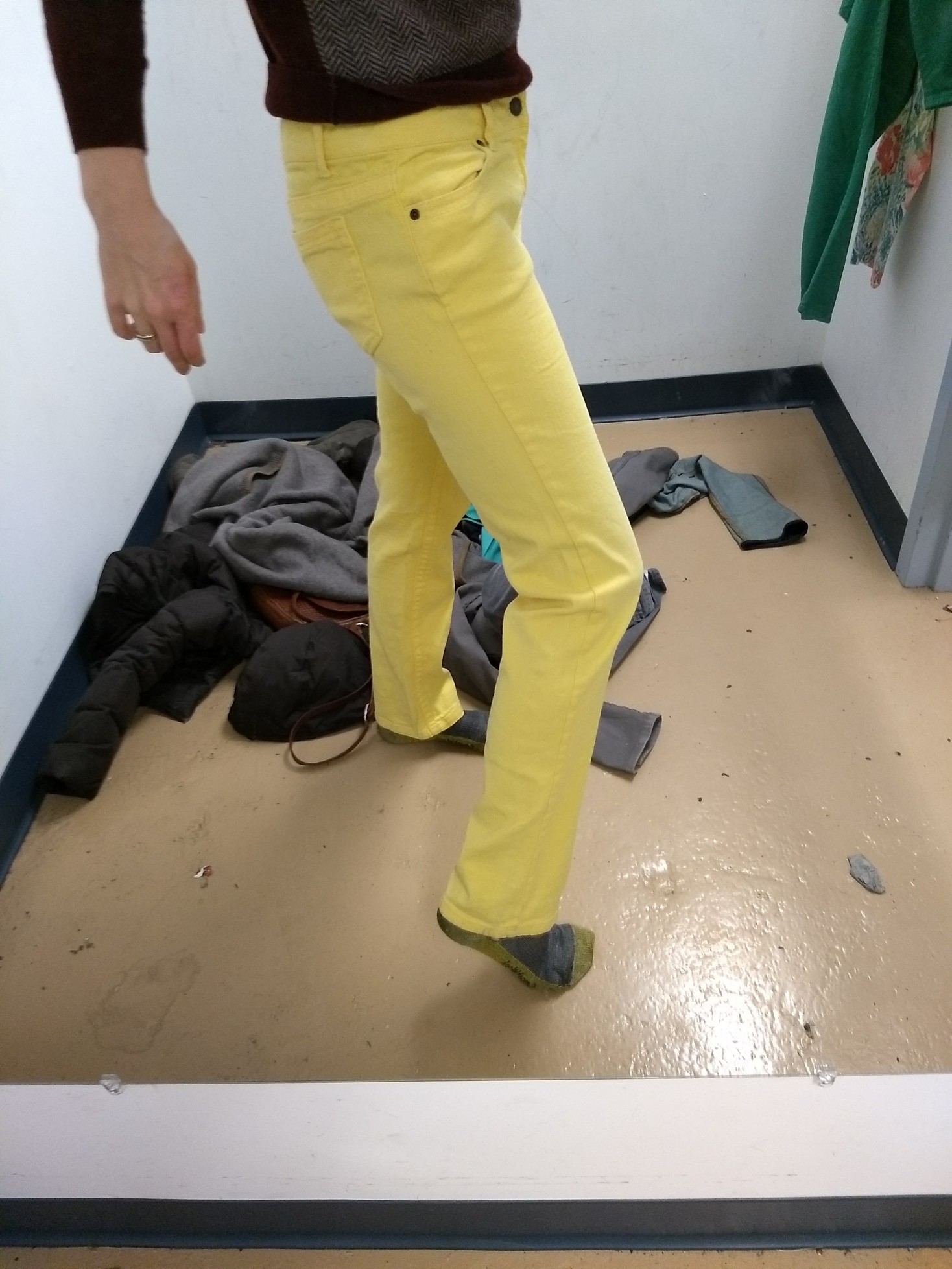
A Light Summer yellow? Nope. The right mutedness but too warm. Too bad, because I loved the fit!

IMG_20180101_171708562_BURST000_COVER_TOP

These pants were too grayed out (and too small! odd sizes indicate Juniors sizing, which is not forgiving to grown up hips/thighs), but they planted the seed for purple pants…so much personality!

IMG_20180113_135004813

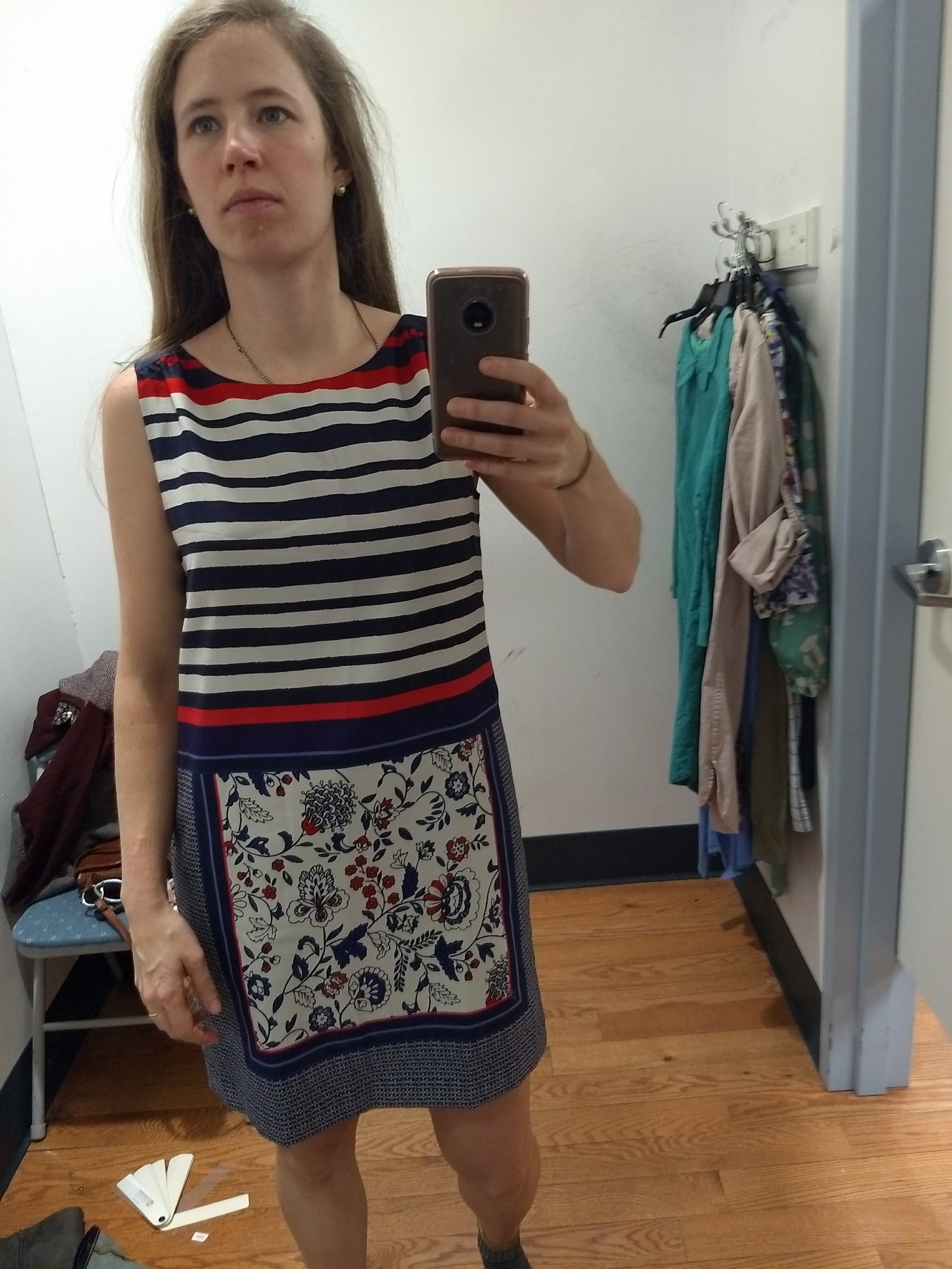
This Ann Taylor dress is totally in my former color wheelhouse, and some of the individual colors work; but per Hope, my analyst, in a mixed-season pattern you’re looking for 80% of the colors being in your season and this one had too much dark navy. It looked too stark:

IMG_20180101_155854488

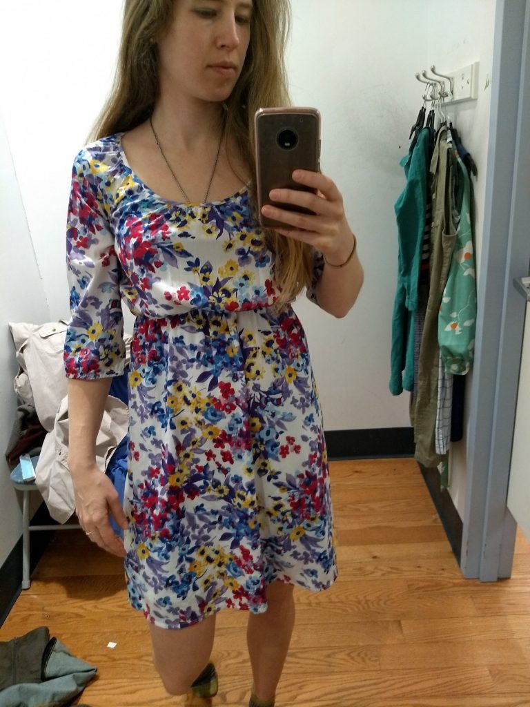
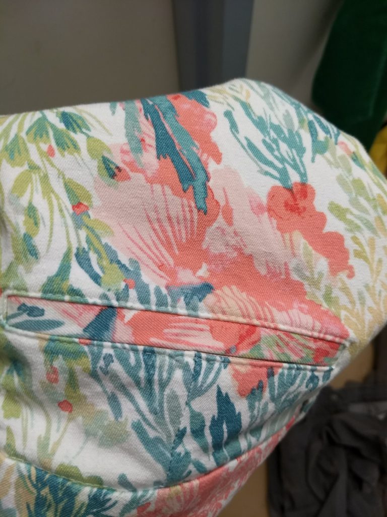
This floral caught my eye because the yellow, blues, the pink, and the richer purple looked like they might work; swatching revealed the colors to be a little too cool and muted. I’m no expert but I’d guess True Summer:

IMG_20180101_160636572

Speaking of which, I’ve really enjoyed the mental game of trying to guess the seasons of random clothes I meet. (Slightly distracting if the clothes are on somebody you’re supposed to be talking to!)

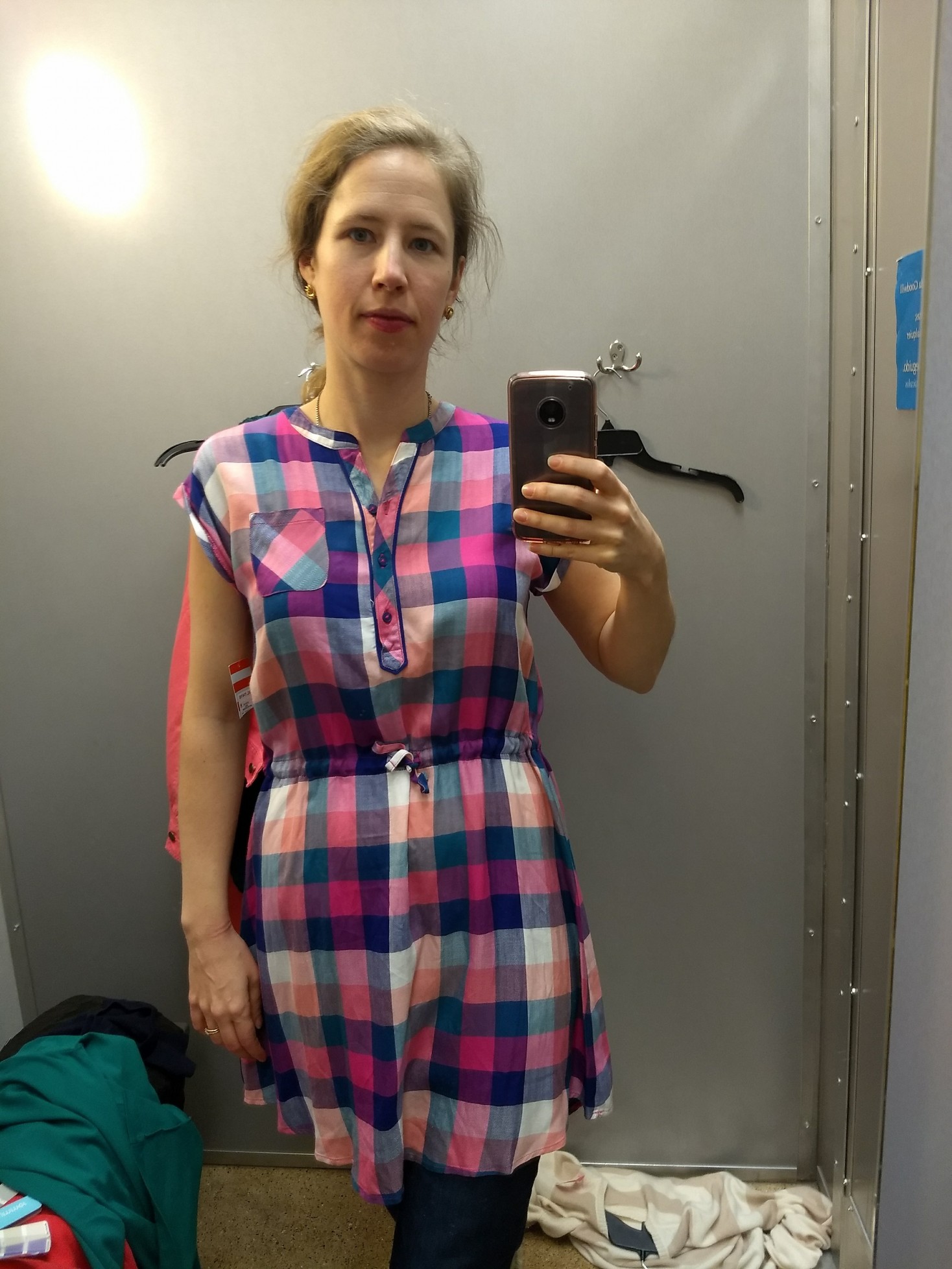
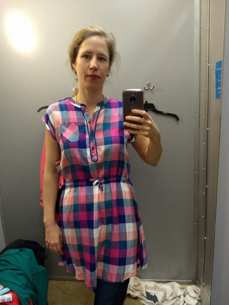
This plaid sleeveless shirt dress is totally my style, but the pastels were sooooo grayed out (not saturated enough) that it looked faded and old on me:

IMG_20180101_160847507
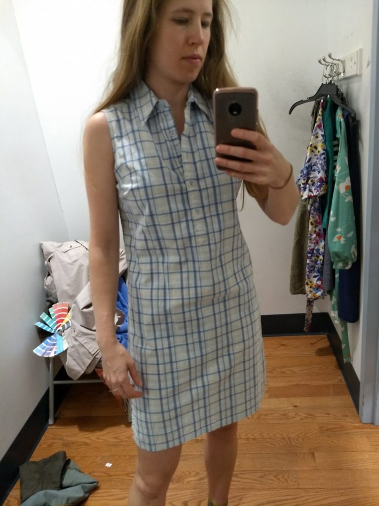
(Maybe this is Dark Winter?? Now I’m just getting reckless!)

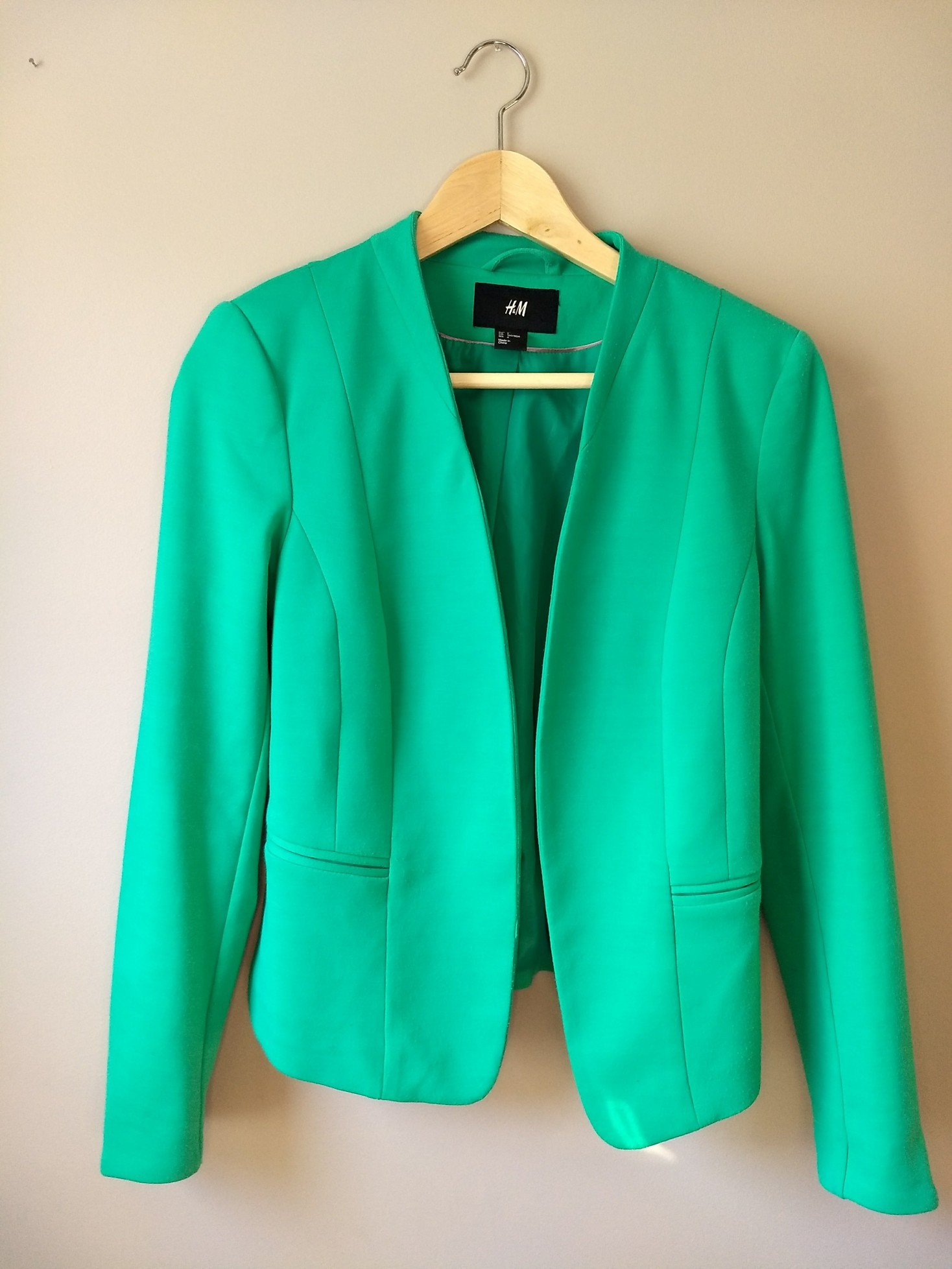
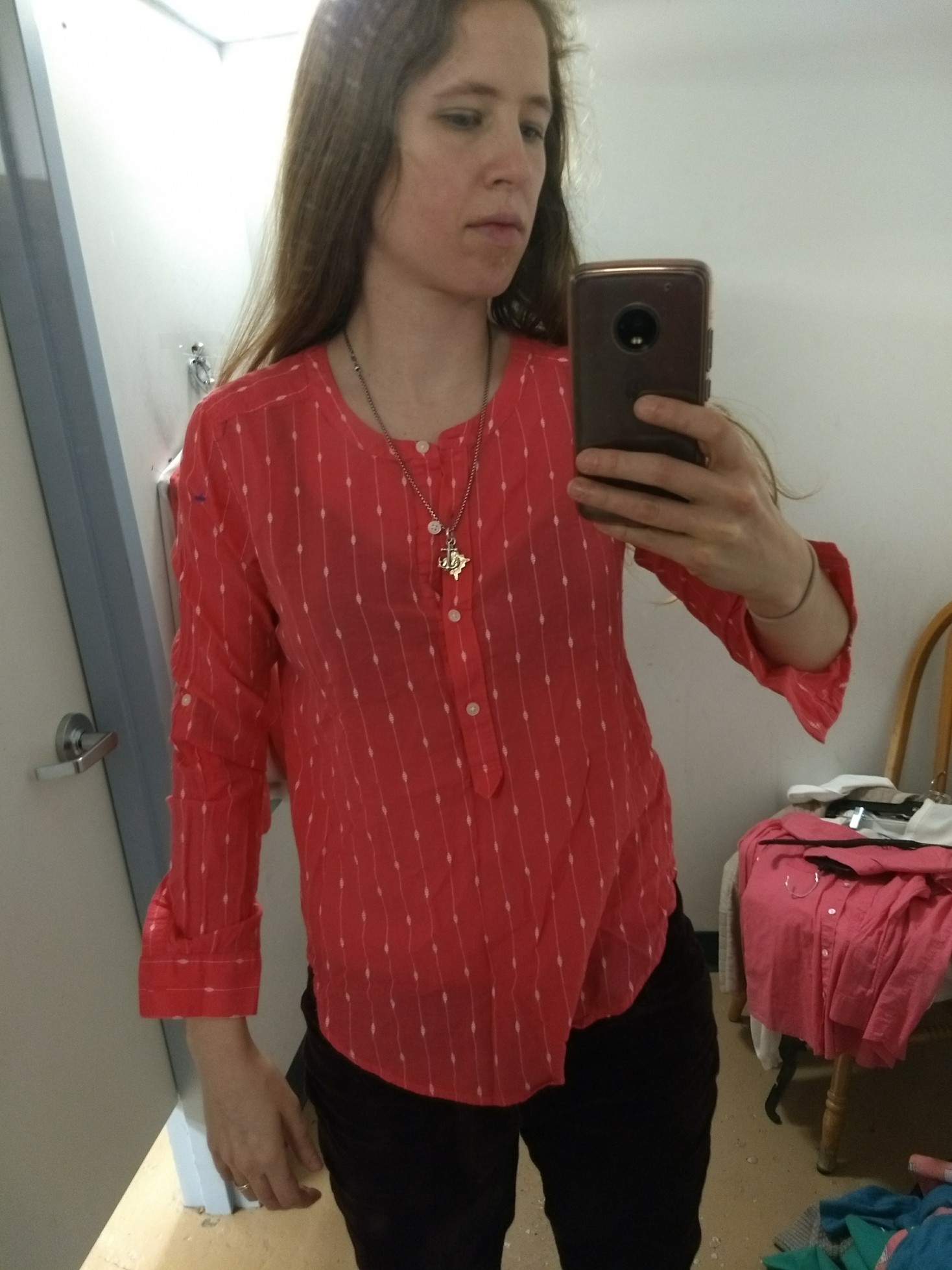
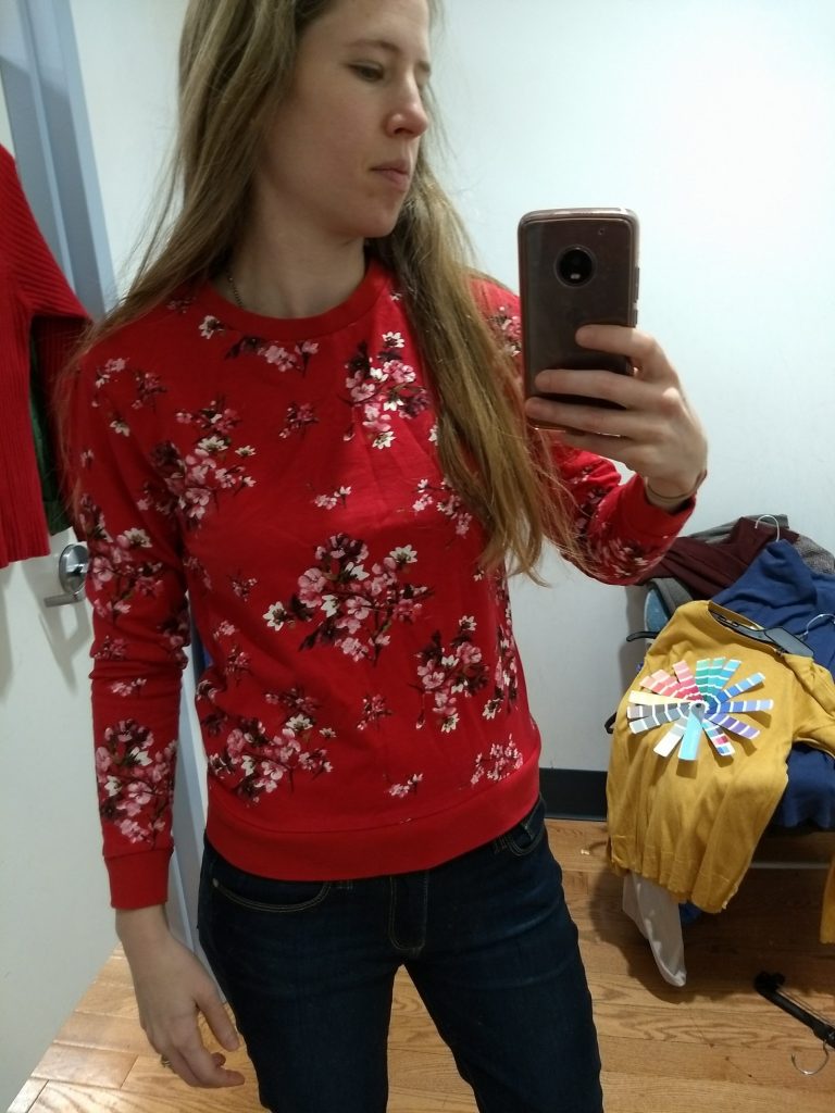
This cherry blossom fitted sweatshirt by H&M (I think) was super cute, but the red was too red – Light Summer “reds” are all pretty pink – plus I didn’t love it as much as I thought I would for a floral print:

IMG_20180101_171507832

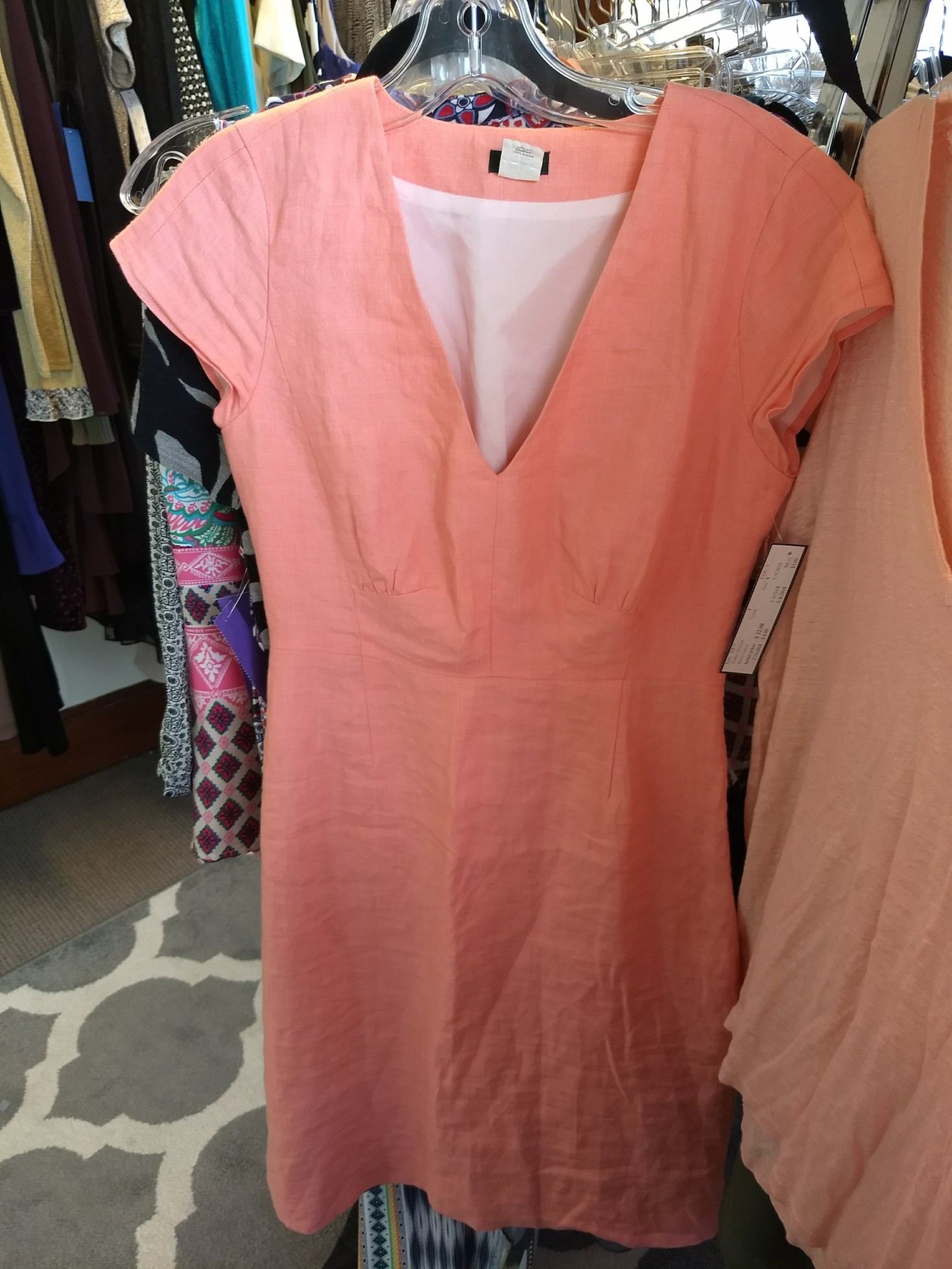
I was hopeful for this dress – I could deal with the pink and it was fun and summery – but I’d venture that’s some Bright Winter coloring going on, aka too bright for me:

IMG_20171228_120016714

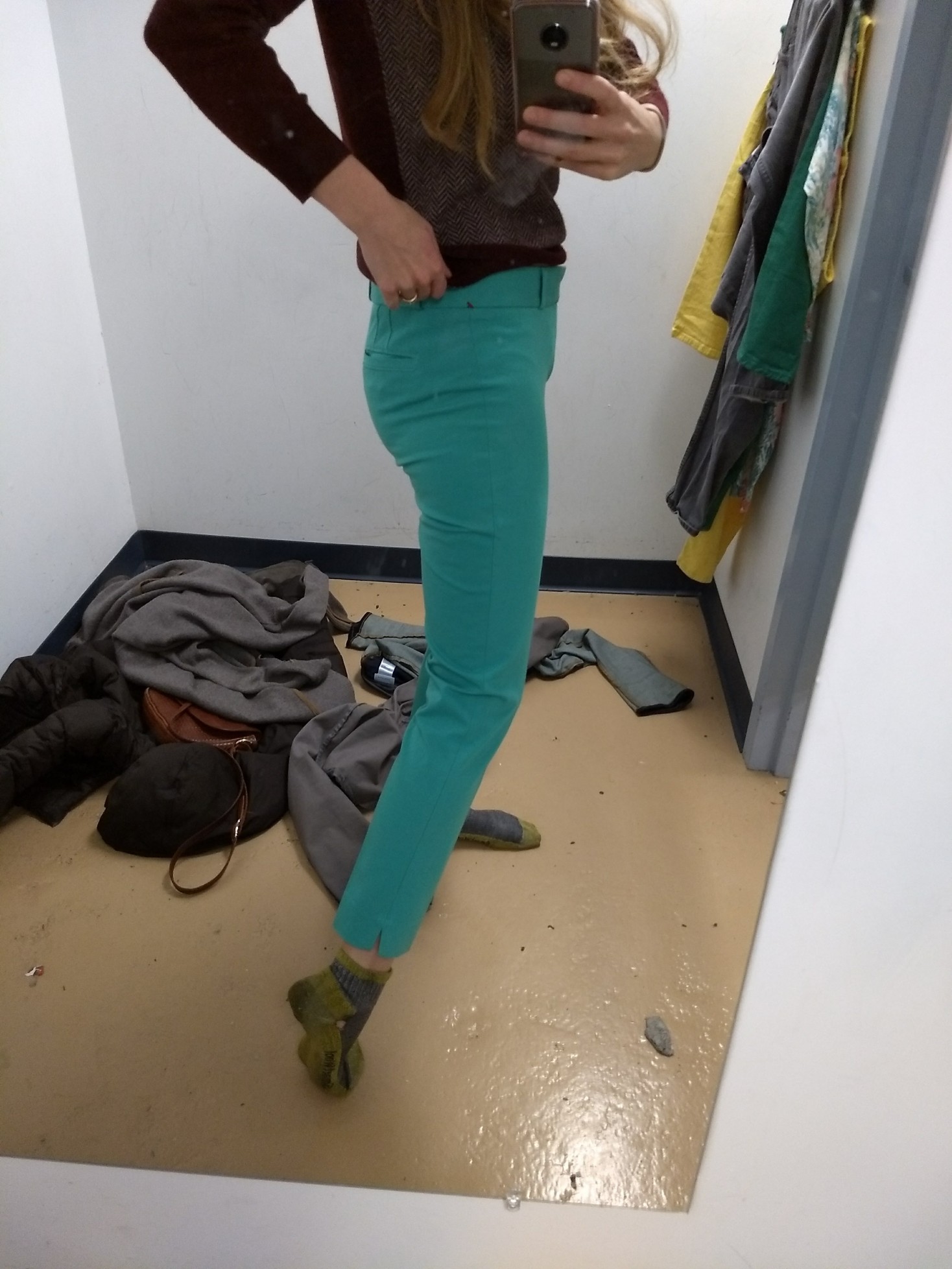
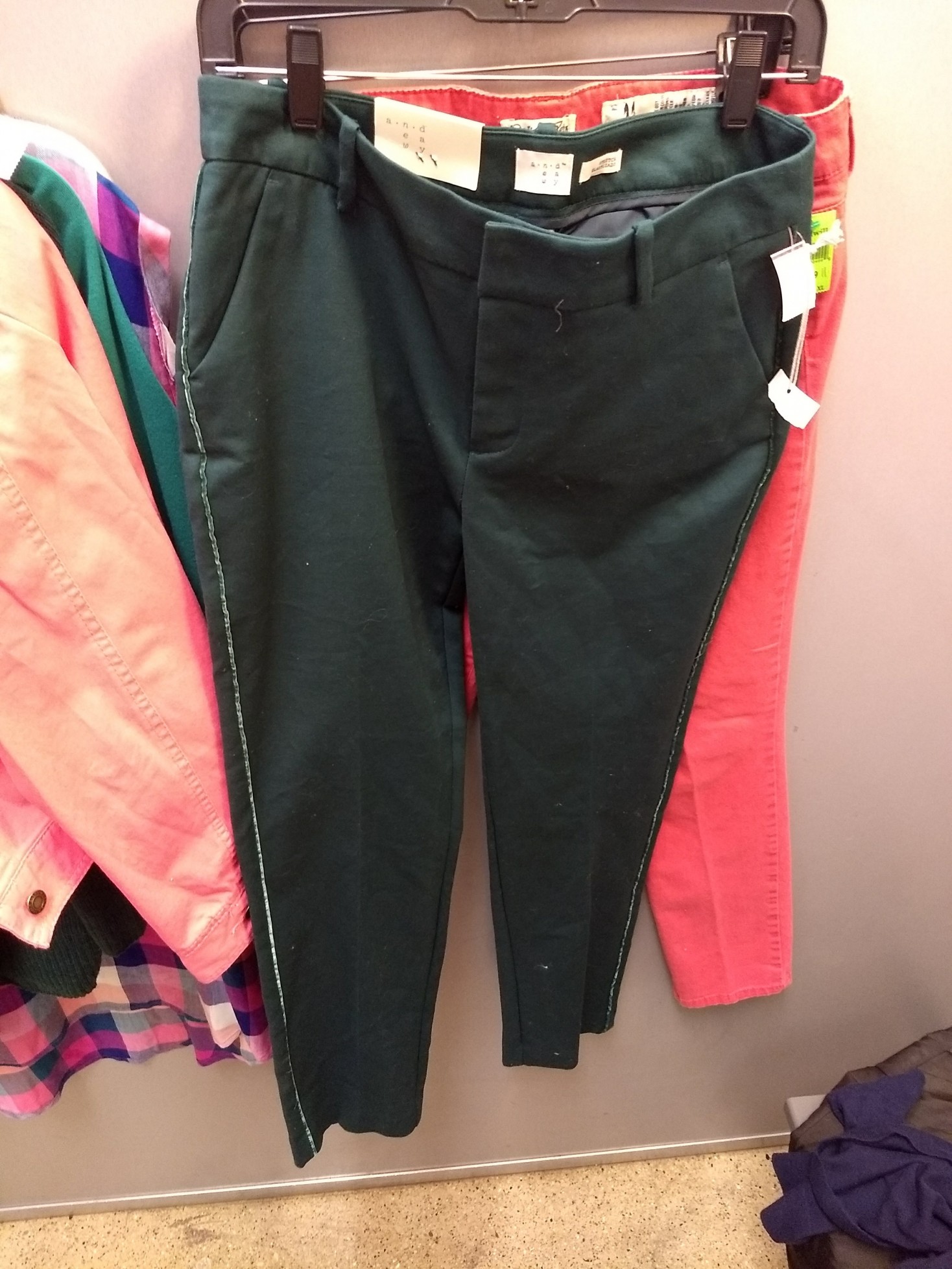
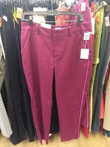
Two gloriously piped trousers to which I said “no,” for they were not my colors:

IMG_20171228_115137659 IMG_20171228_120336090


Now for some clothes that matched, season-wise, but that I didn’t thrift for other reasons.


Light Summer finds that didn’t work

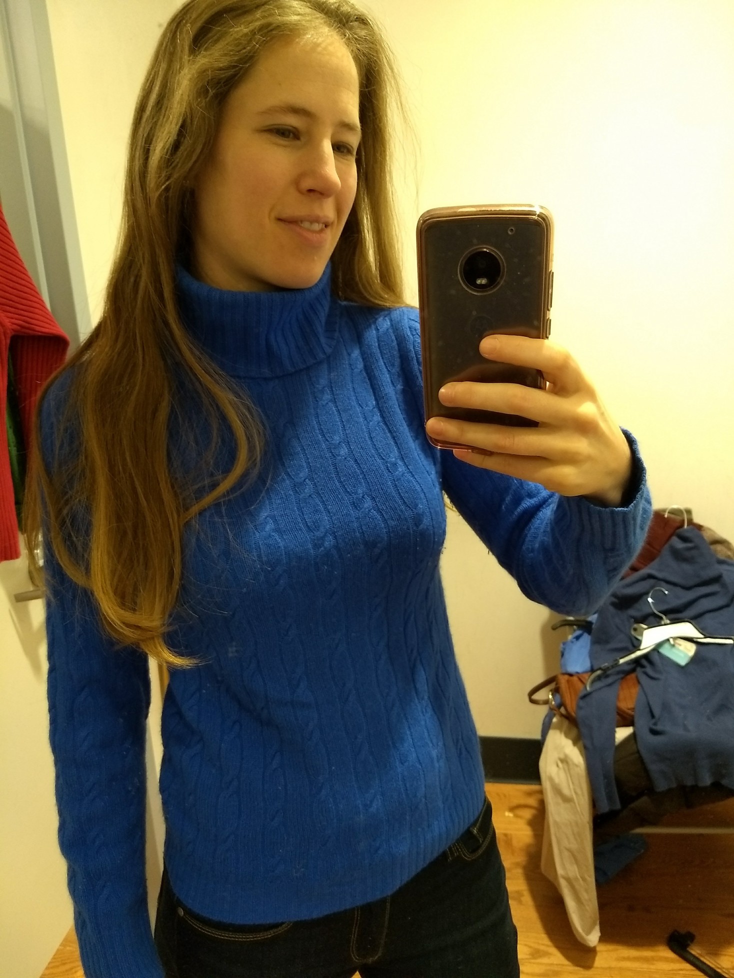
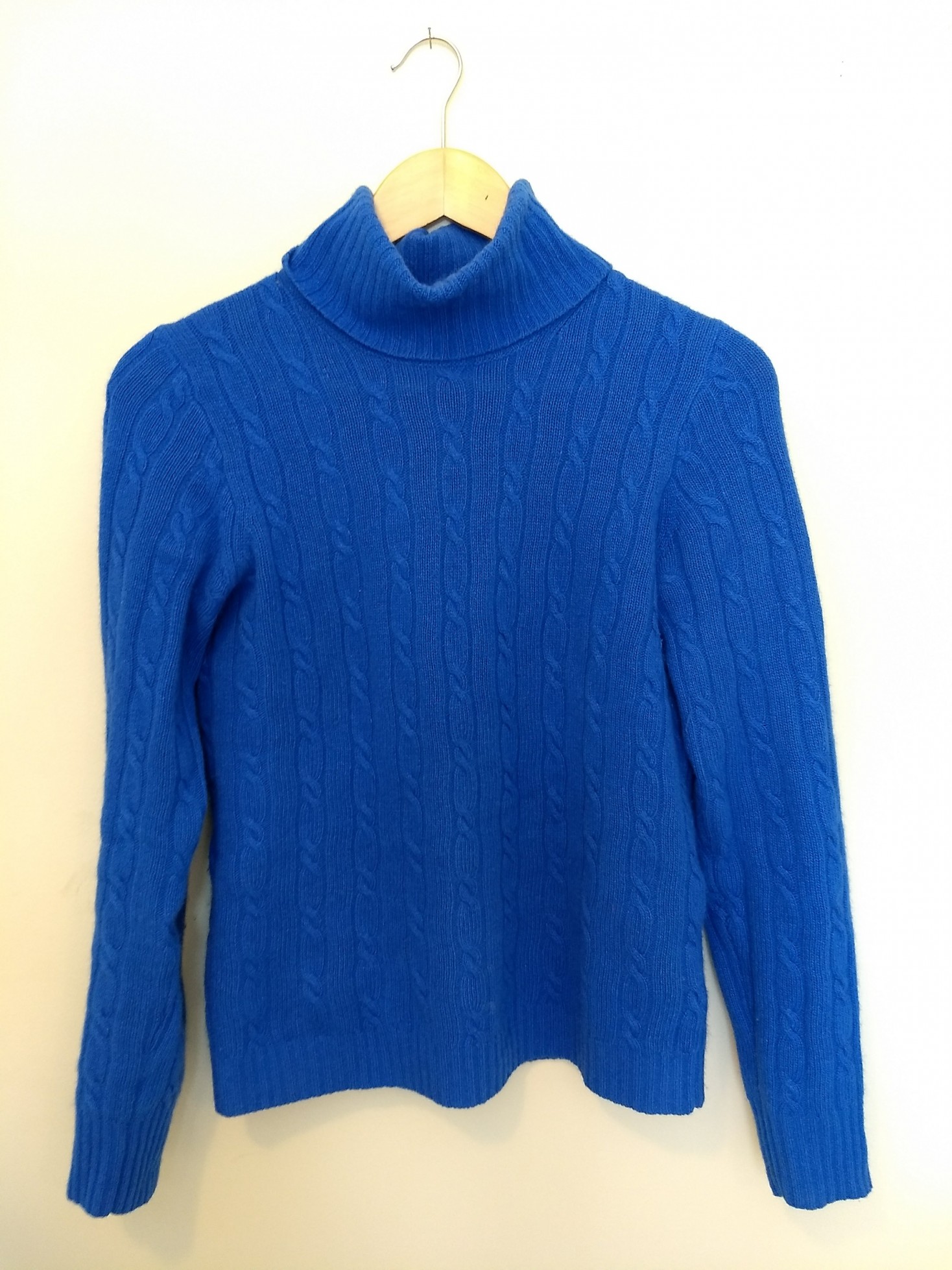
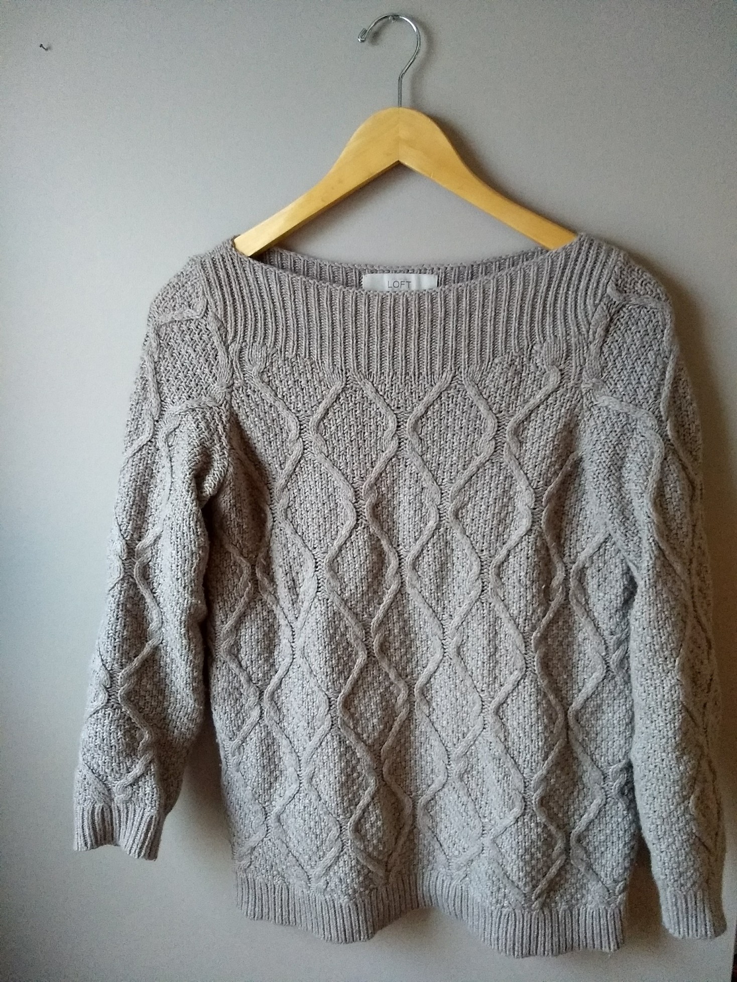
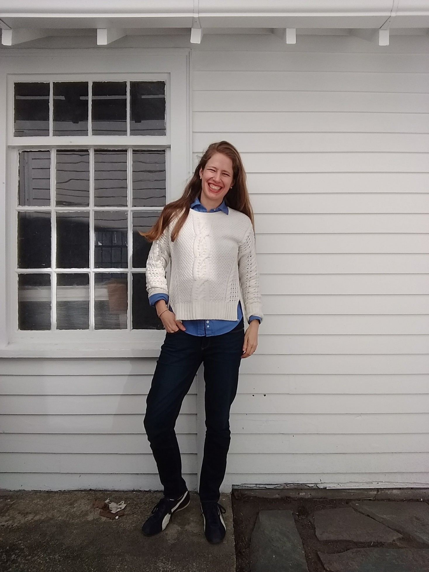
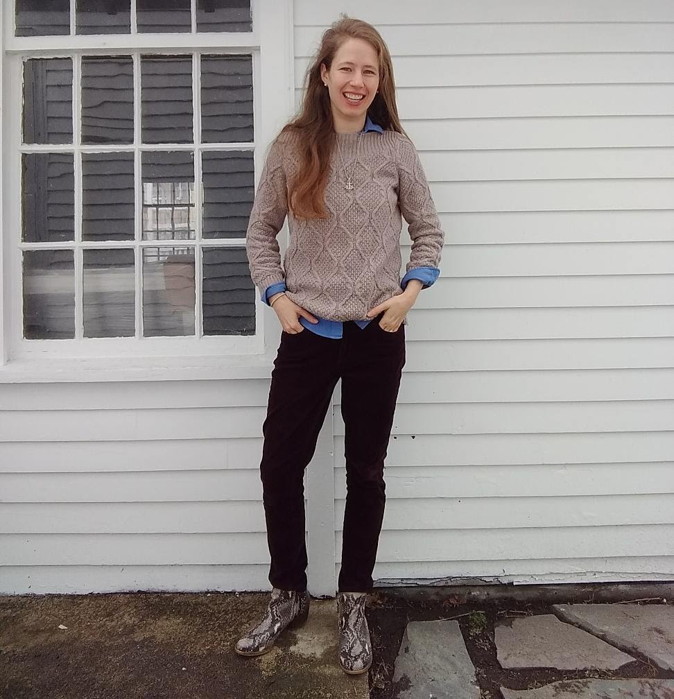
This sweater is pretty close, maybe a bit too muted, but we all know how I feel about straight up cable knit sweaters…

IMG_20180101_170741227

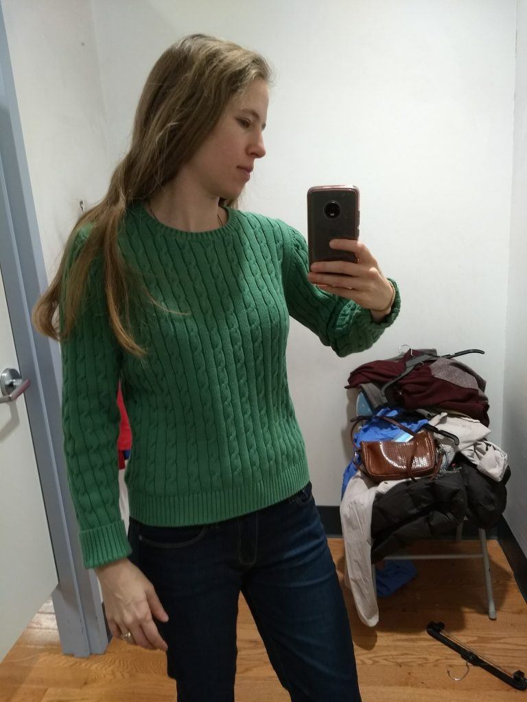
Plus it felt worn, and not in a pleasantly broken-in way.

Cable knit sweaters, unfortunately, seem to be designers’ favorite vehicle for Light Summer sweaters.

I featured this one previously as a good Light Summer yellow but too big…and cable knit. I kind of wish I had thrifted it anyway because it turns out Light Summer yellows are hard to find and it would have been a good reference point. Plus it looks halfway decent as an oversized top with fitted pants:

IMG_20171226_130756606

You know what else is hard to find? Light Summer pinks. Most are too bright, too purply, too muted, or for the corals, too yellow. I didn’t feel like I’d found a real ringer until I saw this post by Edmonton thrifter Adina of Blue Collar Red Lipstick. I’m completely lusting over this Zara blazer/coat thing she thrifted:

A post shared by Adina J (@bcrladinaj) on

Colors being different in photographs, this could look quite different in real life – but the fact that she captioned it with a watermelon emoji makes me think it can’t be too far off. That shade of pink with a hint of translucence looks delicious.

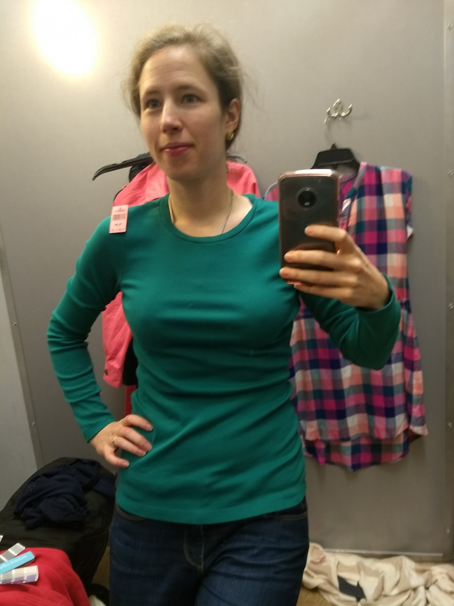
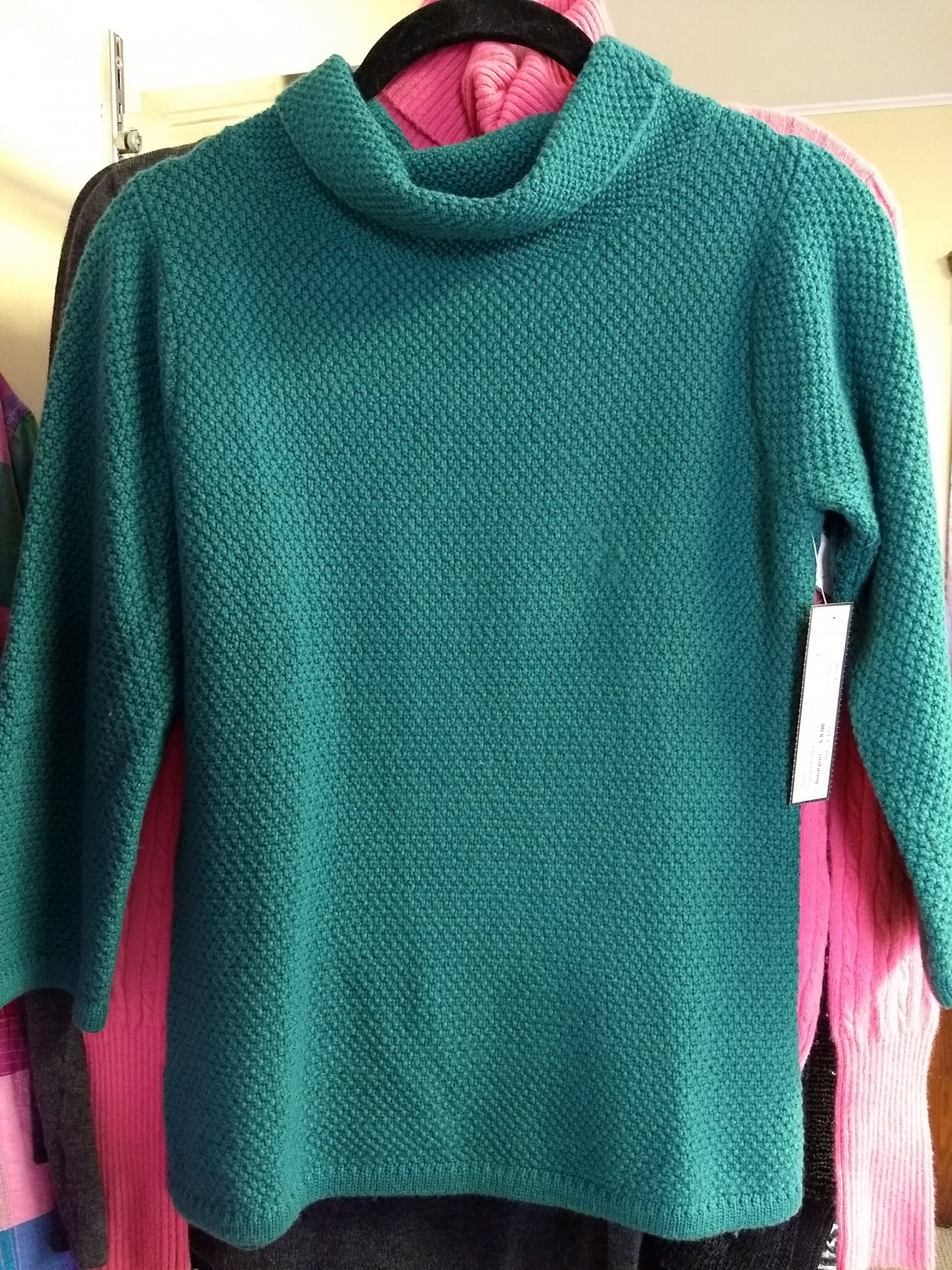
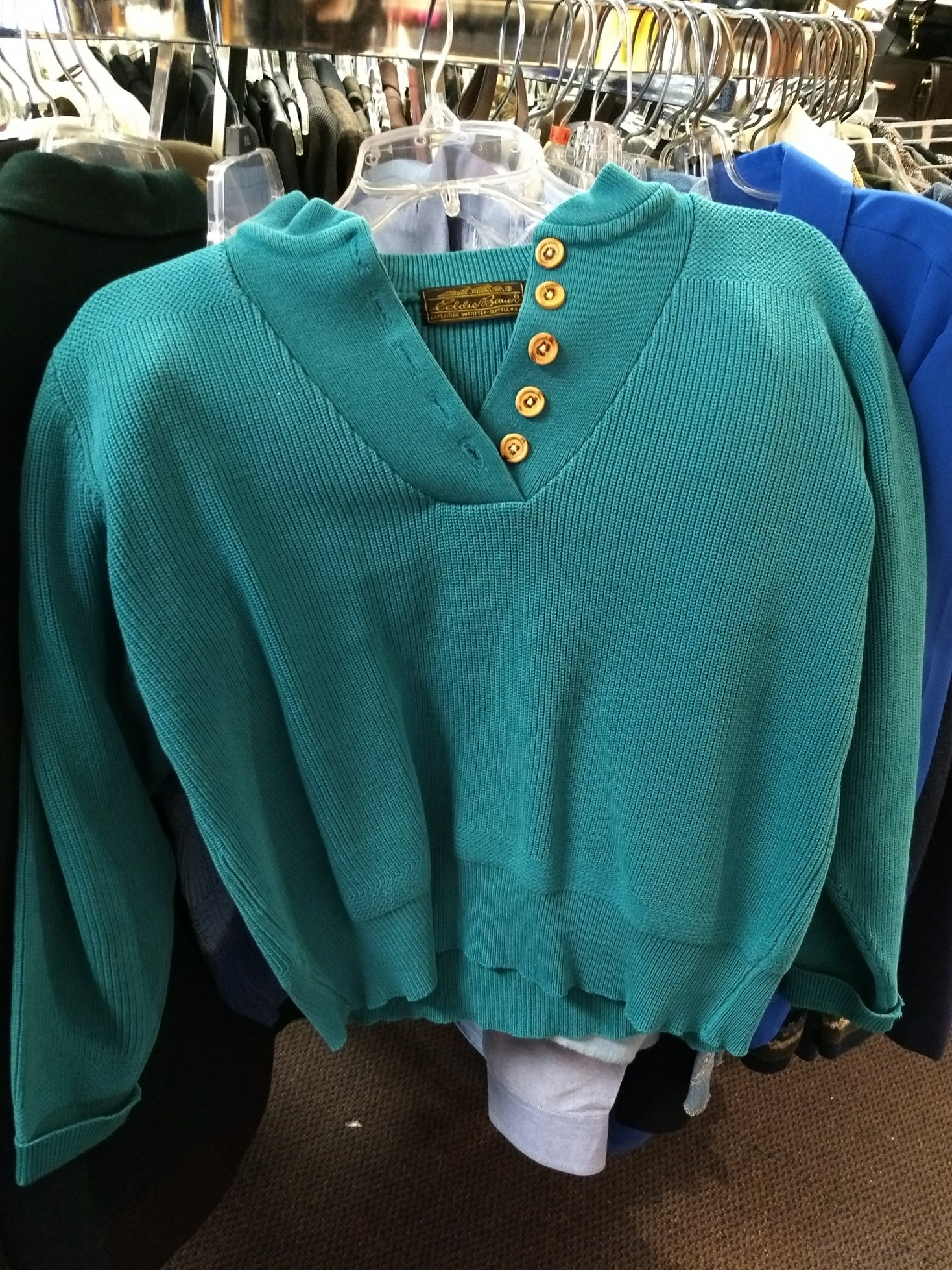
Here is a great Light Summer teal, but either Eddie Bauer was making crop sweaters long before it was cool or somebody shrunk this:

IMG_20171226_123916045

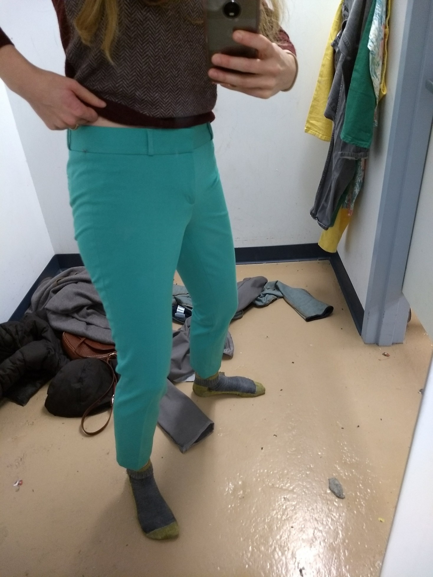
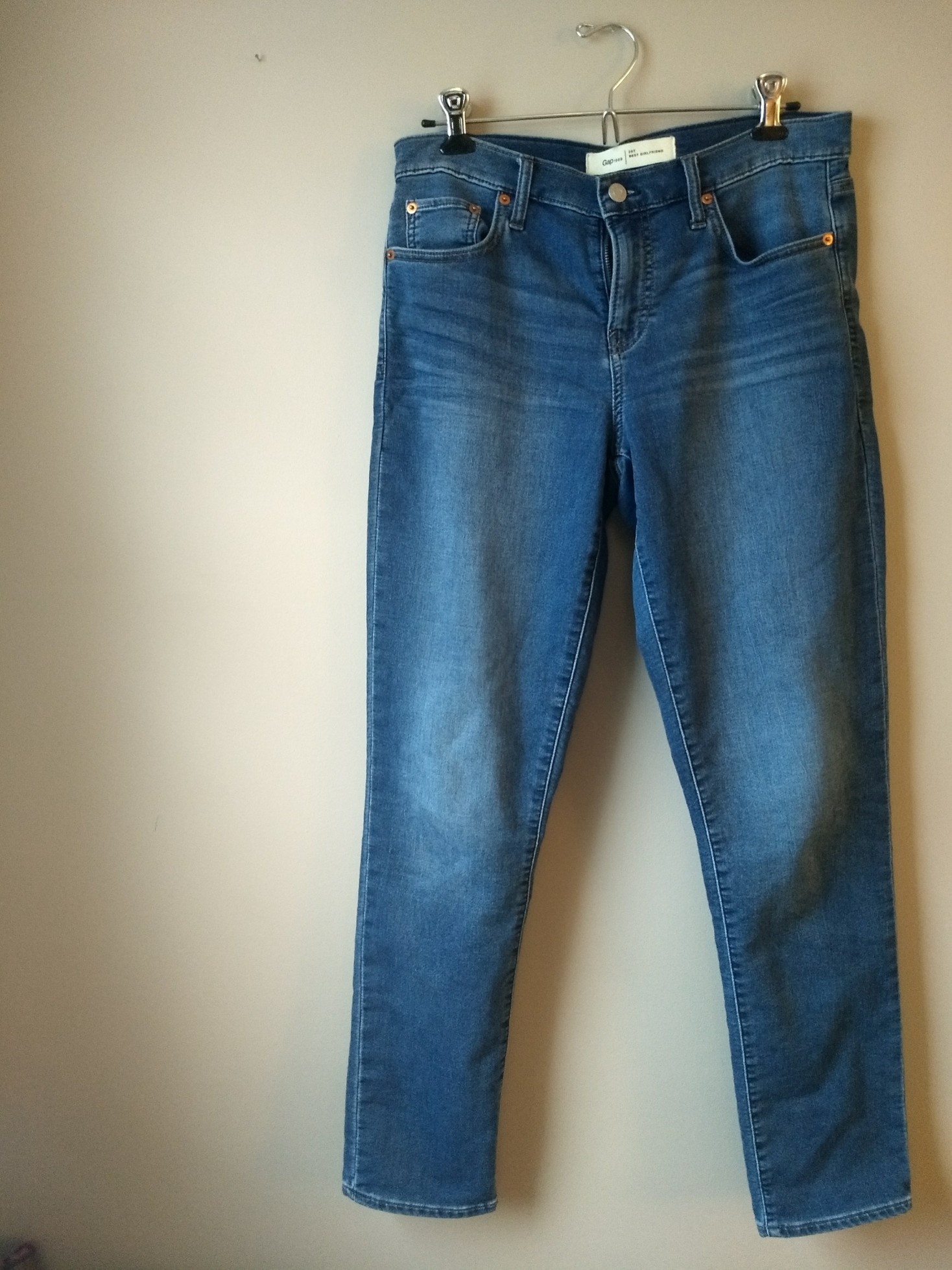
I was psyched to find a pattern that was decently Light Summer in these Old Navy pants; but they were too small despite being my regular size. I’ll just have to keep an eye out for them in the right size in the world of online thrift:

IMG_20180101_174750096

Which, by the way, is going to be a good tool going forward. If I find something in my season on the thrift rack but it’s the wrong size, I can search for it online without worrying about whether the color on my monitor matches up with the actual color of the fabric. This could be dangerous….!

For example, here are a couple things I’d like to find online:

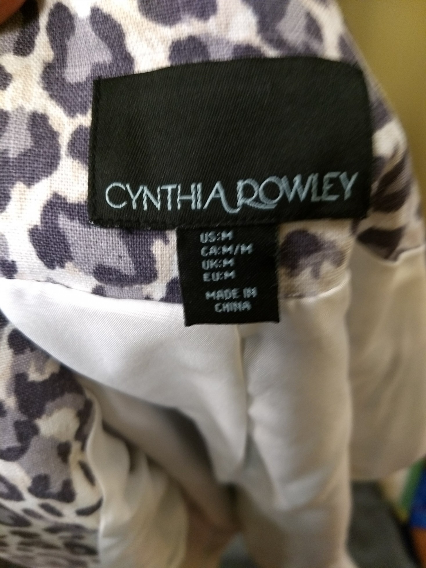
Great leopard print in cool, light, not-too-dark colors; a size too big:
IMG_20180113_142432508
(Does anyone know whether Cynthia Rowley holds up well? The version in the thrift store was starting to look faded, but one in my size on Poshmark looks quite crisp.)

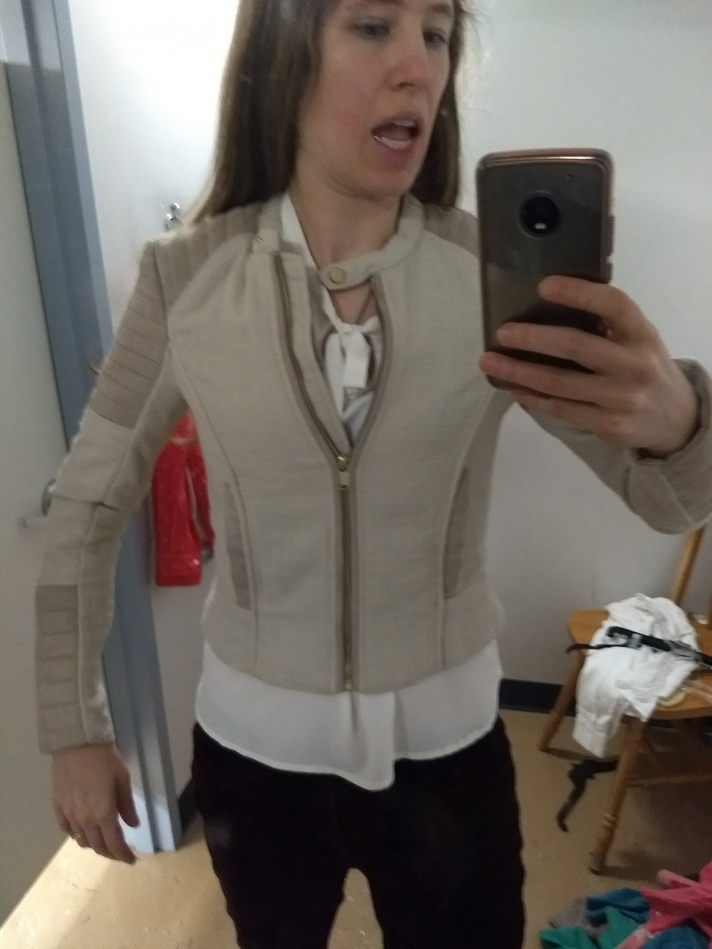
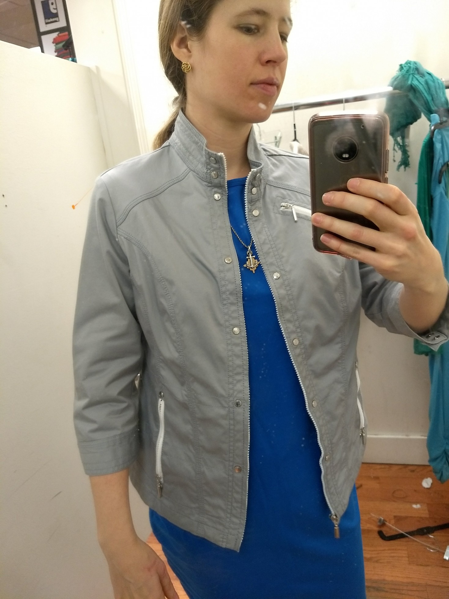
It’s a little too moto for my taste, but I like the tailored details on this jacket by Zenergy by Chico’s. It is the perfect “koala grey” for Light Summer – nice and clear/fresh in color, but also too big:

IMG_20180113_125652138

(That dress was also a great Light Summer, but a size or two too big; baggy in the arms and hips.)

Here’s another good fresh, light grey that was too small for me:

IMG_20180114_171356219

I love slightly worn in, soft cotton twill, but that fabric seems to lend itself to more muted colors (see purple pants below), while the fresh colors I’m looking for have a little shine, like these pants.  A pair of silk-blend Ann Taylor trousers in a cool champagne had the same effect, but they were also too small. (I imagine the shimmer of silk is going to be my friend here.)


Light Summer finds that worked

Part of Hope’s analysis services include a season-specific guide for makeup/clothing/hair, and all the nature-based images she used to talk about Light Summer’s coloring have a bit of luminescence to them. I’m carrying similar images (e.g. the “watermelon pink” I just thought of) in my head to help me flag my colors while thrifting. While Hope’s guide is a proprietary product that comes with the analysis, the 12 Blueprints Light Summer Pinterest board has some good examples – particularly that pink men’s shirt.

I find women’s clothing with that inner glow Hope spoke of to look a little…fancy? Cocktail party-esque? But with the clean, tailored lines of menswear’s, it looks simply divine. So my current goal is to find menswear-inspired pieces with some crispness that will balance out the luminescence. (You know me; I’m 45% Ines de la Fressange / Gentlewoman Chic.)

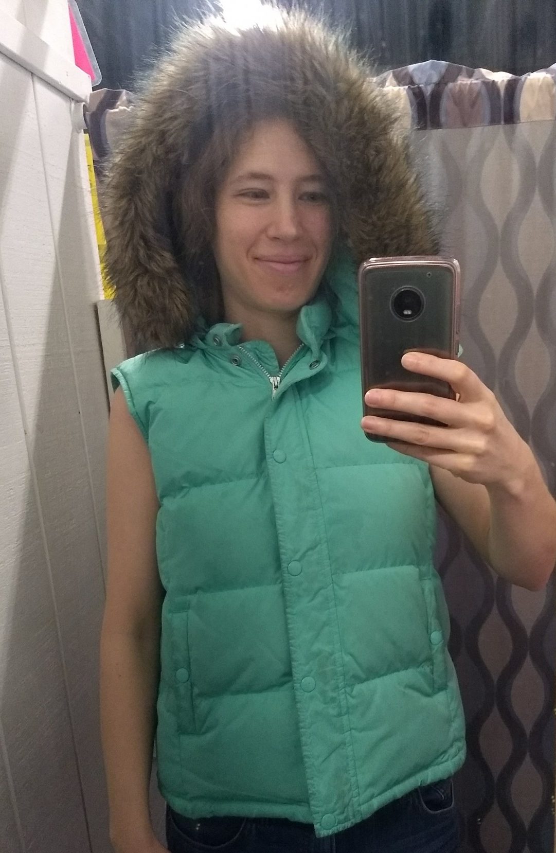
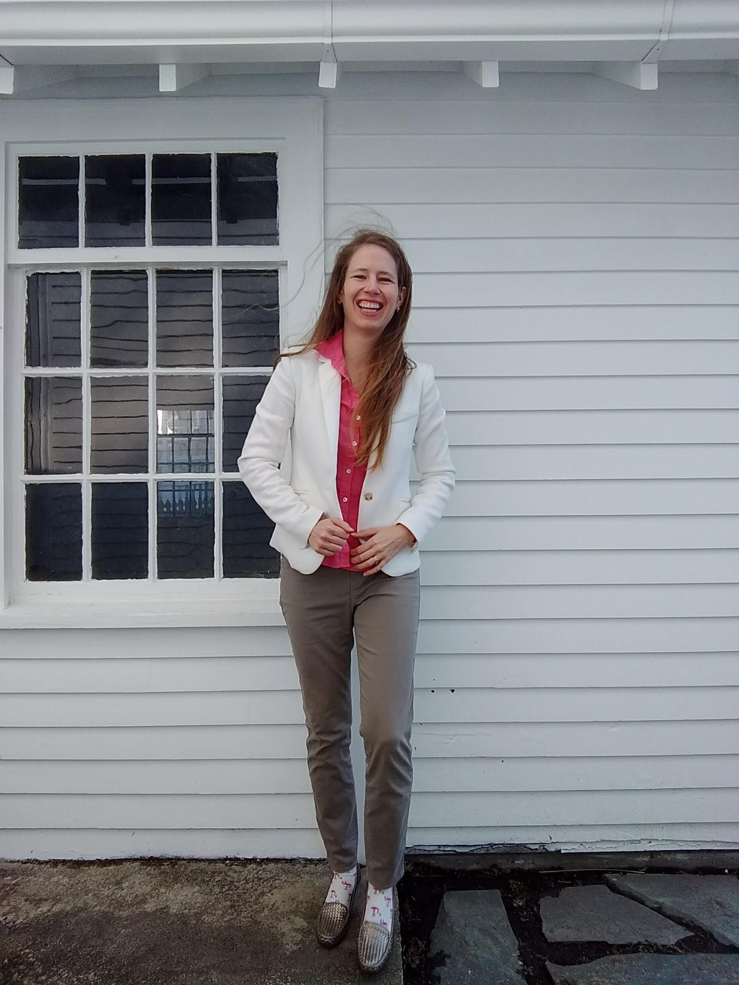
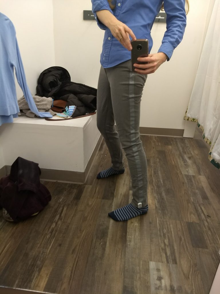
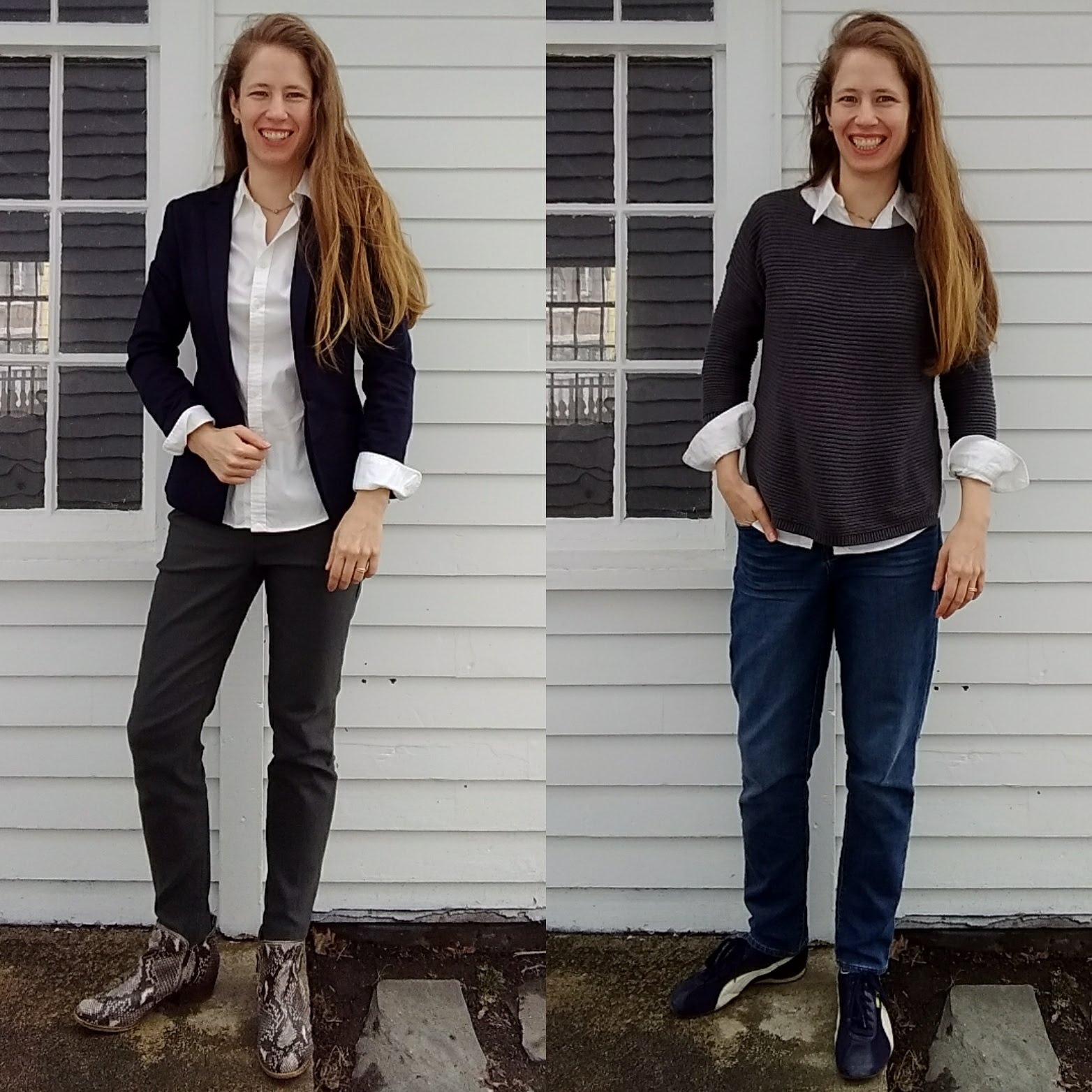
I’ve been looking for a blazer in Light Summer’s glowing teal to hit just that spot, and found one (that wouldn’t photograph well) but that was also oversized and from the 80s. The tailored pants I shared previously also find the sweet spot of reigning in the overly feminine (to my eyes) glowiness:

IMG_20180101_174619762

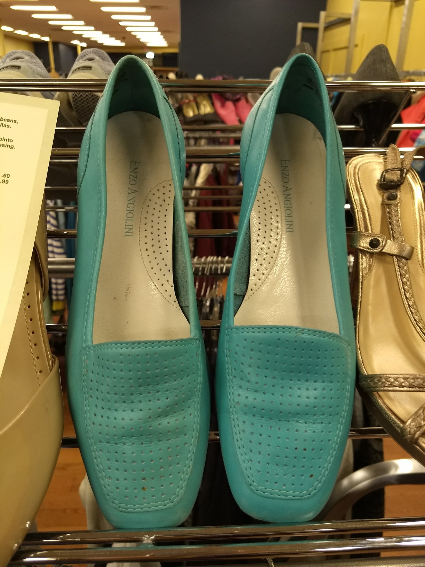
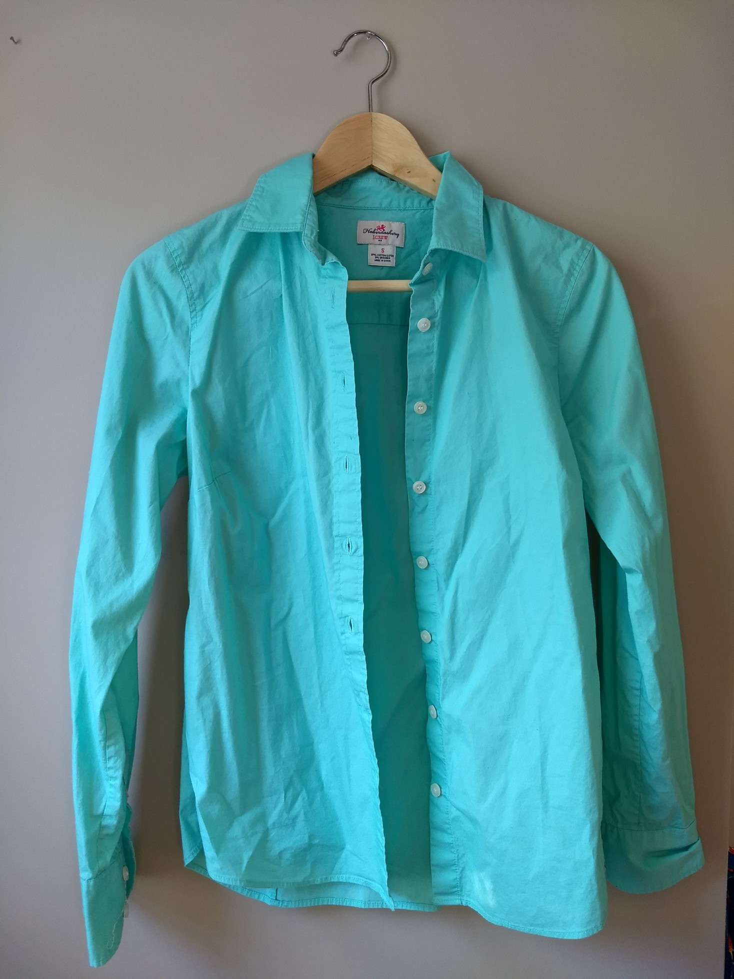
Apparently I have the easiest time finding teals/turquoises; here’s a scarf in a similar color that is 100% nailing Light Summer. It’s got a little shine to it, but I can deal with the glow because it’s not also covered in sequins or drapes or bows:

IMG_20180117_152837974
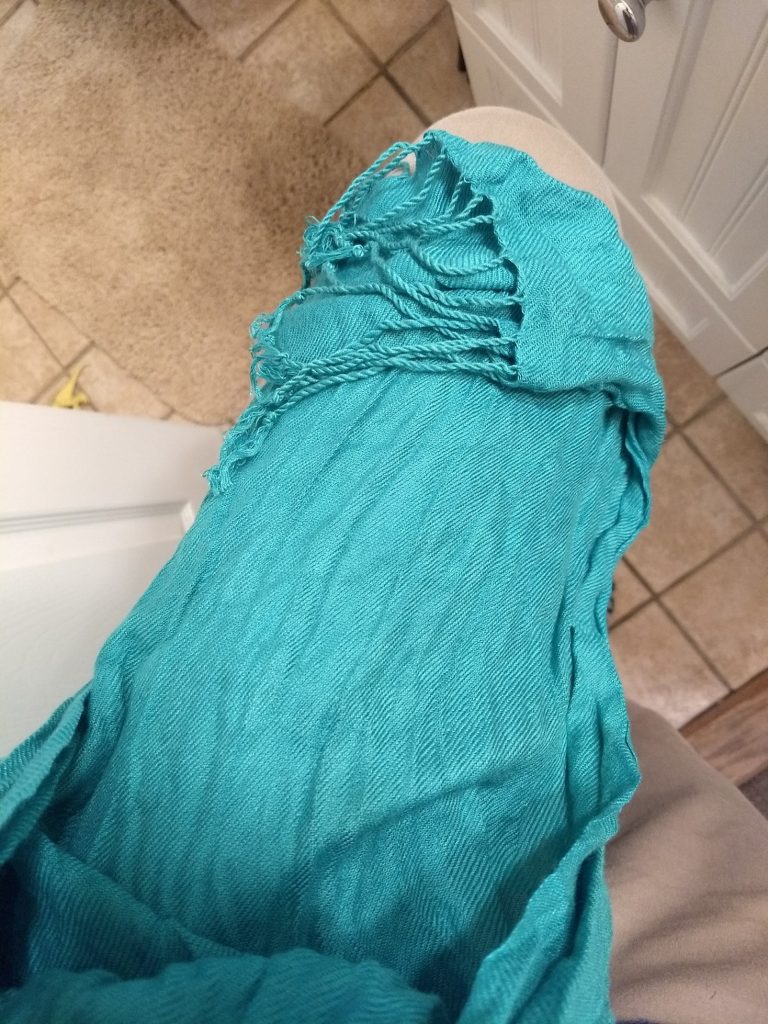
Bonus points if you can spot the dinosaur on the bathroom floor.

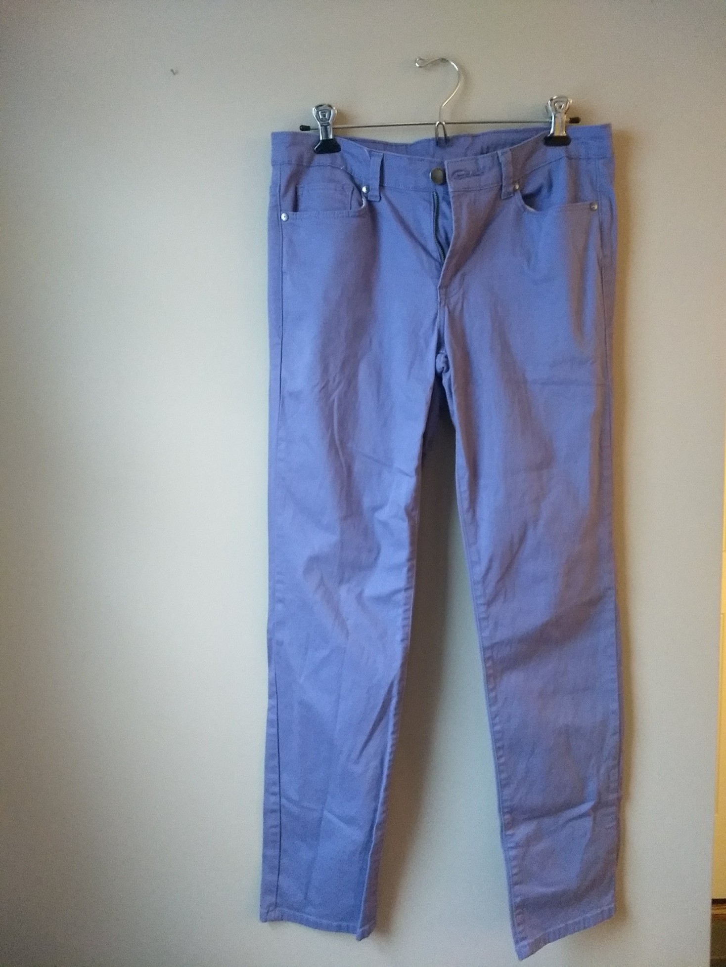
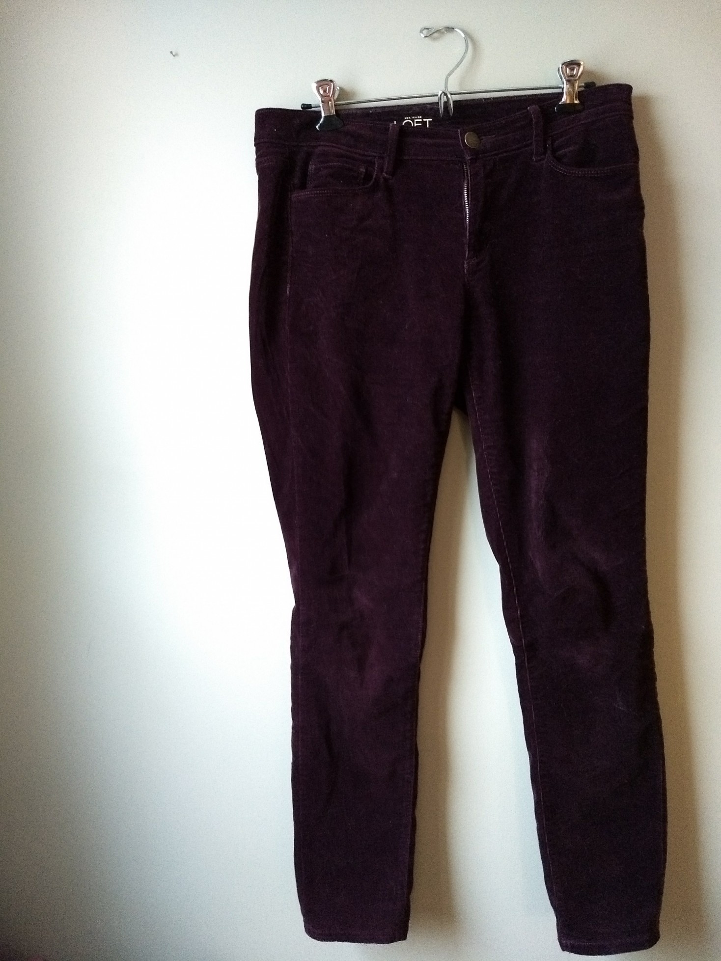
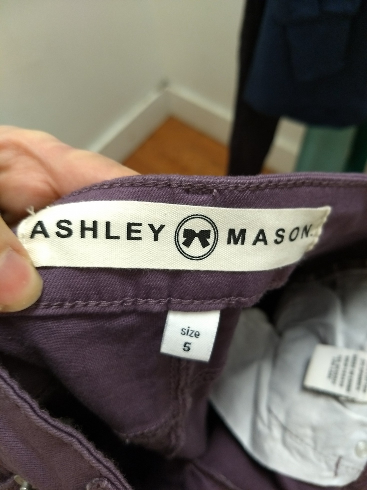
Here’s my second try with purple pants, by Clavin Klein. I think they are in the right purple family but probably a bit too grayed out. I don’t care, though, because will be far enough from my face to fudge it and they fit like a dream:

IMG_20180117_153208450

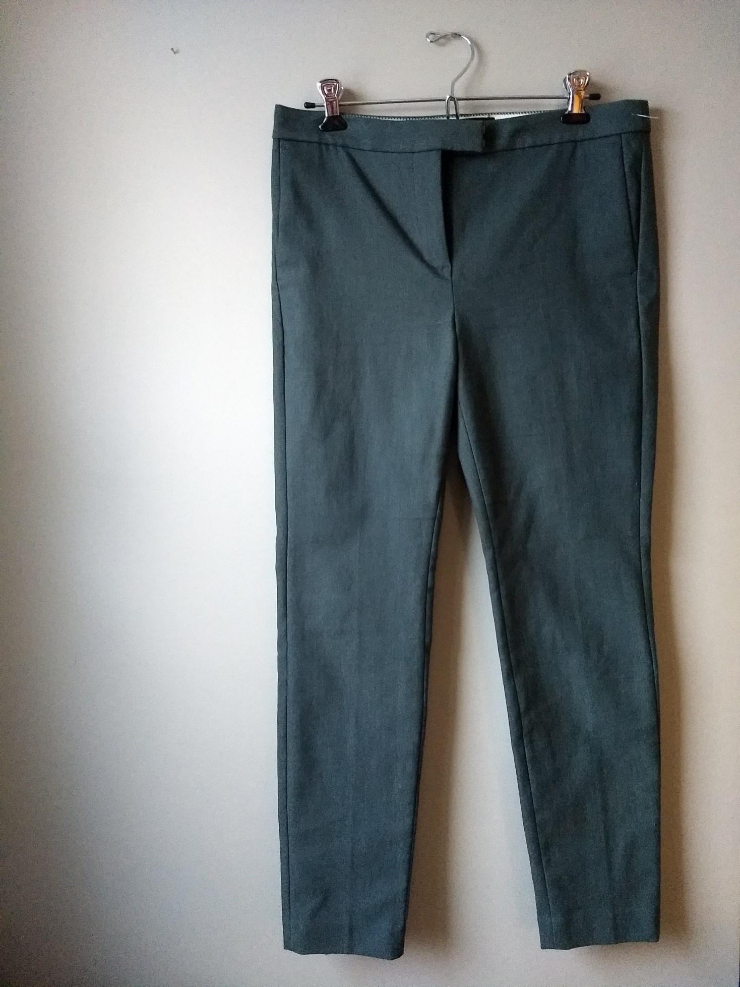
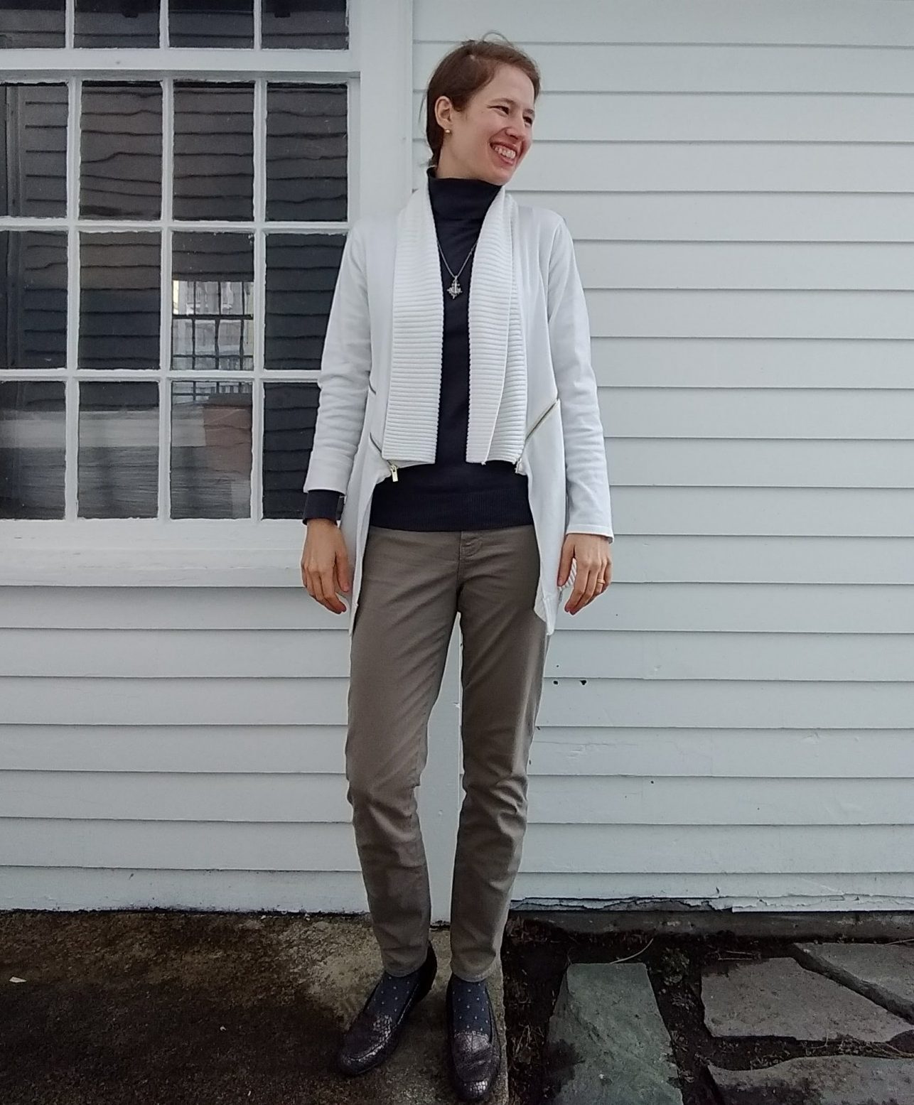
And then, in a fit of sensibility inspired by Kim’s comment, I got myself some neutral bottoms. While purple, green, and yellow pants get me super excited, and I’m even more excited for colored blazers, there are only going to be so many times I’ll want to wear yellow pants with a watermelon blazer and a blue shirt.

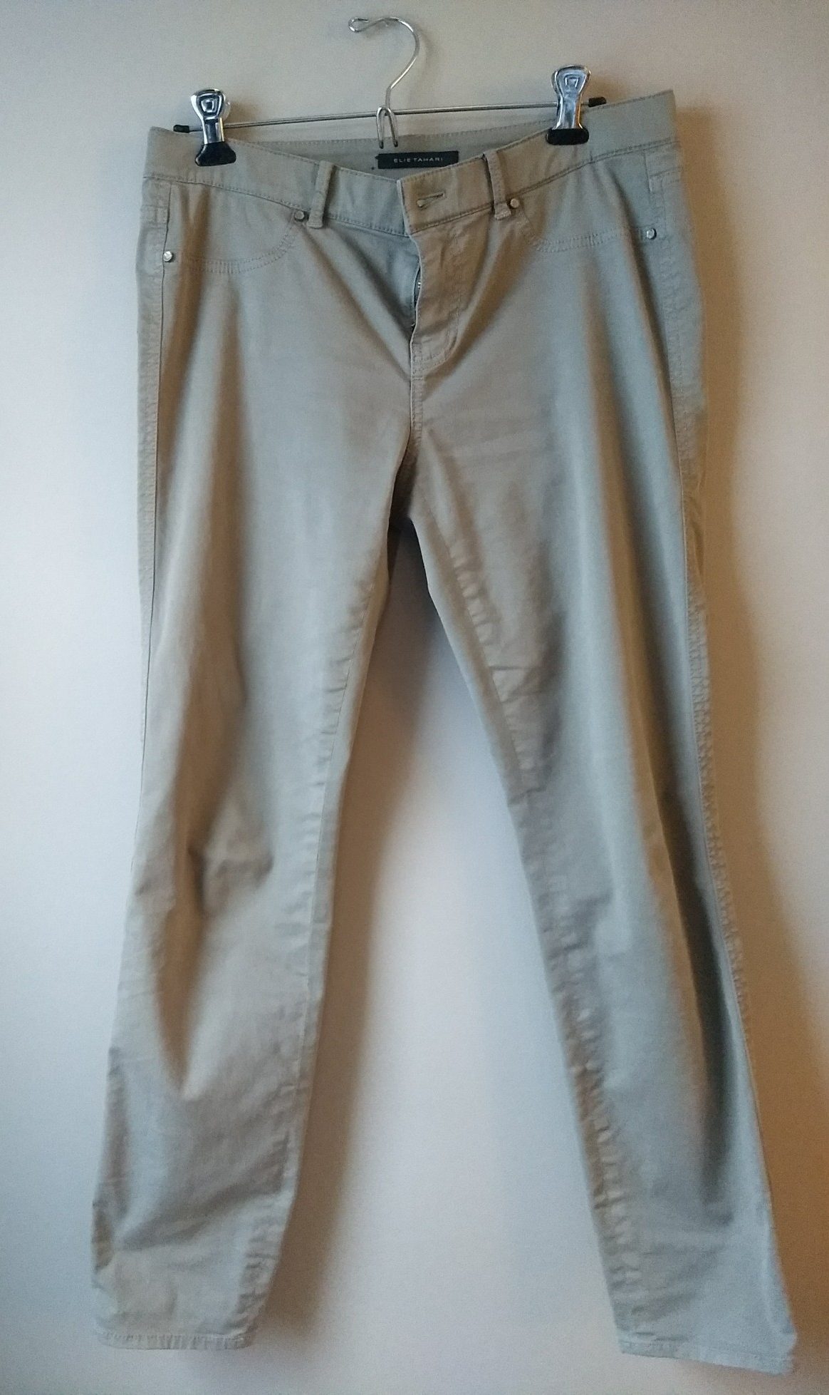
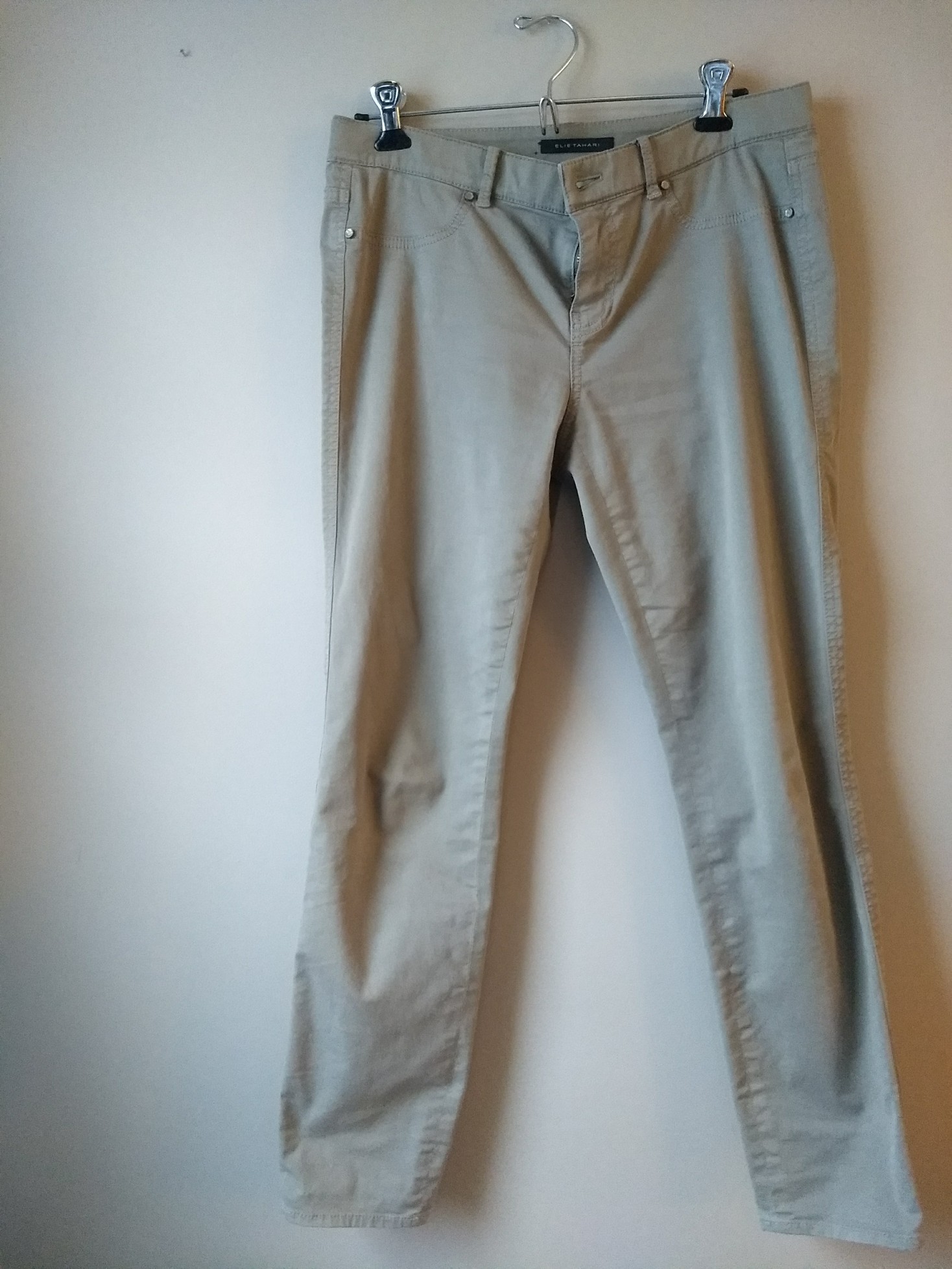
Here are some Elie Tahari pants in a stoney taupe that fit like a dream (my only qualm is all the pockets are fake):

IMG_20180117_153452391

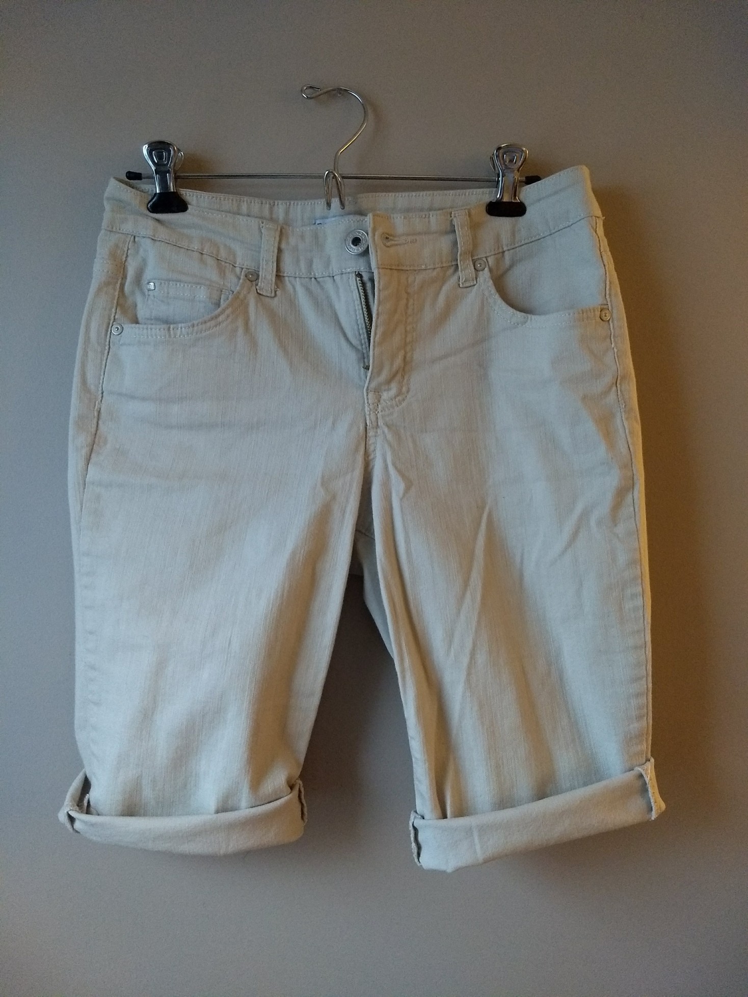
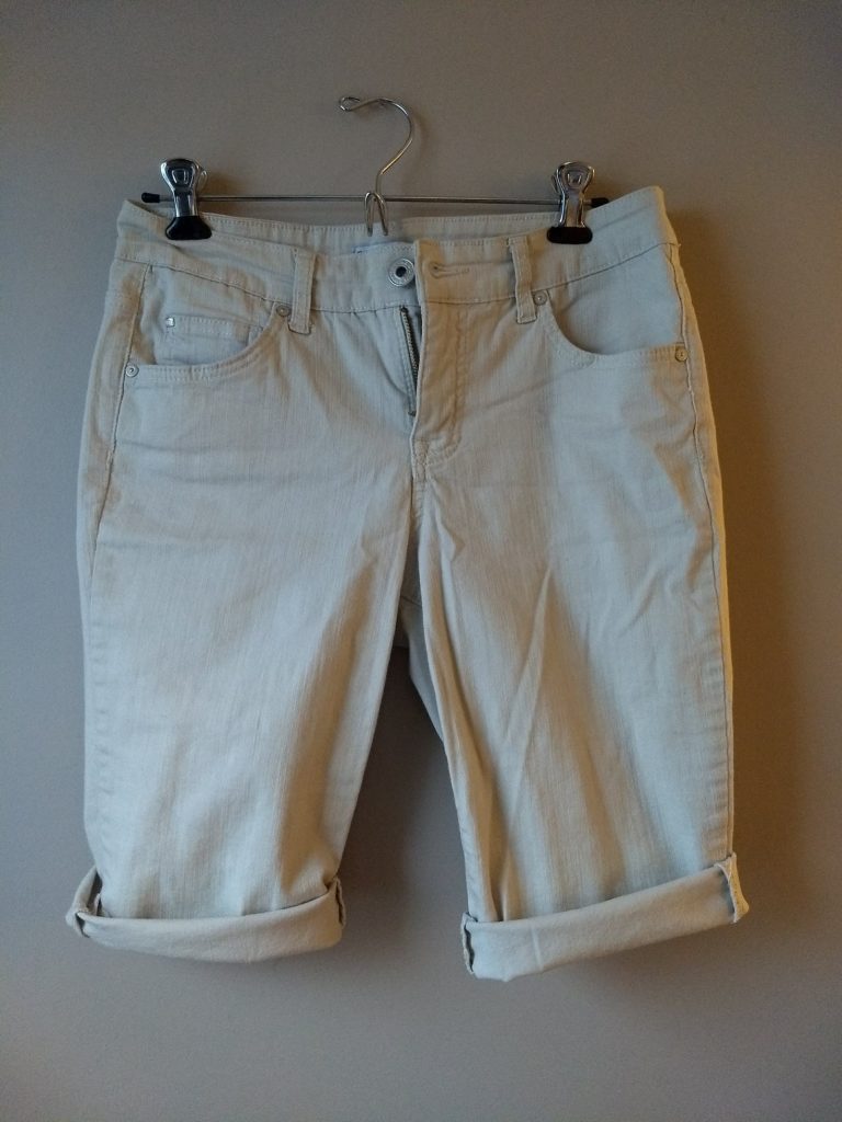
A pair of bleached driftwood (making up color names as I go…) Bandolino capris in the ugliest length possible – just covering the knees…why?! – that I have chopped off and will probably chop more to make into non-Bermuda-length shorts:

IMG_20180117_153313268

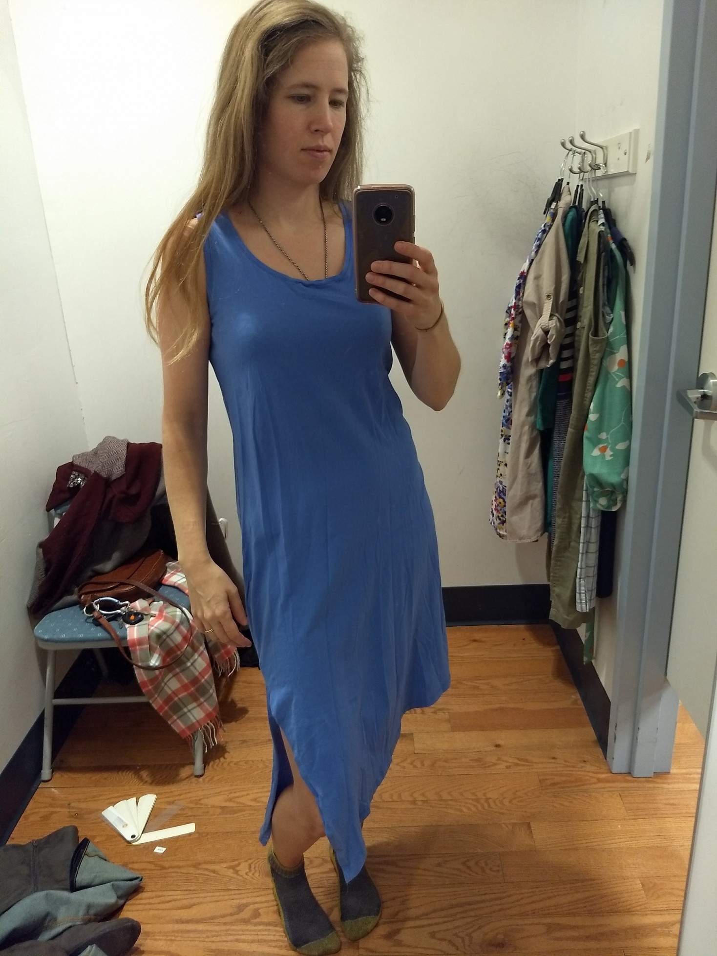
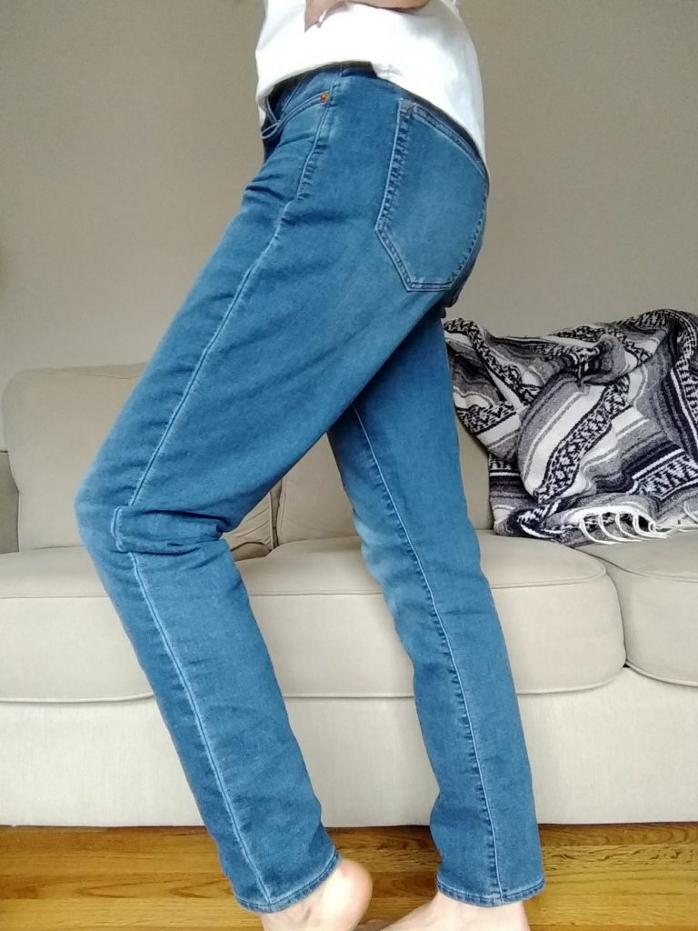
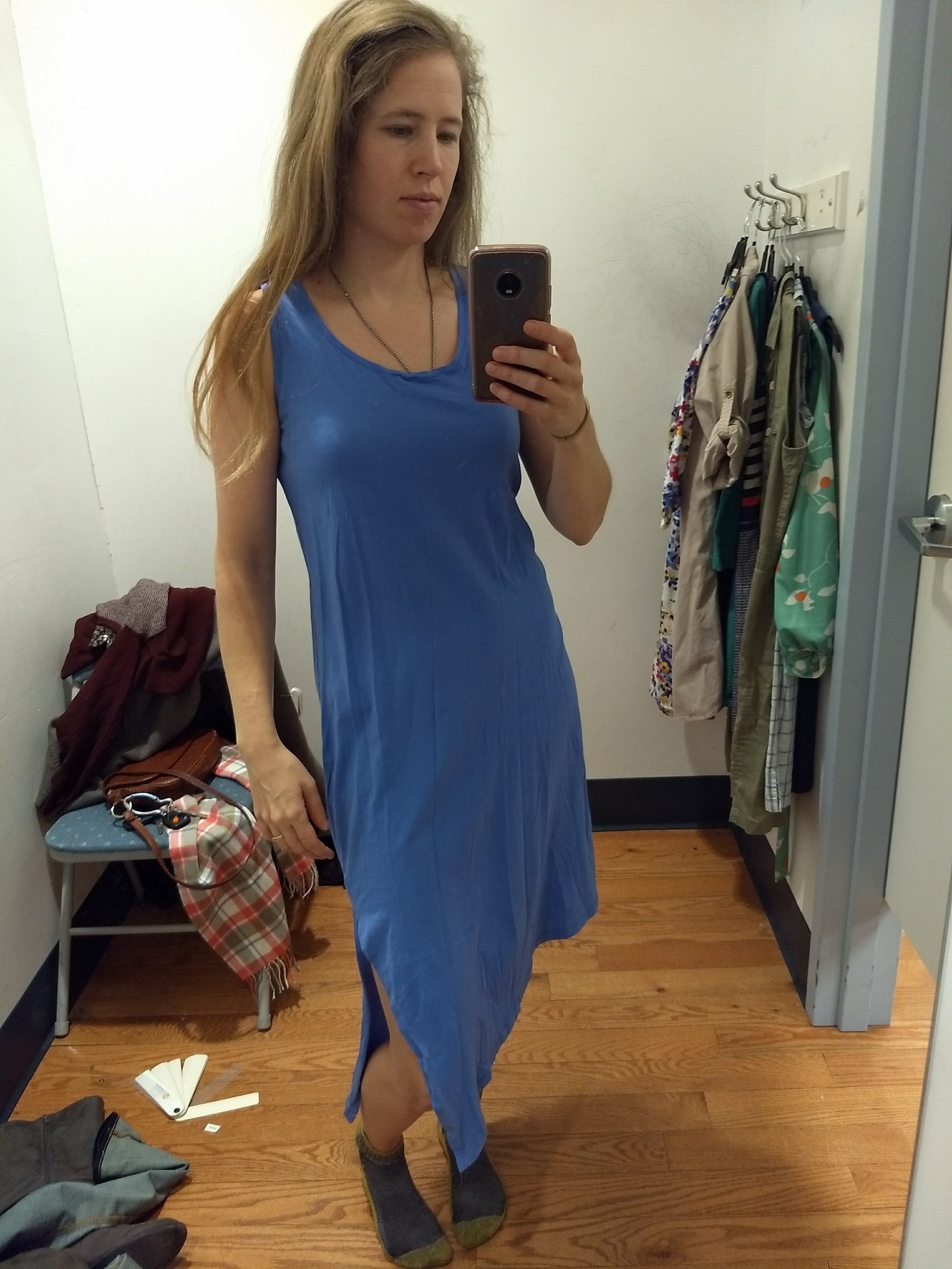
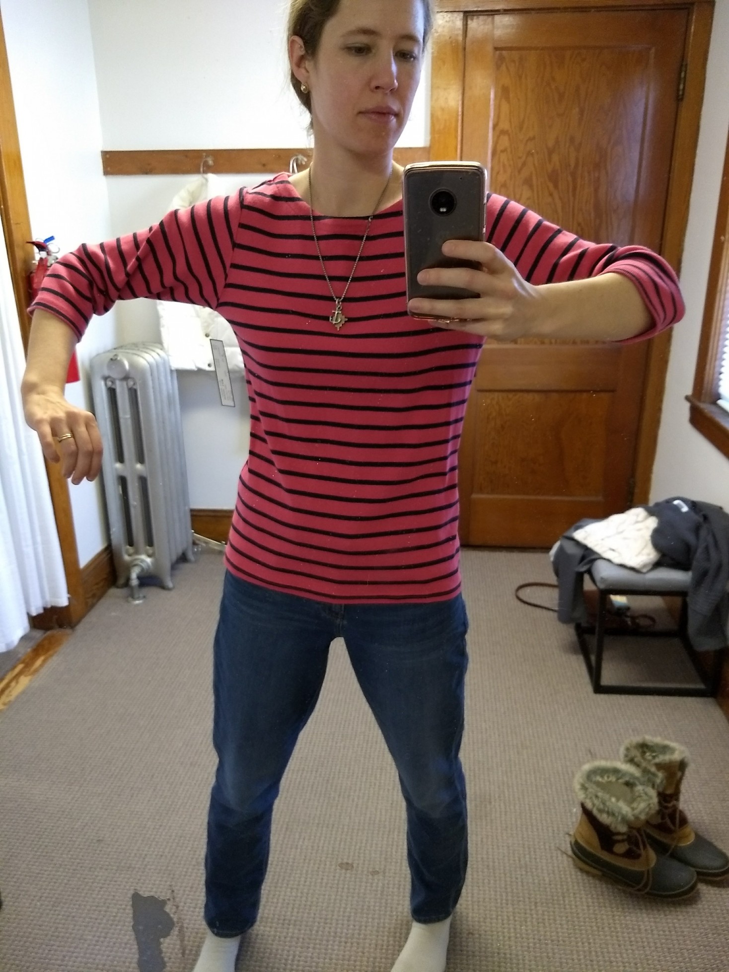
Returning to color, here’s a blue that works really well for Light Summer; it’s a little more cornflower than this picture shows. Check out that sassy bias cut and split hem!

IMG_20180101_160335200_BURST000_COVER_TOP
Once the wrinkles are steamed out, this will feel utterly sexy yet super comfortable. It will be interesting to figure out where I’ll wear it…it’s a bit nightdress-adjacent but I’d love to wear it out of the house, too.

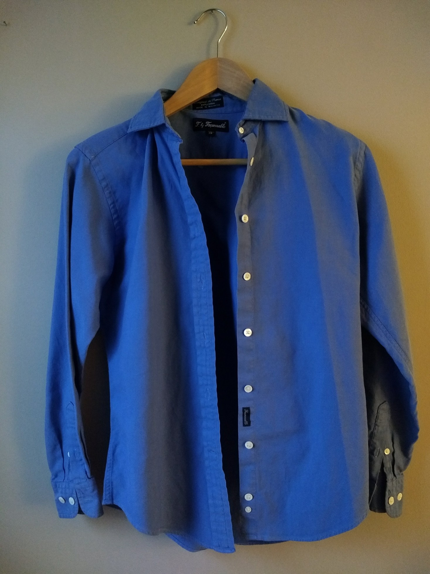
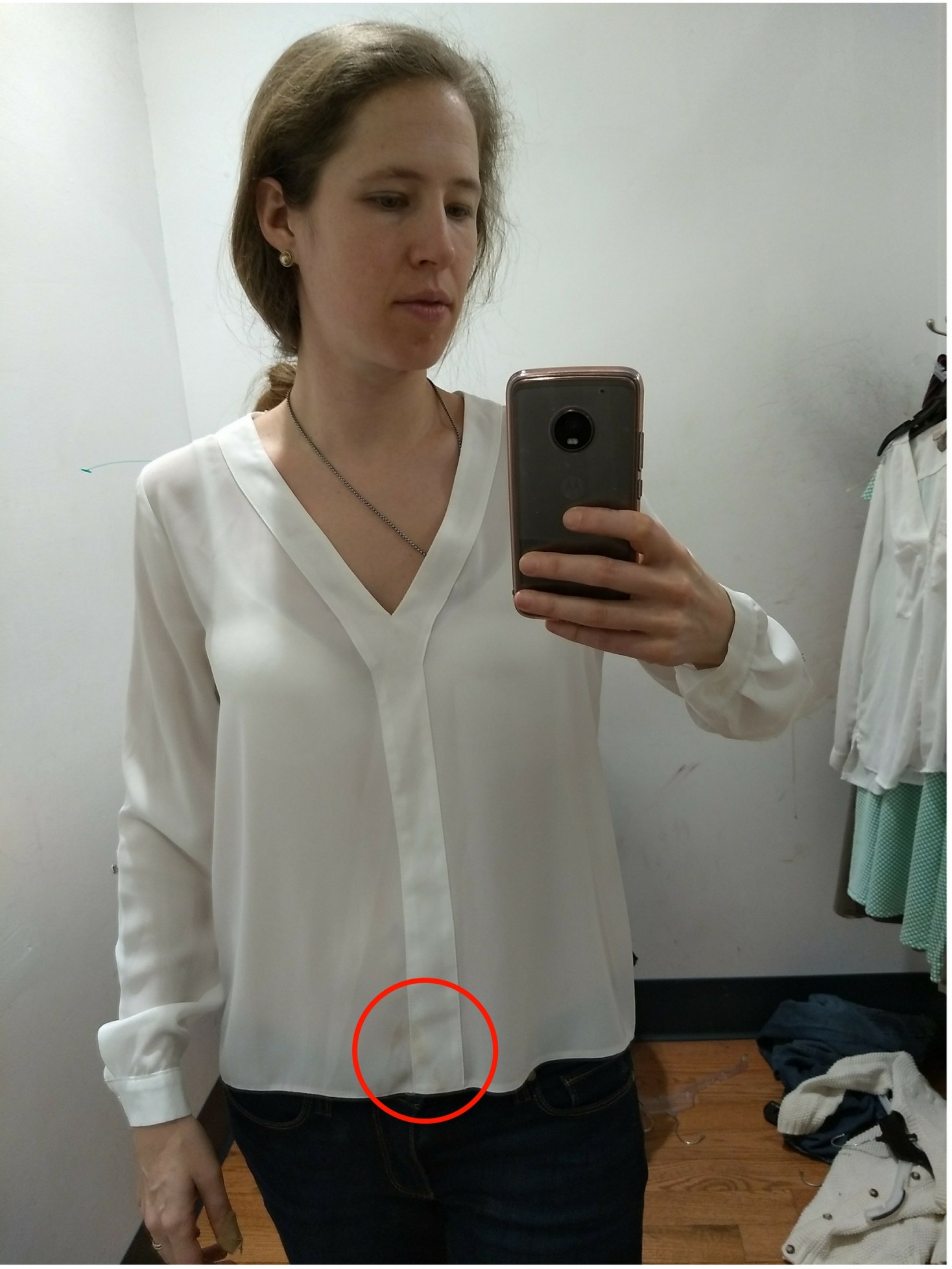
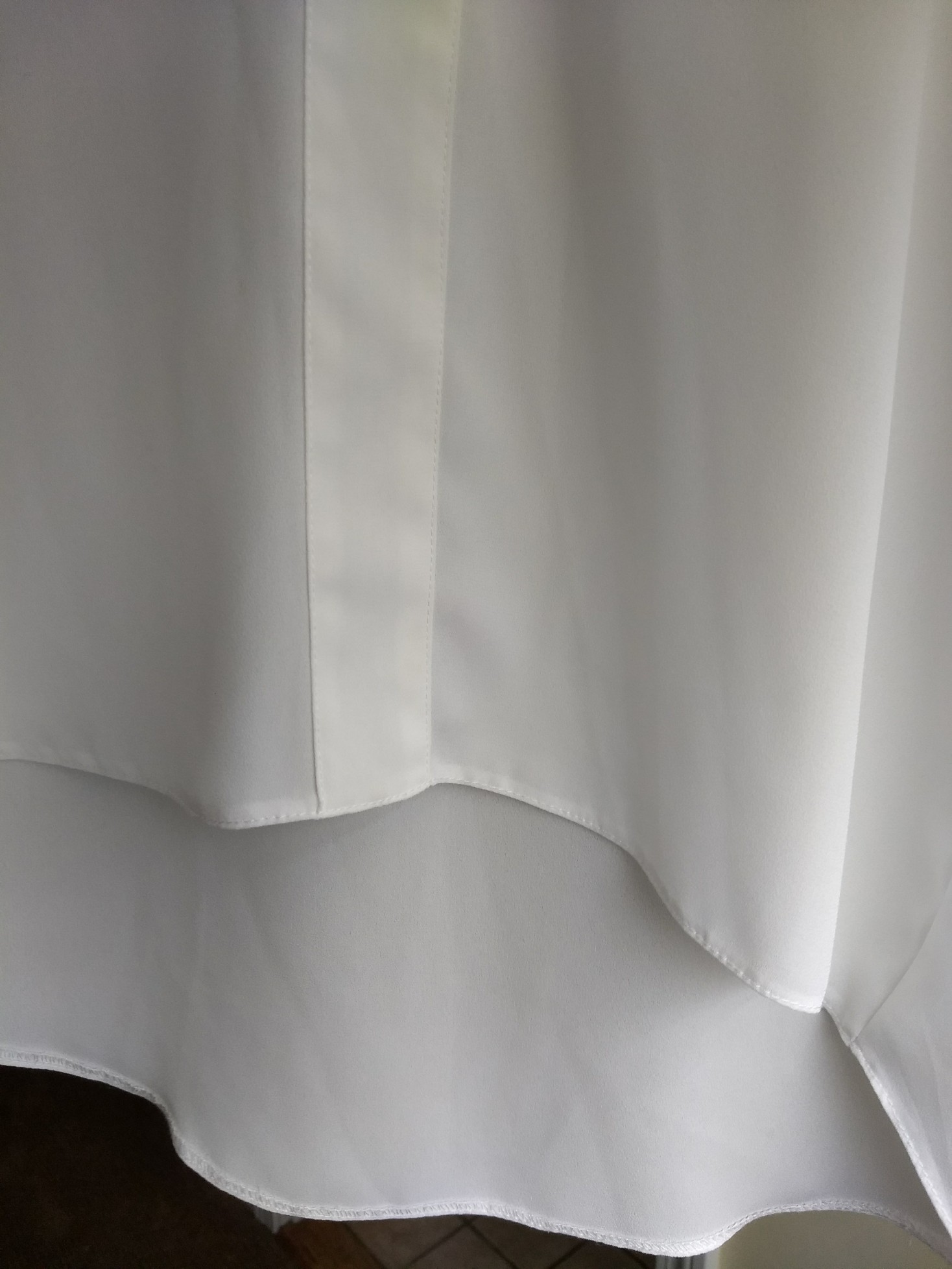
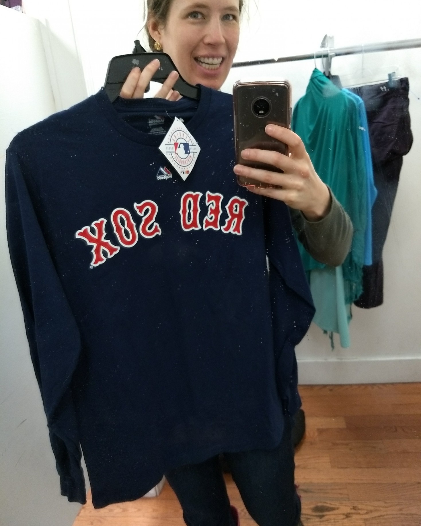
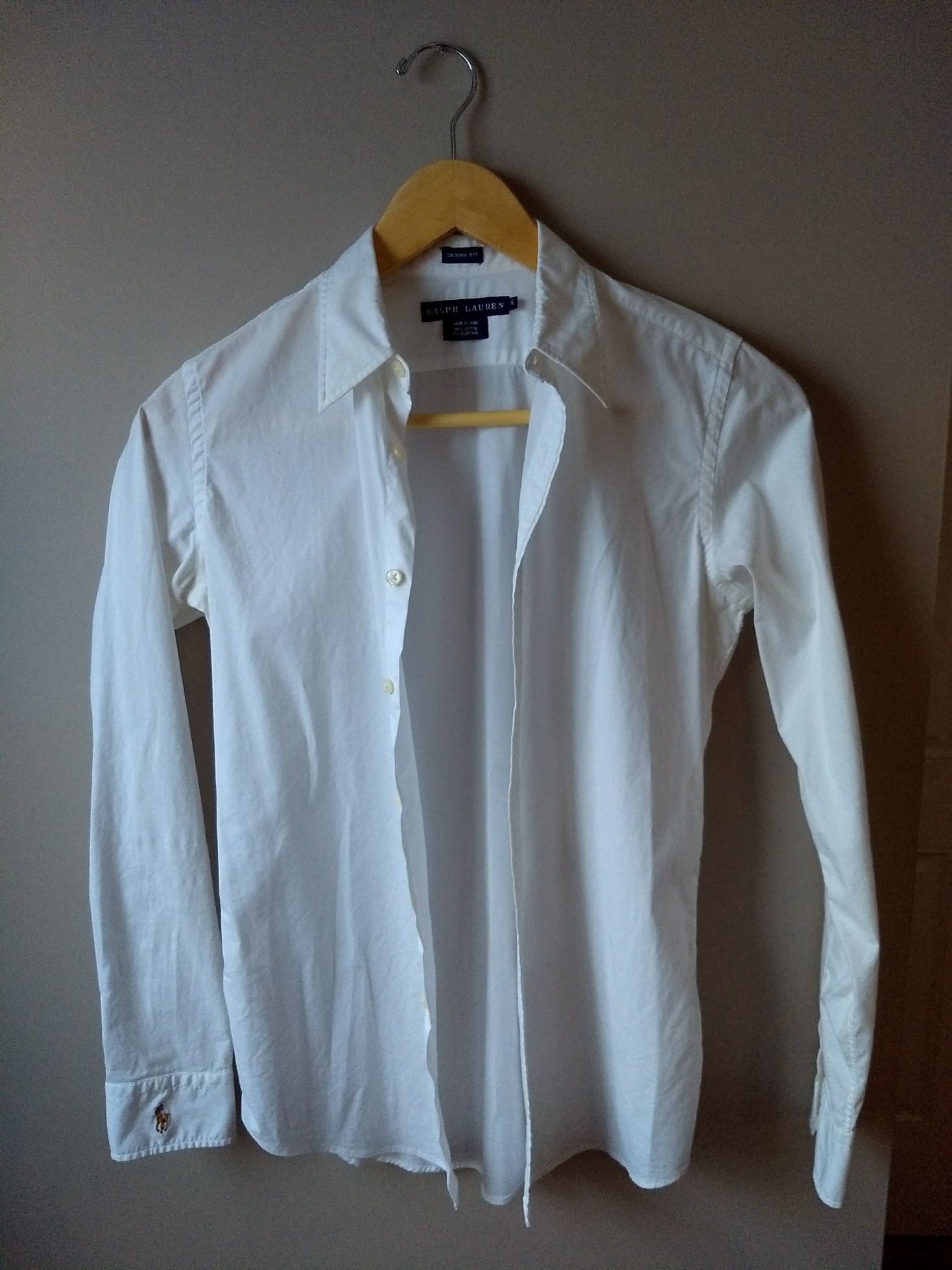
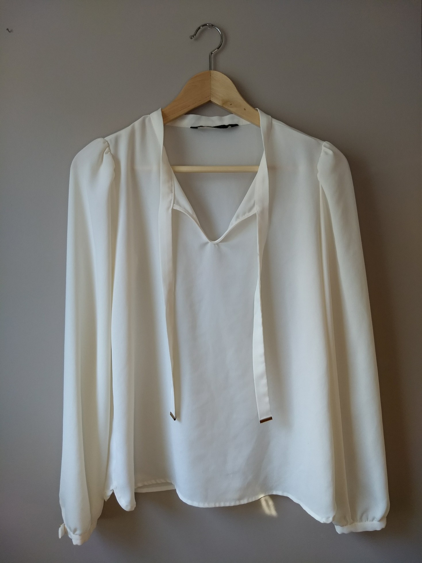
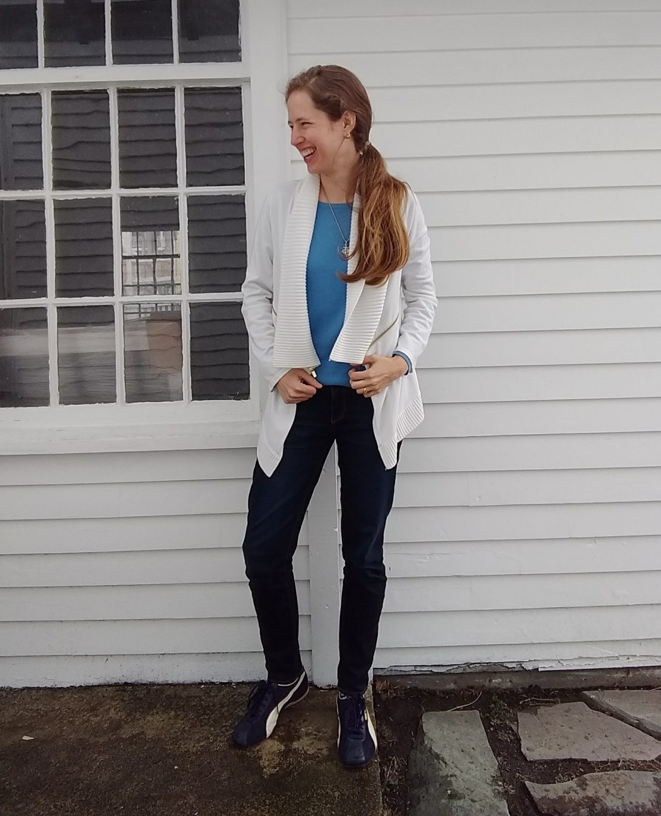
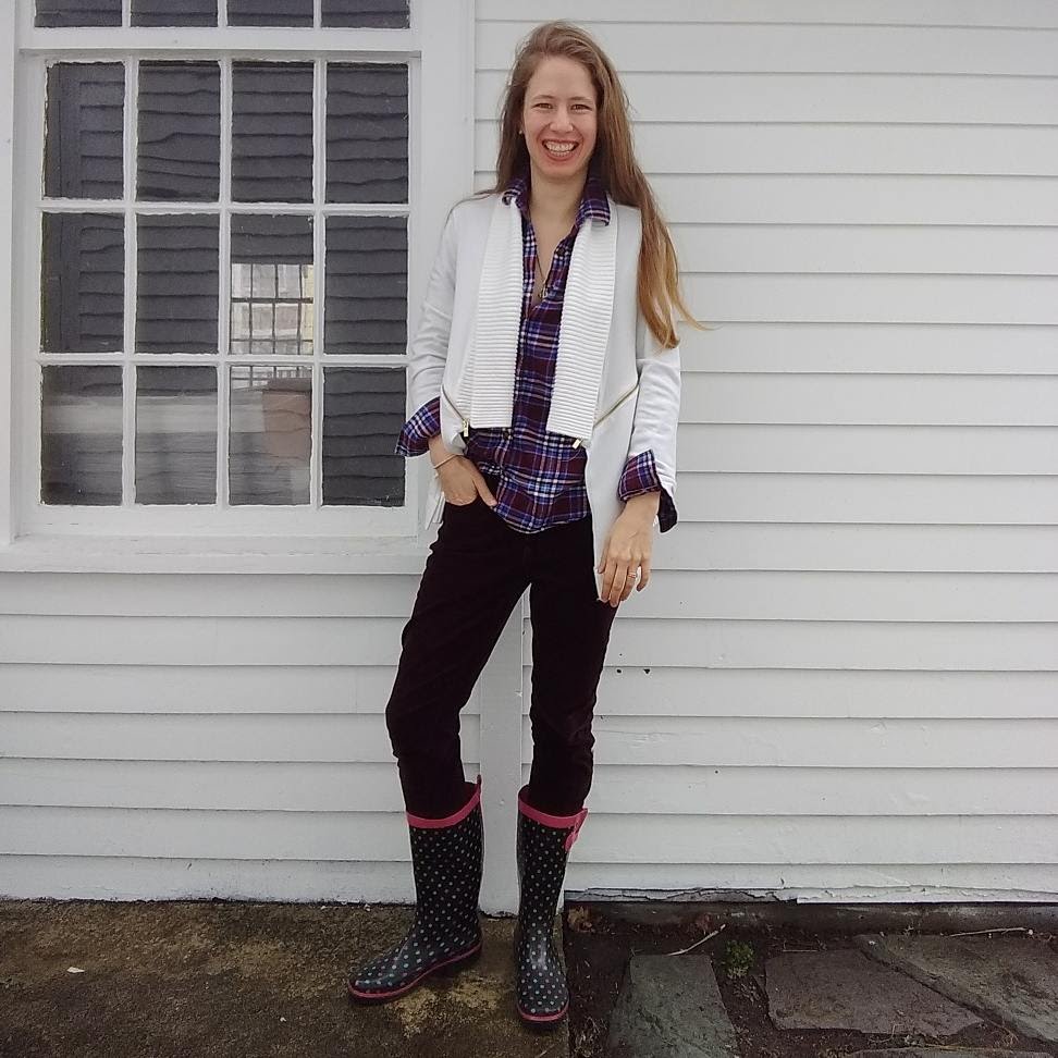
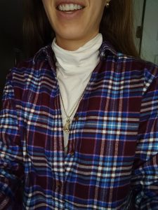
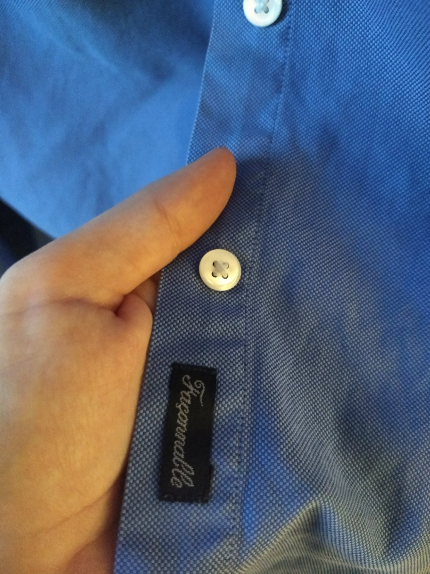
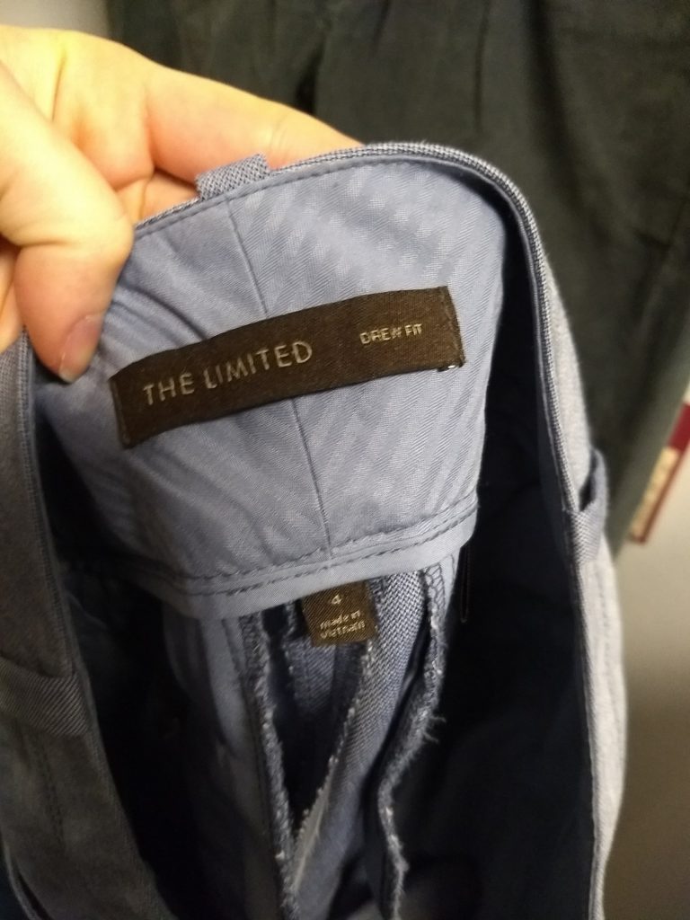
Although I like women’s take on menswear, I haven’t done too many button-downs (I prefer popover tunics) because it’s so hard to find a good fit. But here’s an F by Façonnable button down that fits great; like my new (to me) Land’s End flannel, I plan to wear it under sweaters:

IMG_20180117_162847618

It has two different shades of blue in the fabric, both of which are plausibly Light Summer, but which combined give an almost 3D intensity that might skate into Spring:

IMG_20180117_162926139

We’ll see how that wears.

A brief report from the makeup front: I’m waiting on a cooler foundation before I start trying to find a good lipstick match. (In the makeup portion of my PCA, Hope said my current warm-ish foundation works fine because it blends into the skin. But using it more in certain areas to cover breakouts leaves me looking a bit orange.)  I go for natural beauty products that don’t use toxic ingredients, which narrows down the options considerably and often means it’s more difficult to test in person. But I’m hopeful that a cooler foundation will make it easier to spot Light Summer clothes that make my complexion pop.


That’s all for now, folks! Let me know what you think of my finds and whether you’d like more in this vein.

PS The Winter 10×10 starts tomorrow! Go here for details and let me know if you plan to play along.